Design style guide设计风格指南
What is Dominican Merengue Perico Ripiao?什么是 Dominican Merengue Perico Ripiao?
Perico ripiao is the fire-orange, hand-painted soul of Dominican merengue — a design language that turns cantina signage, dance-hall posters, and accordion-driven euphoria into a maximalist visual feast.佩里科·里皮奥是多米尼加梅伦格音乐最炽烈的根源——这套设计语言将乡间小酒馆招牌、舞厅海报与手风琴驱动的狂欢,化为一场极繁主义的视觉盛宴。
Dominican Merengue Perico Ripiao in briefDominican Merengue Perico Ripiao 速览
Dominican Merengue Perico Ripiao is a design system rooted in the raw folk tradition of perico ripiao — the original, unpolished form of merengue music born in the Cibao Valley of the Dominican Republic. Unlike the polished orchestral merengue that later dominated urban ballrooms, perico ripiao was played by small groups using just three instruments: the tambora drum, the güira metal scraper, and the button accordion. Its visual identity draws directly from the 1950s and 1960s Santo Domingo and Cibao dance-hall poster tradition — a graphic world of fire-orange grounds, hand-painted condensed lettering, emerald green banners, and zinc-red flourishes borrowed from cantina signage and colmado walls.多米尼加梅伦格佩里科·里皮奥设计体系根植于佩里科·里皮奥的原始民间传统——这是诞生于多米尼加锡瓦奥谷地的最初形态梅伦格音乐,粗粝而未经雕琢。与后来统治城市舞厅的精致管弦乐队梅伦格不同,佩里科·里皮奥由只有三件乐器的小组合演奏:坦博拉鼓、吉拉刮板与纽扣手风琴。其视觉语言直接来源于1950至60年代圣多明各与锡瓦奥舞厅海报的传统——那是一个由火橙底色、手绘浓缩字体、翡翠绿横幅与锌红装饰花边构成的图形世界,素材来自小酒馆招牌和街边杂货铺的外墙。
The aesthetic is maximalist in the truest sense: nothing is restrained, nothing whispers. Color fields are saturated to the point of vibration. Letterforms are condensed, bold, and slightly irregular — the trace of a human hand with a wide brush, not the output of a typesetting machine. Diagonal banner-strap compositions cut across the frame with the same urgency that a merengue rhythm cuts through a crowd. Every surface feels like it has been tacked up on a Cibao colmado wall and baked by Caribbean sun.这种美学是最纯粹意义上的极繁主义:没有任何克制,没有任何低语。色彩饱和到震动的边缘。字形浓缩、粗重、略带不规则感——那是人手持宽刷留下的痕迹,不是排字机的输出。对角横幅构图以梅伦格节奏刺穿人群的同等紧迫感斜切画面。每一个界面都像钉在锡瓦奥杂货铺墙上、被加勒比阳光烤过的舞会传单。
Where Bauhaus or Swiss design systems impose rational order, perico ripiao design embraces productive chaos: multiple competing type sizes, overlapping decorative borders, color fields that collide without gradient transitions, and ornamental flourishes that celebrate hand-craft over industrial precision. The system is governed not by a grid but by rhythm — the visual equivalent of the insistent two-four beat that has defined perico ripiao since the 1840s.理性秩序系统强调控制与压制,而佩里科·里皮奥设计则拥抱富有成效的混乱:多个相互竞争的字号、叠压的装饰边框、碰撞而不渐变的色块,以及颂扬手工艺而非工业精准的装饰花纹。这套体系不受网格约束,而受节奏支配——那是自1840年代起就定义佩里科·里皮奥的顽强二四拍的视觉等价物。
See the Dominican Merengue Perico Ripiao design system →查看 Dominican Merengue Perico Ripiao 完整设计系统 →
Where does Dominican Merengue Perico Ripiao come from?Dominican Merengue Perico Ripiao 从何而来?
Perico ripiao — the name is slang, likely derived from a colloquial term for a rough Cibao cantina — emerged as a distinct musical form in the Cibao Valley around the city of Santiago de los Caballeros in the first half of the nineteenth century. The two-four time signature, the tambora-güira-accordion trio, and the call-and-response vocal structure were all established by the 1840s. The music was rural, working-class, and strongly associated with the small farmers and laborers of the Cibao interior — people who danced and drank in cantinas, not in the salons of Santo Domingo's colonial elite.佩里科·里皮奥——这个名字是俚语,可能源于对锡瓦奥某类粗陋小酒馆的口语称呼——在十九世纪上半叶于圣地亚哥-德洛斯卡瓦耶罗斯附近的锡瓦奥谷地形成为独特的音乐形态。二四拍节奏、坦博拉-吉拉-手风琴三重奏以及呼应式人声结构,均在1840年代前后确立。这种音乐是乡村的、工人阶级的,与锡瓦奥内地的小农和劳动者密切相连——那些在小酒馆里起舞痛饮的人,而非圣多明各殖民精英的沙龙宾客。
The visual language of perico ripiao crystallized in the 1950s and 1960s, when the music found itself in a complex political bind. The dictator Rafael Trujillo, who ruled the Dominican Republic from 1930 until his assassination in 1961, nationalized merengue as the official music of the Dominican people — using it as a propaganda tool to construct a unified national identity. Dance-hall promoters and small record labels responded by producing vivid hand-painted posters and painted enamel signs that announced performances by key figures of the tradition. These posters — fire-orange or zinc-red grounds, diagonal banners, condensed hand-lettered type — became the graphic archive of the form.佩里科·里皮奥的视觉语言在1950至60年代定型,当时这种音乐正处于一种复杂的政治困境中。独裁者拉斐尔·特鲁希略于1930年至1961年遇刺前统治多米尼加共和国,他将梅伦格国有化为多米尼加人民的官方音乐——以此作为构建统一民族认同的宣传工具。舞厅主办方和小型唱片公司以生动的手绘海报和搪瓷彩绘招牌作出回应,宣传该传统重要人物的演出。这些海报——火橙或锌红底色、对角横幅、浓缩手绘字体——成为这一音乐形态的图形档案。
The instruments themselves shaped the aesthetic. The güira's metallic scrape, the tambora's dense thud, and the accordion's bright, nasal squeal all register in the design's color logic: the güira suggests the metallic sheen of zinc-red and silver-white; the tambora's darkness anchors the deep shadow tones; the accordion's exuberance drives the saturated fire-orange that dominates the palette. This synesthetic reading is not a retrospective imposition — it was implicit in how dance-hall promoters actually selected paint colors and lettering styles to evoke the music's character.乐器本身塑造了美学。吉拉的金属刮擦声、坦博拉的厚重击打声,以及手风琴明亮鼻腔般的嘶鸣,都在设计的色彩逻辑中留下印记:吉拉暗示锌红与银白的金属光泽;坦博拉的沉暗锚定深阴影色调;手风琴的奔放驱动着主导整个色板的饱和火橙。这种通感式解读并非事后附会——它隐含在舞厅主办方实际选择颜料色彩与字体样式以唤起音乐气质的方式之中。
After Trujillo's assassination in 1961, merengue fragmented into multiple streams. Urban orchestral merengue — with brass, piano, and slick choreography — became internationally famous in the 1980s through artists like Johnny Ventura and later Juan Luis Guerra. But perico ripiao, the raw root form, was preserved by a dedicated community of musicians and scholars, and in 2016 UNESCO inscribed merengue on its Representative List of Intangible Cultural Heritage of Humanity — a recognition that specifically honored the Cibao folk tradition as the form's authentic heart. The visual system associated with perico ripiao today draws on both the historic poster archive and a contemporary revival interest in hand-made, analog, and pre-digital graphic forms.特鲁希略于1961年遇刺后,梅伦格分裂为多个支流。以铜管、钢琴和精心编排舞蹈为特色的城市管弦乐队梅伦格,在1980年代通过约翰尼·文图拉等艺人走向国际,随后胡安·路易斯·格拉以同样方式扬名世界。然而佩里科·里皮奥这一原始根形,由一个专注的音乐家与学者群体加以守护;2016年联合国教科文组织将梅伦格列入人类非物质文化遗产代表作名录,这一认定特别将锡瓦奥民间传统誉为该形态的正宗核心。今天与佩里科·里皮奥相关的视觉体系,既汲取历史海报档案,也呼应当代对手工、模拟与前数字图形形式的复兴兴趣。
What defines the Dominican Merengue Perico Ripiao look?Dominican Merengue Perico Ripiao 的视觉特征是什么?
Color色彩
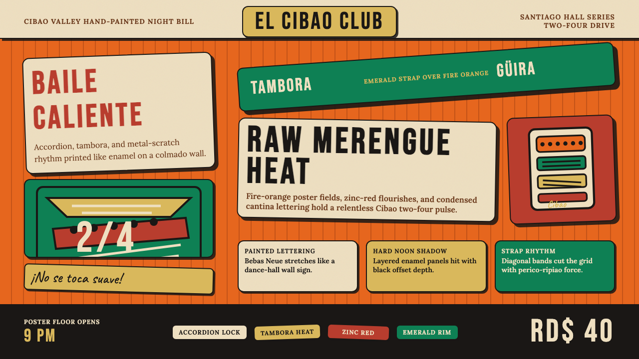
The palette is built around fire-orange as a dominant ground — a warm, sun-cured orange that sits closer to a hot enamel than to a pastel. Against it, emerald green appears as a diagonal accent or banner stripe, and zinc-red provides a secondary warm note used in lettering and border flourishes. White or near-white is used sparingly for headline lettering and contrast breaks. Black functions as the deepest shadow and the anchor for body type. The overall effect is of saturated color fields in collision — no gradients, no transitions, just flat planes of high-energy hue pressing against each other.色板以火橙作为主导底色——一种温暖、经阳光烤灼的橙,更接近热搪瓷而非粉彩。翡翠绿以对角线强调或横幅条纹的形式出现,锌红提供次级暖调,用于字体与边框花纹。白色或近白色仅作为标题字与对比间歇使用。黑色充当最深的阴影,也是正文字体的锚。整体效果是饱和色块的相互碰撞——没有渐变,没有过渡,只有高能色调的平面相互逼压。
Typography字体排印
Letterforms are condensed, tall, and manually irregular — they read as the output of a sign-painter's brush rather than a typesetting machine. Headline type is enormous relative to the composition, often consuming a third or more of the vertical space. Interior letters sometimes vary subtly in weight and angle, preserving the evidence of human hand-work. There is no single type hierarchy imposed by rule; instead, importance is communicated through size contrast, color contrast, and the physical energy of the letterform itself. Secondary information appears in smaller condensed blocks but is never demoted to invisibility.字形浓缩、修长,带着手工的不规则感——呈现为招牌画师宽刷的输出,而非排字机的产品。标题字体相对于构图极为巨大,常常占据三分之一甚至更多的纵向空间。内部字母有时在字重与角度上存在细微差异,保留了人手作业的痕迹。没有任何单一的字体层级体系由规则强加;重要性通过尺寸对比、色彩对比与字形本身的物理能量来传达。次要信息以更小的浓缩文字块呈现,但绝不被降格至不可见。
Diagonal Composition对角构图
The diagonal banner-strap is the system's most distinctive structural device. Where European modernist layouts organize information along horizontal and vertical axes, perico ripiao compositions introduce a bold diagonal band — typically running from upper-left to lower-right, or in the opposite direction — that carries a performer's name, a venue, or a date. This diagonal cuts across the ground color with urgency, creating visual movement that parallels the relentless forward drive of the music itself. Multiple diagonals can coexist in a single composition, layering information like stacked rhythmic patterns.对角横幅条带是这套体系最具辨识性的结构装置。欧洲现代主义版面沿水平与垂直轴线组织信息,而佩里科·里皮奥构图引入粗犷的对角带——通常从左上延伸至右下,或反向——承载表演者姓名、场地或日期。这条对角线以紧迫感切入底色,制造出与音乐本身不息推进感相呼应的视觉运动。单个构图中可以共存多条对角线,像堆叠的节奏型一样层层叠加信息。
Ornamental Borders and Flourishes装饰边框与花纹
Where Bauhaus strips away ornament entirely, perico ripiao celebrates it. Decorative borders — painted in contrasting colors, often featuring repeated geometric or floral motifs lifted from cantina tile work and colonial ironwork — frame text blocks, separate information zones, and emphasize performer names. Flourishes extend from letterforms, curling into the surrounding color fields. These ornamental elements are not arbitrary decoration; they are signals of hand-craft, cultural specificity, and festive occasion. Their presence communicates that this is a special event, not a routine announcement.包豪斯彻底剔除装饰,佩里科·里皮奥则颂扬它。装饰边框——以对比色绘制,常采用源自小酒馆瓷砖工艺与殖民时期铁艺的重复几何或花卉纹样——框住文字块,分隔信息区域,强调表演者姓名。花纹从字形延伸出来,卷入周围的色彩区域。这些装饰性元素不是任意的点缀;它们是手工艺、文化特殊性与节日庆典的信号。它们的存在传达出:这是一个特殊事件,不是例行通告。
Texture and Surface Quality质感与表面品质
The aesthetic deliberately preserves evidence of hand production. Brush strokes are visible in color fields — subtle variations in opacity and direction that no digital flat fill replicates. Letterforms show the small imperfections of brush work: slightly uneven baseline, minor variations in stroke width, brush-end textures at the terminals. This textural quality is what distinguishes perico ripiao from mere tropical maximalism; it insists that a human being made this thing, not a machine. In digital applications, introducing deliberate texture — grain, slight irregularity, visible ink spread — is more faithful to the source than smooth vector perfection.这种美学刻意保留手工制作的痕迹。色彩区域内可见笔触——不透明度与方向上的细微变化,是任何数字平涂所无法复制的。字形展示刷绘的细微瑕疵:略微不均的基线、笔画宽度的轻微变化、末端的刷毛质感。正是这种质感将佩里科·里皮奥与单纯的热带极繁主义区别开来;它坚持:制作这件东西的是人,不是机器。在数字应用中,引入刻意的质感——颗粒感、轻微的不规则、可见的墨水扩散——比光滑的矢量完美更忠实于原始来源。
Layering and Density层叠与密度
Perico ripiao compositions are dense. There is rarely empty space for its own sake — every zone of the composition carries information, color, or texture. Color fields overlap and collide. Type overlaps decorative bands. Illustrative elements — stars, musical notes, portrait silhouettes — appear alongside text. This density is not disorganization; it mirrors the sonic density of the music itself, in which the tambora, güira, and accordion never pause simultaneously. The compositional logic is additive rather than reductive: more is added until the festive atmosphere is achieved, not subtracted until clarity is reached.佩里科·里皮奥构图是密集的。极少有纯粹留白的空间——构图的每个区域都承载信息、色彩或质感。色块叠压碰撞。文字覆盖在装饰带上。图示性元素——星形、音符、人像剪影——与文字并置出现。这种密度并非杂乱无序;它映射了音乐本身的声音密度,在那里坦博拉、吉拉与手风琴从不同时停歇。构图逻辑是累加而非削减的:不断叠加直至节日氛围达成,而非不断去除直至清晰浮现。
Energy and Festivity能量与节庆感
Above all, the system communicates celebration. The fire-orange ground, the diagonal banners, the hand-lettered exuberance, and the ornamental density all work together to say: something joyful is happening here, and you are invited. This festive register is not accidental — it is the design equivalent of the merengue's irresistible rhythmic pull. A composition in this system that feels measured or restrained has failed; the goal is not refinement but infectious euphoria.这套体系首先传达庆典感。火橙底色、对角横幅、手绘字体的奔放与装饰性的密度共同作用,传递出:这里正在发生令人喜悦的事情,而你受邀参与其中。这种节庆格调并非偶然——它是梅伦格无法抗拒的节奏吸引力的设计等价物。在这套体系中,一件感觉克制或收敛的作品就是失败;目标不是精致,而是传染性的狂喜。
See the Dominican Merengue Perico Ripiao design system →查看 Dominican Merengue Perico Ripiao 完整设计系统 →
Who shaped Dominican Merengue Perico Ripiao?谁塑造了 Dominican Merengue Perico Ripiao?
Francisco Antonio Lora — known universally as Ñico Lora — is regarded as one of the founding figures of perico ripiao, active in the Cibao Valley from the early twentieth century. His accordion playing set the template for the form's rhythmic feel and ornamentation style, and his recordings in the mid-twentieth century helped preserve the tradition at a time when urban orchestral merengue was increasingly dominant. Lora's name appears on some of the earliest surviving perico ripiao dance-hall posters, making him both a musical and a visual archetype of the form.弗朗西斯科·安东尼奥·洛拉——人称尼科·洛拉——被公认为佩里科·里皮奥的奠基人物之一,二十世纪初活跃于锡瓦奥谷地。他的手风琴演奏确立了这一形态节奏感与装饰风格的范本;他在二十世纪中叶的录音在城市管弦乐队梅伦格日益主导之际帮助守护了这一传统。洛拉的名字出现在一些现存最早的佩里科·里皮奥舞厅海报上,使他同时成为这一形态的音乐与视觉原型。
Tatico Henríquez was one of the most celebrated perico ripiao accordionists of the twentieth century, whose recordings in the 1960s and 1970s are considered definitive documents of the style at its expressive peak. His playing was known for its rhythmic intensity and emotional range — from driving dance energy to lyrical melancholy — and his associated poster art exemplifies the mature visual language of the tradition: dense, hand-painted, fire-ground compositions with bold condensed lettering. Henríquez died in 1976, but his recordings remain the primary reference for musicians and scholars of the form.塔提科·恩里克斯是二十世纪最具盛名的佩里科·里皮奥手风琴演奏家之一,他在1960至70年代的录音被视为这一风格表现巅峰时期的权威文献。他的演奏以节奏强度与情感幅度著称——从驱动舞场的能量到抒情的忧郁——与他相关的海报艺术体现了这一传统成熟视觉语言的典型形态:密集、手绘、火焰底色构图配以粗重浓缩字体。恩里克斯于1976年辞世,但他的录音至今仍是演奏者与学者研究这一形态的首要参照。
Doña Altagracia Arias Vanderpool — known as Fefita La Grande — is one of the few women to have achieved legendary status in the accordion-driven perico ripiao tradition, a world dominated by male performers. Her recordings from the 1960s onward combined raw Cibao folk energy with theatrical charisma, and her stage presence and promotional materials contributed a more exuberant, almost operatic dimension to the visual language of the tradition — bolder lettering, brighter color contrasts, and a sense of personal star power projected through the graphic surface.多娜·阿尔塔格拉西亚·阿里亚斯·万德普尔——人称「大费菲塔」——是为数不多在手风琴主导的佩里科·里皮奥传统中取得传奇地位的女性之一,这是一个由男性演奏者主导的世界。她自1960年代起的录音将锡瓦奥原始民间能量与戏剧性魅力融为一体;她的舞台形象与宣传材料为这一传统的视觉语言增添了更奔放、近乎歌剧式的维度——更大胆的字体、更鲜明的色彩对比,以及通过图形表面投射的个人明星气场。
Juan de Dios Ventura Soriano — Johnny Ventura — represents the hinge point between perico ripiao's folk roots and the urban merengue explosion of the 1960s and beyond. While he modernized the music's production and showmanship to reach international audiences, his early career was deeply rooted in the Cibao visual and musical tradition. His promotional materials from the late 1950s and 1960s are among the most visually sophisticated examples of the dance-hall poster style, and his later commercial success brought global attention to merengue as a whole — including renewed scholarly and cultural interest in its perico ripiao origins.胡安·德·迪奥斯·文图拉·索里亚诺——约翰尼·文图拉——代表了佩里科·里皮奥民间根源与1960年代以后城市梅伦格爆发之间的转折点。他虽然将音乐的制作与表演风格现代化以触达国际受众,但其早期职业生涯深植于锡瓦奥的视觉与音乐传统之中。他1950年代末至60年代的宣传材料是舞厅海报风格在视觉上最为精致的范例之一;他后来的商业成功使梅伦格整体获得全球关注,也带动了学术界与文化界对佩里科·里皮奥起源的重新兴趣。
Rafael Leonidas Trujillo Molina — the Dominican dictator who ruled from 1930 to 1961 — is an ambivalent figure in the perico ripiao visual tradition. His regime's nationalization of merengue as official state music simultaneously elevated the form's status and commercialized its graphic production: dance-hall posters multiplied, enamel signs proliferated, and the visual language of perico ripiao became a form of state-adjacent popular culture. The richest period of the poster archive coincides almost exactly with his rule, making Trujillo an indirect patron of the form's most iconic visual documents, even as his politics represented the opposite of the music's working-class, grassroots spirit.拉斐尔·列奥尼达斯·特鲁希略·莫利纳——1930至1961年统治多米尼加共和国的独裁者——在佩里科·里皮奥视觉传统中是一个充满矛盾的人物。他的政权将梅伦格国有化为官方国家音乐,同时提升了这一形态的地位并将其图形生产商业化:舞厅海报大量涌现,搪瓷招牌四处蔓延,佩里科·里皮奥的视觉语言成为一种与国家权力相邻的大众文化形态。海报档案最丰富的时期几乎与他的统治时代完全重合,使特鲁希略成为这一形态最具标志性视觉文献的间接赞助人——尽管他的政治立场与这种音乐的工人阶级、草根精神截然相反。
How do you use Dominican Merengue Perico Ripiao today?今天怎么用 Dominican Merengue Perico Ripiao?
Perico ripiao design is a high-energy, high-commitment system. Applying it effectively requires abandoning the instinct toward restraint and instead asking: does this composition feel like a dance-hall announcement? Does it vibrate? If the answer to either is no, the system is being under-applied. The key is to commit fully to the fire-orange ground, the diagonal structures, and the hand-made texture — half-measures produce something that looks merely chaotic without achieving the festive power of the source.佩里科·里皮奥设计是一套高能量、高投入的体系。有效应用它需要放弃对克制的本能,转而追问:这个构图是否像一张舞厅告示?它是否在振动?如果两个问题的答案都是否定的,这套体系就被应用不足了。关键是完全投入火橙底色、对角结构和手工质感——半途而废的做法只会产生一种看似混乱却无法实现原始来源节庆力量的效果。
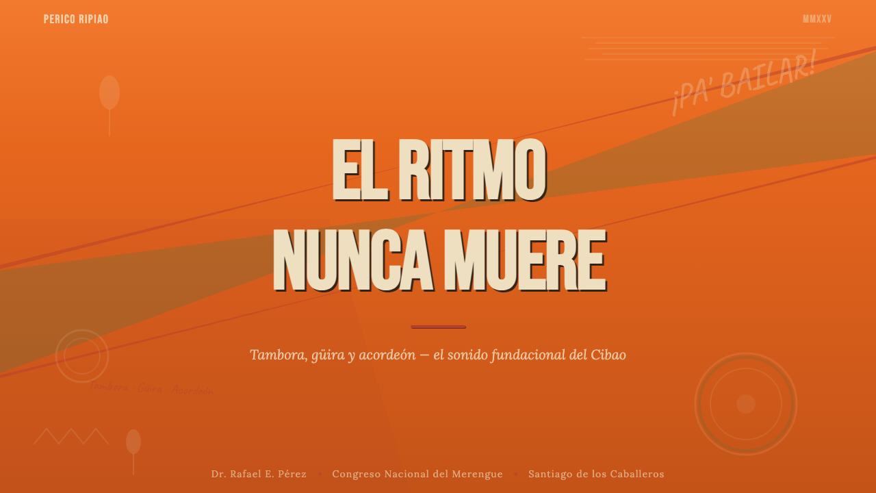
For presentation slides, this system works powerfully for covers and section dividers. A cover slide built on a deep fire-orange ground with a diagonal emerald band carrying the presentation title, large condensed lettering that fills most of the frame, and visible textural irregularity will command attention immediately. Content slides should be treated more carefully: reducing the color density while retaining the diagonal compositional logic and one dominant saturated hue per slide allows the energy to persist without overwhelming data or text. Charts and data visualizations translate well into this system when axes and bar fills are rendered in the primary palette against a cream or off-white ground — the data becomes festive without becoming illegible.在演示文稿中,这套体系在封面与章节分隔页上效果强劲。建立在深火橙底面上、以翡翠绿对角带承载演示标题、充满画面的大浓缩字体加上可见质感不规则感的封面幻灯片,将立即吸引注意力。内容页需要更审慎的处理:降低色彩密度,同时保留对角构图逻辑,每张幻灯片以一种主导饱和色为主,这样能在不压制数据或文字的情况下维持能量。图表与数据可视化在这套体系中的转化效果良好——将坐标轴与柱状填充以主色板呈现,置于奶油色或近白底面上,数据因此变得节庆,却不失可读性。
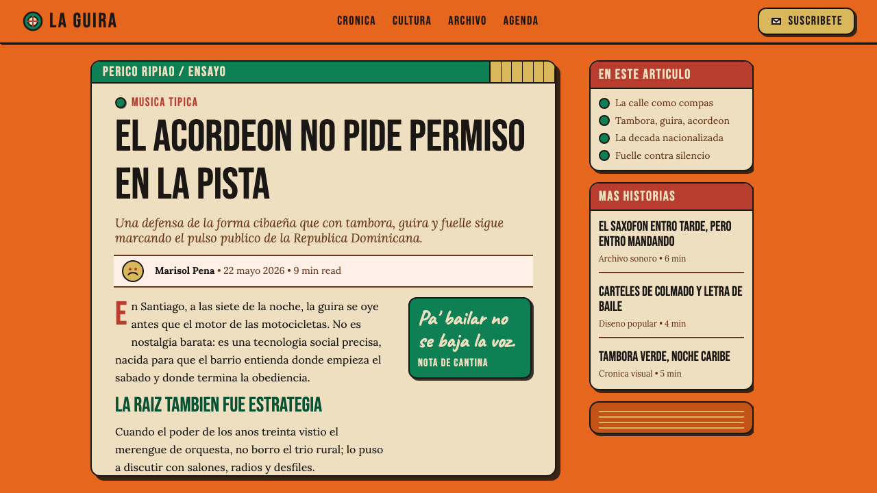
For web interfaces and digital products, perico ripiao is most at home in landing pages, event promotion sites, music or entertainment platforms, and cultural heritage projects. The system's density and maximalism are not suited to dashboard interfaces where scannability under cognitive load is paramount, but they are perfectly matched to contexts where emotional impact and immediate cultural identification are the primary goals. A hero section built with a fire-orange full-bleed ground, diagonal banner typography, and deliberately textured backgrounds will communicate energy and cultural specificity faster than any minimal layout.对于网页界面与数字产品,佩里科·里皮奥最适宜的场所是落地页、活动宣传网站、音乐或娱乐平台,以及文化遗产项目。这套体系的密度与极繁主义不适合认知负荷下可扫描性至关重要的仪表板界面,但完美契合情感冲击与即时文化认同是首要目标的场景。以火橙全出血底色、对角横幅字体和刻意处理的质感背景构建的英雄区块,传达能量与文化特殊性的速度远超任何极简版面。
For editorial and marketing work, the system excels at event posters, festival branding, album artwork, restaurant and hospitality signage, and cultural promotion materials. The historical source material — dance-hall posters and cantina signs — is itself editorial and promotional, so contemporary applications in these genres are direct extensions of the tradition. Print materials benefit from the system's origins in ink-on-paper production: allowing ink to spread slightly, printing on textured or uncoated stock, and embracing slight misregistration between color passes all add authenticity.在编辑与营销领域,这套体系在活动海报、节日品牌标识、专辑封面、餐饮与待客业招牌,以及文化推广材料上表现卓越。历史上的原始材料——舞厅海报与小酒馆招牌——本身就是编辑性与推广性的,因此这些类型的当代应用是对该传统的直接延伸。印刷品受益于这套体系在纸墨生产中的根源:允许墨水略微扩散、在有质感或无涂层纸张上印刷,以及接受色层之间的轻微套印偏差,都能增加真实性。
A common mistake when applying this system is treating the saturated palette as permission to use every color at full intensity simultaneously. The most powerful perico ripiao compositions are actually dominated by one color — fire-orange — with the other hues serving as punctuation rather than co-leads. A second error is substituting digital smoothness for hand-made irregularity: perfectly kerned type, mathematically straight diagonals, and gradient-free smooth color fills will produce something that looks like a parody of the style rather than a genuine application of it. The source's power comes specifically from evidence of hand-work, and preserving that evidence — deliberately or through actual manual production — is what separates an authentic interpretation from a superficial appropriation.应用这套体系时最常见的错误,是将饱和色板理解为同时以全强度使用每种颜色的许可。最有力的佩里科·里皮奥构图实际上以一种颜色——火橙——为主导,其他色彩充当标点而非共同主角。第二个错误是以数字化的光滑感取代手工不规则感:完美字距、数学意义上笔直的对角线,以及无渐变的光滑色彩填充,会产生一种看起来像是对这种风格的戏仿而非真正应用的东西。原始来源的力量恰恰来自手工制作的证据,保留这一证据——无论是刻意为之还是通过实际手工生产——是正宗诠释与表面挪用之间的分野所在。
See the Dominican Merengue Perico Ripiao design system →查看 Dominican Merengue Perico Ripiao 完整设计系统 →
Dominican Merengue Perico Ripiao — FAQDominican Merengue Perico Ripiao · 常见问题
Is perico ripiao the same as merengue?佩里科·里皮奥和梅伦格是同一回事吗?
Perico ripiao is the founding folk form of merengue — the rural Cibao Valley tradition from which all subsequent merengue styles descend. Think of it as merengue in its most elemental state: three instruments, a relentless two-four beat, and no orchestral amplification. When people refer simply to 'merengue' in a contemporary context, they usually mean the urban orchestral form that developed from the 1960s onward — brass, piano, slick choreography — which shares the same rhythmic DNA but has a fundamentally different sonic and visual character. Perico ripiao's design language is distinct from urban merengue's more commercial aesthetic precisely because it preserves the hand-made, grassroots energy of the original.佩里科·里皮奥是梅伦格的奠基民间形态——所有后续梅伦格风格都由此衍生的锡瓦奥谷地乡村传统。可以将它理解为梅伦格最本质的形态:三件乐器、不息的二四拍,无需管弦乐队的扩声。当今语境中人们简单称之为「梅伦格」,通常指的是1960年代以后发展起来的城市管弦乐队形态——铜管、钢琴、精心编排的舞蹈——这与佩里科·里皮奥共享同样的节奏基因,但声音与视觉气质截然不同。佩里科·里皮奥的设计语言之所以有别于城市梅伦格更商业化的美学,正是因为它保留了原始形态手工制作的草根能量。
How does this style differ from other Latin American maximalist design traditions?这种风格与其他拉丁美洲极繁主义设计传统有何不同?
Latin American maximalism is a broad category that includes Mexican cantina signage, Peruvian chicha poster art, Colombian cumbia flyer design, and Brazilian Carnaval graphics, among others. What distinguishes perico ripiao design within this family is its specific combination of: the fire-orange and emerald-green palette derived from Cibao cantina culture, the diagonal banner-strap as a primary compositional device, and the enamel-sign quality of its flat color fields — a hardness and intensity that differs from the more gradient-rich or photographic maximalism found in some other traditions. The tambora-and-accordion sonic character of the music also produces a different rhythmic feel in the composition — percussive and staccato rather than flowing and continuous.拉丁美洲极繁主义是一个宽泛的类别,涵盖墨西哥小酒馆招牌、秘鲁奇查海报艺术、哥伦比亚昆比亚传单设计与巴西狂欢节图形等。佩里科·里皮奥设计在这一家族中的独特性在于其特定组合:来源于锡瓦奥小酒馆文化的火橙与翡翠绿色板,作为主要构图装置的对角横幅条带,以及其平面色块的搪瓷招牌品质——那是一种硬度与强度,有别于某些其他传统中更富渐变或摄影感的极繁主义。音乐中坦博拉与手风琴的声音特质,也在构图中产生了不同的节奏感——打击乐式的顿挫,而非流畅连绵。
Can this system work for digital interfaces, or is it limited to print?这套体系能用于数字界面吗,还是仅限于印刷品?
The style translates to digital contexts but requires deliberate adaptation. Its original medium — hand-painted signs and printed posters — is physical and static; the challenge in digital applications is preserving the textural and compositional energy without producing interfaces that are unusable or overwhelming. The most successful digital applications treat the perico ripiao aesthetic as a surface layer — the visual first impression — rather than as the complete interface system. A landing page hero, a loading screen, a splash interstitial, or an event-announcement modal can carry the full density and energy. Navigation, data display, and transactional interfaces should be simplified, retaining the color palette and diagonal compositional logic while reducing the ornamental density to maintain usability.这种风格可以转化到数字语境中,但需要刻意的适配。其原始媒介——手绘招牌与印刷海报——是物理性且静态的;数字应用中的挑战是在不产生无法使用或令人窒息的界面的前提下,保留质感与构图能量。最成功的数字应用将佩里科·里皮奥美学作为表面层——视觉上的第一印象——而非完整的界面系统。落地页英雄区块、加载画面、启动过场或活动公告弹窗可以承载完整的密度与能量。导航、数据展示与交易性界面则应简化处理,保留色板与对角构图逻辑,同时降低装饰密度以维持可用性。
What does UNESCO recognition mean for this style's cultural status?联合国教科文组织的认定对这种风格的文化地位意味着什么?
UNESCO's 2016 inscription of merengue — with specific attention to the perico ripiao folk tradition — on its Representative List of Intangible Cultural Heritage of Humanity formalized what Dominican musicians and cultural scholars had argued for decades: that perico ripiao is not merely a precursor to be transcended by more sophisticated urban forms, but a living cultural expression with its own irreducible value. For designers working with this style, the UNESCO recognition matters in two practical ways: it signals that the tradition is actively maintained and documented, which means there is a growing archive of authoritative visual and musical material to draw from; and it frames the style within a discourse of cultural preservation and respect, which shapes how appropriation and application should be approached, particularly by designers outside the Dominican cultural context.联合国教科文组织2016年将梅伦格——特别关注佩里科·里皮奥民间传统——列入人类非物质文化遗产代表作名录,正式认可了多米尼加音乐家与文化学者数十年来的主张:佩里科·里皮奥并非一个有待被更精致城市形态超越的前身,而是具有自身不可化约价值的鲜活文化表达。对于运用这种风格的设计师而言,联合国教科文组织的认定在两个实际层面上具有意义:它表明这一传统正在被积极维护与记录,这意味着有越来越丰富的权威视觉与音乐材料可供参考;它也将这种风格置于文化保护与尊重的话语框架内,这将影响挪用与应用的方式,尤其对于多米尼加文化语境之外的设计师而言。
How should a designer handle the tension between authentic hand-made quality and digital production efficiency?设计师应如何处理真实手工品质与数字生产效率之间的张力?
This tension is real and worth naming directly. The perico ripiao aesthetic derives its power from visible evidence of human hand-work — brush irregularity, slight misregistration, ink spread, imperfect letterforms. Digital tools by default produce the opposite: perfect curves, uniform fills, mathematically precise spacing. The practical resolution is not to pretend digital tools are analog, but to make deliberate choices that reintroduce irregularity and texture at key points. Textured brush overlays, deliberately varied letter spacing, painted-edge effects on color field boundaries, and slight rotation irregularity on diagonal elements are all techniques that restore some of the handmade quality without requiring actual manual production. The goal is not perfect simulation but sufficient evocation — enough irregularity that the composition feels made rather than generated.这种张力是真实存在的,值得直接点明。佩里科·里皮奥美学的力量来源于人手工作的可见证据——笔触的不规则、轻微的套印偏差、墨水扩散、不完美的字形。数字工具在默认状态下产生的恰恰相反:完美曲线、均匀填充、数学精准的间距。实际的解决方案不是假装数字工具是模拟工具,而是在关键位置做出刻意选择,重新引入不规则感与质感。质感笔刷叠加、刻意变化的字距、色块边界的手绘边缘效果,以及对角线元素的轻微旋转不规则——这些技术都能在不需要实际手工生产的情况下恢复一些手工品质。目标不是完美模拟,而是充分唤起——足够的不规则性,使构图感觉是被制作出来的,而非被生成出来的。
Related design styles相关设计风格
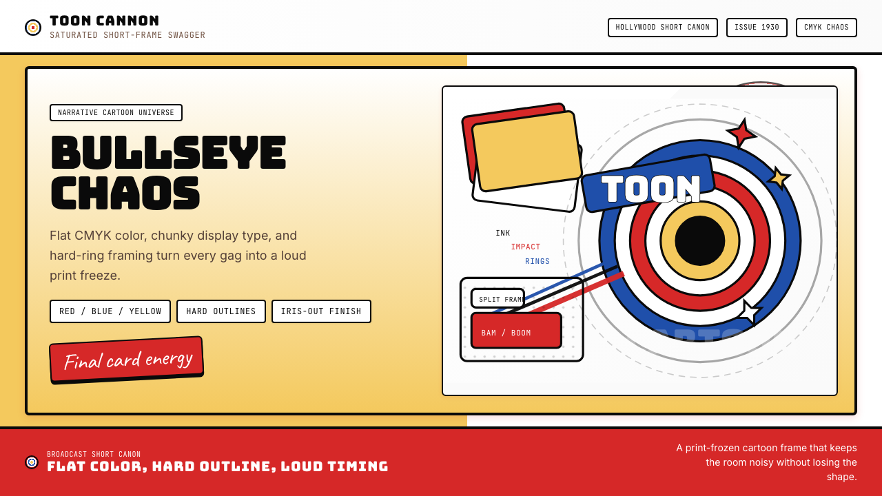 Looney Tunes (Warner Bros.)Pure cartoon chaos. Bull's-eye rings, Bungee type, and red-blue-yellow blocks.纯卡通混乱。牛眼环、粗壮标题字与红蓝黄块面。
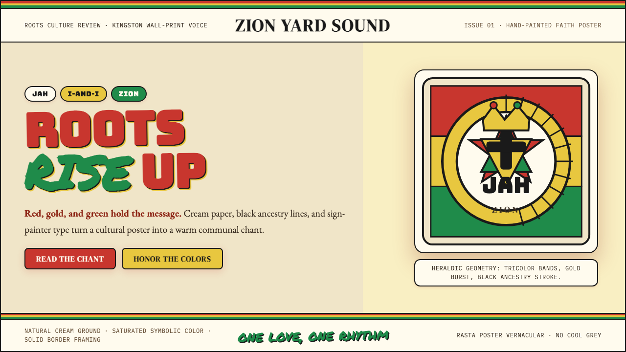 Caribbean Rastafarian (Jamaica)Warm faith, loud color. Red-gold-green bands and black poster type carry the…温暖信仰,高饱和发声:红金绿横带与黑色海报字承载吟唱。
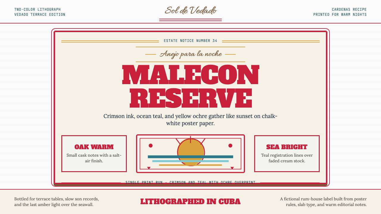 Havana Club Cuban RumSunset in print. Crimson slab type and ocean teal rules age on chalk-white pa…印刷里的日落。深红粗衬线与海洋青绿线框落在白垩纸上。
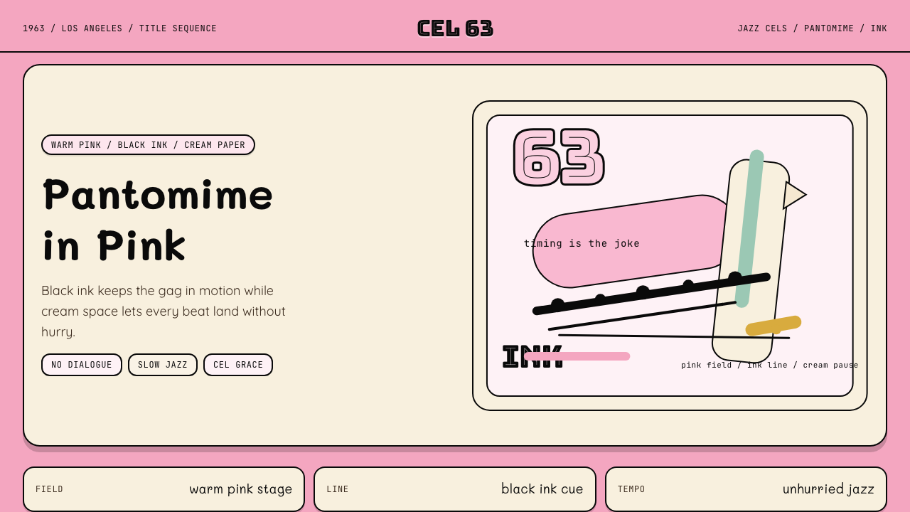 Pink Panther Cartoon (1963)Cool silence with a grin. Pink field, black ink, cream cel space.冷静的默剧感。珊瑚粉底、黑墨线与奶油留白。
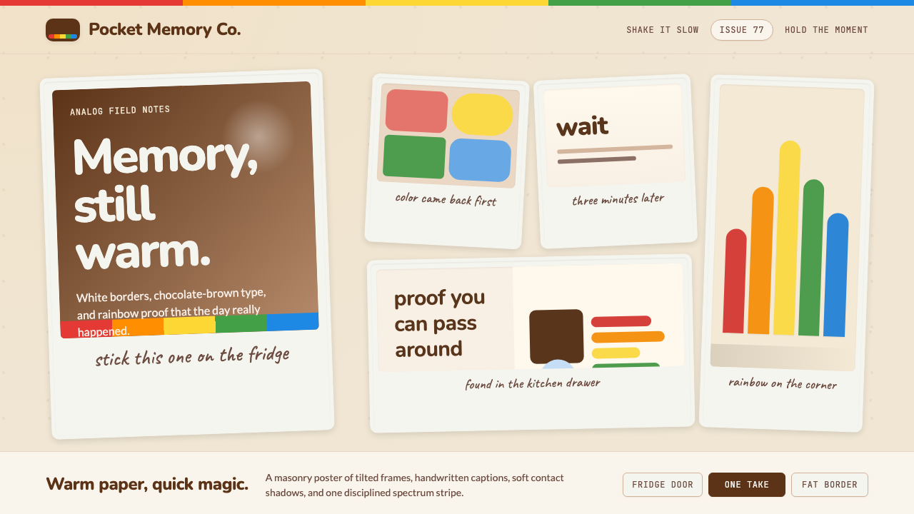 Polaroid InstantMemory made tangible. Photo-white frames tilt on aged paper with a warm rainb…记忆变得可触:相纸白边倾斜在旧纸底上,彩虹条点亮温度。
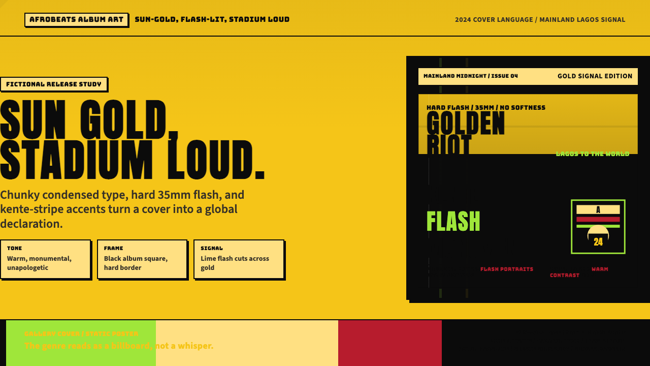 Afrobeats Album Art 2024Sun-gold and stadium loud. Anton type, kente stripes, and hard flash drive th…太阳金和体育场级大字。肯特条纹与硬闪光撑起封面。