What is Polaroid Instant?什么是 Polaroid Instant?
The white-bordered instant print turned memory into something you could shake, watch bloom, and hold in your hand.那张带白边的即时照片,让记忆变成了可以摇一摇、看着显影、握在手心里的东西。
Polaroid Instant in briefPolaroid Instant 速览
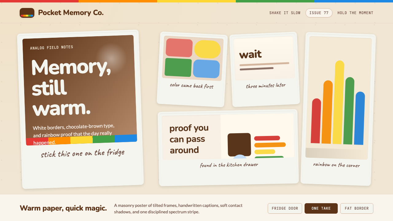
Polaroid Instant is a design style derived from the visual language of instant photography — wide cream-white photo borders, warm-toned image surfaces with the soft color-shift of chemical development, a signature rainbow spectrum stripe, and the casual tilt that comes from pinning a print to a corkboard without a level. The aesthetic is inseparable from its physical origin: the instant photograph as object, as artifact, as proof that something happened.宝丽来即时风格是从即时摄影的视觉语言中生长出来的设计体系——宽阔的奶白色相纸边框、化学显影带来的柔和色偏、标志性的彩虹条纹、以及随手钉在软木板上自然产生的倾斜角度。这套美学与它的物质起点密不可分:即时照片作为一个对象、一件遗存、一份「某件事确实发生过」的证明。
Where many nostalgic styles reach for surface texture alone, Polaroid Instant is grounded in a specific material logic. The white border is structural — it frames the image, provides a writing surface for captions, and signals the hand-held scale of the original object. The rainbow stripe is brand history made visual. The slight rotation is not careless; it is the readable mark of human handling, of a print passed between people. Together, these elements produce warmth without sentimentality, personality without chaos.许多怀旧风格仅仅停留在表面质感的模拟,宝丽来即时风格则根植于一套具体的材料逻辑。白边是结构性的——它框住画面,提供书写标注的空间,并暗示原物的手持尺度。彩虹条纹是品牌历史的视觉化陈述。轻微的旋转并非粗心大意,而是人手经手的可读印记,是一张在人与人之间传递的照片留下的痕迹。这些元素合在一起,产生了不落入伤感的温度,以及不沦为混乱的个性。
Tonally, the style sits in warm browns, aged whites, and the soft faded chromas of a photograph left in sunlight — not pure, brilliant hues but colors that have lived a little. It pairs easily with handwritten annotations, caption-style type, and layered compositions that mimic a wall of pinned prints or the open pages of a scrapbook. The overall feeling is analog authenticity: lived-in, specific, trustworthy in the way that a physical photograph is trustworthy.在色调上,这种风格栖居于温暖的棕色、泛黄的白色、以及在阳光下褪去了一些饱和度的柔和色彩——不是纯粹明艳的色调,而是经历过一些岁月的颜色。它与手写标注、题注式排版,以及模拟一面钉满照片的软木墙或一本摊开的剪贴本的层叠构图天然契合。整体感受是模拟的真实感:有人用过的、具体的、像一张实体照片一样可信的。
See the Polaroid Instant design system查看 Polaroid Instant 完整设计系统
Where does Polaroid Instant come from?Polaroid Instant 从何而来?
The story of Polaroid Instant begins in 1943, on a family vacation in Santa Fe, New Mexico. Edwin Land — physicist, inventor, and founder of the Polaroid Corporation — had just photographed his three-year-old daughter Jennifer. She asked why she couldn't see the picture right away. Land, whose career had already produced the first practical polarizing filter for sunglasses and car headlights, spent the rest of that afternoon walking through the city working out the chemistry of instant development in his head. Within a year he had the core concept; within four years he had a camera. The first Polaroid Model 95, introduced to the public in November 1948 at the Jordan Marsh department store in Boston, sold out its entire stock on the first day.宝丽来即时摄影的故事开始于1943年,新墨西哥州圣菲的一次家庭度假。埃德温·兰德——物理学家、发明家、宝丽来公司创始人——刚刚为三岁的女儿詹妮弗拍了一张照片。她问为什么不能马上看到照片。兰德的职业生涯已经催生了第一款实用的偏振滤光片(用于太阳镜和汽车大灯),那个下午他就在城里漫步,在脑子里推演即时显影的化学原理。不到一年,他完成了核心概念;不到四年,相机问世。1948年11月,第一款宝丽来Model 95在波士顿约旦马什百货首次公开亮相,当天便销售一空。
The early Polaroid cameras produced sepia-toned prints on a peel-apart film that required the user to time the development with a watch, peel the negative from the positive, and coat the surface with a chemical fixative to prevent fading. The process was intimate and faintly alchemical — a private ritual of waiting, peeling, and seeing. Through the 1950s and 1960s, the technology improved steadily, but the defining transformation came in 1972 with the SX-70, the first camera to produce fully automatic, self-developing prints that emerged from the camera face-up and developed in daylight without any user intervention. The photographer simply pointed, pressed, and watched the image slowly bloom from gray to color. This was the Polaroid that became culturally iconic.早期的宝丽来相机生产棕褐色调的分离式胶片照片,使用者需要用手表计时显影,将负片从正片上撕开,再涂抹化学定影剂防止褪色。这个过程亲密而略带炼金术气息——等待、剥离、观看,一套私人仪式。整个1950至60年代,技术持续改进,但决定性的转变发生在1972年:SX-70问世,这是第一款生产完全自动、自我显影照片的相机——照片从相机中正面弹出,在日光下显影,无需任何用户干预。摄影师只需瞄准、按下快门,然后看着画面从灰色缓缓绽放为彩色。这就是那台成为文化符号的宝丽来。
The rainbow spectrum stripe — the visual element most associated with the Polaroid brand — debuted on the SX-70 film pack in the early 1970s and migrated to cameras, packaging, and advertising through the decade. It was not purely decorative: the stripe signified the color fidelity of the film at a moment when color instant photography was technically difficult and commercially differentiated. But its visual effect was immediately legible as joyful and accessible, a chromatic shorthand for spontaneity. Andy Warhol shot thousands of Polaroids throughout the 1970s and 1980s, using the camera as a sketching tool and the prints as both source material and finished artwork. Ansel Adams served as a paid consultant to Polaroid for decades, contributing technical expertise and lending the camera a quiet artistic legitimacy.彩虹条纹——最能代表宝丽来品牌的视觉元素——于1970年代初首次出现在SX-70胶片包装上,随后蔓延至相机机身、包装设计和广告物料。它并非纯粹的装饰:条纹在彩色即时摄影技术上难度极高、商业竞争激烈的时代,象征着胶片的色彩还原能力。但它的视觉效果立即被读解为欢愉与平易近人,一道代表即兴自发的色彩速记符号。整个1970至80年代,安迪·沃霍尔用宝丽来拍摄了数千张照片,将这台相机当作素描工具,将照片既作为素材也作为完成作品。安塞尔·亚当斯则数十年间担任宝丽来的付费顾问,以技术专业知识和安静的艺术声誉为品牌背书。
The decline of the original Polaroid Corporation was slow and painful. Digital cameras eroded the instant-photography market through the 1990s, and in 2001 Polaroid filed for bankruptcy. The company reorganized, struggled, and filed again in 2008, the same year a group of former employees and enthusiasts launched the Impossible Project — acquiring Polaroid's last operating film factory in Enschede, the Netherlands, and beginning the years-long process of reformulating instant film chemistry from scratch. By 2017 the Impossible Project had rebranded as Polaroid Originals, and by the early 2020s a fully revived Polaroid brand was producing both new cameras and new film. The analog revival had found its flagship. In design, the Polaroid aesthetic had meanwhile become a reference point for authenticity, warmth, and the deliberate rejection of digital perfection — qualities that made it newly relevant to brands and designers working in an era of algorithmic imagery.原始宝丽来公司的衰落缓慢而痛苦。整个1990年代,数码相机不断侵蚀即时摄影市场;2001年,宝丽来申请破产。公司重组、挣扎,2008年再度破产——也就在同一年,一群前员工和爱好者发起了「不可能计划」:收购宝丽来位于荷兰恩斯赫德的最后一家运营中的胶片工厂,开始从头重新研发即时胶片化学配方,历时数年。2017年,「不可能计划」更名为Polaroid Originals;到2020年代初,全面复兴的宝丽来品牌已在生产新型相机和新胶片。模拟复兴运动找到了它的旗舰。与此同时,在设计领域,宝丽来美学已成为真实感、温度感与对数字完美主义的主动拒绝的参照点——这些特质,让它在算法图像泛滥的时代重新对品牌和设计师焕发出意义。
What defines the Polaroid Instant look?Polaroid Instant 的视觉特征是什么?
The White Border白色边框
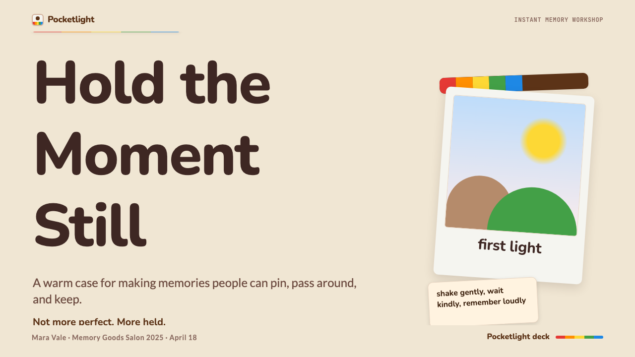
The defining structural element of the Polaroid aesthetic is its wide, cream-white border — heavier at the bottom than on the three other sides, a proportion dictated by the film chemistry and ejection mechanism of the original cameras. In design applications, this border functions as a frame, a signature, and a scale indicator simultaneously. It sets the image apart from its background, creates a writing surface that implies annotation and authorship, and immediately reads as photographic even when the content inside is illustration, type, or data visualization. Using a symmetrical border or omitting the heavier bottom weight loses the essential character.宝丽来美学最核心的结构元素是它宽阔的奶白色边框——下边比其余三边更厚,这一比例由原相机的胶片化学特性和弹出机构决定。在设计应用中,这条边框同时扮演画框、签名和尺度指示符三重角色。它将画面从背景中划分出来,创造出一个暗示标注和作者感的书写空间,无论内部内容是插画、文字还是数据可视化,都能立即被读解为摄影感。使用对称边框或省略底边加粗,就会失去这种风格的本质特征。
Warm, Faded Tonality温暖褪色的色调
Polaroid film had a characteristic warmth — slightly pushed toward amber and brown in the shadows, with highlights that leaned cream rather than pure white. Colors in the midtones were full and saturated but carried a softness that distinguished them from the sharp chromas of digital photography. In design terms, this translates to a palette built on warm off-whites, chocolate and caramel browns, and muted versions of primary hues — colors that feel like they have been exposed to a few years of light and touch. Pure, brilliant colors read as out of place; the palette rewards restraint and the sense of gentle aging.宝丽来胶片有一种标志性的温暖特质——暗部略微偏向琥珀和棕色,高光偏向奶油白而非纯白。中间调的颜色饱和而充盈,却带着一种柔软感,与数码摄影锐利的色彩截然不同。在设计语言中,这转化为一套以温暖的非纯白、巧克力棕和焦糖棕为基础、以静默版本的主色调为点缀的色板——这些颜色感觉像是经历了几年的光照和触摸。纯粹明艳的颜色显得格格不入;这套色板奖励克制和那种被岁月温柔腐蚀的感觉。
The Rainbow Stripe彩虹条纹
The spectrum stripe — a band of continuous color running from red through orange, yellow, green, and into blue — is the Polaroid Corporation's most recognizable brand marking, appearing on camera bodies, film packaging, and promotional materials from the early 1970s onward. In design, it functions as an accent of exuberant color within an otherwise warm, restrained palette: a single horizontal or diagonal stripe that signals the brand's identity without overwhelming the composition. The stripe should appear as a deliberate citation rather than decoration; using it multiple times or at large scale dilutes its effect.彩虹条纹——一条从红色经橙色、黄色、绿色一路延伸至蓝色的连续色带——是宝丽来公司自1970年代初起出现在相机机身、胶片包装和宣传物料上最具辨识度的品牌标记。在设计中,它在本已温暖克制的色板中充当一抹充沛色彩的点睛之笔:一条水平或对角的条纹,既点明品牌身份,又不压倒整体构图。条纹应当作为刻意引用而非装饰出现;多次使用或大面积使用会稀释它的效果。
The Casual Tilt随意的倾斜
Polaroid prints, when displayed on bulletin boards, refrigerators, or scrapbook pages, almost never sit perfectly level. A slight rotation — typically just a few degrees clockwise or counterclockwise — is the visual grammar of casual keeping. In design, this tilt is not arbitrary; it is a precise signal of informality and human handling. Applied to photo-card components, illustration frames, or image modules, it introduces warmth and personality without requiring decorative illustration. The tilt should be gentle enough to read as natural rather than deliberate, and consistent enough across a composition that it feels like a system rather than a mistake.宝丽来照片贴在布告栏、冰箱或剪贴本上时,几乎从不完全水平放置。轻微的旋转——通常只是顺时针或逆时针几度——是随意保存的视觉语法。在设计中,这种倾斜并非任意为之;它是一个关于非正式感和人手经手的精确信号。应用于照片卡片组件、插图框架或图像模块时,它无需借助装饰性插画就能引入温度和个性。倾斜角度应足够轻柔,让人读来自然而非刻意,并在整个构图中保持足够的一致性,让人感受到这是一套系统,而非一个失误。
Handwritten Annotation手写标注
One of the persistent rituals of instant photography is writing directly on the white border — a date, a name, a caption, a running joke. This practice gives Polaroid design its typographic character: a blend of printed or near-handwritten caption type for the formal label, and actual or simulated handwritten script for the personal mark. In digital applications, this does not require real handwriting; the quality to pursue is informality and specificity — type that looks like it belongs to a person and a moment rather than to a brand guideline. Pairing a casual caption with a more structured layout element creates the productive tension between the analog and the organized.即时摄影长久以来的仪式之一,是直接在白色边框上书写——日期、姓名、题注、一个内部笑话。这种习俗赋予宝丽来设计其排版特征:印刷或接近手写的题注字体(用于正式标签)与真实或模拟的手写草书(用于个人印记)的混合。在数字应用中,这不要求真正的手写;应当追求的品质是非正式感和具体性——看起来属于某个人和某个瞬间、而非属于品牌指南的文字。将随意的题注与更有结构感的版式元素搭配,制造出模拟与有序之间富有张力的对话。
Layered, Scrapbook Composition层叠的剪贴本构图
Polaroid prints accumulate. On a refrigerator door, a travel journal, a dorm room wall, they overlap and cluster, arranged by impulse rather than grid. Design in this style embraces that layered quality: photo-cards that overlap slightly, compositional arrangements that feel gathered rather than aligned, backgrounds that suggest aged paper or linen rather than a pure digital surface. The layering is controlled — it reads as curated casualness, not disorder — and functions as a counterpoint to the flat, grid-locked cleanliness of most contemporary interface design.宝丽来照片会积累起来。在冰箱门上、旅行日记里、宿舍墙壁上,它们相互叠压成簇,由冲动而非网格来排布。这种风格的设计拥抱那种层叠品质:略微相互叠压的照片卡片、感觉像是聚拢而非对齐的构图安排、暗示泛黄纸张或亚麻布而非纯数字表面的背景。层叠是受控的——读来像是被策划过的随意,而非混乱——并作为当代界面设计中普遍存在的扁平、网格锁定的整洁感的对位声部而存在。
Soft Photographic Texture柔和的摄影质感
The surface quality of a Polaroid print is distinctive: slightly grainy in the shadows, with a matte finish that diffuses specular reflection, and a color depth that comes from the dye layers of the film rather than the pixel grid of a sensor. In design, this translates to imagery and backgrounds that carry a gentle grain or film-like softness, surface treatments that avoid the hard-edged clarity of pure digital rendering, and an overall visual temperature that favors warmth and slight imperfection over technical precision. The texture should feel like evidence of process rather than added decoration.宝丽来照片的表面质感与众不同:阴影处略带颗粒感,哑光表面漫射镜面反射,色彩深度来自胶片的染料层而非传感器的像素网格。在设计中,这转化为携带轻柔颗粒或胶片质感的图像和背景,回避纯数字渲染硬边清晰感的表面处理,以及整体视觉温度偏向温暖和轻微不完美而非技术精准。质感应当感觉像是过程的证据,而非附加的装饰。

See the Polaroid Instant design system查看 Polaroid Instant 完整设计系统
Who shaped Polaroid Instant?谁塑造了 Polaroid Instant?
Edwin Land founded the Polaroid Corporation in 1937 and remained its driving creative and scientific force for four decades. A Harvard dropout who filed more than five hundred patents in his lifetime, Land approached instant photography not as a commercial opportunity but as a problem in applied physics: how to complete the entire photographic process inside the camera, in daylight, within seconds. His SX-70 camera, launched in 1972, was considered by many engineers an impossible device — a folding single-lens reflex camera that produced integral self-developing prints — and remains one of the most technically sophisticated consumer products of the twentieth century. Land's insistence on keeping photography intuitive and emotionally immediate shaped the Polaroid aesthetic as much as any visual decision.埃德温·兰德于1937年创立宝丽来公司,此后四十年始终是其创意与科学的核心驱动力。这位哈佛退学生一生申请了逾五百项专利,他对待即时摄影的态度不是把它当作商业机遇,而是当作一道应用物理难题:如何在相机内部、在日光下、在数秒之内完成全部摄影流程。他于1972年推出的SX-70相机被许多工程师视为不可能实现的设备——一台能折叠的单镜头反光相机,生产整体自显影照片——至今仍是二十世纪技术最复杂的消费品之一。兰德对摄影直觉性和情感即时性的坚持,对宝丽来美学的塑造不亚于任何视觉决策。
Andy Warhol shot an estimated hundred thousand Polaroid photographs between the early 1970s and his death in 1987. He carried a Big Shot camera as routinely as a notebook, using it to document the faces that passed through The Factory, to make compositional studies for his silk-screen portraits, and — increasingly — as a finished artwork in its own right. Warhol's embrace of the Polaroid was not nostalgic; it was conceptual. The instant print collapsed the distance between experience and record. For a painter whose entire project interrogated the nature of reproduction and celebrity, the camera that could make a portrait in a minute was a philosophical instrument as much as a photographic one. His practice gave instant photography a place in the art world that the medium has never fully relinquished.安迪·沃霍尔从1970年代初到1987年去世,估计拍摄了约十万张宝丽来照片。他随身携带Big Shot相机就像携带笔记本一样习以为常,用它记录穿过「工厂」的一张张面孔,为丝网版画肖像做构图研究,也越来越多地将其作为独立完成的艺术品。沃霍尔对宝丽来的拥抱并非出于怀旧,而是概念性的。即时照片消除了体验与记录之间的距离。对于一位以探究复制与名流本质为全部创作课题的画家而言,一分钟内能完成一幅肖像的相机既是摄影工具,也是哲学仪器。他的实践赋予了即时摄影在艺术世界中至今从未完全失去的地位。
Ansel Adams' association with Polaroid began in 1948, the year the first camera went on sale, and continued until his death in 1984. He served as a formal consultant to the company, advising on the optical and tonal qualities of new film stocks and testing prototypes in the field. Adams published a manual specifically on Polaroid photography and used the medium extensively to make exposure tests before committing to large-format film. His involvement gave the brand a credibility in fine-art photography circles that proved commercially valuable and culturally lasting. It also established a precedent: that instant photography could be taken seriously by practitioners who cared deeply about image quality, tonal range, and the dignity of the photographic process.安塞尔·亚当斯与宝丽来的缘分始于1948年——第一台相机上市的那一年——并一直延续到他1984年去世。他担任公司的正式顾问,就新胶片的光学特性和色调品质提供建议,并在野外测试原型机。亚当斯专门出版了一本关于宝丽来摄影的手册,并广泛使用这一媒介在使用大画幅胶片之前做曝光测试。他的参与赋予品牌在纯艺术摄影圈的公信力,这种公信力在商业上是有价值的,在文化上是持久的。它也确立了一个先例:即时摄影可以被那些深切关注图像品质、色调范围和摄影过程尊严的实践者认真对待。
Florian Kaps was one of the founders of the Impossible Project, the initiative that saved Polaroid's last film-production facility after the corporation's 2008 bankruptcy. An Austrian entrepreneur and Polaroid collector, Kaps had previously launched an online marketplace for vintage instant film. Recognizing that the closure of the Enschede factory would permanently end the supply of integral instant film, he assembled a coalition of investors and former Polaroid engineers to acquire the facility and begin reformulating the chemistry from scratch — a process that took years and produced many technically imperfect but commercially successful film stocks. His work ensured the physical continuity of the medium and provided the material basis for the analog revival that subsequently made the Polaroid aesthetic newly relevant to a generation of designers and brand strategists who had never owned a camera.弗洛里安·卡普斯是「不可能计划」的创始人之一,正是这一行动在宝丽来2008年破产后拯救了其最后一家胶片生产设施。这位奥地利创业者和宝丽来收藏家此前曾创建了一个专营复古即时胶片的在线交易平台。意识到恩斯赫德工厂关闭将永久终结整体即时胶片的供应,他召集了一批投资者和前宝丽来工程师,收购了工厂并开始从头重新配制化学配方——这一过程历时数年,生产出了许多技术上不够完美但在商业上大获成功的胶片产品。他的工作确保了这一媒介的物质延续,并为随后而来的模拟复兴运动提供了物质基础——正是那场复兴,使宝丽来美学对从未拥有过一台相机的新一代设计师和品牌策略师重新焕发出意义。
How do you use Polaroid Instant today?今天怎么用 Polaroid Instant?
Polaroid Instant is a warmth-first style — its fundamental job is to make designed objects feel human, specific, and emotionally present. Applying it correctly means understanding what the visual grammar is actually doing: the border says 'this is a held object'; the tilt says 'a person placed this here'; the warm tonality says 'this has been touched by time.' Each element carries a semantic weight, and using any of them decoratively without that weight produces pastiche rather than design.宝丽来即时风格是一种以温度为首要价值的设计体系——它的根本任务是让设计对象感觉有人情味、具体、在情感上鲜活。正确应用它,意味着理解这套视觉语法实际上在做什么:边框说的是「这是一个被握持的对象」;倾斜说的是「某个人把它放在了这里」;温暖的色调说的是「这经历过时间的触摸」。每一个元素都承载着语义重量,在没有这份重量的情况下仅作装饰使用,产生的是拼贴仿作而非设计。
For presentation slides, the style works exceptionally well as a cover treatment and for narrative or testimonial sections. A cover built around a single tilted photo-card on an aged-paper background, with a handwritten-style caption beneath, immediately signals the warmth and specificity that the rest of the presentation will deliver. Content slides should be treated with more restraint: one or two photo-card components per slide, arranged in a slightly clustered rather than formally aligned manner, with body text in a clean, legible face that contrasts against the informal decorative elements. Data slides can integrate the aesthetic by framing charts inside a photo-border component and using warm palette variations to differentiate data series — the result reads as approachable and editorially considered rather than purely functional.在演示文稿中,这种风格作为封面处理和叙事或证言类版块格外出色。一张以倾斜照片卡片为核心、以泛黄纸张为背景、下方配有手写风格题注的封面,立即传递出整个演示将要呈现的温暖与具体感。内容页面应当更为克制:每页一到两个照片卡片组件,以略微聚拢而非正式对齐的方式排列,正文选用清晰易读的字体,与非正式的装饰性元素形成对比。数据页面可以通过将图表置于带相纸边框的组件内、并用温暖色板的变体区分数据系列来融入这套美学——结果读来亲切且具有编辑质感,而非纯粹功能性。
For web interfaces, Polaroid Instant suits context where human connection and trust-building are primary goals: testimonial sections, about pages, community features, portfolio galleries, and brand storytelling modules. The photo-card with its white border and slight shadow functions as a component that immediately implies authenticity. Pricing pages and dashboards are more difficult territory — the style's informality can work against the clarity and scannability those pages require — but a selective application of warm tonality in backgrounds, combined with photo-card-style feature highlights, can soften a formal layout without compromising its hierarchy. Navigation and type elements should remain clean and readable, with the nostalgic elements reserved for imagery and decorative modules.在网页界面中,宝丽来即时风格适合人际连接和信任建立是首要目标的场景:证言区、关于页面、社区功能、作品集画廊和品牌故事模块。带白边和轻微投影的照片卡片,作为一个组件立即暗示真实性。定价页面和仪表板是更难处理的领域——这种风格的非正式感可能与这些页面所需的清晰度和可扫描性产生冲突——但在背景中选择性地应用温暖色调,并结合照片卡片风格的功能亮点,可以在不损害层级结构的情况下柔化正式版面。导航和文字元素应保持清晰易读,怀旧元素留给图像和装饰性模块。
For editorial and marketing work, the style has particular strength in brand contexts that want to signal heritage, craft, or community: food and beverage brands, travel and hospitality, independent retailers, creative studios, and event photography. A marketing page built in this style typically alternates between full-width warm-toned photography with an overlay of photo-card components and a cleaner, more typographic section for factual or functional content. Print editorial benefits from the style's native warmth: feature spreads with overlapping photo-card imagery, caption type set in a casual weight, and section openers that use a single bold photo-card as the primary illustration create a scrapbook feeling that is approachable without sacrificing credibility.在编辑和营销内容中,这种风格在希望传递传承、工艺或社群感的品牌语境中尤为有力:食品饮料品牌、旅行与酒店业、独立零售商、创意工作室和活动摄影。以这种风格构建的营销页面,通常在全宽温暖色调摄影(叠加照片卡片组件)与用于事实或功能内容的更整洁、更具排印感的区块之间交替出现。印刷编辑内容受益于这种风格原生的温暖感:以相互叠压的照片卡片图像、轻松字重的题注字体排版的专题页面,以及以单张醒目照片卡片作为主要插图的章节开篇,共同营造出一种亲切而不失公信力的剪贴本感觉。
The most common mistake when applying Polaroid Instant is treating it as a texture filter rather than a compositional system. Designers sometimes apply a uniform film grain, a warm color overlay, and a few rounded-corner elements, and assume the result is the style. It is not. The style's character comes from the logic of the print as object — border, tilt, annotation, layering — not from surface warmth alone. A second common error is over-rotating: a tilt beyond about five or six degrees reads as chaotic rather than casual. And a third is overloading with decorative elements simultaneously — border, stripe, tilt, handwriting, and grain all at full intensity cancel each other out and produce visual noise instead of warmth. The discipline is choosing which one or two elements will carry the moment, and letting the others rest.应用宝丽来即时风格时最常见的错误,是把它当作质感滤镜而非构图系统来使用。设计师有时施加一层均匀的胶片颗粒、一个温暖色彩叠加层和几个圆角元素,便以为得到了这种风格。并非如此。这种风格的性格来自照片作为对象的逻辑——边框、倾斜、标注、层叠——而非仅仅来自表面的温度感。第二个常见错误是旋转过度:超过大约五六度的倾斜读来是混乱而非随意。第三个错误是同时堆砌过多装饰元素——边框、条纹、倾斜、手写和颗粒全部以最大强度出现,彼此抵消,产生视觉噪音而非温度。自律在于选择哪一两个元素来承担这个时刻,让其余的退到后台。
See the Polaroid Instant design system查看 Polaroid Instant 完整设计系统
Polaroid Instant — FAQPolaroid Instant · 常见问题
Is Polaroid Instant the same as Lo-Fi or Analog Revival as a design style?宝丽来即时风格和Lo-Fi或模拟复兴作为设计风格是同一回事吗?
They are related but distinct. Lo-Fi and analog revival are broad categories that include cassette-tape aesthetics, vinyl record design, grainy film photography in general, and various retro-technology references. Polaroid Instant is more specific: it is derived from a single, highly recognizable visual object — the instant print — and its grammar is defined by that object's physical properties: border weight and proportion, development tonality, rainbow stripe, tilt, and annotation. A lo-fi design might use film grain and muted color without any of the Polaroid-specific structural elements; a Polaroid Instant design uses those structural elements even when the grain and color are secondary. The specificity is the style's strength — it is readable and associative in a way that generic lo-fi is not.两者相关但截然不同。Lo-Fi和模拟复兴是宽泛的类别,涵盖磁带美学、黑胶唱片设计、泛化的颗粒感胶片摄影以及各种复古科技指涉。宝丽来即时风格则更为具体:它源自一个高度可识别的单一视觉对象——即时照片——其语法由该对象的物理特性定义:边框的重量与比例、显影色调、彩虹条纹、倾斜角度和标注习惯。一个Lo-Fi设计可能使用胶片颗粒和低饱和色彩,而没有任何宝丽来特有的结构性元素;宝丽来即时设计即便在颗粒和色彩退居次位时,也会使用那些结构性元素。具体性正是这种风格的力量所在——它比泛化的Lo-Fi具有更强的可读性和联想力。
Can the style work for a premium or luxury brand context?这种风格能用于高端或奢侈品牌场景吗?
With care, yes. The challenge is that Polaroid Instant's warmth and intentional imperfection can read as informal or even low-cost in contexts where precision and exclusivity are the primary signals. However, the style can be elevated by restraint: a single, large, beautifully framed photo-card on a clean warm ground, with minimal annotation and generous spacing, reads as curated and deliberate rather than casual and accumulated. The key is reducing the layering and scrapbook energy while retaining the border, tilt, and tonal warmth. Luxury applications tend to use one strong photo-card element per layout rather than clustered arrangements, and they pair the nostalgic framing device with high-quality imagery that earns the aesthetic rather than leaning on it for warmth the content doesn't otherwise deliver.谨慎处理的话,可以。挑战在于,宝丽来即时风格的温度感和刻意的不完美,在精准和排他性是首要信号的场景中,可能被读解为非正式甚至廉价。然而,这种风格可以通过克制来提升:在干净温暖的底面上放置一张大而精致的单张照片卡片,标注极简,留白充裕,读来像是被精心策划和刻意为之,而非随意堆叠。关键是减少层叠感和剪贴本气质,同时保留边框、倾斜和色调温度。奢侈品应用倾向于每个版面只使用一个强有力的照片卡片元素,而非聚拢排列,并将怀旧的框架装置与高品质图像搭配——图像需要靠自身品质来支撑这套美学,而非靠美学来为内容的温度感兜底。
How does Polaroid Instant handle dark-mode or dark-background layouts?宝丽来即时风格如何处理深色模式或深色背景版面?
The canonical Polaroid aesthetic is light-ground — the cream-white border and aged-paper background are central to the style's identity. A dark background inversion is possible but requires significant adjustment. On a deep ground, the photo-card border shifts from its characteristic cream-white to a luminous, slightly warm white, and the overall palette must compensate by using richer, more saturated warm tones in image content to preserve the sense of warmth. The rainbow stripe reads well on dark grounds and becomes more prominent — which means using it even more sparingly than usual. The risk is that a dark-ground Polaroid design begins to read as generic vintage or lo-fi rather than specifically Polaroid; retaining the exact border proportion and tilt is especially important on dark backgrounds to preserve the style's structural identity.经典的宝丽来美学以浅色底面为基础——奶白色边框和泛黄纸张背景是这种风格身份的核心。深色背景的反转版本是可能的,但需要大幅调整。在深色底面上,照片卡片边框从标志性的奶白色转变为发光的、略带暖意的白色,整体色板必须通过在图像内容中使用更丰富、更饱和的暖色来补偿,以保持温度感。彩虹条纹在深色底面上效果鲜明,会变得更为突出——这意味着要比平时更节制地使用它。风险在于,深色底面的宝丽来设计开始读来像是泛化的复古或Lo-Fi,而非特指宝丽来;在深色背景上,保持精确的边框比例和倾斜角度对于维护这种风格的结构身份尤为重要。
What makes Polaroid Instant feel authentic versus kitsch?是什么让宝丽来即时风格显得真实而非媚俗?
The line between authentic and kitsch in this style comes down to structural logic versus surface accumulation. An authentic application uses the border, tilt, and annotation because they carry meaning — they reference the physical object and its rituals of use. A kitsch application adds those elements because they look nostalgic, without regard for whether they are doing any semantic work. Practically: authentic applications are selective — one or two Polaroid-specific elements per composition, used at considered scale and proportion. Kitsch applications are cumulative — borders plus tilt plus stripe plus grain plus handwriting plus warm overlay, all at maximum intensity. The second principle is editorial restraint in imagery: authentic Polaroid design uses strong, specific photographs or illustrations that feel like they belong to a moment; kitsch design uses stock photography with a filter applied. The style rewards genuine content more than almost any other nostalgic aesthetic.这种风格中真实与媚俗之间的界线,归结为结构逻辑与表面堆砌之间的差异。真实的应用之所以使用边框、倾斜和标注,是因为它们承载意义——它们指涉那个实体对象及其使用仪式。媚俗的应用添加这些元素,只是因为它们看起来怀旧,而不管它们是否在做任何语义工作。在实践层面:真实的应用是有选择性的——每个构图只用一到两个宝丽来特有的元素,以经过考量的比例和尺度使用。媚俗的应用是累积性的——边框加倾斜加条纹加颗粒加手写加暖色叠加,全部以最大强度同时出现。第二条原则是图像内容的编辑克制:真实的宝丽来设计使用强烈、具体的摄影或插画,感觉它们属于某个时刻;媚俗的设计使用加了滤镜的图库照片。与几乎所有其他怀旧美学相比,这种风格对真实内容的回报更为丰厚。
Does Polaroid Instant work for data-heavy products like analytics dashboards?宝丽来即时风格适合数据密集型产品(如分析仪表板)吗?
Generally, it is not the right choice for primary analytics interfaces, where precision, density, and scannability are the overriding requirements. The style's warmth and informality work against the cognitive clarity that data-heavy screens need. However, selective application is possible and can be effective in specific contexts: onboarding flows, empty states, achievement moments, and summary cards can all benefit from a Polaroid-inflected warmth that makes the product feel more human and the data feel less clinical. The approach is to use the full Polaroid visual language as an accent layer within an otherwise neutral, functional interface — photo-card-style highlight modules for key metrics, warm-toned background sections for narrative content — rather than applying the style to the entire product. The moment the style competes with data legibility, it should step back.一般来说,对于以精准、密度和可扫描性为首要需求的核心分析界面,这并不是正确的选择。这种风格的温度感和非正式感与数据密集屏幕所需的认知清晰度相悖。然而,在特定场景中,选择性应用是可行且有效的:引导流程、空状态、成就时刻和摘要卡片都可以受益于宝丽来风格的温度感,让产品感觉更有人情味,让数据感觉不那么临床。方法是在一个原本中性、功能性的界面内,将完整的宝丽来视觉语言作为点缀层使用——为关键指标使用照片卡片风格的高亮模块,为叙事内容使用温暖色调的背景区块——而不是将这种风格应用于整个产品。一旦这种风格与数据可读性产生竞争,它就应当退后。
Related design styles相关设计风格
 Peanuts Comic Schulz (1950)Gentle melancholy on newsprint. Caveat lettering, cream panels, yellow and bl…温柔忧郁的新闻纸感:Caveat 手写字、奶油格框、黄蓝点色。
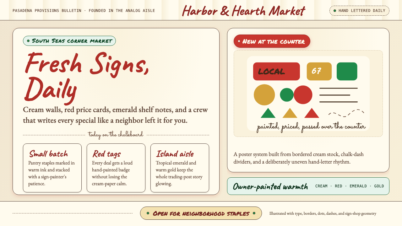 Trader Joe's Hand-LetteredHandmade grocery warmth. Cream chalkboards, red price tags, emerald accents.手写杂货温度:奶油黑板、红色价签、翠绿点缀。
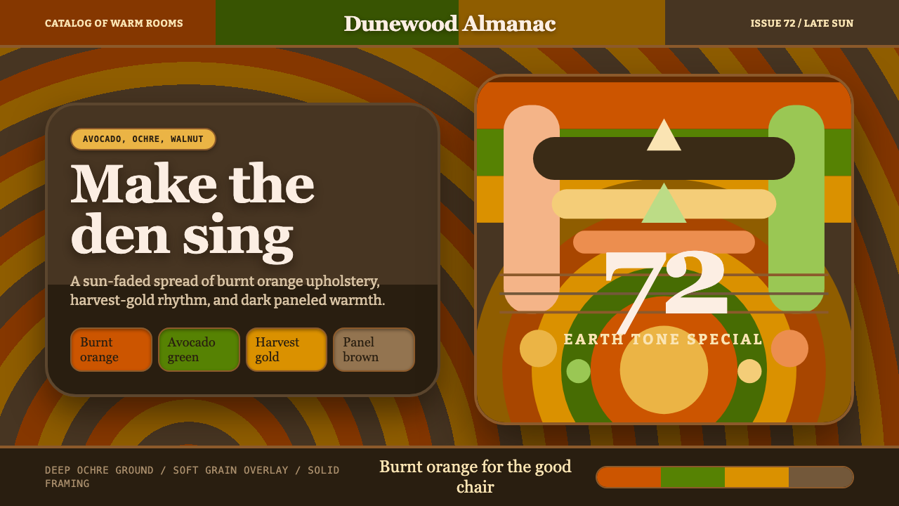 1970s Earth TonesWarm maximalism stays muddy. Bulbous slabs, avocado bands, and harvest-gold r…暖色极繁不怕浑厚:圆胖字、牛油果绿块与丰收金同心环。
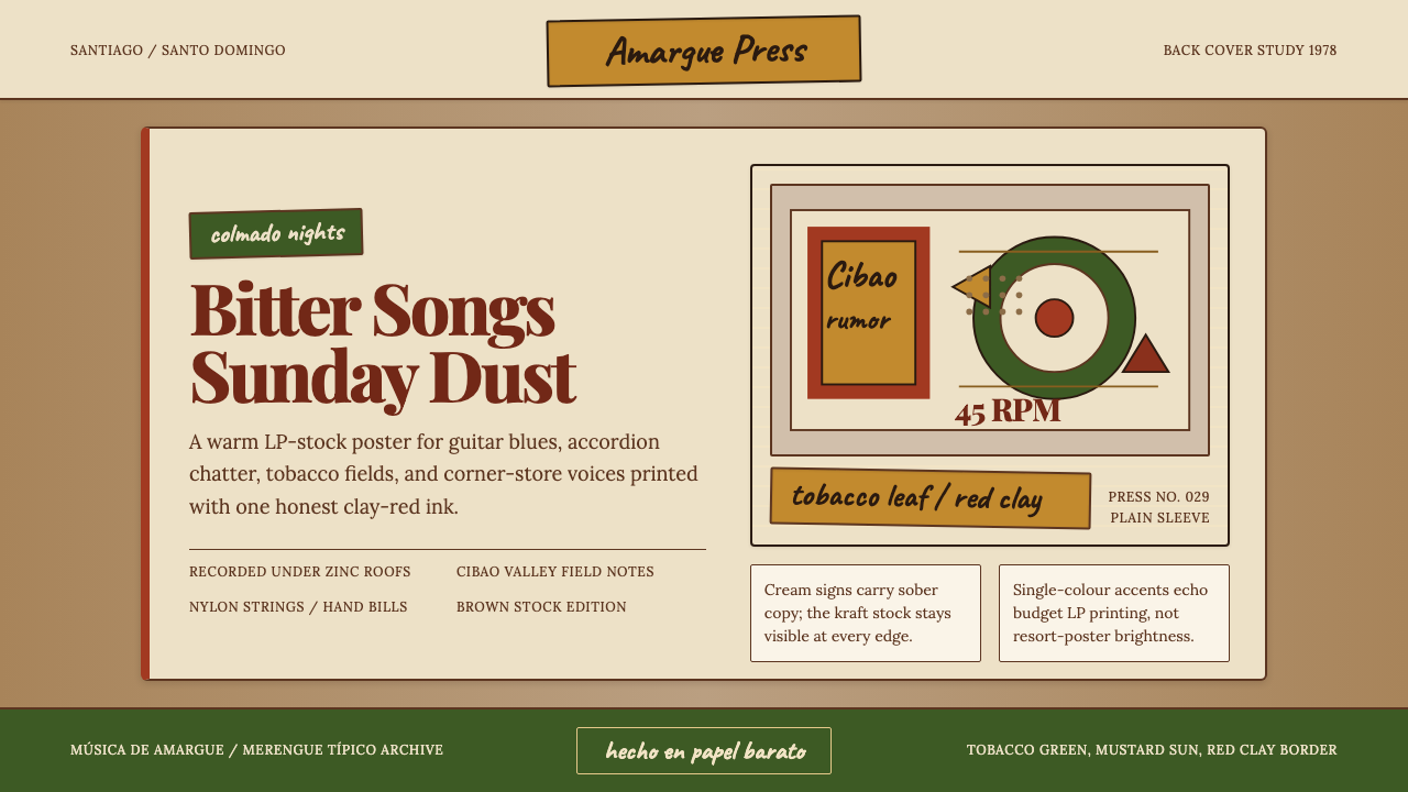 Dominican Bachata & Perico RipiaoPlainspoken warmth. Kraft stock, red clay serif, and typewriter credits carry…质朴而温热。牛皮纸、红土衬线与打字机署名托住苦情。
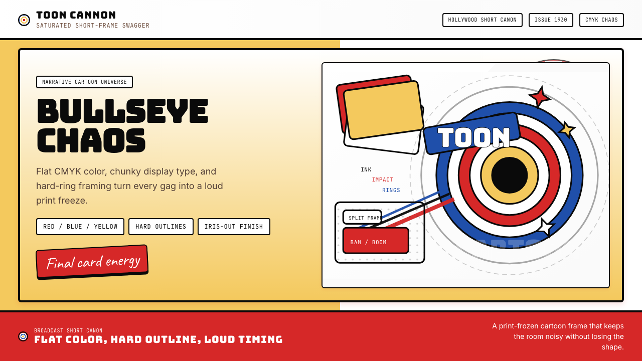 Looney Tunes (Warner Bros.)Pure cartoon chaos. Bull's-eye rings, Bungee type, and red-blue-yellow blocks.纯卡通混乱。牛眼环、粗壮标题字与红蓝黄块面。
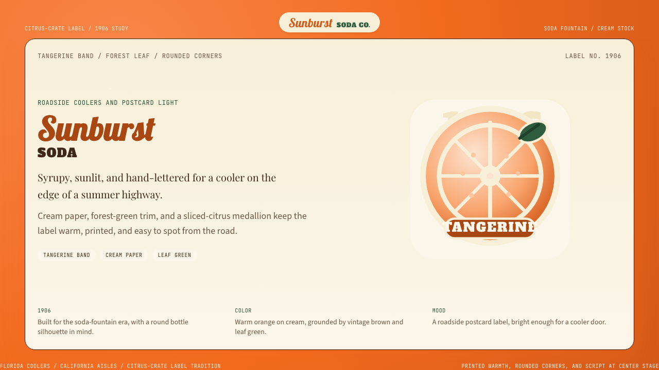 Orange Crush Soda (1906)Syrupy nostalgia. Tangerine, cream, and script make it a postcard label.糖浆般怀旧。橘红、奶油纸与手写体把标签变成明信片。