What is Orange Crush Soda (1906)?什么是 Orange Crush Soda (1906)?
Orange Crush turned a Florida citrus label into a complete visual language — warm tangerine, hand-lettered script, and cream paper that make every surface feel like a postcard from 1947.Orange Crush 将佛罗里达柑橘标签化为一套完整的视觉语言——暖橘色、手写体与奶油纸纹,让每一个版面都像一张1947年的明信片。
Orange Crush Soda (1906) in briefOrange Crush Soda (1906) 速览
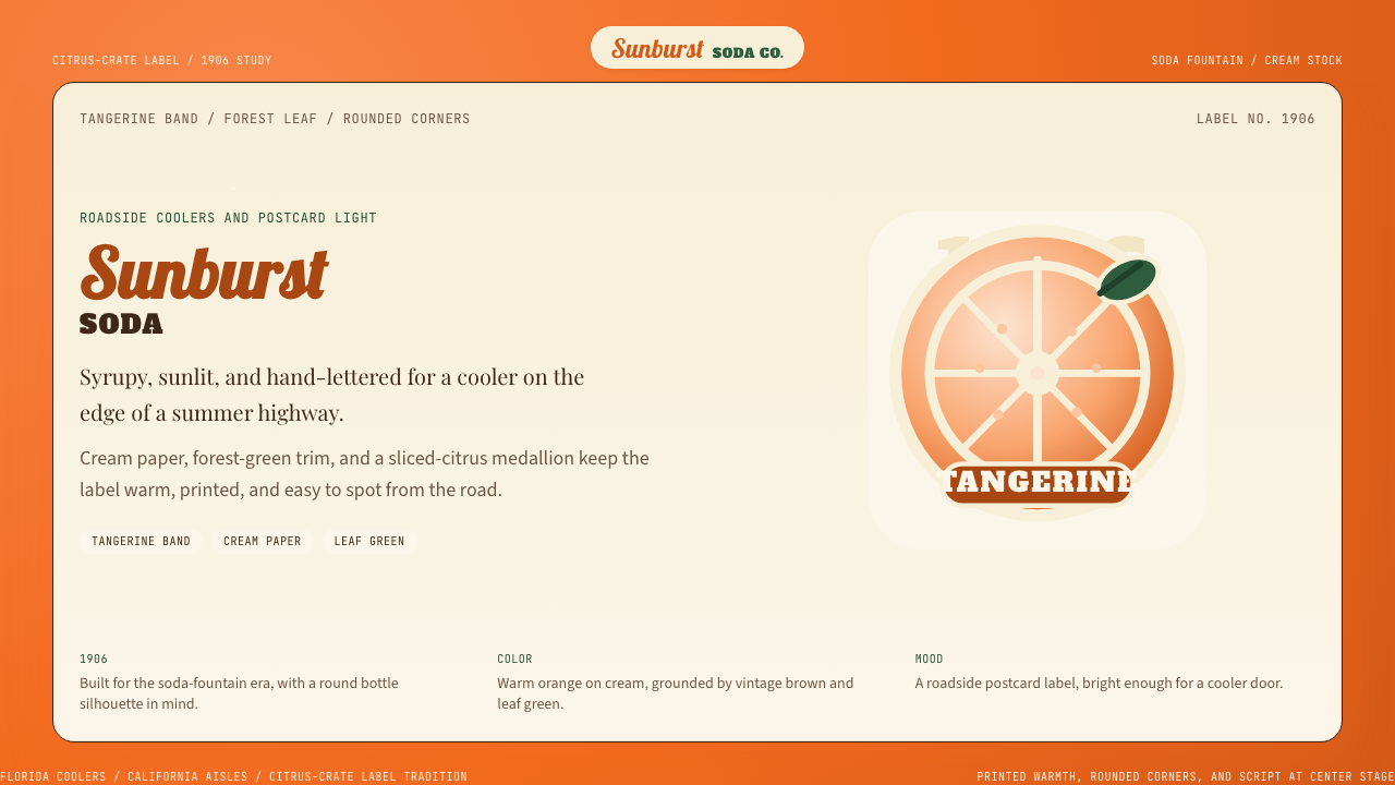
Orange Crush Soda (1906) is an American illustrated-label design system rooted in the visual heritage of the early twentieth-century soda fountain era. Its defining marks are a saturated tangerine ground, a flowing cursive wordmark, hand-drawn citrus slice illustrations, and cream-toned paper textures that evoke the lithographed bottle labels of the 1920s through 1950s. Together these elements create an aesthetic of warm, sun-drenched nostalgia — the feeling of a sweating glass bottle in a roadside gas station cooler.Orange Crush Soda(1906)是一套植根于二十世纪初苏打水喷泉时代视觉遗产的美国插画标签设计体系。它的标志性元素包括:饱和的橘红色底调、流畅的手写体商标字、手绘柑橘切片插图,以及令人联想到1920至1950年代彩色石印瓶标的奶油色纸纹质感。这些元素共同构建出一种温暖、阳光充盈的怀旧美学——仿佛一只在公路边加油站冷藏柜里冒着水雾的玻璃瓶。
The system belongs to a broader tradition of American citrus-marketing design, a genre that flourished when Florida and California growers competed fiercely for consumer attention. Labels had to communicate freshness, sweetness, and regional identity in an instant, working across everything from glass bottles to tin trays to advertising cards. The visual vocabulary that emerged — vivid fruit illustration, rich warm color, readable hand-lettered type — proved extraordinarily durable, surviving the transition from lithography to offset printing to digital reproduction.这套设计体系归属于更宏大的美国柑橘营销设计传统。这一流派兴盛于佛罗里达与加利福尼亚种植者争夺消费者注意力最为激烈的年代。标签必须在一瞬间传递新鲜感、甜美感与地域身份,并适用于从玻璃瓶到锡制托盘再到广告卡片的各种载体。由此形成的视觉词汇——鲜艳的水果插图、浓郁的暖色调、清晰易读的手写体——展现出惊人的耐久性,从石版印刷历经胶版印刷,延续至数字复制时代。
What distinguishes the Crush aesthetic from generic vintage pastiche is the specificity of its warmth. The palette is not simply orange: it layers the deep tangerine of the soda itself against forest-green leaf accents and the gentle cream of aged paper. Rounded corners echo the silhouette of the classic fluted glass bottle. The overall effect is less 'retro' than genuinely historical — a design language with traceable origins, consistent visual logic, and a relationship to real material culture.Crush 美学区别于泛泛复古风格的,是其温暖感的精确性。这套色板不仅仅是「橙色」:它将苏打水本身的深橘色与森林绿的叶片点缀、陈年纸张的柔和奶油色层叠在一起。圆润的弧形边角呼应了经典竖纹玻璃瓶的轮廓。整体效果与其说是「复古」,不如说是真实的历史感——一套有迹可循的起源、一贯的视觉逻辑,以及与真实物质文化之间有根可寻的关联。
See the Orange Crush Soda (1906) design system查看 Orange Crush Soda (1906) 完整设计系统
Where does Orange Crush Soda (1906) come from?Orange Crush Soda (1906) 从何而来?
Orange Crush was founded in 1906 by Clayton J. Howel and Neil C. Ward, who developed a formula for a carbonated orange beverage in Chicago, Illinois. At the time, flavored sodas were a booming category: soda fountains were social anchors of American small-town life, and citrus flavors — positioned as healthful and refreshing — commanded premium status. The name 'Crush' likely referenced the cold-pressed juice extraction method, implying genuine fruit content in an era when most competitors used artificial flavorings. From the beginning, the brand's identity leaned heavily on the suggestion of real citrus — a visual promise made through illustration rather than ingredient lists.Orange Crush 由克莱顿·豪厄尔(Clayton J. Howel)与尼尔·沃德(Neil C. Ward)于1906年在伊利诺伊州芝加哥创立,两人共同研发了一款碳酸橙汁饮料配方。彼时,调味苏打水是一个蓬勃发展的品类:苏打水喷泉是美国小镇社交生活的锚点,而柑橘口味——因其被视为健康清爽——享有溢价地位。「Crush」这个名字很可能指代冷榨果汁的提取工艺,在大多数竞争对手仍使用人工香精的年代,暗示着产品含有真实果汁。从品牌诞生之初,其身份认同便深度依赖对真实柑橘的视觉暗示——一种以插画而非成分表作出的视觉承诺。
The visual language that would define Crush emerged through the 1910s and 1920s, as the brand expanded distribution and invested in bottle-label design. J. M. 'Cap' Thompson was an early figure associated with the brand's commercial development. The iconic labels of the era were lithographed masterworks of the applied graphic arts: sliced orange cross-sections rendered with botanical accuracy, script lettering designed to flow like a pen stroke across curved glass, and a color palette anchored in the warm citrus spectrum. These labels did not merely name the product — they performed its flavor through visual sensation.定义 Crush 的视觉语言在1910至1920年代随品牌扩张和瓶标设计投入的增加逐渐成形。J·M·「帽子」汤普森(J. M. 'Cap' Thompson)是与品牌早期商业发展相关的重要人物。那个时代的经典标签是应用图形艺术的石版印刷杰作:具备植物学精确度的橙子切片剖面图、专为在弧形玻璃上流淌如笔触般设计的手写体字形,以及以暖柑橘色系为锚点的色板。这些标签不仅仅是产品命名——它们通过视觉感官演绎出产品的味道。
The brand's aesthetic reached its visual peak during the American mid-century soda fountain culture of the 1930s through 1950s. This was the Norman Rockwell era of illustrated packaging — a moment when American commercial art was deeply invested in idealized, hand-crafted imagery as an antidote to industrial impersonality. Crush's tangerine-and-cream palette, its hand-lettered warmth, and its citrus-slice illustrations positioned it squarely within this tradition. The roadside gas station, the lunch counter, the summer afternoon — Crush's visual world was inseparable from these American settings.品牌的美学在1930至1950年代美国中世纪苏打水喷泉文化鼎盛时期达到视觉顶峰。那是诺曼·洛克韦尔式插画包装的时代——美国商业艺术深度投入于理想化、手工感图像,以此对抗工业化的冷漠。Crush 的橘红与奶油色板、手写体的温度,以及柑橘切片插图,将其精准地定位在这一传统之中。公路边加油站、午餐柜台、夏日午后——Crush 的视觉世界与这些美国场景不可分割。
The brand passed through multiple ownership changes across the twentieth century, eventually reaching its current home under Keurig Dr Pepper. Through these transitions, the core visual identity proved remarkably stable. The tangerine color, the script wordmark, the citrus illustration — these elements survived reformulations, repackagings, and decades of evolving consumer tastes. This persistence itself became part of the brand's meaning: Orange Crush is legible as a historical artifact as much as a contemporary beverage. The Curio design system distills this accumulated visual logic into a transferable set of aesthetic principles — capturing the warmth and material richness of the illustrated-label heritage without being constrained to its specific commercial context.品牌在二十世纪历经多次所有权更迭,最终落户于当前的 Keurig Dr Pepper 旗下。在这些更替中,核心视觉身份展现出惊人的稳定性。橘红色、手写体商标字、柑橘插图——这些元素历经配方重组、包装更新与数十年消费者口味演变而留存下来。这种持久性本身成为品牌意义的一部分:Orange Crush 与其说是一款当代饮料,不如说是一件可辨认的历史文物。Curio 设计体系将这套积累的视觉逻辑提炼为一组可移植的美学原则——在不局限于其特定商业语境的前提下,捕捉插画标签遗产的温暖感与物质丰富性。
What defines the Orange Crush Soda (1906) look?Orange Crush Soda (1906) 的视觉特征是什么?
Color Palette色彩体系
The dominant hue is a rich, deeply saturated tangerine — warmer than a traffic orange, richer than a pastel apricot, sitting in the zone that evokes ripe navel oranges in direct sunlight. This anchoring color is balanced by two secondaries: a cream or off-white derived from aged paper stock, which softens the overall warmth, and a deep forest green drawn from citrus foliage, which provides cool contrast and grounds the composition. The interplay of warm tangerine, cool green, and neutral cream is the system's most distinctive signal.主导色是一种浓郁、高度饱和的橘红色——比交通橙更温暖,比杏色更厚实,落在阳光直射下成熟脐橙的色感区间。这一锚定色由两个辅色加以平衡:一种源自陈年纸张的奶油色或米白色,软化整体暖调;一种源自柑橘叶片的深森林绿,提供冷色对比并稳定构图。暖橘红、冷绿与中性奶油三者之间的互动,是这套体系最具辨识度的信号。
Typography字体排印
Script and cursive letterforms carry the emotional weight of the system. The wordmark tradition leans on flowing, connected letterforms that suggest a confident pen stroke — informal enough to feel hand-made, consistent enough to feel authoritative. This script register contrasts with a secondary display typeface in a rounded, sturdy style reminiscent of early twentieth-century American commercial lettering: slightly condensed, warm, and unpretentious. Body text, where it appears, calls for a legible serif or rounded sans that maintains the system's warmth rather than importing modernist neutrality.草书与手写体字形承载着这套体系的情感重量。商标字的传统依赖流畅的连笔字形,仿佛充满自信的笔触——随性到有手工感,又统一到有权威感。这种草书风格与次级展示字体形成对比,后者采用圆润、厚实的样式,令人联想到二十世纪初美国商业字体:略带窄缩、温暖、不做作。正文字体(若出现)应选用易读的衬线体或圆润无衬线体,以维持体系的温暖基调,而非引入现代主义的中性感。
Illustration Language插图语言
The citrus slice cross-section is the system's most iconic illustrative element — a halved or quartered orange rendered with enough botanical detail to communicate freshness and authenticity, but stylized enough to read clearly at small sizes and on curved surfaces. This illustration tradition draws from the citrus-crate label art of California and Florida, where competition between growers drove an elevation of illustration quality. Other permitted illustrative elements include citrus leaves and stems, bubbles suggesting carbonation, and light glare effects implying cold glass.柑橘切片剖面图是这套体系最具标志性的插图元素——半剖或四分之一切的橙子,以足够的植物学细节传递新鲜感与真实感,同时风格化程度足以在小尺寸和弧形表面上清晰呈现。这一插图传统源自加利福尼亚与佛罗里达的柑橘箱标签艺术,种植者之间的竞争推动了插图品质的提升。其他允许使用的插图元素包括:柑橘叶片与茎枝、暗示碳酸气泡的气泡图案,以及暗示冰凉玻璃的反光效果。
Texture and Surface质感与表面
Paper texture is integral to the aesthetic rather than decorative afterthought. The cream ground of the system carries the subtle grain of uncoated stock — fibrous, slightly rough, the opposite of the slick coated surfaces of contemporary packaging. This texture signals age and handcraft, anchoring the design in a pre-digital material culture. Applied digitally, paper grain works best as a very light overlay, present enough to read at normal viewing distances but not so heavy that it reads as distress or damage.纸张质感是美学的有机组成部分,而非装饰性补充。体系的奶油底色承载着非涂布纸的细腻纹理——有纤维感、略带粗糙,与当代包装光滑涂布表面截然相反。这种质感传递出岁月感与手工感,将设计锚定在前数字化的物质文化中。数字应用时,纸张颗粒感最好作为极轻的叠加层,在正常观看距离下可感知,但不至于重到被解读为破损或做旧效果。
Shape and Structure形态与结构
Rounded corners and softened edges pervade the system, echoing the contour of the classic fluted Crush glass bottle. Rectangular containers become pill-shaped; badges use ovoid rather than sharp-cornered frames; compositional zones are bounded by curved rules rather than hard lines. This consistent rounding creates a sense of physical friendliness — forms that feel pleasant to hold — while also functioning as a period marker, since the severe hard corner was itself a later modernist imposition on a tradition that preferred the more forgiving curve.圆角与柔化边缘遍布整套体系,呼应着经典竖纹 Crush 玻璃瓶的轮廓。矩形容器变为胶囊形;徽章使用椭圆形而非尖角框架;版面分区由弧形线条而非硬直线界定。这种一贯的圆润处理营造出一种触觉友好感——令人感到愉悦的形态——同时也作为时代标记发挥作用,因为严格的硬角本身是现代主义对这一更偏爱宽容弧线的传统的后期强加。
Depth and Layering层次与叠加
Unlike flat modernist systems, the Crush aesthetic embraces light dimensionality. Subtle drop shadows — soft rather than hard, warm in tone to match the palette — suggest that elements rest on the cream ground rather than being painted on it. Illustration elements overlap type, type overlaps texture, and the whole composition achieves the layered quality of a printed label built up through successive lithographic passes. This is not the severe geometric shadow of Bauhaus or the deep shadow of contemporary neumorphism — it is the gentle depth of an old label.与平面现代主义体系不同,Crush 美学拥抱轻度立体感。细腻的投影——柔和而非硬边,暖色调以匹配整体色板——暗示元素是搁置在奶油底面上,而非被涂抹在其上。插图元素叠压文字,文字叠压质感,整体构图呈现出一张经由多次石版叠印而成的印刷标签所特有的层叠品质。这不是包豪斯的严格几何投影,也不是当代新拟物主义的深重阴影——而是一张旧标签所特有的温柔纵深。
Warmth as a System Value温暖感作为体系价值
Every element in the system — color, type, illustration, texture, shape — is selected for its contribution to a unified warmth. This is not warmth in a generic or vague sense but a specifically American, specifically mid-century warmth: the kind associated with summer leisure, handmade things, and the confident optimism of the postwar consumer era. The system therefore has an inherent personality. It is unsuited to contexts demanding neutrality, severity, or technological sophistication, and it excels in contexts where approachability, pleasure, and sensory appeal are the desired brand values.体系中的每一个元素——色彩、字体、插图、质感、形态——都以其对统一温暖感的贡献为选择依据。这里的温暖感不是泛泛而谈的感觉,而是一种具体的美国式、中世纪式温暖:与夏日休闲、手工制物以及战后消费时代自信乐观主义相关联的那种感觉。因此这套体系具有内在的个性。它不适合需要中性感、严肃感或技术精密感的语境,而在亲切感、愉悦感与感官吸引力是期望品牌价值的语境中表现卓越。
See the Orange Crush Soda (1906) design system查看 Orange Crush Soda (1906) 完整设计系统
Who shaped Orange Crush Soda (1906)?谁塑造了 Orange Crush Soda (1906)?
Howel co-founded the Orange Crush brand in Chicago in 1906, developing the original carbonated orange beverage formula alongside Neil C. Ward. His contribution was not merely commercial: by insisting on a product identity tied to real citrus — expressed through the brand name, the illustration language, and the sourcing narrative — Howel established the visual and conceptual foundation that would persist for over a century. The decision to compete on perceived authenticity rather than price or novelty shaped everything that followed in the brand's visual history.豪厄尔与尼尔·沃德于1906年在芝加哥共同创立了 Orange Crush 品牌,研发了最初的碳酸橙汁配方。他的贡献不仅在商业层面:通过坚持将产品身份与真实柑橘相捆绑——以品牌名称、插图语言与溯源叙事加以表达——豪厄尔奠定了视觉与概念基础,这一基础延续逾百年。以感知真实性(而非价格或新奇感)为竞争维度的决策,塑造了品牌视觉历史中随后发生的一切。
Ward partnered with Howel in the founding of Orange Crush, bringing the commercial and distribution expertise that allowed the formula to move from local Chicago novelty to nationally distributed brand. The early scaling decisions — standardizing bottle shape, investing in label printing quality, establishing the tangerine-and-cream color identity across regional bottlers — were the kind of operational choices that embed a visual language into mass culture. Ward's role represents the infrastructure side of a design system: without consistent reproduction and distribution, even the best-conceived aesthetic fails to achieve cultural resonance.沃德与豪厄尔共同创立 Orange Crush,带来了商业运营与分销专业知识,使这一配方从芝加哥本地新奇饮料发展为全国分销品牌。早期的规模化决策——统一瓶型、投资标签印刷品质、在各地区灌装商间确立橘红与奶油的色彩身份——正是将视觉语言嵌入大众文化的那类运营选择。沃德的角色代表了设计体系的基础设施层面:没有一致的复制与分发,即使构思最精妙的美学也无法实现文化共鸣。
Thompson was an early figure in the commercial development of Orange Crush, associated with the brand's expansion during its formative years. His involvement coincided with the period in which the visual identity — the script wordmark, the citrus illustration system, the characteristic bottle shape — was being consolidated into the recognizable form that would persist across decades. Thompson represents a generation of American brand builders who understood that a soda was not merely a formula but an experience, and that visual design was the primary vehicle for delivering that experience to consumers at the point of sale.汤普森是 Orange Crush 商业发展初期的重要人物,与品牌在形成期的扩张密切相关。他的参与恰逢视觉身份被整合成型的关键时期——手写体商标字、柑橘插图体系、标志性瓶型——这些元素在那一时期固化为将延续数十年的可辨认形式。汤普森代表了一代美国品牌建造者,他们理解苏打水不仅仅是一个配方,而是一种体验,而视觉设计是在销售终端将这种体验传递给消费者的首要媒介。
The visual richness of the Orange Crush aesthetic owes a significant debt to the anonymous and semi-anonymous illustrators who elevated citrus-crate label art in California and Florida between roughly 1880 and 1950. Working for printing houses that supplied growers and bottlers, these illustrators developed a specialized vocabulary for depicting citrus: the light-refracting translucency of orange flesh, the textured skin of the rind, the glossy surface of leaves. Their work was commercial art in the most rigorous sense — designed to survive printing on uncoated stock, to read from a distance, and to communicate quality instantly — and it achieved a level of craft that has influenced packaging design ever since.Orange Crush 美学的视觉丰富性,在相当程度上得益于大约1880至1950年间在加利福尼亚和佛罗里达提升柑橘箱标签艺术水准的无名及半具名插图画家们。他们为服务种植商与灌装商的印刷公司工作,发展出一套描绘柑橘的专业词汇:橙肉的透光半透明质感、橘皮的纹理表面、叶片的光泽。他们的作品是最严格意义上的商业艺术——设计为能在非涂布纸上存活印刷、能在远距离可读、能即时传递品质——并达到了此后持续影响包装设计的工艺高度。
The peak visual decade for Orange Crush's aesthetic — the 1940s and early 1950s — coincided precisely with the height of Norman Rockwell's cultural influence and the broader American investment in illustrated, hand-crafted commercial imagery. This was not coincidence: Rockwell and the Saturday Evening Post cover tradition represented the same cultural values that Crush's visual language embodied — idealized Americana, warmth, accessibility, the comfort of the familiar. Understanding the Crush aesthetic requires understanding this mid-century moment, when American commercial design was the most confident, craft-intensive, and culturally resonant it has ever been.Orange Crush 美学视觉最鼎盛的十年——1940年代与1950年代初——恰好与诺曼·洛克韦尔文化影响力的顶峰,以及美国商业界对插画、手工感图像的广泛投入高度重合。这并非巧合:洛克韦尔与《星期六晚邮报》封面传统所代表的文化价值,与 Crush 视觉语言所承载的完全一致——理想化的美国风情、温暖感、亲切感、熟悉事物带来的慰藉。理解 Crush 美学,需要理解这个中世纪时刻:那是美国商业设计有史以来最自信、最重手工艺、文化共鸣最深的时期。
How do you use Orange Crush Soda (1906) today?今天怎么用 Orange Crush Soda (1906)?
The Orange Crush (1906) style is a high-warmth, high-specificity system that rewards thoughtful application and punishes careless deployment. It is not a neutral historical overlay — it carries strong personality associations with American summer leisure, handcrafted authenticity, and mid-century optimism. Before applying it, confirm that these associations align with your product's intended emotional register. When they do, the system delivers an immediately recognizable warmth that few other historical palettes can match.Orange Crush(1906)风格是一套高温暖感、高特定性的体系,它回报周全的应用,惩罚粗率的使用。它不是一个中性的历史叠加层——它携带着与美国夏日休闲、手工真实感和中世纪乐观主义强烈关联的个性。应用之前,请确认这些关联与你的产品意图传达的情感基调相符。当两者吻合时,这套体系能释放出其他历史色板鲜有匹敌的即时可辨认温度。
For presentation slides, the style transforms both cover and content pages. A cover works best as a compositional evocation of the label itself: the tangerine ground filling a generous band across the top or bottom, cream space for the title set in a rounded or script-influenced display typeface, and a citrus-derived illustrative motif — even a simplified one — as the compositional anchor. Content slides should use the cream as a warm near-white background, the tangerine for section headers or data highlights, and green sparingly for secondary accents. Data visualizations — bar charts, progress indicators — take on an almost illustrated quality when bars are rendered in the tangerine-to-cream spectrum with softly rounded ends. The paper-texture overlay, kept very subtle, gives slides the feeling of printed material rather than screen output.在演示文稿中,这套风格能够改造封面页与内容页。封面最好作为对标签本身的构图致敬:橘红色底色填满顶部或底部的宽阔色带,奶油色区域承载以圆润或草书感展示字体排列的标题,一个柑橘衍生的插图母题——哪怕是简化版本——作为构图锚点。内容页应以奶油色作为温暖的近白背景,橘红色用于章节标题或数据重点,绿色节制地用作次级强调。数据可视化——柱状图、进度指示器——当条形以橘红至奶油的色谱渲染、两端圆润收尾时,呈现出近乎插画的品质。极为克制的纸张质感叠加层,赋予幻灯片印刷品的感觉,而非屏幕输出的感觉。
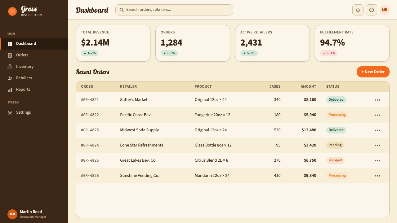
For web interfaces, the style is best suited to contexts where warmth and approachability are strategic priorities: food and beverage brands, artisan marketplaces, heritage product lines, tourism and hospitality, seasonal promotional landing pages. Dashboard or pricing applications in these sectors benefit from the system's clear hierarchy: tangerine for primary calls to action, cream for card backgrounds, forest green for success states or freshness signals. Navigation elements in a rounded sans-serif maintain period character without sacrificing readability. Avoid using the style for contexts that require perceived technological sophistication, clinical precision, or corporate neutrality — the warmth that is a strength in the right context reads as unsophisticated in the wrong one.在网页界面上,这套风格最适合温暖感与亲切感是战略优先项的语境:食品与饮料品牌、手工艺品市集、传统产品线、旅游与酒店业、季节性促销落地页。这些领域的仪表板或定价应用受益于体系清晰的层级:橘红色用于主要行动号召,奶油色用于卡片背景,森林绿用于成功状态或新鲜感信号。以圆润无衬线字体呈现的导航元素保持时代气质而不牺牲可读性。避免将这套风格用于需要感知技术精密感、临床精确性或企业中性感的语境——在正确语境中是优势的温暖感,在错误语境中会被解读为缺乏专业度。
For editorial and marketing applications, the system supports both print-derived layouts and digital equivalents. An editorial layout might use the tangerine as a full-bleed section header block, with cream body-text areas below; pull quotes set in script-influenced type become natural focal points. Marketing pages work with the style's label-poster logic: a feature block might place illustrated citrus art alongside product copy set in rounded display type, the whole thing framed by a forest-green rule that echoes the border tradition of vintage labels. For social media cards, the most effective approach borrows the label format directly — a tangerine ground, a script headline, a simplified citrus motif, and the cream or forest-green secondary — creating a card that reads as designed rather than generated.在编辑与营销应用中,这套体系同时支持源自印刷的版式和数字版本。编辑版式可以用橘红色作为全出血的章节标题色块,下方跟随奶油色正文区域;以草书感字体排列的引用语自然成为视觉焦点。营销页面运用这套风格的标签-海报逻辑:一个特性展示区块可以将插画柑橘图案与圆润展示字体排列的产品文案并置,整体以森林绿线条框定,呼应复古标签的边框传统。对于社交媒体卡片,最有效的方式是直接借用标签格式——橘红色底、草书标题、简化柑橘母题、奶油色或森林绿辅色——创造出一张看起来是被设计的而非被生成的卡片。
The most common mistake when applying this style is conflating vintage warmth with visual clutter. The original bottle labels were actually well-organized compositions: strong focal illustration, clear typographic hierarchy, and decisive negative space. Contemporary applications that pile on multiple textures, several script typefaces, excessive aged-paper distress, and competing decorative borders quickly tip from evocative into illegible. The correct approach is selectivity: one texture, one script element, one or two warm accent colors, and enough negative cream space to let each element breathe. The Crush aesthetic is generous — but it is not chaotic.应用这套风格时最常见的错误,是将复古温暖感与视觉杂乱混为一谈。原版瓶标实际上是构图清晰的作品:强力的焦点插图、清晰的字体层级、果断的留白。将多种质感、若干草书字体、过度做旧的纸张效果与相互竞争的装饰边框叠加堆砌的当代应用,会迅速从唤起联想滑向无法阅读。正确的方式是选择性:一种质感、一个草书元素、一到两种暖色强调色,以及足够的奶油色负空间让每个元素得以呼吸。Crush 美学是慷慨的——但它不是混乱的。
See the Orange Crush Soda (1906) design system查看 Orange Crush Soda (1906) 完整设计系统
Orange Crush Soda (1906) — FAQOrange Crush Soda (1906) · 常见问题
Is this style appropriate for tech products or SaaS interfaces?这套风格适合科技产品或 SaaS 界面吗?
Rarely, and only in specific contexts. The Crush aesthetic is optimized for warmth, approachability, and sensory association — values that work against the perceived precision, capability, and modernity that most SaaS products need to communicate. A fintech dashboard, a developer tool, or a B2B analytics platform will typically read as dated or unsophisticated in this style. The exceptions are SaaS products in adjacent spaces: a restaurant management platform serving small independent operators, a food-and-beverage inventory tool, or a consumer-facing recipe subscription service might plausibly use elements of the system. Even then, the most effective approach is selective borrowing — warm color accents, a rounded interface, perhaps a textured background — rather than full system immersion.很少,且仅适用于特定语境。Crush 美学优化于温暖感、亲切感与感官联想——这些价值观与大多数 SaaS 产品需要传达的精密感、能力感和现代感相抵触。金融科技仪表板、开发者工具或 B2B 分析平台在这套风格下通常会显得过时或缺乏专业度。例外存在于相邻领域的 SaaS 产品:服务小型独立经营者的餐厅管理平台、食品与饮料库存工具,或面向消费者的食谱订阅服务,可能合理地使用这套体系的元素。即便如此,最有效的方式也是选择性借用——暖色调强调色、圆润的界面、或许一个质感背景——而非完全沉浸于整套体系。
How do I avoid making designs look like Halloween rather than citrus?如何避免设计看起来像万圣节而非柑橘?
The orange-versus-Halloween trap is real and comes down to three factors: hue temperature, palette companionship, and illustration character. Halloween orange tends toward a cooler, more aggressive spectrum — it pairs with black for maximum contrast. Crush tangerine is warmer, richer, and more red-adjacent. Keep the hue in the warm-orange zone rather than letting it drift toward a pure or cool orange. Second, pair the tangerine with cream and forest green rather than with black; black-and-orange is a Halloween combination, cream-and-orange is a citrus one. Third, the illustration language matters: clean, naturalistic citrus fruit references summer and fresh produce; spiky or angular graphic treatments read as contemporary without historical warmth.橙色与万圣节的混淆陷阱是真实存在的,根源在于三个因素:色相温度、色板伴色与插图性格。万圣节橙色倾向于更冷、更具攻击性的色谱——它与黑色搭配以求最大对比度。Crush 的橘红色更温暖、更厚实、更接近红色端。将色相保持在暖橙区间,避免漂移向纯橙或冷橙。其次,将橘红色与奶油色和森林绿搭配,而非与黑色搭配;黑色配橙色是万圣节组合,奶油色配橙色是柑橘组合。第三,插图语言至关重要:干净、自然主义的柑橘水果图像唤起夏天与新鲜农产品的联想;尖锐或棱角化的图形处理则读作当代感,缺乏历史温度。
Can the style work in a dark-background or night-mode variant?这套风格能做深色背景或夜间模式变体吗?
A dark variant is possible but requires significant rethinking of the palette relationships. The warmth of the system depends heavily on the cream ground — remove it and the tangerine loses its grounding context. On a very dark background, tangerine reads correctly (it is bright enough to hold) but the forest green tends to disappear, losing the cool-warm contrast that gives the palette its depth. A workable dark variant replaces the cream ground with a very dark warm brown or a near-black with a slight warm undertone, keeps the tangerine as the primary accent, uses a muted sage or olive instead of forest green, and adds a warm off-white (not cold white) for text. The paper-texture approach still applies, but the texture should be even more subtle on dark grounds to avoid reading as noise.深色变体是可能的,但需要对色板关系进行大幅重新构思。这套体系的温暖感在很大程度上依赖奶油色底面——去掉它,橘红色就失去了根基语境。在非常深的背景上,橘红色能正常呈现(它足够明亮以保持可见),但森林绿倾向于消失,失去赋予色板深度的冷暖对比。一个可行的深色变体方案:以非常深的暖棕色或带有轻微暖色底调的近黑色取代奶油色底面,保留橘红色作为主要强调色,以哑光鼠尾草绿或橄榄绿替代森林绿,并为文字添加暖调米白色(而非冷白色)。纸张质感的方式仍然适用,但在深色底面上质感应更加克制,避免被解读为噪点。
How does this style differ from generic vintage or retro design?这套风格与泛泛的复古设计有何不同?
Generic vintage design borrows surface signals — distressed textures, sepia tones, antiqued typefaces — without grounding them in a specific historical visual logic. The Orange Crush system is rooted in a precise tradition: the American citrus-marketing label as it existed between roughly 1906 and 1955, with specific color relationships, specific illustration conventions, and specific typographic registers derived from that tradition. The difference shows in application: generic vintage feels mood-driven and interchangeable; the Crush system has internal consistency. When you choose this style, you are choosing a specific historical argument about warmth, craft, and American summer culture — not applying a filter. That specificity is what gives the system its authority and also what limits its range of appropriate applications.泛泛的复古设计借用表面信号——做旧质感、棕褐色调、仿古字体——而不将其根植于任何具体的历史视觉逻辑。Orange Crush 体系植根于一个精确的传统:大约1906至1955年间美国柑橘营销标签的特定色彩关系、特定插图惯例,以及由此传统衍生的特定字体风格。这种差异在应用中清晰可辨:泛泛复古感觉由情绪驱动、可以互换;Crush 体系具有内在一致性。当你选择这套风格,你选择的是一个关于温暖感、手工艺与美国夏日文化的具体历史论点——而非施加一个滤镜。这种特定性赋予这套体系以权威,同时也界定了它适用范围的边界。
What kinds of brands and products are the strongest fits?哪类品牌和产品与这套风格最匹配?
The strongest fits share one or more of the following qualities: they are in or adjacent to the food and beverage category; they are positioning on heritage, craft, or authenticity; they are targeting a broad consumer audience rather than a specialized professional one; they operate in contexts where emotional warmth and sensory pleasure are purchase drivers. Specific strong fits include artisan food and drink brands, vintage-styled retail, summer or seasonal event identities, hospitality and tourism brands emphasizing regional character, recipe and food media, and any brand seeking to communicate tradition and trustworthiness in a consumer-friendly visual register. Weak fits include B2B software, medical and clinical applications, financial services, and any product whose value proposition centers on technological advancement or analytical rigor.最匹配的品牌与产品共享以下一种或多种特质:处于或毗邻食品饮料品类;在传统、手工艺或真实性上进行定位;面向广泛消费者受众而非特定专业群体;在情感温暖感与感官愉悦感是购买驱动力的语境中运营。具体的强匹配包括:手工食品与饮料品牌、复古风格零售、夏日或季节性活动视觉形象、强调地域特色的酒店旅游品牌、食谱与美食媒体,以及任何希望在消费者友好的视觉语境中传达传统感与可信度的品牌。弱匹配包括:B2B 软件、医疗与临床应用、金融服务,以及任何价值主张以技术进步或分析严谨性为中心的产品。
Related design styles相关设计风格
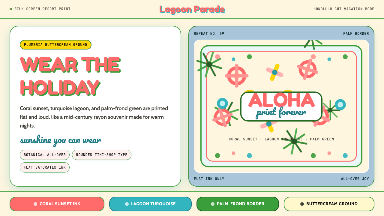 Hawaiian Aloha ShirtThe shirt is the holiday. Buttercream ground, coral Fredoka type, and flat tr…穿上就是假期。奶油底、珊瑚 Fredoka 字与热带平面印花。
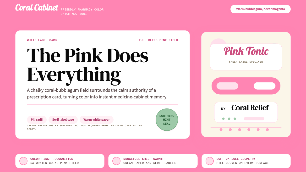 Pepto-Bismol Pink (1901)Color is the cure. Bubblegum pink floods the field; white label cards and pil…颜色就是招牌:泡泡糖粉铺满画面,白色标签卡和药丸弧度稳住信任。
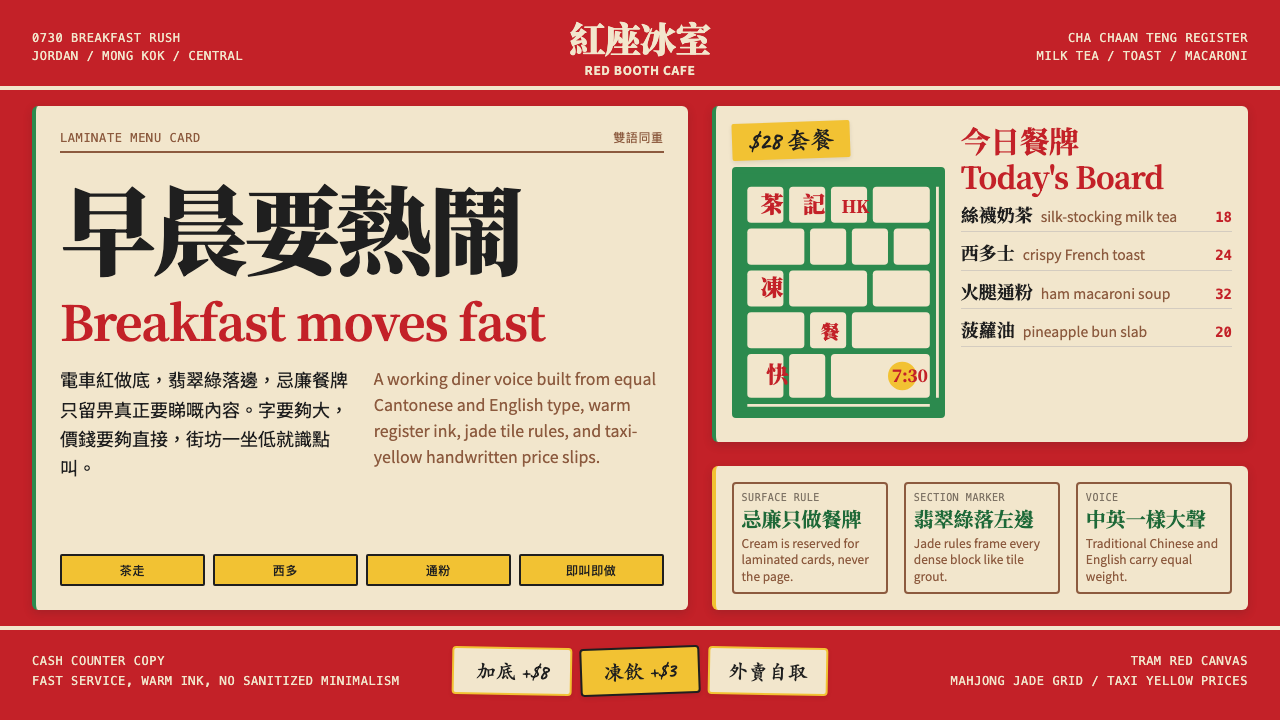 Hong Kong Cha Chaan TengDemocratic diner warmth. Tram red, jade rules, cream menu cards, equal Canton…街坊飯堂的熱度:電車紅、翡翠綠線、忌廉餐牌,中英並重。
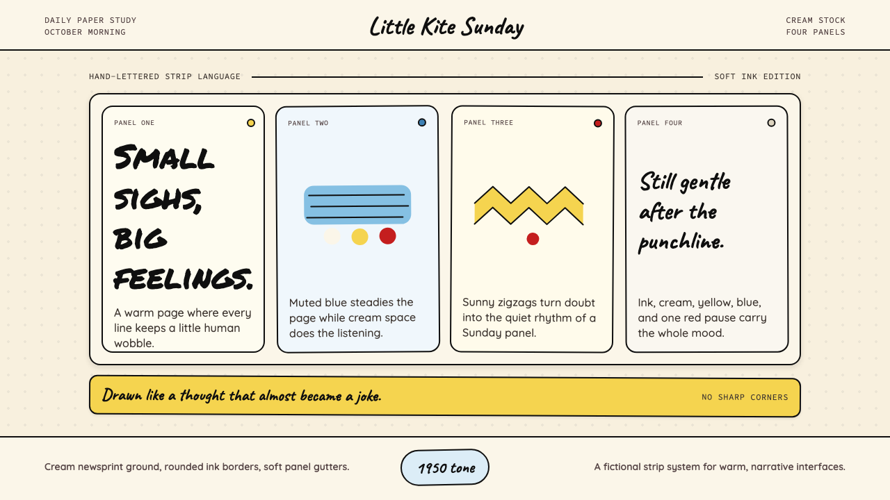 Peanuts Comic Schulz (1950)Gentle melancholy on newsprint. Caveat lettering, cream panels, yellow and bl…温柔忧郁的新闻纸感:Caveat 手写字、奶油格框、黄蓝点色。
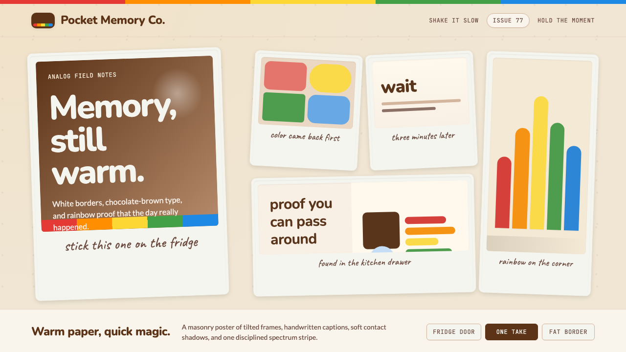 Polaroid InstantMemory made tangible. Photo-white frames tilt on aged paper with a warm rainb…记忆变得可触:相纸白边倾斜在旧纸底上,彩虹条点亮温度。
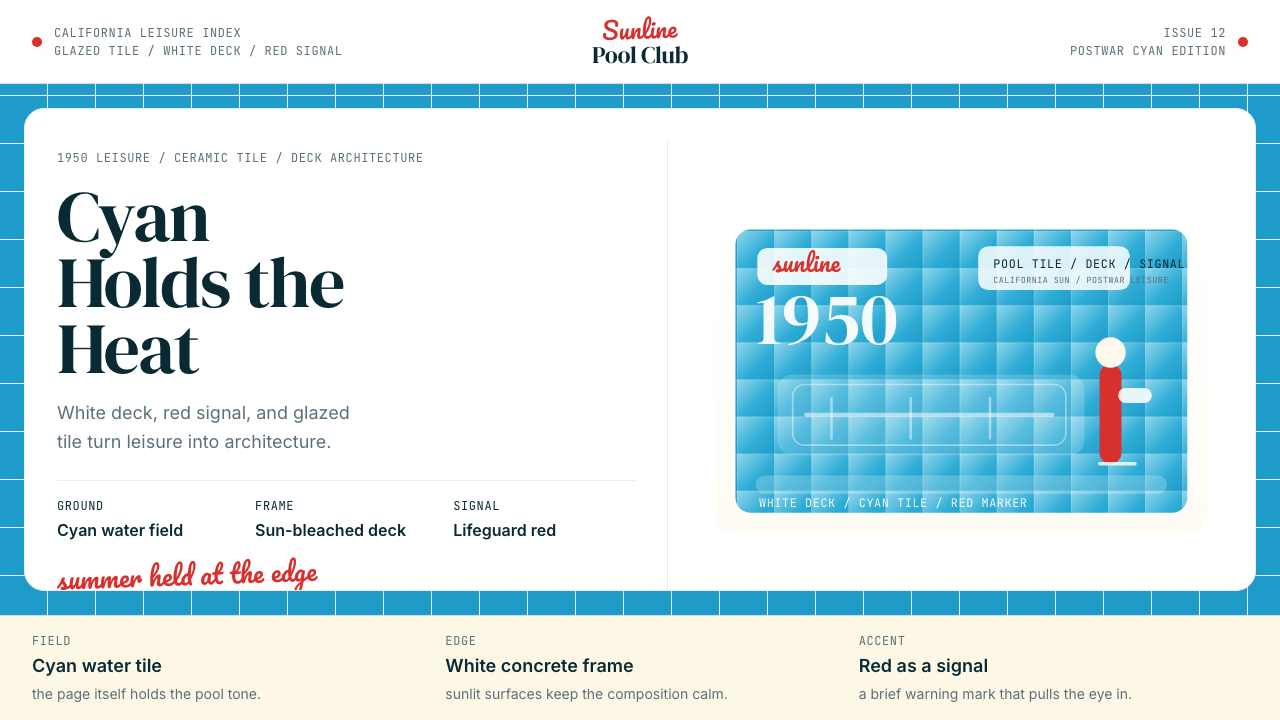 Swimming Pool Vintage Cyan Tile (1950)Leisure turned architectural. Cyan tile, white deck, and red accents set the…把悠闲做成建筑感。青瓷砖、白池边与红色点睛。