What is Hawaiian Aloha Shirt?什么是 Hawaiian Aloha Shirt?
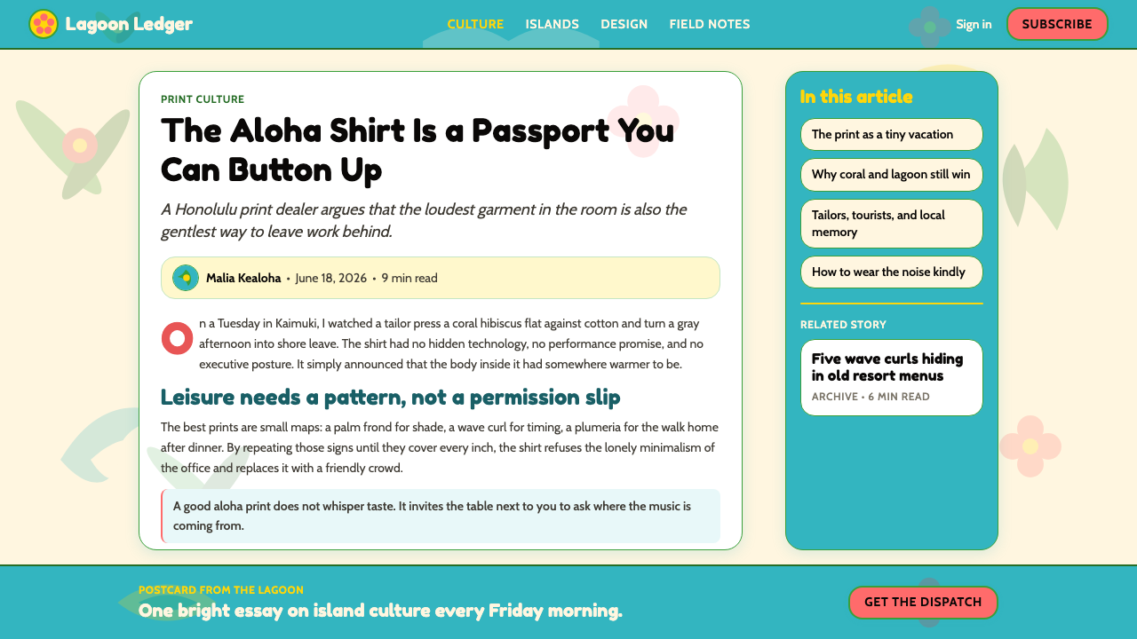
The aloha shirt doesn't decorate leisure — it is leisure, a full-color declaration that botanical abundance, warm water, and unhurried time are the only rules that matter.阿罗哈衬衫不是休闲的装饰——它本身就是休闲,一份全彩宣言:植物的丰盛、温暖的海水与不赶时间,是唯一值得遵守的规则。
Hawaiian Aloha Shirt in briefHawaiian Aloha Shirt 速览
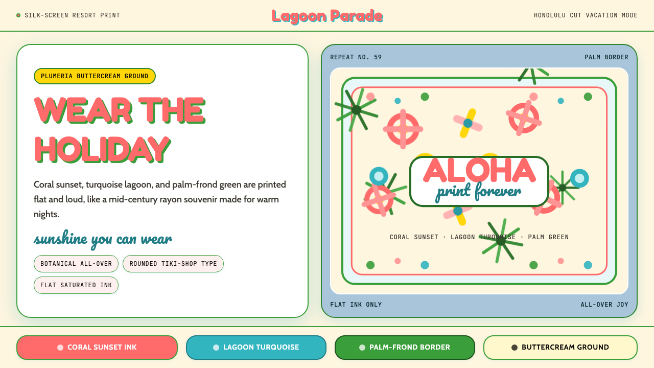
The Hawaiian aloha shirt is the most universally recognized tropical-leisure design language in the world. Its visual grammar is built on saturated all-over prints — dense botanical motifs, oceanic scenes, tiki carvings, and stylized wildlife — rendered flat against grounds ranging from warm cream to deep ocean turquoise. The palette is deliberately high-key: coral and sunset orange beside palm-frond green, sunshine yellow against cerulean blue, hibiscus red blooming across natural linen. Nothing recedes; everything competes joyfully for attention.夏威夷阿罗哈衬衫是全球最具辨识度的热带休闲设计语言。它的视觉语法建立在饱和的全幅印花之上——茂密的植物纹样、海洋场景、提基雕像、风格化的野生动物——以平面方式铺陈于从温暖奶油到深海绿松石的底色之上。色板刻意高调:珊瑚与日落橙紧邻棕榈绿,阳光黄与蔚蓝对望,木槿红在天然麻色上盛放。没有什么在退场;一切都在欢快地争夺注意力。
What distinguishes the aloha shirt aesthetic from generic tropical decoration is its specific fusion of cultural traditions. Polynesian kapa bark-cloth geometry — bold repeating forms derived from hand-stamped barkcloth — sits alongside Japanese yukata-fabric patterning and mid-century American resort illustration. The result is neither purely indigenous nor purely imported: it is a genuinely syncretic visual culture born from the particular geography and immigration history of the Hawaiian Islands.将阿罗哈衬衫美学与泛泛的热带装饰区分开来的,是它对多元文化传统的特殊融合。波利尼西亚树皮布的几何纹样——源自手工敲印树皮布的粗犷重复形态——与日本浴衣面料的织物图案并置,再糅入二十世纪中期美国度假地的插图风格。结果既非纯粹的原住民传统,也非纯粹的舶来品:它是诞生于夏威夷群岛特殊地理与移民历史的真正混融视觉文化。
In contemporary design use, the aloha shirt vocabulary signals warmth, openness, and a deliberate rejection of corporate restraint. Applied to digital or print work, it brings a sense of celebration and approachability that few other historical styles can match. The design system thrives in contexts that want to communicate that the experience on offer is pleasurable, relaxed, and maybe a little bit outside the ordinary rules.在当代设计实践中,阿罗哈衬衫的视觉语汇传递温暖、开放,以及对企业拘谨风格的主动拒绝。应用于数字或印刷作品时,它带来一种庆典感与亲近感,这是很少有其他历史风格能够媲美的。这套设计语言在需要传达「体验本身令人愉悦、轻松,也许还稍稍超出常规规则」的场景中尤为得心应手。
See the Hawaiian Aloha Shirt design system查看 Hawaiian Aloha Shirt 完整设计系统
Where does Hawaiian Aloha Shirt come from?Hawaiian Aloha Shirt 从何而来?
The aloha shirt was born in 1930s Honolulu at the intersection of three distinct textile and cultural worlds. Chinese and Japanese immigrant merchants had long operated dry-goods stores selling kimono silk and yukata cotton; their bolts of vivid floral and geometric fabric were already part of everyday Hawaiian commercial life. When local tailors — many of them Japanese American — began cutting these fabrics into sport-shirt shapes for the tourist and plantation-worker market, they were not inventing a new idea so much as translating existing material abundance into a new form. The garment's defining characteristic, the all-over print with no single dominant focal point, came directly from the logic of Japanese textile design, where the repeat pattern is the statement.阿罗哈衬衫诞生于1930年代的檀香山,诞生于三种截然不同的纺织与文化世界的交汇处。中国和日本移民商人长期经营出售和服丝绸与浴衣棉布的杂货店,他们店里成卷的鲜艳花卉与几何面料早已是夏威夷日常商业生活的一部分。当地裁缝——其中许多是日裔美国人——开始将这些面料裁剪成运动衬衫款式,面向旅游者与种植园工人市场,他们与其说是在发明一个全新的概念,不如说是将既有的物质丰盛转译为一种新的形态。这件衬衫的决定性特征——全幅印花、没有单一视觉焦点——直接来自日本纺织设计的逻辑:重复图案本身就是陈述。
The entrepreneur most often credited with naming and commercializing the aloha shirt is Ellery Chun, a Chinese American merchant who registered the trademark 'Aloha Shirt' in 1936 and stocked his King-Smith Clothiers shop in Honolulu with ready-to-wear shirts cut from kimono fabrics. Chun understood that tourists arriving by ocean liner from the mainland wanted a tangible souvenir of the tropics — something wearable and unmistakably Hawaiian. His shirts provided exactly that. Around the same time, local newspapers began advertising aloha shirts as appropriate business attire for Hawaii's warm climate, a social legitimization that transformed what could have remained a tourist novelty into everyday island dress.最常被誉为阿罗哈衬衫命名人与商业化先驱的,是华裔美国商人埃勒里·郑(Ellery Chun)。他于1936年注册了「Aloha Shirt」商标,并在檀香山的King-Smith服装店里备货了用和服面料裁制的成衣衬衫。郑理解乘海轮从大陆抵达的游客想要一件触手可及的热带纪念品——某种可以穿着、且毫无疑问属于夏威夷的东西。他的衬衫恰好满足了这一需求。几乎同时,当地报纸开始将阿罗哈衬衫宣传为适合夏威夷温暖气候的正式商务着装,这一社会认可的过程将一件可能停留于旅游纪念品的服装,转化成了岛屿日常服饰。
The golden era of the aloha shirt ran roughly from 1947 to 1959, the year Hawaii achieved statehood. Alfred Shaheen, a Los Angeles-born designer who set up manufacturing operations in Honolulu after World War II, was the defining creative force of this period. Shaheen operated his own fabric-printing facilities and developed the lush, narrative all-over prints — featuring outrigger canoes, Diamond Head silhouettes, tropical fish, and dense hibiscus-and-plumeria compositions — that became iconic. He experimented with vertical repeat patterns that read coherently when the shirt was worn unbuttoned, a structural insight that had enormous influence on how the garment was subsequently designed.阿罗哈衬衫的黄金时代大致从1947年延续至1959年夏威夷建州之年。出生于洛杉矶的设计师阿尔弗雷德·沙欣(Alfred Shaheen)在二战后于檀香山建立了制造设施,成为这一时期决定性的创意力量。沙欣经营自己的面料印刷工厂,开发了叙事性的全幅印花——描绘舷外支架独木舟、钻石头山轮廓、热带鱼群、以及密集的木槿与鸡蛋花构图——这些图案成为了经典。他还实验了竖向循环图案,使得衬衫敞开穿着时整体图案依然连贯,这一结构性洞察对后续的衬衫设计产生了深远影响。
The Tiki revival of the 1950s and early 1960s amplified the aloha shirt's cultural reach far beyond Hawaii. Don the Beachcomber and Trader Vic's, the mainland tiki-bar chains that introduced Polynesian-themed cocktail culture to American cities, dressed their staff in aloha shirts and promoted the garment as the emblem of a fantasy Pacific lifestyle. Hollywood reinforced the association: Elvis Presley wore aloha shirts in Blue Hawaii (1961), and the garment appeared on practically every television vacation sequence of the era. By the time mass tourism to Hawaii took off in the jet age, the aloha shirt was already a globally recognized shorthand for tropical leisure — a design language that had traveled well beyond its geographic and cultural origins to become an international visual convention.1950至60年代初的提基(Tiki)复兴浪潮将阿罗哈衬衫的文化影响力大幅扩展至夏威夷以外。Don the Beachcomber与Trader Vic's这两家将波利尼西亚主题鸡尾酒文化引入美国大城市的提基酒吧连锁,让员工身着阿罗哈衬衫上班,并将这件衬衫推广为幻想中的太平洋生活方式的徽章。好莱坞进一步强化了这种联结:猫王艾维斯·普雷斯利在《蓝色夏威夷》(1961年)中穿着阿罗哈衬衫,这件衬衫也出现在那个时代几乎每一个电视度假场景里。当喷气机时代的大众旅游开始涌入夏威夷时,阿罗哈衬衫早已是全球公认的热带休闲的速记符号——一种已经远远超越其地理与文化原点、成为国际视觉惯例的设计语言。
What defines the Hawaiian Aloha Shirt look?Hawaiian Aloha Shirt 的视觉特征是什么?
Color色彩
The aloha shirt palette is unabashedly saturated and multichromatic. Grounds range from warm white and natural cream through turquoise lagoon, deep cobalt ocean, sunset coral, and jungle green. Motif colors are bold and often unexpected in combination — hibiscus red against cobalt, yellow plumeria on deep black, white outrigger canoes on terracotta. The characteristic effect is of maximum color without muddiness: each hue is clean and print-bright, the way early commercial silk-screen inks read on rayon. Muted or desaturated palettes feel inauthentic to the tradition.阿罗哈衬衫的色板毫不掩饰地饱和而多彩。底色从温暖的白色和天然奶油色,延伸至绿松石泻湖、深钴蓝海洋、日落珊瑚与丛林绿。图案色彩大胆,组合往往出人意料——木槿红配钴蓝,黄色鸡蛋花铺在深黑底上,白色独木舟浮于赭红之上。标志性效果是色彩极致丰富而不显浑浊:每一种色相都纯净鲜亮,如同早期商业丝网印刷油墨在人造丝上的呈现效果。沉闷或低饱和的色板与这一传统格格不入。
All-Over Print Structure全幅印花结构
The definitive structural feature of the aloha shirt aesthetic is the all-over print: motifs repeat across the entire surface with no hierarchy, no focal point, no empty ground. Every square centimeter participates equally. This is the opposite of conventional Western textile logic, where a central motif is set against a neutral background. Applied to layouts, this principle translates to dense, edge-to-edge composition — backgrounds are not negative space but active pattern fields, and the design reads as a total visual environment rather than a figure-ground arrangement.阿罗哈衬衫美学最决定性的结构特征是全幅印花:图案在整个表面重复,没有层级,没有焦点,没有空白底面。每一平方厘米都平等参与。这与西方传统纺织逻辑正好相反——后者是将中心图案置于中性底色之上。应用于版面时,这一原则转化为密集的、延伸至边缘的构图:背景不是负空间,而是活跃的图案场域,整个设计作为一个完整的视觉环境被阅读,而非图与底的对比关系。
Motif Vocabulary图案词汇
Authentic aloha print imagery draws from a specific lexicon: hibiscus, bird of paradise, plumeria, and torch ginger among flowers; outrigger canoes, surfboards, and ocean waves among activity motifs; tropical fish, sea turtles, and flamingos among fauna; pineapples, breadfruit, and banana leaves among vegetation. Tiki carvings and mid-century resort architecture also appear. The illustration style is flat and rounded, favoring thick outlines and bold simplified shapes over detailed naturalistic rendering. Every element is recognizable at a glance.正宗阿罗哈印花的图像来自一套特定词汇:花卉中有木槿、鹤望兰、鸡蛋花与火炬姜;活动图案中有舷外支架独木舟、冲浪板与海浪;动物中有热带鱼、海龟与火烈鸟;植物中有菠萝、面包果与香蕉叶。提基雕像与二十世纪中期度假地建筑也会出现。插图风格平面而圆润,偏爱粗轮廓与大胆简化的形状,而非细腻的自然主义描绘。每一个元素都能一眼辨认。
Typography字体排印
Typefaces associated with the aloha shirt tradition are friendly and rounded — letterforms with open apertures, generous curves, and minimal stress contrast. Display type often carries a hand-lettered or brush-script quality that evokes mid-century resort signage and travel-poster typography. Body text sits in clean, warm-toned type that never competes with the surrounding imagery. The typographic tone is always approachable, never austere. Heavy geometric sans-serifs or sharp modern typefaces feel categorically wrong in this context.与阿罗哈衬衫传统相关联的字体是友好而圆润的——字形开口宽阔、曲线丰满、笔画粗细对比最小。展示字体往往带有手写或毛笔书法的质感,让人想起二十世纪中期度假地招牌与旅行海报的字体风格。正文排印干净,色调温暖,从不与周围的图像竞争。字体格调始终平易近人,绝不严肃。粗重的几何无衬线或锋利的现代字体在这一语境中显得格格不入。
Flatness and Print Quality平面感与印刷质感
Despite the richness of color and motif, the aloha shirt visual system is resolutely flat. Shadows are absent or very minimal; forms are not modeled with highlight and shade. The aesthetic owes this quality to its silk-screen printing origins, where each color was a separate ink layer applied without gradation. Applied to contemporary design, this means favoring solid fills over gradients, crisp edges over feathered or blurred ones, and a generally graphic rather than photographic quality of rendering. The flatness is part of what gives the style its cheerful, immediate impact.尽管色彩与图案丰富,阿罗哈衬衫视觉系统始终是彻底平面的。阴影缺席或极为克制;形态不以高光与暗部塑形。这一美学特质源于丝网印刷的起源——每种颜色都是单独一层油墨叠印,无渐变过渡。应用于当代设计,这意味着偏爱实色填充而非渐变,偏爱清脆边缘而非羽化或模糊,以及一种总体上图形化而非摄影化的渲染质量。这种平面感正是赋予该风格欢快而即时的视觉冲击力的部分原因。
Cultural Syncretism文化混融
The aloha shirt's visual identity is inseparable from its multicultural origins. Polynesian geometric barkcloth patterns, Japanese yukata repeat structures, Chinese silk-trade color sensibilities, and American mid-century commercial illustration all contribute to the tradition. This layered heritage means the style has a distinctive quality of simultaneous familiarity and exoticism — each element is legible on its own terms, yet the combination produces something that belongs to no single cultural tradition. Designs that draw from only one strand of this inheritance feel thinner and less authentic than those that honor the full complexity.阿罗哈衬衫的视觉身份与其多元文化起源不可分割。波利尼西亚几何树皮布纹样、日本浴衣的循环织物结构、中国丝绸贸易的色彩感性,以及美国二十世纪中期的商业插图——这些传统共同构成了这一风格的遗产。这种层叠的文化来源赋予了该风格一种独特的品质:同时具有亲切感与异域感——每一个元素在自身语境中都清晰可读,但组合在一起却产生了不属于任何单一文化传统的东西。仅从这一遗产的某一条线索汲取灵感的设计,感觉比那些尊重全部复杂性的设计更单薄、更不真实。
Mood and Emotional Register情绪与情感格调
The aloha shirt aesthetic is committed to joy. It refuses restraint, refuses gravitas, refuses the visual language of seriousness and institutional authority. Its emotional register is celebratory, generous, and slightly extravagant — the visual equivalent of ordering the drink with the paper umbrella. This is not a weakness but a specific capability: applied correctly, the style communicates openness and pleasure with an immediacy that no amount of careful neutral design can achieve. The design system works precisely because it takes leisure seriously enough to go all the way.阿罗哈衬衫美学致力于欢乐。它拒绝克制,拒绝庄重,拒绝严肃与权威机构的视觉语言。它的情感格调是庆典式的、慷慨的,略显奢侈——如同视觉上点了那杯插着纸伞的饮料。这不是弱点,而是一种特定的能力:正确应用时,这种风格以任何精心设计的中性美感都无法企及的即时性,传递开放与愉悦。这套设计语言之所以有效,恰恰因为它足够认真地对待休闲——认真到底。

See the Hawaiian Aloha Shirt design system查看 Hawaiian Aloha Shirt 完整设计系统
Who shaped Hawaiian Aloha Shirt?谁塑造了 Hawaiian Aloha Shirt?
Chun is the merchant-designer most credited with formalizing the aloha shirt as a commercial product. A Chinese American who trained briefly at Yale before returning to Hawaii to run King-Smith Clothiers, he registered the trademark 'Aloha Shirt' in 1936 and was among the first to manufacture ready-to-wear shirts from kimono and yukata fabrics. His business instinct — recognizing that mainland tourists wanted a transportable piece of Hawaii — gave the garment its market rationale, and his storefront became an early gathering point for the trade. While Chun was not the sole inventor of the form, his commercial framing defined how the aloha shirt was understood, priced, and sold for the next two decades.郑是最常被誉为将阿罗哈衬衫正式确立为商业产品的商人设计师。这位华裔美国人曾短暂就读于耶鲁,后返回夏威夷经营King-Smith服装店。他于1936年注册了「Aloha Shirt」商标,并率先用和服与浴衣面料生产成衣衬衫。他的商业直觉——意识到大陆游客想要一件可以带走的夏威夷——赋予了这件衬衫市场理由,他的店铺也成为这个行业早期的汇聚地。尽管郑并非这一形式的唯一发明者,但他的商业框架决定了阿罗哈衬衫在此后二十年间被理解、定价与销售的方式。
Shaheen is the defining creative figure of the aloha shirt's golden era. Born in Los Angeles and trained in textile engineering, he relocated to Honolulu after World War II and built an integrated manufacturing operation — his own fabric-printing mills, design studios, and retail distribution — that was unique in the Hawaii garment industry. Shaheen's prints were narrative and lush: he developed vertical designs that read as compositions when the shirt hung open, featured Hawaiian cultural imagery rendered in sophisticated color combinations, and pioneered the use of new synthetic fabrics that took bold color particularly well. His work dressed celebrities, appeared in films, and set the visual standard that the global aloha shirt market still references. The Shaheen archive remains one of the most complete records of mid-century Hawaiian textile design.沙欣是阿罗哈衬衫黄金时代决定性的创意人物。出生于洛杉矶、受过纺织工程训练的他,在二战后迁居檀香山,建立了一套综合制造体系——拥有自己的面料印刷工厂、设计工作室与零售分销网络,这在夏威夷服装业中独一无二。沙欣的印花叙事性强、丰盛茂密:他开发了衬衫敞开悬挂时可作为完整构图阅读的竖向设计,将夏威夷文化意象以精妙的色彩组合呈现,并率先使用特别善于承载鲜艳色彩的新型合成面料。他的作品为名流穿着、出现在电影中,并确立了全球阿罗哈衬衫市场至今仍在参照的视觉标准。沙欣档案馆至今仍是二十世纪中期夏威夷纺织设计最完整的记录之一。
McCullough, co-founder of the Reyn Spooner label, was responsible for one of the aloha shirt's most significant evolutions: the inside-out or 'reverse print' construction. By printing fabric on the reverse side and then sewing the shirt so the more muted, sun-faded version of the pattern faced outward, McCullough created an aloha shirt that could pass as business-appropriate in Hawaii's evolving professional culture — what locals came to call 'Aloha Friday' attire. This innovation made the aloha shirt a year-round garment for working professionals rather than solely tourist or beach wear, and Reyn Spooner's aesthetic — subdued grounds, tonal prints, classic nautical and botanical motifs — became the standard for the island workplace shirt.麦卡洛,Reyn Spooner品牌的联合创始人,推动了阿罗哈衬衫最重要的演变之一:内外翻转或称「反向印花」的制作工艺。他将面料印刷在反面,再以图案朝外的方式裁缝衬衫,使得更为柔和、如经日晒褪色般的图案版本朝外——从而创造出一件在夏威夷不断演变的职业文化中可被视为商务着装的阿罗哈衬衫,也就是当地人所称的「阿罗哈星期五」着装。这一创新使阿罗哈衬衫成为职场人士全年可穿的服装,而不再仅限于旅游或海滩场合。Reyn Spooner的美学——柔和底色、同色调印花、经典的航海与植物纹样——成为岛屿职场衬衫的标准。
Donn Beach (born Ernest Gantt), the founder of the Don the Beachcomber restaurant chain, was not a textile designer but a culture-maker whose influence on the aloha shirt's global spread was decisive. His Hollywood tiki bar, opened in 1934, and the mainland chain it spawned created the fantasy Polynesia that millions of Americans experienced without ever visiting the Pacific. The aloha shirt was central to the Don the Beachcomber aesthetic: staff uniforms, décor, and marketing all featured it. By embedding the garment in the tiki-culture imagination — alongside rum drinks, carved wooden figures, and woven-mat ceilings — Beach transformed the aloha shirt from a Hawaiian local product into the universal costume of tropical escape. The tiki revival he helped launch still shapes how the aloha shirt is read in popular culture.唐·比奇本兄(出生名欧内斯特·甘特),Don the Beachcomber餐厅连锁的创始人,并非纺织设计师,而是一位文化创造者——他对阿罗哈衬衫全球传播的影响具有决定性意义。他于1934年在好莱坞开设的提基酒吧,以及由此衍生的大陆连锁店,创造出了数以百万计的美国人在未曾踏足太平洋的情况下所体验到的幻想中的波利尼西亚。阿罗哈衬衫是Don the Beachcomber美学的核心:员工制服、装饰与营销全都以其为主角。通过将这件衬衫嵌入提基文化的想象之中——与朗姆酒饮品、雕刻木像与编织茅草天花板并列——比奇本兄将阿罗哈衬衫从夏威夷本地产品转变为热带逃离的通用服装。他助力掀起的提基复兴浪潮,至今仍在塑造阿罗哈衬衫在大众文化中被解读的方式。
Presley did not design aloha shirts, but his wearing of them in the 1961 film Blue Hawaii and on the iconic 1973 Aloha from Hawaii satellite concert broadcast — in an eagle-emblazoned aloha suit designed by Bill Belew — gave the garment two of its most culturally visible moments. The Blue Hawaii film in particular, set against the lush backdrop of the islands, presented the aloha shirt to a global movie audience as the natural dress of youth, pleasure, and romantic freedom. The Aloha from Hawaii concert was the first major entertainment event broadcast globally via satellite, and Presley's studded aloha-inspired stage costume was the image the world saw. Both moments established the garment's association with a specifically American fantasy of paradise that continues to resonate in contemporary aloha shirt culture.普雷斯利并非阿罗哈衬衫的设计师,但他在1961年电影《蓝色夏威夷》中的穿着,以及在1973年「来自夏威夷的阿罗哈」卫星音乐会直播中身着比尔·贝鲁设计的鹰纹阿罗哈演出服,赋予了这件衬衫两个文化能见度最高的历史时刻。《蓝色夏威夷》以岛屿的葱郁背景为舞台,向全球院线观众呈现了阿罗哈衬衫作为青春、愉悦与浪漫自由的天然着装。「来自夏威夷的阿罗哈」音乐会是第一场全球卫星直播的重大娱乐活动,普雷斯利缀满装饰的阿罗哈风格舞台服装成为全世界目睹的那个形象。这两个时刻确立了这件衬衫与一种特定美国式天堂幻想的关联,这种关联在当代阿罗哈衬衫文化中持续共鸣。
How do you use Hawaiian Aloha Shirt today?今天怎么用 Hawaiian Aloha Shirt?
The aloha shirt design language is highly directional — it communicates specific things with great effectiveness, and applying it correctly begins with understanding what those things are. At its core, this aesthetic says: warmth, welcome, abundance, and the temporary suspension of ordinary rules. Products and contexts that genuinely benefit from those associations — travel and hospitality, food and beverage, entertainment, summer events, lifestyle brands, and anything that wants to signal that serious work is balanced by genuine enjoyment — are natural fits. Forcing the style onto a context that requires authority, precision, or institutional gravity will produce dissonance no amount of execution skill can overcome.阿罗哈衬衫设计语言具有强烈的方向性——它能非常有效地传达特定的信息,正确应用的前提是理解这些信息是什么。从本质上说,这套美学传递的是:温暖、欢迎、丰盛,以及对普通规则的暂时搁置。能真正从这些联想中受益的产品与场景——旅游与酒店业、餐饮、娱乐、夏季活动、生活方式品牌,以及任何想要传达「认真工作与真实享乐并存」信号的内容——都是天然契合的选择。将这种风格强加于需要权威感、精确性或机构庄重感的场景,会产生任何执行技巧都无法弥合的违和感。
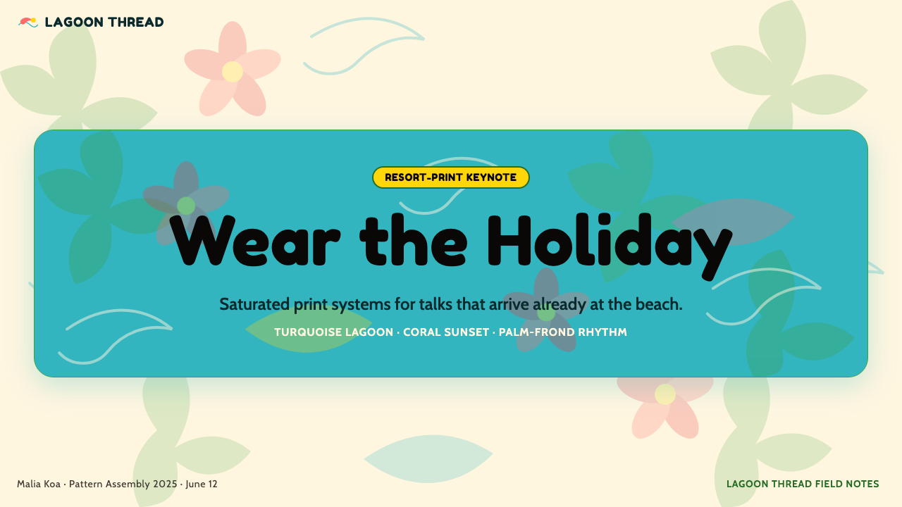
For presentation slides, the aloha aesthetic works best when the content itself invites celebration or carries a positive emotional charge: launch decks, annual summaries with strong results, team culture presentations, event programs, and hospitality pitches. A cover slide benefits from a full-bleed tropical print used as background — dense botanical motifs at reduced opacity behind a clean, rounded typeface in coral or sunshine yellow. Content slides should use a lighter touch: a bordered card or a panel with a small tropical accent at one corner keeps the energy alive without overwhelming body text. Data slides can adopt the palette without the all-over print; bar charts in the signature coral-turquoise-yellow combination read as cheerful and clear against a warm white or cream ground.对于演示文稿,阿罗哈美学在内容本身带有庆典色彩或正面情绪的场景中表现最佳:发布演讲、业绩优异的年度总结、团队文化展示、活动节目单,以及酒店业的商业提案。封面幻灯片适合用全出血热带印花作背景——密集的植物纹样在低透明度下衬托出珊瑚色或阳光黄的圆润字体,清晰易读。内容幻灯片应轻盈一些:有边框的卡片或在一角带有小型热带点缀的面板,能在不压迫正文的前提下保持活力。数据幻灯片可沿用色板而无需全幅印花;以标志性的珊瑚-绿松石-黄色组合呈现的柱状图,在温暖的白色或奶油底色上既欢快又清晰。
For web interfaces, the aloha shirt vocabulary suits consumer-facing products in travel booking, resort and hotel properties, food delivery, outdoor lifestyle, and beverage brands. Dashboard and pricing page applications follow a tropical color hierarchy: a warm cream or pale sand background, primary interactive elements and calls to action in coral or turquoise, secondary information in a softer botanical green. Card components work well with a subtle leafy or floral border motif rather than a plain rule. Navigation should feel open and unhurried — wide letter-spacing in a rounded typeface, generous padding, and an absence of sharp corners across the entire component library. The aesthetic struggles on productivity tools, B2B SaaS platforms requiring perceived authority, or any interface where users arrive under stress.对于网页界面,阿罗哈衬衫视觉语汇适合旅游预订、度假村与酒店、外卖配送、户外生活方式和饮料品牌等面向消费者的产品。仪表板与定价页面的应用遵循热带色彩层级:温暖奶油或浅沙色背景,主要交互元素与行动号召使用珊瑚色或绿松石,次要信息使用更柔和的植物绿。卡片组件适合以细腻的叶片或花卉边框纹样替代普通线条。导航应感觉开放而从容——宽松的字母间距、圆润字体、充裕的内间距,以及整个组件库中对尖锐转角的回避。这套美学在生产力工具、需要体现权威感的B2B SaaS平台,或任何用户带着压力到访的界面上都会力不从心。
For editorial and marketing work, the style delivers a poster-like directness that suits travel features, food writing, summer campaign materials, festival branding, and tourism promotions. A full-bleed tropical print header followed by a clean editorial body is a reliable pattern: the print provides the emotional hook, and the clean typography delivers the content with legibility. Marketing pages benefit from alternating full-color print panels and white-ground sections, allowing the reader to breathe between moments of maximum color. Email headers and social cards in this style have strong stopping power in crowded feeds — the saturated palette and flat illustration quality are immediately recognizable at thumbnail scale.对于编辑与营销内容,这种风格提供海报式的直接冲击力,适合旅游专题报道、美食写作、夏季活动营销素材、节庆品牌设计与旅游推广。全出血热带印花页眉后接清晰的编辑正文,是一种可靠的模式:印花提供情感钩子,干净的排版以易读性传递内容。营销页面通过交替排列全彩印花板块与白底板块获益,让读者在色彩最为浓烈的时刻之间得以喘息。这种风格的邮件页眉和社交媒体卡片在拥挤的信息流中具有强劲的停顿力——饱和的色板与平面插图质感在缩略图尺度下依然具有即时辨识度。
A common mistake when applying the aloha shirt aesthetic is treating every surface as an opportunity for maximum print density. Authentic aloha design — particularly of the Alfred Shaheen era — used the all-over print on the garment itself but understood negative space in compositional elements like labels, tags, and packaging. Applied to digital and print work, this means reserving the full-bleed, edge-to-edge tropical treatment for hero moments and anchor elements, then using solid grounds in palette colors for body sections and secondary components. Using the dense print everywhere simultaneously produces visual fatigue rather than joyful abundance. Another frequent error is choosing motifs without regard for the tradition's specific vocabulary — generic tropical clipart or flat cactus illustrations read as appropriation-without-understanding. The aloha shirt tradition is specific: its motifs, its color logic, and its flat-print quality have cultural weight that generic 'tropical' does not.应用阿罗哈衬衫美学时,一个常见错误是将每一个表面都视为发挥最大印花密度的机会。正宗的阿罗哈设计——尤其是阿尔弗雷德·沙欣时代的作品——在衣物本身使用全幅印花,但在标签、吊牌和包装等构成元素上理解负空间的价值。应用于数字与印刷作品时,这意味着将全出血、延伸至边缘的热带处理保留给视觉焦点与锚定元素,在正文板块与次要组件上改用色板纯色底。将密集印花铺满每一处,产生的是视觉疲劳而非欢快的丰盛感。另一个常见错误是选择图案时不顾及这一传统特定的图案词汇——通用的热带剪贴画或扁平仙人掌插图,传达的是「挪用而不理解」的感觉。阿罗哈衬衫传统非常具体:它的图案、色彩逻辑与平面印刷质感承载着泛泛「热带」所不具备的文化分量。
See the Hawaiian Aloha Shirt design system查看 Hawaiian Aloha Shirt 完整设计系统
Hawaiian Aloha Shirt — FAQHawaiian Aloha Shirt · 常见问题
Is the aloha shirt aesthetic the same as generic tropical design?阿罗哈衬衫美学与泛泛的热带设计是同一回事吗?
No, and the distinction matters. Generic tropical design borrows surface elements — palm trees, pineapples, bright colors — without the structural logic that makes the aloha shirt tradition coherent. Authentic aloha design is defined by specific principles: the all-over print structure with no focal hierarchy, the flat silk-screen print quality, the multicultural motif vocabulary drawing from Polynesian, Japanese, and American mid-century traditions, and the specific palette logic of printing-bright saturated hues on warm grounds. A design that uses tropical clipart against a white background in a conventional figure-ground arrangement is not aloha design — it is tropical decoration. The difference is not pedantic; it produces meaningfully different visual results and communicates meaningfully different cultural signals.不,这一区别很重要。泛泛的热带设计借用了表面元素——棕榈树、菠萝、鲜艳色彩——却没有使阿罗哈衬衫传统得以连贯的结构逻辑。正宗的阿罗哈设计由特定原则定义:没有焦点层级的全幅印花结构、平面丝网印刷质感、汲取波利尼西亚、日本与美国二十世纪中期传统的多元图案词汇,以及将印刷级饱和色彩铺于温暖底面的特定色彩逻辑。在白底上以常规图底关系使用热带剪贴画的设计,不是阿罗哈设计——那是热带装饰。这个区别并非学究式的;它会产生截然不同的视觉结果,传递截然不同的文化信号。
Can this style work for a dark background or night-mode layout?这种风格可以用于深色背景或夜间模式的版面吗?
Yes, with care. The aloha shirt tradition does include dark-ground variants — prints on deep navy, black, or jungle green grounds were common in the Shaheen era and remain classic today. On a dark ground, the palette logic shifts: warm whites and pale yellows take on the role that coral and turquoise play on light grounds, providing contrast and energy. The key constraint is that flat, print-quality colors remain essential — dark-mode aloha design should use rich, saturated mid-tones rather than desaturated pastels or glowing neon. Avoid gradients on dark grounds even more strictly than on light ones, as they immediately break the flat-print visual contract that the tradition depends on.可以,但需谨慎。阿罗哈衬衫传统本身包含深色底面的变体——在深海蓝、黑色或丛林绿底面上的印花在沙欣时代相当普遍,至今仍是经典。在深色底面上,色彩逻辑会发生转变:温暖的白色与浅黄色承担了浅色底面上珊瑚与绿松石的角色,提供对比与活力。关键约束是:平面的、具有印刷质感的色彩依然不可或缺——深色模式的阿罗哈设计应使用丰富、饱和的中调色,而非去饱和的粉彩或发光的霓虹。在深色底面上要比浅色底面更严格地回避渐变,因为渐变会立即破坏这一传统所依赖的平面印刷视觉契约。
How does aloha shirt design differ from other tropical-leisure aesthetics like Tiki or Caribbean?阿罗哈衬衫设计与提基或加勒比海等其他热带休闲美学有何不同?
The three traditions share a tropical palette and leisure orientation but have distinct visual characters. Tiki aesthetic is darker and more artifact-centered: carved wooden figures, bamboo forms, woven textures, and a palette heavy on deep browns, weathered oranges, and jungle greens — it references a fantasy Polynesia seen through American mid-century kitsch. Caribbean design tends toward brighter, more saturated solid colors with geometric or abstract patterning rather than botanical illustration, and draws from reggae-era graphic design, calypso typography, and African diaspora textile traditions. Aloha shirt design is the most illustrative of the three, the most botanically specific, and the most directly connected to a real textile-production tradition rather than a decorative theme. Understanding these distinctions prevents stylistic confusion when selecting the right visual language for a project.三种传统共享热带色板与休闲取向,但具有截然不同的视觉特质。提基美学更为深沉,更以人工制品为中心:雕刻木像、竹制形态、编织质感,以深棕色、风化橙与丛林绿为主调——它参照的是透过美国二十世纪中期媚俗趣味所看到的幻想波利尼西亚。加勒比海设计偏向更明亮、更饱和的纯色,搭配几何或抽象图案而非植物插图,并汲取雷鬼时代平面设计、卡林索音乐字体与非洲离散纺织传统。阿罗哈衬衫设计是三者中插图感最强的,植物细节最为具体,也与真实的纺织生产传统而非装饰主题有最直接的连接。理解这些区别,有助于在为项目选择视觉语言时避免风格混淆。
Is this aesthetic appropriate for serious or professional contexts?这种美学适合严肃或专业的场景吗?
It depends on what kind of seriousness. The aloha shirt tradition has its own form of professional legitimacy — in Hawaii, the aloha shirt has been accepted business attire since the 1960s, and 'Aloha Friday' workplace culture spread across the mainland in the 1990s. In design terms, the aesthetic signals that a product or brand takes pleasure and human warmth seriously, which is a form of professional commitment in hospitality, food, travel, and consumer lifestyle sectors. The style is categorically unsuitable for contexts that require projecting institutional authority, analytical rigor, or financial gravity — banking, medical, legal, or enterprise software interfaces will not be served by it. Used knowingly in the right context, however, it is not less professional than any other design system — it is simply optimized for a different set of human values.这取决于是哪种严肃性。阿罗哈衬衫传统拥有其自身的职业合法性——在夏威夷,阿罗哈衬衫自1960年代起便被接受为商务着装,「阿罗哈星期五」的职场文化在1990年代蔓延至美国大陆。从设计角度看,这种美学传递的信号是:产品或品牌认真对待愉悦与人文温度,这在酒店、餐饮、旅游与消费者生活方式领域是一种职业承诺。这种风格从根本上不适合需要彰显机构权威、分析严谨性或金融稳重感的场景——银行、医疗、法律或企业软件界面都无法从中获益。然而,在合适的场景中有意识地使用,它并不比任何其他设计系统更缺乏专业性——它只是为一套不同的人类价值观而优化。
How do I avoid the aloha shirt aesthetic looking dated or campy?如何避免阿罗哈衬衫美学看起来过时或俗气?
The line between celebration and kitsch is mainly a question of intention and control. Dated or campy aloha design tends to result from three specific errors: using low-resolution or poorly drawn motifs, mixing the tropical palette with drop shadows and other contemporary digital-default effects that break the flat-print visual logic, and applying the style uniformly across all touchpoints without relief. Contemporary aloha-influenced design that reads as fresh tends to edit the motif vocabulary to a smaller, crisper selection; maintain strict flatness across all graphic elements; use the all-over print treatment selectively for hero moments and solid palette colors for supporting elements; and anchor the composition with a typographic system that is clean and current rather than nostalgic. The goal is to honor the tradition's vibrancy without replicating its most commodified mid-century expressions.庆典与媚俗之间的界线,主要是意图与控制的问题。过时或俗气的阿罗哈设计通常源于三个具体错误:使用低分辨率或绘制粗糙的图案,将热带色板与阴影及其他打破平面印刷视觉逻辑的当代数字默认效果混用,以及在所有触点上无差别地均匀铺用这种风格而不留喘息。当代阿罗哈影响的设计之所以显得清新,往往因为:将图案词汇编辑为更小、更精准的选择;保持所有图形元素的严格平面性;将全幅印花处理选择性地保留给视觉焦点时刻,辅助元素改用色板纯色;并以干净而当代(而非怀旧)的字体系统为构图提供锚定。目标是致敬这一传统的活力,而不是复制其最为商业化的二十世纪中期表达。
Related design styles相关设计风格
 Orange Crush Soda (1906)Syrupy nostalgia. Tangerine, cream, and script make it a postcard label.糖浆般怀旧。橘红、奶油纸与手写体把标签变成明信片。
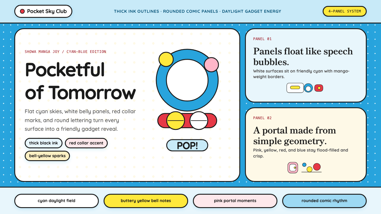 DoraemonChildhood joy, inked bold. Cyan fields, white panels, red collars, and rounde…童年快乐被粗线描出:青蓝底、白面板、红项圈与圆润漫画字。
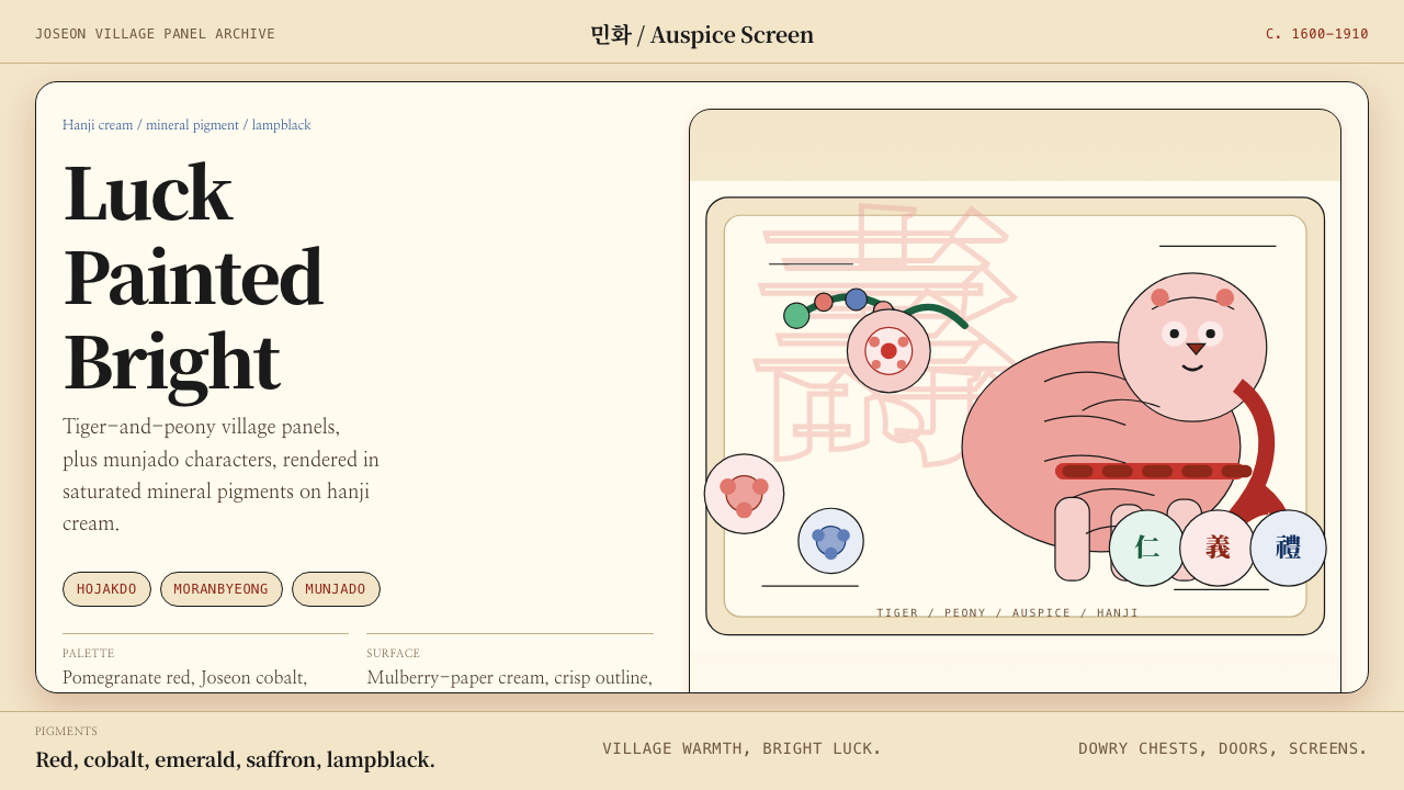 Korean Minhwa (Joseon Folk Painting)Cheerful prosperity over restraint. Mineral reds, cobalt, and lampblack on ha…喜庆胜过克制:矿物红、钴蓝、灯黑线描在韩纸米色底上。
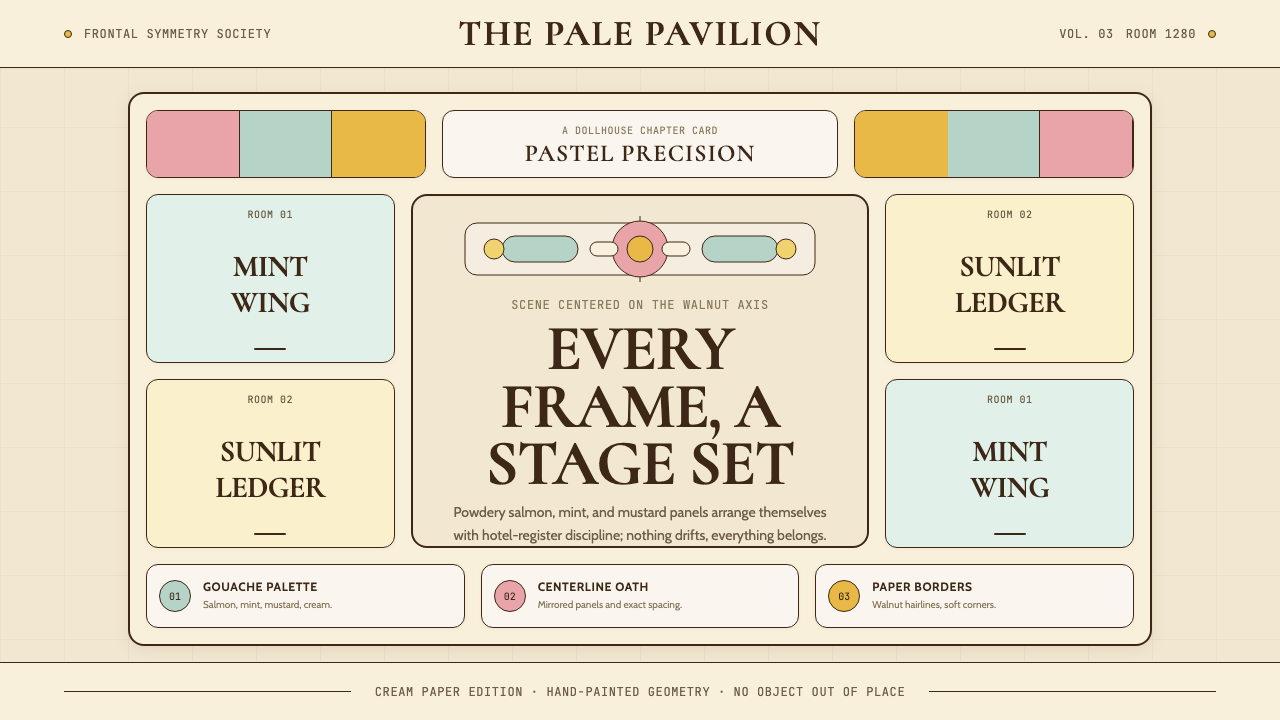 Wes Anderson SymmetricalSymmetry turns warm. Salmon-mint panels, Cabin type, walnut rules stage each…对称让画面变暖:鲑鱼粉与薄荷绿面板、胡桃线框搭成舞台。
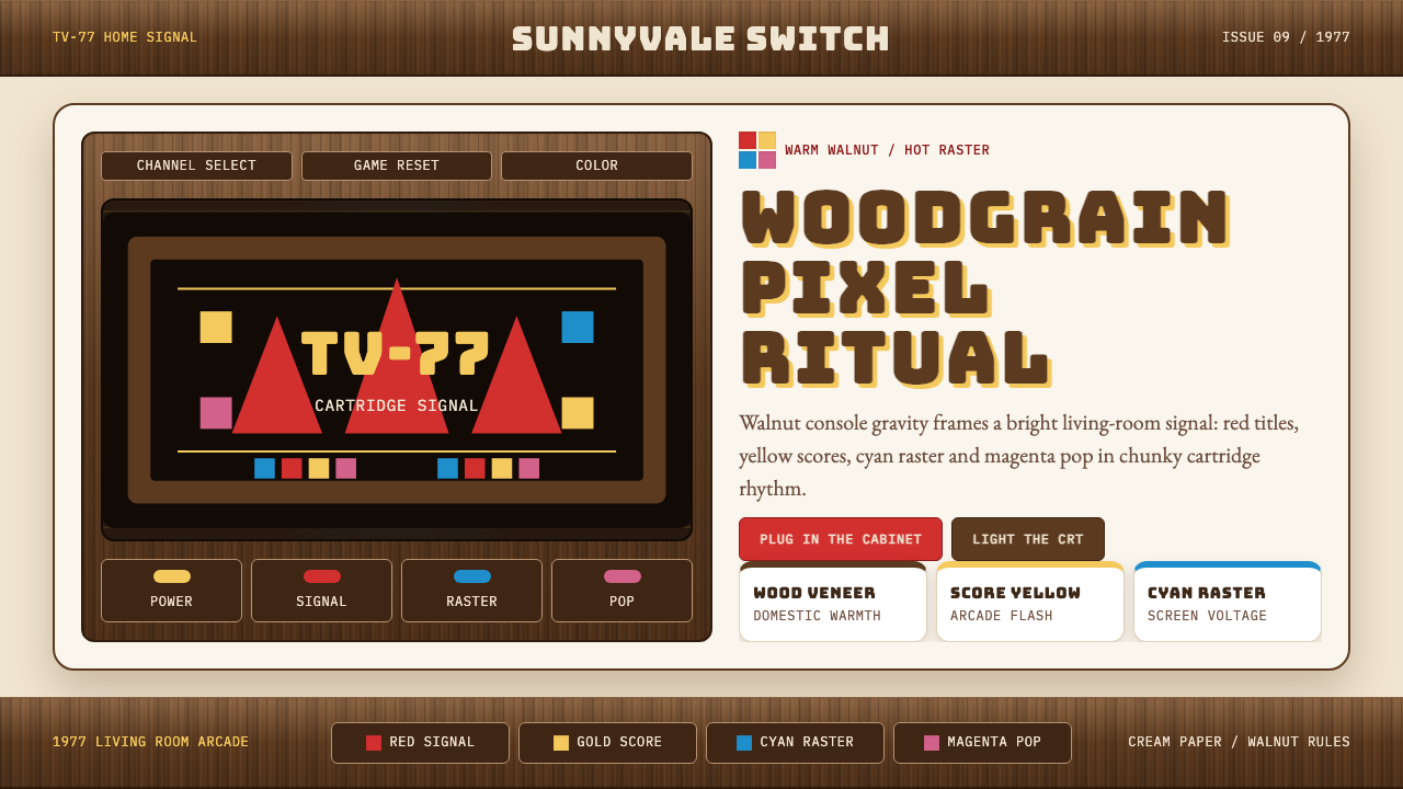 Atari 2600 (Woodgrain)Woodgrain meets raw pixels. Walnut panels frame Bungee type and CMYK raster b…木纹遇上生猛像素:胡桃木面板包裹Bungee字与CMYK色块。
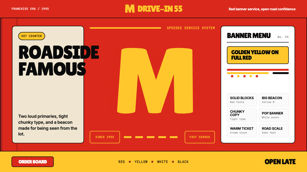 McDonald's Golden ArchesRoadside famous. Saturated red, hot yellow, and chunky type shout from 1955.路边即识别:饱和红、热黄与厚重字体喊出1955。