What is Korean Minhwa (Joseon Folk Painting)?什么是 Korean Minhwa (Joseon Folk Painting)?
Minhwa turns a tiger into a grinning neighbor, a bookshelf into a paradise of color — Joseon Korea's folk painters made prosperity visible with the boldness of someone who has nothing to prove.民画把老虎画成咧嘴而笑的邻居,把书架变成色彩的天堂——朝鲜王朝的村庄画师以一种毫无负担的坦率,让吉祥变得可见。
Korean Minhwa (Joseon Folk Painting) in briefKorean Minhwa (Joseon Folk Painting) 速览
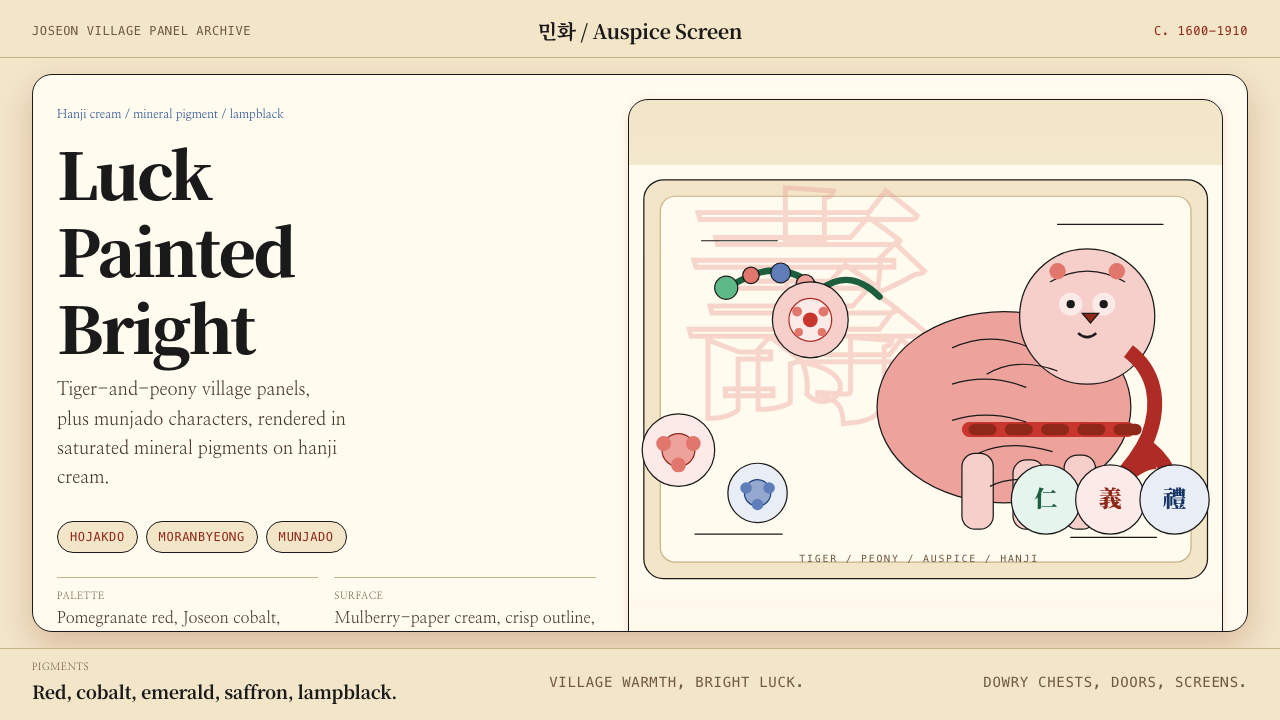
Korean Minhwa — the word means literally 'people's painting' — is the folk-painting tradition that flourished across the Joseon dynasty from roughly 1600 to 1910. Where the ruling literati class practiced restrained ink monochrome to signal their cultured indifference to color, the anonymous village painters of Minhwa did the opposite: they loaded hanji mulberry paper with saturated mineral pigments — pomegranate red, Joseon cobalt, Korean emerald, saffron orange, lampblack — and bounded every passage with a confident, calligraphic outline. The result is an aesthetic of cheerful abundance that reads immediately as warm, symbolic, and distinctly Korean.民画(민화)意为「民众的绘画」,是朝鲜王朝(约1600至1910年)遍布半岛各地的民间绘画传统。统治阶层的士大夫以水墨淡彩彰显超然于色彩之外的文人修养,而匿名的村庄画师则走向截然相反的方向:他们用石榴红、朝鲜钴蓝、朝鲜绿、藏花橙、灯黑等矿物颜料,在韩纸(hanji)桑皮纸上铺满饱和色块,再以自信而富书法感的线条勾勒轮廓。由此形成的美学,是一种愉悦而丰盈的气质——温暖、充满象征、鲜明地属于朝鲜半岛。
The subject matter of Minhwa is almost entirely auspicious. Tigers and magpies face each other from pine branches — the tiger as guardian and wit, the magpie as messenger of good news. Peony screens were painted for wedding rooms to symbolize prosperity and marital happiness. Chaekgeori, or scholar's-bookshelf paintings, filled entire screens with stacked books, brushes, inkstones, bronzeware, and exotic curios — a visual wish-list for learning and worldly attainment. Munjado, or letter paintings, embedded Confucian virtue characters within landscape scenes so that moral teaching could hang on an ordinary wall as decoration. Each subject type was a coded language of aspiration shared between painter and patron.民画的题材几乎清一色为吉祥主题。虎鹊图中,老虎与喜鹊在松枝上遥遥相对——老虎是守护者与机智的化身,喜鹊是报喜的信使。牡丹屏风悬挂于洞房,象征富贵与婚姻美满。册架图(chaekgeori)将书籍、笔墨、砚台、铜器、奇玩陈设于层层画格之中,是对学识与世俗功名的视觉许愿。文字图(munjado)将儒家德目字嵌入山水场景,让道德教化作为装饰挂上普通百姓的墙壁。每一类题材都是画师与主顾之间共享的志愿密语。
The visual character of Minhwa is instantly readable: flat color areas bounded by ink outlines, strong contrast between warm and cool pigments, joyful disregard for naturalistic proportion, and a compositional instinct that prizes symbolic completeness over spatial realism. Tigers are round and striped and wide-eyed; flowers are larger than the vases that hold them; books hover in impossible stacks. This is not naivety — it is a deliberate folk grammar that prioritizes meaning and delight over the illusionistic conventions of court painting.民画的视觉面貌一目了然:以墨线勾边的平涂色块、冷暖颜料之间的强烈对比、对自然比例的欢快漠视,以及将象征完整性置于空间写实性之上的构图本能。老虎圆滚滚、布满条纹、瞪着大眼;花朵比盛放它们的花瓶还大;书本以不可能的角度层叠。这不是笨拙,而是一套有意为之的民间语法——它将意义与喜悦放在首位,而非宫廷绘画的写实幻觉。
Where does Korean Minhwa (Joseon Folk Painting) come from?Korean Minhwa (Joseon Folk Painting) 从何而来?
The roots of Minhwa lie in the ritual painting traditions of Joseon Korea (1392–1910), a Confucian state that organized society along strict hierarchical lines. Court painters at the royal Dohwaseo Bureau produced refined works for the aristocracy; Buddhist temples commissioned icon paintings for worship. But ordinary people — merchants, farmers, and artisans — had their own visual culture. Itinerant painters, often working without formal training and known colloquially as hwajang or 'picture artisans', traveled between villages producing affordable panels, screens, and folded albums for domestic use. The precise origins of Minhwa as a distinct tradition are difficult to date, but by the mid-Joseon period — roughly the seventeenth century — the subject types, pigment palette, and stylistic conventions that define the genre were well established.民画的根源可追溯至朝鲜王朝(1392—1910年)的仪式绘画传统。朝鲜是一个以儒家思想组织社会的国家,等级秩序严密。王室图画署(Dohwaseo)的宫廷画师为贵族绘制精致作品,佛教寺院委托画工制作供奉图像。而普通百姓——商人、农民、工匠——则有自己的视觉文化。走街串巷的画师,通称「画匠」(hwajang,即「画技工匠」),游历于村落之间,为家用生产价格实惠的画板、屏风与折叠册页。民画作为独立传统的确切起源难以精确追溯,但到了朝鲜王朝中期——大约十七世纪——定义这一流派的题材类型、颜料色板与风格程式已然完备确立。
The auspicious subject matter of Minhwa is inseparable from its social function. Joseon society was saturated with symbolic thinking derived from Confucian ethics, Daoist cosmology, and shamanistic folk belief. Certain images were understood to protect a household, attract wealth, promote longevity, or ensure successful childbirth. A tiger painted on a gate ward kept malevolent spirits at bay. Peonies in the bridal chamber signaled prosperity for the new couple. The ten longevity symbols — pine, crane, tortoise, deer, bamboo, sun, water, cloud, mushroom of immortality, and mountain — appeared singly and in combination across cushion covers, lacquerware, embroidery, and painted screens. Minhwa painters codified these symbols into a visual vocabulary that any household could purchase and any viewer could read.民画的吉祥题材与其社会功能密不可分。朝鲜社会浸润于儒家伦理、道家宇宙观与萨满民俗信仰交织而成的象征性思维体系之中。某些图像被认为能保护家宅、招引财富、延年益寿或保佑子嗣顺利降生。绘于门扉的老虎图用以驱退邪灵;洞房里的牡丹象征新人的富贵;十长生——松、鹤、龟、鹿、竹、日、水、云、灵芝、山——单独或组合出现在坐垫、漆器、刺绣与画屏上。民画画师将这些象征符号整理成一套视觉词汇,任何家庭都可以购买,任何观者都能读懂。
The aesthetic that distinguishes Minhwa from the literati tradition it implicitly challenges was shaped by the conditions of its production. Village painters worked quickly, from memory and conventional templates, on absorbent hanji paper that rewarded confident single-pass brushwork over labored revision. Mineral pigments — mined and ground rather than ink-suspended — demanded flat, opaque application. The lampblack outline, drawn with a brush loaded generously and moved with calligraphic rhythm, became the defining structural element that held color areas together and gave figures their characteristic expressiveness. These practical constraints produced an aesthetic signature: bold, flat, outlined, and warm.将民画与其隐然挑战的文人传统区分开来的美学,是由其生产条件塑造的。村庄画师凭记忆和程式模板快速作画,所用的韩纸(hanji)桑皮纸吸水性强,奖励一气呵成的自信用笔,而非反复修改的费力劳作。矿物颜料——以研磨矿石而非墨水悬浮的方式制成——要求平涂、不透明地敷色。以大量饱蘸墨汁的毛笔、带着书法节奏一挥而就的灯黑轮廓线,成为将色块凝聚、赋予形象独特表情的核心结构元素。这些实践限制产生了鲜明的美学签名:大胆、平涂、勾线、温暖。
The twentieth-century rediscovery of Minhwa is largely credited to Yanagi Soetsu (1889–1961), the Japanese philosopher and founder of the Mingei folk-craft movement, who encountered Korean folk art during Japan's colonial administration of Korea and recognized in it a quality of unconscious beauty he called 'beauty without the self.' Yanagi's writings drew international attention to Minhwa at a time when it was in danger of being forgotten. Korean collector and scholar Cho Jayong subsequently devoted decades to gathering and documenting Minhwa works. Since the 1980s, Minhwa has undergone a full cultural revival in South Korea, with its imagery appearing in fashion, packaging, digital media, and contemporary fine art — a folk tradition that became one of the defining visual signatures of Korean cultural identity on the global stage.民画在二十世纪的重新发现,在很大程度上归功于日本哲学家、民艺运动创始人柳宗悦(1889—1961年)。他在日本殖民朝鲜期间接触到朝鲜民间艺术,从中发现了他称之为「无我之美」的无意识之美。柳宗悦的著述在民画濒临被遗忘之际,引发了国际社会对它的关注。韩国收藏家和学者赵子庸(Cho Jayong)此后数十年间致力于搜集与记录民画作品。自1980年代以来,民画在韩国经历了全面的文化复兴,其图样频繁出现于时尚、包装、数字媒体与当代艺术之中——一个民间传统,成为韩国文化身份在全球舞台上最具辨识力的视觉符号之一。
What defines the Korean Minhwa (Joseon Folk Painting) look?Korean Minhwa (Joseon Folk Painting) 的视觉特征是什么?
Palette色板
Minhwa works in a palette of five to seven saturated mineral pigments arranged on a warm cream hanji ground. Pomegranate red and Joseon cobalt blue are the defining poles — warm and cool, advancing and receding — with Korean emerald green, saffron orange, and white serving as secondary voices. The pigments are opaque and densely applied, creating flat color areas with a powdery, almost velvety surface quality. Black, used for outlines and calligraphic accents, is the darkest value in the system. The overall chromatic effect is cheerful, legible, and deliberately festive rather than refined or restrained.民画以五至七种矿物颜料在温暖的韩纸米色底上展开。石榴红与朝鲜钴蓝是定义性的两极——暖与冷、前进与后退——朝鲜绿、藏花橙与白色充当副声部。颜料不透明、厚实敷涂,形成带有粉质甚至绒感的平涂色块。灯黑用于轮廓线和书法性点缀,是整个体系中最深的色调。整体色彩效果是愉快的、清晰的,刻意具有节庆感,而非精致或克制。
Outline轮廓线
The lampblack ink outline is the structural spine of Minhwa composition. Drawn with a fully loaded brush in a single confident pass, the line varies in thickness as the brush pivots — swelling at corners, tapering at tips — giving figures a calligraphic vitality that flat color alone could not achieve. The outline simultaneously defines form, contains color, and provides the rhythmic energy that makes Minhwa compositions feel animated rather than static. In skilled hands, the line quality alone identifies the work as Minhwa: it is neither the trembling fine line of a court miniature nor the dry dragged stroke of literati ink painting.灯黑墨线是民画构图的结构脊梁。以充分蘸墨的毛笔一气贯通,线条随笔锋转动而粗细变化——在转角处鼓胀,在尖端收细——赋予形象一种仅靠平涂色彩无法实现的书法性生命力。轮廓线同时定义形体、容纳色彩,并提供让民画构图感觉生动而非静止的节律能量。在有经验的画师笔下,线质本身便能认定作品为民画:它既不是宫廷细密画颤抖的极细线,也不是文人水墨画干涩拖拉的笔触。
Symbolic Subjects象征题材
Every Minhwa subject type carries a specific symbolic program understood by any Joseon viewer. Tigers ward off evil; magpies bring good news; cranes and pines signal longevity; peonies indicate wealth and marital bliss; pomegranates with split skins show abundant progeny; bats (their name a homophone for 'good fortune' in Korean) scatter across textiles and painted panels as auspicious scatter-pattern ornament. Chaekgeori bookshelf paintings encode the aspiration for scholarly achievement. Munjado letter paintings make Confucian virtues — loyalty, filial piety, trust, propriety — visually present in the domestic space. The symbolic density of the imagery is what gives Minhwa its distinctive combination of decorative richness and moral seriousness.民画的每一类题材都承载着朝鲜王朝任何观者都能理解的特定象征程序。老虎驱邪,喜鹊报喜,鹤与松象征长寿,牡丹代表富贵与婚姻幸福,裂开露籽的石榴寓意多子多孙,蝙蝠(其名称在韩语中与「福」谐音)作为吉祥散花图样散布于布料与画幅之上。册架图编码了对学识成就的期许;文字图则将儒家德目——忠、孝、信、礼——在家居空间中以视觉形式呈现。图像的象征密度,正是赋予民画那种独特的装饰丰盛与道德庄重并存气质的根本所在。
Joyful Proportion喜庆比例
Minhwa deliberately departs from naturalistic proportion in ways that are immediately charming. Animals are round-bodied, large-headed, and wide-eyed — the Joseon tiger in particular has been reduced from a fearsome predator to a friendly, slightly bewildered companion who is too fat and happy to menace anyone. Flowers overflow their containers. Cranes tuck improbably large heads under improbably small wings. This is not the result of technical limitation but of a folk-painting logic that prioritizes emotional truth over optical accuracy: things that are important are made large, things that are friendly are made round, things that are auspicious are made bright.民画刻意以令人亲切的方式偏离自然比例。动物圆滚滚的身体、大头、圆眼——朝鲜王朝的老虎尤为如此,它从令人生畏的猛兽被简化为友善、略带迷茫的伴侣,圆胖而快乐,全然没有威胁性。花朵溢出容器之外,仙鹤把大得离谱的头埋在小得离谱的翅膀下。这不是技术局限的结果,而是一种民间绘画逻辑——它将情感真实置于视觉准确之上:重要的东西画大,友善的东西画圆,吉祥的东西画亮。
Flat Depth平面深度
Minhwa does not use cast shadows, linear perspective, or atmospheric recession to create spatial depth. Figures appear on the picture surface as a series of overlapping flat planes, with spatial relationships indicated by vertical position — higher on the panel reads as farther back — or by a conventional stacking logic derived from the subject type itself (books in chaekgeori, for instance, are arranged in a flat-fronted system that reads as both a view into shelves and a decorative pattern simultaneously). This flat-depth approach is what makes Minhwa imagery so compatible with contemporary digital surfaces: it is already native to two dimensions.民画不使用投射阴影、线性透视或大气退晕来制造空间深度。形象以一系列叠压的平面层次呈现于画面表面,空间关系由垂直位置暗示——画面较高处意味着较远——或由题材类型本身衍生的惯例性叠加逻辑来表达(例如,册架图中的书籍采用正面平铺的排列方式,可以同时被读作对书架的透视与装饰图案)。这种平面深度处理方式,正是民画图样与当代数字界面如此相容的根本原因:它天然属于二维空间。
Pattern and Repetition图案与重复
Many Minhwa formats use systematic repetition as a compositional strategy. Chaekgeori bookshelf panels divide the picture surface into a grid of compartments, each containing a still-life grouping rendered in the same flat descriptive manner. Flower-and-bird compositions repeat the pairing of blossoming branch and avian figure across multiple panels of a folding screen, creating a rhythm that is both decorative and encyclopedic. This taste for organized repetition — a kind of visual listing of abundance — gives Minhwa a pattern-like quality that is distinct from both the gestural spontaneity of literati ink painting and the hierarchical order of court portraiture.许多民画形式将系统性重复作为构图策略。册架图将画面分割为一格格的方格,每格内盛放一组以相同平涂描述方式呈现的静物。花鸟图在折叠屏风的多个画幅上反复组合花枝与鸟雀,形成一种既有装饰性又具百科全书感的节奏。这种对有序重复的偏好——一种对丰盛的视觉罗列——赋予民画一种图案般的质感,使它有别于文人水墨画的笔墨即兴,也有别于宫廷画像的等级秩序。
Hanji Ground韩纸底色
The support for most Minhwa work is hanji, a handmade paper produced from the inner bark of the paper mulberry tree. Hanji has a warm cream tone, a slightly textured surface, and exceptional absorbency. The warm ground temperature interacts with the mineral pigments laid over it, pushing the reds warmer and softening the blues, and it shows through wherever the paint application is thin. The result is that even heavily worked Minhwa panels retain a luminous quality — the ground breathes through the pigment — that distinguishes them from the harder appearance of work on silk or Western paper. In contemporary digital Minhwa-inspired work, the equivalent is a warm off-white or cream background rather than a pure white.大多数民画作品的底材是韩纸(hanji),一种以构树内皮制成的手工纸。韩纸带有温暖的米色调,表面略有纹理,吸水性极强。温暖的底色温度与其上的矿物颜料相互作用,使红色更暖,使蓝色更柔,并在颜料薄涂处透出底色。结果是,即使是描绘密集的民画画幅也保有一种发光的质感——底色透过颜料呼吸——使其有别于绢本或西式纸张上作品的更硬朗面貌。在当代数字化的民画风格创作中,对应之物是温暖的米白色或奶油色背景,而非纯白色。
Who shaped Korean Minhwa (Joseon Folk Painting)?谁塑造了 Korean Minhwa (Joseon Folk Painting)?
The vast majority of Minhwa works were produced by anonymous artisan-painters who traveled between villages, working from memory and conventional templates without formal academic training. Their anonymity is not a gap in the historical record but a structural feature of the tradition: Minhwa painting was understood as craft production rather than individual artistic expression, and painters did not sign their work. The consistent quality and remarkable stylistic coherence of Minhwa across two centuries of village production testifies to the strength of the oral and workshop transmission systems through which technique and iconographic programs were passed from senior to junior painters.绝大多数民画作品出自匿名的工匠画师,他们游走于村落之间,凭记忆和程式模板创作,从未受过正式学院训练。他们的匿名性不是历史记录的缺失,而是这一传统的结构性特征:民画绘制被理解为手工生产而非个人艺术表达,画师不在作品上署名。民画在两个世纪村庄生产中所呈现的稳定质量与显著风格一致性,印证了口传与作坊传承体系的强大——技法与图像程序正是通过这一体系从前辈画师传递给后辈的。
Yanagi Soetsu (1889–1961) was the Japanese philosopher and aesthetician who founded the Mingei folk-craft movement and became the single most important outside advocate for Minhwa's artistic and cultural significance. Encountering Korean folk art during Japan's colonial administration of the peninsula, Yanagi recognized in Minhwa a quality he described as 'beauty born of sadness' and 'the beauty of necessity' — art produced not for self-expression but for use, not by trained elites but by working people. His 1922 essay on Korean folk art and his later collection of Joseon ceramics and textiles drew international attention to a tradition that Korean intellectuals of the era — caught between colonial pressure and the prestige of Western modernism — had not yet fully recognized as their own heritage.柳宗悦(1889—1961年)是日本哲学家与美学家,民艺运动创始人,也是迄今最重要的民画艺术与文化价值的外部倡导者。在日本殖民朝鲜半岛期间接触到朝鲜民间艺术后,柳宗悦从民画中发现了他所描述的「悲哀之美」与「必要之美」——不为自我表达而生、而为使用而生的艺术,不是由受过训练的精英创作,而是由劳动人民创作。他于1922年撰写的朝鲜民间艺术论文,以及他后来收藏的朝鲜陶瓷与织物,引发了国际社会对这一传统的关注——当时的朝鲜知识界,在殖民压力与西方现代主义的威望之间两难,尚未充分将民画认作本民族的遗产。
Cho Jayong (1926–2000) was the Korean collector, educator, and folk-art advocate who more than any other individual is responsible for the systematic preservation and scholarly documentation of Minhwa in the twentieth century. Beginning in the 1970s, Cho assembled a major private collection of Minhwa panels and screens at a time when the works were still widely undervalued and sold cheaply at antique markets. He founded the Emille Museum near Seoul — one of the first institutions in Korea dedicated to folk and applied arts — and his publications and exhibitions established the scholarly frameworks within which Minhwa is now understood. The contemporary revival of Minhwa as a living design vocabulary owes much to the archive and the critical language that Cho built.赵子庸(1926—2000年)是韩国收藏家、教育家和民间艺术倡导者,在二十世纪对民画系统性保护与学术记录的贡献,超过任何其他个人。自1970年代起,赵子庸开始收藏民画画板与屏风,彼时这些作品仍被普遍低估,在古玩市场上廉价出售。他在首尔附近创立了艾美利博物馆(Emille Museum)——韩国最早致力于民间艺术与应用艺术的机构之一——其出版物与展览建立了当今理解民画的学术框架。民画作为活的设计词汇在当代的复兴,在很大程度上得益于赵子庸所建立的档案与批评语言。
Lee Dong-jae is a contemporary Korean artist and educator who has been central to the revival of Minhwa as a practiced art form rather than a museum artifact. Working from the late twentieth century onward, Lee trained in traditional Minhwa technique — mineral pigments on hanji, lampblack outline, conventional iconographic programs — and has both practiced and taught the tradition while simultaneously engaging with questions of how folk-painting vocabulary can operate in contemporary contexts. His influence runs through the network of Minhwa studios and cultural education programs that have spread across South Korea since the 1980s, helping to ensure that Minhwa is transmitted as embodied craft knowledge and not merely as archival image.李东在(Lee Dong-jae)是当代韩国艺术家和教育家,在将民画从博物馆藏品复兴为活态艺术实践的进程中居于核心地位。自二十世纪晚期起,李东在接受了传统民画技法训练——韩纸上的矿物颜料、灯黑轮廓线、传统图像程序——既亲身实践又传授这一传统,同时探讨民间绘画词汇如何在当代语境中运作。他的影响力渗透于自1980年代以来在韩国各地扩展的民画工作室与文化教育网络,有助于确保民画作为具身的工艺知识而非仅仅作为档案图像得以传承。
How do you use Korean Minhwa (Joseon Folk Painting) today?今天怎么用 Korean Minhwa (Joseon Folk Painting)?
Minhwa is one of the most distinctive historical design vocabularies available to contemporary practitioners precisely because it is so immediately readable as warm, symbolic, and culturally specific. Applying it well requires understanding what the visual system is actually doing — using saturated flat color to create a sense of festive abundance, using bold outline to give every element a confident presence, using symbolic subject matter to carry meaning beyond pure decoration — rather than simply borrowing its surface appearance.民画是当代实践者可用的最具辨识力的历史设计词汇之一,原因正在于它能被立刻读作温暖的、充满象征的、具有文化特殊性的。正确应用它,需要理解这套视觉系统实际上在做什么——用饱和的平涂色彩创造节庆丰盈感,用粗轮廓赋予每个元素自信的存在感,用象征题材承载超越纯粹装饰的意义——而非仅仅借用它的表面外观。
For presentation slides, Minhwa works best in contexts that call for cultural warmth, celebratory tone, or distinctive brand personality. A cover page benefits from a strong asymmetric arrangement: a symbolic motif — a single bold tiger or a peony cluster — occupies one zone of the slide while the title appears in high-contrast lettering against the warm cream ground. The hanji-cream background is the tonal anchor for the whole system; switching it to pure white loses the warmth that makes the palette cohesive. Content slides should restrain the color to two or three from the mineral palette, using one warm tone (such as the pomegranate red) for emphasis and the cream field for the majority of the surface. Data slides can borrow the chaekgeori compartment logic — organizing charts and figures into bordered zones that echo the shelf-grid format — to make numbers feel curated rather than clinical.对于演示文稿,民画在需要文化温度、庆典感或鲜明品牌个性的场合表现最佳。封面页适合强烈的非对称布局:一个象征性母题——单只粗犷的老虎或一簇牡丹——占据幻灯片的一个区域,标题以高对比度字体出现在温暖的韩纸米色底面上。韩纸奶油色背景是整个体系的色调锚点;换成纯白色会失去使色板保持凝聚力的温度。内容页应将色彩限制在矿物色板的两到三种,以一种暖色调(如石榴红)作强调,奶油底色占据大部分画面。数据页可以借用册架图的格格分隔逻辑——将图表与数据组织进有边框的区块,呼应书架格的形式——使数字呈现出经过精心编排的质感,而非临床的冷漠感。
For web interfaces and dashboards, Minhwa's flat-depth logic and strong chromatic contrast translate well to card-based layouts. Use the cream or warm off-white as the page background, with mineral red or cobalt as the primary accent for active states and calls to action. Borders — in the Minhwa tradition, everything is outlined — replace shadow-based depth; cards and panels gain presence through a solid, moderately weighted border rather than a drop shadow. Icon systems benefit from the Minhwa approach: flat, outlined, colored with a single mineral tone, with any figurative elements simplified toward the rounded, friendly proportions of folk iconography. Pricing and tier pages can use the symbolic palette to differentiate tiers — warm red for premium, cobalt for standard, emerald for economy — in a way that feels culturally grounded rather than arbitrary.对于网页界面与仪表板,民画的平面深度逻辑与强烈的色度对比很好地适用于卡片式布局。以奶油色或温暖的米白色作页面背景,以矿物红或钴蓝作活动状态与行动号召的主色强调。边框——在民画传统中,一切都有轮廓线——取代基于阴影的深度;卡片与面板通过一条实体的、适度粗细的边框获得存在感,而非靠投影。图标系统从民画方式中获益:平涂、勾线、以单一矿物色调着色,任何具象元素都向民间图像的圆润友善比例简化。定价与等级页面可以用象征性色板区分层级——暖红代表高端,钴蓝代表标准,翠绿代表经济——以一种在文化上扎实而非随意的方式呈现。
For editorial and marketing work, Minhwa's poster-like boldness and rich symbolic vocabulary support storytelling-driven design. A feature article layout can use a large Minhwa-derived motif as a full-bleed opening visual — a patterned background of repeated crane and cloud elements, for instance — with body text set in high-contrast lettering on a cream or white field. Marketing pages benefit from the alternating compartment structure: full-width sections alternate between cream-on-deep-cobalt and black-on-cream, echoing the visual rhythm of a Minhwa folding screen. The symbolic specificity of the imagery rewards considered selection: choosing a peony motif for a luxury goods brand, a magpie-and-pine for a communications platform, or a chaekgeori-inspired bookshelf arrangement for an education or knowledge product aligns visual language with brand meaning at a level that purely decorative pattern cannot achieve.对于编辑与营销内容,民画的海报式大胆感与丰富的象征词汇支持叙事驱动的设计。一篇特稿的版面可以用大幅民画衍生母题作全出血开篇视觉——例如,以重复鹤云纹样构成的图案化背景——正文以高对比度字体排印于奶油或白色底面上。营销页面适合交替格格结构:全宽区块在深钴蓝底奶油字与奶油底黑字之间交替,呼应民画折叠屏风的视觉节奏。图像的象征性特殊性使经过考量的选择获得回报:为奢侈品牌选择牡丹母题,为通信平台选择喜鹊与松树,为教育或知识产品选择受册架图启发的书架排列——将视觉语言与品牌意义在纯装饰图案无法触及的层面上对齐。
A common mistake when applying Minhwa is treating it as a flat-illustration style that can be executed with any bold color combination. The warmth and coherence of the authentic Minhwa palette depend on the specific relationships between its mineral tones — particularly the interplay of pomegranate red, Joseon cobalt, and the warm cream ground. Substituting bright digital primaries for the mineral pigments produces a result that reads as generic folk-art pastiche rather than Minhwa. Similarly, the outline is not optional decoration: removing it to create a 'cleaner' version loses the calligraphic energy that gives the style its vitality. A second frequent error is using Minhwa imagery as wallpaper — scattering tiger and peony motifs across a background — without engaging its symbolic logic. Minhwa imagery was always placed with intentional meaning; treating it as pure surface pattern evacuates exactly the quality that makes it culturally resonant.应用民画时最常见的错误,是把它当作一种可以用任何大胆色彩组合执行的平涂插画风格。真实民画色板的温度与凝聚力,依赖于其矿物色调之间的特定关系——尤其是石榴红、朝鲜钴蓝与温暖奶油底色之间的相互作用。用明亮的数字原色替代矿物颜料,产生的结果会被读作泛化的民间艺术仿制品,而非民画。同样,轮廓线不是可选的装饰:为追求「更简洁」而去掉它,会失去赋予这种风格生命力的书法能量。另一个常见错误是将民画图样用作壁纸——将老虎与牡丹母题散布于背景之上——而不介入其象征逻辑。民画图样从来都是有意为之、带着明确含义摆放的;将其视为纯粹的表面图案,恰恰抽空了使它具有文化共鸣的那种品质。
Korean Minhwa (Joseon Folk Painting) — FAQKorean Minhwa (Joseon Folk Painting) · 常见问题
How is Minhwa different from other East Asian folk-painting traditions?民画与其他东亚民间绘画传统有何不同?
Minhwa shares the broad category of East Asian folk painting with Chinese New Year prints (nianhua), Japanese Otsu-e, and Vietnamese Dong Ho painting, but it is distinctively Korean in its color palette, iconographic program, and compositional sensibility. Chinese nianhua tend toward a denser, more symmetrical composition and a brighter, more festive red-and-gold palette. Japanese Otsu-e is looser and more gestural, with a more limited subject range. Vietnamese Dong Ho woodblock prints use a warm earthy palette quite different from the mineral brightness of Minhwa. What distinguishes Minhwa most clearly is the combination of Joseon-specific symbols (the tiger-magpie pairing, the chaekgeori bookshelf format, munjado letter paintings), the characteristic lampblack outline on hanji ground, and an approach to proportion and form that is simultaneously humorous and dignified — a quality that seems to arise from the tradition's roots in both shamanic folk religion and Confucian moral culture.民画与中国年画、日本大津绘、越南东湖画同属东亚民间绘画大类,但其色板、图像程序与构图感性鲜明地属于朝鲜半岛。中国年画趋于构图更密、更对称,色板以更鲜亮的红金节庆调为主。日本大津绘更疏松、更具笔触感,题材范围也更有限。越南东湖木版印画使用与民画矿物明亮感截然不同的温暖土色系。最鲜明地区别民画的,是朝鲜王朝特有象征(虎鹊组合、册架图格式、文字图)的组合、韩纸底上标志性的灯黑轮廓线,以及一种对比例与形态的处理方式——同时带有幽默感与庄重感——这种品质似乎源于传统扎根于萨满民俗信仰与儒家道德文化双重土壤的历史。
Can Minhwa work in a dark-background digital context?民画风格能在深色背景的数字界面中使用吗?
Minhwa is historically a light-ground tradition — the warm hanji cream is not incidental but structural, warming the entire chromatic system. A dark-ground version is possible, but it requires careful adjustment. On a deep background, the mineral palette loses the warmth of the hanji interaction; the pomegranate red will read as more aggressive, and the cobalt will cool considerably. The approach that works best is to invert the hierarchy — use the cream or a light mineral tone as the foreground color for outlines and type, and select one accent from the warm end of the palette (the saffron orange or a muted red-orange) for emphasis, while avoiding the full mineral saturation that works on a light ground. The outline, however, should remain — a dark Minhwa without bold line becomes an entirely different and much less Minhwa-specific aesthetic.民画在历史上是浅底色传统——温暖的韩纸奶油色并非偶然,而是结构性的,它温暖着整个色彩体系。深底色版本是可行的,但需要仔细调整。在深色背景上,矿物色板失去了与韩纸相互作用的温度;石榴红会显得更具攻击性,钴蓝会大幅降温。最有效的做法是倒置层级——将奶油色或浅矿物色调用作轮廓线与文字的前景色,从色板的暖端选取一种(藏花橙或偏暖的红橙色)作强调,同时避免浅底上有效的全饱和矿物色。但轮廓线应当保留——没有粗轮廓线的深色民画会变成一种完全不同的、民画特色大为减弱的美学。
Is it appropriate to use Minhwa imagery outside a Korean cultural context?在韩国文化语境之外使用民画图样是否合适?
Minhwa imagery carries specific symbolic meaning within Korean culture, and using it with awareness of that meaning — rather than as generic 'Asian folk art' surface pattern — is both more respectful and more effective design. The tiger-and-magpie pairing, for instance, is a very specific Korean cultural icon with a particular narrative tradition; using it as pure decoration without acknowledging its cultural origin produces a thinner result than using it with intentional symbolic weight. The technique and aesthetic vocabulary of Minhwa — flat mineral color, bold lampblack outline, warm hanji-inspired ground, the proportional logic of joyful distortion — can be appropriated as a design system without directly reproducing its iconography, and this approach tends to produce more original and less culturally fraught outcomes.民画图样在韩国文化中承载着特定的象征意义,带着对这种意义的认知使用它——而非将其作为泛化的「亚洲民间艺术」表面图案——既更为尊重,也能产生更有效的设计。例如,虎鹊组合是一个非常具体的韩国文化符号,有其特定的叙事传统;在没有承认其文化起源的情况下纯粹作为装饰使用,结果会比带着有意为之的象征重量使用薄弱得多。民画的技法与美学词汇——矿物平涂色彩、粗灯黑轮廓线、受韩纸启发的温暖底色、喜庆变形的比例逻辑——可以作为设计系统加以借鉴,而无需直接复制其图像体系,这种方式往往能产生更具原创性且文化摩擦更少的结果。
How does Minhwa relate to contemporary K-design and Korean visual culture?民画与当代韩流设计及韩国视觉文化有何关联?
Minhwa has experienced a sustained revival in South Korean visual culture since the 1980s that has accelerated considerably in the context of the global spread of Korean pop culture. Its imagery appears in collaboration collections from major fashion houses, in the packaging of Korean cosmetics and food brands, in the opening sequences of Korean drama and film productions, and in the graphic identities of cultural events from the 2018 PyeongChang Winter Olympics onward. Contemporary Korean designers and illustrators often work with the Minhwa palette and subject vocabulary in ways that are explicitly hybrid — combining the folk visual grammar with modernist composition, digital media, and international typography. The tiger in particular has become a broadly recognized symbol of Korean cultural identity, its rounded Minhwa form circulating globally as both cultural branding and contemporary art reference.自1980年代以来,民画在韩国视觉文化中经历了持续的复兴,在韩流流行文化全球扩散的背景下,这一进程加速得尤为显著。其图样出现于各大时尚品牌的联名系列、韩国化妆品与食品品牌的包装、韩剧与韩国电影的片头序列,以及自2018年平昌冬奥会以来的文化活动视觉识别之中。当代韩国设计师与插画师常常以明确的混合方式运用民画的色板与题材词汇——将民间视觉语法与现代主义构图、数字媒介和国际字体排印结合在一起。老虎尤其成为被广泛认知的韩国文化身份象征,其圆润的民画形态作为文化品牌与当代艺术参照在全球流通。
What is the difference between Minhwa and Korean court painting?民画与朝鲜王朝宫廷绘画有何区别?
Korean court painting and Minhwa existed in the same historical period but operated within entirely different institutional, technical, and aesthetic frameworks. Court painters at the Dohwaseo Bureau were salaried government officials who trained rigorously in both Korean and Chinese painting conventions, and their work — royal portraits, ceremonial scrolls, documentary paintings of court events — was governed by strict iconographic protocols and assessed by criteria of technical refinement. Minhwa painters were itinerant artisans with no institutional affiliation, working from conventional templates, and evaluated primarily by how effectively their work served its domestic and ritual purposes. Technically, court painting uses a much wider tonal range, more nuanced brushwork, and often incorporates ink monochrome alongside mineral color. Aesthetically, court painting prizes refinement, restraint, and fidelity; Minhwa prizes expressiveness, symbolic clarity, and warmth. The two traditions occasionally influenced each other — court painters sometimes worked on folk-format screens; Minhwa painters sometimes borrowed court iconographic programs — but they represent genuinely distinct visual cultures.朝鲜王朝的宫廷绘画与民画共存于同一历史时期,却在完全不同的制度、技术与美学框架内运作。图画署的宫廷画师是领薪俸的政府官员,严格训练于朝鲜与中国绘画传统,其作品——王室肖像、仪式长卷、宫廷活动纪实画——受严格的图像程序规范,以技术精湛为评判标准。民画画师是没有任何机构归属的游走工匠,依照惯用模板作画,评判标准主要是其作品在家庭使用与仪式目的上的实效性。在技法上,宫廷绘画使用更宽广的色调范围,笔墨更为细腻,常常将水墨与矿物色彩并用。在美学上,宫廷绘画崇尚精致、克制与忠实;民画崇尚表现力、象征清晰与温度。两种传统偶尔相互影响——宫廷画师有时在民间格式的屏风上作画,民画画师有时借用宫廷图像程序——但它们代表着真正不同的视觉文化。
Related design styles相关设计风格
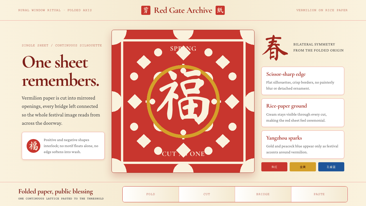 Chinese Jianzhi Paper-CuttingRitual red, cut as one. Vermilion lacework on rice-paper cream locks every sh…仪式性的红,一剪成片。朱红镂空压在米黄纸上,所有形都扣住中轴。
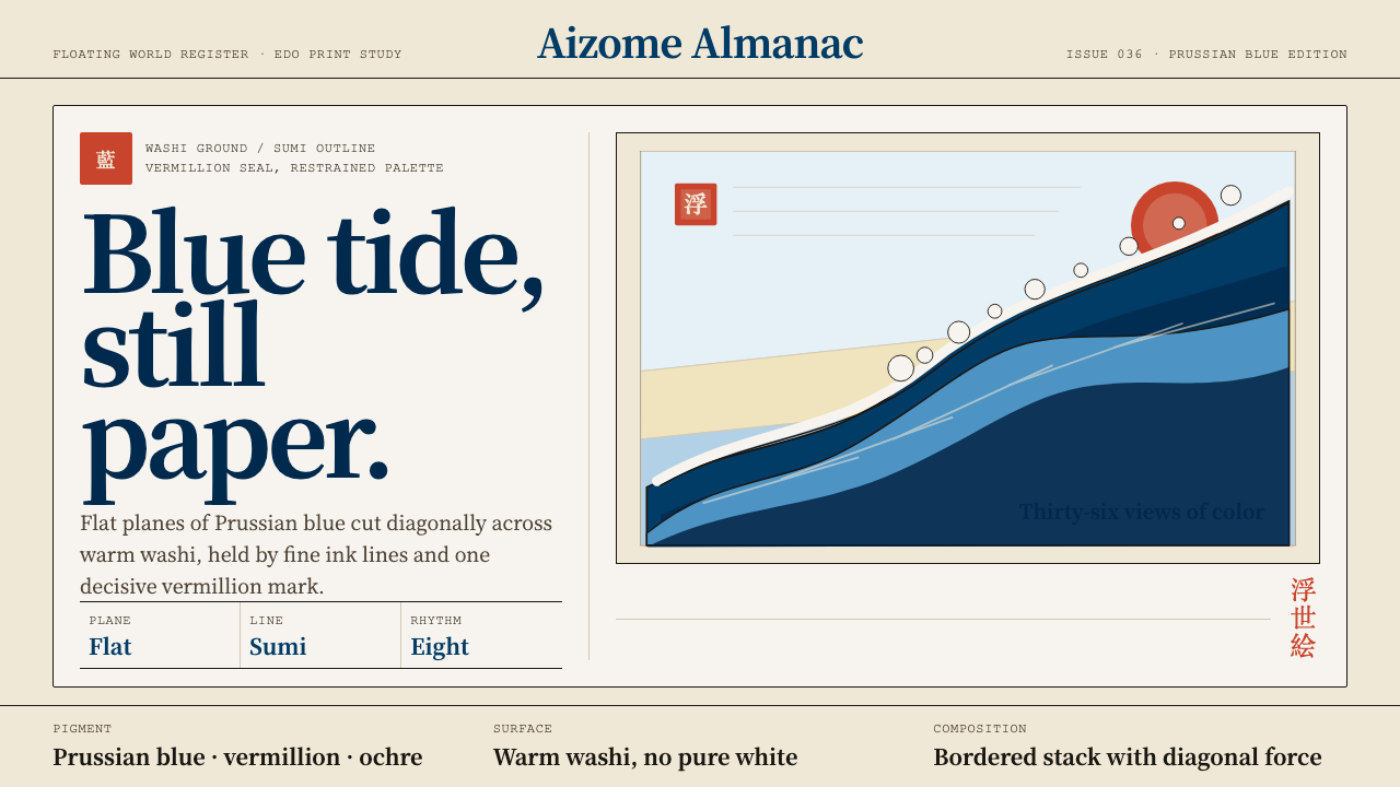 Edo Ukiyo-e (Hokusai)Flat power on paper. Prussian blue diagonals and vermillion seals cut across…纸上有力:普鲁士蓝对角线与朱红印章切入暖和纸。
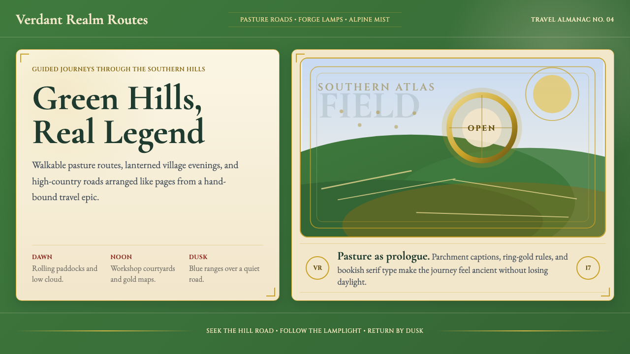 NZ Lord of the Rings TourismEpic feels approachable. Pasture green, ring-gold, and Garamond book frames.史诗却亲近:牧场绿、戒指金与Garamond书框。
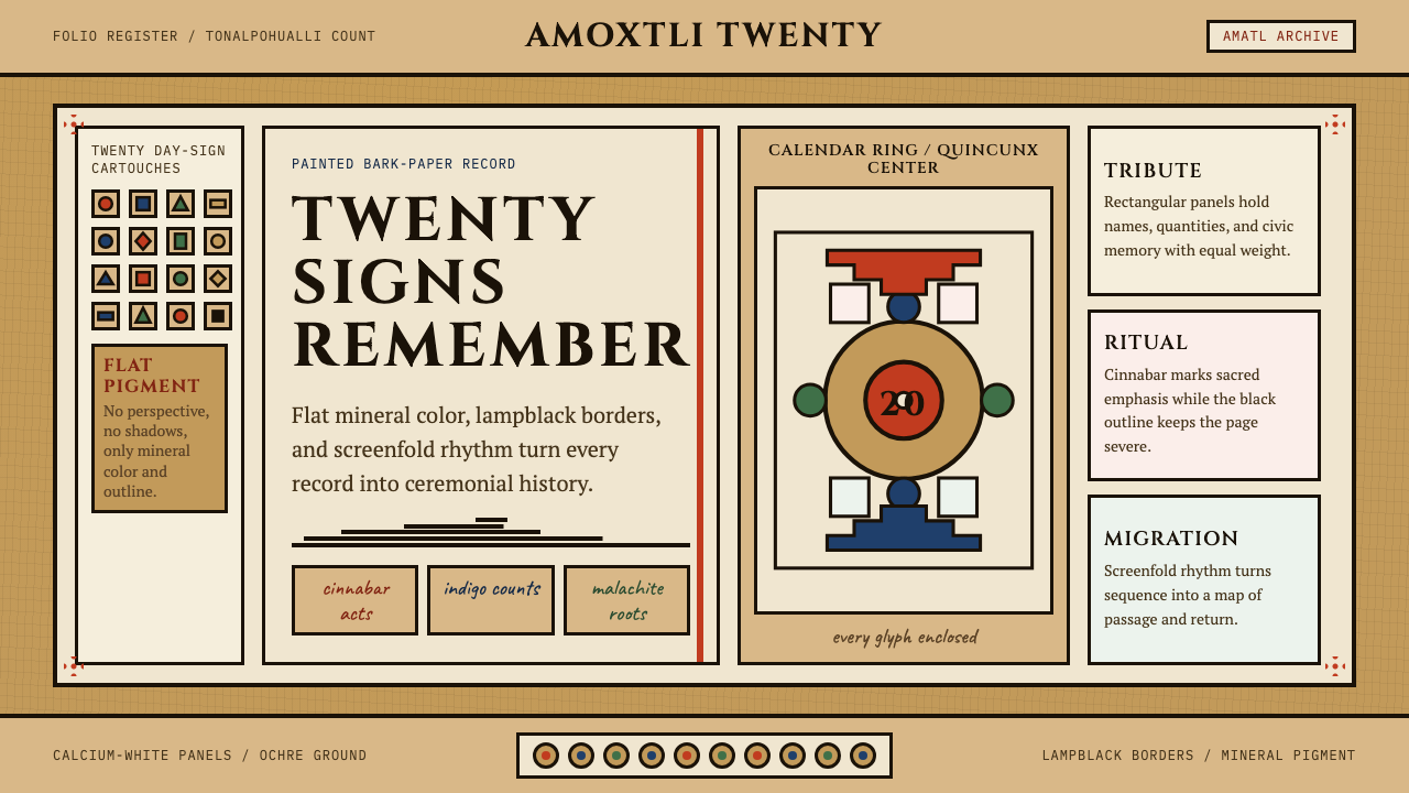 Aztec CodexSacred records stay severe. Ochre amatl ground, Cinzel capitals, black cartou…神圣记录保持庄严。赭黄纸底、Cinzel 大写与黑色匣框。
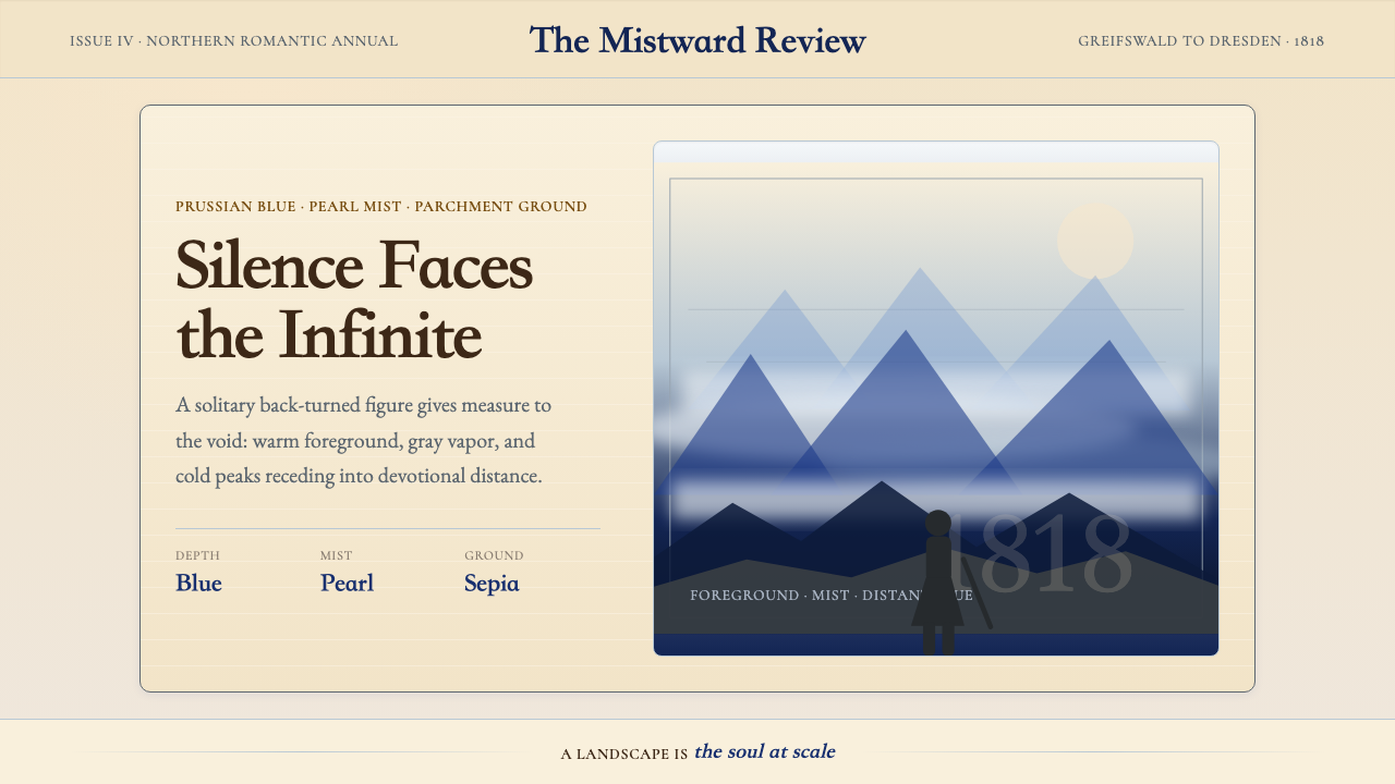 Caspar David FriedrichSilence becomes vast. Prussian blue depth, pearl mist, and parchment framing…寂静变得辽阔:普鲁士蓝纵深、珍珠雾与羊皮纸框层层后退。
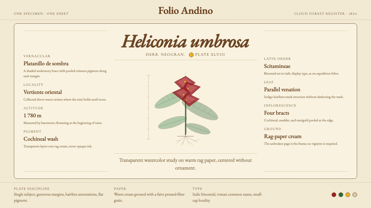 Colombian Botanical (Triana)Observation becomes ornament. Crimson watercolor specimen breathes on cream r…观察即装饰。绯红水彩标本静置于奶油破布纸。