Design style guide设计风格指南
What is NZ Lord of the Rings Tourism?什么是 NZ Lord of the Rings Tourism?
When Peter Jackson chose New Zealand as Middle-earth, he didn't just film a landscape — he fused a national tourism identity with Tolkien's mythology, creating a visual language of sweeping pastoral grandeur, soft fantasy ornamentation, and the unmistakable feeling that the world is wider and more wondrous than it first appeared.当彼得·杰克逊选择新西兰作为中土世界,他不仅仅是在拍摄一片风景——他将国家旅游品牌与托尔金的神话深度融合,创造出一种融汇壮阔田园气象、轻盈奇幻装饰与「世界比想象更辽阔」那种独特感受的视觉语言。
NZ Lord of the Rings Tourism in briefNZ Lord of the Rings Tourism 速览
NZ Lord of the Rings Tourism is a design system born from the collision of two powerful identity machines: the New Zealand government's long-running "100% Pure" destination campaign and the visual art direction developed by Weta Workshop for Peter Jackson's film trilogy. The resulting aesthetic is not simply movie merchandise translated into travel brochures. It is a genuine visual dialect — one that uses sweeping landscape photography, warmly aged typography, and restrained fantasy flourishes to say that a real place and an imagined world are, in some essential way, the same.「NZ指环王旅游」设计系统诞生于两股强大品牌力量的碰撞:新西兰政府长期推行的「百分百纯净新西兰」目的地宣传,以及维塔工作室为彼得·杰克逊电影三部曲建立的视觉美术体系。由此形成的美学,远不止于把电影周边转化为旅行手册。它是一套真正的视觉方言——以壮阔的风景摄影、温润的古旧字体与克制的奇幻装饰来传达:一个真实的地方与一个想象的世界,在某种本质意义上是同一回事。
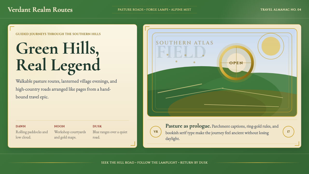
The visual register sits comfortably between official destination marketing and illustrated fantasy publishing. Broad, light-filled vistas of volcanic peaks, emerald paddocks, and deep fjords carry the weight of the landscape photography tradition, while soft gold borders, circular badge motifs derived from the One Ring, and serif letterforms drawn from illuminated manuscript heritage introduce the fantasy register. Neither element overwhelms the other — the pastoral keeps the fantasy grounded, and the fantasy lifts the pastoral into myth.这套视觉语言舒适地栖居于官方目的地营销与插画奇幻出版之间。宽幅、充满光线的火山峰、翠绿牧场与深邃峡湾画面,承载了风景摄影传统的分量;而柔和的金色边框、从至尊魔戒衍生的圆形徽章母题,以及从彩饰手稿传统中汲取灵感的衬线字体,则引入了奇幻语域。两种元素互不压制——田园气息让奇幻保持接地,奇幻意象则将田园提升为神话。
This system is approachable in a way that many fantasy aesthetics are not. Where darker fantasy design tends toward heavy textures, ominous palettes, and aggressive ornamentation, the NZ Lord of the Rings idiom stays warm and sun-touched. The Shire — not Mordor — is its emotional center of gravity. The result is a design language that communicates wonder without menace, grandeur without exclusivity, and depth of world-building without requiring the viewer to have read a single page of source material.这套系统具有许多奇幻美学所不具备的亲切感。与那些倾向于厚重纹理、阴沉色调与攻击性装饰的黑暗奇幻设计不同,「NZ指环王」这套视觉语言始终保持温暖与阳光触感。夏尔——而非魔多——是它的情感重心所在。由此形成的设计语言能传递惊奇而不带威胁,传递壮阔而不生疏离,传递世界建构的深度而无需观者读过任何一页原著。
See the NZ Lord of the Rings Tourism design system →查看 NZ Lord of the Rings Tourism 完整设计系统 →
Where does NZ Lord of the Rings Tourism come from?NZ Lord of the Rings Tourism 从何而来?
The story begins not with a design brief but with a location scout. In the late 1990s, Peter Jackson's production team scoured New Zealand for landscapes that could stand in for Tolkien's invented world. What they found — the volcanic plateau of Tongariro, the limestone hills near Matamata, the dramatic Southern Alps above Queenstown, the rugged coastlines of the South Island — was so cinematically convincing that the films would eventually make location tourism one of New Zealand's fastest-growing industries. Tourism New Zealand, the government agency responsible for destination marketing, recognized the opportunity almost immediately and began co-branding efforts that ran parallel to the trilogy's theatrical releases between 2001 and 2003.故事的起点不是一份设计简报,而是一次选景勘察。1990年代末,彼得·杰克逊的制作团队踏遍新西兰,寻找能够替代托尔金虚构世界的真实地貌。他们所发现的——汤加里罗的火山高原、玛塔玛塔附近的石灰岩丘陵、皇后镇上方戏剧性的南阿尔卑斯山脉、南岛粗犷的海岸线——在镜头中如此令人信服,以至于这些电影最终将影视取景地旅游打造成新西兰增长最快的产业之一。负责目的地营销的政府机构旅游新西兰几乎立刻意识到这一机遇,随即启动了与2001年至2003年三部曲院线公映同步推进的联合品牌推广。
Weta Workshop, the Wellington-based practical effects and design company that Jackson had co-founded with Richard Taylor, was responsible for the trilogy's physical design language: the armour, weapons, costumes, creature designs, and prop work that gave each culture of Middle-earth — Shire hobbit, Elvish, Rohirric, Gondorian — its distinctive visual register. Alan Lee and John Howe, the two illustrators whose decades of Tolkien artwork had defined the visual imagination of millions of readers before a single frame was shot, were brought onto the production as concept artists. Their influence — Lee's soft romanticism, Howe's more dramatic medievalism — permeated every designed surface in the trilogy and became the aesthetic foundation from which all downstream NZ Lord of the Rings design would draw.维塔工作室——杰克逊与理查德·泰勒联合创立的惠灵顿实物特效与设计公司——负责了三部曲的实体设计语言:盔甲、武器、服装、生物设计与道具,赋予中土世界每种文化——夏尔霍比特、精灵、洛汗、刚铎——各自独特的视觉语域。艾伦·李与约翰·豪——这两位插画师在电影开拍前已以数十年的托尔金插画定义了数百万读者的视觉想象——作为概念艺术家被延揽入组。他们的影响——李的柔和浪漫主义与豪的戏剧性中世纪主义——渗透进三部曲的每一处设计表面,并成为此后一切「NZ指环王」衍生设计汲取灵感的美学基础。
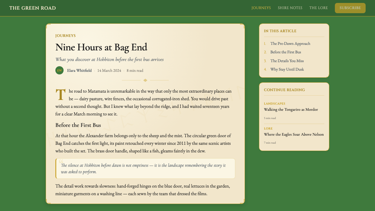
The permanent reconstruction of the Hobbiton movie set in Matamata in 2012 was the event that transformed the design system from a film-era campaign into an ongoing identity. The original sets had been built to be dismantled; when the films proved world-changing for New Zealand tourism, the landowners negotiated to keep a portion of the set standing. For the production of The Hobbit trilogy (2012–2014), the set was rebuilt in permanent materials and has since operated as a ticketed attraction visited by hundreds of thousands of people each year. The physical experience — walking through round-doored Hobbit holes, past a garden pub, through a landscape that looks simultaneously real and fictional — gave the design system a spatial dimension that most tourism aesthetics never achieve.2012年在玛塔玛塔对霍比屯片场的永久性重建,是将这套设计系统从电影宣传期活动转变为持续品牌形象的关键事件。最初的片场是按拆卸用途建造的;当电影证明自身对新西兰旅游业具有改变世界的力量后,地主与制片方谈判保留了部分场景。为拍摄《霍比特人》三部曲(2012—2014年),片场以永久性材料重建,此后作为收费景区持续运营,每年吸引数十万访客。那种亲身体验——穿过圆拱门霍比特洞穴、经过一家花园酒馆、漫步于一片真实与虚构同时并存的风景之中——赋予了这套设计系统一种大多数旅游美学从未企及的空间维度。
Tourism New Zealand's co-marketing relationship with the film properties created a virtuous circle that shaped the visual system over two decades. Official materials used photography that mirrored the films' cinematographic grammar — golden-hour light, wide establishing shots, an emphasis on scale contrast between human figures and landscape. The "100% Pure New Zealand" brand identity, already built on pristine natural imagery, was deepened by the association with Tolkien's explicit love of pastoral nature. Over time, a stable visual vocabulary emerged: deep pastoral greens, warm gold accents, round-arch framing devices, serif letterforms with slight calligraphic variation, and the recurring motif of the lone figure dwarfed by an immense natural backdrop.旅游新西兰与电影版权方的联合营销关系在二十年间形成了一种良性循环,持续塑造着这套视觉系统。官方宣传材料使用的摄影语法与电影的摄影文法如出一辙——黄金时刻的光线、宽幅的定场镜头、对人物与风景之间尺度对比的强调。「百分百纯净新西兰」品牌形象本已建立在纯粹自然图像之上,与托尔金对田园自然的明确热爱相融合后愈发深厚。随着时间推移,一套稳定的视觉词汇逐渐形成:深沉的田园绿、温暖的金色点缀、圆拱形取景框、带有轻微书法变化的衬线字体,以及孤独身影被壮阔自然背景矮化的反复出现的核心母题。
What defines the NZ Lord of the Rings Tourism look?NZ Lord of the Rings Tourism 的视觉特征是什么?
Palette色调
The color system is anchored by two dominant families: a deep, saturated pastoral green that recalls the rolling paddocks of the Waikato region, and a warm, aged gold that reads simultaneously as late-afternoon sunlight and the glint of Elvish metalwork. These two colors carry the emotional weight of the system — green for belonging, groundedness, and the natural world; gold for myth, value, and the threshold between the everyday and the extraordinary. Supporting tones lean toward warm neutrals: the creamy off-white of parchment, the soft brown of aged leather and turned earth, and a cool blue-grey that appears in shadow areas and distant mountains, preventing the palette from becoming uniformly warm and honeyed.这套色彩体系由两大主导色系构成:一种深沉饱满的田园绿,令人联想到怀卡托地区绵延起伏的牧场;以及一种温暖、带有岁月感的金色,既像午后斜阳的光晕,又像精灵金工的闪烁。这两种颜色承载着整个系统的情感分量——绿色意味着归属、踏实与自然世界;金色意味着神话、珍贵与日常与非凡之间的门槛。辅助色调倾向于温暖的中性色:羊皮纸般的奶油白、陈旧皮革与翻起泥土的柔和棕褐,以及出现在阴影区域与远山的冷调蓝灰——这种冷调防止整体色盘变得一味温暖甜腻。
Typography字体排印
The typographic register draws from the long tradition of humanist book typography — the kind found in quality illustrated editions of classic literature rather than in corporate marketing. Letterforms have organic warmth: serifs carry slight bracketing that recalls calligraphic origins, and at display sizes the characters show a subtle variation in stroke weight that links them to hand-lettered illuminated manuscripts. Capitals are used with restraint and ceremony, often appearing in slightly spaced settings that evoke the title pages of fine press books. There is a deliberate contrast between this warmly historicist display register and cleaner, more functional body text, which keeps the overall reading experience accessible even while the decorative level signals depth and care.字体排印语域汲取了源远流长的人文主义书籍字体传统——那种在精装插画版经典文学作品中常见的字体,而非公司营销材料中的那种。字母形态带有有机的温度:衬线带有轻微括弧弧度,呼应书法起源;在展示字号下,笔画粗细呈现出微妙的变化,将它们与手写彩饰手稿相连接。大写字母被节制而庄重地使用,常以略微加宽字距的方式出现,令人联想到精品印刷书籍的扉页。这种温暖的历史主义展示字体与更为简洁、功能性更强的正文之间形成了刻意的对比,使整体阅读体验保持亲切,即便装饰层次在传达深度与用心。
Ornamentation装饰元素
Decoration is present but always subordinated to the landscape and the content it frames. The ornamental vocabulary is drawn primarily from two sources: the circular, interlocked motifs of Tolkien's invented rune systems and Ring engravings, and the foliate border traditions of Victorian and Edwardian illustrated books. Thin gold lines frame content areas, defining edges without creating visual weight. Circular badge forms appear as containing shapes for titles or place names. Leaf and vine motifs occupy corners and margins at small scale, never competing with the primary imagery. The overall effect is of a book that has been carefully and lovingly decorated rather than a poster designed to demand attention.装饰元素存在,但始终从属于风景与其所框定的内容。装饰词汇主要来源于两处:托尔金虚构符文体系与戒文刻印的圆形交错母题,以及维多利亚和爱德华时代插画书籍的叶形边框传统。纤细的金色线条框定内容区域,划定边界而不增加视觉分量。圆形徽章作为标题或地名的容纳形式出现。叶子与藤蔓母题以小尺度占据角落与页边,从不与主图像竞争。整体效果如同一本被细心而深情地装帧过的书籍,而非一张被设计用来夺取注意力的海报。
Landscape Photography Grammar风景摄影语法
Photography in this system does specific compositional work that distinguishes it from generic destination marketing. Shots favor a wide establishing frame in which at least one-third of the image is sky, often at golden hour when the quality of light matches the warm gold tones of the overall palette. Human figures appear small in the frame, emphasizing the scale of the landscape around them rather than centering the human experience. Aerial perspectives appear frequently, offering the viewpoint that characters like the Eagles provide in the narrative — a god's-eye compression of vast distance. Seasonal preference leans toward late summer and early autumn, when the pastures are still green but beginning to show the first warmth of turning leaves.这套系统中的摄影完成了特定的构图任务,使其有别于通常的目的地营销图片。画面倾向于宽幅定场取景,至少三分之一为天空,且常在黄金时刻拍摄,以便光线质感与整体色调中的暖金相呼应。人物在画面中显得渺小,强调四周风景的尺度而非以人类体验为中心。航拍视角频繁出现,呈现出叙事中老鹰们所提供的那种俯瞰视点——对广袤距离的神明式压缩。季节偏好集中于晚夏和初秋,此时牧场依然翠绿却开始透出树叶转色的第一抹暖意。
Scale Contrast and the Pastoral Sublime尺度对比与田园崇高
One of the system's most consistent compositional principles is the deliberate use of scale contrast to evoke a sense of the sublime — not the terrifying sublime of storm and shipwreck, but the gentler pastoral sublime of the Romantic tradition. A lone traveller on a winding road, a single round door set into a hillside, one figure standing at the edge of a vast plain — these compositions communicate that the world extends far beyond what any individual can see or comprehend, and that this is cause for wonder rather than dread. The principle operates across all formats, from full-page photography to small spot illustrations, and is the single device most responsible for the system's consistent emotional register.这套系统最为一贯的构图原则之一,是刻意运用尺度对比来唤起一种崇高感——不是风暴与船难那种令人恐惧的崇高,而是浪漫主义传统中较为温柔的田园崇高。一位孤独旅人走在蜿蜒小路上,一扇圆门嵌入山坡之中,一个身影站在辽阔平原的边缘——这些构图传达的是:世界延伸至远超任何个体所能看见或领会之处,而这是令人惊叹的理由,而非恐惧的来源。这一原则贯通所有格式,从整页摄影到小型点缀插图,也是整套系统情感基调保持一致的最关键手段。
Texture and Materiality质感与物质性
Unlike the flat, hard-edged approach of geometric modernism, this visual system embraces surface texture as a carrier of history and meaning. Parchment-like grounds, the grain of weathered wood, the woven quality of linen, and the soft press of letterpress printing all appear as background textures that signal age, craft, and authenticity. These textures are never so prominent that they obscure legibility, but they create a consistent tactile dimension that distinguishes the system from purely photographic or purely digital approaches. The texture register says: this place has a past; what you are looking at has been touched by many hands over a long time.与几何现代主义的平面硬边处理不同,这套视觉系统将表面质感作为历史与意义的载体加以拥抱。羊皮纸般的底面、风化木材的纹理、亚麻织物的肌理感,以及凸版印刷的柔和压痕,都以背景质感的形式出现,传递着岁月、工艺与真实性的信号。这些质感从不突出到遮蔽可读性的程度,但它们创造了一种持续的触感维度,使整套系统区别于纯粹摄影或纯粹数字化的处理。这种质感语域在说:这个地方有它的历史;你所看到的东西,已被无数双手在漫长岁月中触摸过。
Bilingual Register: Tourist and Pilgrim双重叙事语域:游客与朝圣者
Perhaps the most subtle characteristic of this design system is that it addresses two different audiences simultaneously, without straining to reconcile them. The first audience is the ordinary tourist: someone who enjoyed the films and would like to see the landscape, the sets, the scenery that stood in for Middle-earth. The second is the Tolkien pilgrim: someone for whom the books and their visual interpretation carry deep personal meaning and who approaches the landscape with something approaching reverence. The visual system speaks to both without condescending to the first or over-serving the second — the pastoral photography satisfies the tourist's sense of destination, while the ornamental depth and fantasy framing honour the pilgrim's sense of arrival in a storied world.这套设计系统或许最为微妙的特征,在于它同时向两种不同受众发言,却无需刻意调和两者。第一类受众是普通游客:欣赏过电影、希望亲眼看看那片替代中土世界的风景、片场与景观的人。第二类是托尔金朝圣者:对于他们而言,这些书籍及其视觉诠释承载着深厚的个人意义,他们带着近乎虔敬的心情走近这片土地。这套视觉系统与两者对话,既不俯就前者,也不过度迎合后者——田园摄影满足游客的目的地感,而装饰深度与奇幻取景则尊重朝圣者抵达一个充满故事的世界的那种感受。

See the NZ Lord of the Rings Tourism design system →查看 NZ Lord of the Rings Tourism 完整设计系统 →
Who shaped NZ Lord of the Rings Tourism?谁塑造了 NZ Lord of the Rings Tourism?
Jackson's decision to film all three Lord of the Rings films simultaneously in New Zealand over eighteen months of principal photography created an unprecedented concentration of design work in a single country and production. His insistence on building and photographing physical environments — Hobbiton, Rivendell's outdoor locations, the volcanic landscapes of Mordor — rather than relying primarily on digital environments gave the visual system its photographic authenticity. His early films were made in Wellington, and his loyalty to New Zealand as a production base transformed the country's film industry infrastructure while simultaneously creating the conditions for what would become one of the most effective destination-cinema marketing campaigns in history.杰克逊决定在长达十八个月的主要拍摄期内在新西兰同步拍摄全部三部《指环王》电影,在单一国家与制作体系内形成了前所未有的设计工作高密度集中。他坚持构建并拍摄实体场景——霍比屯、瑞文戴尔的室外取景地、魔多的火山地貌——而非主要依赖数字环境,赋予了这套视觉系统以摄影真实感。他早年在惠灵顿拍片,对新西兰作为制作基地的忠诚改变了这个国家的电影工业基础设施,同时创造了条件,使其成为历史上最成功的目的地-电影营销案例之一。
Lee's illustrated edition of The Lord of the Rings, published in 1991, was the visual reference that defined a generation's mental image of Tolkien's world before the films existed. His style — soft watercolor washes, delicate pen work, a preference for the intimate over the monumental, and a pervading quality of gentle northern European melancholy — was imported wholesale into the film's design language when he joined the production as a concept artist. Lee's contribution explains why the NZ Lord of the Rings aesthetic tends toward soft romanticism rather than hard fantasy: his sensibility was always more Pre-Raphaelite than pulp-fantasy, more William Morris than Frank Frazetta. He won an Academy Award for Best Art Direction for The Return of the King.李于1991年出版的《指环王》插画版,是在电影问世之前定义了一代人脑海中托尔金世界视觉形象的参照。他的风格——柔和的水彩晕染、精细的钢笔线条、对亲密感胜于宏大感的偏好,以及弥漫其中的温柔北欧忧郁气质——在他作为概念艺术家加入制作团队时被整体移植进电影的设计语言。李的贡献解释了为何「NZ指环王」美学倾向于柔和浪漫主义而非坚硬奇幻:他的感性始终更接近拉斐尔前派而非廉价幻想,更像威廉·莫里斯而非弗兰克·弗雷泽塔。他凭借《王者无敌》荣获奥斯卡最佳艺术指导奖。
Taylor co-founded Weta Workshop with Jackson and served as the head of the physical design department across both the Lord of the Rings and Hobbit trilogies. Under his direction, Weta developed the material vocabulary of Middle-earth: the specific aging and patination of Gondorian armour, the hand-crafted organic quality of Shire pottery and furniture, the elven calligraphy and decorative metalwork that would later become recurring motifs in the tourism design system. Taylor's insistence on fabricating real objects — chainmail knitted ring by ring, swords forged and etched — rather than simulating them digitally gave the physical design an authority that photography translates faithfully. His department won multiple Academy Awards for their work on the productions.泰勒与杰克逊联合创立了维塔工作室,并在《指环王》和《霍比特人》两个三部曲中担任实体设计部门负责人。在他的主导下,维塔建立了中土世界的材料词汇:刚铎盔甲特定的做旧与包浆处理、夏尔陶器与家具手工艺的有机质感、此后成为旅游设计系统反复出现母题的精灵文字与装饰金工。泰勒坚持制造真实物体——逐环编织的锁子甲、经过锻造与蚀刻的剑——而非以数字方式模拟,赋予了实体设计一种摄影能忠实传达的权威感。他的部门凭借这两个制作系列的工作多次荣获奥斯卡奖。
Howe has been the other half of the canonical Tolkien illustration partnership for over three decades. Where Alan Lee tends toward the intimate and the wistful, Howe brings a more dramatic, heraldic sensibility — his Tolkien work favors strong silhouettes, bold compositional choices, and a feel for the monumental that makes his images well-suited to marketing materials and large-format applications. His interpretation of key iconographic elements — the silhouette of the One Ring, the typography of the Ring inscription, the armor of the Nazgul — provided reference points that the tourism design system has absorbed and simplified into its ornamental vocabulary.豪三十余年来一直是正典托尔金插画的另一半搭档。艾伦·李倾向于亲密感与伤感,豪则带来一种更为戏剧性、更具纹章感的感性——他的托尔金作品偏爱强烈的剪影、大胆的构图选择,以及一种对宏大感的把握,使他的画面非常适合营销材料与大尺幅应用。他对关键图标元素的诠释——至尊魔戒的剪影轮廓、戒文的字体处理、戒灵的盔甲——为旅游设计系统提供了参照点,这些参照点被吸收并简化进其装饰词汇之中。
The government tourism agency deserves recognition as a design actor in its own right, not merely a client. Tourism New Zealand made a series of strategic decisions — co-branding with the film releases, commissioning matching photography, creating dedicated "Lord of the Rings location" guides — that shaped the visual system's public grammar. Their "100% Pure New Zealand" tagline, launched in 1999, was already in place when the films arrived and proved perfectly compatible with the pastoral-mythic register the films established. The agency's consistency over two decades — maintaining the association across three trilogies worth of content — is what transformed a film-era moment into a durable design identity.旅游新西兰这一政府旅游机构本身应被视为一个设计行为者,而不仅仅是委托方。旅游新西兰做出了一系列战略决策——与电影发行联合品牌、委托拍摄风格匹配的照片、制作专属的「指环王取景地」指南——这些决策塑造了这套视觉系统的公共语法。他们于1999年推出的「百分百纯净新西兰」标语,在电影到来之时已然就位,并被证明与电影所建立的田园-神话语域完美相容。该机构跨越两个十年的一贯性——将这种关联维系于三个三部曲的内容之中——正是将一个电影时代的短暂时刻转化为持久设计身份的关键所在。
How do you use NZ Lord of the Rings Tourism today?今天怎么用 NZ Lord of the Rings Tourism?
NZ Lord of the Rings Tourism is a rich and specific visual system, and applying it well requires understanding its emotional contract with the viewer. The system promises a particular feeling: that the world is larger, older, and more beautiful than everyday life suggests, and that a journey — whether to New Zealand or into a book — can put a person in contact with that larger world. Design work that borrows from this system should honor that promise. The mistake is to treat it as a fantasy theme or a movie brand, rather than as a pastoral-romantic aesthetic with particular values about landscape, scale, and the relationship between the human and the non-human world.「NZ指环王旅游」是一套丰富而特定的视觉系统,恰当应用它需要理解它与观者之间的情感契约。这套系统承诺了一种特定的感受:世界比日常生活所呈现的更为辽阔、古老而美好,一段旅程——无论是前往新西兰还是进入一本书——可以让人与那个更大的世界产生接触。从这套系统中汲取灵感的设计作品应当兑现这一承诺。常见的错误是将它当作奇幻主题或电影品牌来处理,而非将其视为一套对风景、尺度与人类和非人类世界之关系持有特定价值观的田园浪漫主义美学。
For presentation slides, the system works best when the content itself carries some weight of journey, discovery, or transformation. A travel pitch, a year-in-review that emphasizes growth and change, an educational deck about geography or natural history — these benefit from the aesthetic's combination of grandeur and warmth. Cover slides work well with a full-bleed landscape photograph occupying most of the frame, with the title set in a warm, serif display face against a softened lower third. Content slides should use the parchment-tone neutral backgrounds with gold rule separators; body text reads better in a clean, moderately spaced serif than in the same elaborate display face used for titles. Avoid pairing this system with cold, high-contrast corporate templates — the tonal clash will flatten both.对于演示文稿幻灯片,这套系统在内容本身携带旅程、发现或转变分量时效果最佳。旅行提案、以成长与变化为重点的年终回顾、关于地理或自然历史的教育课件——这些都得益于这套美学对宏大与温暖的结合。封面幻灯片适合以全幅风景摄影占据画面大部,标题以温暖的衬线展示字体设置在柔化的下三分之一区域。内容幻灯片应使用羊皮纸色调的中性背景,配以金色线条分隔符;正文在简洁、适度间距的衬线字体中读起来比在标题所用的精美展示字体中更为清晰。避免将这套系统与冷峻、高对比度的企业模板配对——色调冲突会使两者都失去力量。
For web interfaces and digital marketing, the system suits experiences that want to communicate heritage, authenticity, and considered quality — boutique travel operators, literary publishers, artisan product brands, or any service that positions itself as offering something crafted rather than manufactured. Navigation should be typographic and unhurried; dropdown menus and hover states work better in the warm gold accent than in a cold interactive blue. Photography should be curated for the qualities the system values: generous natural light, human figures at the scale of the landscape, no obvious post-processing that flattens the tonal range. Hero sections with a large landscape image, a short decorative rule, and a brief headline in display type establish the register immediately.对于网页界面与数字营销,这套系统适合希望传达传承感、真实性与精心品质的体验——精品旅行运营商、文学出版社、手工艺产品品牌,或任何将自身定位为提供匠心之作而非批量制品的服务。导航应当字体性且从容不迫;下拉菜单与悬停状态在温暖金色强调色中的效果优于冷调的交互蓝。图片应当依据系统所看重的品质进行策划:充裕的自然光线、处于风景尺度中的人物身影、无明显平坦化色调范围的后期处理。以大幅风景图像、一条短小装饰线条和简洁的展示字体标题构成的首屏区块,能立即建立起这套语域。
For editorial and print work — destination guides, cultural magazines, illustrated books — the system is closest to its native territory. The multi-column editorial grid suits this aesthetic better than single-column blog formats; generous margins create space for the small ornamental details to breathe. Chapter openers and section breaks benefit from a decorative motif at small scale — a leaf, a ring, a fine-line rule — rather than from abstract geometric devices. Pull quotes set in a warm display face against a slightly tinted ground carry the same quality as a richly decorated marginal note in an illuminated manuscript. The overall pacing should be slow and inviting rather than quick and scannable.对于编辑与印刷作品——目的地指南、文化杂志、插画书籍——这套系统最接近其本源领地。多列编辑网格比单列博客格式更适合这套美学;慷慨的页边留白为小型装饰细节创造呼吸空间。章节首页与段落分隔从一个小尺度的装饰母题中获益——一片叶子、一个指环、一条细线——而非抽象的几何装置。在略带色调的底面上以温暖展示字体排印的引用段落,带有与彩饰手稿装饰页边注释相同的品质。整体节奏应当缓慢而引人入胜,而非快速可扫描。
A common mistake when applying this system is overloading the decoration. Because the ornamental vocabulary is rich — circular badges, leaf motifs, fine gold lines, textured grounds, calligraphic display type — there is a strong temptation to use all of it at once. This produces visual noise that undermines the system's essential quality: its feeling of spaciousness and natural grandeur. The landscape photography works precisely because it is uncluttered; the ornamentation should occupy the margins and frames, leaving the primary image field open. A second common error is mismatching the photography — using high-saturation travel stock photography rather than images that share the system's specific preferences for golden-hour light, pastoral subject matter, and human figures at small scale in large landscapes.应用这套系统时的常见错误是装饰过载。因为装饰词汇丰富——圆形徽章、叶形母题、纤细金色线条、质感底面、书法式展示字体——很容易产生一次性全部使用的强烈冲动。这会产生视觉噪声,破坏这套系统的本质品质:它的空间感与自然壮阔感。风景摄影之所以有效,正是因为它简洁无杂;装饰元素应当占据页边与边框,保持主图像区域的开阔。第二个常见错误是摄影匹配失当——使用高饱和度旅行图库照片,而非符合系统对黄金时刻光线、田园主题与大景中小身影之特定偏好的图像。
See the NZ Lord of the Rings Tourism design system →查看 NZ Lord of the Rings Tourism 完整设计系统 →
NZ Lord of the Rings Tourism — FAQNZ Lord of the Rings Tourism · 常见问题
Is this style specific to Lord of the Rings, or can it work for other fantasy or travel contexts?这种风格是《指环王》专属的,还是可以用于其他奇幻或旅游场景?
The style is specific enough in its origins that using it wholesale for unrelated fantasy properties would read as derivative. However, its underlying aesthetic principles — pastoral photography, warm-gold ornamentation, humanist serif typography, the romance of natural scale — are transferable to other contexts where those values align with the product's story. Literary tourism for other destinations, cultural heritage institutions, high-end eco-travel brands, or illustrated books about natural history can all draw from this register without feeling like Tolkien imitations, as long as the photography and landscape are genuinely the subject rather than a borrowed frame.这种风格的起源足够特定,以至于将其全套照搬用于不相关的奇幻内容会显得衍生。然而,其底层美学原则——田园摄影、暖金装饰、人文主义衬线字体、自然尺度的浪漫感——可以迁移至其他与这些价值观相契合的场景。其他目的地的文学旅游、文化遗产机构、高端生态旅行品牌,或关于自然历史的插画书籍,都可以从这套语域中汲取灵感而不显得像托尔金仿制品——前提是摄影与风景是真正的主题,而非一个借来的框架。
How does this style handle dark or serious content — can it work for something with conflict or difficulty?这种风格如何处理黑暗或严肃的内容——它能用于包含冲突或困难的事物吗?
The system has a tonal range that is wider than it first appears. The Shire register — pastoral warmth, round-arch motifs, golden-hour light — works for accessible and welcoming content. But the trilogy's visual vocabulary also includes a more dramatic, shadow-heavy register associated with Gondor, the paths of the dead, and the volcanic landscapes of the North Island. Photography from the Tongariro area, with its barren volcanic slopes and brooding skies, can carry a sombre grandeur within the same overall palette. The key is maintaining the pastoral-romantic framing device — the sense that even difficulty exists within a world of meaningful beauty — rather than shifting into a dark-fantasy aesthetic that abandons the system's essential warmth.这套系统的色调范围比初看时更为宽广。夏尔语域——田园温度、圆拱母题、黄金时刻光线——适合亲切而温暖的内容。但这个三部曲的视觉词汇中也包含一种更为戏剧性、阴影更重的语域,与刚铎、亡灵之路和北岛火山地貌相关联。汤加里罗地区的摄影,以其荒芜的火山坡地与沉郁的天空,可以在同一整体色盘中承载一种庄严的悲壮感。关键在于维持田园浪漫主义的取景框架——那种即便是困境也存在于充满意义的美好世界中的感受——而非转向一种抛弃系统本质温暖感的黑暗奇幻美学。
The system uses a lot of texture and ornamentation. Does it work in purely digital contexts where those elements can feel dated?这套系统使用了大量质感与装饰。它在那些此类元素可能显得过时的纯数字场景中同样适用吗?
Used at the wrong scale or density, textured grounds and fine ornamental lines can appear dated in digital contexts — they may recall the visual excess of early 2000s web design, when parchment textures were often applied indiscriminately. The key is restraint and purpose. Texture should appear at the edges and margins of a composition, not as a full-bleed background behind body text. Gold ornamental lines work at large formats — hero banners, section dividers — but should not appear at small sizes where they become visual noise rather than visual refinement. In mobile contexts especially, simplify aggressively: lead with photography, commit to the warm palette, and let the typography carry the ornamental burden that border work handles in larger formats.在错误的尺度或密度下使用,质感底面和纤细装饰线条在数字场景中可能显得过时——它们可能令人联想到2000年代初期网页设计的视觉过剩,那时羊皮纸质感常被不分场合地滥用。关键在于克制与目的性。质感应当出现在构图的边缘与页边处,而非作为正文背后的全幅背景。金色装饰线条在大尺幅格式中有效——首图横幅、区块分隔——但不应出现在小尺寸场景中,在那里它们会成为视觉噪声而非视觉精致。尤其在移动端场景中,应积极地简化:以摄影为先导,坚守温暖色调,让字体承担大尺幅格式中边框装饰所承担的装饰职责。
How does this style relate to other heritage or destination-tourism aesthetics — is it easy to confuse with something else?这种风格与其他遗产类或目的地旅游美学有何关联——它是否容易被与其他风格混淆?
There are family resemblances to several adjacent aesthetics. It shares warm color palettes and serif typography with general heritage tourism design, but the fantasy ornamentation distinguishes it sharply. It shares landscape photography emphasis and pastoral green palettes with Irish tourism and Scottish highland marketing, but those aesthetics lack the Tolkien-derived circular motifs and the specific quality of the gold accent, which reads as precious metal rather than as harvest warmth. The closest potential confusion is with general illustrated-fantasy book design, which shares the ornamental vocabulary but typically lacks the landscape photography and the destination-marketing context. What makes the NZ Lord of the Rings idiom distinct is precisely the fusion of all three elements: photographic landscape realism, government tourism warmth, and Tolkien-derived fantasy depth.这套风格与几种相邻美学有着家族相似性。它与通用遗产旅游设计共享温暖色调和衬线字体,但奇幻装饰将其清晰地区别开来。它与爱尔兰旅游和苏格兰高地营销共享对风景摄影的强调和田园绿色调,但那些美学缺乏源自托尔金的圆形母题和金色强调的特定质感——那种金色读起来像贵金属,而非丰收的温度。最有可能产生混淆的是通用插画奇幻书籍设计,它共享装饰词汇,但通常缺乏风景摄影和目的地营销的语境。使「NZ指环王」这套语言独具特色的,正是三种元素的融合:摄影性风景写实主义、政府旅游营销的亲切感,以及源自托尔金的奇幻深度。
Can this style work for products or brands that have no connection to New Zealand or to fantasy?这种风格适用于与新西兰或奇幻毫无关联的产品或品牌吗?
Yes, but the connection to the source material needs to be dissolved before application. The system's underlying visual values — pastoral warmth, the beauty of natural scale, typographic depth, the suggestion of storied history — are not properties of New Zealand or Tolkien specifically. A premium outdoor equipment brand, a craft distillery communicating provenance and character, a slow-travel platform, or a literary magazine can all use the core register (landscape photography + warm gold + humanist serif + light ornamentation) effectively without the Tolkien-specific motifs. The practical rule: retain the photography grammar and the palette; simplify or abstract the ornamentation away from recognizable ring and rune references; let the typography and the landscape do the emotional work that the explicit fantasy iconography would have done.可以,但在应用之前,需要先将与原始素材的关联溶解。这套系统的底层视觉价值观——田园温度、自然尺度之美、字体深度、充满故事的历史感——并非新西兰或托尔金的专属属性。一个高端户外装备品牌、一家传达产地与性格的精酿蒸馏厂、一个慢旅行平台,或一本文学杂志,都可以在不使用托尔金专属母题的情况下有效运用核心语域(风景摄影+暖金+人文主义衬线字体+轻量装饰)。实用规则:保留摄影语法和色调;将装饰元素从可识别的指环与符文参照中简化或抽象出来;让字体与风景承担原本由明确的奇幻图标所完成的情感工作。
Related design styles相关设计风格
 Korean Minhwa (Joseon Folk Painting)Cheerful prosperity over restraint. Mineral reds, cobalt, and lampblack on ha…喜庆胜过克制:矿物红、钴蓝、灯黑线描在韩纸米色底上。
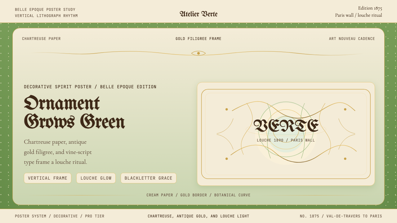 Absinthe Art Nouveau Green (1875)Ornate and verdant. Chartreuse field, gold filigree, vine-script type, and lo…华丽而青绿。黄绿色底、金丝花边与藤蔓字体托出浑浊光。
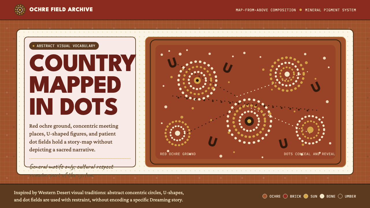 Aboriginal Dot PaintingAncient story-map energy. Red ochre, bone dots, concentric circles, and U-mar…古老故事地图感:红赭底、骨白点、同心圆与 U 形构成大地。
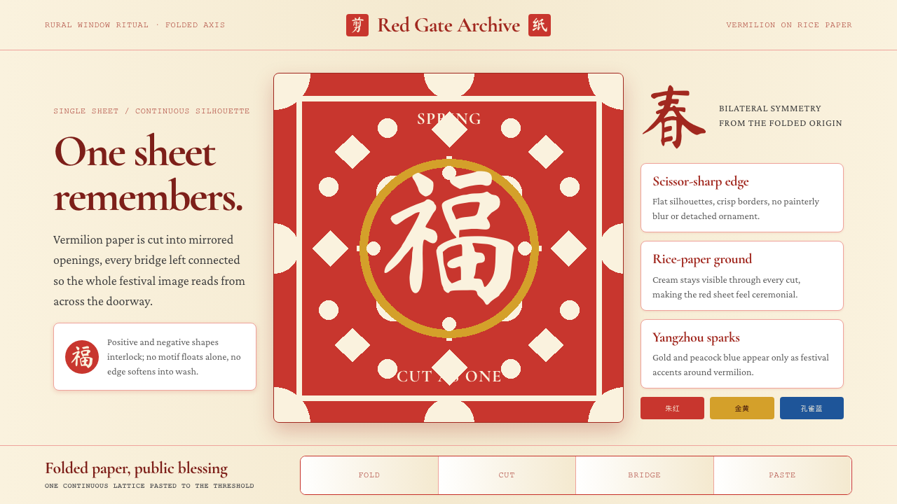 Chinese Jianzhi Paper-CuttingRitual red, cut as one. Vermilion lacework on rice-paper cream locks every sh…仪式性的红,一剪成片。朱红镂空压在米黄纸上,所有形都扣住中轴。
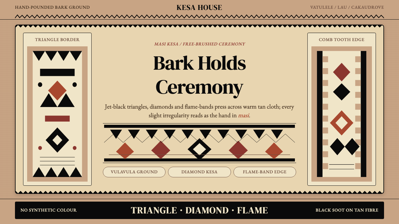 Fijian Masi (Tapa Cloth)Ceremony hits in black. Tan bark ground carries diamonds, zigzags and flame-b…黑色几何即仪式:暖褐树皮底承载菱形、锯齿与火焰边。
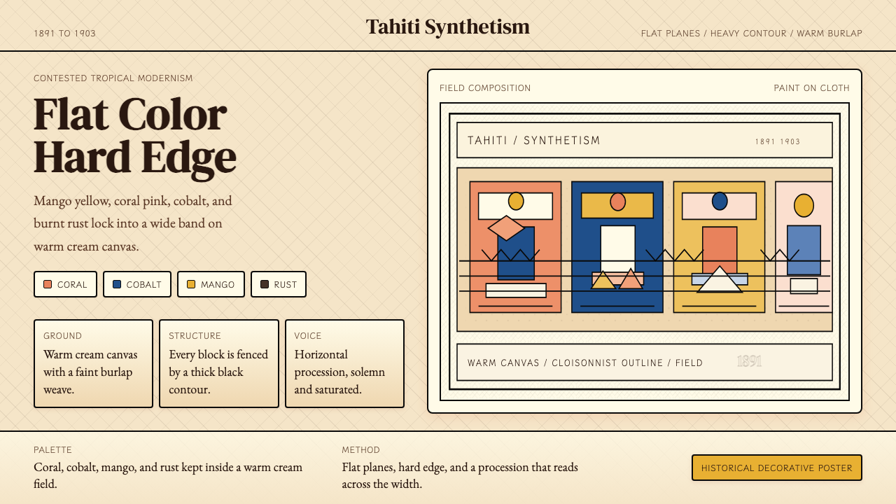 Gauguin — Tahiti SynthetismFlat color, hard edge. Cream canvas, coral, cobalt, and rust lock into a frie…平涂硬边。奶油底上珊瑚、钴蓝与焦土红排成壁带。