What is Edo Ukiyo-e (Hokusai)?什么是 Edo Ukiyo-e (Hokusai)?
Ukiyo-e — 'pictures of the floating world' — distilled Edo Japan's entire visual imagination into flat color planes, delicate ink outlines, and compositions of such diagonal force that they rewired how Western artists understood space.浮世绘——“流动世界的图像”——将江户日本的全部视觉想象力凝练为平涂色块、精致墨线轮廓,以及强劲对角线的构图张力,彻底改写了西方艺术家对空间的理解。
Edo Ukiyo-e (Hokusai) in briefEdo Ukiyo-e (Hokusai) 速览
Ukiyo-e is the Japanese woodblock printing tradition that flourished during the Edo period (1603–1868). The word ukiyo originally carried a Buddhist connotation of impermanence — the sorrowful transience of earthly life — but by the seventeenth century it had been repurposed with ironic pleasure to mean the fashionable, hedonistic 'floating world' of Edo's merchant class: kabuki theater, sumo wrestling, tea houses, and the licensed pleasure districts. Prints depicted these subjects with an aesthetic that was simultaneously popular and refined.浮世绘是江户时代(1603—1868年)蓬勃发展的日本木版印刷传统。“浮世”一词最初带有佛教色彩,指尘世的无常与悲苦,但到了十七世纪,它已被带着讽刺意味的享乐精神重新定义,转而指涉江户市民阶层时髦而纵乐的“浮动世界”——歌舞伎、相扑、茶屋与花街柳巷。版画以一种既通俗又雅致的美学描绘这些题材。
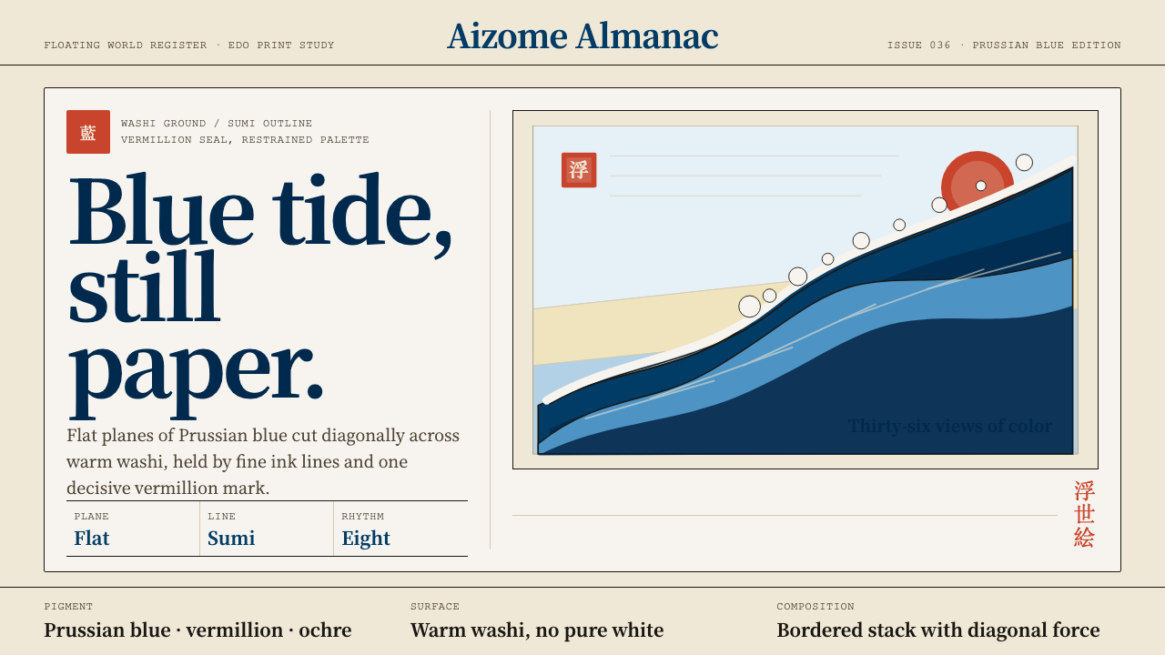
Visually, ukiyo-e is defined by a small number of absolute commitments: flat color planes with no modelling or gradients; contour lines drawn in sumi ink that describe form without simulating volume; and compositions organized through overlapping horizontal bands — foreground, middle ground, sky — rather than through Western linear perspective. Backgrounds are often left as unprinted paper or washed in a single atmospheric color. The result is images that feel simultaneously immediate and timeless, bold yet unhurried.在视觉语言上,浮世绘有几条绝对的承诺:无明暗过渡的平涂色块;以墨线勾勒轮廓而不模拟体积;构图通过叠压的横向色带——近景、中景、天空——来组织,而非借助西方的线性透视。背景常常是未印色的和纸本色,或以单一色调的渲染覆盖。其结果是一种既即时又永恒、既大胆又从容的图像气质。
Katsushika Hokusai (1760–1849) pushed the tradition to a new level of compositional ambition with his series 'Thirty-Six Views of Mount Fuji' (1830–1832). Where earlier ukiyo-e had focused on people — actors, beauties, wrestlers — Hokusai made landscape the dominant subject and brought to it an almost architectural sense of scale and geometry. The arrival of imported Prussian blue pigment around 1820 gave him a deep, stable, luminous hue that no Japanese pigment had provided before, and his use of it in gradated washes and flat planes became the visual signature of the entire tradition.葛饰北斋(1760—1849年)以《富岳三十六景》(1830—1832年)将这一传统推向了全新的构图高度。早期浮世绘以人物为主——演员、美人、力士——北斋却以风景为主体,并为之注入了近乎建筑般的尺度感与几何感。约1820年前后传入的普鲁士蓝颜料,赋予了他前所未有的深邃、稳定而光亮的蓝色,他对这种颜料在渐晕洗色与平涂块面上的运用,成为整个浮世绘传统最具辨识度的视觉标志。
See the Edo Ukiyo-e (Hokusai) design system查看 Edo Ukiyo-e (Hokusai) 完整设计系统
Where does Edo Ukiyo-e (Hokusai) come from?Edo Ukiyo-e (Hokusai) 从何而来?
The Edo period (1603–1868) was defined by the Tokugawa shogunate's policy of national isolation (sakoku), which kept foreign influence minimal and concentrated cultural life within Japan's own cities. Edo — the shogunal capital, today's Tokyo — grew into one of the world's largest cities by 1700, with a prosperous merchant class that was economically powerful but socially ranked below samurai, scholars, and farmers in the Confucian hierarchy. Denied access to high culture by social convention, merchants and artisans built their own parallel culture centered on entertainment, fashion, and vernacular art. Ukiyo-e was the visual expression of this parallel world.江户时代(1603—1868年)以德川幕府的锁国政策为标志——这一政策将外国影响降至最低,也将文化生活集中于日本自身的城市之中。江户——幕府的首都,即今日东京——到1700年前后已发展成为当时世界最大城市之一。富裕的商人阶层在经济上势力强大,却在儒家等级秩序中被置于武士、学者与农民之下。被社会惯例拒于高雅文化门外的商人与工匠,建立起以娱乐、时尚与通俗艺术为中心的另一套平行文化。浮世绘就是这个平行世界的视觉表达。
Woodblock printing itself was not new — it had been used for centuries to reproduce Buddhist texts and illustrations. What changed in the seventeenth century was the application of this reproductive technology to secular, commercial image-making. Publishers in Edo commissioned artists, who would draw the designs in ink on thin paper; professional block-cutters would then transfer these outlines to woodblocks; printers would press successive blocks — one per color — onto sheets of handmade washi paper. At its height, a single edition might run to several hundred prints, making images affordable to urban commoners for the first time. The mass-produced print was Edo's equivalent of the poster and the magazine.木版印刷本身并不新鲜——数百年来,它一直被用于复制佛教典籍与插图。十七世纪的变化,在于这一复制技术被引入了世俗的、商业性的图像制作。江户的出版商委托画师以墨笔在薄纸上绘制草稿,专业刻版师将轮廓转刻到木版上,印刷工将一块块版——每色一块——依次压印在手工制作的和纸上。鼎盛时期,一个版次可印制数百张,使图像首次对城市平民变得触手可及。量产印刷品是江户时代的海报与杂志。
The tradition moved through several distinctive phases. Early ukiyo-e (late seventeenth century) was dominated by figure subjects: Hishikawa Moronobu's bold line prints of women and genre scenes established the format. Multi-color printing (nishiki-e, 'brocade pictures') emerged around 1765 under Suzuki Harunobu, whose delicate palette and idealized feminine figures set the template for bijinga (beauty pictures). Tōshūsai Sharaku's intensely psychological actor portraits appeared in a single concentrated burst in 1794–1795. Kitagawa Utamaro refined the close-up female portrait into an art of extraordinary psychological subtlety. Hokusai and his younger contemporary Utagawa Hiroshige elevated landscape — fūkeiga — to the dominant genre, and it was this final phase that most directly reached and transformed Western art.这一传统经历了几个截然不同的阶段。早期浮世绘(十七世纪末)以人物题材为主:菱川师宣以粗犷有力的墨线版画描绘女性与市井场景,奠定了这一形式的基础。1765年前后,铃木春信率先推出多色套印(锦绘),他那纤柔的色调与理想化的女性形象确立了美人画的范式。东洲斋写乐在1794—1795年间集中爆发出一批心理深度惊人的演员肖像。喜多川歌麿将近景女性肖像磨砺成一种心理细腻度极高的艺术。北斋与他的后辈歌川广重将风景画——风景绘——提升为主导类型,而这最后一个阶段,也最直接地影响并改变了西方艺术。
The opening of Japan to Western trade after Commodore Perry's mission in 1853 led, within a generation, to ukiyo-e prints traveling to Europe as wrapping paper for exported ceramics. Édouard Manet, Edgar Degas, Claude Monet, and Vincent van Gogh each collected prints and openly absorbed their compositional lessons: the flattening of space, the bold cropping, the use of outline, the asymmetric placement of subject against empty ground. This influence — christened Japonisme — transformed Impressionism and Post-Impressionism, and through those movements, shaped the entire trajectory of Western modernism. The influence was not one-directional: Prussian blue itself was a European invention that Hokusai adopted, and woodblock artists of the late Edo period were already incorporating some Western perspective conventions into their landscape work.1853年黑船事件打开日本国门后,不出一代人,浮世绘版画便随着出口陶瓷的包装纸流传到欧洲。马奈、德加、莫奈、梵高各自收藏版画,公开吸收其构图之道:空间的平面化、大胆的裁切、轮廓线的使用、将主体非对称置于空白底面上的方式。这股影响——被称为“日本主义”——改变了印象派与后印象派,并经由这两大运动塑造了整个西方现代主义的走向。影响并非单向而行:普鲁士蓝本身是欧洲的发明,被北斋引为己用;江户晚期的木版画师也已在风景作品中融入了若干西方透视法的惯例。
What defines the Edo Ukiyo-e (Hokusai) look?Edo Ukiyo-e (Hokusai) 的视觉特征是什么?
Flat Color Planes平涂色块
Ukiyo-e applies color in unmodulated, even planes with no gradients, no highlights, and no cast shadows — a direct consequence of the woodblock printing process, where each block deposits a single layer of water-based pigment. This flatness is not a limitation but a discipline: it forces compositional decisions to be made through shape, outline, and placement rather than through tonal modelling. Modern applications should honor this by using solid fills rather than gradients, and reserving any wash effect for intentional atmospheric zones only.浮世绘以均匀、无过渡的平涂填色,无高光、无明暗变化、无投影——这是木版印刷工艺的直接产物:每块木版只沉积一层水性颜料。这种平面性并非局限,而是一种自律:它迫使构图决策通过形状、轮廓与位置来完成,而非依赖明暗塑造。现代应用应以实色填充而非渐变来尊重这一原则,仅在刻意营造大气氛围的区域才保留渲染效果。
Sumi Ink Contour墨线轮廓
A thin, precise outline in deep sumi ink defines every form in ukiyo-e. The line is the primary carrier of information — it describes volume without simulating it, separates color planes without hard shadows, and gives the image its characteristic drawn quality. Line weight varies subtly to suggest pressure and emphasis: slightly heavier at the base of figures, lighter and more calligraphic in hair or fabric folds. In digital interfaces, this translates to hairline borders in a near-black tone rather than drop shadows or ambient glow.纤细而精确的墨线勾勒出浮世绘中每一个形态的轮廓。线条是信息的主要载体——它不模拟体积却能描述体积,不借助重色阴影却能分隔色块,并赋予图像独特的笔绘质感。线条粗细有微妙变化,暗示用笔力度与强调重点:人物底部略重,发丝或衣褶处更轻盈而富于书法感。在数字界面中,这转化为近黑色的极细边框,而非投影或环境光晕。
Constrained Palette有限色彩
The multi-block printing process imposed an inherent limit on color — early prints used two or three blocks; elaborate late Edo prints might use seven or eight. This constraint produced a distinctive economy: every color is present because it is necessary, and the combinations carry maximum visual weight from minimum hue variety. Prussian blue anchors the system as its deepest, most saturated note; vermillion provides warmth and visual tension; ochre bridges the warm paper ground to both. The background is washi paper itself — a warm off-white that reads as light rather than neutral.多版套印工艺对色彩数量有天然限制——早期版画使用两三块版,江户晚期的精工版画也不过七八块。这一约束催生了独特的用色经济:每种颜色的出现皆因必要,有限的色相组合承载着最大的视觉重量。普鲁士蓝作为体系中最深、最饱和的音符锚定整体;朱红提供温暖感与视觉张力;赭黄在暖色和纸底面与冷色蓝调之间架起桥梁。背景是和纸本色——一种温暖的近白色,让人感受到光而非中性。
Asymmetric Diagonal Composition非对称对角线构图
Ukiyo-e compositions are governed by diagonal energy rather than bilateral symmetry. In 'The Great Wave,' the wave's claw-like crest arcs from lower-left to upper-right; Fuji sits small and stable in the far distance as a geometric counterweight. This diagonal dynamism — often reinforced by a cropped foreground element that pushes into the frame from one edge — creates tension and movement without symmetry. The convention of placing the horizon high and leaving the lower register open is equally characteristic, giving a sense of vast space without traditional Western receding perspective.浮世绘构图受对角线动势支配,而非左右对称。在《神奈川冲浪里》中,浪峰的利爪状弧线从左下延伸至右上;富士山作为几何重心,静静矗立于远景一隅。这种对角线的动感——常常由一个从画面边缘切入的近景元素来强化——无需对称便制造出张力与运动感。将地平线置于高位、将前景区域留空的惯例同样具有代表性,在不借助西方透视退缩法的前提下营造出辽阔的空间感。
Layered Planes叠压平面
Space in ukiyo-e is organized as a series of overlapping horizontal bands stacked vertically on the picture plane — the visual equivalent of theater stage flats receding into the wings. Sky occupies the upper register; a middle band holds the primary subject; foreground elements anchor the bottom. Rather than diminishing in size with distance, objects are often drawn at consistent scale with depth implied purely through overlap and vertical position. This planar stratification, borrowed in part from Chinese Song and Ming dynasty landscape traditions, is the formal grammar that Western Japonisme enthusiasts found most exotic and most influential.浮世绘的空间以一系列叠压的水平色带为组织原则,在画面平面上垂直堆叠——犹如剧场侧幕依次退入纵深。天空占据上方色带,中间色带安置主体,近景元素锚定底部。物体随距离的缩小并非关键——深度往往仅靠叠压关系与垂直位置来暗示,而不依赖尺度递减。这种平面分层法部分借鉴了中国宋明山水画传统,也正是西方“日本主义”爱好者觉得最为异域、最具启示的形式语法。
Washi Ground和纸底面
The physical substrate of ukiyo-e — handmade washi paper produced from kozo (paper mulberry) fibers — contributes a warm, slightly absorbent surface whose fibrous texture gives printed inks a subtly matte, organic quality entirely different from the hard-edged reproduction of Western engraving. Colors appear to glow from within rather than sit on top. In digital application, this quality is approximated through warm off-white backgrounds (rather than pure white), and optionally through very subtle noise overlays at low opacity that recall the irregular fiber pattern of handmade paper.浮世绘的物理基底——以楮(纸桑)纤维手工制成的和纸——提供了一种温暖、略带吸收性的表面;其纤维质感赋予印刷墨色一种柔和的哑光有机感,与西方铜版印刷的硬边复制品截然不同。色彩仿佛从内部发光,而非附着于表面之上。在数字应用中,这种品质通过温暖的近白色背景(而非纯白)来近似,也可选择性地叠加极低透明度的细腻噪点纹理,唤起手工纸的不规则纤维肌理。
Vermillion Seal朱红印章
Every ukiyo-e print bears at least one red seal — the artist's hanko (personal seal) stamped in cinnabar or vermillion ink, identifying authorship and authenticating the print. This small rectangular or oval mark functions as a focal anchor: a burst of warm red in an otherwise blue-and-neutral composition that the eye is drawn to first. In design applications, the hanko principle translates into a small, square vermillion accent mark — a badge, a label, a call-to-action button — that provides warmth and specificity within an otherwise restrained palette.每一幅浮世绘上至少有一枚红印——画师以辰砂或朱砂印泥盖上的落款印章,用以标明作者身份并证明版画的真实性。这枚小小的方形或椭圆形印记充当视觉焦点的锚:在以蓝色与中性色为主的构图中,一抹温暖的朱红让目光首先落停于此。在设计应用中,印章原则转化为一枚小巧的方形朱红强调元素——徽章、标签、行动号召按钮——在克制的整体色调中注入温度与视觉焦点。
See the Edo Ukiyo-e (Hokusai) design system查看 Edo Ukiyo-e (Hokusai) 完整设计系统
Who shaped Edo Ukiyo-e (Hokusai)?谁塑造了 Edo Ukiyo-e (Hokusai)?
Hokusai (1760–1849) was active as an artist for seven decades and is estimated to have produced over thirty thousand works. He changed his artist name at least thirty times, viewing each change as a spiritual renewal and fresh beginning. His series 'Thirty-Six Views of Mount Fuji' (the final print count was actually forty-six) transformed landscape printmaking by imposing a rigorous geometric logic onto natural scenery — Mount Fuji appears in each print as a stable triangle, the compositions structured around its presence or absence in unexpected corners of the frame. He is said to have written at age seventy that nothing he produced before the age of seventy was worth attention, and that he expected to reach true mastery at one hundred and ten.北斋(1760—1849年)艺术生涯活跃长达七十年,据估计创作了三万余件作品。他至少改名三十次,将每次改名视为精神上的更新与新的起点。他的《富岳三十六景》(实际印刷了四十六幅)通过对自然景观施加严格的几何逻辑,彻底改变了风景版画的面貌——富士山在每一幅中以稳定的三角形出现,构图围绕着它在画面意想不到角落中的在场或缺席展开。相传他在七十岁时曾写道,此前所作皆不值一提,并期望在一百一十岁时才能真正达到大成。
Hiroshige (1797–1858) was Hokusai's most significant contemporary rival in the landscape genre, and in some respects his temperamental opposite. Where Hokusai's compositions are dramatic and geometric, Hiroshige's are lyrical and atmospheric: rain depicted as diagonal ruled lines, snow as white negative space against darkened sky, mist as dissolving layers of pale wash. His series 'One Hundred Famous Views of Edo' and 'The Fifty-Three Stations of the Tōkaidō' documented urban and road-journey scenes with a poetic melancholy that proved enormously influential. Van Gogh copied two of Hiroshige's prints directly in oil paint, and Monet's garden at Giverny — with its Japanese bridge and reflective pond — was conceived in explicit dialogue with Hiroshige's vision.歌川广重(1797—1858年)是风景题材上与北斋最具竞争力的同时代人,在某种程度上也是气质上的反面。北斋的构图戏剧而几何,广重的则抒情而大气:雨水以对角线条表现,雪景以暗沉天空衬托的白色负空间呈现,烟霾化为逐渐消融的淡色渲染层。他的《名所江户百景》与《东海道五十三次》以一种带有诗意忧郁的笔调记录了城市与旅途场景,影响深远。梵高直接以油画临摹了广重的两幅版画;莫奈在吉维尼的花园——日本拱桥与倒影池塘——也是在与广重意境的明确对话中构想而成的。
Utamaro (1753–1806) specialized in bijinga — pictures of beautiful women — and brought to the genre an unprecedented psychological intimacy. His signature innovation was the ōkubi-e, the large-head or bust-portrait format, which cropped away the full figure and concentrated attention on facial expression, the line of a neck, the arrangement of hair ornaments. His images are not portraits of individuals but idealizations of feminine types — the romantic, the coquette, the distracted — read through precise observation of posture, gesture, and physiognomy. Utamaro's work defined the bijinga genre for a generation and influenced the representation of women in Western art through Japonisme.喜多川歌麿(1753—1806年)专擅美人画,并为这一题材带来了前所未有的心理亲近感。他的标志性创新是大首绘——截去全身、聚焦于面部表情的半身肖像构图——使目光集中于表情、颈线与发饰的布置。他的图像并非个人肖像,而是女性类型的理想化——多情的、娇媚的、若有所思的——通过对姿态、手势与面相的精准观察来传达。歌麿的作品定义了整整一代人的美人画面貌,并经由日本主义影响了西方艺术对女性形象的表现。
Sharaku is one of the great mysteries of art history: he produced approximately one hundred and forty-five actor portraits in a period of roughly ten months in 1794–1795, then vanished entirely from the record. His prints departed sharply from the idealized actor images that his contemporaries produced, depicting kabuki performers with exaggerated, almost caricatural intensity — bulging eyes, twisted mouths, extreme tension in the hands. His identity has never been established with certainty. The prints were not commercially successful in his own time, dismissed as too realistic and unflattering, but they are now regarded as among the greatest portraits in the history of printmaking.东洲斋写乐是艺术史上的一大谜团:他在1794—1795年间仅约十个月内创作了大约一百四十五幅演员肖像,随即从所有记录中消失无踪。他的版画与同时代人制作的理想化演员图像截然不同,以夸张、近乎漫画式的强度描绘歌舞伎演员——眼珠突出,嘴角扭曲,双手极度紧绷。他的真实身份至今无从确证。这批版画在当时并不畅销,被批评为过于写实、有损形象,但如今被视为版画史上最伟大的肖像之列。
Harunobu (1725–1770) is credited with introducing full polychrome woodblock printing — nishiki-e, or 'brocade pictures' — around 1765, transforming ukiyo-e from a primarily monochrome tradition into the rich, multi-color medium it is known as today. Before Harunobu, most prints were produced in two or three colors; his technical advance allowed the delicate layering of six or more blocks, enabling the subtle tonal gradations and patterned textiles that became central to the aesthetic. His own subjects were typically young, slight figures of androgynous beauty in intimate indoor settings, rendered with a porcelain delicacy that influenced every bijinga artist who followed.铃木春信(1725—1770年)于1765年前后被认为率先引入了全彩木版套印——锦绘——将浮世绘从一个以单色为主的传统转变为我们今天所熟知的丰富多彩的媒介。春信之前,大多数版画只用两三种颜色;他的技术突破允许六块乃至更多版的精细叠印,实现了后来成为这一美学核心的微妙色调层次与纹样织物表现。他本人的题材通常是在温馨室内环境中的纤细中性少年少女形象,以瓷器般的细腻感表现,影响了此后所有的美人画艺术家。
How do you use Edo Ukiyo-e (Hokusai) today?今天怎么用 Edo Ukiyo-e (Hokusai)?
Applying ukiyo-e as a design system requires understanding that its power comes from constraint and structural decision-making rather than from surface decoration. The instinct to add a 'Japanese feel' through cherry blossoms, red torii gate silhouettes, or cursive script is exactly wrong — those are cultural symbols, not design principles. The actual ukiyo-e principles are spatial (flat planes, diagonal diagonals, cropped foreground), chromatic (Prussian blue as structural anchor, vermillion as counterpoint, washi ground), and linear (precise sumi-ink outlines replacing shadows and gradients). Work from those three axes and the cultural authenticity will follow.将浮世绘作为设计系统来应用,需要理解其力量来自约束与结构决策,而非表面装饰。凭借樱花、鸟居剪影或草书来添加“日本感”的直觉恰恰是错误的——那些是文化符号,不是设计原则。真正的浮世绘原则是空间性的(平涂平面、对角线动势、裁切的近景元素),色彩性的(普鲁士蓝作为结构锚、朱红作为对位色、和纸作为底面),以及线条性的(精准墨线轮廓取代阴影与渐变)。从这三个维度出发,文化真实性自然随之而来。
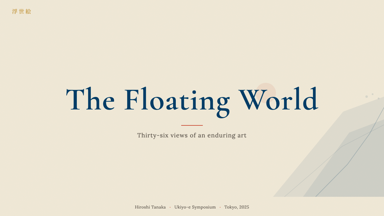
For presentation slides, the style produces a distinctive and memorable result with relatively few moves. A cover slide works best with a strong diagonal element — a wave, a horizon band, an angled color field — that cuts across a washi-warm background. The title sits in high-contrast serif type (preferably a Garamond or similar cut with fine hairlines) against the flattest possible surface. Content slides should be treated as woodblock compositions: a strong color band as a section header, body text in a clear serif at generous leading, and data visualizations rendered as flat filled shapes without gradients or three-dimensional effects. Bar charts become color planes; pie charts become flat discs.对于演示文稿,这种风格以相对简洁的手法产生独特而令人印象深刻的效果。封面最适合一个强劲的对角线元素——一道浪涌、一条地平线色带、一块倾斜的色场——切过温暖的和纸背景。标题以高对比度的衬线字体(最好是具有细发丝线的加拉蒙或类似字体)落在尽可能平涂的底面上。内容页应当被当作木版构图来处理:以强烈色带作区块标题,正文以清晰衬线体宽松排版,数据可视化呈现为不带渐变或三维效果的平涂色块——条形图成为色面,饼图成为平面圆盘。
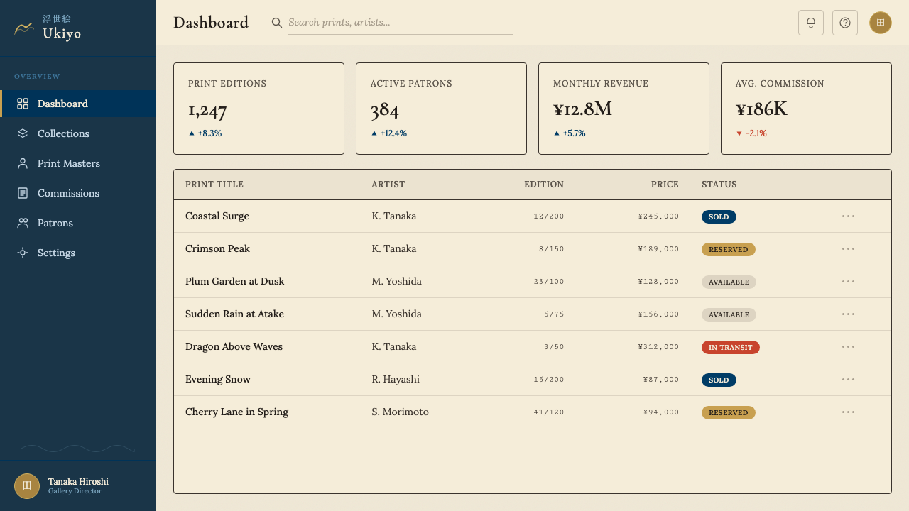
For web UI, ukiyo-e works particularly well in editorial, cultural, or portfolio contexts where the atmosphere of refined restraint reinforces content. A pricing or dashboard layout built on this system should use the warm off-white washi ground as the page background, card surfaces slightly cooler at a light neutral tone, and borders as thin sumi-ink-like lines rather than shadows. Prussian blue handles primary interactive states — links, focus rings, primary buttons — while vermillion is reserved for the highest-priority calls to action or error states. The horizontal banding principle translates naturally to alternating section backgrounds on marketing pages: washi warm alternating with a slightly deeper neutral creates depth without breaking the flat-color discipline.对于网页界面,浮世绘在编辑、文化或作品集类场景中尤为出色——这些场景中,精致克制的氛围本身就强化了内容。以这套体系构建的定价页或仪表板应以温暖的和纸近白色作为页面背景,卡片表面略冷一些取偏浅的中性色调,以类似墨线的细边框而非阴影来界定边界。普鲁士蓝承担所有主要交互状态——链接、焦点环、主要按钮——朱红则保留给最高优先级的行动号召或错误状态。水平色带原则自然地转化为营销页面上交替的区块背景:温暖的和纸色与略深的中性色交替,在不破坏平涂纪律的前提下制造深度。
For editorial and marketing work, the style has a natural affinity for long-form storytelling and cultural content. Article layouts benefit from generous vertical white space between sections — the Edo woodblock's unprinted margin — and from section markers that are typographic (a bold number or rule) rather than decorative. Pull quotes work well in Prussian blue against a vermillion horizontal rule. Marketing pages that need emotional warmth can lean on the ochre-gold accent for background washes behind feature sections, with the main palette providing contrast and structure. The hanko-stamp badge — a small square vermillion label — is useful across contexts wherever a tier indicator, status tag, or emphasis marker is needed.对于编辑与营销内容,这种风格天然适合长文叙事与文化类内容。文章版面受益于章节之间慷慨的纵向留白——江户木版的空白边距——以及字体性的(粗序号或分隔线)而非装饰性的章节标记。引言段落以普鲁士蓝搭配朱红水平线效果突出。需要情感温度的营销页面可以将赭金色强调用于特性区块的背景渲染,主色板则提供对比与结构。印章徽章——一枚小方形朱红标签——在任何需要等级指示、状态标签或强调标记的场景中都十分有效。
The most common mistake is using the ukiyo-e palette while retaining Western spatial conventions: gradients, soft drop shadows, modelled illustration, or perspective-based hero images. Each of these imports volumetric space that flatness excludes by definition. A second common error is over-saturating the blue to a cobalt or navy that loses the particular luminous depth of Prussian blue. A third is treating the vermillion as a danger or error color exclusively — it is an accent and a counterpoint, warm and lively, not a warning signal. Reserve it for moments of energy and invitation, not only for alerts.最常见的错误是使用浮世绘色板,却保留了西方的空间惯例:渐变、柔和投影、有明暗的插图或透视感强烈的主视觉图像。这些无一例外地引入了与平面性原则相悖的体积空间感。第二个常见错误是将蓝色过度饱和为钴蓝或海军蓝,失去了普鲁士蓝特有的深邃光感。第三个错误是把朱红专用于危险或错误状态——它是一种强调色与对位色,温暖而生动,而非警示信号。把它保留给充满能量与邀请感的时刻,而不仅仅是警报。
See the Edo Ukiyo-e (Hokusai) design system查看 Edo Ukiyo-e (Hokusai) 完整设计系统
Edo Ukiyo-e (Hokusai) — FAQEdo Ukiyo-e (Hokusai) · 常见问题
What makes ukiyo-e different from other Japanese art traditions?浮世绘与其他日本艺术传统有何不同?
Ukiyo-e was fundamentally a commercial, mass-production medium aimed at an urban merchant audience, which distinguishes it sharply from earlier aristocratic Japanese art traditions. Court painting (yamato-e), ink wash painting (sumi-e), and the decorative Rinpa school were all produced in small quantities for elite patronage — hanging scrolls, folding screens, painted sliding doors. Ukiyo-e prints were made in editions of hundreds and sold at markets and bookstalls for prices equivalent to a bowl of noodles. This accessibility drove both its popular subject matter (entertainment, fashion, travel) and its visual directness: images designed to communicate quickly to a broad audience rather than reward contemplative study.浮世绘本质上是一种面向城市商人受众的商业性、量产媒介,这使它与更早的日本贵族艺术传统截然不同。宫廷绘画(大和绘)、水墨画与装饰性的琳派,都是为精英赞助人小批量制作的——挂轴、折屏、障壁画。浮世绘版画以数百张为一版次,在市集与书摊上以相当于一碗面条的价格出售。这种可及性既驱动了其通俗题材(娱乐、时尚、旅行),也决定了其视觉的直接性:图像旨在向广大受众快速传达,而非等待沉思式的细细品味。
Why is Prussian blue so central to the Hokusai look?普鲁士蓝为何在北斋的视觉语言中如此核心?
Before the import of Prussian blue (Berlin blue) around 1820, Japanese artists had access to blue pigments derived from indigo and azurite, neither of which could achieve the deep, luminous, and stable saturation that Prussian blue provided. Indigo faded; azurite was expensive and granular. Prussian blue was cheaper, more stable, and capable of producing both intense solid fills and delicate graduated washes from a single pigment — qualities that aligned perfectly with the woodblock printing process. Hokusai seized on it immediately and used it in ways that created the iconic contrast between deep blue sea and cream-white wave foam that 'The Great Wave' is now famous for. Without Prussian blue, the visual signature of mature Hokusai would simply not exist.在1820年前后普鲁士蓝(柏林蓝)传入之前,日本画师所能获得的蓝色颜料来自靛蓝与蓝铜矿,两者均无法达到普鲁士蓝所具有的深邃、光亮而稳定的饱和度。靛蓝褪色,蓝铜矿昂贵且颗粒粗糙。普鲁士蓝更廉价、更稳定,单一颜料既能产生浓烈的实色填充,也能呈现细腻的渐晕渲染——这些特性与木版印刷工艺天然契合。北斋立即掌握了这种颜料,并以之创造了深蓝海浪与奶白浪花之间那标志性的对比,使《神奈川冲浪里》成为举世闻名的图像。没有普鲁士蓝,北斋成熟期的视觉标志根本无从存在。
How did ukiyo-e influence Western modern art?浮世绘如何影响了西方现代艺术?
The influence, known as Japonisme, was rapid and pervasive once Japanese prints reached Europe in the 1860s and 1870s. At the most immediate level, Western artists copied specific ukiyo-e compositional devices: the high horizon, the cropped figure at the edge of the frame, the use of flat outline over modelled form, and the placement of subjects against unmodulated color fields rather than atmospheric backgrounds. Monet restructured his garden around a Japanese bridge and used the reflective surface of water as flat color planes in his late lily pond series. Degas borrowed the unusual cropping and overhead viewpoints. Van Gogh was so explicit about the influence that he painted oil copies of Hiroshige prints and wrote about ukiyo-e in his letters as a model of how to express emotions through simplified form and pure color. At a deeper structural level, ukiyo-e demonstrated to Western artists that the elimination of perspective depth and tonal modelling was not a deficiency but a legitimate and powerful spatial alternative.这股影响——被称为日本主义——在日本版画于19世纪六七十年代传入欧洲后迅速而广泛地蔓延开来。在最直接的层面上,西方艺术家临摹了浮世绘特定的构图手法:高地平线、在画框边缘被裁断的人物、以平涂轮廓取代明暗塑造、将主体置于无过渡色面而非大气背景上。莫奈围绕日本拱桥重新设计了他的花园,并在晚期的睡莲系列中将水面的倒影用作平涂色面。德加借鉴了不寻常的裁切与俯视角度。梵高对这一影响如此坦率,以至于直接以油画临摹了广重的版画,并在书信中将浮世绘描述为通过简化形态与纯色来表达情感的范本。在更深的结构层面,浮世绘向西方艺术家证明:消除透视深度与色调明暗并非一种缺陷,而是一种合理且有力的空间替代方案。
Can the ukiyo-e style work in dark-mode interfaces?浮世绘风格能用于深色模式界面吗?
The historical palette is fundamentally a light-ground system — the warm washi off-white is not just a background color but a structural element that gives Prussian blue and vermillion their particular luminous quality. A dark inversion is possible but requires significant reinterpretation. On a dark ground, the Prussian blue loses its contrast advantage (it reads dark against dark) and vermillion becomes the dominant visual signal rather than an accent. A workable dark variant would treat a deep navy or charcoal as the base, use a lighter, desaturated blue-grey for surfaces, bring in vermillion and ochre as the primary accent colors, and deploy fine cream or washi-toned lines where the original used sumi-ink outlines on light ground. The result would be inspired by ukiyo-e rather than derived from it — and honesty about that distinction matters.历史上的调色板从根本上是一套浅色底面系统——温暖的和纸近白色不仅仅是背景颜色,更是赋予普鲁士蓝与朱红各自独特光感的结构性元素。深色反转是可能的,但需要相当程度的重新诠释。在深色底面上,普鲁士蓝失去了对比优势(深色对深色,难以区分),朱红则从强调色变成了视觉主导。可行的深色变体方案是:以深海军蓝或炭灰色作为基础,用较浅、去饱和的蓝灰色作为表面,将朱红与赭金用作主要强调色,并以奶油色或和纸色调的细线,取代原版中浅色底面上的墨线轮廓。这样的结果是受浮世绘启发,而非直接派生——坦率地承认这一区别,本身也是一种态度。
What kinds of products are a natural fit for this design style?哪类产品天然适合这种设计风格?
Ukiyo-e works best where editorial richness, cultural depth, and contemplative pace are aligned with user expectations. Digital magazines, cultural institution websites (museums, galleries, performance venues), travel and hospitality platforms, portfolio sites for designers and photographers, and long-form reading applications all benefit from the style's combination of warm restraint and compositional boldness. It is also a strong choice for brands that position themselves at the intersection of Japanese and Western sensibility — furniture, clothing, food, beauty. It is less suited to fast-moving consumer products, entertainment platforms requiring high visual energy, or SaaS tools where functional density must compete with ambient aesthetic warmth. The style rewards slow attention; interfaces that need to communicate quickly at a glance should look elsewhere.浮世绘最适合编辑丰富性、文化深度与沉浸式节奏符合用户期待的场景。数字杂志、文化机构网站(博物馆、画廊、演出场馆)、旅行与酒店平台、设计师与摄影师的作品集网站,以及长文阅读应用,都能从这种风格温润克制与构图大胆的结合中获益。它对于将自身定位于日西感性交汇处的品牌也是有力选择——家具、服装、食品、美妆。对于快节奏的消费品、需要强烈视觉能量的娱乐平台,或功能密度与环境美感需要兼顾的SaaS工具,这种风格则不太适合。它奖励缓慢而专注的注意力;需要在一瞥之间迅速传达信息的界面,应当另择其他。
Related design styles相关设计风格
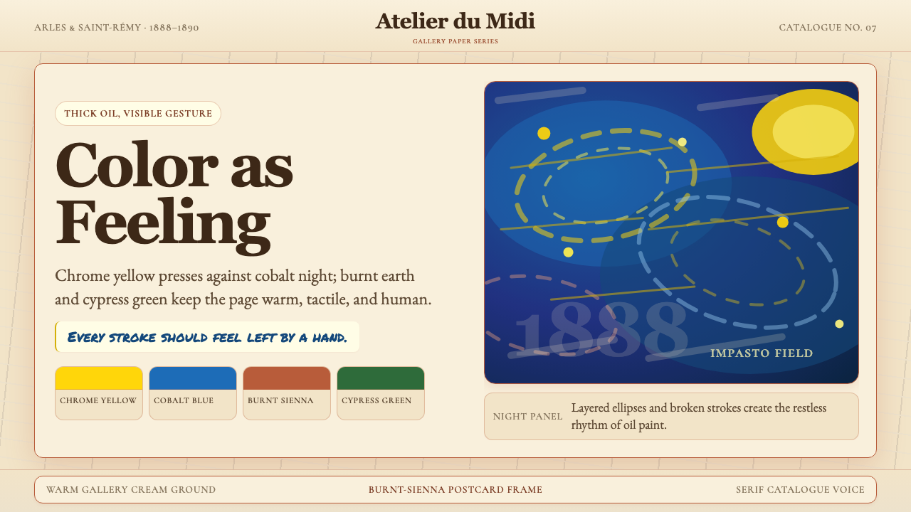 Van Gogh Post-ImpressionistFeeling made visible. Chrome yellow meets cobalt swirls on warm gallery cream.情感可见。铬黄与钴蓝旋涡落在暖画廊奶油底上。
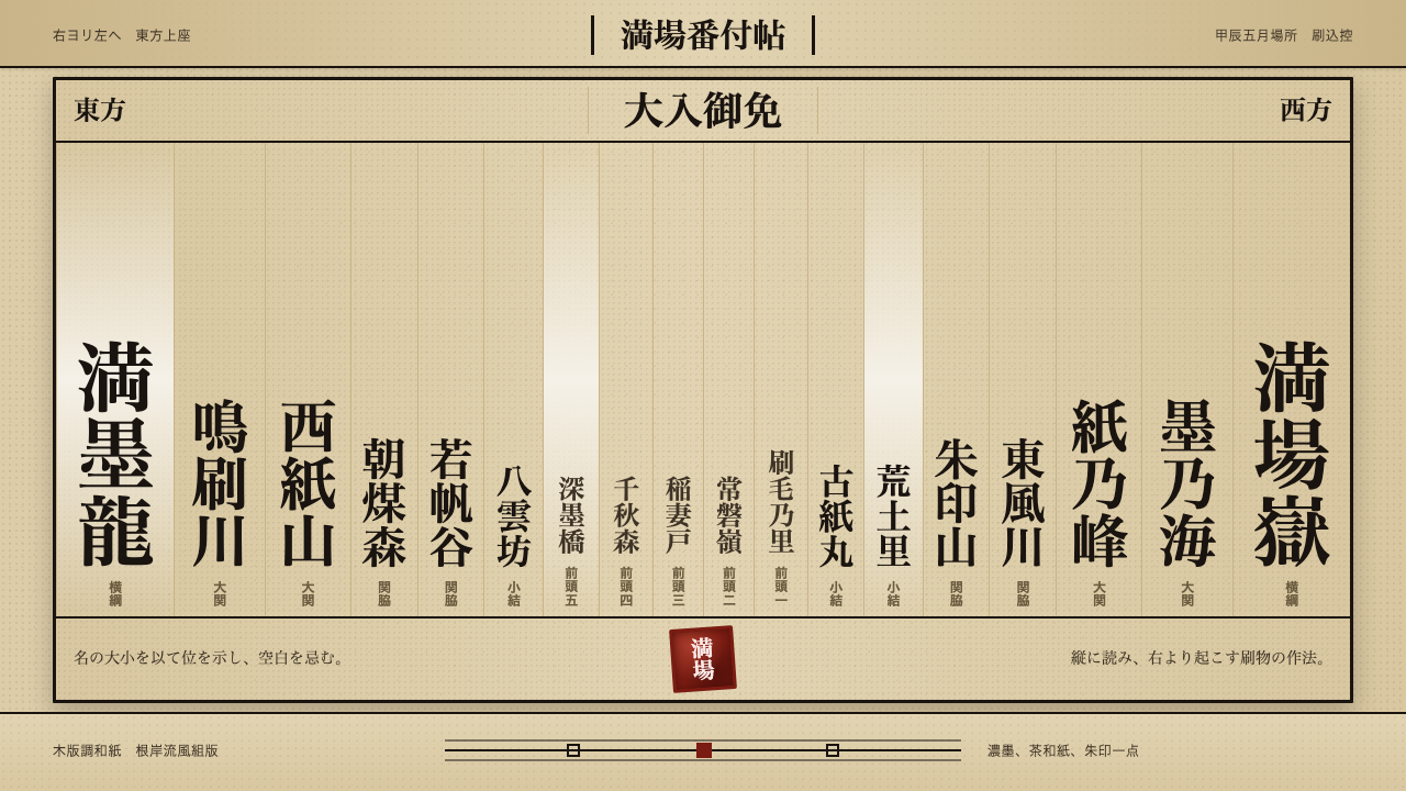 Sumo BanzukeCeremonial density. Sumi columns crowd tan washi; rank-scaled type meets one…仪式感来自拥挤:浓墨竖列铺满茶色和纸,字号按等级放大,朱印收尾。
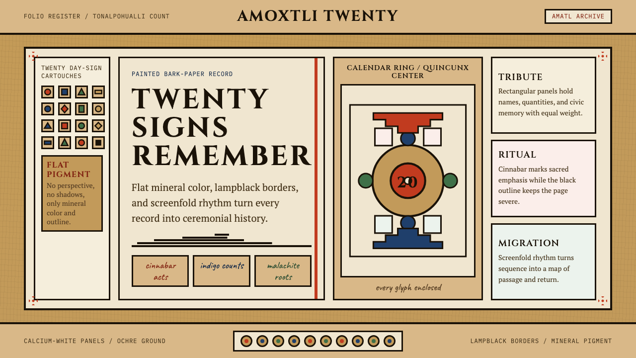 Aztec CodexSacred records stay severe. Ochre amatl ground, Cinzel capitals, black cartou…神圣记录保持庄严。赭黄纸底、Cinzel 大写与黑色匣框。
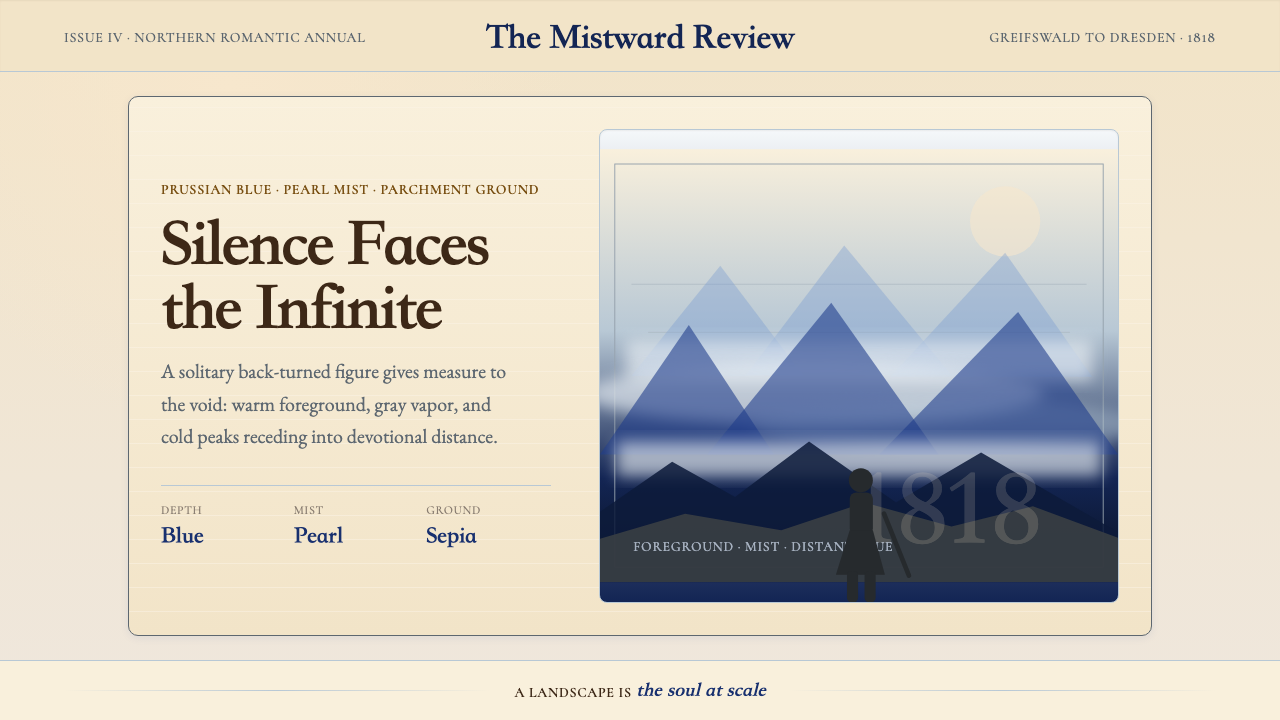 Caspar David FriedrichSilence becomes vast. Prussian blue depth, pearl mist, and parchment framing…寂静变得辽阔:普鲁士蓝纵深、珍珠雾与羊皮纸框层层后退。
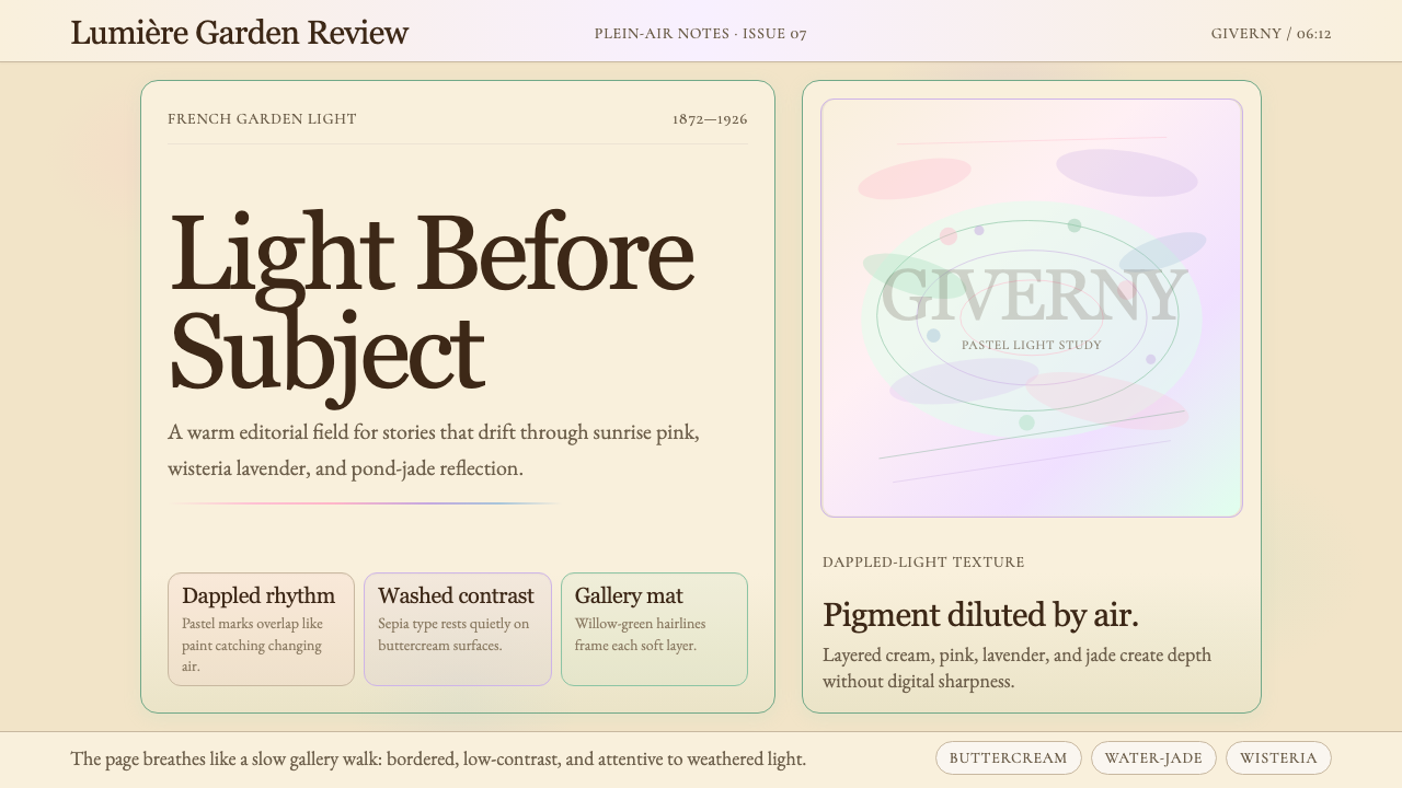 Claude Monet ImpressionistLight becomes the subject. Buttercream, pastel dapples, and Cormorant serif s…光成为主题。奶油底、粉彩斑点与Cormorant衬线柔化画面。
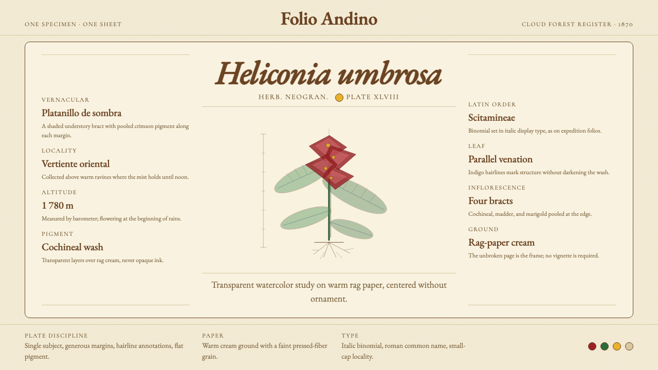 Colombian Botanical (Triana)Observation becomes ornament. Crimson watercolor specimen breathes on cream r…观察即装饰。绯红水彩标本静置于奶油破布纸。