What is Sumo Banzuke?
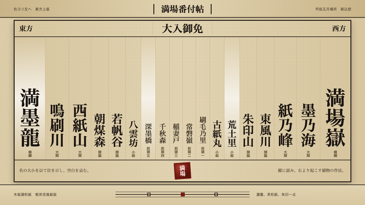
The banzuke crowds every inch of the page with thick brushed columns because in this tradition, empty paper looks like empty seats.
Sumo Banzuke in brief
Sumo Banzuke is the design language of the official ranking sheet of Grand Sumo, a single dense broadsheet hand-brushed by a gyōji (sumo referee-scribe) before every tournament. Unlike quieter East Asian ink traditions that prize empty space, the banzuke is built on deliberate, ceremonial density — thick, tightly packed columns of brushed characters fill nearly the entire sheet, with almost no area left untouched.
The system exists to communicate hierarchy through scale and position rather than through separate labels or explanatory text. Wrestlers are ranked purely by where their name sits and how large it is brushed: the yokozuna's name occupies the largest type at the very top, and rank descends both in position and in character size moving outward and downward, with East ranked in the right-hand column and West in the left, read top-to-bottom in traditional vertical Japanese order.
Visually, the language reads as woodblock-weight ink on fibrous, tea-toned washi paper — heavy, confident brush strokes in the negishi-ryū calligraphic style, packed so closely together that the whole sheet reads as a single dense field of ink from a distance, with individual names only resolving into legibility on close inspection.

Where does Sumo Banzuke come from?
The banzuke tradition stretches back to the Edo period, when sumo wrestling developed from a scattered set of regional and shrine-affiliated contests into an organized, professionalized sport with a formal ranking hierarchy. A ranking sheet was needed not merely to record results but to publicly and unambiguously declare each wrestler's standing before a tournament began — a matter of considerable social and financial consequence for wrestlers whose income and status depended directly on rank.
The specific calligraphic style used for the banzuke, known as negishi-ryū or sumo moji, developed as its own specialized branch of Japanese calligraphy distinct from ordinary brush writing. Characters are deliberately thickened and compressed, with strokes widened and rounded until the negative space between them nearly disappears. This is not a stylistic accident: within sumo tradition, thick, crowded characters are read as an auspicious wish for a full, packed venue, while thin characters with visible white space between strokes are considered to invite the bad luck of empty seats.
Producing a banzuke has historically been the responsibility of specialized gyōji — sumo's referees, who also serve as ceremonial officials and, in this specific role, as trained scribes. The most senior gyōji lineages, including the historically prominent Kimura Shōnosuke and Shikimori Inosuke names passed down through generations of officials, carried responsibility for the negishi-ryū brushwork as a serious craft discipline in its own right, taught and refined over years of apprenticeship rather than treated as incidental paperwork.
The banzuke's reading order and layout — East ranked to the right, West to the left, rank descending outward from the yokozuna's name at the top-center, read top-to-bottom in the traditional vertical format — has remained essentially unchanged since the Edo period and continues to be issued in this exact form before every honbasho (grand tournament) held today, making it one of the longest continuously maintained pieces of functional graphic design in the world.
What defines the Sumo Banzuke look?
Color
The palette is almost entirely monochrome: dense black sumi ink on tea-toned, fibrous washi paper, with a single vermilion seal as the sole accent color. There is no secondary palette and no decorative color anywhere — every visual distinction is carried by scale and position, not hue.
Rank-Scaled Typography
Character size is the primary carrier of meaning: the yokozuna's name is brushed at the largest scale, and every subsequent rank down the hierarchy is rendered progressively smaller, with no separate numbering or labeling system needed. This makes hierarchy instantly readable through scale alone, even to a viewer unfamiliar with the specific names.
Negishi-ryū Calligraphy
The specific brush style used, negishi-ryū, deliberately thickens and rounds every stroke until the white space between characters nearly vanishes. Thick, crowded lettering is traditionally read as an auspicious wish for a full house, while thinner strokes with visible gaps are associated with empty seats — making the density itself symbolically loaded rather than merely decorative.
Vertical Reading Order
Text runs in traditional Japanese vertical columns, read from top to bottom and right to left, with East ranks occupying the right-hand columns and West ranks the left. This reading order is not incidental formatting — it is load-bearing structure that encodes the East-West division fundamental to sumo's tournament organization.
Ceremonial Crowding
Nearly every inch of the sheet carries brushed content, with almost no deliberate empty space of the kind prized in quieter ink traditions. This crowding is a positive value here, not a lack of restraint — the tradition explicitly treats a densely filled sheet as auspicious and a sparse one as inviting misfortune.
Fibrous, Toned Ground
The paper is a tan, fibrous washi with a visibly textured surface, giving the ink a slightly absorbed, matte quality rather than sitting crisply on a smooth white ground. This material choice reinforces the sheet's weight and ceremonial gravity, distinguishing it from a merely printed or administrative document.
The Vermilion Seal
A single red seal marks the sheet's official authenticity, functioning as the one point of saturated color amid an otherwise entirely monochrome field. Its placement and small scale relative to the dense brushwork around it give it disproportionate visual and symbolic weight.

Who shaped Sumo Banzuke?
The lineage of sumo referee-officials trained specifically in the negishi-ryū calligraphic style responsible for hand-brushing every banzuke. Their craft is a specialized discipline distinct from ordinary Japanese calligraphy, focused entirely on producing the thick, densely packed characters the tradition requires, passed down through structured apprenticeship rather than taught as general brushwork.
The most senior hereditary name among sumo's chief gyōji, passed down through generations of officials at the top of the profession's hierarchy. A gyōji holding this name carries ultimate responsibility for the ceremonial and administrative functions of the sport, including oversight of the ranking system the banzuke publicly announces.
The second most senior hereditary gyōji name, traditionally held alongside Kimura Shōnosuke at the top of the profession. Together these two lineages represent the institutional continuity that has kept the banzuke's format essentially unchanged since the Edo period.
How do you use Sumo Banzuke today?
Sumo Banzuke transfers well to any context that wants to communicate ceremonial weight, formal hierarchy, and deliberate density rather than airy minimalism. Its core discipline is the opposite of quieter East Asian ink traditions — density itself is a positive, load-bearing value here, not a compromise.
For presentation slides, a cover page can borrow the rank-scaled typography logic directly: a title set in the largest scale surrounded by supporting text at progressively smaller sizes, packed tightly rather than spaced generously, immediately communicates hierarchy and gravity. Content slides work well for anything genuinely hierarchical — an org chart, a leaderboard, or a tiered pricing comparison rendered as dense, rank-scaled text rather than as separated cards reads with real authority. Data slides can use the East-West column division literally for any two-sided comparison.
For web interfaces, the aesthetic suits leaderboard, ranking, or competitive-standing features especially well — a ranked list where font size scales with position, set against a warm toned background with minimal spacing between entries, borrows the vocabulary convincingly. It is a poor fit for typical SaaS dashboards, which usually depend on generous whitespace for scannability; this style works specifically where density itself communicates status.
For editorial and marketing work, the style suits any content built around formal ranking, tournament structure, or hierarchical achievement — awards pages, competitive rankings, or heritage-brand storytelling about earned status. A densely packed, rank-scaled list of names or achievements, finished with a small red seal-like mark, reads immediately as ceremonial rather than casual.
The most common mistake is softening the density into generously spaced, minimalist layouts, which entirely defeats the style's purpose — this is one design language where more space is a mistake, not an improvement. Equally, using multiple accent colors instead of the single vermilion seal dilutes the hierarchy that scale and monochrome ink are meant to carry alone.

Sumo Banzuke — FAQ
Why does the banzuke crowd the page so densely instead of leaving breathing room?
Within sumo tradition, thick, tightly packed characters with almost no visible white space are read as an auspicious wish for a full, packed tournament venue. Thin lettering with visible gaps between strokes, by contrast, is associated with the bad luck of empty seats. The density is therefore not a stylistic default but a deliberate symbolic choice, distinct from other East Asian ink traditions that treat empty space as meaningful in the opposite direction.
How does the banzuke communicate rank without using separate labels or numbers?
Rank is encoded entirely through the size and position of each brushed name. The yokozuna's name is brushed at the largest scale at the top-center, and every lower rank is rendered progressively smaller as it moves outward and downward, with East ranks in the right-hand columns and West ranks in the left. This means the hierarchy is legible at a glance through scale alone, without needing any separate numerical or textual ranking system.
What makes negishi-ryū different from ordinary Japanese calligraphy?
Negishi-ryū is a specialized branch of calligraphy developed specifically for sumo ranking sheets, distinguished by deliberately thickened, rounded strokes that compress the negative space between characters until it nearly disappears. Ordinary Japanese calligraphy traditions often value visible brush dynamics and negative space as expressive elements; negishi-ryū instead treats maximal density as the primary formal goal, tied directly to the tradition's belief that crowded characters invite a full house.
Why is East always placed to the right and West to the left?
This division reflects sumo's fundamental tournament structure, in which every wrestler is assigned to either the East or West side for competitive and ceremonial purposes, a division maintained since the Edo period. The banzuke's layout — East to the right, West to the left, read in traditional top-to-bottom, right-to-left Japanese order — simply encodes this pre-existing structural division directly into the document's format rather than inventing a new convention.
Where does this style struggle or feel out of place?
It struggles for content that needs to feel approachable, casual, or spacious — consumer onboarding flows, wellness products, or anything where generous whitespace and a relaxed pace are the goal will find the banzuke's ceremonial crowding reads as overwhelming rather than authoritative. It is also a poor fit for content that lacks any genuine hierarchy to encode, since the entire system depends on scale-based rank differences to make sense; applying it to a flat, non-hierarchical list produces visual noise without the meaningful structure that justifies the density.
Related design styles
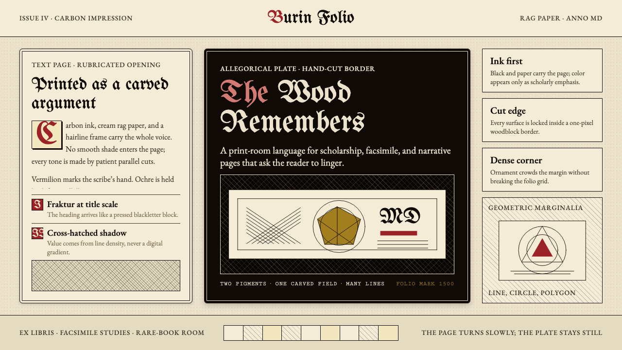 Dürer WoodcutInk remembers everything. Fraktur titles, rag-paper cream, and cross-hatched…
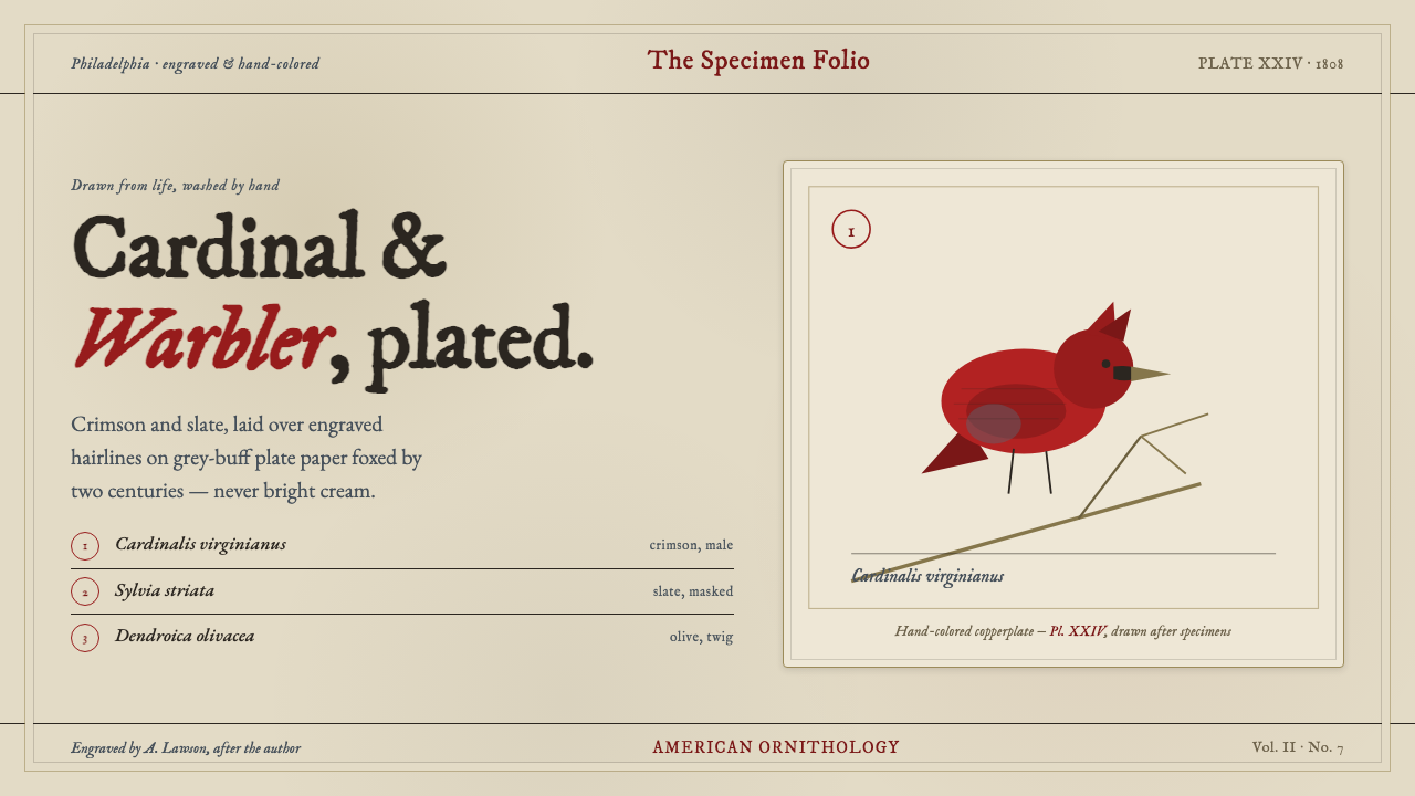 Wilson Ornithology PlateAn 1808 ornithology plate reborn. Cardinal crimson and slate, washed over eng…
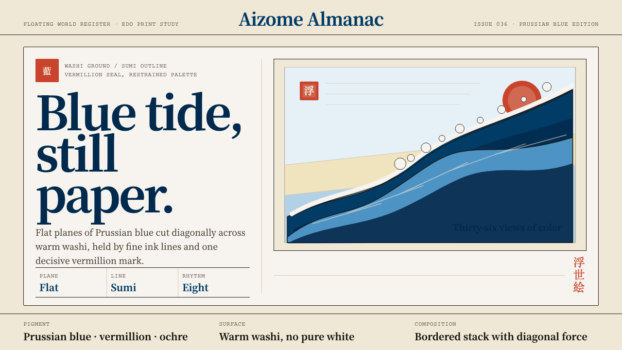 Edo Ukiyo-e (Hokusai)Flat power on paper. Prussian blue diagonals and vermillion seals cut across…
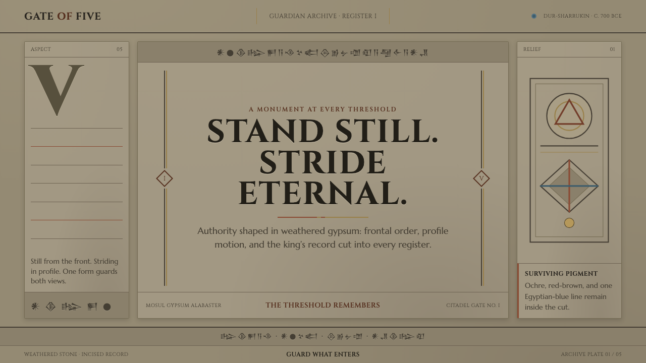 Assyrian Lamassu ReliefAuthority carved into silence. Buff-gray stone, monumental capitals, and cune…
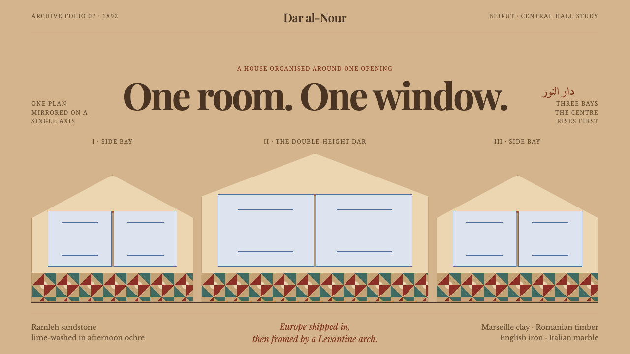 Beirut Triple-Arch HouseSymmetry holds the house together. Sandstone ochre frames three pointed bays…
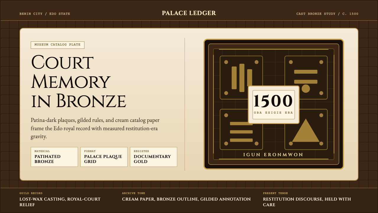 Benin Bronze (Edo, 1500)Royal memory, cast in bronze. Cream plaques and gilded lines carry museum gra…