What is Wilson Ornithology Plate?
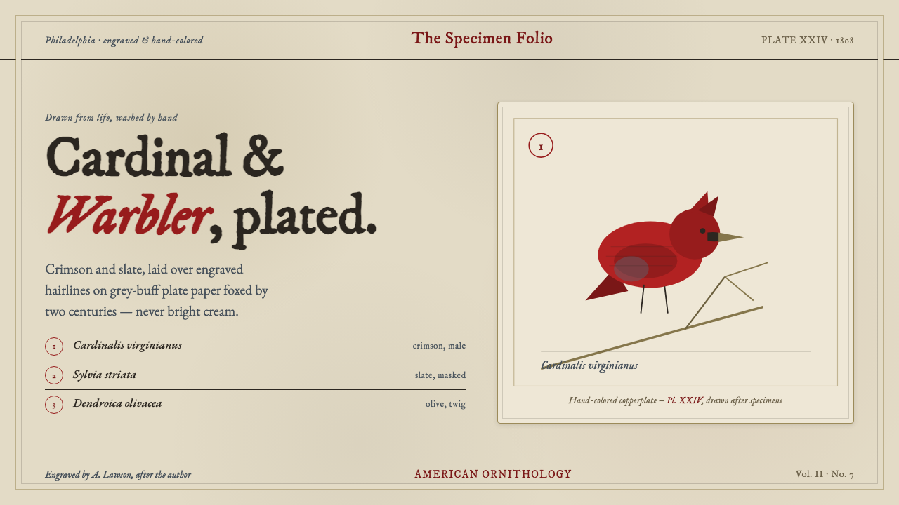
Wilson Ornithology Plate turns an early American bird engraving into a living editorial system: cardinal crimson, warbler slate, ink-black detail, and the patient grain of foxed paper.
Wilson Ornithology Plate in brief
Wilson Ornithology Plate is a historically rooted visual style reconstructed from Alexander Wilson’s American Ornithology, published in Philadelphia between 1808 and 1814. Its reference point is not a generic vintage illustration but a specific kind of natural-history plate: birds gathered on a single engraved sheet, their anatomy described through fine copperplate marks and their plumage brought forward with hand-applied color. The resulting character is observant, tactile, and quietly dramatic. It makes information feel collected rather than merely displayed.
The style begins with the ground. Instead of a clean gallery white or polished cream, the page feels like aged hand-laid plate paper: muted, grey-buff, slightly weathered, and softened by the visual memory of foxing. On that restrained field, cardinal crimson carries the strongest visual charge, slate evokes the cooler body color of warblers, and ink-black provides the sharpest anatomical and typographic definition. These colors do not behave as decorative branding accents. They behave as pigments laid over an engraved record.
Its central visual tension lies between precision and wear. Engraved lines and stippled shading imply close looking, taxonomy, and material craft; watercolor-like washes prevent the work from becoming sterile. Lettering should feel inherited from etched plate captions: formal, measured, and slightly ceremonial without becoming theatrical. The composition should read as a page from a cabinet of observation, where every mark exists to identify, frame, or dignify a specimen.
Where does Wilson Ornithology Plate come from?
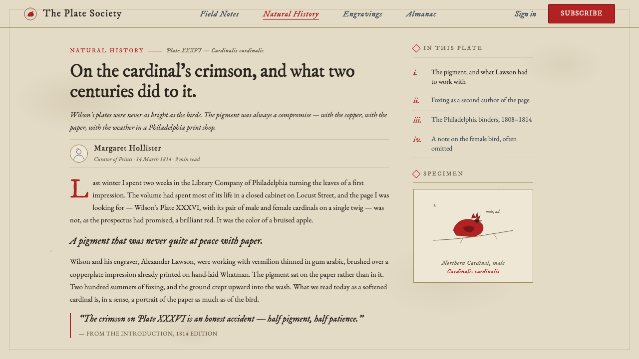
The style originates in Alexander Wilson’s American Ornithology, whose first edition appeared in Philadelphia from 1808 to 1814. The work assembled cardinals and warblers on individual copperplates, treating the printed sheet as both an image and a record. A viewer encounters birds not as free-floating decorative motifs but as studied subjects: placed, bounded, named, and rendered with enough attention that line itself becomes evidence of looking.
Alexander Lawson engraved the plates. Copperplate engraving gives the source material its defining discipline: contours are cut rather than brushed, tonal depth is built through repeated marks and stipple, and details retain a crisp graphic edge even when the subject is natural and feathered. This is why the style should never be reduced to a soft watercolor look. The watercolor wash is essential, but it rests on an underlying architecture of incision, contour, and accumulated engraved texture.
Hand-coloring supplied the plates’ vivid life. Brilliant crimson and slate were applied over the engraved image, creating a relationship between controlled black linework and more variable areas of pigment. That relationship is especially useful for contemporary design: structure can remain steady while color carries species, emphasis, or emotional temperature. The pigment should feel absorbed into paper and responsive to the engraved drawing beneath it, rather than floating above it as a glossy digital overlay.
The broader context is early American natural-history illustration, where a printed image served curiosity, recognition, and the desire to preserve observed forms. Wilson Ornithology Plate carries that purpose into modern use without pretending to be a scientific facsimile. Its visual language is strongest when it preserves the source’s respect for specimens, captions, and material process: a page is an artifact of observation, and the beauty of the artifact comes from how visibly it records attention.
What defines the Wilson Ornithology Plate look?
Foxed Paper Ground
The background is dusty grey-buff, aged rather than pristine. It should suggest hand-laid plate paper that has spent generations gathering warmth, unevenness, and quiet discoloration. A bright white field breaks the illusion immediately: this style depends on a ground that feels archival, absorbent, and materially present. The paper is not a neutral absence behind the content; it is the atmosphere that lets engraved black and hand-applied color belong together.
Engraved Linework
Fine contour lines and stippled tonal fields provide the style’s structural voice. They should describe form patiently, especially around feathers, edges, masks, and other identifying features, instead of relying on broad painterly blur. The linework can be dense, but it should remain legible as an accumulation of deliberate marks. Its purpose is not visual noise or a generic antique filter; it is a reminder that depiction came through incision, repetition, and close observation.
Hand-Colored Pigment
Cardinal crimson and warbler slate are the emotional anchors of the palette, with ink-black defining masks, captions, and the sharpest boundaries. Color is laid over drawing, not substituted for it. It should feel like a wash with variable absorption and restrained edges, allowing the engraved construction to remain visible beneath. Crimson is most effective as a concentrated presence, while slate can carry quieter mass and cooler counterweight.
Specimen Composition
The page treats birds as observed specimens rather than mascots or ornamental silhouettes. A subject may occupy the visual center, but the composition should leave room for captioning, surrounding evidence, and the generous stillness associated with a plate. Grouping is permitted when it reads as a studied collection, not as decorative repetition. Each figure needs enough isolation that its color, contour, and posture can be examined.
Etched Caption Typography
Typography stands in for the plate’s etched captions. It should feel formal and period-aware, with a measured rhythm that supports identification rather than competing for spectacle. Titles, scientific or editorial labels, and descriptive notes should appear integrated with the image, as though they were inscribed into the same artifact. Avoid loudly contemporary display type, casual interface lettering, or excessive typographic variation; the hierarchy should be calm, archival, and readable.
Restrained Material Depth
Depth comes from paper, engraving, and pigment layers rather than polished simulation. The visual surface can feel rich because it contains grain, stipple, wash, and dark ink, but it should not become glossy, metallic, or theatrically dimensional. Any sense of age should arise from the relationship between marks and paper. The best result feels held in a drawer or archive: flat enough to remain a print, textured enough to feel handled.
Who shaped Wilson Ornithology Plate?
Wilson is the central source figure for the style through American Ornithology, published in Philadelphia from 1808 to 1814. The work establishes its governing image of birds as closely observed subjects gathered on a printed plate. Wilson’s presence matters less as a decorative historical reference than as the origin of the system’s attention: careful depiction, named subjects, and a page built around natural-history observation.
Lawson engraved the copperplates for American Ornithology. His role explains why the visual source has such a firm graphic skeleton beneath its color: the image is carried by incised contours, line-based shading, and stipple before hand-coloring enters. Contemporary work in this style should retain that order of operations conceptually. Drawing and structure lead; color enriches what the engraved framework has already made intelligible.
American Ornithology is the primary artifact from which the style is reconstructed. Its individual sheets combine birds, copperplate engraving, hand-coloring, and aged plate paper into a single visual object. The style takes its authority from preserving those relationships: a bird is not separable from its caption, color is not separable from the engraved line beneath it, and the image is not separable from the paper field that gives it age and atmosphere.
How do you use Wilson Ornithology Plate today?
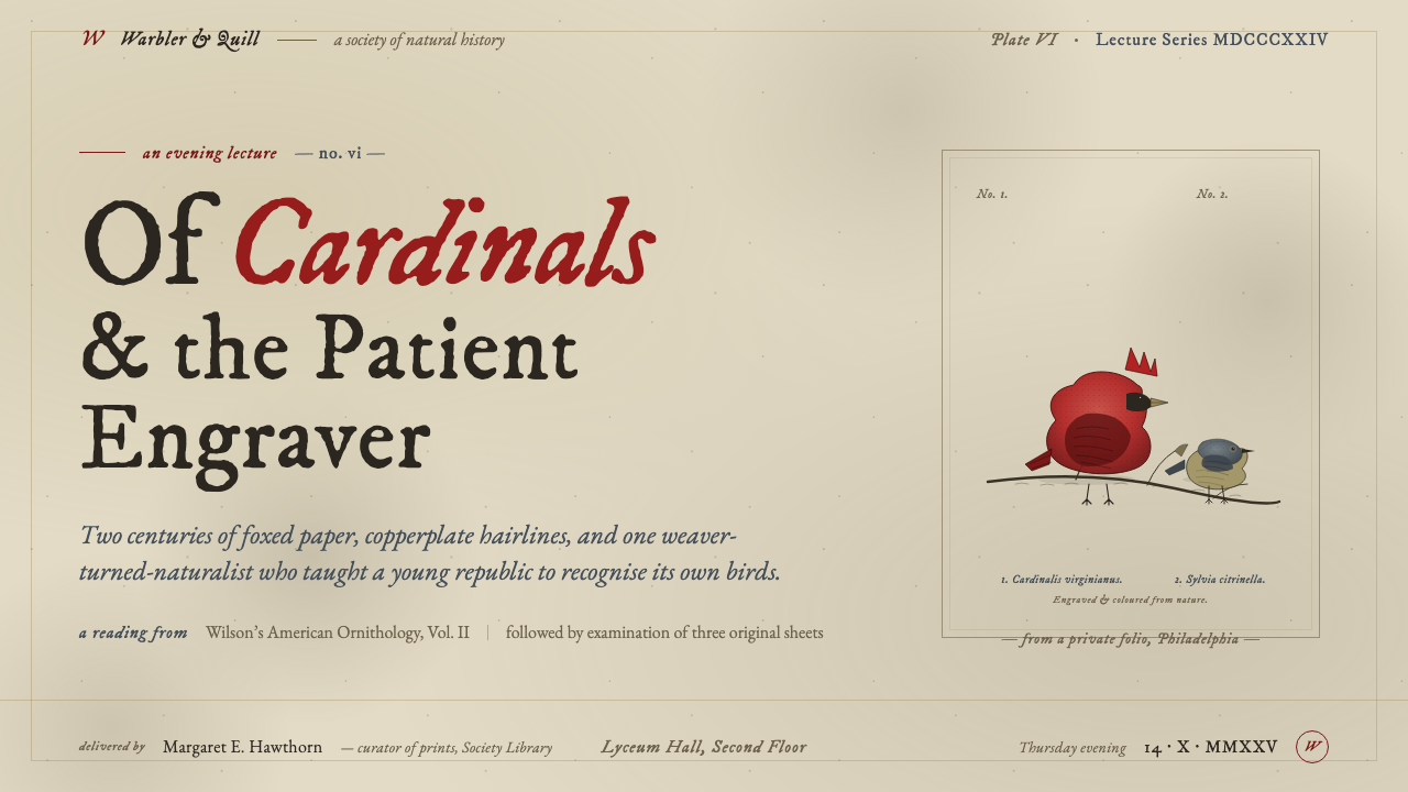
For presentation covers, use the plate as an editorial invitation rather than a decorative backdrop. Let one bird or one tightly cropped engraved detail establish the subject, with cardinal crimson or slate providing a single decisive accent against foxed paper. The title should feel like a plate caption enlarged into an opening statement: formal, spare, and allowed ample surrounding stillness. Avoid filling the cover with many unrelated antique motifs; the power comes from a specimen-like focal point and the material atmosphere around it.
On content slides, treat the visual language as a method for ordering information. Place headings, notes, and supporting imagery with the clarity of a catalogued sheet. Engraved dividers, small caption-like labels, and limited pigment washes can distinguish sections without turning the page into a scrapbook. For data slides, the same logic applies: data marks should remain crisp and intelligible, while crimson and slate identify the most meaningful comparison or category. The surrounding paper ground should support reading, not reduce contrast or make values feel antique for its own sake.
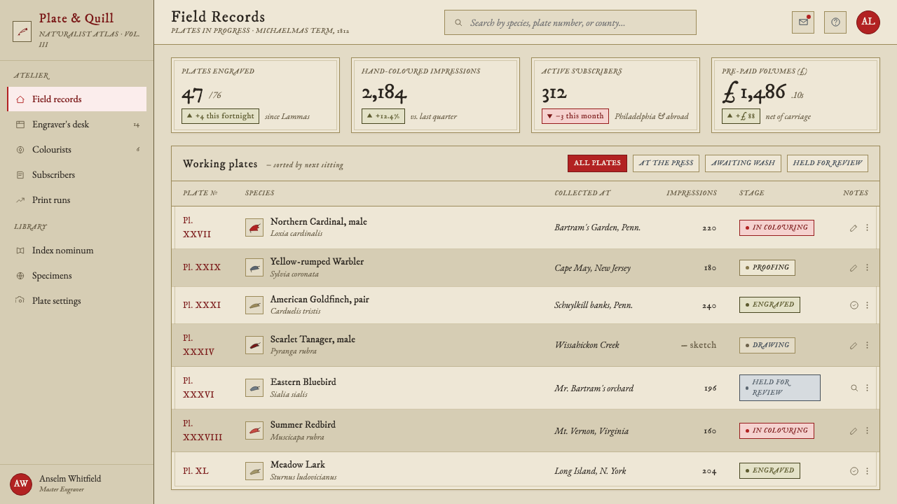
For web interfaces, Wilson Ornithology Plate works best in editorial dashboards, collection browsers, research-oriented products, and pricing pages that benefit from provenance and careful hierarchy. Use the paper ground as a calm container, reserve the deepest ink-like tone for essential text and controls, and introduce crimson or slate where status, selection, or product distinction truly needs attention. Cards and panels should feel like mounted sheets or catalog entries, with captions doing real navigational work. The interface must remain contemporary in usability even when its visual voice is archival.
For editorial and marketing work, the style is especially effective for long-form stories, cultural programming, collections, product launches with a crafted point of view, and campaigns about observation or preservation. Pair an engraving-like image with concise captioning, then give the prose enough clear space to read as modern editorial content. Marketing sections can alternate between broad paper fields, close details of linework, and purposeful crimson interruptions. The goal is not to make every page look old; it is to make the work feel made, collected, and worth lingering over.
The common mistake is to treat the style as a vintage texture pack. Random stains, generic bird illustrations, overly soft watercolor, and excessive red produce nostalgia without the source material’s discipline. A convincing application preserves the hierarchy of the original artifact: aged paper provides the ground, engraving establishes form, hand color supplies selective life, and caption-like typography records what matters. If every surface is distressed, every bird is colorful, or every label is ornate, the quiet authority of the plate disappears.
Wilson Ornithology Plate — FAQ
Is Wilson Ornithology Plate simply a vintage bird-illustration style?
No. Bird imagery is only one visible part of the system. Its identity comes from the relationship among copperplate linework, hand-applied color, foxed plate paper, and etched-caption typography. Replacing those relationships with a generic bird drawing on beige paper produces an antique mood but not this particular visual language. The style depends on observation, print structure, and material restraint as much as it depends on the subject.
Can the style use photography instead of an engraved bird?
It can, but photography should be treated as evidence within the plate logic rather than as a glossy window onto a scene. A photograph works best when it is cropped for contour, detail, posture, or texture, then accompanied by caption-like information and the restrained paper-and-ink system. If the image remains highly polished, atmospheric, and visually dominant, it will overwhelm the engraved foundation that defines the style.
Why should the paper ground avoid bright cream or clean white?
The source material is defined by aged hand-laid plate paper, described as dustier grey-buff and shaped by generations of foxing. A pristine ground makes crimson and slate behave like contemporary interface accents, whereas a weathered field lets them read as pigment over an artifact. The subdued ground also gives ink-black linework enough atmosphere to feel engraved rather than merely printed.
How much crimson should a contemporary application use?
Use it as a decisive pigment, not a universal fill. In the source material, brilliant crimson has impact because it sits in dialogue with slate, black engraving, and aged paper. Let it identify the focal subject, an important state, or a single editorial interruption, then allow the quieter materials to carry the rest of the composition. When crimson covers everything, it stops reading as hand-coloring and begins to erase the plate’s hierarchy.
Where does this style struggle?
It struggles when speed, glossy novelty, or high-density transactional interaction is the main value. A style built from observation and printed material needs room for captions, texture, and visual pause; forcing it into every urgent control surface can make the product feel needlessly ornate or slow to scan. It is strongest where provenance, editorial thoughtfulness, collections, learning, or material culture are genuinely part of the experience.
Related design styles
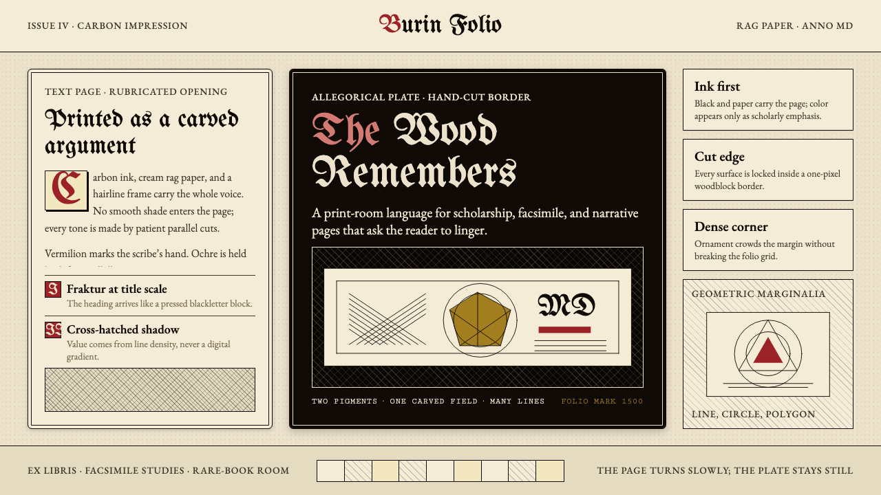 Dürer WoodcutInk remembers everything. Fraktur titles, rag-paper cream, and cross-hatched…
 Sumo BanzukeCeremonial density. Sumi columns crowd tan washi; rank-scaled type meets one…
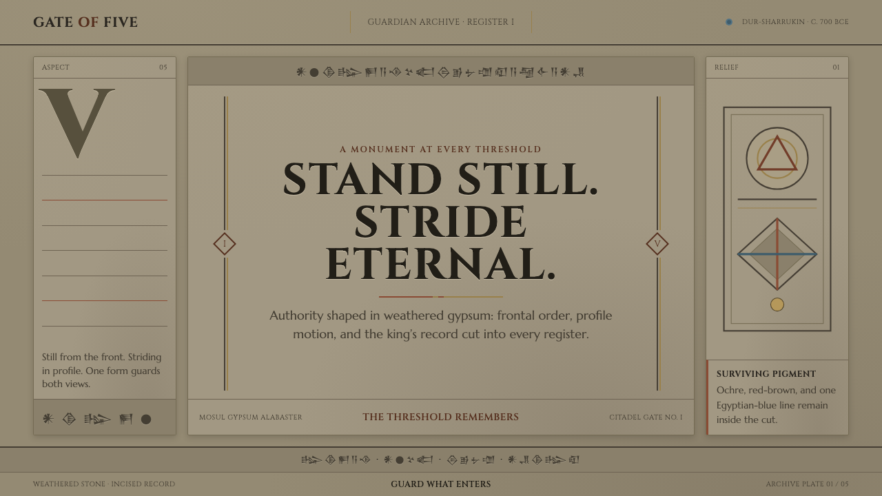 Assyrian Lamassu ReliefAuthority carved into silence. Buff-gray stone, monumental capitals, and cune…
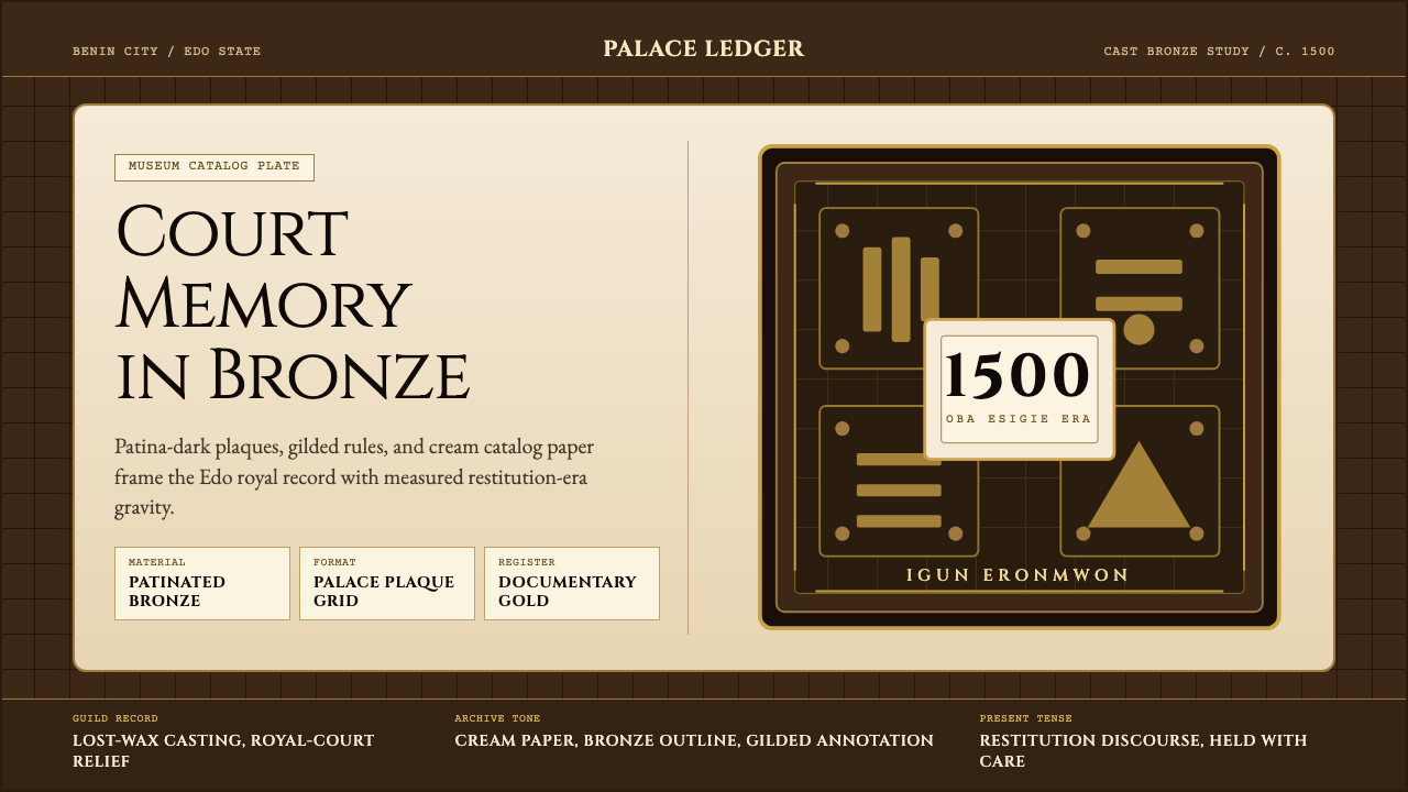 Benin Bronze (Edo, 1500)Royal memory, cast in bronze. Cream plaques and gilded lines carry museum gra…
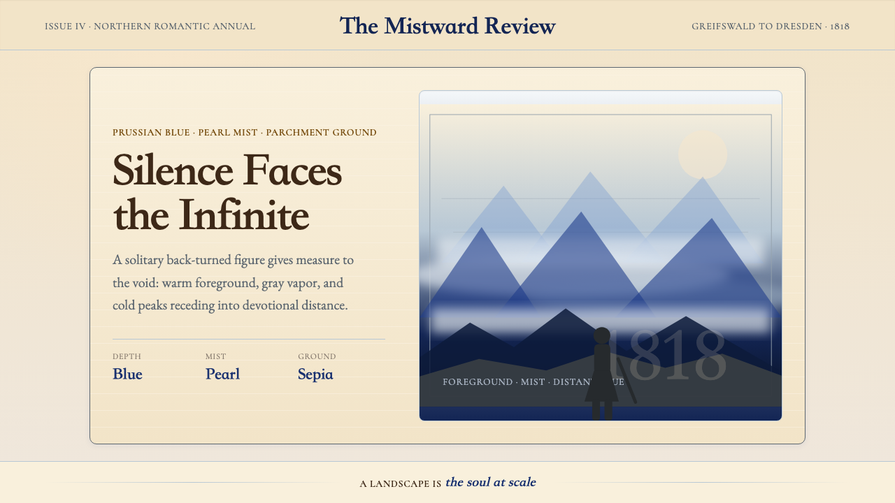 Caspar David FriedrichSilence becomes vast. Prussian blue depth, pearl mist, and parchment framing…
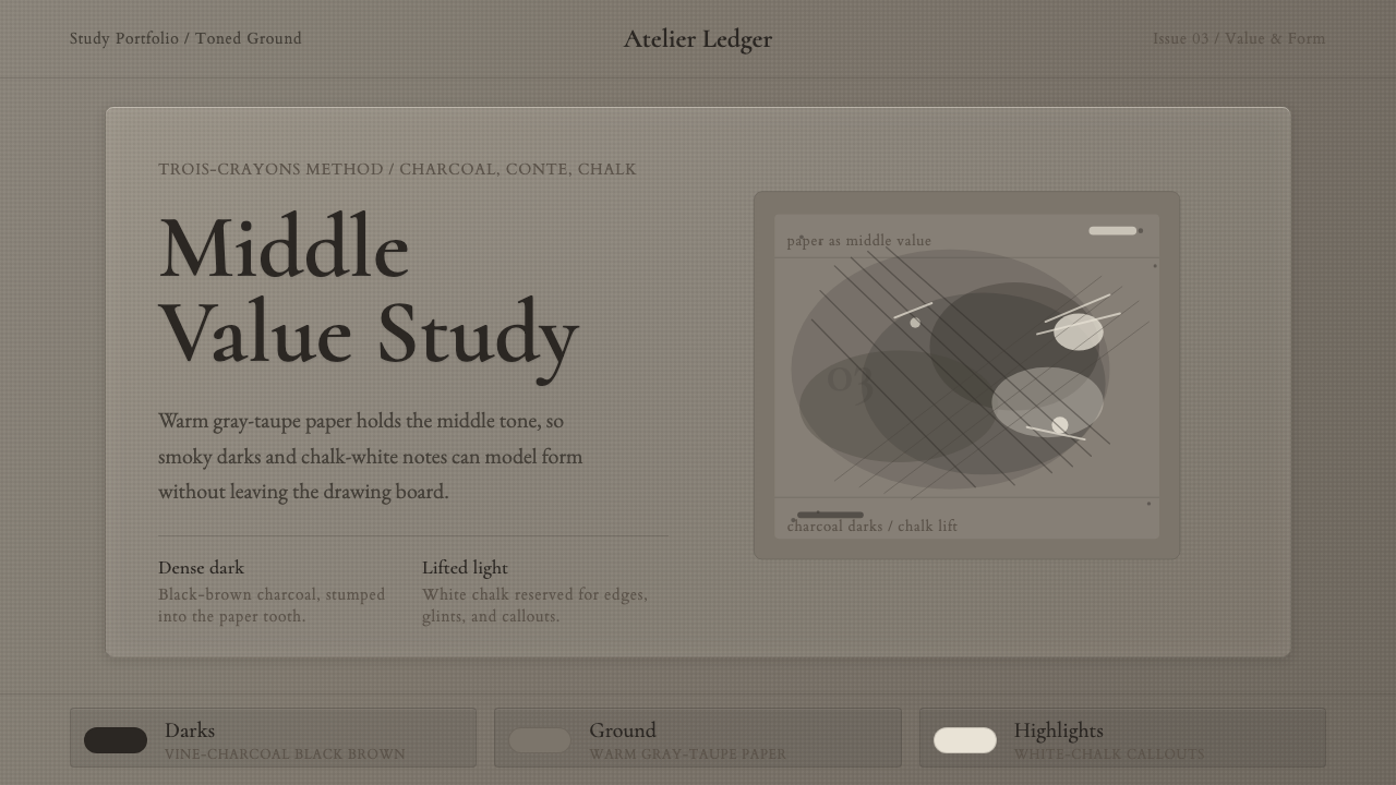 Charcoal & Conté DrawingAtelier calm, in middle value. Gray-taupe tooth, smoky charcoal, and chalk-wh…