What is Charcoal & Conté Drawing?
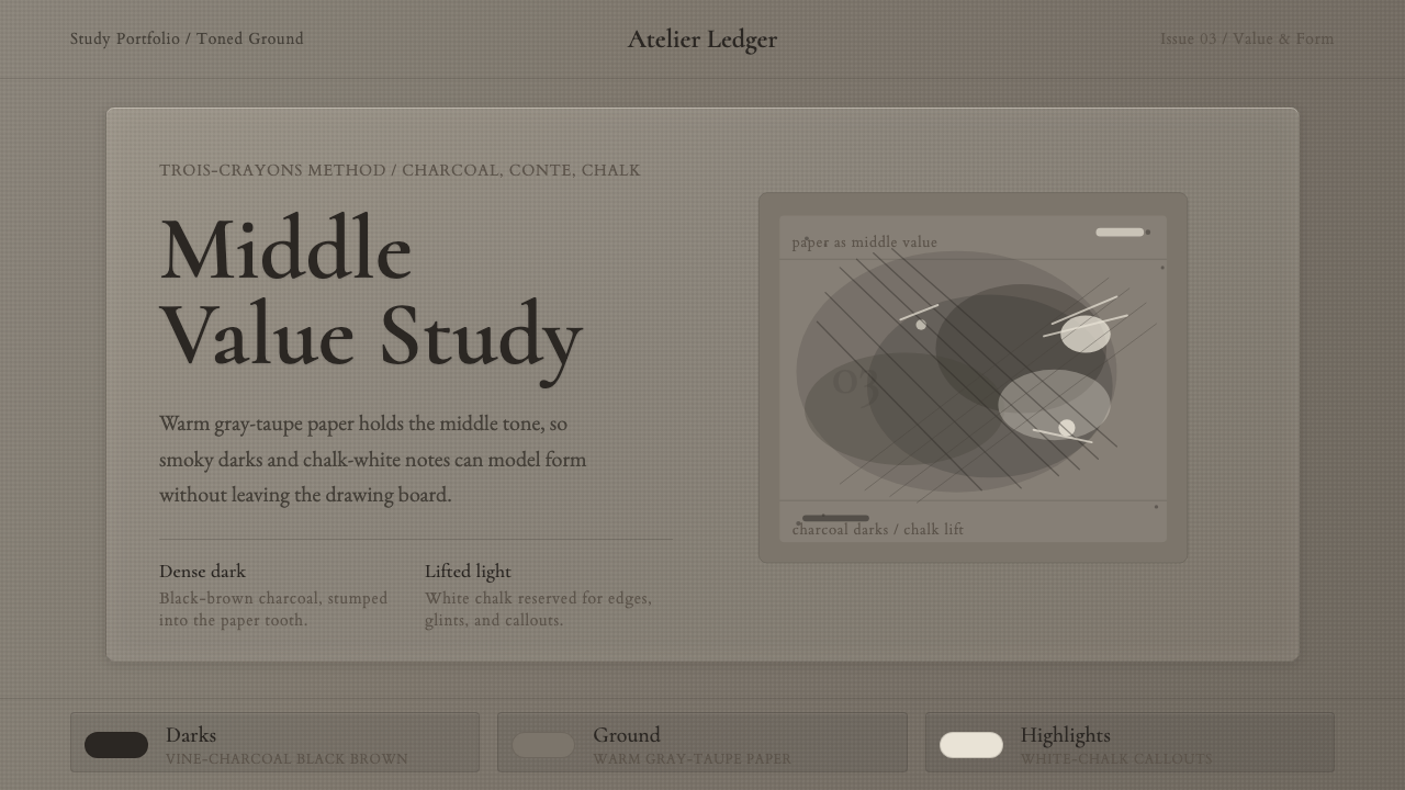
Charcoal and Conté drawing starts from the middle: a toned paper holds the mid-value, and every mark either pushes into shadow with charcoal or pulls back toward light with white chalk.
Charcoal & Conté Drawing in brief
Charcoal and Conté drawing is an academic tonal-drawing method built on a simple idea: instead of starting from white paper and adding both light and shadow, the artist starts from a toned, mid-value paper and only has to add the two extremes — soft vine charcoal is pushed into the shadows, and a stick of white chalk is pulled up into the highlights. The paper itself supplies the middle value, which is why the technique is sometimes called the trois-crayons, or 'three chalks,' approach when a third material — a warm reddish chalk called sanguine — is added alongside the black and white.
The materials are deliberately different from one another. Vine charcoal — thin sticks of charred willow or vine wood — is soft, powdery, and immediately responsive; it can be laid down broadly with the side of the stick to block in a whole shadow mass, then smudged, wiped back, or lifted with a kneaded eraser to carve light back out of it. Conté crayon, a harder compressed stick of pigment bound with clay and wax, holds a point and a sharper edge, useful for the crisp accents, contour lines, and precise dark notes that pure charcoal blurs too easily. Working the two together — soft charcoal for mass, harder Conté for edge — is central to how the technique builds a convincing sense of form.
The finished look is unmistakable: a warm, granular mid-gray field with visible paper texture showing through even the darkest passages, soft smudged transitions where charcoal has been rubbed or blended, and small, deliberate flashes of chalk-white concentrated only where the light is strongest. The Metropolitan Museum of Art notes that charcoal itself reads warmer than graphite pencil — its blacks run from a warm black-brown to a dense, velvety black, but never the cold, flat black of ink or paint. That warmth, plus the restraint of the highlights, is what gives the medium its calm, contemplative, unmistakably 'studio' feeling.
Where does Charcoal & Conté Drawing come from?
The name Conté belongs to a real person: Nicolas-Jacques Conté, a French scientist, balloonist, and inventor. In 1795, with France at war and cut off from the fine natural graphite mined in England that European pencil- and crayon-makers had long relied on, Conté devised a way to fire powdered graphite with clay in a kiln, producing drawing sticks whose hardness could be precisely controlled by adjusting the clay-to-graphite ratio. The invention is the direct ancestor of both the modern graded pencil and the harder, denser drawing crayon that still carries his name — and it arrived, tellingly, as a wartime substitution that turned out to outlast the shortage that produced it.
The broader habit of combining a small number of chalks on toned paper is much older than Conté's invention. European draftsmen had used red, black, and white natural chalks together — the trois-crayons, or 'three chalks,' method — since the Renaissance and Baroque periods to model flesh and form with warmth and economy. The technique reached a particular peak of fluency in eighteenth-century France, where it became closely associated with figure and portrait studies made rapidly from life, prized for how quickly a skilled hand could suggest volume, warmth, and skin tone with just three colors of chalk on a toned ground.
It was the nineteenth-century academic atelier system, though, that turned this loose habit into a formal curriculum. Art academies across Western Europe — above all in Paris, but echoed in Italian and other European academic studios — organized beginning students around exactly this exercise: hours spent drawing plaster casts of classical sculpture, and later the live model, in charcoal and chalk on toned paper, long before a student was permitted to touch paint. Structured teaching materials, most famously a set of instructional plates published in the 1860s and 1870s by the academic painter Charles Bargue, broke the method into a sequence — cast fragments, then full casts, then the live model — that is still used in ateliers training figurative artists today.
What the academic method drilled into students was a way of seeing organized around value rather than outline: think in large tonal masses first, refine edges last, and never let a contour line stand in for the study of light. That discipline — mid-tone ground, shadow pushed down from it, light pulled up from it — is why charcoal and Conté drawing still reads, more than a century later, as the visual shorthand for serious, patient, foundational draftsmanship.
What defines the Charcoal & Conté Drawing look?
Value and Ground
The system starts from a true mid-value ground — a warm gray-taupe, never white and never dark — so that both the shadow work and the highlight work read as departures from a stable middle, rather than as additions built up from nothing. This mid-tone-first logic is the single most defining structural idea in the style.
Color
Grays and blacks are warm rather than cold — closer to a soft black-brown than to a flat, neutral black — with occasional warmth from a reddish sanguine chalk where the fuller trois-crayons palette is used. White appears only as concentrated chalk highlight, never as a background or a large field, which keeps it feeling precious rather than default.
Texture
The paper's own tooth — its fine woven or grained surface — stays visible even through the darkest passages, giving every tonal area a granular, slightly broken quality rather than a flat digital fill. This grain is what separates an authentic charcoal feel from a simple gray gradient.
Mark-making
Two distinct mark qualities coexist: broad, soft, smudged tonal masses laid in with the side of a stick and blended by hand or stump, and sharp, controlled accent lines and edges held with a firmer point. The contrast between the two — soft mass, crisp edge — is what makes the medium read as deliberate rather than messy.
Typography
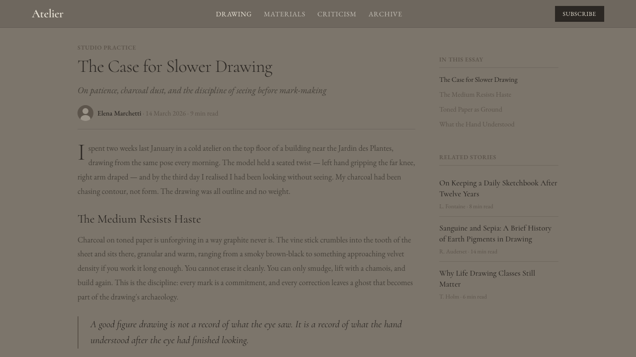
Restrained, classical roman serif letterforms with generous spacing between lines carry the atelier's unhurried, academic register — type that reads as considered and unhurried rather than commercial or decorative, echoing the discipline of a student who is not permitted to rush a study.
Composition
Figures and studies are typically given generous surrounding space and softened, vignette-like edges that fade rather than stop abruptly at a hard frame, letting the toned ground breathe around the subject the way it would around a life-drawing study pinned to a studio wall.
Who shaped Charcoal & Conté Drawing?
Conté was a French scientist, balloonist, and inventor who, in 1795, devised a way to fire powdered graphite with clay to produce drawing sticks of controllable hardness, at a time when France was cut off from imported English graphite. His invention is the direct ancestor of both the modern graded pencil and the harder, denser drawing crayon that still carries his name.
Seurat, working a century after Conté, became the medium's most celebrated draftsman, producing black conté-crayon studies on heavily textured paper that built form almost entirely from tonal gradation rather than line — his figures seem to emerge from the paper's own grain rather than being outlined onto it, and his conté drawings remain the benchmark most often cited for the medium's velvety tonal range.
Watteau, the early eighteenth-century French draftsman, is the artist most closely associated with bringing the trois-crayons method to its height of fluency, using red, black, and white chalk together on toned paper to capture figure studies with a warmth and immediacy that influenced generations of later academic training.
Bargue, a French academic painter, published a set of instructional lithographic plates in the 1860s and 1870s that broke charcoal figure drawing into a repeatable teaching sequence — cast fragments, then full casts, then the live model — a course structure still used by classical ateliers to train students today.
Across nineteenth-century Western Europe, and above all in Paris, formal art academies built their foundational curriculum around exactly this exercise, requiring students to spend months or years drawing in charcoal and chalk before they were permitted to paint — the institutional structure that preserved and standardized the technique long after any individual teacher's lifetime.
How do you use Charcoal & Conté Drawing today?
Because the entire system is organized around a mid-value ground rather than a white one, applying it well starts with committing to a warm gray-taupe field as the default background — not white, and not a deep charcoal black — and treating both darker and lighter elements as departures pushed away from that middle, the way shadow and highlight are pushed away from the toned paper in the original medium.
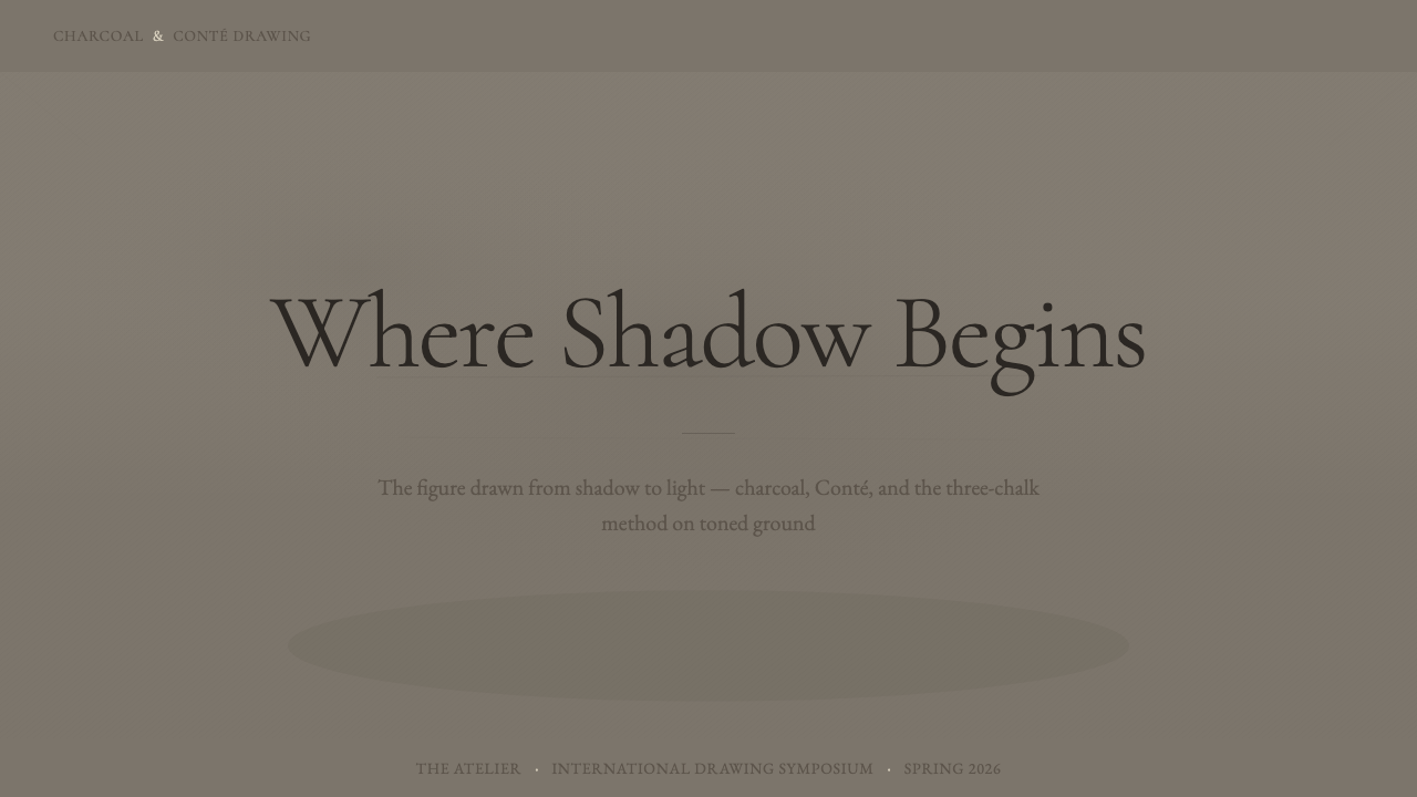
On presentation slides, a cover works well built around a single warm gray-taupe field with a restrained charcoal-toned title and one small, deliberate chalk-white accent — a rule, a numeral, a single highlighted word — rather than a bright accent color, since the whole point of the palette is that light is rare and earned. Content slides should keep body text calm and generously spaced, echoing the unhurried classical register, and avoid competing with the tonal ground through busy iconography. Data visualizations translate naturally into value-based charts — bars or areas shaded from the mid-tone ground down into charcoal-dark and up into chalk-white, rather than distinguished by hue.
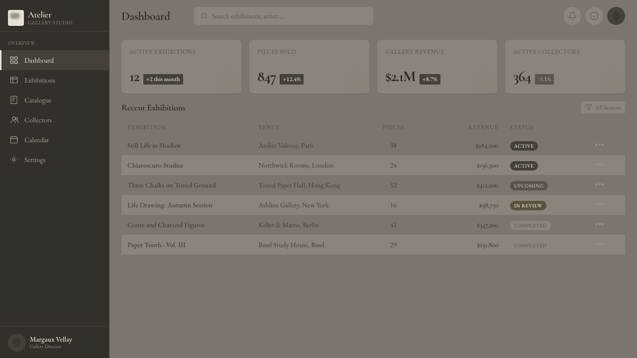
For web interfaces, the style suits editorial, portfolio, education, and cultural-institution contexts where a calm, considered, unhurried register reads as credibility rather than dullness — think museum microsites, writing platforms, or premium editorial dashboards rather than high-energy consumer apps. Cards and panels should sit close in value to the mid-tone background rather than jumping to stark white, with borders kept soft or nearly absent so that elements feel drawn into the page rather than cut out of it. Pricing pages can use the same restraint that makes a highlight precious in the original medium — reserve the lightest, brightest element in the interface for the single plan you want to draw the eye to, and keep everything else within the tonal midrange.
In editorial and marketing work, the style suits long-form writing, cultural criticism, and any content that wants to signal seriousness and craft rather than urgency — think essays, retrospectives, or arts coverage. Marketing pages benefit from treating white space itself as the 'highlight,' used sparingly and only where attention should land, while the bulk of the composition stays within a narrow, warm gray tonal band.
The most common mistake is treating this as simply 'a gray theme' and defaulting to a neutral, cool, flat gray background — which loses the warmth that the Met specifically calls out as the medium's defining quality, and loses the visible paper texture that keeps a tonal field from reading as a flat digital fill. A second frequent error is overusing the white highlight: in the original medium, chalk-white is rationed to a handful of touches per drawing, and a layout that scatters bright white elements everywhere collapses the very contrast the technique depends on.
Charcoal & Conté Drawing — FAQ
What's the difference between charcoal and Conté crayon?
Charcoal is a soft, powdery, low-density stick of charred wood (traditionally vine or willow), while Conté crayon is a harder, denser stick made of pigment compressed with a clay-and-wax binder — a process invented by Nicolas-Jacques Conté in 1795. In practice, artists use charcoal for broad, easily blended tonal masses and Conté for sharper edges, firmer lines, and darker accents that hold their shape without smudging as readily.
Why is the paper toned instead of white?
Starting from a mid-value, warm-toned paper — rather than white — means the artist only has to add the two extremes, pushing shadow down with charcoal and pulling highlight up with white chalk, instead of building an entire value range up from nothing. It's a working shortcut that also produces the calm, unified tonal feeling the medium is known for, since the paper's own color unifies every passage that isn't deliberately pushed toward black or white.
What is the trois-crayons technique?
Trois-crayons, French for 'three chalks,' refers to drawing with red (sanguine), black, and white chalk together on toned paper — a method that predates Conté's invention by centuries and reached particular fluency in eighteenth-century France. The red chalk added warmth suggestive of skin tone, the black defined shadow and structure, and the white lifted highlights, letting a skilled draftsman suggest a fully modeled, warm-toned figure with just three materials.
Why does academic training rely so heavily on this method?
Because it forces a student to think in tonal masses rather than outlines. Nineteenth-century academies built entire foundational curricula around charcoal and chalk studies of plaster casts and the live model precisely because the medium doesn't let a student hide behind a clean contour line — form has to be built and proven through value, the same skill that later carries over into painting.
Why does charcoal look 'warm' rather than simply gray or black?
Charred organic material — vine or willow wood — produces a range of blacks that lean brown rather than neutral, especially compared to the cool, flat black of graphite or ink. The Metropolitan Museum of Art specifically describes charcoal's range as running from a warm black-brown to a dense black, and that underlying warmth is part of what makes charcoal studies feel atmospheric and alive rather than stark.
Related design styles
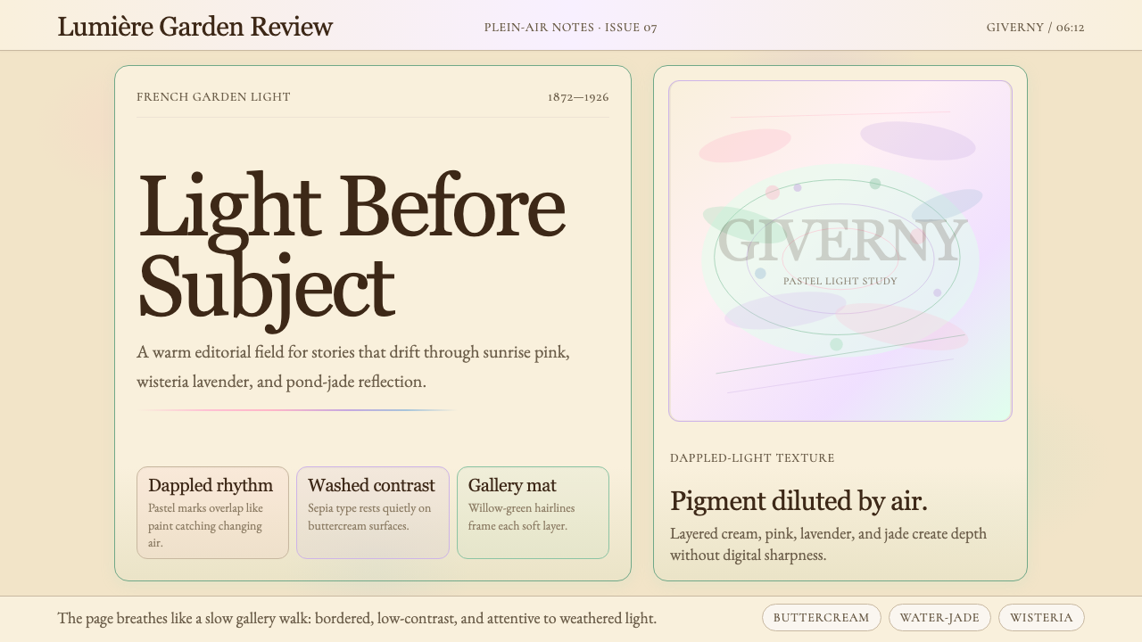 Claude Monet ImpressionistLight becomes the subject. Buttercream, pastel dapples, and Cormorant serif s…
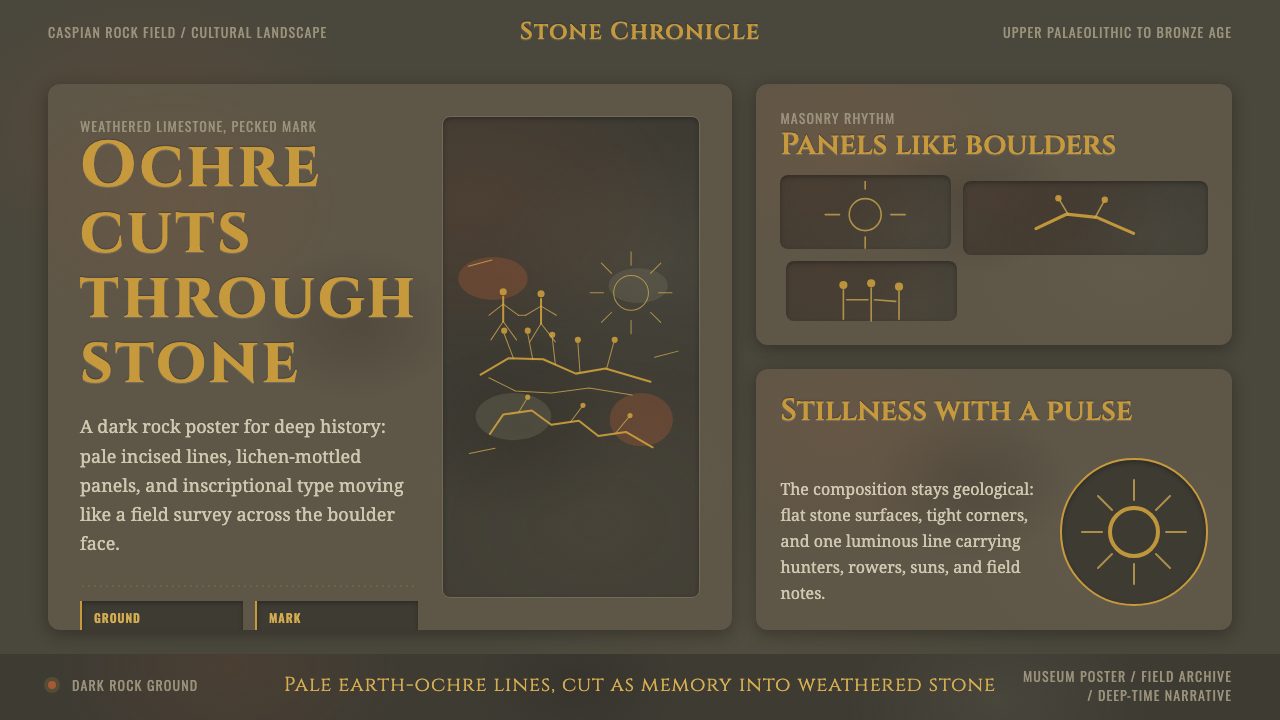 Azerbaijani Gobustan PetroglyphAncient rock speaks. Ochre incisions glow across dark lichen-mottled stone.
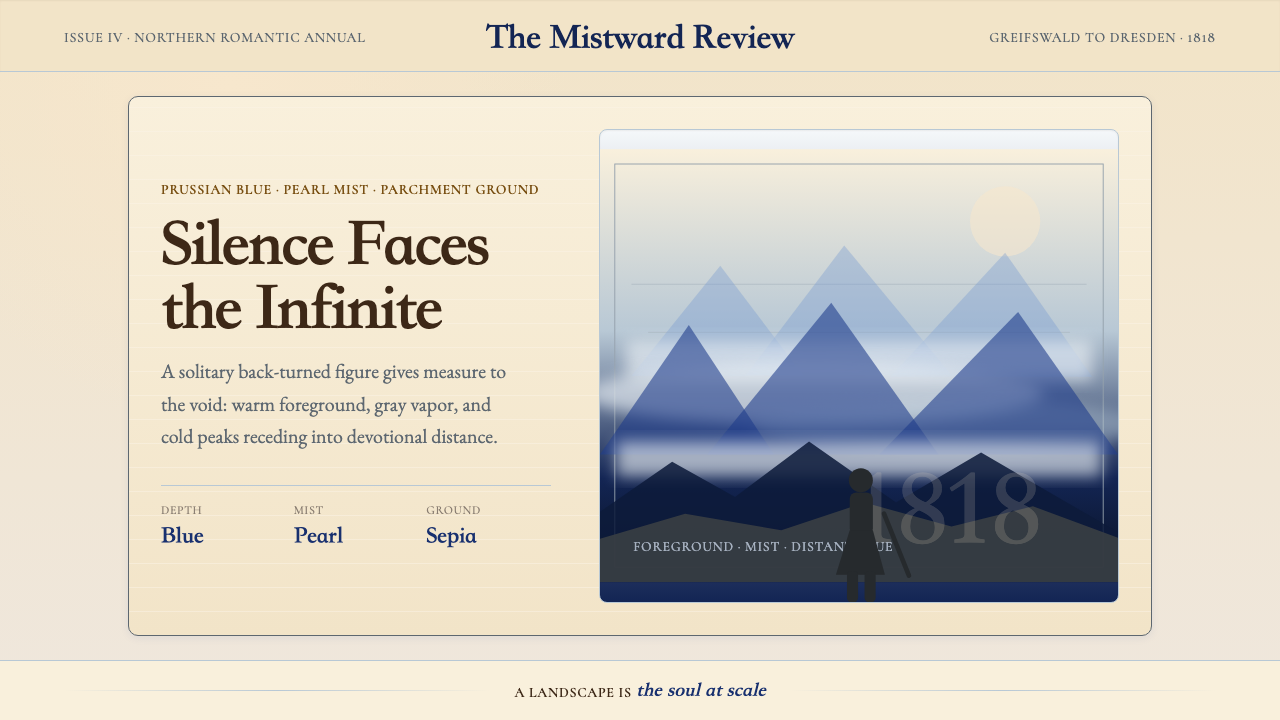 Caspar David FriedrichSilence becomes vast. Prussian blue depth, pearl mist, and parchment framing…
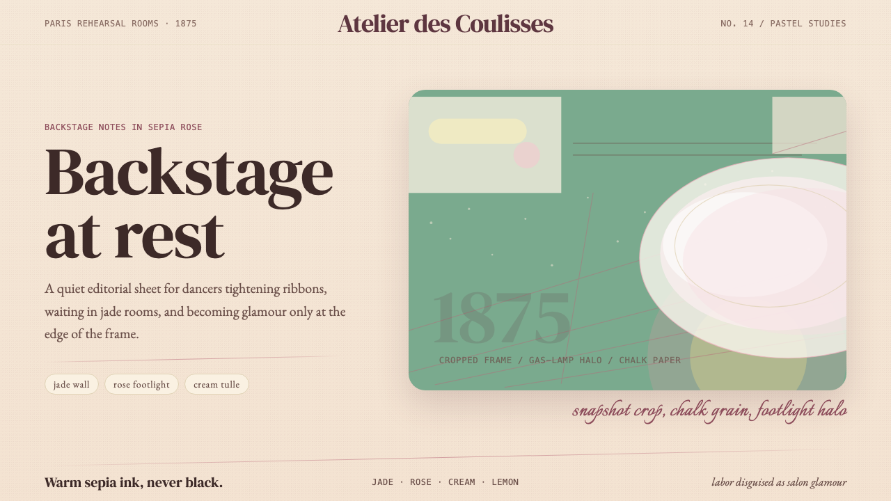 Degas Ballet PastelsBackstage glamour is labor. Jade walls, rose footlights, cropped serifs on cr…
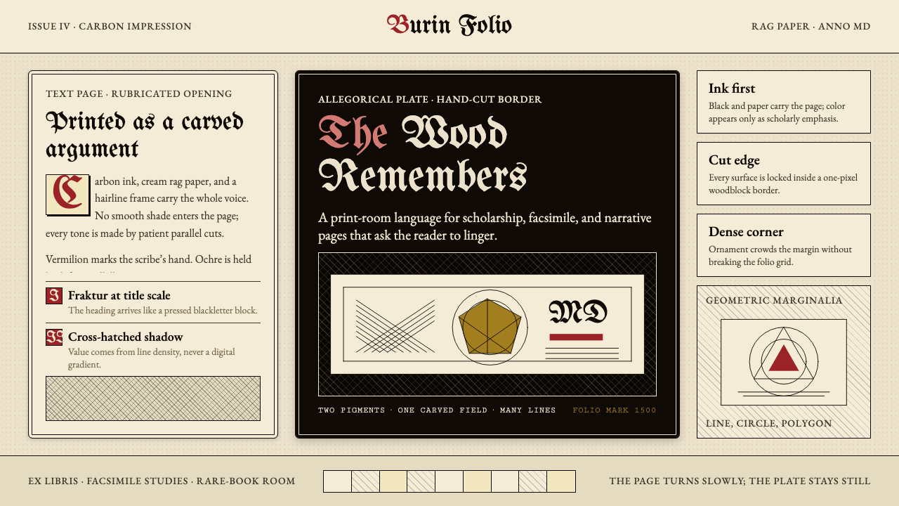 Dürer WoodcutInk remembers everything. Fraktur titles, rag-paper cream, and cross-hatched…
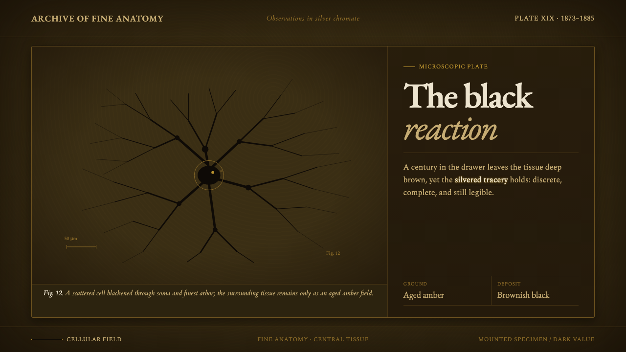 Golgi Neuron Silver StainA century-darkened specimen. Near-black dendrites branch across an aged amber…