What is Azerbaijani Gobustan Petroglyph?
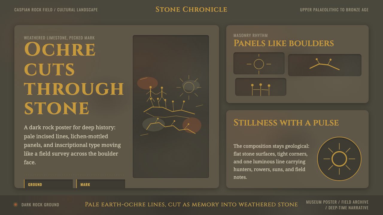
Azerbaijani Gobustan Petroglyph turns an ancient rock surface into a dark digital language: pale ochre incisions, rough pecked marks, and figures that seem newly exposed from stone.
Azerbaijani Gobustan Petroglyph in brief
Azerbaijani Gobustan Petroglyph is a visual style derived from the petroglyphs carved into weathered limestone boulders at Gobustan, in Azerbaijan’s Caspian coastal semi-desert. Its essential image is not parchment, sand, or museum display. It is dark, dusty, lichen-mottled rock interrupted by lighter cuts: bull hunts, dancers arranged in rows, reed boats full of oarsmen, and radiating sun symbols.
The historical images were made by pecking and cutting the rock surface. Fresh incisions revealed lighter stone beneath the weathered exterior, creating figures that read as earth-ochre lines against an olive-grey field marked by reddish mineral stains and silvery lichen. In a contemporary interface, that contrast becomes the governing rule: imagery and information should feel excavated from the surface, not placed decoratively on top of it.
The style combines a weathered-stone ground, restrained ochre marks, stippled peck textures, and a lapidary typographic voice associated with Cinzel and Marcellus. It is dark by nature. Its atmosphere comes from geological depth, uneven erosion, and the concentrated clarity of a cut line. A successful application feels like a close view of rock carrying human memory across a vast span of time.
Where does Azerbaijani Gobustan Petroglyph come from?
The source landscape is Gobustan, Azerbaijan, a Caspian coastal semi-desert in the Caucasus. Across weathered limestone boulders, prehistoric carvers created a long visual record of hunting, movement, travel, and symbolic life. The setting matters as much as the motifs: these are images inseparable from exposed stone, dust, mineral variation, and the slow alteration of a rock surface.
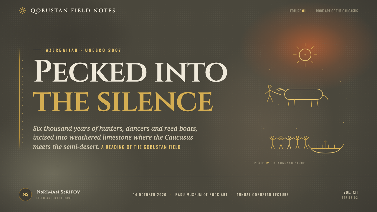
The petroglyph tradition spans from the Upper Palaeolithic through the Bronze Age, approximately 20,000 to 2,000 BCE. More than six thousand images were pecked over roughly twenty millennia. That duration gives the visual language its unusual force. It does not present a single authored style frozen in one moment; it carries repeated acts of marking across generations of hunter-gatherer carvers and later pastoralist communities.
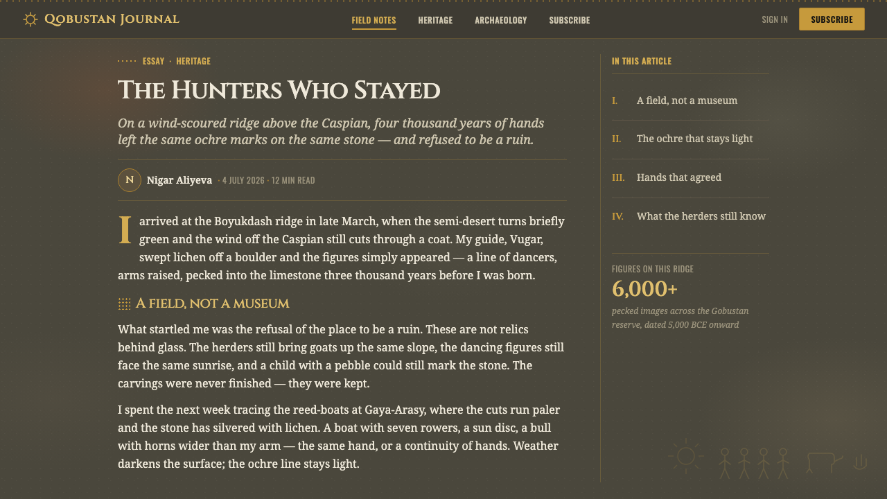
The imagery establishes the style’s recurring vocabulary. Bull hunts introduce animal mass and tension. Dancing rows turn individual figures into rhythm and procession. Reed boats, densely occupied by oarsmen, create horizontal movement and collective effort. Radiating suns supply a compact celestial emblem. None requires naturalistic rendering to communicate; each survives through silhouette, repetition, incision, and placement on stone.
Gobustan was UNESCO-listed in 2007 as a cultural landscape. The supplied historical record also identifies Isaak Jafarzadeh as a documenting archaeologist. For design use, that recognition is a reminder that the material is not a generic prehistoric pattern bank. It belongs to a specific Azerbaijani landscape and to a Caucasus petroglyph tradition, so its motifs should be handled with attention, context, and restraint.
What defines the Azerbaijani Gobustan Petroglyph look?
Dark Weathered Stone
The background should read as dark olive-grey limestone rather than paper, sand, or a neutral modern black. Its darkness is dusty and uneven, carrying the sense of weathering rather than polished luxury. Subtle patches of reddish ochre and silvery lichen can break the field, but they should remain part of the stone’s quiet history, never become a busy decorative texture.
Incised Ochre Marks
Primary marks are pale earth-ochre, as if the darker crust has been removed to expose lighter stone below. Lines should feel cut, pecked, or abraded rather than painted with a smooth brush. Their brightness comes from material contrast, not from glow effects. A single sharp figure or symbol can carry more authority than a large field of uniformly colored ornament.
Pecked Texture
Texture is granular and local. Stippled marks suggest repeated contact with stone, allowing a silhouette to retain roughness at its edges and density in its interior. The surface should not look digitally distressed for its own sake. Texture has a structural job: it distinguishes an incision from an illustration and makes the image feel inseparable from the rock that contains it.
Silhouette and Repetition
Figures are reduced to readable outlines and compact signs. A hunter, animal, boat, oarsman, dancer, or sun does not need modeled volume. Meaning emerges from stance, grouping, and repeated gesture. Rows are especially important: repeated human forms produce rhythm, while repeated oars or radiating lines turn an image into an ordered field of movement.
Lapidary Typography
Cinzel and Marcellus provide the intended typographic voice: formal, carved, and enduring without becoming theatrical. Headlines should feel like inscriptions set against stone, while supporting text remains calm and legible. The contrast comes from hierarchy and spacing, not ornamental letter treatment. Typography should appear to belong to the same archaeological surface as the marks, while remaining clearly contemporary in use.
Excavated Contrast
The central visual drama is revelation: a light mark emerges from a dark field. Keep this contrast selective. A dark surface needs generous quiet areas so that incised imagery, labels, and directional details can be discovered gradually. If every element is equally bright, the work loses its sense of excavation and becomes merely high-contrast decoration.

Who shaped Azerbaijani Gobustan Petroglyph?
The prehistoric hunter-gatherer carvers named in the source material represent the earliest makers within Gobustan’s long sequence. Their significance for the style lies in the directness of the mark: figures, animals, and signs are not detached illustrations but actions performed on limestone. Contemporary work should preserve that economy, allowing an incised outline to communicate before additional visual explanation is added.
Early pastoralist communities are identified as later contributors to the Gobustan imagery. Their presence underscores that the rock face accumulated meaning over time rather than serving one isolated event. In design, this suggests a layered but disciplined composition: additions may feel successive and human, yet every layer must remain readable against the enduring dark stone ground.
Isaak Jafarzadeh is identified in the source material as a documenting archaeologist. His inclusion places observation and record alongside the original acts of carving. The design style should therefore avoid turning the material into anonymous rustic atmosphere. It works best when its rock texture, motifs, and typographic inscriptions support careful looking and make the cultural landscape feel specific rather than interchangeable.
How do you use Azerbaijani Gobustan Petroglyph today?
For presentation covers, use the dark stone field as a stage for one dominant incised motif: a boat, a dancing row, a bull-related silhouette, or a radiating sign. Let the title behave like an inscription placed near that discovery. Content slides should become calm archaeological panels, with one text hierarchy for the main argument and a quieter level for evidence or annotation. Avoid filling every open area with marks; the empty rock is part of the composition.
For data slides, treat charts as excavated diagrams rather than glossy business graphics. An ochre line can carry the principal comparison, while secondary information recedes into stone-like neutrals. Repeated symbols can make categories feel related to the style’s processional imagery, but labels must remain immediately legible. The goal is not to disguise information as ancient art; it is to give analytical material the same clarity, surface contrast, and deliberate rhythm.
For web interfaces, the style is particularly suited to cultural archives, exhibition pages, research tools, and storytelling dashboards. A dark weathered ground can hold navigation, filters, maps, and content panels when the pale incised treatment is reserved for active paths, selected records, and meaningful indicators. Dashboards benefit from the distinction between quiet stone areas and revealed information. Pricing or membership pages can use the same system when the offering values access, preservation, learning, or discovery.
For editorial and marketing work, build the page as a sequence of discoveries. A large motif can introduce an article; cropped details of pecked texture can separate sections; short captions can read like field notes alongside longer prose. Marketing should emphasize atmosphere through restraint, not through a collage of every available symbol. One recurring image family, one consistent inscriptional voice, and a carefully maintained dark ground will feel more credible than a dense archaeological pastiche.
The common mistake is confusing the style with generic desert imagery or primitive-looking decoration. Gobustan is dark rock, not tan paper, and its marks derive their power from exposed lighter stone, not from ornamental scribbles. Another mistake is making texture uniformly loud, which erases the hierarchy between rock, incision, and text. Keep the motif count limited, preserve quiet weathered space, and use each figure as a meaningful sign rather than a background pattern.
Azerbaijani Gobustan Petroglyph — FAQ
Is this style simply a prehistoric or desert-themed aesthetic?
No. Its reference is specific: the Gobustan cultural landscape in Azerbaijan’s Caspian coastal semi-desert and its Caucasus petroglyph tradition. The decisive visual condition is weathered dark limestone with lighter exposed incisions. General desert palettes, parchment backgrounds, and arbitrary tribal-looking motifs miss the material logic that makes the style recognizable.
Why must the background remain dark rock rather than a light earth tone?
Because the style depends on the visual event of an incision emerging from a darker weathered surface. A light ground reverses that relationship and makes the marks feel printed instead of cut. The dark field also provides the quiet depth needed for ochre symbols, captions, and text to appear as discoveries. The supplied design direction is explicit: always dark rock, never desert-tan paper.
Can petroglyph motifs be used as a repeating decorative pattern?
They can repeat, but repetition should preserve meaning. Dancing rows, oarsmen, and radiating signs already contain internal rhythm, so they are better used as structured sequences, dividers, or navigational signals than as wallpaper. A dense repeated pattern weakens the sense that each mark was deliberately pecked into stone and can reduce culturally specific imagery to surface decoration.
How should imagery and photography coexist with the incised marks?
Treat any added imagery as a supporting surface, not as a competing spectacle. Cropped rock details, restrained documentation, and images that retain texture can work when they preserve the dark-to-light logic of the system. Avoid glossy scenic treatment that overwhelms the petroglyph vocabulary. The incised mark should remain the clearest communicative gesture, with photography supplying context and material depth.
Related design styles
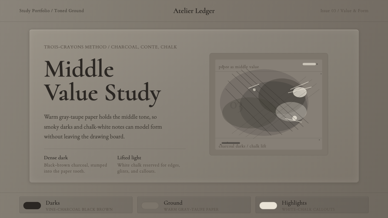 Charcoal & Conté DrawingAtelier calm, in middle value. Gray-taupe tooth, smoky charcoal, and chalk-wh…
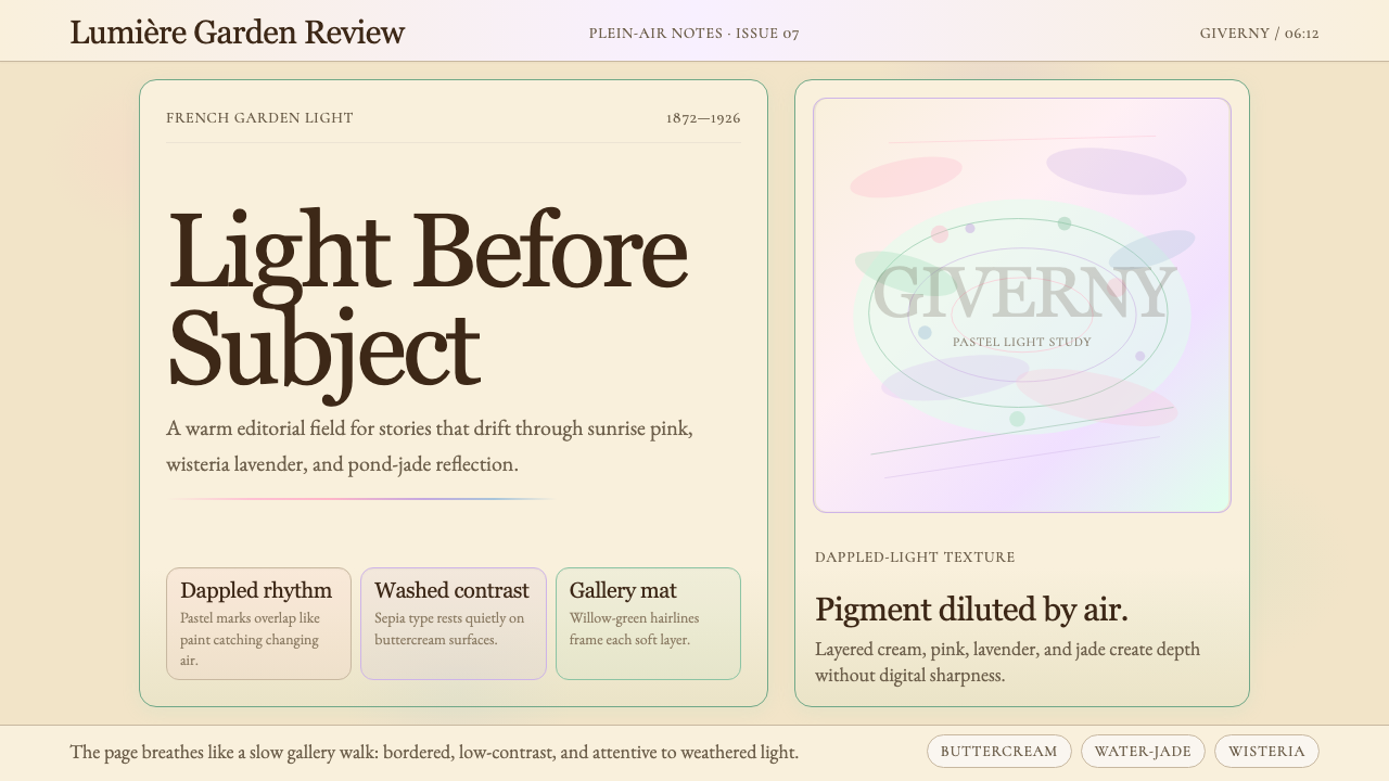 Claude Monet ImpressionistLight becomes the subject. Buttercream, pastel dapples, and Cormorant serif s…
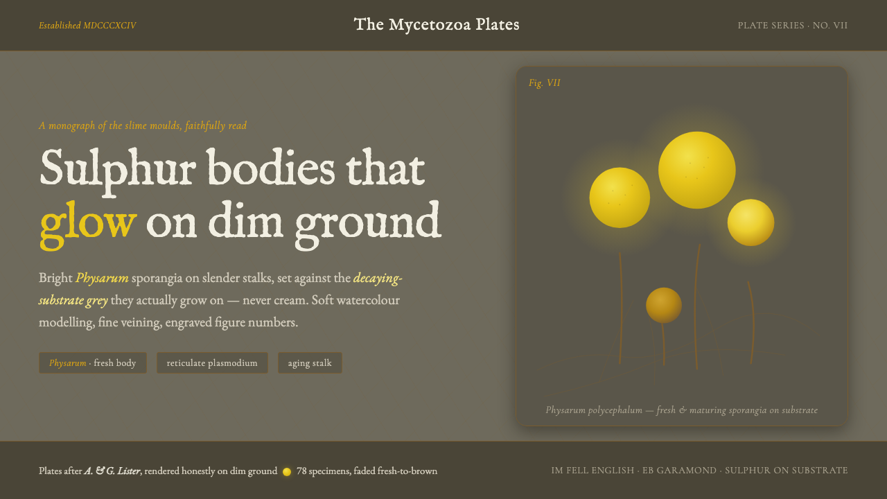 Slime Mold PlasmodiumYellow glows because the ground is dim. Sulphur Physarum sporangia on decayin…
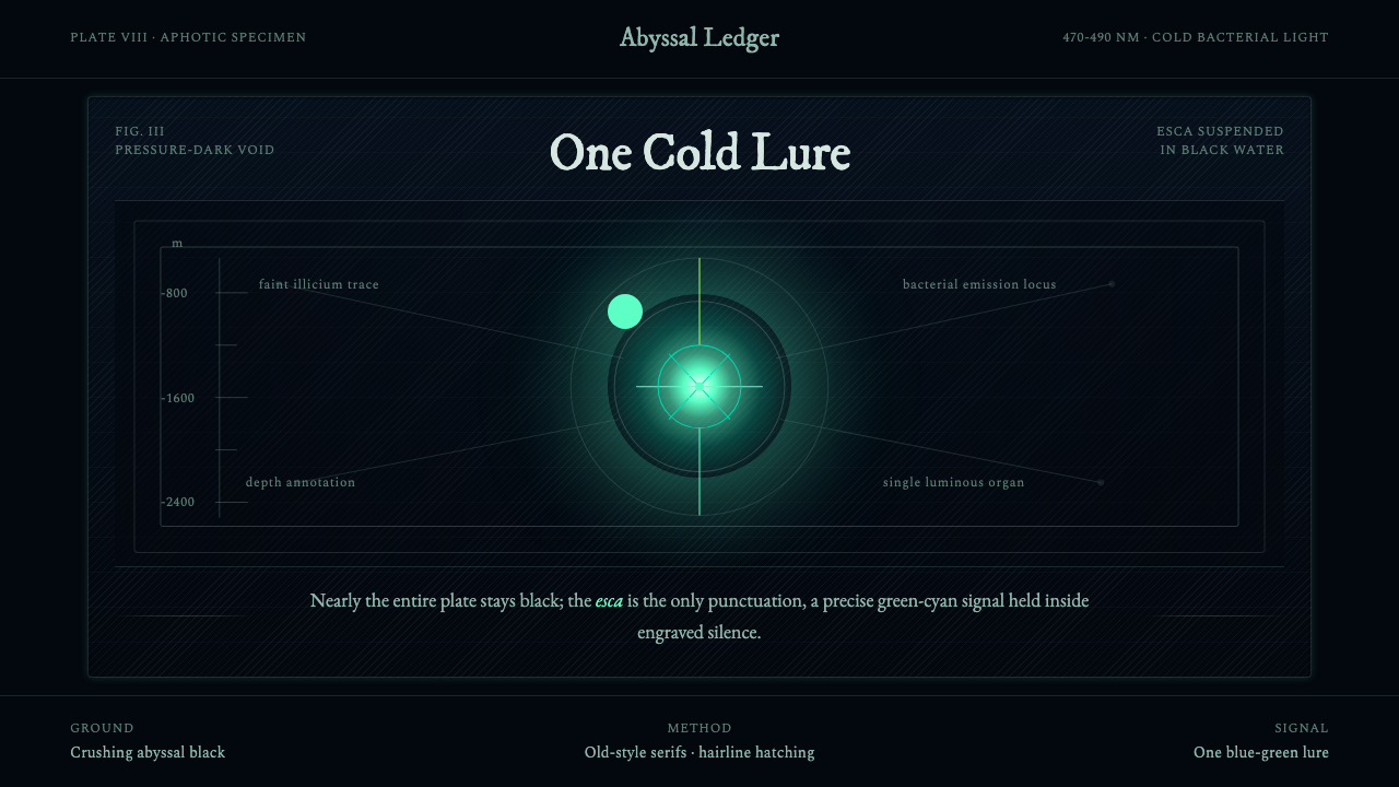 Anglerfish Lure BioluminescenceLight is scarce. Old serifs and hairline rules frame one cold green-cyan lure.
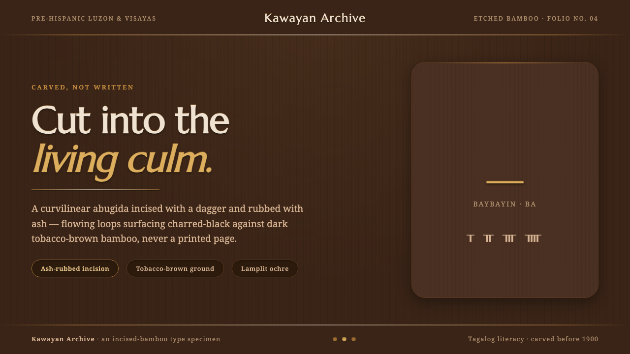 Baybayin ScriptCarved, not written. Curvilinear baybayin ash-rubbed into tobacco-brown bambo…
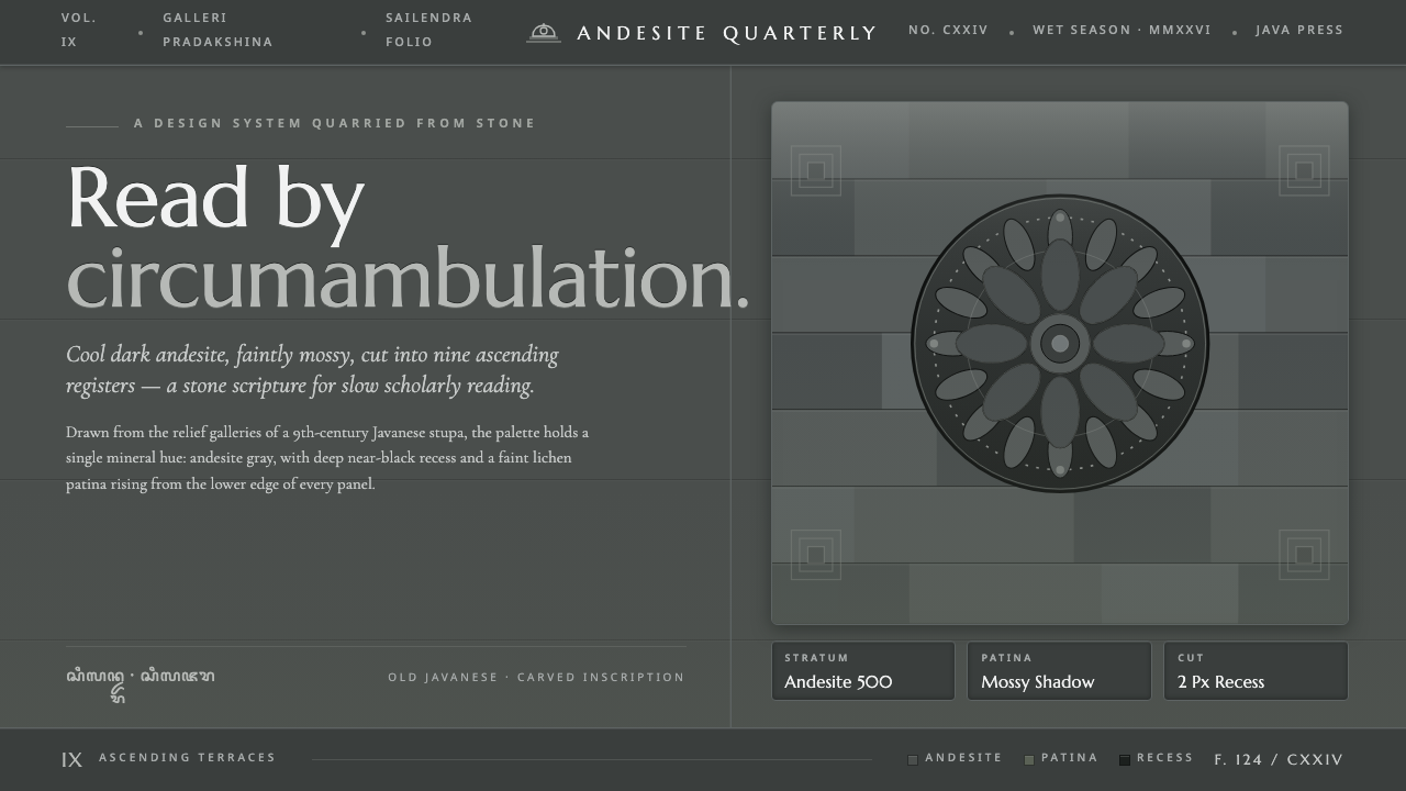 Borobudur Andesite GrayStone read like scripture. Cool andesite gray, near-black recess, mossy patin…