What is Slime Mold Plasmodium (Lister Plate)?
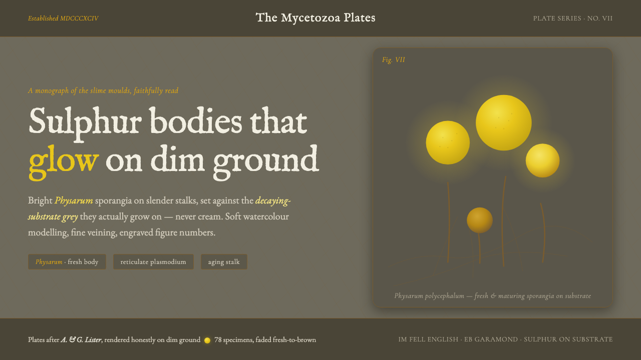
Yellow glows because the ground is dim: sulphur-yellow Physarum sporangia rise from decaying-substrate grey, rendered with the quiet precision of a naturalist’s hand-painted plate.
Slime Mold Plasmodium (Lister Plate) in brief
Slime Mold Plasmodium, or the Lister Plate style, translates the visual language of Arthur and Gulielma Lister’s natural-history monograph into an interface system. Its defining image is not a generic mushroom, forest, or botanical illustration, but a specific contrast: bright sulphur-yellow Physarum sporangia against the dim grey of decaying substrate. The darkness is structural. It gives the yellow its apparent light.
The style combines scientific observation with the softness of period watercolour. Forms are modelled gently rather than rendered as polished objects, while fine reticulate lines describe plasmodium veins with almost engraved delicacy. A restrained sequence of fresh yellow, muted ochre, and aging brown carries the sense of a living specimen moving through stages. The result feels archival without becoming dusty, and biological without becoming ornamental.
Its atmosphere comes from disciplined tension. The ground remains quiet, grey, and materially suggestive; the specimen provides the concentrated visual energy. Figure numbers, thin linework, and plate-like spacing imply classification and study, while the luminous yellow keeps the composition alive. Every element should feel as though it belongs to a field guide, a specimen drawer, or a carefully labelled page from a scientific collection.
Where does Slime Mold Plasmodium (Lister Plate) come from?
The source is A Monograph of the Mycetozoa, published by Arthur and Gulielma Lister in 1894. The monograph gathered seventy-eight hand-painted plates devoted to slime moulds, placing observation, classification, and visual recording within the same publication. The design style takes its name from that plate tradition because the plate is more than an image: it is a complete information environment in which specimen, ground, line, sequence, and label work together.
The plates focused on details that give the system its identity: bright sulphur-yellow Physarum sporangia held on slender stalks, reticulate veins within plasmodium, and life-stage sequences that move from fresh yellow toward aging brown. These details create a visual vocabulary with both biological specificity and strong graphic potential. The specimen is never an isolated decorative icon; it is part of a recorded process.
The historical setting is Western Europe, specifically Britain, within Victorian and Edwardian scientific monograph illustration, Mycetozoa taxonomy, and natural-history watercolour plate engraving. The visual reference extends into the early 1900s, when hand-painted scientific plates still carried the authority of close looking and careful description. This context explains the balance between softness and discipline: the image is atmospheric, but its atmosphere serves recognition.
The modern interface interpretation should preserve that origin rather than imitate it superficially. The goal is not to place antique-looking drawings on a fashionable dark theme. It is to retain the logic of the plate: a dim material ground, a specimen isolated through contrast, linework that communicates structure, and labels that make the image legible as knowledge. Historical character emerges from the relationship between these parts.
What defines the Slime Mold Plasmodium (Lister Plate) look?
Luminous Yellow
Yellow is the active color of the system, but its brightness is created through contrast rather than neon intensity. It belongs to the sporangium: concentrated, organic, and slightly variable across life stages. Fresh yellow should feel alive; aging yellow may drift toward ochre or brown. The color is most convincing when surrounded by quiet darkness and given enough uninterrupted space to register as a glow.
Decaying-Substrate Grey
The ground is a deep, subdued grey that suggests decaying substrate without becoming literal dirt or theatrical black. It should absorb attention, carry a faint material presence, and make the specimen feel situated rather than floating. Cream and bright paper-white are outside the system’s core language. The darkness is not a mood layer placed behind the design; it is the ecological condition that makes the yellow legible.
Watercolour Modelling
Forms are built through soft tonal modelling, with gentle transitions that describe volume without turning the specimen into glossy three-dimensional hardware. The surface should retain the sense of pigment settling into paper. Unevenness is useful when it remains controlled: a slight variation in yellow density can make a cluster feel biological, while excessive texture becomes antique decoration. Modelling should clarify the specimen’s presence, not compete with it.
Reticulate Veining
Fine lines describe the plasmodium as a network rather than a solid mass. Their value lies in delicacy, branching, and continuity. Veins may sit beneath or beside larger yellow forms, allowing the composition to shift between specimen view and diagram. They should never become heavy contour outlines. The linework is evidence of structure, a quiet record of how the organism occupies space.
Engraved Figure Numbers
Figure numbers bring the scientific plate into the interface. They should feel printed, deliberate, and secondary to the specimen, acting as anchors for captions, stages, or related records. Their presence changes an image from atmosphere into documentation. Numbering is especially effective when it follows the composition’s natural reading path and remains visually restrained rather than becoming a prominent interface badge.
Life-Stage Sequence
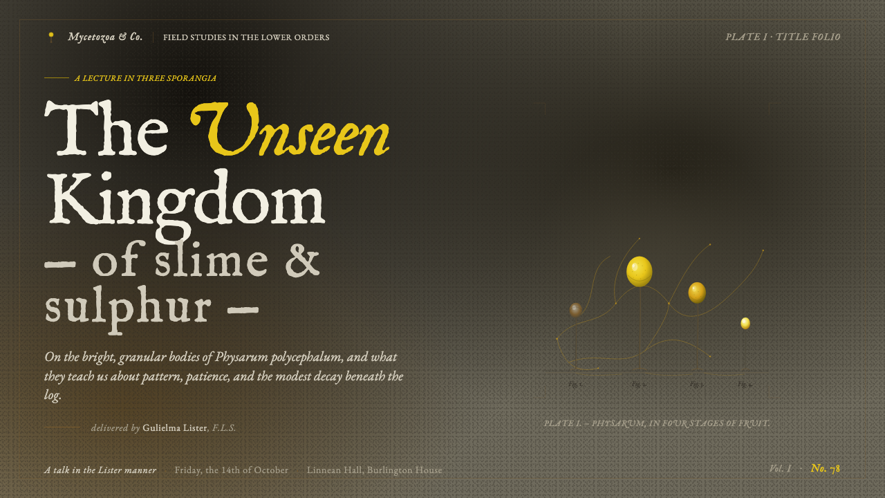
Fresh yellow fading toward brown is not merely a palette variation; it is a narrative device. The sequence gives the style time and change, allowing a page to show development rather than a single frozen specimen. Stages should be ordered clearly, with enough separation for each form to be read and enough continuity for the transition to feel biological. The sequence is useful for timelines, comparisons, and explanatory data.
Who shaped Slime Mold Plasmodium (Lister Plate)?
Arthur Lister is one of the two named authors of A Monograph of the Mycetozoa, the 1894 source that gathered seventy-eight hand-painted plates of slime moulds. Within this design system, his name represents the monograph’s observational and taxonomic authority: the insistence that visual beauty should remain attached to careful recording.
Gulielma Lister is the second named author of the monograph and part of the style’s essential historical identity. Her presence keeps the reference anchored to the actual Lister publication rather than to an invented Victorian botanical mood. The system treats authorship as part of the visual record, not as a decorative attribution.
Sulphur Physarum sporangia provide the system’s most recognizable specimen: bright yellow forms held on slender stalks against a dim substrate. They supply the characteristic focal color, the sense of vertical growth, and the contrast between fragile biological form and heavy surrounding ground.
The sequence from fresh yellow to aging brown is a central reference for the style’s sense of time. It turns colour into evidence of change and allows a composition to communicate development, decline, or comparison without relying on decorative effects. The sequence is a figure in the broadest sense: an image that carries information through ordered visual stages.
How do you use Slime Mold Plasmodium (Lister Plate) today?
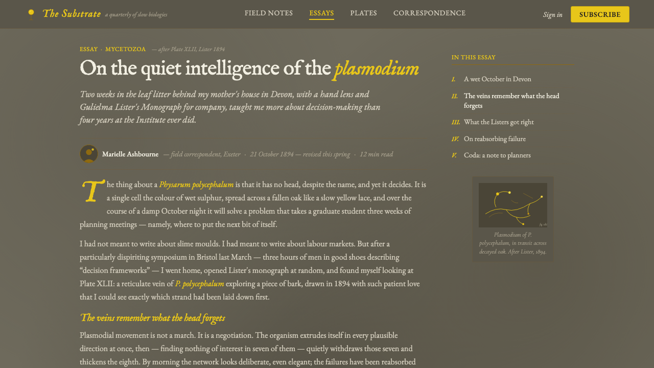
For presentation slides, use the dark substrate grey as the continuous field and let yellow operate as a specimen-like focal signal. A cover can place a large softly modelled form or vein cluster away from the centre, leaving the title in a quiet, well-separated area. Content slides should feel like related plates in the same monograph: restrained labels, fine rules, generous breathing room, and a clear hierarchy between specimen, caption, and explanatory text. Data slides can turn stage sequences into visual evidence, showing fresh yellow moving toward brown as a process rather than treating colour as decoration.
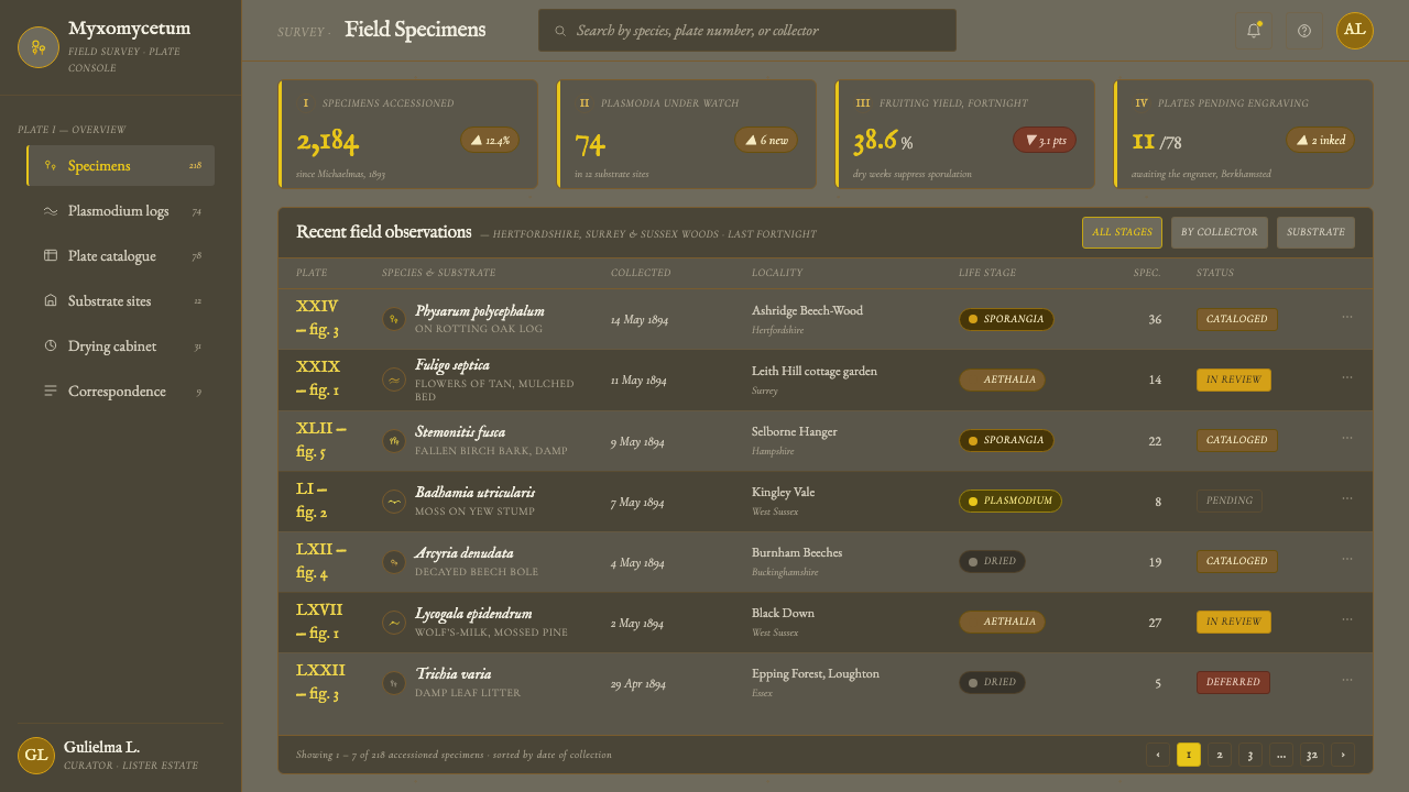
In web dashboards and pricing pages, the style works best when the interface behaves like a catalogue of observations. Use the dim grey ground for the main field, subdued panels for supporting information, and sulphur yellow for active states, selected records, or the most important value. Aging brown can indicate historical or completed states without introducing a separate visual language. Pricing tiers should be differentiated through specimen-like emphasis and labelled structure, not through a row of competing bright colours. The interface should remain calm enough for the yellow to retain its authority.
For editorial layouts, the Lister Plate style supports essays, field notes, research pages, and cultural writing that benefit from a sense of collected evidence. A narrow reading measure can sit beside larger figure areas, with captions and engraved-style numbers treated as part of the page rather than as afterthoughts. Marketing work can borrow the system’s strongest contrast for launches, reports, and educational campaigns: a dark material field, one luminous yellow subject, and supporting copy that feels catalogued instead of shouted. The result is distinctive while still communicating seriousness.
For data storytelling, the life-stage sequence provides a particularly strong model. A chart or comparison can move from fresh yellow through muted intermediary tones toward brown, making change visible as a biological progression. Fine branching lines can connect related records or show the spread of a subject across a page, provided they remain secondary to the main evidence. Figure numbers and short captions help the viewer understand that each visual mark belongs to a larger record.
The common mistake is to treat the style as a generic dark theme with bright yellow accents. That approach loses the ecological relationship at its centre. Cream backgrounds, glossy gradients, sharp digital neon, heavy decorative outlines, and unrelated botanical motifs all weaken the reference. Another mistake is to make every element luminous. The yellow works because the ground stays quiet, the linework stays fine, and the specimen remains specific. Restraint is what makes the glow believable.
Slime Mold Plasmodium (Lister Plate) — FAQ
Is this simply a dark botanical illustration style?
No. Its identity depends on the specific relationship between sulphur-yellow Physarum sporangia and decaying-substrate grey, together with plasmodium veining, soft watercolour modelling, engraved figure numbers, and life-stage change. Removing those relationships leaves a generic dark nature theme rather than the Lister Plate language.
Why must the background stay dim and grey?
Because the yellow is meant to appear luminous through contrast. The grey also suggests the decaying substrate where the organisms grow, so it provides both visual and ecological context. A bright or creamy ground changes the meaning of the specimen and removes the condition that makes its colour glow.
Can the style use modern gradients or glossy effects?
The source material points toward soft watercolour modelling, not glossy digital rendering. Gentle tonal variation can describe organic volume, but it should retain the feeling of pigment on a plate. Gloss, artificial shine, and theatrical effects make the specimen resemble a product object and weaken the naturalist reference.
How should life-stage sequences be used in an interface?
Treat the sequence as information. Fresh yellow, transitional tones, and aging brown can organise a timeline, comparison, or explanatory diagram. Keep the stages distinct enough to read and connected enough to feel continuous. The colour progression should communicate change, not merely provide a decorative palette.
What kinds of products suit the Lister Plate style?
It suits interfaces and content that benefit from archival authority, biological specificity, and dark visual focus: research dashboards, field records, educational tools, cultural publications, reports, and carefully framed campaigns. It is less suitable when the product depends on bright neutrality, playful generality, or a light paper-like atmosphere, because those qualities conflict with the system’s dim substrate and concentrated yellow.
Related design styles
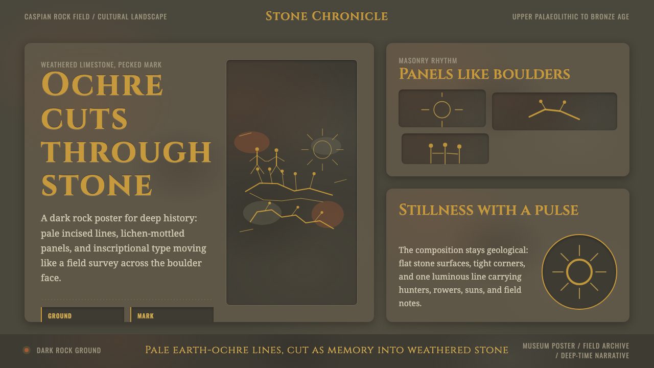 Azerbaijani Gobustan PetroglyphAncient rock speaks. Ochre incisions glow across dark lichen-mottled stone.
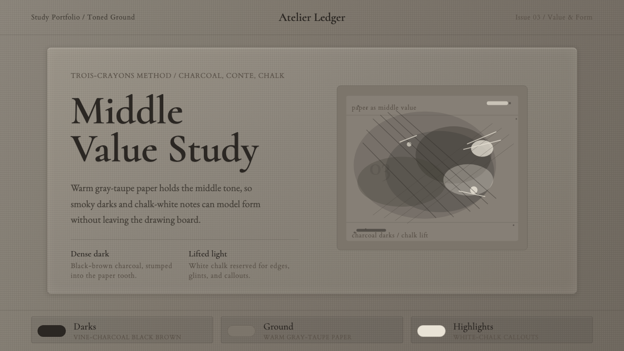 Charcoal & Conté DrawingAtelier calm, in middle value. Gray-taupe tooth, smoky charcoal, and chalk-wh…
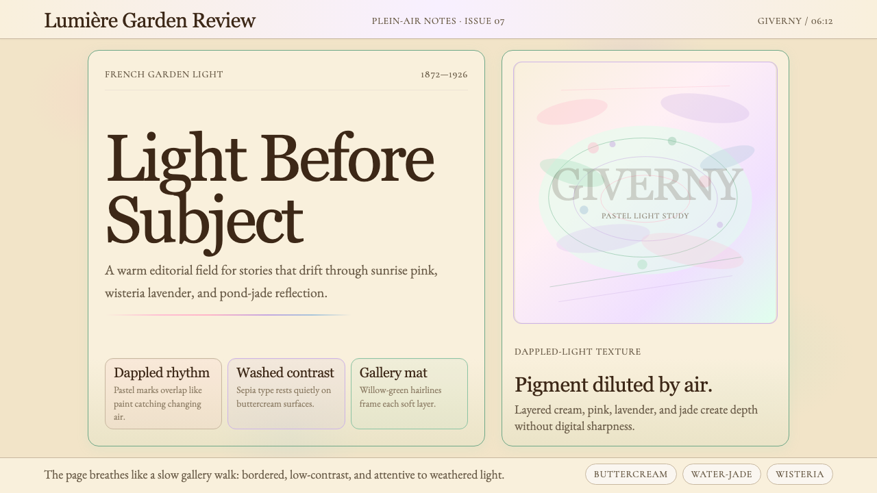 Claude Monet ImpressionistLight becomes the subject. Buttercream, pastel dapples, and Cormorant serif s…
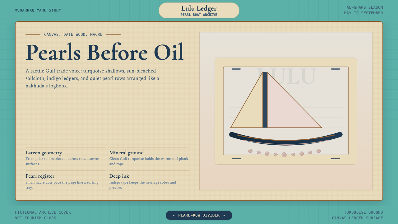 Bahraini Dhow Pearl-Diving BoatMineral and sun-bleached. Gulf turquoise, canvas cream, and pearl rows frame…
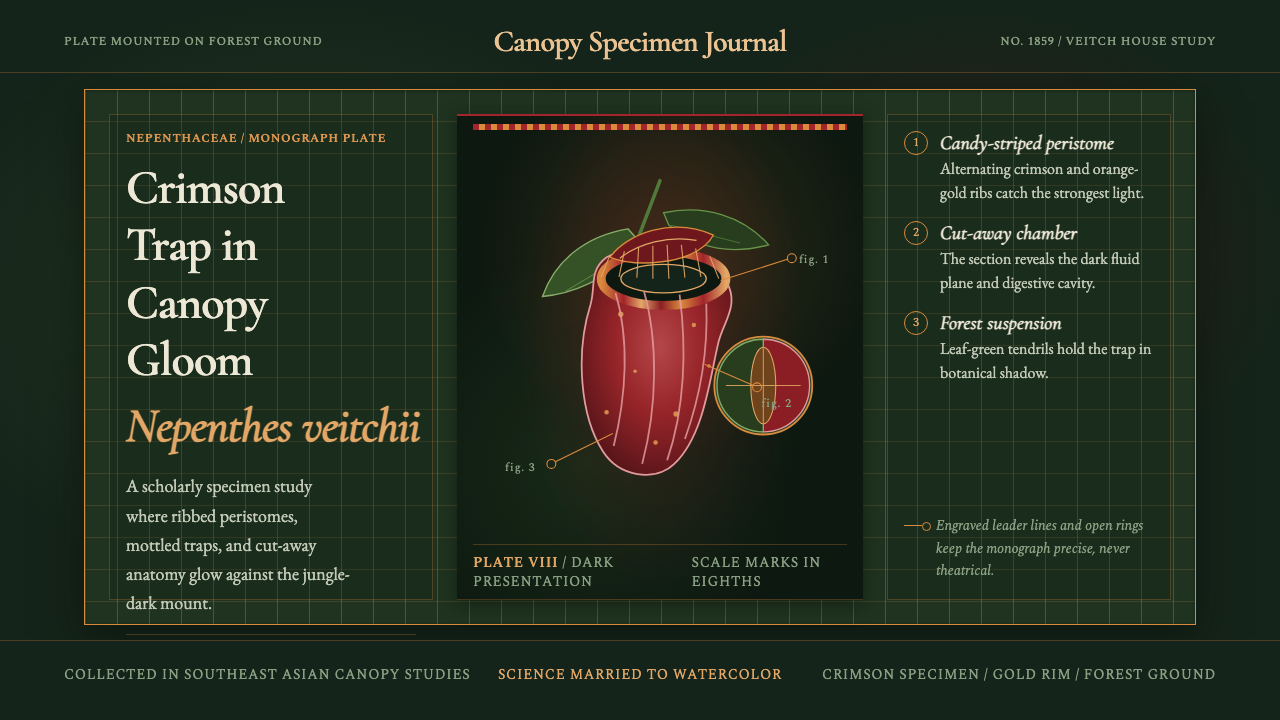 Carnivorous Pitcher PlantBotanical danger glows. Crimson traps and gold rims float on jungle-dark gree…
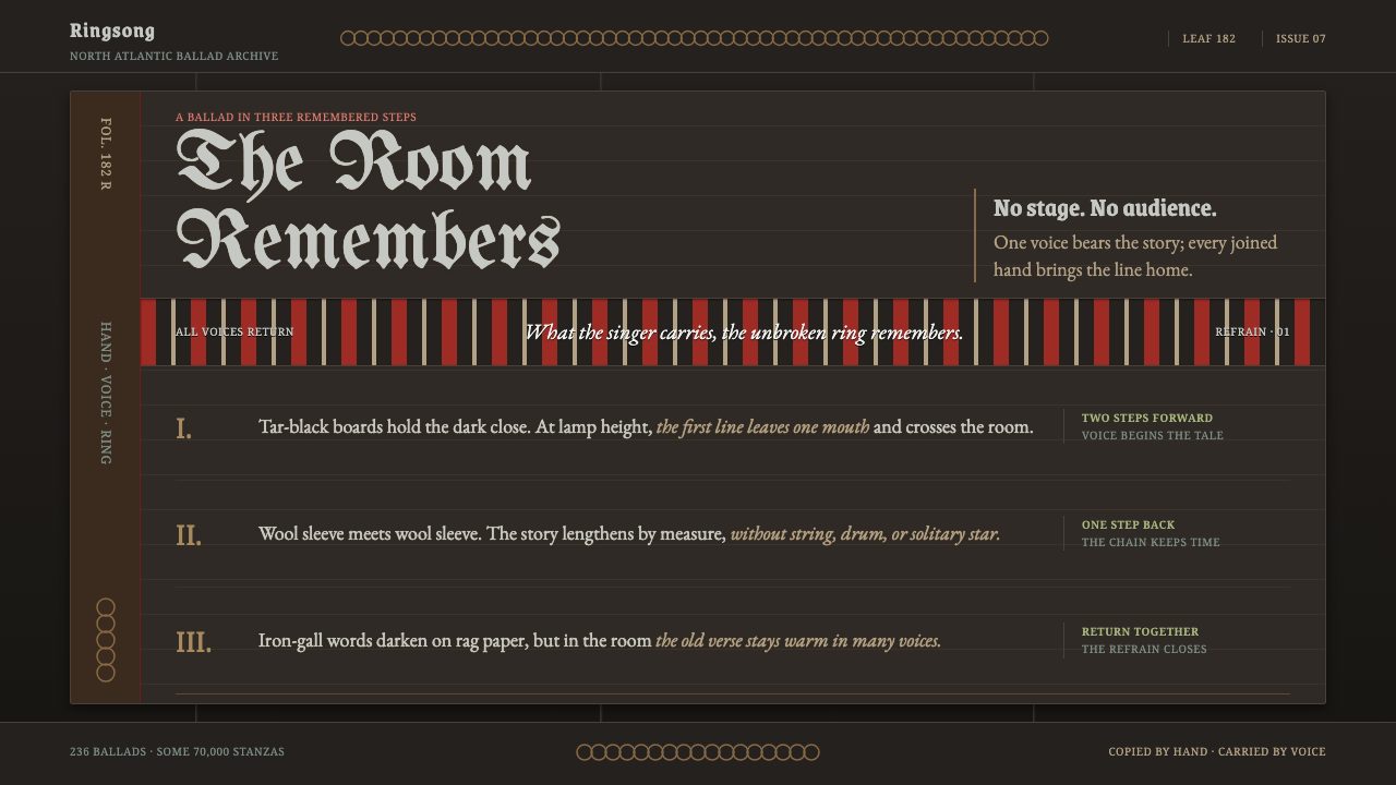 Faroese KvæðiThe room sings as one. Silver type and red refrain bands rule a tar-black man…