What is Borobudur Andesite Gray?
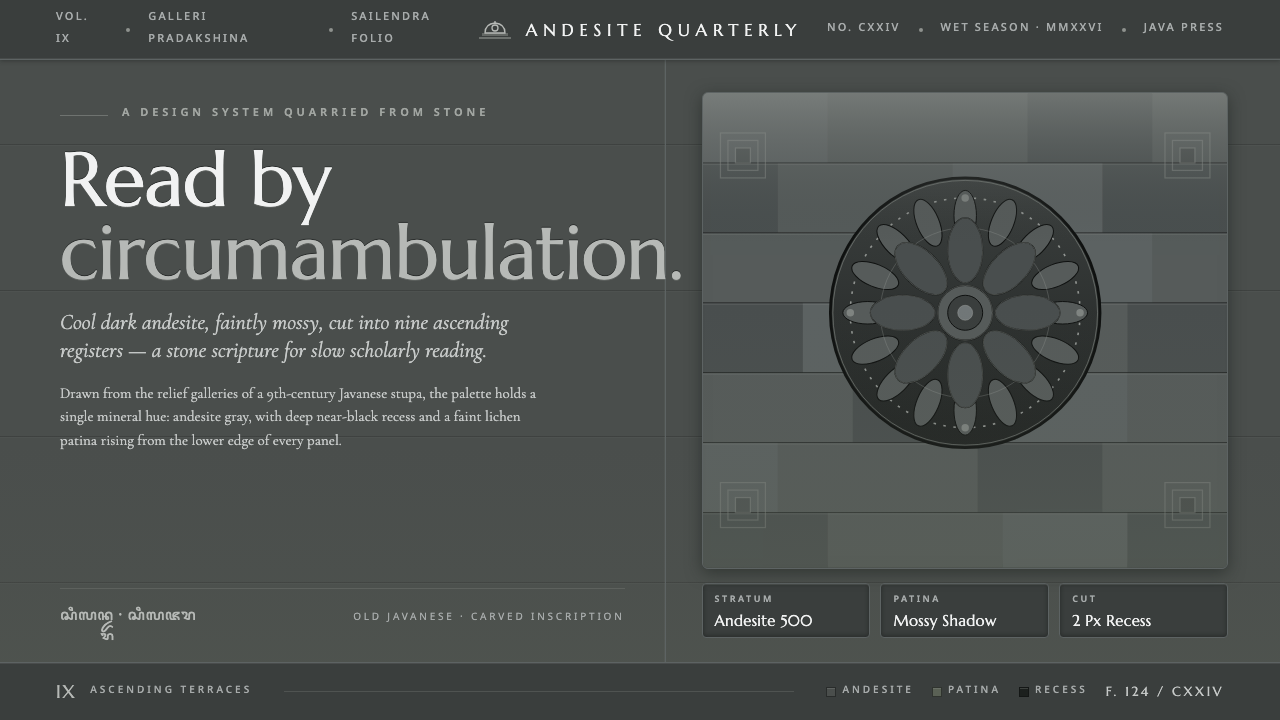
Borobudur Andesite Gray treats the interface as carved stone: cool volcanic gray, near-black recesses, moss-soft patina, and monumental serif lettering that feels excavated rather than typed.
Borobudur Andesite Gray in brief
Borobudur Andesite Gray is a dark, weathered design language derived from the stone surfaces of Borobudur, the great Mahayana stupa of Central Java. Its foundation is a cool andesite gray with a restrained mossy-green cast, surrounded by near-black recesses and softened by the visual memory of lichen and wet-season patina. The result is grave, tactile, and architectural rather than luxurious or polished.
The system imagines every surface as part of a monument. Backgrounds recede like shadowed corridors, panels read as carved slabs, borders resemble joints between fitted stones, and typography carries the authority of an inscription. The palette stays within weathered grayscale, with green appearing as a faint organic trace rather than a bright accent. Cream, ivory, and pure white do not belong to the system.
Its defining gesture is the conversion of relief into hierarchy. Large headings feel like carved declarations; smaller text behaves like explanatory panels along a circumambulatory path; spacing creates pauses between narrative scenes. The style is dark without becoming theatrical, historic without becoming decorative, and restrained without losing the physical presence of stone.
Where does Borobudur Andesite Gray come from?
Borobudur is the great ninth-century Mahayana stupa of Central Java, Indonesia, raised under the Sailendra dynasty from volcanic andesite quarried near the Progo River. The monument is not simply a building faced with stone. Its terraces, passages, and carved surfaces form a continuous narrative environment in which architecture, sculpture, and ritual movement are inseparable.
Its relief panels extend for more than two kilometres and are read through circumambulation: the visitor moves around the monument, encountering narrative scenes in sequence. This movement supplies the design system with one of its deepest structural ideas. Information should not arrive as a flat collection of isolated modules; it should unfold through thresholds, pauses, recesses, and moments of emphasis.
The source traditions behind the monument include Javanese Buddhist temple architecture, the narrative relief-panel tradition, and Mahayana stupa-mandala design. Together they explain the system’s combination of mass and sequence. The stone is monumental, but the experience is progressive: one passes from surface to surface, from shadow into visibility, and from individual image to larger cosmological order.
Borobudur was built approximately between 800 and 850 CE under Sailendra patronage. Its surviving stone surfaces predate 1900 and carry the visual authority of material that has endured weather, time, and repeated care. The design language does not imitate every historical detail; it distils that endurance into a contemporary system of dark stone, carved lettering, deep relief, and subdued patina.
What defines the Borobudur Andesite Gray look?
Andesite Gray
The dominant color is a cool volcanic gray, dark enough to feel substantial but not so black that it loses mineral character. A faint mossy-green cast keeps the surface organic and connected to weathered stone. Gray is not treated as a neutral backdrop; it is the material of the system, carrying the visual weight that another style might assign to color.
Near-Black Recess
The deepest values belong to recesses, seams, and carved interiors. Near-black is structural rather than atmospheric: it marks depth, separates adjoining planes, and gives panels the feeling of being cut into a larger mass. It should appear with intention, allowing darkness to describe form instead of merely making the page moodier.
Carved Serif
Marcellus and similar monumental serif treatment stand in for inscriptions cut into stone. Letterforms should feel upright, measured, and ceremonial, especially in large headings and labels. Typography is not an overlay placed above the material; it is imagined as part of the surface, with scale and spacing giving each word the stillness of an engraved statement.
Relief and Depth
Hierarchy is expressed through the logic of relief. Primary elements project forward through contrast and presence, secondary elements sit within quieter planes, and supporting information retreats into shadowed surfaces. Borders, dividers, and cards should feel like changes in elevation or fitted stone courses rather than decorative UI chrome.
Weathered Patina
Patina introduces softness without turning the system warm or polished. Moss and lichen are references for a muted surface variation, not invitations to add botanical decoration or vivid green. The effect should suggest a monument maintained through seasons: cared for, exposed, and visibly marked by time.
Circumambulatory Rhythm
The visual rhythm should unfold in sequence rather than arrive all at once. Repeated panels, deliberate intervals, and alternating depths can guide the eye as a visitor is guided around a relief narrative. The composition gains power from procession: each section should feel like the next carved scene in a continuous stone scripture.

Who shaped Borobudur Andesite Gray?
The Sailendra dynasty provided the patronage under which Borobudur was raised in Central Java around the ninth century. In this design language, their role is represented through monumentality, continuity, and the sense that visual order can carry religious and civic significance across generations.
The Javanese stone carvers gave the monument its physical language through fitted volcanic stone and narrative relief. Their presence informs the system’s insistence on surface, incision, repetition, and workmanship that remains legible even after weathering.
Gunadharma is named in the source tradition as the legendary architect associated with Borobudur. As a figure, he represents the imaginative union of architecture, sacred order, and crafted stone that the design system seeks to evoke without pretending to reproduce a historical artifact.
How do you use Borobudur Andesite Gray today?
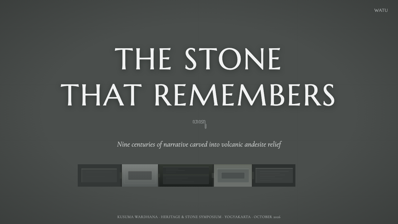
For presentation slides, use the style as a procession. The cover should feel like a monumental entrance: a dark andesite field, a restrained title in carved serif capitals, and one strong plane or recess establishing depth. Content slides should behave like successive relief panels, with a stable reading structure and generous intervals between sections. Data slides work best when charts are treated as engraved diagrams: quiet gray surfaces, near-black axes or recesses, and mossy green reserved for the single story the audience must notice.
For web interfaces, Borobudur Andesite Gray suits dashboards, archives, and analytical tools that need authority and sustained attention. Panels can read as fitted stone slabs, while the deepest near-black tone separates navigation, detail views, or active states. On pricing pages, tier differences should come from elevation, surface contrast, and typographic prominence rather than a carnival of colors. The interface should feel discovered in layers, with information emerging from a coherent monument-like structure.
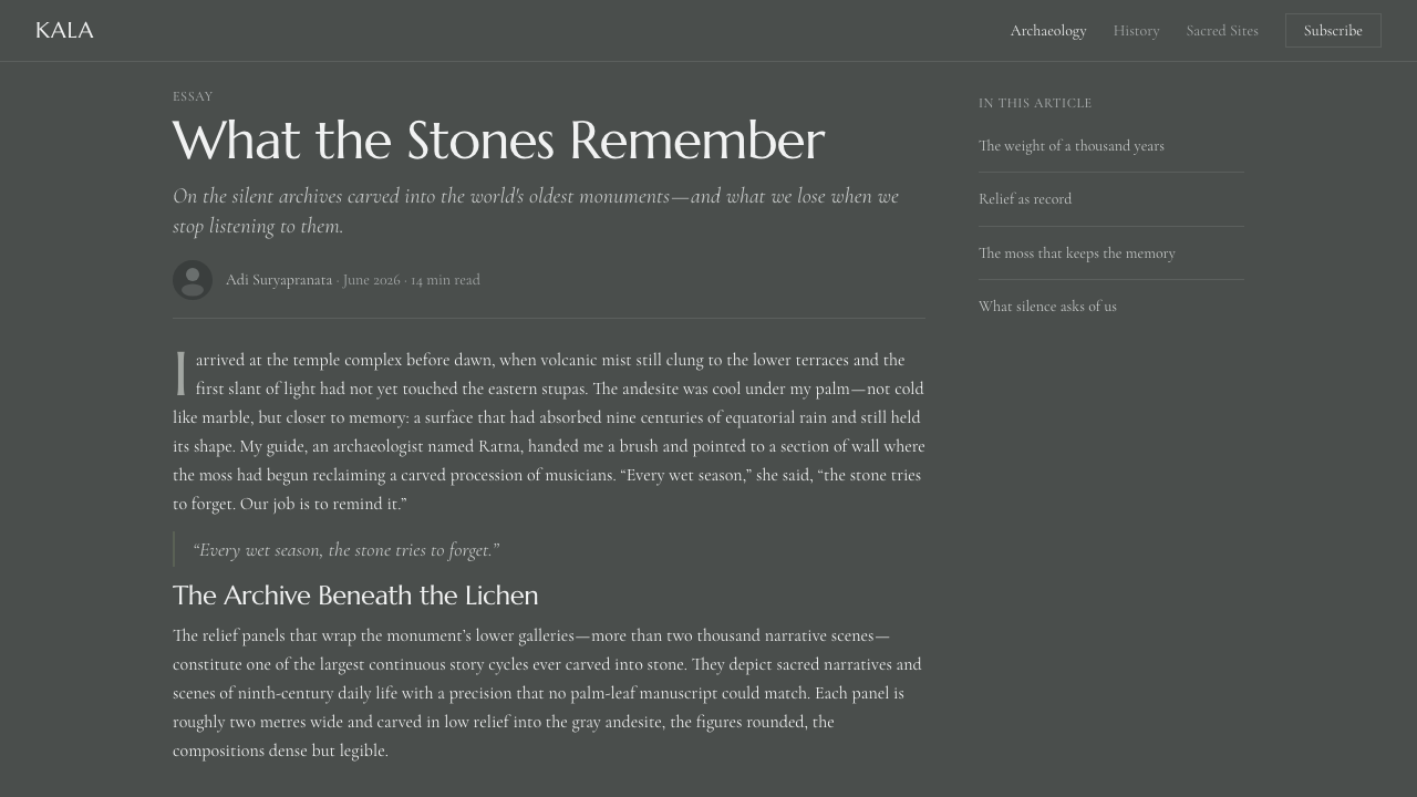
For editorial work, the system supports essays, cultural archives, museum materials, and long-form narratives. A large carved heading can establish the chapter, while body text sits in quieter gray planes that preserve a sense of reading through inscriptions. Relief-like bands, restrained rules, and recurring panel structures can mark movement from one argument or scene to the next. Imagery, when used, should reinforce stone, shadow, carving, or weather rather than compete with the material language.
For marketing, the style is strongest when the product is positioned as enduring, considered, and rooted in craft. Campaign pages can alternate between broad dark fields and more visible stone-gray surfaces, using patina as a subtle signature across sections. Calls to action should emerge through contrast and placement, not bright saturation. The overall message is quiet authority: an object or service shaped with care, meant to be examined, and built to remain legible over time.
The common mistake is turning the theme into generic dark luxury. Glossy black surfaces, metallic accents, bright emerald green, ornamental temple motifs, and dramatic lighting all move away from the source. Another mistake is applying texture everywhere until hierarchy disappears. Authentic Borobudur Andesite Gray depends on restraint: gray remains material, near-black describes depth, green remains patina, and carved typography carries the clearest voice.
Borobudur Andesite Gray — FAQ
Is Borobudur Andesite Gray meant to look like a literal photograph of Borobudur?
No. It is a distillation of the monument’s material and spatial logic, not a photographic replica. The relevant qualities are cool volcanic stone, deep carved recesses, narrative sequencing, subdued patina, and inscription-like typography. Literal temple imagery can be used when appropriate, but the system should still work through surface, hierarchy, and rhythm even when no monument is pictured.
Can the style use white, ivory, or cream backgrounds?
They should be avoided. The source system is defined by dark andesite gray, near-black recesses, and weathered grayscale. Lightening the background into cream or ivory changes the material metaphor from carved volcanic stone to a lighter editorial surface. Visibility can be created through shifts within the dark range, carefully placed gray planes, and the separation of relief-like layers.
How much green belongs in the palette?
Very little. Green belongs to the idea of moss and lichen patina, so it should appear muted, weathered, and subordinate to the stone. It is most effective as a trace that identifies an active or important detail, not as a second dominant color. Bright green breaks the aged mineral character and turns patina into decoration.
Why are serif capitals important to the system?
They stand in for chiselled inscriptions. Their upright, monumental character gives headings the gravity of carved declarations and helps typography belong to the surface rather than float above it. The treatment should remain measured: excessive ornament, theatrical display type, or many competing type styles would weaken the feeling of a continuous stone scripture.
What makes this style different from generic dark mode?
Generic dark mode usually treats darkness as a functional setting. Borobudur Andesite Gray treats darkness as material and depth. Near-black marks recesses, gray establishes stone, green suggests weathering, and typography behaves like an inscription. Its layouts are shaped by procession and relief, so the interface should feel carved and sequential rather than simply recolored.
Related design styles
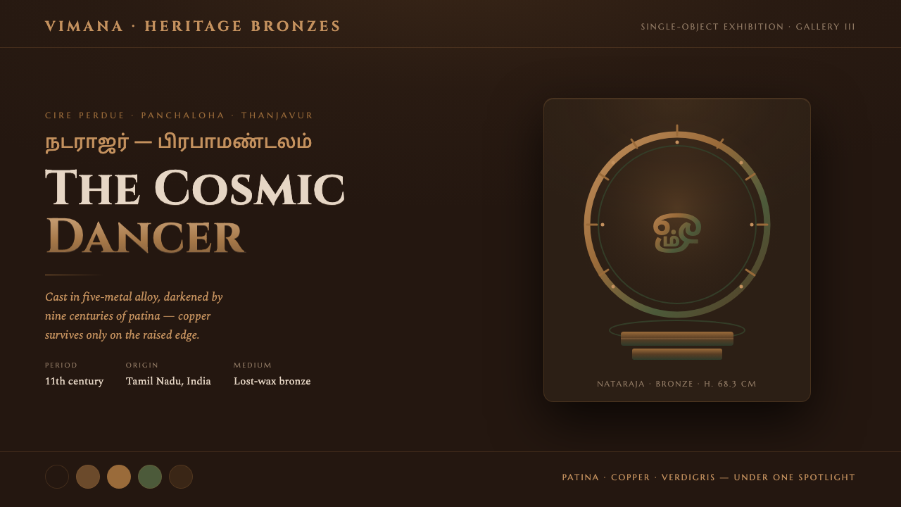 Chola Bronze NatarajaA patinated bronze under museum spotlight. Near-black field, verdigris recess…
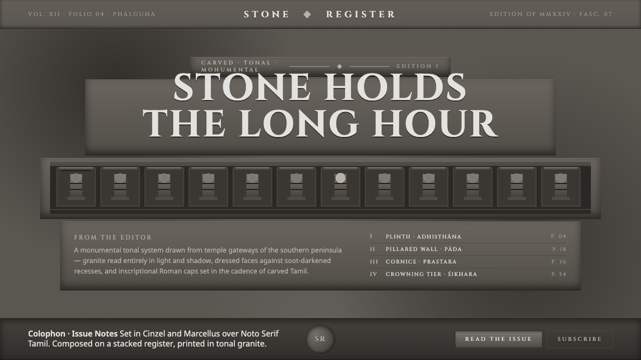 Dravidian Granite GrayscaleRead entirely in grayscale. Soot-dark recesses against dressed granite, Cinze…
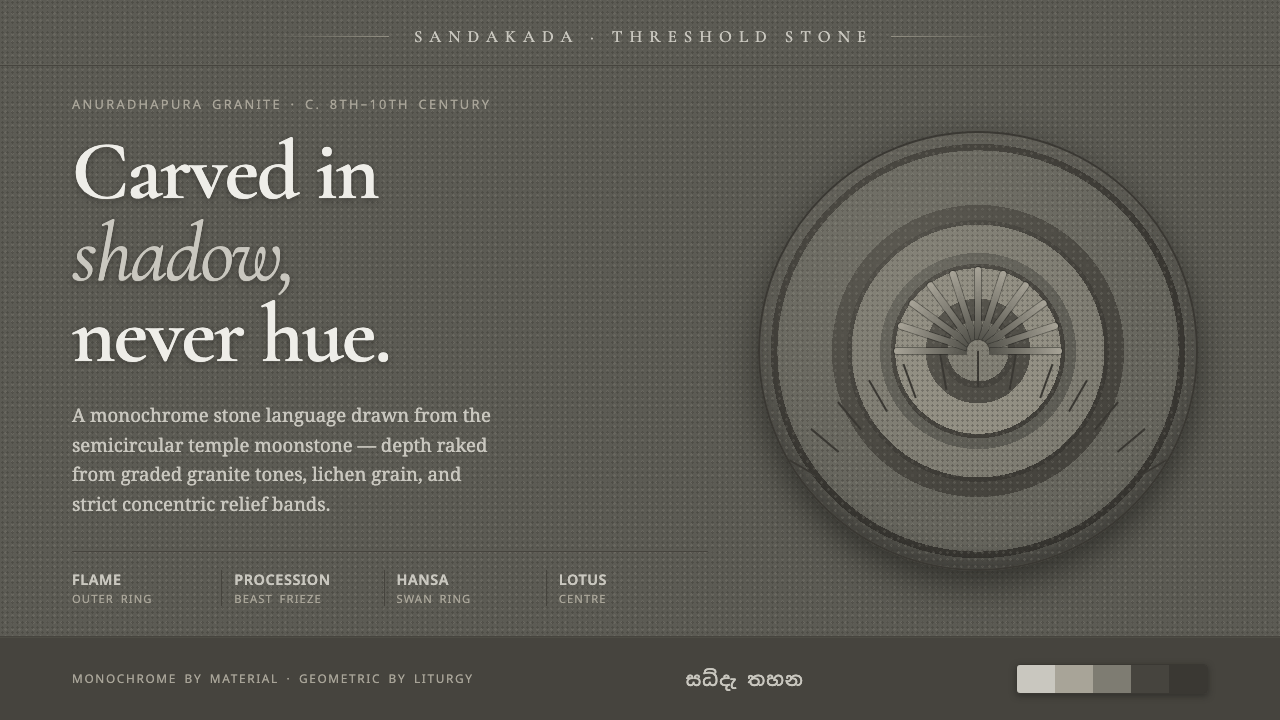 Sandakada Pahana MoonstoneDepth carved from shadow, never hue. Weathered-granite grays in concentric mo…
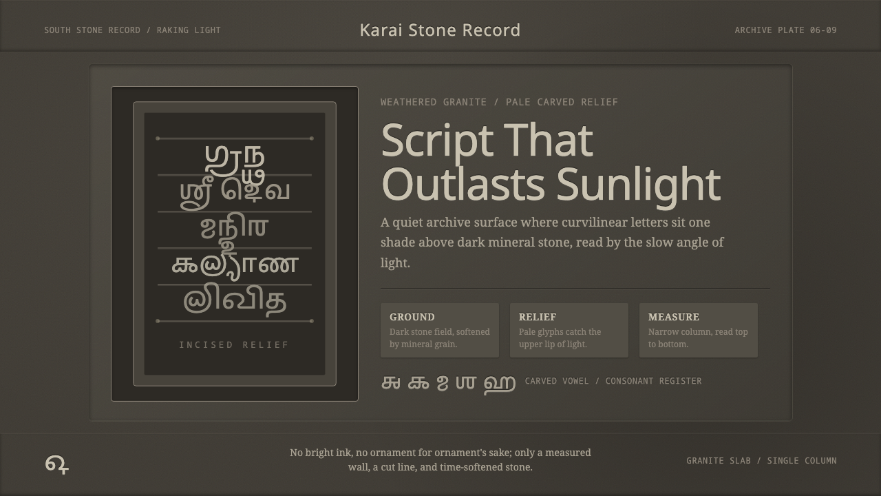 Tamil Grantha InscriptionSacred stone, quietly lit. Pale Grantha glyphs float on dark granite in a nar…
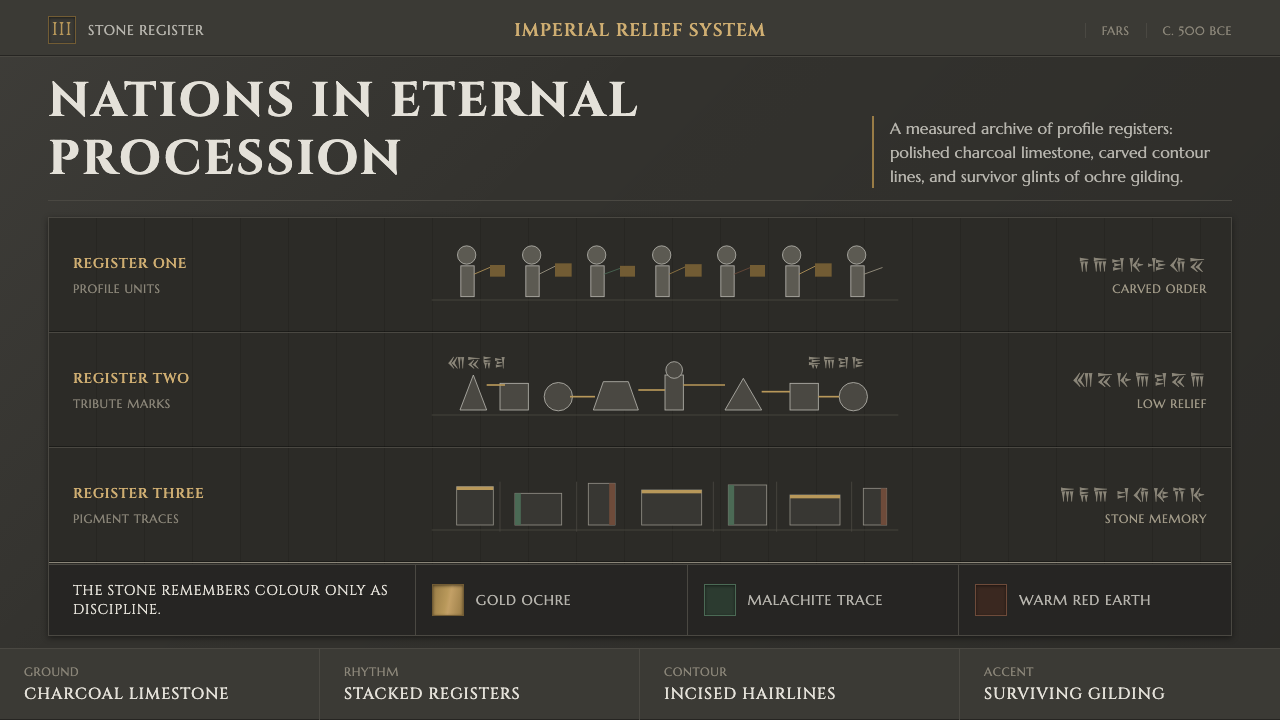 Achaemenid Persepolis ReliefImperial restraint in stone. Charcoal registers carry ochre, green, and red p…
 Anglerfish Lure BioluminescenceLight is scarce. Old serifs and hairline rules frame one cold green-cyan lure.