What is Chola Bronze Nataraja?
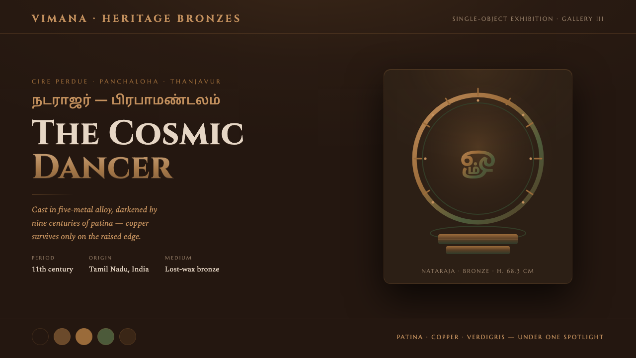
Chola Bronze Nataraja turns darkness into a shrine — a patinated bronze language of fire, copper light, verdigris shadow, and sacred motion held perfectly still.
Chola Bronze Nataraja in brief
Chola Bronze Nataraja is a design system derived from the South Indian temple bronze tradition of the Chola dynasty, especially the celebrated Nataraja bronzes associated with Tamil Nadu, Thanjavur, and Chidambaram. Its central image is Shiva as Nataraja, the cosmic dancer, cast in panchaloha by the lost-wax method and enclosed within the prabhamandala, an arch of fire. The figure is poised mid-step upon the dwarf of ignorance, combining movement, balance, and spiritual force in a single sculptural presence.
The visual character begins with darkness rather than ornament. A near-black bronze ground provides the atmosphere of a museum gallery after the surrounding room has fallen away. Copper-bronze lettering catches the imagined light of the artifact, while verdigris settles into recesses and quieter planes. The result is not a generic metallic aesthetic: it depends on the contrast between aged surface and newly caught light, between the dense black field and the warm edge of a raised contour.
This system treats the artifact with restraint. The palette remains confined to patina, copper, and verdigris; illumination is localized like a museum spotlight; and typography is expected to feel engraved, incised, or recovered from metal rather than printed as a bright digital overlay. Tamil script is presented alongside Latin display lettering, preserving the cultural identity of the source while allowing the system to function across bilingual compositions.
Where does Chola Bronze Nataraja come from?
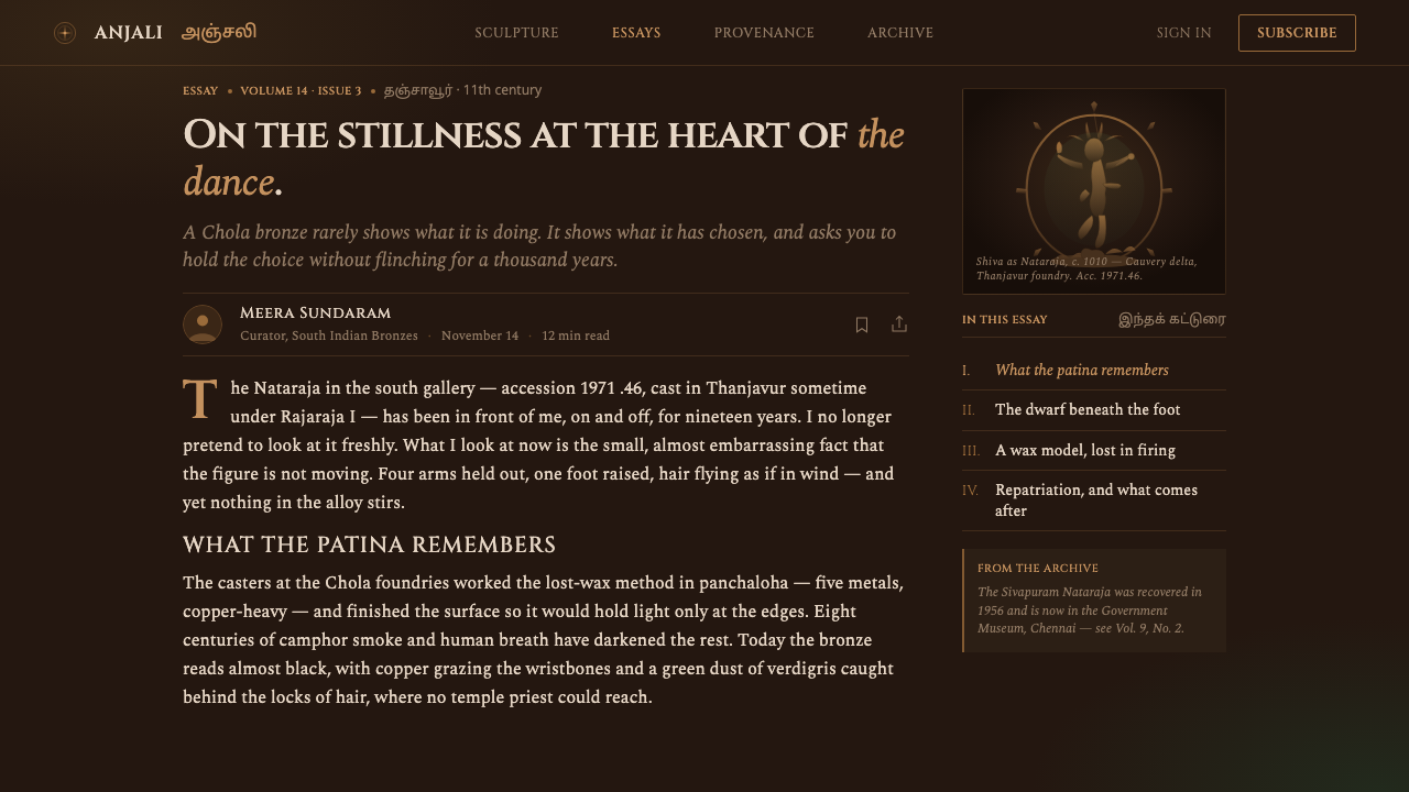
The source tradition belongs to the Chola dynasty period, spanning the ninth through thirteenth centuries in South India. Tamil Nadu, with Thanjavur and Chidambaram as important geographic anchors, provides the cultural landscape for the system. The famous Nataraja bronzes of the eleventh century are treated here not as isolated decorative objects but as the historical core of a visual vocabulary built from temple sculpture, ritual presence, and enduring material surface.
Chola temple bronze-casting workshops used the lost-wax method, also known as cire perdue, to produce figures whose form is carried by the casting process itself. The method gives the artifact a sense of singularity: the surface is not a repeatable graphic pattern but the record of a body, a mold, a pour, and the passage of time. Panchaloha further establishes the material identity of the figure, making bronze the substance of the image rather than a visual effect applied after the fact.
The Nataraja icon of Chidambaram supplies the system with its most powerful composition. Shiva appears as the cosmic dancer, held within the prabhamandala arch of fire and balanced above the dwarf of ignorance. This arrangement gives the visual language a natural circular frame, a central figure, a surrounding field of energy, and a clear tension between stillness and movement. Fire is not treated as a soft glow; it is a decisive ring that defines the space around the body.
The design translation preserves those origins through atmosphere and hierarchy. Near-black becomes the surrounding void, copper-lit edges become the readable structure, and verdigris marks the places where age and shadow gather. Engraved Latin display is placed beside Tamil script rather than replacing it. The resulting system is historical in reference but contemporary in use: it carries the authority of South Indian temple sculpture into interfaces, editorial pages, presentations, and other carefully framed compositions.
What defines the Chola Bronze Nataraja look?
Near-Black Ground
The background is a near-black bronze field, deep enough to suggest a darkened gallery without becoming a neutral digital black. It gives the artifact room to emerge and makes every warm edge feel discovered rather than applied. The darkness should remain visually present around the content; it is the atmosphere, not empty space waiting to be filled.
Patina Palette
Color is restricted to the aged family of bronze: blackish brown patina, warm copper, and green-brown verdigris. Copper is reserved for emphasis and legibility, while verdigris belongs to recesses, secondary information, and atmospheric depth. The palette feels geological and time-worn, never glossy, synthetic, or brightly metallic.
Spotlit Relief
Light behaves like a museum spotlight falling across relief. Raised contours, rims, and expressive edges receive copper warmth; hollows remain subdued and green-brown. The contrast should feel directional and physical, as though the surface has depth and the light has a reason for touching one plane before another.
Circular Fire Frame
The prabhamandala supplies a circular organizing device: a ring of fire around a poised central presence. In design applications, circular framing can hold a title, focal image, or central statistic, but it should retain the sense of contained energy. The ring is not a decorative border; it is the boundary of a charged space.
Engraved Bilingual Type
Typography should appear engraved, incised, or uncovered from the bronze surface. Latin display lettering can carry the formal headline, while Tamil script remains visible as an honored parallel presence. The two scripts should share the same atmosphere without being forced into identical shapes or allowing Latin to dominate the cultural reading of the composition.
Material Honesty
Every visual decision should suggest actual metal, age, and relief rather than imitate a generic luxury finish. Copper highlights belong to raised surfaces; verdigris belongs to protected recesses; the dark field belongs to the surrounding chamber. This logic prevents the system from collapsing into a decorative bronze gradient or a polished gold treatment.
Who shaped Chola Bronze Nataraja?
The Chola temple bronze-casting workshops are the material origin of the system. Their lost-wax practice gives the visual language its respect for process, singularity, and sculptural presence. In design terms, the workshop is represented through surfaces that feel formed rather than decorated: a dark body, raised copper edges, and verdigris gathered where time would naturally settle.
The Nataraja icon of Chidambaram provides the system with its central image and spiritual structure. Shiva as cosmic dancer, framed by fire and balanced above ignorance, creates a composition that is simultaneously animated and controlled. Its influence appears whenever a layout uses a central focus, a surrounding ring, and a deliberate tension between motion and stillness.
Panchaloha and lost-wax casting establish bronze as the substance behind the image. This is why the system favors patina, relief, and localized reflection over generic metallic shine. The material tradition asks the designer to make surface, age, and light carry meaning, so that the artifact remains present even when no literal statue is shown.
How do you use Chola Bronze Nataraja today?
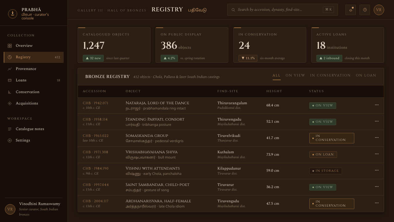
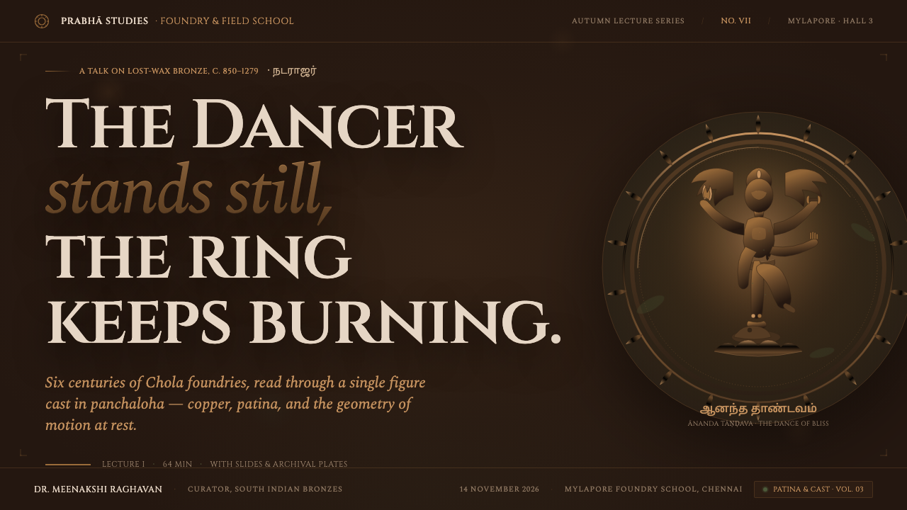
For presentation slides, use the near-black ground as a continuous gallery-like field. A cover can place a large title beside a circular fire-inspired frame or a single copper-lit focal form, leaving generous darkness around it. Content slides should rely on clear engraved hierarchy and restrained patina accents. Data slides work best when a central figure or chart is treated like a relic under light, with copper marking the principal reading and verdigris supporting secondary detail.
For web interfaces, the system suits dashboards, pricing pages, and analytical tools that need authority without glossy futurism. Keep the main field dark and let copper define active states, selected values, or primary actions. Verdigris can distinguish supporting information and quieter status signals. Cards should feel like framed plaques or metal panels, with light appearing to fall across their surfaces rather than producing a generic polished interface.
For editorial and marketing work, Chola Bronze Nataraja creates a strong sense of cultural depth and ceremonial focus. Articles can pair a narrow reading column with a broad dark margin for Tamil labels, metadata, or translated fragments. Section changes may be marked by a circular motif, a copper rule, or a shift from lit bronze to verdigris shadow. Marketing pages benefit from treating each feature as an object on display, using silence and controlled illumination to make the message feel deliberate.
For imagery, use the logic of the artifact rather than unrelated ornamental motifs. A subject can be cropped close so that patina, edge light, and recesses become the image; a circular frame can suggest the prabhamandala without copying every sculptural detail. The system is strongest when light reveals form gradually and the surrounding darkness remains intact. Tamil script should remain part of the composition wherever the cultural reference is explicit.
The common mistake is treating the style as a luxury bronze theme: adding bright gold, glossy reflections, decorative filigree, or many metallic effects until the artifact loses its age and gravity. Another failure is using Tamil script as a superficial texture while allowing Latin lettering to carry all meaning. Authentic application requires a narrow material palette, localized light, visible darkness, and genuine bilingual respect. The design should feel excavated, not embellished.
Chola Bronze Nataraja — FAQ
Is Chola Bronze Nataraja simply a dark metallic style?
No. Its darkness is tied to the presence of a patinated bronze artifact under museum light. The system depends on the relationship between a near-black field, copper-lit raised edges, and verdigris in recesses. If those relationships are replaced by generic black, gold, and glossy reflections, the result may look luxurious but no longer belongs to this visual language. The cultural structure matters as much as the surface treatment.
How should Tamil script and Latin lettering coexist?
They should appear as parallel parts of the same composition, sharing the engraved and material atmosphere without being forced into identical roles. Latin display lettering may organize a headline or translated title, while Tamil script remains visible and meaningful rather than decorative. The important principle is that Latin should not erase or replace the script associated with the source culture.
Can the system work on a light background?
It can be adapted, but the near-black field is central to the approved expression. A light ground removes the sense of the museum chamber and weakens the contrast between darkness and localized illumination. If adaptation is necessary, preserve the essential relationships: patina should remain aged rather than pastel, copper should still mark raised or primary information, and verdigris should remain quieter and recessive. The result should still feel like bronze under light, not a general antique palette.
What is the difference between a fire ring and a decorative border?
The prabhamandala is an organizing and symbolic structure, not an ornamental frame added around content. It defines a charged space around the central figure and creates tension between containment and movement. In a layout, a circular device should therefore help establish focus, hierarchy, or atmosphere. If it merely surrounds text without affecting the composition, it has become decoration and has lost the Nataraja reference.
Related design styles
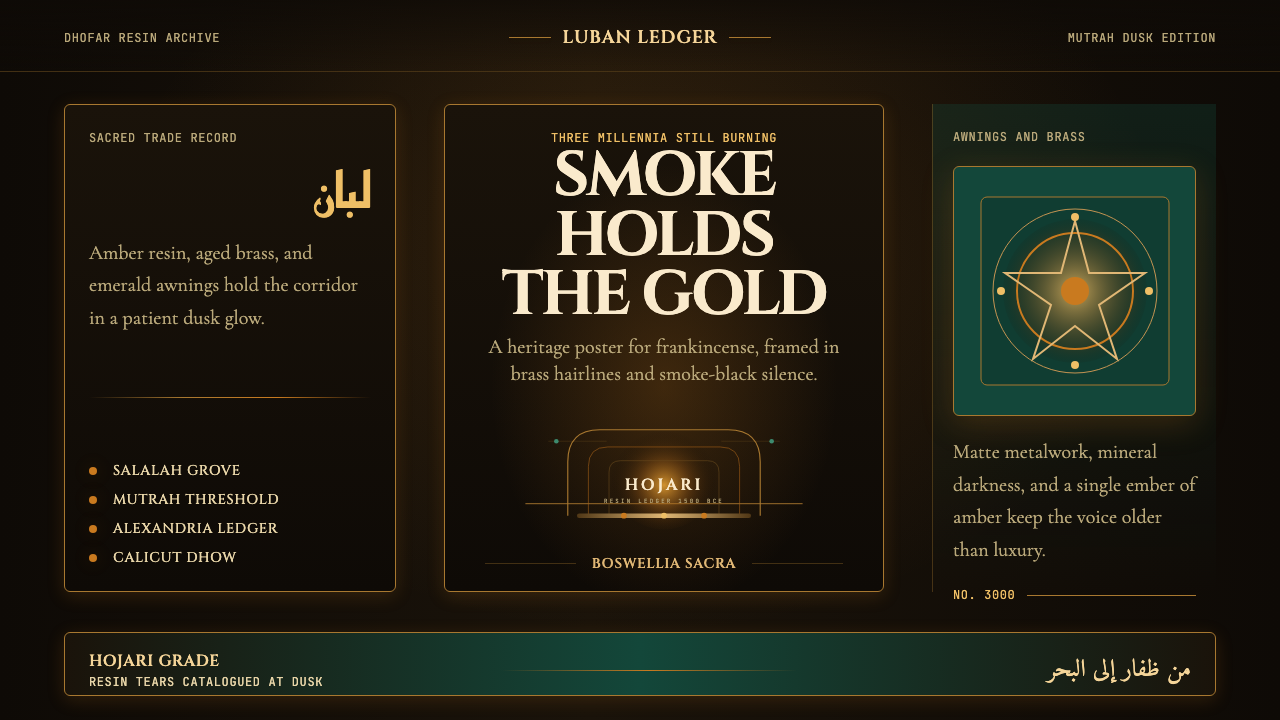 Omani Frankincense Souq AmberAncient trade still glows. Amber smoke, brass frames, and emerald dusk carry…
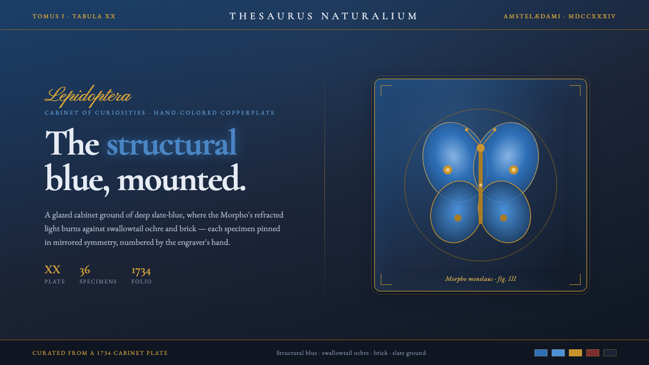 Seba Butterfly CabinetStructural blue, mounted. Iridescent Morpho glows on a slate cabinet ground,…
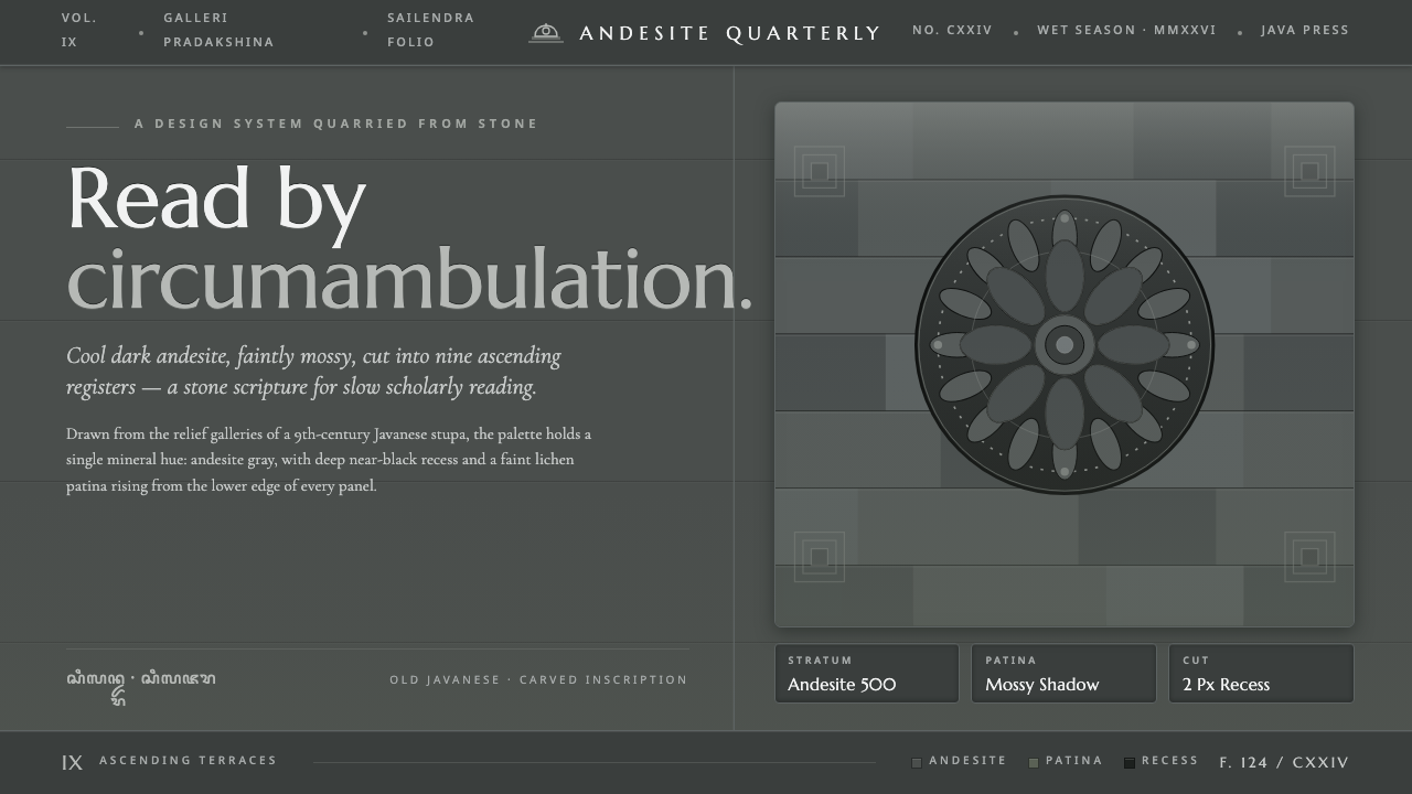 Borobudur Andesite GrayStone read like scripture. Cool andesite gray, near-black recess, mossy patin…
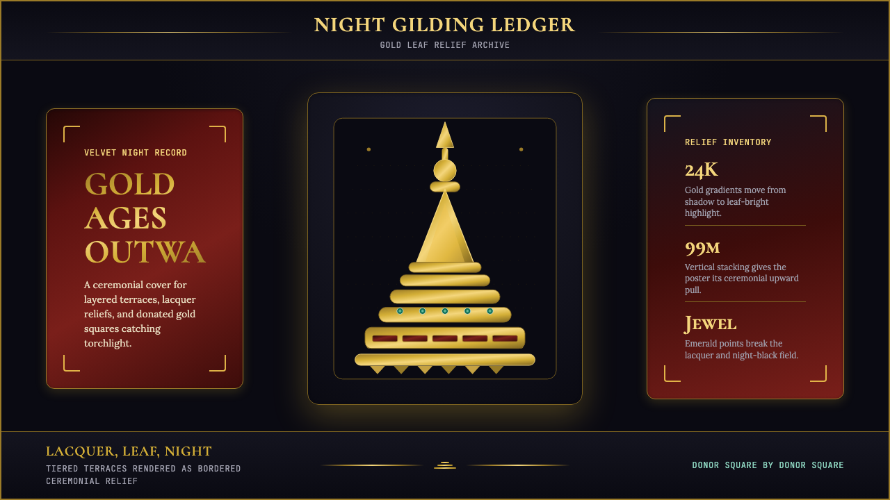 Burmese Shwedagon Stupa ReliefGold refuses restraint. Velvet black, teak-red lacquer, and tiered gradients…
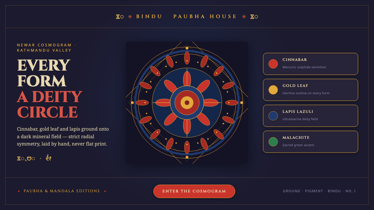 Kathmandu Tantric MandalaSacred geometry as interface. Cinnabar, gold and lapis rings radiate from one…
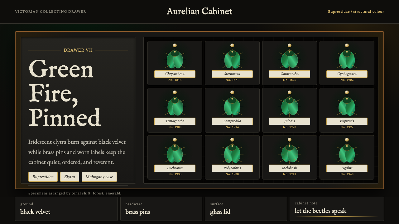 Beetle Specimen CabinetGreen burns in darkness. Emerald elytra grids glow under brass keylines and b…