What is Seba Butterfly Cabinet?
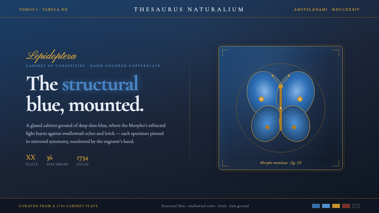
The Seba Butterfly Cabinet turns natural-history plates into a dark Wunderkammer interface, where structural Morpho blue glows like living light against slate, charcoal, ochre, and brick.
Seba Butterfly Cabinet in brief
The Seba Butterfly Cabinet is a visual system drawn from Albertus Seba’s Thesaurus, published in Amsterdam in 1734. Its defining image is the hand-colored copperplate butterfly plate: specimens arranged with rigorous mirrored symmetry, iridescent Morpho blue beside ochre swallowtails, and every form presented as though mounted inside a cabinet of curiosities.
The palette begins with a deep slate-blue and charcoal ground. Against it, Morpho blue acts as the principal event: vivid, luminous, and visibly different from an ordinary painted blue because its effect suggests refracted light rather than pigment. Ochre frames and brick accents give that radiance an earthy counterweight.
As an interface language, the system combines engraved serif type, script cartouches, framed specimens, and ordered plate-like composition. It feels historical without becoming disorderly. The attraction comes from the tension between strict classification and natural iridescence: the cabinet is controlled, but its contents appear alive.
Where does Seba Butterfly Cabinet come from?
Albertus Seba’s Thesaurus belongs to the tradition of the cabinet of curiosities, or Wunderkammer, in which unusual natural objects were collected, arranged, and displayed as evidence of the world’s variety. The cabinet was not merely storage. It was a theatrical method of looking: rare forms became precious through selection, mounting, framing, and deliberate juxtaposition.
The Amsterdam volume translated that method into natural-history copperplate engraving. Butterflies could be recorded with careful attention to contour and wing structure, then enriched by hand-coloring. The engraved line supplied order and precision; the added color supplied difference, rarity, and visual seduction. The result sits between catalogue and spectacle.
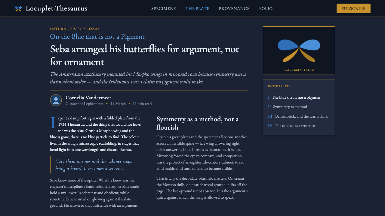
The systematic specimen plate is central to the style. Rather than scattering butterflies across a decorative field, it arranges them as a coherent visual argument. Mirrored symmetry makes the plate feel measured and authoritative, while neighboring species and colors create comparison. Every specimen belongs to a collection, and every collection has a visible structure.
This design system distills those qualities into an interface. Its dark ground recalls the cabinet interior, its serif lettering recalls engraved captions, and its script cartouches recall labels made for display. The historical source is therefore present through relationships — mounting, ordering, framing, and contrast — rather than through antique decoration alone.
What defines the Seba Butterfly Cabinet look?
Structural Morpho Blue
Blue is treated as refracted luminance, not a flat pigment. It should appear to burn against the dark ground, reserved for focal specimens, active emphasis, or moments that need unmistakable visual life.
Cabinet Ground
Deep slate-blue and charcoal establish the enclosure. The background is not empty space but the cabinet surface that gives every specimen weight, contrast, and a sense of being deliberately placed.
Mirrored Symmetry
Composition follows the logic of a specimen plate: bilateral balance, aligned bodies, and controlled spacing. Symmetry creates authority and calm, allowing the iridescent details to feel exceptional without making the whole system chaotic.
Engraved Serif
Serif lettering carries the voice of the plate: measured, archival, and precise. It should feel cut into a historical record, with contrast and spacing that support reading rather than ornamental theatricality.
Script Cartouches
Script appears in cartouches, titles, or display labels where a sense of ceremony is useful. Its role is ceremonial and identifying; it should not compete with the serif system that handles sustained reading.
Ochre and Brick Framing
Ochre supplies the frame and label-like warmth, while brick introduces a grounded accent. Both colors support the blue rather than rival it, keeping the palette earthy around its most luminous note.
Mounted Materiality
Images and panels should feel mounted, framed, and catalogued. Borders, captions, and controlled placement communicate that each element is a specimen with a place in the collection, not a loose decorative illustration.
Who shaped Seba Butterfly Cabinet?
Seba is the source figure behind the Thesaurus and the cabinet logic this system reinterprets. His Amsterdam volume provides the central image of hand-colored butterflies arranged as a deliberate natural-history collection, combining record, comparison, and visual wonder.
The copperplate engravers supplied the disciplined linework that makes the butterfly plates feel exact and systematic. Their contribution is echoed by the interface’s engraved serif voice, controlled contours, and preference for structure over casual illustration.
The Dutch hand-colorists brought the printed plates their chromatic life. Their work explains the system’s insistence that color feel applied with care: Morpho blue must read as luminous and exceptional, while ochre and brick preserve the material warmth of the collection.
How do you use Seba Butterfly Cabinet today?
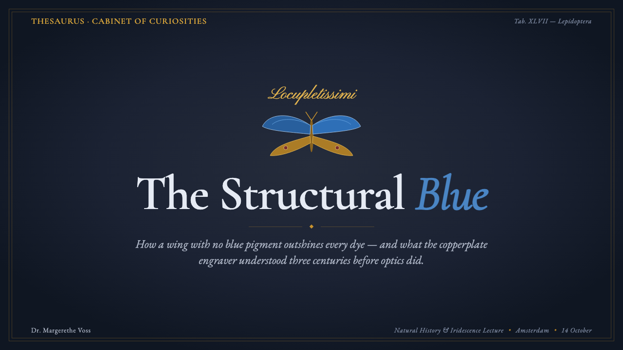
For presentation slides, use the cabinet ground as the stage and let the cover behave like a specimen plate. A centered or mirrored arrangement can hold the title, while an ochre cartouche or framed butterfly supplies the identifying gesture. Content slides should preserve clear plate logic: engraved serif headings, compact labels, and generous dark space. Data slides can treat each category as a mounted specimen, using Morpho blue to identify the most important comparison and ochre or brick to separate supporting groups.
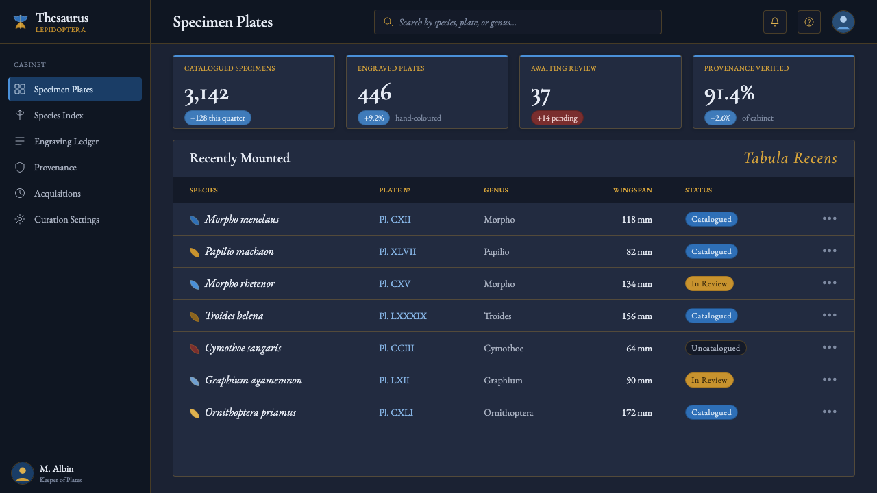
For web interfaces, the system suits dashboards, archives, catalogues, and pricing pages that need to feel curated rather than generic. Cards can read as specimen mounts, with dark surfaces, restrained borders, and framed labels. Structural blue should identify the active plan, selected state, or primary action; ochre can support secondary information, while brick can mark a meaningful warning. The hierarchy should remain orderly so the luminous accent retains its rarity.
For editorial and marketing work, the style creates an immediate sense of collection and discovery. An article can open with a large mounted image, a script cartouche for its subject, and engraved serif text arranged like a plate caption. Section breaks may use ochre framing or a quiet brick rule. Marketing pages can present products as specimens within a cabinet, making comparison, provenance, and selected details feel more important than promotional noise.
Imagery should be cropped and placed as if it belongs to a curated plate. A butterfly, product, or featured object should have a visible relationship to its frame, caption, and neighboring material. Interaction can borrow from the act of inspection: selected items glow in Morpho blue, while surrounding elements remain quiet and grounded. This creates drama through attention and contrast rather than through constant movement or decorative effects.
The common mistake is to treat the style as generic vintage decoration: adding random scrolls, distressed surfaces, or many competing antique details while using blue as an ordinary accent. That breaks the system’s central discipline. The cabinet works because its contents are ordered, mounted, and compared. Preserve the dark ground, the specimen logic, the engraved voice, and the rare quality of the blue before adding any ornamental flourish.
Seba Butterfly Cabinet — FAQ
What makes the Morpho blue different from an ordinary blue accent?
It is presented as structural color: a glow associated with refracted light rather than a flat pigment. In application, that means it should function as a rare visual event. Keep the surrounding ground dark and earthy so the blue appears to emerge from the cabinet rather than sit on top of it as a routine interface color.
Does every Seba Butterfly Cabinet layout need perfect symmetry?
Symmetry is the historical anchor, not a rule that every interface element must obey mechanically. The important qualities are mirrored balance, deliberate alignment, and the feeling that each object has been placed for comparison. A variation can be less literal while still preserving the systematic specimen-plate logic.
Why is the background so dark?
The dark slate-blue and charcoal ground recalls the interior of a cabinet and gives the mounted specimens visual weight. More practically, it allows the structural blue to read as luminous and makes ochre framing feel material rather than decorative. A pale background would change the system’s central relationship between enclosure and glow.
How should script type and engraved serif type work together?
Script belongs in cartouches, display titles, and identifying labels where ceremony helps establish the cabinet mood. Engraved serif type should carry headings, captions, and sustained reading because it is more measured and legible. The contrast works when each style has a defined role rather than when both compete for attention.
What is the biggest mistake when applying this style?
The biggest mistake is confusing historical atmosphere with historical structure. Random scrolls, distressed textures, and excessive ornament may look antique, but they do not create a Seba plate. The system depends on a dark cabinet ground, mounted forms, mirrored order, engraved lettering, earthy framing, and blue used with restraint and purpose.
Related design styles
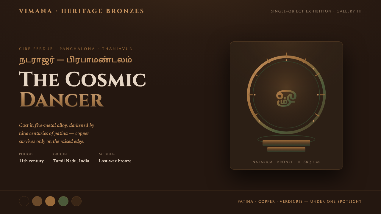 Chola Bronze NatarajaA patinated bronze under museum spotlight. Near-black field, verdigris recess…
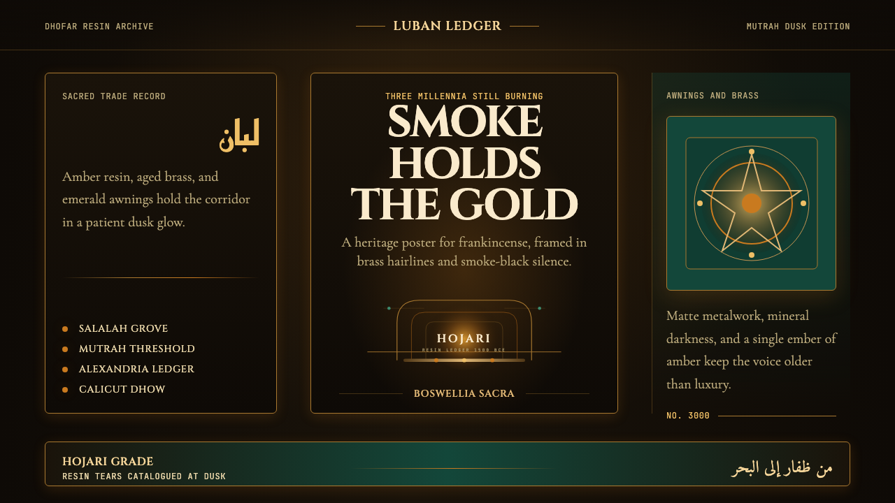 Omani Frankincense Souq AmberAncient trade still glows. Amber smoke, brass frames, and emerald dusk carry…
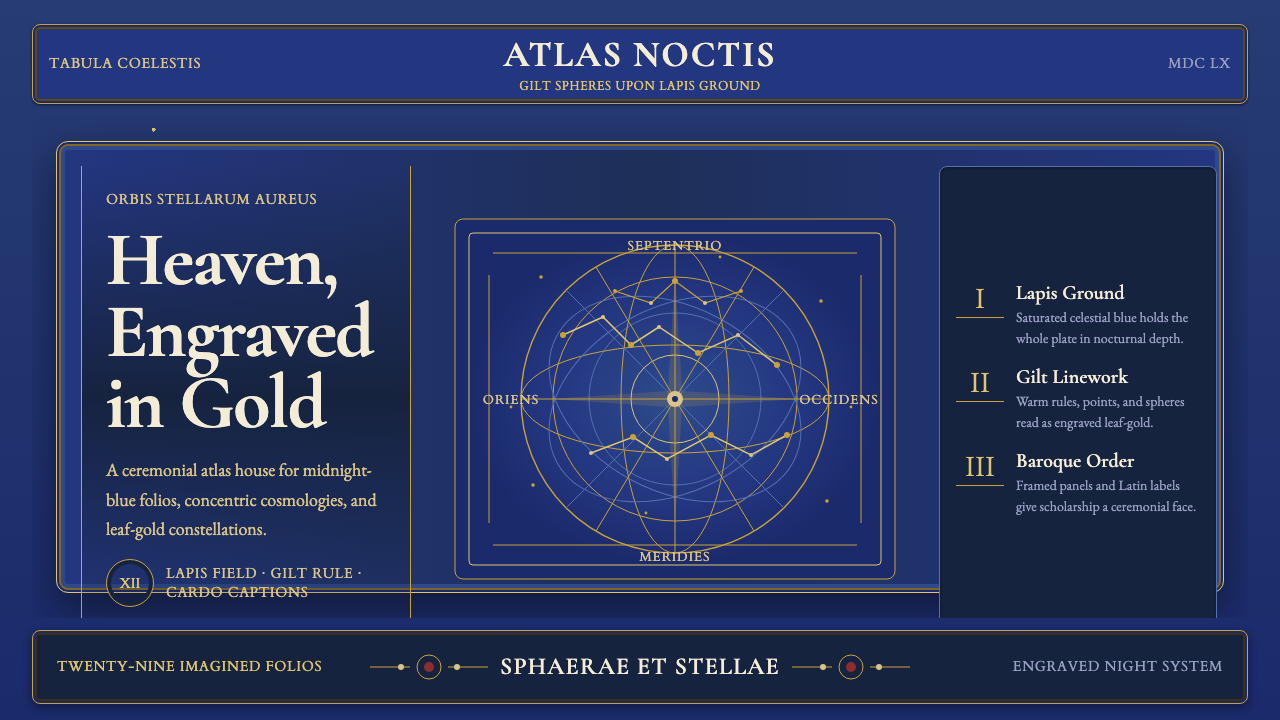 Cellarius Celestial AtlasCelestial luxury on lapis. Gilt serif type, star fields, and concentric chart…
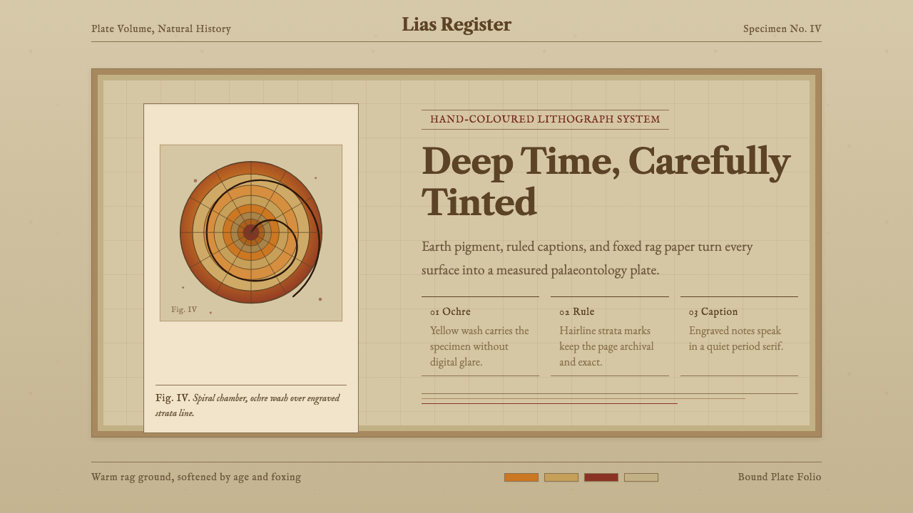 Ammonite Fossil PlateDeep time feels hand-tinted. Ochre spiral, foxed paper, and engraved captions…
 Armenian ErkatʿagirDevotional lapis reigns. Gold rules and angular serif glyphs frame a sacred g…
 Beetle Specimen CabinetGreen burns in darkness. Emerald elytra grids glow under brass keylines and b…