What is Omani Frankincense Souq Amber?
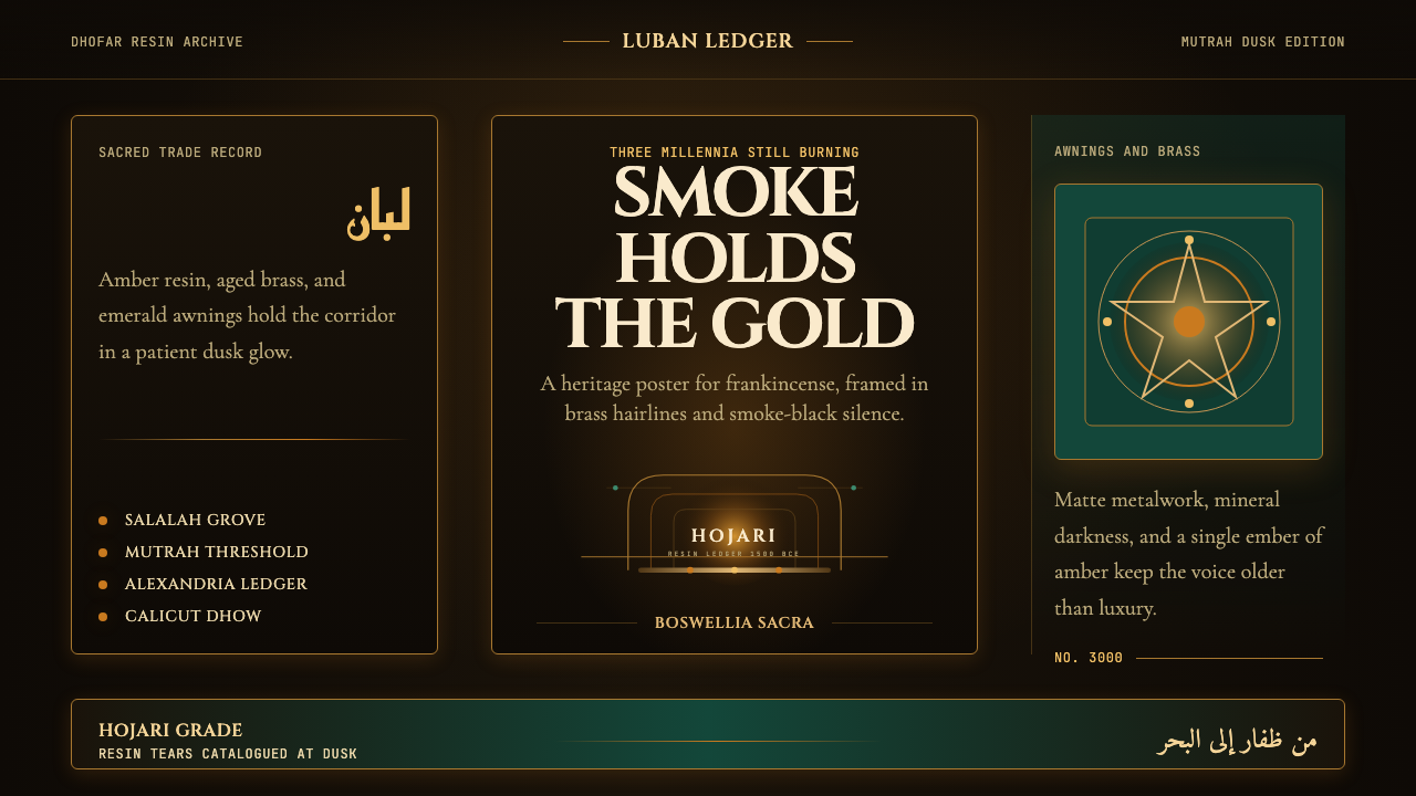
Three thousand years of trade condensed into amber glow, brass smoke, and the ritual darkness of the Mutrah Souq at dusk.
Omani Frankincense Souq Amber in brief
Omani Frankincense Souq Amber is a design aesthetic rooted in the sensory world of Oman's ancient incense trade — specifically the atmosphere of the Mutrah Souq in Muscat as evening descends, when brass mabkhara burners cast pools of warm amber light against darkened corridor walls, emerald awnings frame arched doorways, and the air carries the resinous weight of Boswellia sacra. The style channels this specific moment: the contrast of warmth against deep shadow, the patina of aged metal, the organic richness of resin and smoke.
The palette is built from mineral and organic sources rather than synthetic brightness. Warm amber and resin tones take the place of conventional highlight colors; aged brass stands in for neutral mid-tones; a deep, dusky emerald — the color of the souq's canvas awnings — punctuates the composition. The dominant field is charcoal darkness, not black-screen severity, but the layered shadow of a covered market interior at the edge of night. This is not minimalism. It is richness under restraint.
Typography in this aesthetic bridges two great lettering traditions: the flowing, calligraphic inheritance of Arabic script and the lapidary authority of Roman inscriptions — the two writing systems that, together, defined the ancient incense trade routes linking Dhofar to Alexandria and Calicut. The result is a visual language that feels simultaneously ancient and composed, carrying the weight of long-distance commerce and deep ritual.
Where does Omani Frankincense Souq Amber come from?
The Boswellia sacra tree, which grows almost exclusively in the Dhofar Governorate of southern Oman and across the border into Yemen, has been harvested for frankincense resin since at least 1500 BCE. Ancient Egyptians burned it in temple rituals; the Babylonians, Assyrians, and Persians traded it as currency; Roman emperors demanded it by the shipload for state funerals and religious ceremonies. Pliny the Elder, writing in the first century CE, complained that frankincense had made the people of southern Arabia the wealthiest on earth. The resin tears — hardened drops that form when the bark is scored — were individually weighed, graded, and bartered across networks that stretched from sub-Saharan Africa to the courts of Han Dynasty China.
The physical infrastructure of this trade gave the Omani aesthetic its architectural vocabulary. The covered souq — a long, arched corridor market — emerged as the definitive commercial form across the Arabian Peninsula and the wider Islamic world: a space designed to provide shade from extreme heat while concentrating buyers and sellers in close proximity. The Mutrah Souq in Muscat, whose present form dates to the sixteenth century under the Al Bu Said dynasty, is among the oldest continuously operating markets in the Arab world. Its low arched ceilings, worn stone floors, and recessed vendor stalls create the characteristic interplay of deep shadow punctuated by concentrated light — the aesthetic source material for this design language.
The Frankincense Trail — the overland and maritime network connecting Dhofar's harvesting regions to Mediterranean and Asian markets — was inscribed as a UNESCO World Heritage Site in 2000, recognizing four sites in the Dhofar region: the ancient city of Sumhuram (Khor Rori), the ruined port of Al-Baleed, the harvesting area of Wadi Dawkah, and the caravan oasis of Shisr (possibly the legendary lost city of Ubar, rediscovered by explorer Wendell Phillips in the 1950s and archaeologist Juris Zarins in the early 1990s using satellite imagery). UNESCO recognition formalized what the design world was already intuiting: that this landscape and its material culture constitute a coherent visual heritage.
The modern revival of Omani heritage identity was in large part the project of Sultan Qaboos bin Said, who came to power in 1970 and over fifty years transformed Oman from a largely closed, medieval-organized state into a modern nation-state that nonetheless curated its material and cultural heritage with unusual care. Qaboos commissioned restorations of historic forts, promoted traditional crafts including silversmithing, khanjar production, and weaving, and embedded frankincense culture at the center of Omani national identity — the Omani rial banknotes, official architecture, and national ceremonies all feature incense imagery. This institutionalization of heritage gave the souq aesthetic its contemporary legitimacy, moving it from local vernacular to global design reference point.
What defines the Omani Frankincense Souq Amber look?
Color
The palette is built on deep darkness as the dominant field — not pure black but the layered, absorptive shadow of a covered market interior, carrying undertones of smoke and aged stone. Against this field, three accent registers emerge: warm amber-resin tones that glow like lit brass, a deep souq emerald that reads as both organic and precious, and the muted gold of aged metal surfaces. The overall effect is mineral richness: every color appears to have been stained or oxidized by time rather than applied fresh. Brightness is rare and concentrated, functioning like candlelight in a dim corridor rather than ambient illumination.
Light and Shadow
The defining visual tension in this aesthetic is the relationship between deep shadow and concentrated warm light. Rather than filling compositions with even illumination, the style pools light — creating zones of visibility surrounded by darkness, echoing the way brass mabkhara burners illuminate only their immediate surroundings in the depth of a souq corridor. Shadows are not flat silhouettes but layered, atmospheric zones that carry texture and depth. The interplay of organic warmth and enveloping darkness gives the aesthetic its ritual character: light becomes an event rather than a background condition.
Texture and Surface
Where many dark design aesthetics flatten their surfaces to achieve a screen-native precision, this style insists on surface memory — the visible history of materials that have been used and aged. Brass that shows patina rather than polish; stone that carries the wear of centuries of foot traffic; fabric that has been warmed and stained by incense smoke. In visual execution, this translates to treatments that suggest grain, oxidation, and layering rather than smooth gradients or crisp fills. The surface quality is organic and time-worn, not pristine or mechanical.
Typography
The typographic identity draws from two traditions that crossed at the ancient incense trade routes: Arabic calligraphic forms and Roman lapidary inscriptions. Display type favors letterforms with a calligraphic quality — strokes that vary in width, forms that evoke the pen or chisel rather than the digital vector. Body text is set with careful rhythm, leaning toward classical proportions rather than contemporary condensed efficiency. The overall typographic register is that of a carved inscription or illuminated manuscript: deliberate, weighty, and without haste.
Composition and Space
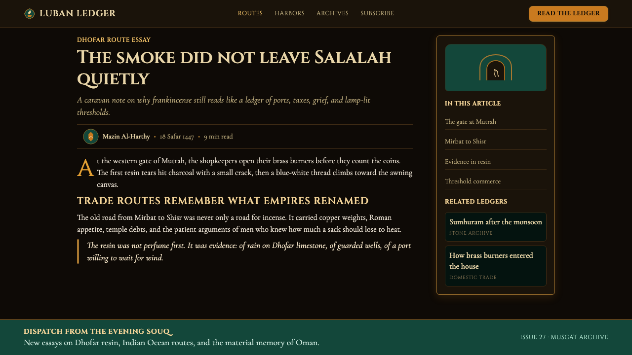
Compositions in this aesthetic favor the vertical and the arched — echoing the architecture of souq doorways, minarets, and the horseshoe arches common to traditional Omani and wider Islamic built environments. Framing is central to the visual logic: elements are presented within frames, thresholds, or arched containers rather than floating freely in open space. Negative space is not empty but atmospheric — the darkness between elements carries weight and presence, functioning as the shadow-filled corridor frames the lit stall at its end.
Ornament and Pattern
Unlike purely reductive design aesthetics, this style accommodates ornament — but ornament of a specific cultural register. Geometric interlocking patterns derived from Islamic architectural tilework, arabesques that echo the carved wooden mashrabiya screens of traditional Omani homes, and the dense repeat patterns of woven textiles all provide a vocabulary for surface enrichment. This ornament is never casual or eclectic: it is used sparingly, in specific locations — borders, dividers, background registers — and always references the formal vocabulary of the source tradition.
Pacing and Restraint
Perhaps the most distinctive quality of this style is its pacing. A frankincense ritual is not fast: the charcoal must be lit, the resin placed, the smoke allowed to rise before the ceremony begins. This deliberate, unhurried progression translates into compositional restraint — generous spacing between elements, significant use of dark empty ground, and a resistance to visual crowding. Negative space is not emptiness but intention. Every element that appears has been chosen; the space between them is itself part of the composition.
Who shaped Omani Frankincense Souq Amber?
The Roman author and natural philosopher documented the frankincense trade in extraordinary detail in his Naturalis Historia (completed circa 77 CE), including the harvesting methods, the grading system for different resin qualities, the overland routes from Dhofar to Mediterranean ports, and the staggering volume of resin consumed annually by Rome alone. His writings constitute the most complete surviving ancient description of the trade that defined Oman's wealth and cultural identity for over a millennium, and his accounts of the Boswellia sacra trees and their aromatic tears remain vivid enough to serve as visual source material.
Sultan Qaboos, who ruled Oman from 1970 until his death in 2020, was the architect of modern Oman's material and cultural identity. His fifty-year reign oversaw the construction of heritage institutions — museums, restored forts, traditional craft programs — that formalized the visual and sensory culture of incense, silversmithing, and souq life as distinctly Omani. His sustained investment in the Mutrah Souq's preservation and his promotion of frankincense as a national symbol gave the aesthetic its contemporary context as something consciously curated rather than accidentally surviving.
The American explorer and archaeologist Wendell Phillips led expeditions to southern Arabia in the late 1940s and 1950s, conducting some of the first systematic archaeological investigations of the ancient frankincense city of Sumhuram (near present-day Salalah) and the wider Dhofar region. His work brought international scholarly attention to the physical remains of the incense trade and helped establish the visual record of ancient Dhofari architecture — the mud-brick warehouses, walled harbors, and ceremonial buildings — that now informs the historical dimension of this aesthetic.
The American archaeologist Juris Zarins led the team that in 1992 identified the ruins at Shisr, in the Empty Quarter of southern Oman, as the probable site of the legendary city of Ubar — a major node in the ancient frankincense trade whose collapse into a sinkhole may have inspired the cautionary legend of a city destroyed by divine judgment. Zarins used early satellite imagery to locate the site, bringing global media attention to the archaeology of the Dhofar frankincense region and contributing to the documentation that supported the eventual UNESCO listing.
The 2000 UNESCO World Heritage inscription of the Land of Frankincense — covering the four sites of Wadi Dawkah, Shisr, Al-Baleed, and Khor Rori — was an institutional event that legitimized the Dhofari frankincense aesthetic as globally recognized visual heritage. UNESCO recognition transformed the material culture of incense harvesting, caravan trading, and port commerce from regional vernacular into a curated world heritage category, encouraging architects, designers, and cultural institutions to engage with its visual vocabulary as a primary design reference rather than a merely local tradition.
How do you use Omani Frankincense Souq Amber today?
Omani Frankincense Souq Amber is among the most atmospherically specific design aesthetics available — powerful where its emotional register is appropriate, and unmistakably wrong where it is not. The style speaks of antiquity, ritual, material richness, and slow commerce; it works best for products and communications that want to evoke depth, heritage, and sensory experience. Luxury goods, cultural institutions, fragrance and wellness brands, heritage hospitality, and high-end artisan marketplaces are natural homes for this aesthetic. Contemporary tech products and fast-moving consumer categories will find it a difficult fit.
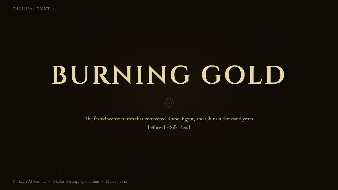
For presentation slides, the aesthetic excels in contexts requiring gravitas and distinction. A cover slide benefits from the strong field-and-light composition: a near-dark background with a single concentrated amber or emerald accent element, and the brand name or title set in a typographic treatment with calligraphic weight. Content slides should resist the temptation to brighten the palette — the dark background is the system, and disrupting it for legibility defeats the aesthetic. Achieve readability through generous type sizing and careful contrast between warm highlight tones and the charcoal ground, with the emerald accent reserved for section markers or key data points. Data visualizations work best as warm-toned forms on the dark ground — charts that glow rather than charts that sit on white.
For web interfaces, this aesthetic is most effective in immersive, destination-style experiences: boutique hotel or resort websites, cultural institution galleries, luxury product detail pages, fragrance brand storefronts, and curated marketplace landing pages. The style translates naturally into dark-mode web design, since darkness is native to it. Navigation and structural elements should be typographic and architectural in character — heavy logotypes, spaced letterforms for section labels, thin ruled lines for division. Interactive elements should use the amber or brass tone for hover and active states, with the emerald reserved for a single accent function such as the primary call to action.
For editorial and marketing work, the style supports long-form narrative and feature photography contexts. An editorial layout in this aesthetic uses a dark-ground, wide-margin format with text set in warm mid-tones rather than pure white — the goal is legibility without visual harshness. Feature images work best when they carry natural amber and shadow qualities: architectural photography, close-up material photography of resin or brass or woven fabric, and night-market photography are strong sources. Marketing campaigns can use the style for hero moments — a full-screen dark composition with a single glowing product — while reverting to lighter treatments for conversion-focused lower-funnel pages.
A common mistake when applying this aesthetic is importing its color palette into a standard light-background layout and expecting the result to carry the same atmosphere. Amber on white reads as orange; the souq emerald on white reads as a generic deep green. The magic of the palette is entirely dependent on the darkness it is set against. A second frequent error is treating all three accent colors — amber, brass, and emerald — as equally active simultaneously, which produces visual noise rather than the focused warmth of the source material. The amber glow should dominate; the brass should function as a tonal variation of the amber register; the emerald should appear as a single, precious accent. Restraint with the emerald is what keeps the composition from becoming a generic jewel-tone combination.
Omani Frankincense Souq Amber — FAQ
Is this aesthetic genuinely rooted in Omani visual culture, or is it a romanticized outsider view?
The aesthetic has a genuine material basis in the actual visual environment of the Mutrah Souq and the Dhofar frankincense landscape — the amber light from brass burners, the emerald awnings, the arched corridor spaces, and the dark stone interiors are all documentable features of real places. The frankincense trade is among the best-documented ancient economies, with archaeological, textual, and numismatic evidence spanning three thousand years. Where the aesthetic becomes interpretive is in its translation to screen environments — foregrounding certain visual qualities over others is a design decision. Using this aesthetic with care means acknowledging its source culture explicitly, referencing its formal heritage accurately, and avoiding the reduction of a complex material culture to a set of decorative motifs.
How does this aesthetic differ from other dark-palette Middle Eastern or Islamic design styles?
The distinctions lie in specificity of source and emotional register. Many dark-palette design styles drawing on Middle Eastern visual culture emphasize geometric pattern complexity, architectural monumentality, or the bright jewel-tone palette of Persian tilework — lapis, turquoise, saffron on cream. The Omani Frankincense Souq Amber aesthetic is defined instead by the specific sensory quality of the incense market — warmth, organic texture, smoke, the memory of resin — which translates into a much warmer and more atmospheric color range, with pattern playing a supporting rather than starring role. It is quieter and more interior than monumental Islamic architectural aesthetics, and more organic and ancient-feeling than contemporary Gulf modernism.
Can this aesthetic work for digital products beyond landing pages — for example, dashboards or web applications?
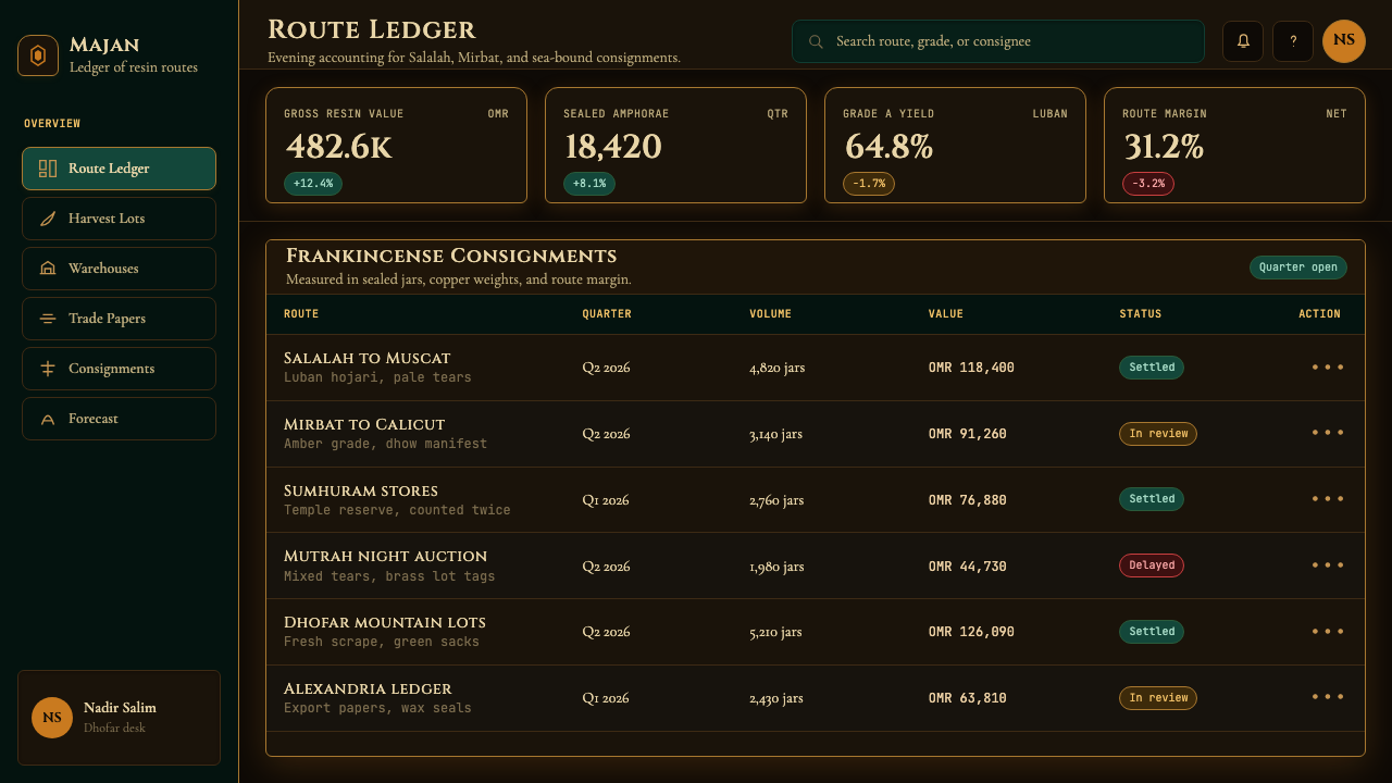
It can, but it requires translation rather than direct application. The challenge with applying this aesthetic to functional UI — dashboards, data tools, multi-step forms — is that its defining qualities are atmospheric rather than structural. A dashboard needs rapid visual scanning, clear state feedback, and unambiguous interaction affordances. Applying the full souq amber palette to dense functional UI risks making critical states — error, warning, success — hard to distinguish from decorative states, and the dark atmospheric ground can reduce legibility under ambient light conditions. The more productive approach is to use the aesthetic as a theming layer: dark ground, amber and emerald accents for interactive states, brass mid-tone for structural elements, while keeping the underlying information architecture clean and conventional.
What kinds of photography pair best with this aesthetic?
Photography that carries natural warmth, depth, and material richness reads best within this aesthetic. Night market photography and available-light interior shots with warm artificial lighting sources — lanterns, candles, brass fixtures — integrate naturally into the palette without requiring heavy color treatment. Close-up material photography of resin, aged metal, woven textile, carved stone, or fired ceramic also works exceptionally well, since these subjects already carry the organic texture that the aesthetic assumes. Contemporary architectural photography of Islamic or Omani buildings, particularly interiors, is a strong source. What works poorly: clean studio product photography on white backgrounds, bright outdoor daylight photography, and high-saturation contemporary lifestyle imagery that belongs to an entirely different aesthetic world.
Is it possible to adapt this style for a light-mode interface?
A light inversion is possible but fundamentally changes the nature of the aesthetic. In light mode, the amber becomes a warm golden-cream ground rather than a concentrated glow, and the emerald reads as a surface color rather than a depth indicator. The result is pleasant and warm but loses the quality of luminosity-against-darkness that is the style's core expressive property — the sense of something emerging from shadow. A light application is closer to a general warm Middle Eastern palette than to the souq-at-dusk specificity this system achieves in its canonical dark form. If light mode is required for accessibility reasons, treat the light version as a daytime variant: the market in afternoon light rather than at dusk — warm and spacious rather than dramatic and enclosed.
Related design styles
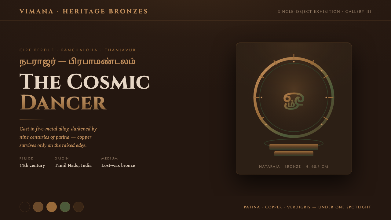 Chola Bronze NatarajaA patinated bronze under museum spotlight. Near-black field, verdigris recess…
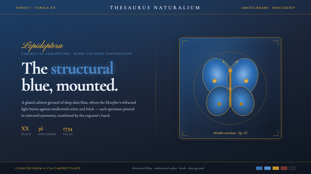 Seba Butterfly CabinetStructural blue, mounted. Iridescent Morpho glows on a slate cabinet ground,…
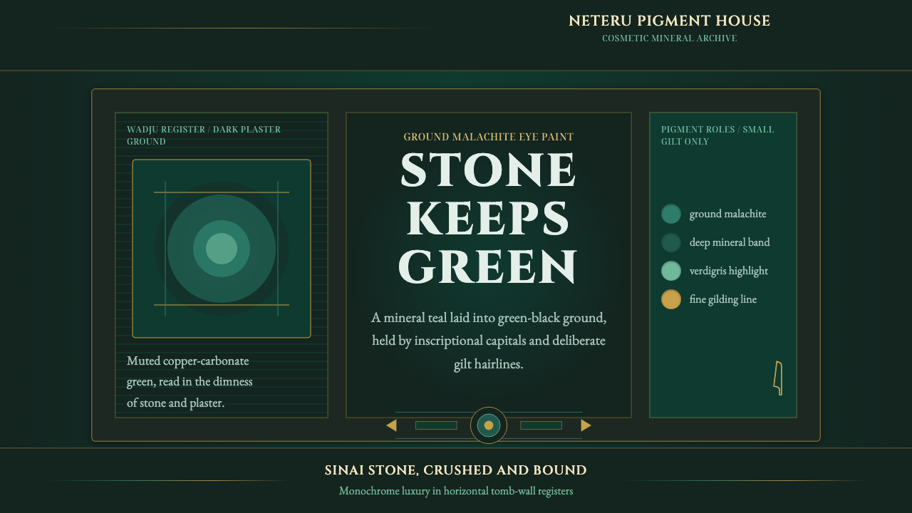 Egyptian Malachite PigmentGrave mineral green. Muted malachite bands on green-black stone, cut by fine…
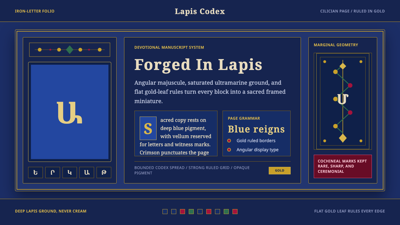 Armenian ErkatʿagirDevotional lapis reigns. Gold rules and angular serif glyphs frame a sacred g…
 Armenian Illuminated ManuscriptGilded maximalism. Burnished gold, lapis frames, and vermilion initials build…
 Beetle Specimen CabinetGreen burns in darkness. Emerald elytra grids glow under brass keylines and b…