What is Brass Orrery?
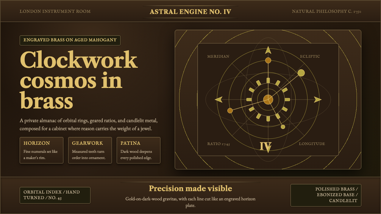
Brass Orrery brings the clockwork cosmos of the 1750 Enlightenment to the screen — polished brass mechanism glowing against near-black mahogany, planetary rings orbiting in meticulous engraved arcs, reason made radiant and gold.
Brass Orrery in brief
Brass Orrery is a design style rooted in the scientific instruments of the European Enlightenment — specifically the mechanical orreries built by London craftsmen such as John Rowley, Thomas Wright, and George Graham around 1750. An orrery is a clockwork model of the solar system: brass gears, engraved horizon rings, and polished armatures arranged above a stained mahogany base. The visual identity of this tradition is the dramatic contrast of warm, bright metal against dark, almost black wood — gold-on-ebony, never cream-on-white.
The aesthetic is one of scientific gravitas fused with decorative precision. Every element earns its presence through function: a gear exists to transfer motion, a graduated ring exists to measure celestial angles, an engraved label exists to identify a celestial body. Nothing is merely ornamental, yet every functional element is rendered with the care of a luxury object — burnished edges, crisp letterforms in an old-style roman face, knurled knobs and gilded sphere-tops that reward close inspection.
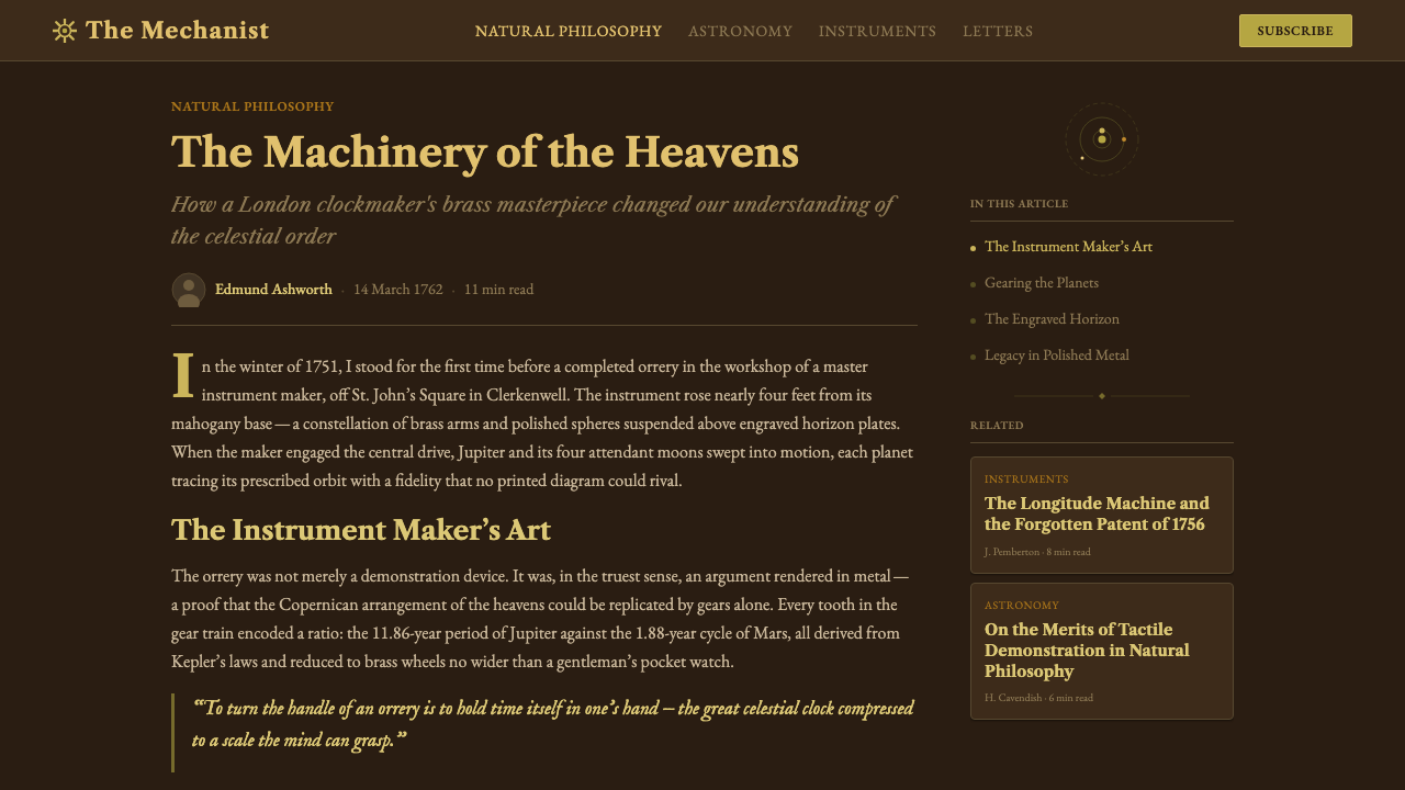
Visually, Brass Orrery occupies a narrow, distinctive palette: the warm amber-gold of polished brass, the deep near-black of aged mahogany, the lighter honey-brown of brass that has taken on some patina, and occasionally the pale ivory of engraved paper dials or vellum labels. Typography in this tradition favors classical old-style letterforms with moderate contrast — the kind of type set by London printers working alongside the instrument makers of the same era. The result reads as learned, authoritative, and quietly opulent rather than loud or decorative.
Where does Brass Orrery come from?
The orrery as a named instrument dates to the early eighteenth century, when the instrument maker John Rowley constructed a mechanical solar-system model for Charles Boyle, 4th Earl of Orrery, around 1713. Boyle's title became the instrument's name, and the form spread rapidly among the educated classes of Britain and continental Europe as a demonstration piece that made the Newtonian cosmos legible and tangible. By the mid-eighteenth century, orreries had become both working scientific tools and prestigious display objects: a well-made orrery on a gentleman's library table announced that its owner engaged seriously with natural philosophy.
The craftsmen who built orreries in London's instrument-making quarter — centered on the Strand and Fleet Street — operated at the intersection of precision engineering and applied ornament. Their workshops produced not only scientific instruments but also fine clocks, theodolites, and navigational devices. This dual identity — functional tool and decorative object — shaped everything about the visual character of the instruments. Brass was chosen for its machinability and corrosion resistance, but also for its warm golden color. Mahogany bases were stained dark to provide maximum contrast with the bright metal above. Engraved lettering on the graduated rings used an old-style roman with sharp serifs, the same typeface found in the best London books and maps of the period.
The intellectual climate of the Enlightenment reinforced the aesthetic. Natural philosophy in the 1750s was publicly celebrated rather than restricted to specialists: lectures at coffeehouses drew audiences who expected instruments to be both accurate and beautiful. James Ferguson, the Scottish astronomer who wrote extensively about orreries and constructed many himself, was explicit about the relationship between visual quality and intellectual credibility — a well-made instrument commanded attention and respect that a crude one did not. The Brass Orrery aesthetic thus carries with it a philosophy: precision and beauty are not in tension; they are complementary arguments for the same underlying rationality.
The style's influence extended beyond physical instruments into the broader visual culture of the Enlightenment period: engraved frontispieces in scientific volumes, cartouches on navigational charts, decorative borders on astronomical atlases all drew on the same vocabulary of bright metal, dark ground, classical lettering, and circular or arc-based geometric forms. By the early nineteenth century, mass production had made scientific instruments plainer and cheaper, and the specific aesthetic of the handmade brass orrery began to recede — but it was never forgotten, surviving as a cultural shorthand for the intersection of intellectual seriousness and visual refinement.
What defines the Brass Orrery look?
Color palette
The palette is anchored by two dominant tones: the warm amber-gold of polished brass and the deep near-black of aged mahogany. Between them sits a middle register of honey-toned patinated brass — the color of metal that has been handled and admired rather than freshly minted. Accent tones include the pale ivory of engraved paper or vellum dials, and occasionally a deep verdigris where copper alloys have oxidized. The palette contains no pure whites and no cool grays: every neutral reads warm. Color is used not decoratively but structurally — the contrast between bright metal and dark wood does the work that color blocking does in other systems.
Typography
Lettering in the Brass Orrery tradition is set in classical old-style roman — a typeface with moderate stroke contrast, bracketed serifs, and an axis of stress that tilts slightly from the vertical, as it does in the work of printers like William Caslon, whose types were ubiquitous in London publishing and instrument-labeling of the mid-eighteenth century. The type is engraved rather than printed, which means each character has the crispness of a cut rather than the softness of ink-on-paper. Numerals are old-style, with descenders that align to the curved graduation marks they annotate. Type is used sparingly — labels and measurements, nothing more — and every label earns its presence by identifying something specific.
Geometry and orbital forms
Circles, arcs, and concentric rings are the governing geometric vocabulary — the literal shapes of planetary orbits translated into design elements. Unlike purely abstract geometric styles, the circles here carry cosmological meaning: they refer to celestial mechanics, to the paths that bodies trace through space over time. Supporting geometries include the radial grid of a compass rose, the precisely graduated arc of a sextant, and the rectangular cartouche of an engraved label. Straight lines serve mainly as radial spokes or horizon bars — elements that locate the observer within the system rather than decorate the surface.
Texture and surface treatment
The Brass Orrery aesthetic is inseparable from the quality of its surfaces. Polished brass has a directional grain from the buffing process; turned brass has fine concentric lines from the lathe; knurled brass has a diamond cross-hatch for grip. These are not decorative textures applied from outside — they are the honest marks of fabrication. Mahogany, at this period, was finished with oil and wax rather than lacquer, giving it a low sheen that absorbs rather than reflects light. In digital applications, these textural references must be handled carefully: a simulated grain that is too even or too saturated will tip from authentic into theatrical.
Illumination and contrast
Brass Orrery compositions rely on a specific lighting logic: bright objects emerge from dark backgrounds, as if lit from above by a single warm directed source — the kind of raking light that reveals engraved detail. This is not a flat, evenly-lit aesthetic. Highlights on brass sit at consistent angles, suggesting a real three-dimensional form even when the application is primarily two-dimensional. The contrast ratio between the brightest brass highlight and the darkest mahogany shadow is extreme. This chiaroscuro heritage descends not from painting but from the practical display of instruments under candlelight or early gaslight — conditions under which maximum contrast was necessary for legibility.
Ornament as information
The Brass Orrery tradition does not reject ornament — it demands that ornament justify itself informationally. The cartouche around a label is not a decoration; it is a visual boundary that groups related text and separates it from measurement graduations. The foliate scrollwork occasionally found at the base of instrument stands is minimal and restrained, derived from classical architectural vocabulary, and always subordinate to the mechanical forms above it. Decorative flourishes exist at the margins; the functional core is kept ruthlessly clear. This is different from both Bauhaus (which eliminates ornament entirely) and Rococo (where ornament is the point): Brass Orrery allows ornament that does informational work and refuses ornament that does not.
Scale and calibration
Orreries are instruments of measurement, and their aesthetic carries a deep sense of calibration: everything is sized in relation to something else, nothing is arbitrary. Graduated rings are divided into equal segments; sphere sizes represent relative planetary magnitudes; armature lengths encode orbital radii. In design terms, this translates to a system of proportional relationships rather than absolute sizes — a rigorous underlying scale that makes the whole feel inevitable rather than decorative. When the Brass Orrery aesthetic is applied to interfaces, the strongest executions maintain this sense of calibration: type sizes, spacing rhythms, and component weights all feel derived from a single underlying measure rather than chosen independently.
Who shaped Brass Orrery?
Rowley was one of the foremost instrument makers in early eighteenth-century London, active from the 1690s until his death around 1728. He constructed the orrery commissioned for Charles Boyle that gave the instrument type its name — a device of exceptional mechanical refinement for its period. Rowley's instruments combined the highest standards of precision engineering with the visual ambitions of luxury decorative objects: his brass and mahogany compositions established the visual template that subsequent makers would follow for generations. He worked under royal patronage and his instruments entered the collections of leading natural philosophers and aristocratic collectors across Europe.
Graham was the most technically accomplished English clockmaker of the first half of the eighteenth century, and his contributions to the Brass Orrery tradition were as much mechanical as visual. His invention of the dead-beat escapement and the mercury-compensated pendulum solved longstanding problems of precision timekeeping, and these solutions shaped the internal architecture of orrery mechanisms. Graham's workshop on Fleet Street was the leading precision instrument establishment in London; his apprentices included John Harrison, who would go on to solve the longitude problem. The aesthetic discipline of Graham's work — clarity of mechanism, precision of scale, nothing concealed or ornamented away from its function — translated directly into the visual character of the instruments his collaborators produced.
Ferguson was a Scottish astronomer and instrument maker who did more than almost any other figure to popularize the orrery and articulate its visual and educational philosophy. Born in humble circumstances in Banffshire in 1710, he was largely self-taught and became known for his public astronomical lectures, illustrated with instruments he designed and built himself. His 1756 book Astronomy Explained upon Sir Isaac Newton's Principles, which became one of the most widely read popular science texts of the eighteenth century, contained elaborate engravings of orreries and celestial instruments that fixed their visual character in the popular imagination. Ferguson's emphasis on clarity, legibility, and the capacity of a well-made instrument to make abstract ideas tangible remains one of the defining statements of the Brass Orrery aesthetic.
Wright of Durham — not to be confused with the philosopher Thomas Wright — was an instrument maker who worked in the London trade from around 1718 and produced orreries of exceptional quality. His surviving instruments show a particular care for the visual integration of mechanical and decorative elements: the turned columns of his instrument stands, the engraved cartouches on his horizon plates, and the proportional logic of his armatures represent the mature form of the Brass Orrery aesthetic. Wright also supplied instruments to continental European patrons, helping to spread the specific London visual character of the orrery tradition beyond Britain. His workshop training methods contributed to the continuity of the craft through apprentice transmission.
Caslon was the preeminent typeface designer of mid-eighteenth century England, whose type foundry on Chiswell Street supplied the typefaces used in the most important English books, newspapers, and printed instruments of the period. The typeface that bears his name — with its moderate stroke contrast, generously proportioned lowercase letters, and sturdy bracketed serifs — became so ubiquitous in London printing that it is essentially inseparable from the graphic character of Brass Orrery-era documents. When instrument makers chose engraved letterforms for the labels and graduation marks on their orreries, they were working within a typographic environment entirely shaped by Caslon's output. His typeface was later revived by the Arts and Crafts movement, by book designers of the early twentieth century, and remains in use today — a thread of visual continuity from the Enlightenment instrument bench to contemporary type libraries.
How do you use Brass Orrery today?
Brass Orrery is most at home in contexts that call for intellectual authority combined with visual warmth — a combination that is rarer in contemporary design than either quality alone. It works well for premium data products, documentary-style editorial design, scientific publishing, luxury educational materials, and brand identities in domains such as astronomy, watchmaking, rare books, and archival research. The style signals seriousness without coldness: the warmth of the brass and wood palette prevents the chiaroscuro contrast from reading as severe.
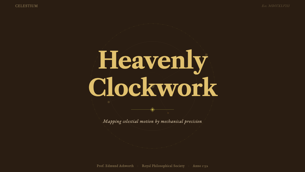
For presentation decks, Brass Orrery suits the cover page best when it can commit fully to the dark ground with bright brass-toned highlights — a half-hearted warm palette against a medium gray reads neither as Brass Orrery nor as anything else. Content slides should be treated conservatively: dark backgrounds with warm-toned text on the primary level, lighter-toned text for secondary information, and circular or arc-based diagrams rather than rectilinear charts where content permits. Data visualizations work well when they adopt the orbital logic — pie charts and donut charts reference the form language directly; bar charts and line graphs should have their gridlines in a warm mid-tone rather than a cool gray.
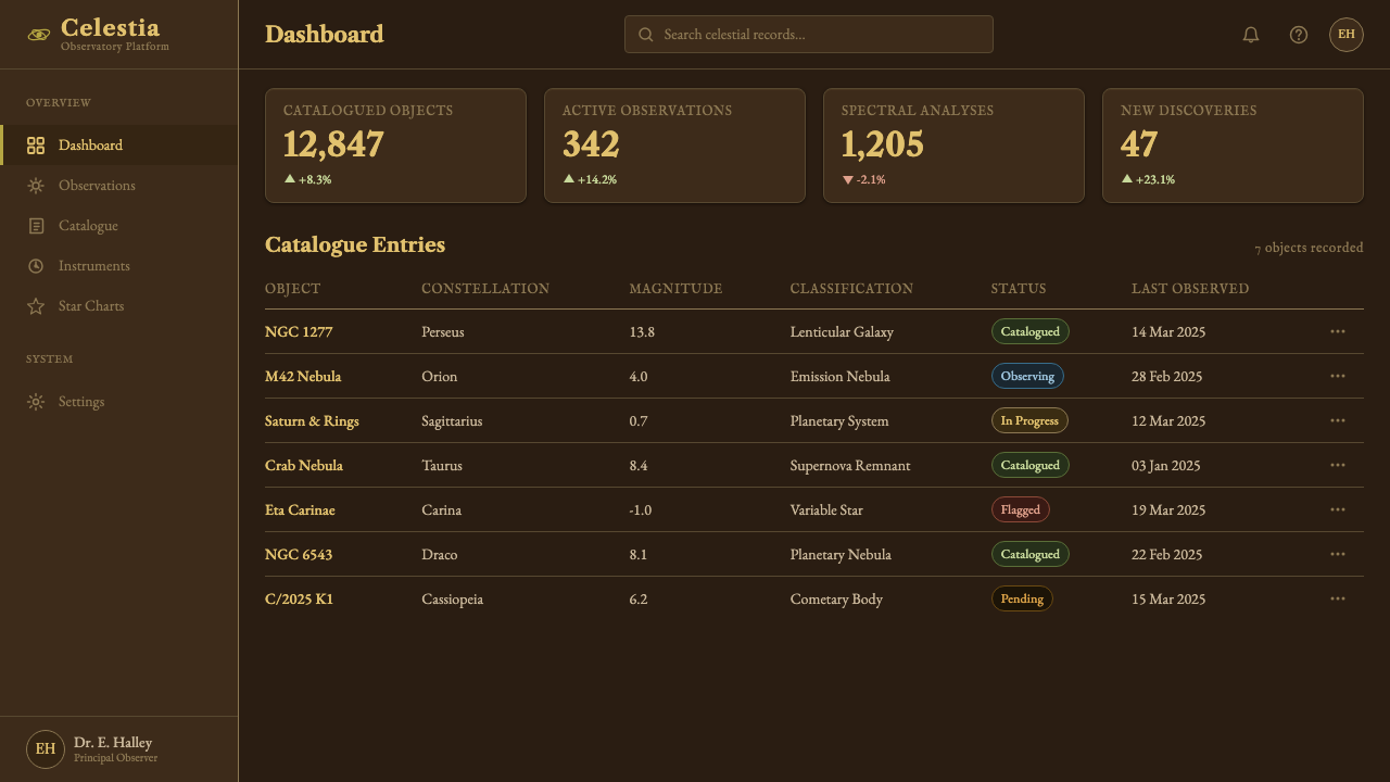
For web interfaces, the style suits applications where the user expects depth and expertise: reference tools, archival search interfaces, astronomical or scientific databases, and premium subscription products in knowledge-intensive fields. The approach requires genuine commitment to the dark background: buttons should use the warm brass-toned gold as a highlight state, interactive elements should have a quality of revealed detail on hover — as if the user is bringing a raking light source closer — and the typography should favor a classical serif in reading contexts rather than a contemporary sans-serif. A navigation bar in this style is wide and generous with whitespace, its labels set in a slightly expanded old-style roman.
For editorial and marketing work, the most successful applications establish a direct visual connection to the historical tradition rather than a general warm-dark palette. A feature article on scientific instruments, a campaign for a watchmaking brand, or a book cover for a history of astronomy can all absorb Brass Orrery conventions fully. The critical decisions are which surface quality to reference — freshly polished brass is a different statement from aged, slightly verdigris-tinted brass — and how much of the cartouche-and-border vocabulary to include before the design tips from referential into pastiche.
The most common mistake when applying Brass Orrery is using a warm-dark palette without committing to the precision that justifies it. The style is not generically warm-and-dark — it is specifically precision-on-darkness: graduated, calibrated, every element sized in relation to a consistent underlying measure. Substituting a generic moody dark brown and gold combination without the engraved-detail logic produces something closer to a steakhouse menu than an Enlightenment instrument. The second common mistake is over-texturing: real brass and mahogany are not heavily grained — they are smooth surfaces with directional marks from specific fabrication processes. A simulated wood grain at high contrast or an aggressive brushed-metal texture will overwhelm the palette's innate restraint.
Brass Orrery — FAQ
How is Brass Orrery different from general steampunk or Victorian design?
Steampunk and Victorian design borrow the brass-and-dark-wood palette but layer it with industrial excess — exposed rivets, pipes, gears as decoration, ornamental complexity as spectacle. Brass Orrery is specifically pre-Victorian (centered on 1750, a century before Victoria's reign began) and belongs to the Enlightenment tradition of reason and measurement rather than the Victorian celebration of industrial power. The difference shows in the ornament: a steampunk composition adds mechanical elements as decoration; a Brass Orrery composition allows only those mechanical elements that serve a demonstrable function. The style is also quieter in contrast — steampunk tends toward high visual noise, while Brass Orrery depends on generous dark ground and the restraint of selective precision.
Can Brass Orrery work in a light-background version?
It can, but requires significant adjustment. The historical instruments were displayed against dark surfaces because that contrast made the engraved details legible and made the brass glow. Inverting to a light background removes the chiaroscuro that is central to the aesthetic's identity — the result will read more like aged parchment and ink than like a brass instrument. A light-ground variant works best when it references the ivory-and-brown of engraved paper diagrams rather than trying to replicate the metal-on-wood effect: warm off-white or aged paper tones as background, dark warm-brown for structural lines and type, with brass-toned gold used sparingly as an accent rather than as a dominant tone. This is a genuine variant with its own coherence, not a degraded version of the dark-ground original.
How should engraved detail be simulated in digital interfaces?
The key is to reference the quality of engraving without simulating the physical process directly. Engraved text and lines have very specific qualities: sharp edges, consistent line weight within a stroke, a slight warmth from the exposed brass or copper alloy beneath the surface oxidation. In digital applications, this translates to type and line work with high edge sharpness (no anti-aliasing softness at small scales), a warm rather than cool color for structural lines, and a fine stroke weight for informational lines rather than the heavy borders of more graphic styles. Avoid drop shadows on engraved-referencing elements — engraving is cut into a surface and has no shadow. A subtle inner glow or bevel, used with extreme restraint, can suggest the quality of cut metal without tipping into skeuomorphism.
Is Brass Orrery appropriate for mobile interfaces?
The style presents real challenges at mobile scale. Its sophistication depends on fine detail — engraved-weight lines, graduated scales, restrained letterforms with subtle stroke contrast — and these qualities either disappear or become muddy at small display sizes. The deep dark backgrounds also tend to create legibility problems when ambient light is high, a common condition for mobile use. The style works better as a considered accent in mobile contexts than as a governing visual language: a rich dark splash screen, a detail-oriented loading state, or an expanded view where the user has committed attention. Attempting to carry the full Brass Orrery vocabulary through a standard mobile list view or navigation pattern will typically produce something that reads as merely dark and warm rather than as precisely and authentically calibrated.
What makes Brass Orrery feel authentic rather than like a costume?
Authenticity in this style comes from understanding the functional logic that produced the aesthetic, not from copying its surface features. The Brass Orrery looks the way it looks because every decision was constrained by purpose: the dark ground maximizes contrast for legibility; the brass tone is the material's natural color; the arc forms are the shapes of celestial orbits; the classical typography is the best available letterform technology of the period. When these choices are replicated without their functional justification — dark ground chosen for moodiness, gold color chosen for luxury associations, arc forms chosen for nostalgia — the result is decoration wearing the style's clothes. The test is whether each visual decision can be justified by the same logic that justified the original: does this dark ground serve contrast? Does this arc form serve calibration? If the answers are honest, the result will feel authentic.
Related design styles
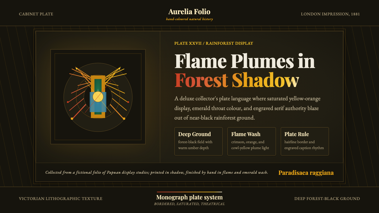 Bird of Paradise MonographTheatrical plate-book darkness. Flame plumes blaze from a bordered forest-bla…
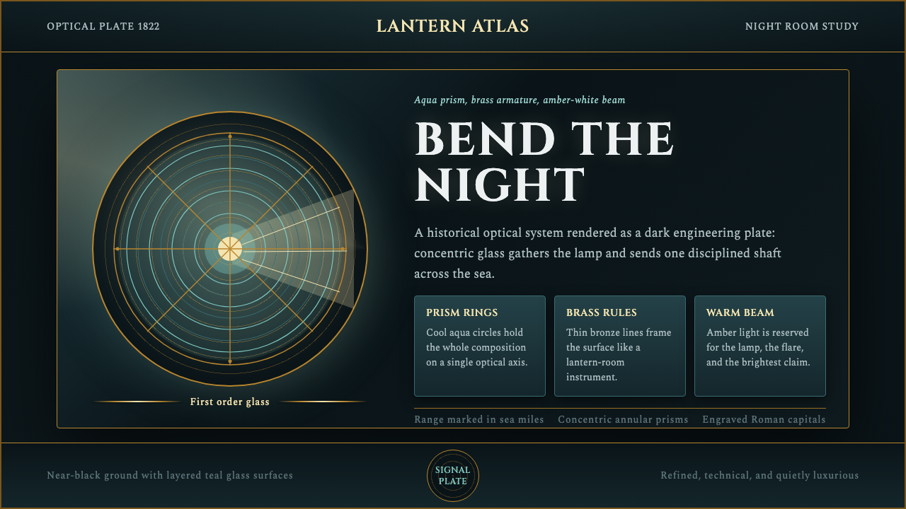 Fresnel Lighthouse LensPrecision cuts the dark. Aqua rings, brass rules, and an amber beam define th…
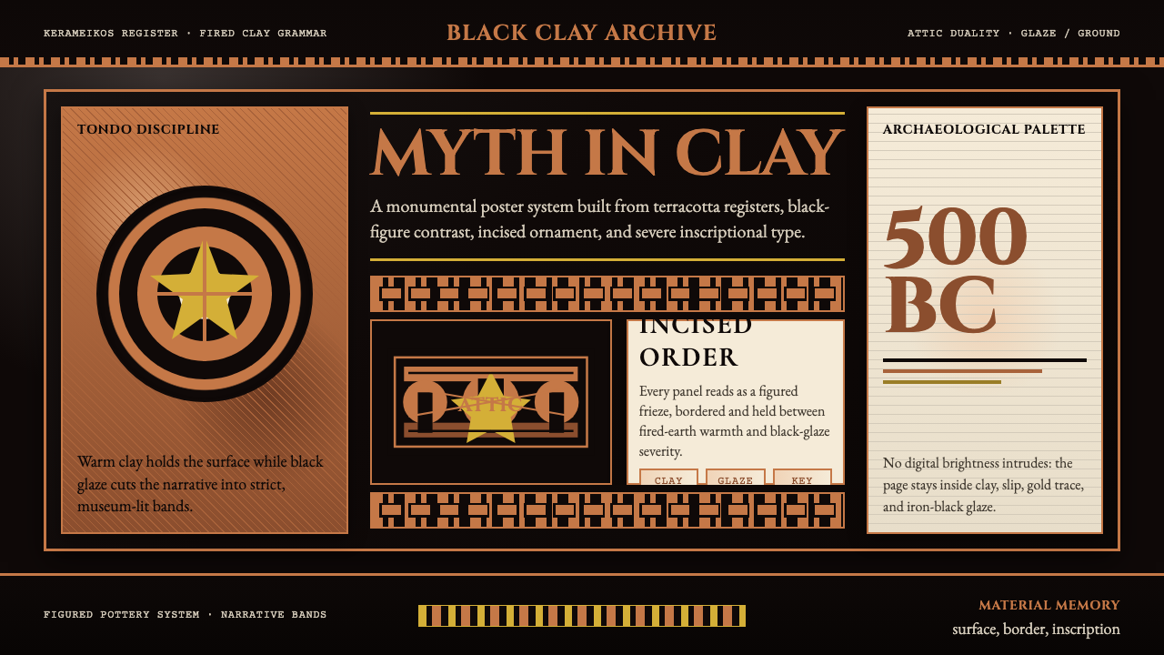 Greek Vase Attic (500 BC)Archaeological severity. Jet-black glaze, terracotta bands, and meander borde…
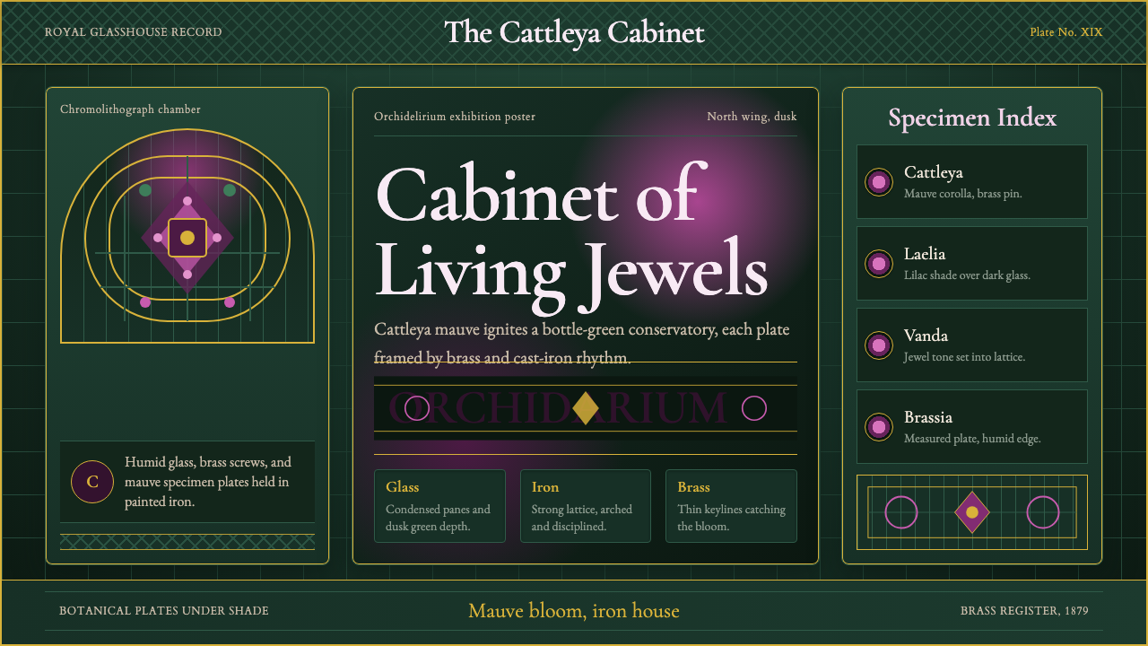 Orchid ConservatoryLush Victorian darkness. Cattleya mauve and brass sit inside bottle-green iro…
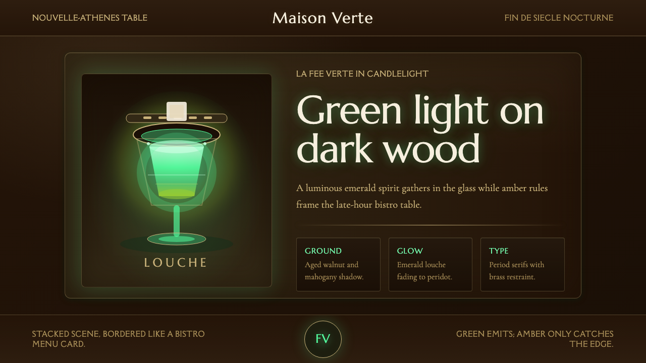 Absinthe Green Fairy GlowDarkness makes the fairy glow. Emerald louche on mahogany, framed by amber se…
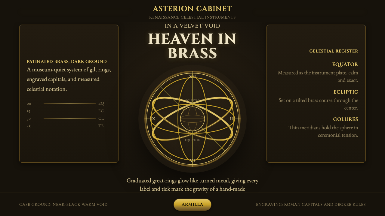 Armillary SphereMuseum darkness makes brass celestial. Cinzel capitals and concentric gold ri…