What is Fresnel Lighthouse Lens?
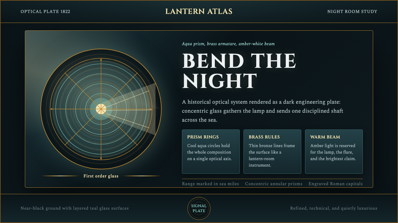
The Fresnel lighthouse lens turned a candle-sized flame into a beam that could be seen from twenty miles at sea — and its concentric rings of cut glass became a design language of precision, optics, and quiet nocturnal drama.
Fresnel Lighthouse Lens in brief
The Fresnel Lighthouse Lens style is drawn from one of the nineteenth century's great feats of applied optics: the lighthouse lens invented by French physicist Augustin-Jean Fresnel in 1822. Rather than grinding a single thick, heavy lens, Fresnel realized that a lens could be sliced into a set of concentric prism rings around a central bullseye, each ring angled to bend stray light back into one disciplined beam. The result looked like a beehive of cut glass held in a brass frame — and it let a modest flame project farther than any lamp before it.
As a visual system, this style is less about the lens as an object and more about the room that housed it. It imagines the lantern room of a lighthouse at night: a near-black environment where almost nothing is lit except the apparatus itself. Within that darkness, the optical glass takes on a faint aqua-green cast (a side effect of the iron content in period glass), the brass and bronze fittings catch warm metallic highlights, and a single amber-white beam cuts a clean path through the gloom.
The overall effect sits between scientific illustration and maritime romance. It borrows the visual authority of a nineteenth-century technical plate — the kind of engraving that would have accompanied a treatise on optics or a naval almanac — while keeping the emotional charge of a beacon standing watch over open water. It is precise rather than decorative, and every element earns its place by reference to how the actual instrument was built and lit.
Where does Fresnel Lighthouse Lens come from?
Before Fresnel, lighthouses relied on reflector systems — parabolic mirrors behind oil lamps — that wasted most of their light to scatter and absorption, or on simple lenses so thick and heavy that they were impractical to manufacture at the sizes a coastal beacon required. Ships were lost every year to coastlines that should have been visible but weren't, and the economic and human cost of poor maritime lighting was a recognized crisis for seafaring nations across the early industrial period.
Augustin-Jean Fresnel, already known for his work establishing the wave theory of light, approached the problem as a physicist rather than a lamp-maker. In 1822, working for the French Commission des Phares (Lighthouse Commission), he proposed replacing a single convex lens with a series of stepped, concentric prism rings — a design that preserved the optical power of a full lens while drastically reducing the glass, weight, and material needed. Each ring was ground and positioned to refract the light from the source into a single parallel or focused beam, depending on the type of light required.
The invention was installed the same year at the Cordouan lighthouse at the mouth of the Gironde estuary, one of the oldest and most prestigious lighthouses in France, and the improvement in visible range was immediate and dramatic. Fresnel lenses were soon standardized into an ordering system — from massive first-order lenses for major coastal landfalls down to smaller sixth-order lenses for harbor lights — and the design spread from France to Britain, the United States, and lighthouse services around the world over the following decades.
The technology remained the standard for lighthouse illumination for more than a century, eventually paired with rotating mechanisms, clockwork drives, and later electric lamps, before being gradually supplanted in the twentieth century by aerobeacons and solid-state optics. Surviving Fresnel lenses are now prized as artifacts of engineering history, preserved in maritime museums and still-operating lighthouses, and the lantern room itself — glass, brass, and beam suspended in darkness — has become a recognizable emblem of precision-built, purpose-driven design.
What defines the Fresnel Lighthouse Lens look?
Ground and Atmosphere
The environment reads as near-black — the interior of an unlit lantern room at night, where the only illumination comes from the apparatus itself. This near-total darkness is not a void; it has depth and faint warmth at its edges, the way a real room retains ambient reflection even when the primary light source is small and concentrated. Everything else in the system is legible only because it interrupts this darkness.
Optical Glass
The lens rings themselves carry a distinctive aqua-green cast, a property drawn directly from the iron content naturally present in nineteenth-century glass. This is not a decorative color choice but a material fact — the same faint green tint visible in old bottle glass or ship portholes — and it is what distinguishes this palette from a generic 'glass and metal' aesthetic. The rings should read as cut and faceted, catching light at their edges rather than glowing uniformly.
Brass and Bronze Metalwork
The armature that holds the glass rings in place is rendered in warm metallic tones — brass catching a bright, almost bronze gleam where it meets the light source, darkening toward umber and shadow in the recesses. This metal is structural, not ornamental: it exists to hold the optics in precise position, and its highlights should look machined and deliberate rather than soft or polished for beauty's own sake.
The Beam
A single warm amber-white shaft of light is the visual and narrative center of the system — the payoff of all that precision engineering. It should appear as a clean, directional cut through the darkness rather than a diffuse glow; its edges are relatively defined, the way a genuinely collimated beam behaves, and its color sits between amber and white rather than veering toward a cold or clinical tone.
Typography as Technical Plate
Lettering draws on the register of a nineteenth-century optical or naval plate: refined Roman capitals for titling, evoking engraved captions on scientific diagrams, paired with a more workmanlike engraver's body type for supporting text. The relationship between the two should feel like a caption beneath an illustration in an old treatise — authoritative, slightly formal, never casual or rounded.
Composition and Symmetry
Because the source object is a radially symmetric optical instrument, compositions built around this style tend toward a strong central axis — a bullseye or focal ring anchoring the frame, with concentric or radiating elements built outward from it. This symmetry is not decorative flourish; it mirrors the actual geometry of a Fresnel lens viewed head-on, and departures from it should be deliberate rather than incidental.
Restraint and Isolation
Because the entire premise depends on darkness making a small number of elements legible, the style resists clutter. Every glowing or metallic element competes for attention against true black, so the palette works best when only two or three focal points are active at once — the lens, the beam, perhaps one supporting metal detail — rather than a busy field of simultaneous highlights.

Who shaped Fresnel Lighthouse Lens?
Fresnel invented the stepped, concentric-ring lens in 1822 while working for the French lighthouse authority, applying his broader physics research on the wave nature of light to a pressing maritime engineering problem. His design multiplied the effective range of a lighthouse beam while sharply cutting the glass and weight required, and the standardized order system that grew out of his work (from large first-order lenses to small harbor-light lenses) was adopted by lighthouse services internationally.
France's lighthouse commission, the body Fresnel worked for when he developed the lens, was itself part of a broader nineteenth-century push to professionalize and standardize maritime safety infrastructure. Its adoption of Fresnel's design as an official standard — rather than treating it as one inventor's experiment — was what allowed the technology to be manufactured, ordered, and installed systematically across an entire national coastline, and later exported as a proven system to other countries.
Located at the mouth of the Gironde estuary and among the oldest lighthouses still standing in France, Cordouan was the site of the first installation of a Fresnel lens in 1822. The immediate, measurable improvement in visible range at this single, prestigious site helped demonstrate the invention's value and accelerated its adoption elsewhere, making Cordouan a touchstone location in the history of maritime optics.
Though not a single historical individual, the figure of the lighthouse keeper — the person who maintained the lamp, wound the clockwork rotation mechanism, and stood watch through the night — is inseparable from the cultural memory this style draws on. The keeper's solitary vigilance in a small glass-and-brass room, tending a light meant to save strangers at sea, supplies much of the atmosphere and emotional register the style aims for, even though no human figure appears in the visual system itself.
How do you use Fresnel Lighthouse Lens today?
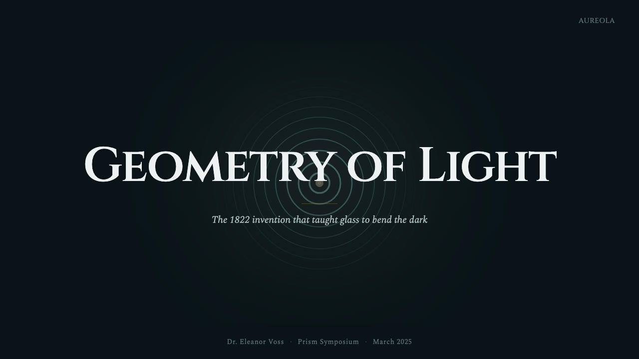
On presentation cover slides, this style rewards a composition built around a single strong focal point rather than a busy scene. A large concentric-ring motif or a suggestion of the lens's bullseye center, placed against the near-black ground with the amber beam cutting across one corner, gives a cover slide immediate gravity. Titling in the refined Roman-capital register keeps the mood closer to a technical frontispiece than a travel poster, which is the right register for this material — precise, not picturesque.
Content and data slides benefit from treating the darkness as negative space that does real work: a near-black background lets a small number of metallic or glass-toned accents carry all the visual weight, so charts and diagrams should use the aqua-green and brass tones sparingly and consistently, reserving the amber beam color for the single most important callout or metric on a slide rather than spreading it across every highlight.
In web interfaces, the style suits dashboards and pricing pages where a sense of instrumentation and precision is an asset — analytics tools, monitoring consoles, or premium-tier products that want to feel engineered rather than merely styled. A dark near-black interface with brass-toned borders or dividers and a single amber accent color for primary actions echoes the lens-and-beam relationship without requiring literal iconography; restraint in how many elements glow at once is essential to keeping the effect legible rather than gaudy.
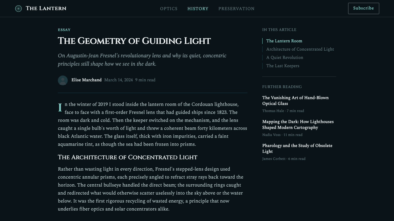
For editorial and marketing treatments, the style leans into its maritime-scientific narrative: long-form pieces about craftsmanship, engineering history, or precision-built products can use the near-black ground and amber beam as a recurring visual motif across section breaks, pull quotes set in the engraver's body register, and a restrained brass rule standing in for a divider. The tone supports authority and quiet drama rather than energy or playfulness, so it fits premium or heritage-minded brands more naturally than youthful or casual ones.
The most common mistake is treating this as a generic 'dark mode with gold accents' theme and losing the material logic that makes it specific. Every element should trace back to an actual property of the instrument — the iron-tinted glass, the machined brass, the collimated beam, the technical-plate lettering — rather than an arbitrary combination of dark background and warm accent color. Overusing the amber tone across many simultaneous elements, or replacing the aqua-green glass cast with a generic teal, flattens the style into a mood board rather than a system with a real historical referent.
Fresnel Lighthouse Lens — FAQ
What actually makes this style different from a generic dark mode with warm accents?
The difference is that every visual choice traces back to a real, physical instrument. The near-black ground is the unlit lantern room; the aqua-green tint is the documented iron content of period optical glass; the brass and bronze are the actual metal used to hold the lens rings in place; the amber-white beam is what a collimated lighthouse light looks like in practice. A generic dark-and-gold theme has no such referent, so its choices are arbitrary and can drift in any direction. This style should stay anchored to those material facts even as it's adapted to new formats.
Can this style work with a light or white background instead of near-black?
It resists it more than most styles would, because the entire visual logic depends on darkness making a small set of lit elements legible — the beam only reads as a beam if it's cutting through something dark. On a light ground, the aqua-green glass and brass metalwork can still function as a restrained accent palette, but the dramatic contrast that gives this style its identity, and the sense of a single beam piercing a dark room, is largely lost. If a lighter variant is required, it works best as a secondary or supporting treatment rather than the primary expression of the style.
Is the aqua-green glass tone the same as a generic teal or cyan accent?
No, and treating them as interchangeable is one of the fastest ways to lose the style's specificity. The aqua-green in this system is meant to read as a material property of glass — subtle, slightly desaturated, appearing mainly at the edges and facets of the lens rings where light catches the glass — rather than a bold, flat, saturated accent color applied broadly. A generic teal used as a dominant color block reads as a completely different, more contemporary digital aesthetic and breaks the nineteenth-century optical-instrument illusion this style depends on.
How much of the lens's actual concentric-ring geometry needs to appear for the style to read correctly?
It doesn't need to be a literal, technically accurate diagram of a Fresnel lens to work, but some suggestion of radial or concentric structure — even just a subtle ring motif around a focal point, or a composition organized around a strong central axis — helps ground the piece in its source object. Without any hint of that geometry, the style can collapse into a more generic 'nautical dark and brass' mood that loses the specific optical-instrument identity the name promises.
What kinds of products or brands is this style poorly suited to?
It struggles wherever warmth, playfulness, or high-energy immediacy are the priority — children's products, casual social apps, or brands built around approachability rather than authority tend to fight against the style's quiet, almost solemn precision. It also demands real restraint to execute well, so contexts that need many simultaneous calls to action or a dense, busy interface will fray the effect, since the style depends on isolating a small number of lit elements against darkness rather than layering many at once.
Related design styles
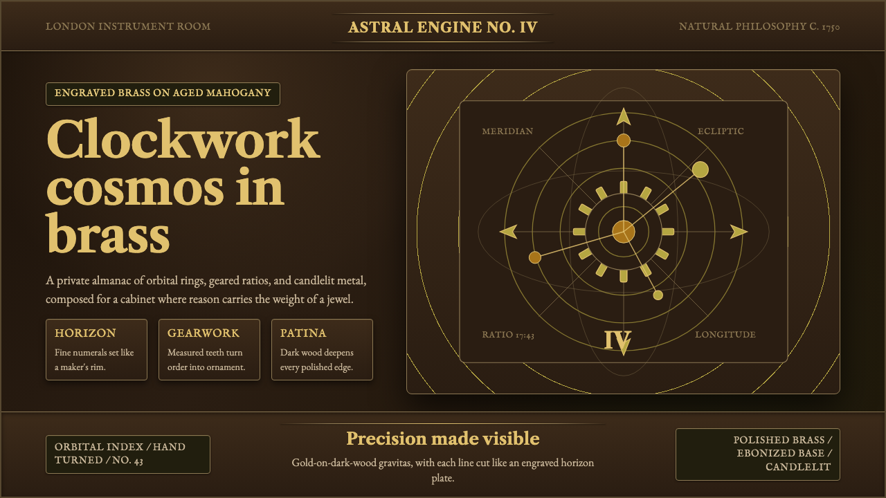 Brass OrreryTurns reason into gold. Brass rings and Caslon type glow over near-black maho…
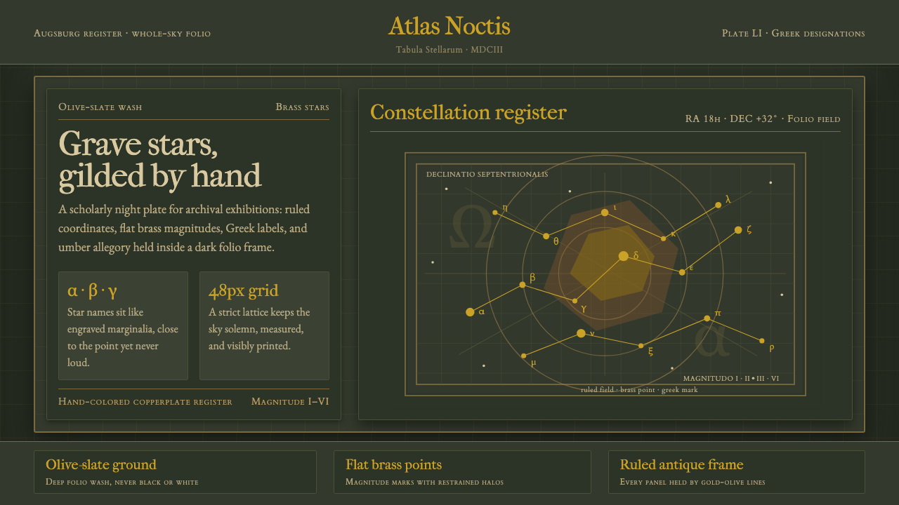 Bayer UranometriaGrave celestial folio. Olive-slate grid, brass stars, Greek labels, old-style…
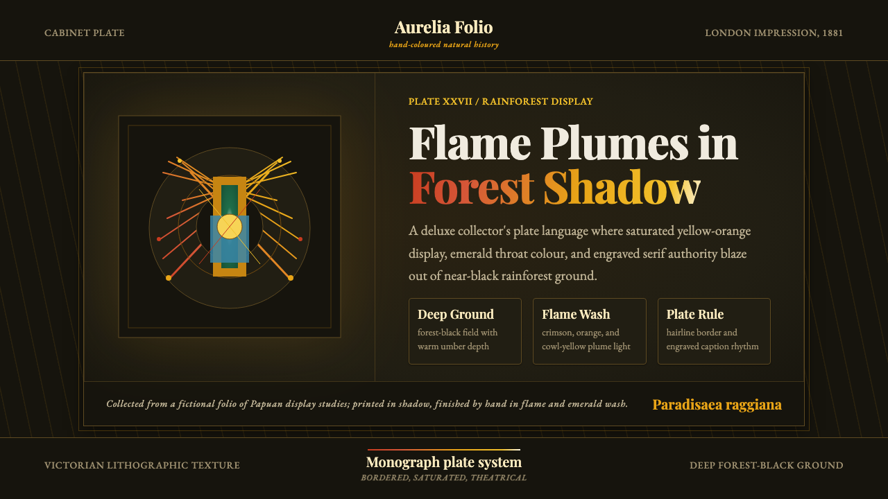 Bird of Paradise MonographTheatrical plate-book darkness. Flame plumes blaze from a bordered forest-bla…
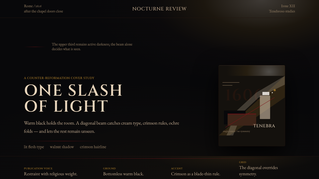 Caravaggio TenebrismDarkness acts first. Warm-black voids, Cinzel capitals, and one ochre raking…
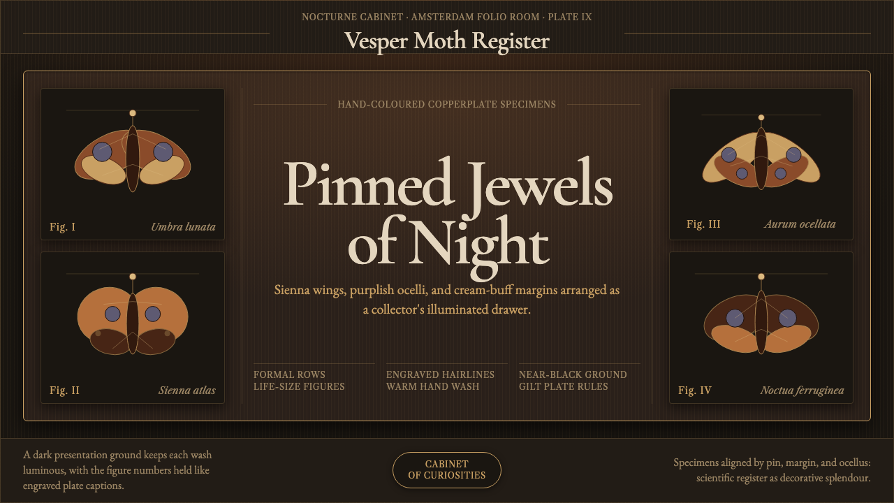 Cramer Exotic MothsJewel-like precision. Sienna specimens glow in formal rows on a near-black pl…
 Dracula Gothic (1897)Victorian dread after dark. Blood-red initials and tarnished gilt haunt coffi…