What is Baybayin Script?
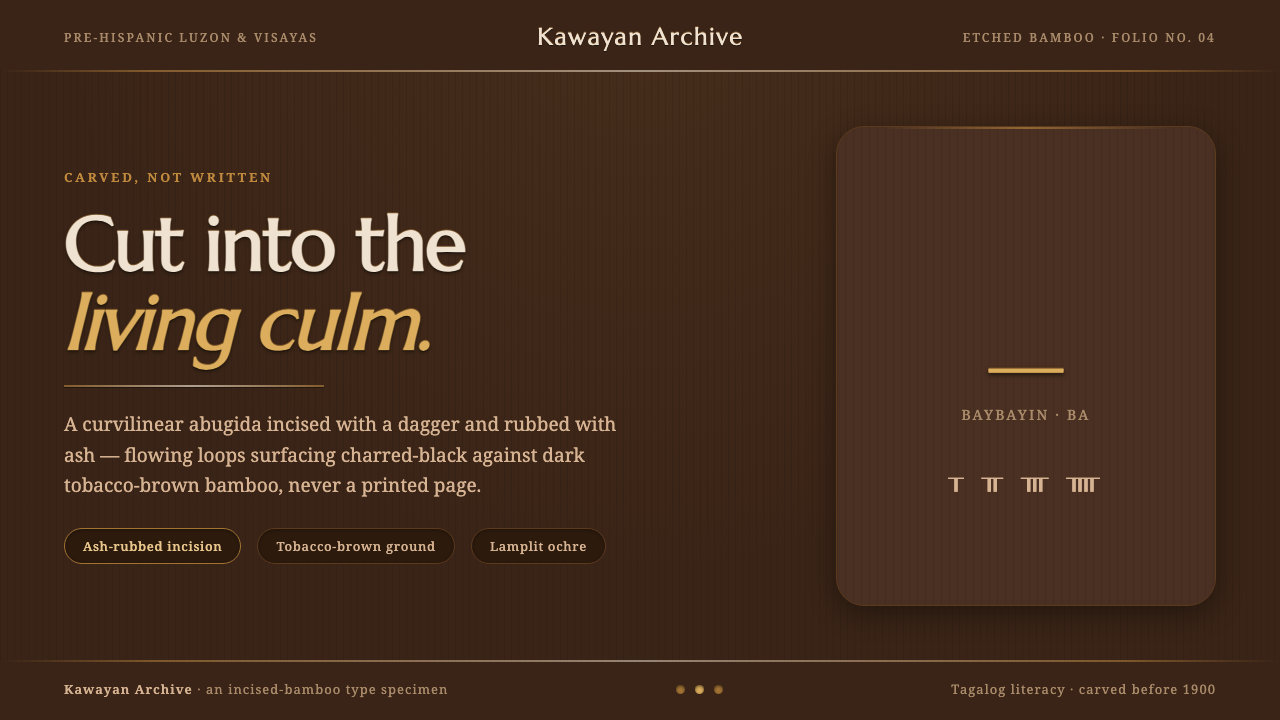
Baybayin feels carved rather than written: looping script, ash-dark incisions, and the warm, earthen presence of bamboo under lamplight.
Baybayin Script in brief
Baybayin is a curvilinear abugida used by Tagalog and other Philippine peoples before 1900, particularly across Tagalog Luzon and the Visayas. Its forms are defined by rounded, flowing strokes that suit incision into bamboo: marks move in loops and curves rather than behaving like the crisp, mechanically repeated letters of print.
The script belongs to a Brahmic-derived Southeast Asian abugida tradition, but its visual identity in this system comes equally from its making. A scribe incised glyphs into bamboo with a dagger or a sharpened bamboo split, then rubbed ash and charcoal into the cuts. The visible writing was therefore inseparable from the bamboo culm, the cut line, and the dark material settled within it.
As a design language, Baybayin translates that craft into a tactile digital surface. Tobacco-brown grounds suggest bamboo, ash-black marks preserve the look of rubbed incisions, and ochre carries the feeling of nearby lamplight. The result should never feel like pristine ink on paper. It should feel earthen, handled, and slightly softened by material rather than sharpened by a press.
Where does Baybayin Script come from?
Baybayin belongs to the pre-colonial and pre-Hispanic writing history of the Philippines. Before 1900, Tagalog and other Philippine peoples used this curvilinear abugida in Tagalog Luzon and the Visayas. Its historical setting matters because the visual language begins with a local practice of literacy and material making, not with a later attempt to imitate a printed alphabet.
The script is described within a Brahmic-derived Southeast Asian abugida tradition. That placement explains why Baybayin should be understood as a script system with its own formal rhythm rather than as a decorative collection of isolated signs. Its curving glyphs are part of a coherent written vocabulary, and their movement across a surface carries more importance than the rigid alignment associated with typeset Roman text.
Bamboo etching was central to the script's appearance. Glyphs were cut into the bamboo using a dagger or sharpened bamboo split, then made legible by rubbing ash and charcoal into the incisions. The dark reading line was thus produced through removal and filling: the surface was opened, and the recessed mark held the material that made it visible.
Indigenous Tagalog scribes stand at the center of this history, while early Spanish chroniclers form part of the surviving source context named for Baybayin. Pedro Chirino and Francisco Lopez are associated with that early chronicler tradition. For a contemporary visual system, this history calls for restraint: the style should foreground the script, bamboo craft, and pre-Hispanic Philippine literacy rather than adding unrelated exoticism or treating the forms as interchangeable ornament.
What defines the Baybayin Script look?
Carved Line
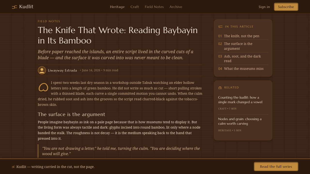
Baybayin marks should read as incised grooves filled with ash and charcoal, not as flawless digital strokes. Their edges can feel subtly rounded and material-bound, as if the line has met the grain and curvature of bamboo. Visual precision comes from clear glyph construction, not from sterile sharpness.
Earthy Ground
The ground evokes dark tobacco-brown bamboo rather than paper or a neutral software canvas. It should feel dense, warm, and naturally dark, creating enough visual body for ash-black marks to appear embedded in the surface. The background is material presence, not empty space waiting for decoration.
Rounded Glyph Rhythm
The curvilinear character of the script is the primary ornamental force. Loops and rounded turns should be given room to breathe, with enough surrounding quiet to let each glyph retain its own movement. Tight mechanical repetition makes the script feel typeset; measured spacing lets it feel traced by hand and cut into a living surface.
Ash-Black Contrast
The principal contrast is not bright ink against blank paper but charcoal-dark incision against tobacco-brown bamboo. It should be strong enough for reading while remaining absorbed by the ground, as though the dark mark has settled into a cut rather than floated above it. Black belongs to the object, not to a separate graphic layer.
Lamplit Ochre
Ochre functions as the style's sense of illumination. It should appear sparingly, like warm light catching an edge, a heading, or a small point of attention. Its role is not to add decorative brightness but to suggest the intimate glow that makes dark bamboo and charcoal marks feel tactile rather than severe.
Tactile Restraint
Every texture and irregularity should serve the impression of etched bamboo. The system works when it remains quiet and concentrated: a limited earthen palette, a small number of carved gestures, and generous dark space. Excessive distressing, layered effects, or unrelated folk motifs can bury the script beneath atmosphere instead of honoring its material logic.
Who shaped Baybayin Script?
Indigenous Tagalog scribes are the essential makers behind Baybayin's pre-1900 use. Their practice joined literacy to bamboo etching: the script was cut with a dagger or sharpened bamboo split and made visible with ash and charcoal. Any contemporary interpretation should keep this act of making central rather than reducing Baybayin to a decorative motif.
Early Spanish chroniclers are part of the named historical source context surrounding Baybayin. Their presence signals that the script's history is encountered through records as well as through indigenous practice. In educational work, they should be presented as chroniclers in that context, without allowing the record to eclipse the Philippine peoples whose writing practice it concerns.
Pedro Chirino is named among the early Spanish chroniclers connected to Baybayin's source context. Within this theme, his relevance is historical documentation rather than visual authorship. His inclusion helps locate the script in the early written record while the visual system remains grounded in indigenous Tagalog scribes, bamboo, ash, charcoal, and incised form.
Francisco Lopez is likewise identified as an early Spanish chronicler in the Baybayin source context. He represents the documentary side of a history whose primary visual language was materially made on bamboo. His place in an article is therefore contextual: a reminder that Baybayin's pre-Hispanic Philippine literacy has both living material associations and recorded historical traces.
How do you use Baybayin Script today?
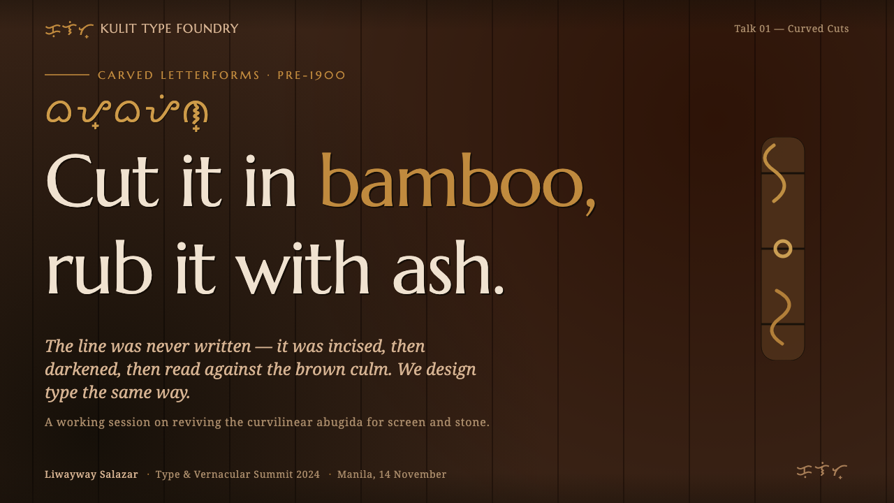
For presentation covers, let the Baybayin atmosphere arrive before the information density. Use a tobacco-brown field, a restrained ash-black script gesture, and a small ochre point that feels like lamplight. A title should sit with deliberate calm beside or beneath the carved form, allowing the cover to resemble an etched bamboo object rather than a conventional title page.
For content and data slides, prioritize legibility over imitation. Keep explanatory text in a clear supporting type treatment, while Baybayin acts as a heading, divider, or focal inscription rather than carrying dense body copy. Charts should use the system's earthy contrast and warm accent to distinguish relationships, with dark surfaces and carved-line cues providing structure instead of ornamental frames.
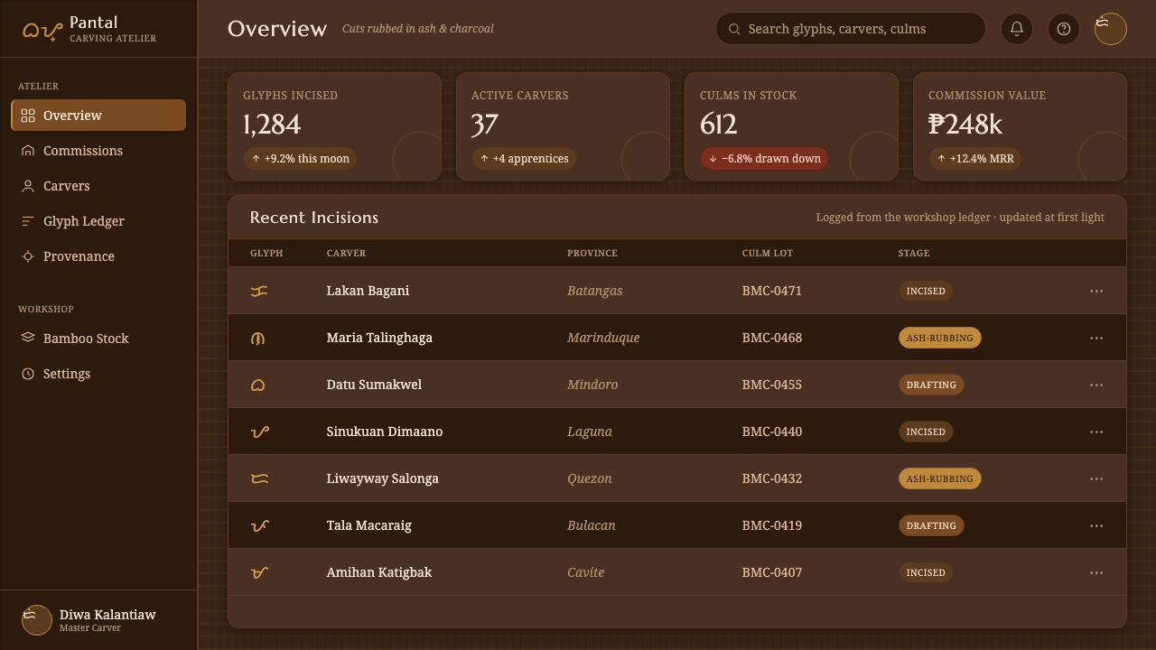
For web interfaces, Baybayin works best in dashboards, archives, or pricing pages that benefit from a grounded and deliberate atmosphere. Use the tobacco-brown ground to establish the environment, keep navigation and controls direct, and reserve script forms for identity-bearing moments such as section markers, welcome panels, or feature labels. Functional information must remain immediately readable; the carved quality should enrich the interface without making ordinary tasks feel ceremonial.
For editorial and marketing work, the style is especially effective when a story needs material presence. Articles can alternate quiet dark fields with text-led passages, using ash-black dividers and limited ochre emphasis to guide attention. Campaign pages should foreground the relationship among Philippine writing, bamboo etching, charcoal, and light, giving each visual element a clear narrative role instead of filling the page with generalized tropical imagery.
The common mistake is to treat Baybayin as a generic handwritten flourish or to make every surface rough, glowing, and ornamental. That loses the defining contrast between disciplined script and tactile material. Use the curvilinear glyphs sparingly and with respect for their role as writing; let texture suggest incised bamboo; and keep visual effects subordinate to the quiet authority of the carved mark.
Baybayin Script — FAQ
Is Baybayin a font style or a writing system?
Baybayin is a curvilinear abugida used by Tagalog and other Philippine peoples before 1900. A contemporary design system can draw on its forms and material associations, but it should not collapse the script into a font-like decoration. The glyphs are writing, while the tobacco-brown bamboo, ash-black cuts, and lamplit ochre are the visual language used here to frame that writing.
Why should the lines look carved rather than printed?
Because the approved material basis for this theme is bamboo etching. Baybayin glyphs were incised with a dagger or sharpened bamboo split, then rubbed with ash and charcoal. A carved appearance preserves the relationship between form and process: the dark mark appears to inhabit a groove in bamboo instead of sitting as clean ink on top of an abstract background.
Can the style use bright accents?
Yes, but the accent should behave like ochre illuminated by lamplight, not like a competing digital signal. Its best role is to direct attention to a heading, edge, action, or small point of emphasis. The dominant experience should remain tobacco-brown bamboo and ash-black incision, with warmth appearing as a controlled trace of light.
Where does Baybayin work best in a digital product?
It works best where identity, context, and paced reading matter: a cover state, an archive or cultural section, a dashboard welcome area, a feature introduction, or an editorial campaign. Dense controls and explanatory content should remain direct and legible. The style is most persuasive when it gives a product a material atmosphere without requiring every operational element to imitate a carved artifact.
What should designers avoid when interpreting Baybayin?
Avoid treating the script as interchangeable ornament, making the forms printer-crisp, or burying them beneath excessive texture and unrelated decoration. The source material points to a specific relationship: curvilinear writing, bamboo incision, ash and charcoal, tobacco-brown surface, and ochre lamplight. A successful interpretation protects that relationship and leaves enough quiet space for the script to be read.
Related design styles
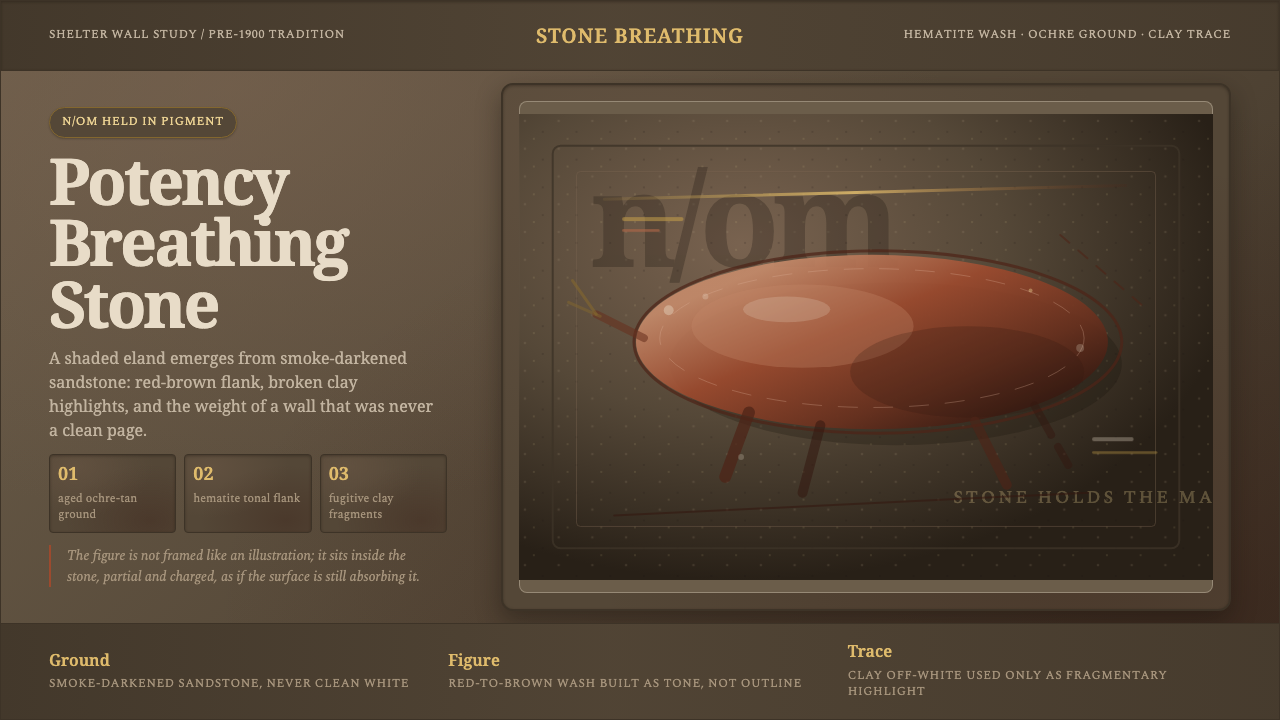 San Rock Art DrakensbergPotency stains the stone. Hematite gradients breathe over smoke-dark sandston…
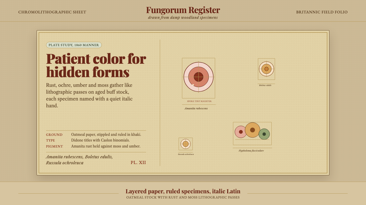 Victorian Mycology PlatePatient field science. Rust and moss specimens sit on stippled buff paper wit…
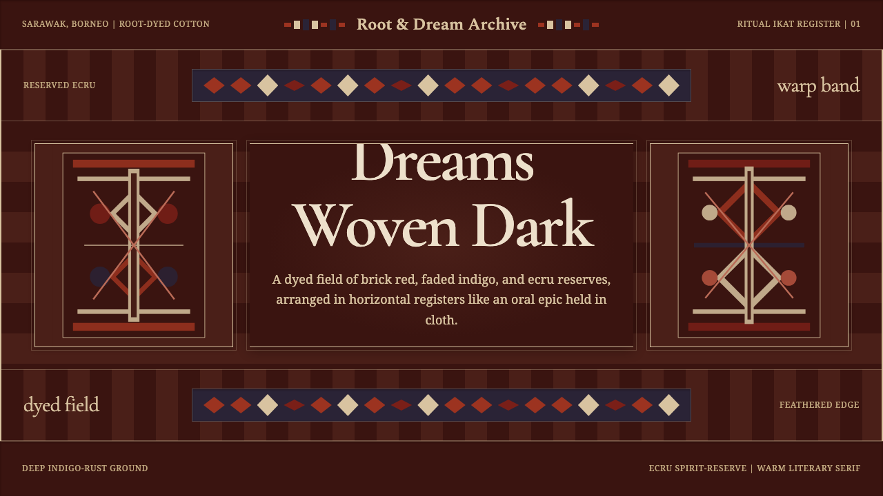 Iban Pua KumbuSacred cloth logic. Indigo-rust bands, ecru reserves, and blurred ikat edges…
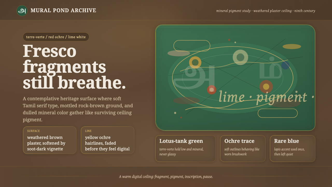 Sittanavasal Jain Cave FrescoBreathes through age. Terre-verte green and ochre lines fade into brown plast…
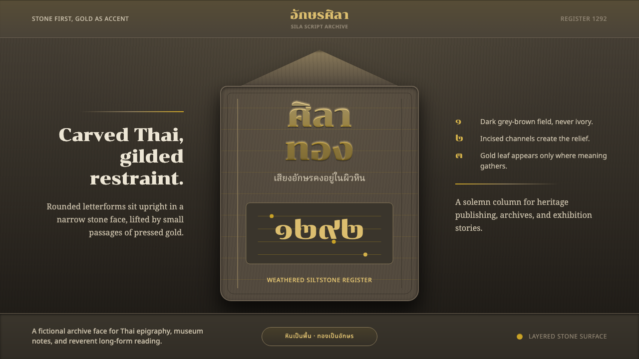 Sukhothai Thai ScriptStone carries the script. Chonburi Thai letters glint gold on dark siltstone.
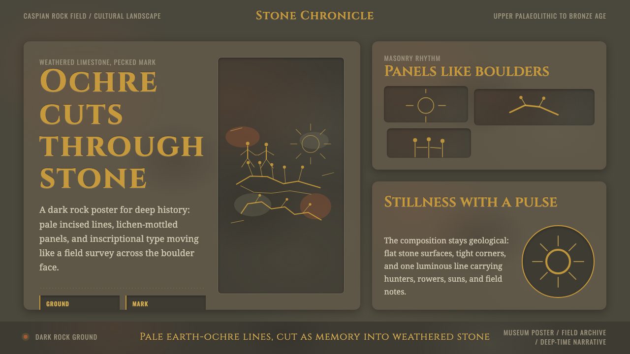 Azerbaijani Gobustan PetroglyphAncient rock speaks. Ochre incisions glow across dark lichen-mottled stone.