What is Sittanavasal Jain Cave Fresco?
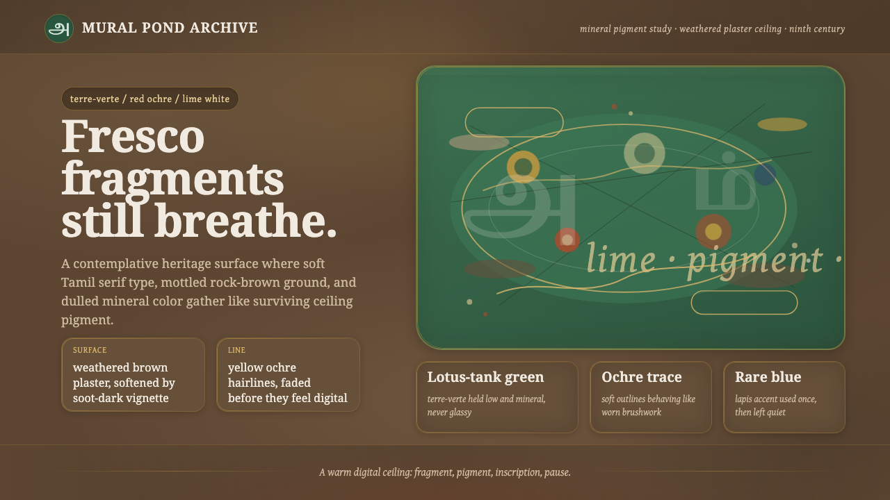
Sittanavasal Jain Cave Fresco turns a weathered ninth-century lotus pond into a digital language of mineral color, softened edges, and surfaces that seem to hold their breath through time.
Sittanavasal Jain Cave Fresco in brief
The Sittanavasal Jain Cave Fresco design system draws from the painted ceiling of the Sittanavasal cave in Tamil Nadu, South India. Its central image is a samavasarana lotus pond: a field of water, lotus forms, dancers, elephants, and geese rendered in subdued mineral pigment over an aged lime-plaster surface. The effect is not one of pristine illustration. It is an image encountered through weathering, where color, line, plaster, and rock remain inseparable.
As a visual style, it begins with the condition of the wall rather than the subject painted upon it. Brown rock and lime plaster form the atmosphere; terre-verte green, red and yellow ochre, lapis blue, and lime white emerge as deposits of attention within that atmosphere. Pigment should feel absorbed into a surface, not applied above it. Forms remain legible, but their boundaries are softened by age, interruption, and the uneven character of the ground.
The system is dark, warm, and contemplative. It rejects the bright polish of contemporary interface design in favor of faded fresco fragments: panels feel discovered rather than manufactured, decorative motifs feel remembered rather than repeated, and empty space carries as much weight as imagery. Its beauty comes from restraint and material presence, not from sharp contrast or ornamental abundance.
Where does Sittanavasal Jain Cave Fresco come from?
The visual source belongs to the ninth-century Pandya-period Jain cave painting tradition at Sittanavasal in Tamil Nadu. The site is identified with the Sittanavasal, or Arivar Koil, rock-cut temple. Its painted ceiling places religious imagery directly within an excavated stone environment, making architecture, plaster, and mural part of one continuous experience rather than separate layers of design.
The fresco is associated with Jain cave-temple mural painting and with fresco-secco over lime plaster. That technical condition matters for the style. A lime-plaster ground does not behave like a smooth digital canvas: it has absorbency, variation, and physical history. The design language therefore treats irregularity as essential evidence of the medium, not as a defect to be removed.
The surviving visual vocabulary centers on the samavasarana lotus pond, rendered with terre-verte green and soft ochre line across weathered brown plaster. Dancers, elephants, and geese animate the pond without turning it into a crowded narrative field. Their presence suggests a world of movement and life held inside an overall atmosphere of repose.
For contemporary use, the origin should remain visible in the translation. The goal is not to simulate an archaeological object or turn sacred imagery into generic decoration. It is to carry forward the fresco’s material logic: mineral color against earthen ground, line that yields to surface, and imagery that feels inseparable from the place in which it appears.
What defines the Sittanavasal Jain Cave Fresco look?
Weathered Ground
The dominant field resembles brown rock covered by aged lime plaster. It should be mottled, uneven, and quiet rather than uniformly dark. Variation gives the layout depth without relying on glossy effects: lighter abrasion, denser brown passages, and softened interruptions make the ground feel lived through. Content appears to rest within this field, never floating cleanly above it.
Mineral Pigment
Terre-verte green leads the palette, accompanied by dulled red and yellow ochres, lapis blue, and lime white. These colors should read as pigments with density and age, not as luminous interface accents. Green can carry the pond’s vegetative and watery presence; ochre gives line and warmth; blue and white arrive sparingly as cooler, lighter interruptions in the earthen field.
Soft Ochre Line
Figures and motifs are defined through soft ochre line rather than hard contour. The line should suggest gesture, direction, and recognition without enclosing every form completely. It may fade into the ground, break around a textured passage, or thicken where a shape needs emphasis. This creates the impression that drawing and wall have aged together.
Faded Fragment
Components should feel like portions of a larger painted surface. Edges are softened, contrast is moderated, and decorative details appear partially revealed rather than perfectly restored. Cards, image areas, and dividers work best when they retain the humility of fragments: they can frame information, but they should not become polished objects competing with the fresco atmosphere.
Lotus-Pond Rhythm
The samavasarana lotus pond offers a compositional model rather than a pattern to duplicate. Organic clusters, open intervals, and gently distributed figures create a rhythm closer to a painted environment than a rigid grid. Circular lotus forms can become quiet anchors, while dancers, elephants, and geese suggest movement through restrained silhouettes or illustrative fragments.
Quiet Sacredness
The style’s emotional register is reverent but not theatrical. Dark earth, faded pigment, and ample breathing room produce attention through stillness. Ornament should be used as an echo of the mural’s world, never as visual noise. The result is appropriate when a design needs gravity, memory, and human presence without becoming monumental or severe.
Who shaped Sittanavasal Jain Cave Fresco?
The painters remain anonymous, but their work establishes the visual foundation of the style: mineral pigment, soft ochre drawing, and a lotus-pond world held within a weathered rock-cut setting. Their anonymity shifts attention away from individual authorship and toward the integrated relationship between image, material, and sacred place.
The rock-cut temple is not merely a container for the painting; it is part of the painting’s meaning. Brown rock, lime plaster, and ceiling imagery create a single material setting. In digital translation, this encourages backgrounds and content surfaces to behave as one environment rather than as unrelated layers.
The lotus pond is the fresco’s central pictorial field and the style’s strongest compositional reference. Its dancers, elephants, and geese give the scene life, while its green, ochre, and brown atmosphere prevents movement from becoming visual urgency. It offers a model of animated imagery governed by calm.
How do you use Sittanavasal Jain Cave Fresco today?
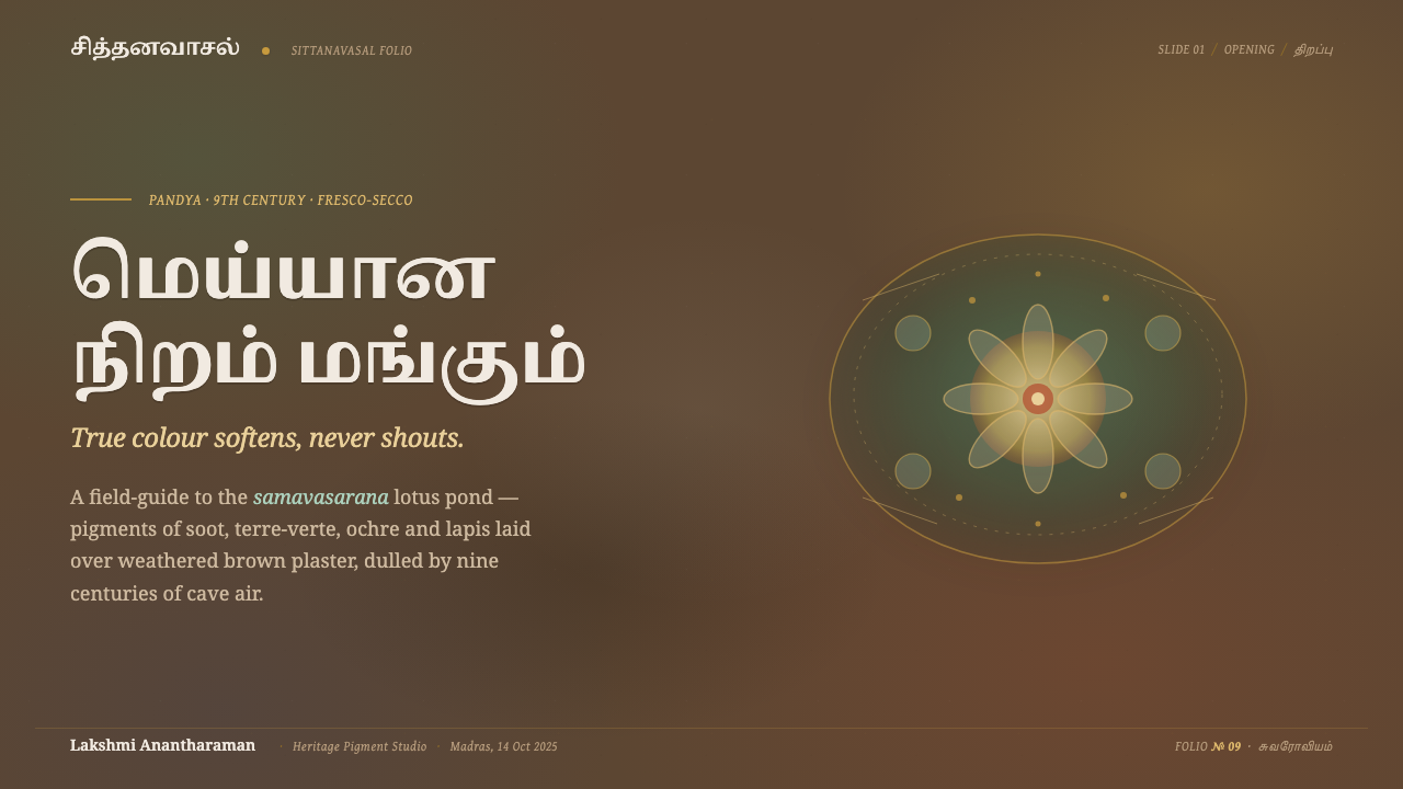
For presentation covers, use the brown plaster-like ground as the primary stage, then let a restrained lotus form, ochre line drawing, or muted green field establish the subject. Titles should feel carved into the atmosphere through clear but softened typographic contrast. On content slides, keep information in calm groupings separated by generous empty ground; use mineral accents to distinguish ideas, not to make every block compete.
Data slides work when charts are treated as part of the painted surface. Use subdued green and ochre to establish categories, reserve lime white for key readings, and let rules or outlines remain soft rather than aggressively technical. The goal is not to disguise information as art. It is to make analytical material feel settled into the same visual climate as the rest of the presentation.
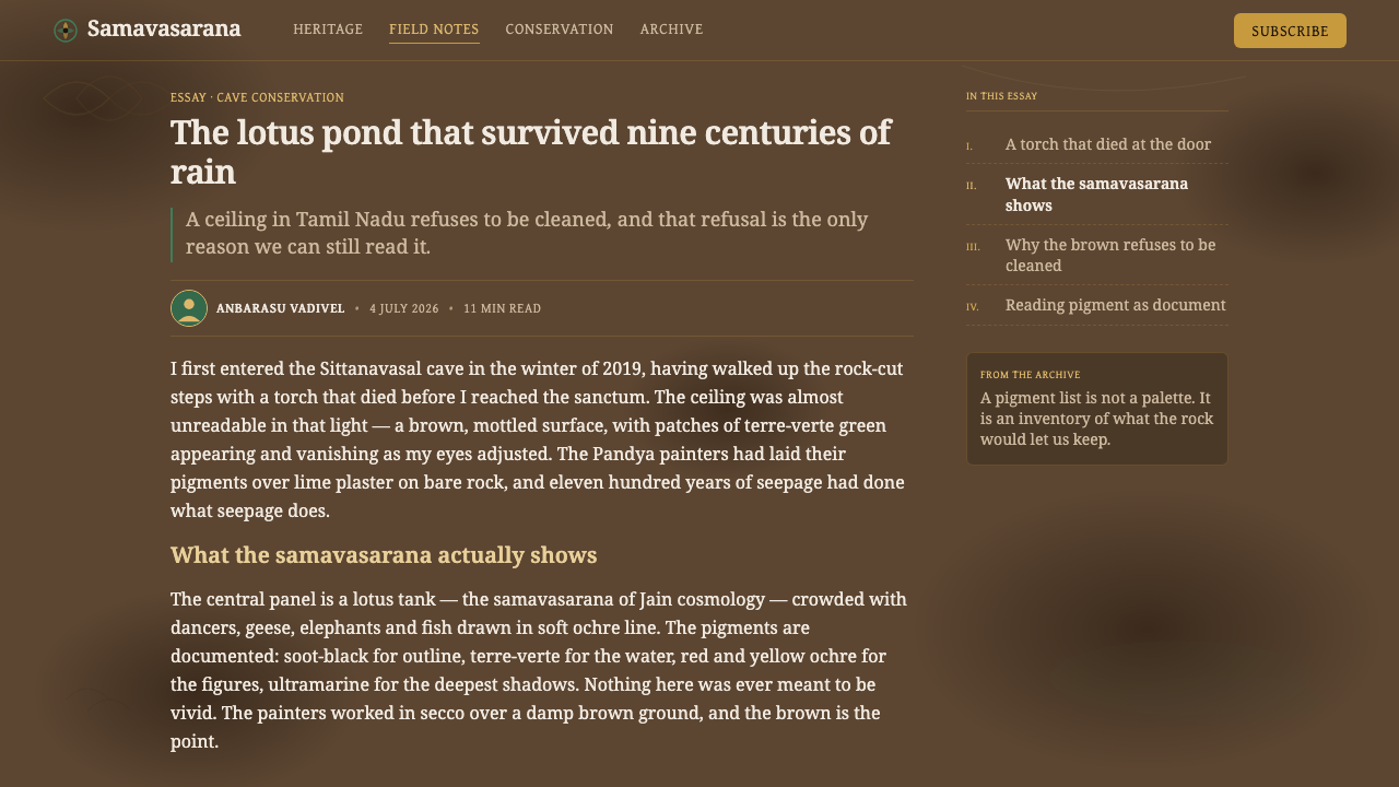
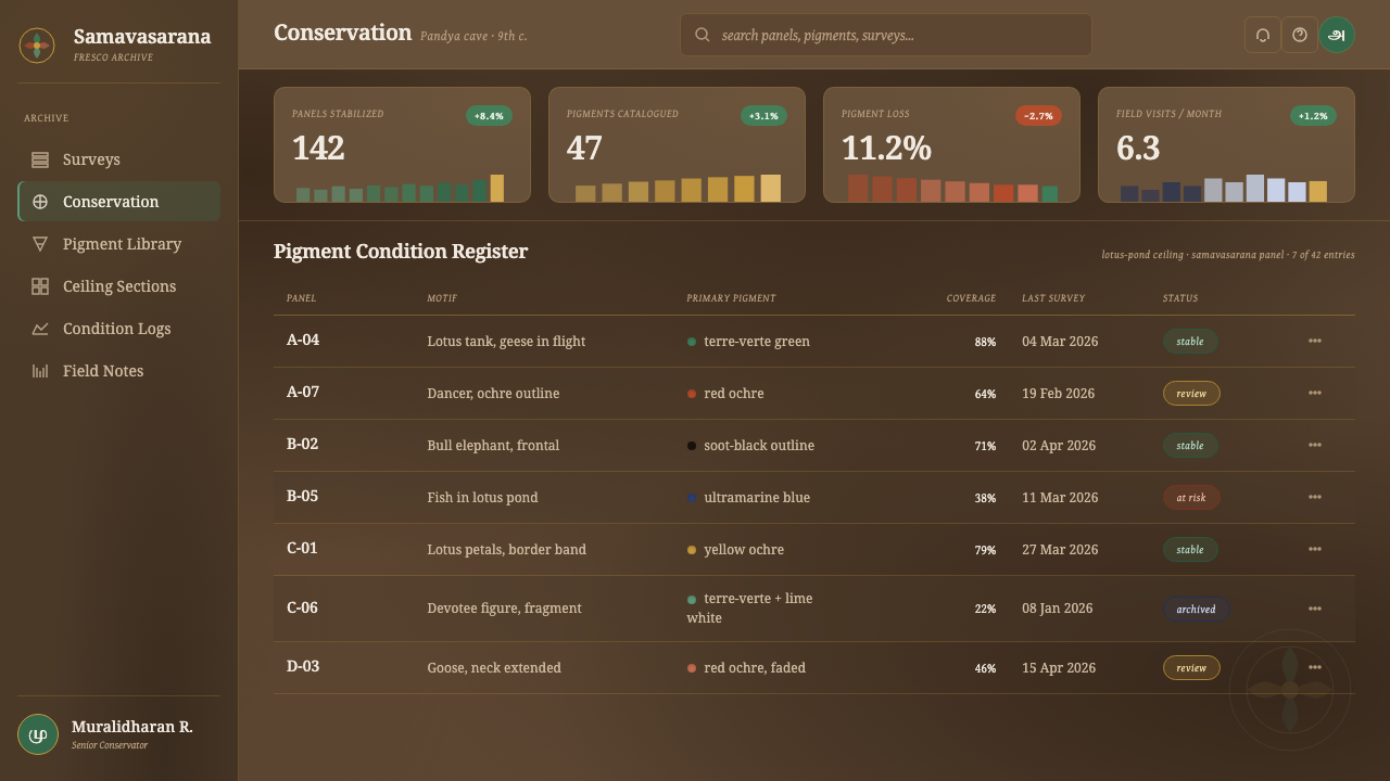
For web interfaces, the style suits cultural archives, editorial platforms, reflective learning experiences, and products that benefit from a sense of memory or material depth. Dashboards can use the weathered ground to unify sections while keeping readings and controls carefully legible. Pricing pages can distinguish options through restrained mineral fields and quiet line work, allowing hierarchy to emerge without bright promotional intensity.
For editorial and marketing work, use the fresco atmosphere to frame stories about place, craft, history, or slow attention. Long-form pages benefit from wide areas of unmarked ground, images that appear as fragments within the page, and section transitions that echo a drawn line or a change in plaster tone. Marketing should remain measured: the style is strongest when it invites looking, not when it turns every message into an urgent demand.
The common mistake is to treat age as a texture effect added over an otherwise modern layout. A noisy distressed overlay, bright decorative pigments, or sharply polished cards will break the system immediately. Authentic use depends on restraint: let the ground carry history, let color appear mineral and faded, and let imagery remain connected to the calm, fragmentary logic of the fresco.
Sittanavasal Jain Cave Fresco — FAQ
Is this style simply a rustic or vintage look?
No. Its aged appearance comes from a specific visual source: Jain cave-temple mural painting over lime plaster in a rock-cut setting. Rustic styling often treats wear as charm, while this system treats weathering as material history. The difference lies in the relationship between pigment, plaster, rock ground, and the lotus-pond imagery that binds them together.
Can the palette be made brighter for a modern interface?
Brightness should be introduced cautiously. The style depends on dulled mineral pigments appearing against a weathered brown field; intense color can make the design feel promotional or synthetic. If stronger emphasis is needed, increase clarity through contrast in placement, empty space, or typography before making the pigments appear newly mixed or luminous.
How should figures such as dancers, elephants, and geese be used?
Use them as quiet narrative presences rather than decorative clip art. A partial silhouette, a soft ochre contour, or a fragment placed within a broad field is usually more faithful to the source atmosphere than repeated, highly finished illustrations. Their role is to animate the lotus-pond world while preserving its repose.
Where does the style work poorly?
It can struggle where immediate brightness, clinical precision, or high-speed transactional clarity is the primary need. Dense operational screens and aggressively promotional pages may lose legibility if the fresco atmosphere becomes too dominant. Use it where contemplation, cultural depth, editorial pacing, or a sense of place supports the product’s purpose.
Related design styles
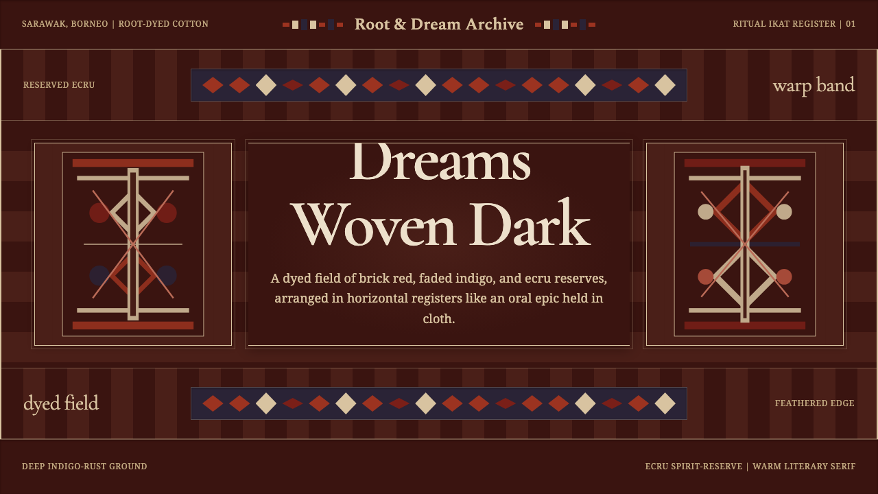 Iban Pua KumbuSacred cloth logic. Indigo-rust bands, ecru reserves, and blurred ikat edges…
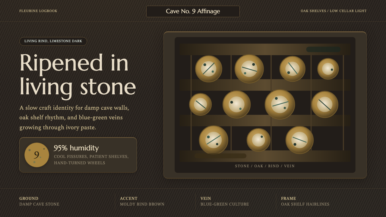 Cheese Affinage CavePatience reads as stone. Rind brown, mold green, and oak shelf grids glow in…
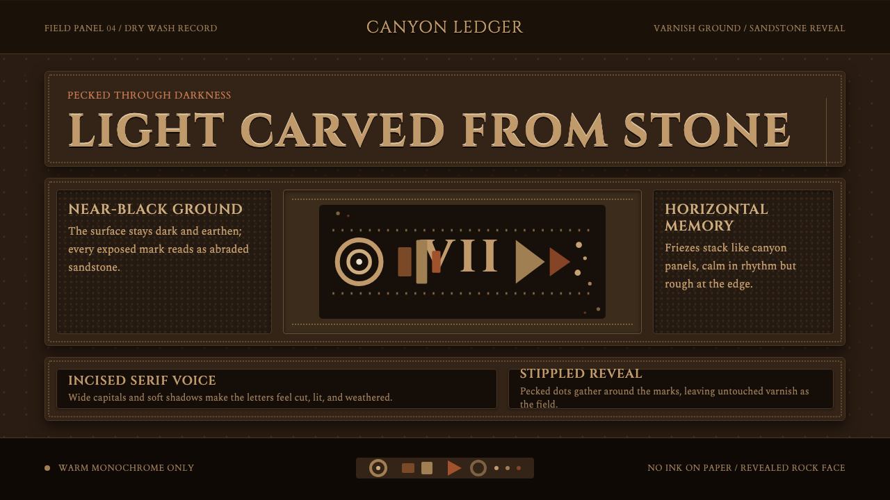 Desert VarnishStone remembers. Sandstone glyphs cut through near-black varnish in stacked f…
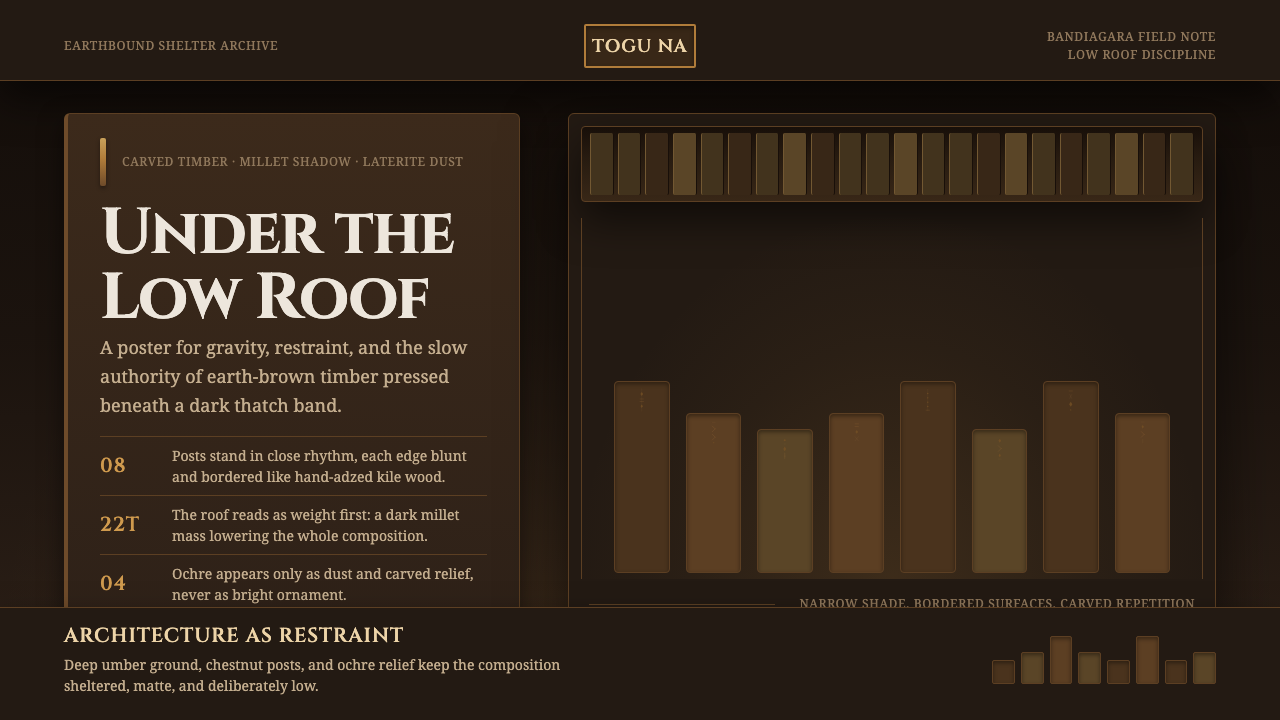 Dogon Toguna Shelter MaliGravity made visible. Deep umber ground, low roof band, chestnut posts in sha…
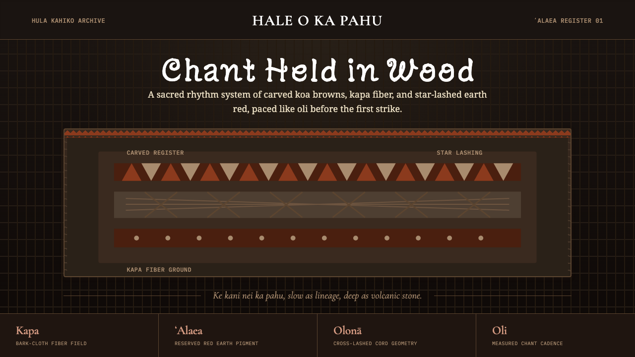 Hawaiian Hula Pahu DrumSacred weight, hand-marked. ʻAlaea red, kapa texture, and stacked carved regi…
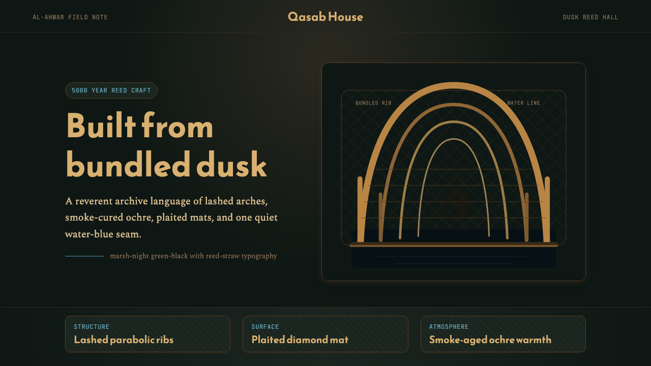 Iraqi Marsh Arab Mudhif ReedReverent reed darkness. Kufi arches, ochre lattice, and one water-blue line h…