What is Cheese Affinage Cave?
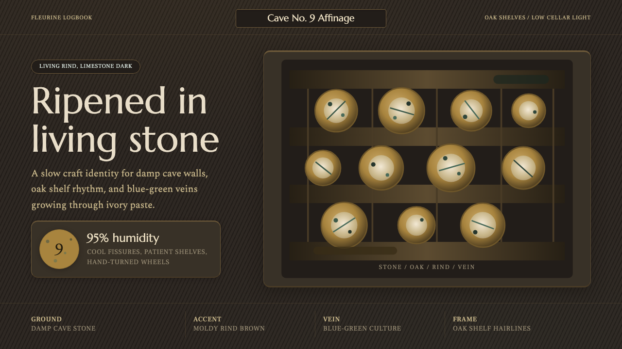
A cheese cave is a living clock — a cellar aesthetic where mold, stone, and patient darkness are the whole design system.
Cheese Affinage Cave in brief
Cheese Affinage Cave is a design language drawn not from a studio or a manifesto but from a working cellar: the natural limestone caves near Roquefort-sur-Soulzon in southern France, where wheels of blue cheese ripen for weeks in near-total darkness. Nothing here was designed to be looked at. The rind color, the shelf wear, the faint green bloom of mold are byproducts of biology and geology, and the design system simply pays close attention to what that process actually looks like.
The visual signature is a moldy rind brown as the anchor tone, threaded with a blue-green vein color that traces the path of mold growth through a wheel, deepened by a near-black mold-green, warmed by oak-shelf brown, and lifted only slightly by an ivory cheese-paste tone that stands in for the one thing in the cave getting lighter rather than darker. Every hue in the range describes an actual, observable stage of decay-into-flavor — there is no invented accent color, because the cave doesn't produce one.
This makes the system unusual among design languages: it has no name from a movement, no single author, and no manifesto. Its authority comes from repetition — the same rind chemistry, the same oak, the same cool stone air, produced identically for well over a thousand years by generations of cheesemakers working the same fissures in the same plateau. The design system reads as ancient because the process it describes actually is.
Where does Cheese Affinage Cave come from?
The Roquefort caves sit inside the Combalou, a collapsed limestone plateau in the Aveyron department of southern France. Millennia ago, a section of the plateau's cap rock gave way, leaving behind a jumble of fissured rock riddled with narrow natural chimneys the locals call fleurines. These fleurines act as a passive climate system: they draw cool, moisture-laden air up from underground water tables and vent it slowly through the rock pile, holding the caves at a near-constant cool temperature and very high humidity year-round without any mechanical refrigeration. It is, in effect, a piece of pre-industrial climate engineering that nobody engineered — geology did the work, and cheesemakers simply noticed it worked.
Roquefort itself is one of the oldest named cheeses in continuous production in Europe, referenced in French records as early as the Middle Ages and, according to local legend, discovered by accident when a shepherd left bread and ewe's-milk curd behind in a cave and returned to find it transformed by mold — a charming story that is folklore rather than documented history, but one told consistently enough in the region to be part of the cheese's own identity. What is documented is that Roquefort has held protected legal status in France since 1925, one of the earliest formal geographic-origin protections given to any food product anywhere, which is why the cave-ripening method has been preserved essentially unchanged rather than industrialized away.
The ripening process itself is what the design system describes. Wheels are pierced to let air reach their interior, then laid on century-old oak shelves — never metal or plastic, because oak's grain and mild antimicrobial properties interact with the cheese in ways synthetic materials do not. Over the following weeks, Penicillium roqueforti spores, introduced early in cheesemaking, spread through the pierced channels, and the exterior develops its living rind: a yellow-brown crust mottled with patches where blue-green mold has broken through to the surface. Affineurs — the specialists whose entire craft is aging cheese rather than making it — monitor and turn the wheels by hand, reading moisture and mold spread the way a vintner reads a barrel.
This tradition sits within a broader French and European culture of blue-cheese affinage, in which natural caves — rather than refrigerated industrial rooms — are treated as irreplaceable to the final flavor and texture. The AOC (Appellation d'Origine Contrôlée) framework that protects Roquefort formalizes this: legally, the cheese can only be called Roquefort if it is aged in these specific caves under the Combalou plateau, which means the design vocabulary this system draws from is not a generic 'cave' but this one particular geological accident, still doing the same job it did before anyone thought to protect it.
What defines the Cheese Affinage Cave look?
Color
The palette reads as a cross-section of an actual rind: a dominant moldy yellow-brown for the crust, a cooler blue-green vein that threads through it like a mold seam caught mid-spread, a much darker near-black green for the deepest mold pockets, a warm oak-shelf brown for structural and background elements, and a single pale ivory for the interior paste. Nothing is bright or saturated in the conventional sense — every tone looks slightly damp, slightly aged, as though it has been sitting in cool dark air for weeks, because in the source material it has.
Surface and Texture
The defining textural idea is unevenness that reads as evidence of a real, slow process rather than a flaw. A rind is never one flat color; it is mottled, with mold breaking through the crust in irregular patches that thin toward the edges rather than stopping on a hard line. Surfaces in this system favor that same soft, organic irregularity over crisp geometric edges — the opposite instinct of a system built for manufactured precision.
Light and Atmosphere
Because the source environment is a cave lit only by whatever work-light affineurs bring in, the mood leans dark and low-contrast rather than bright and clean. Light in this system feels ambient and diffuse rather than directional and dramatic — closer to the residual glow of a cellar bulb than a spotlight. The effect this produces is intimacy: the viewer feels close to the surface of something rather than looking at it from a comfortable, well-lit distance.
Materials
Two materials govern the system's structural language: rough-hewn limestone, which supplies the cool gray-stone undertone behind the color palette, and century-old oak shelving, which supplies the warm brown used for framing and dividing elements. The choice deliberately excludes anything that reads as new, synthetic, or mass-produced — no steel racking, no plastic trays — because those materials are literally absent from the tradition this system documents.
Composition
Because the cave's own architecture is a repeating grid of oak shelves stacked in rows, the system carries a natural affinity for row-and-column arrangements — shelf after shelf, wheel after wheel — without that grid ever feeling mechanical, since each 'cell' in it (each wheel) looks slightly different from its neighbors. This gives the language an unusual combination: structured layout with organic, non-repeating detail inside each unit.
Mood
The dominant emotional register is patience rather than speed. Nothing about an affinage cave is fast: cheese cannot be rushed to ripeness, and the visual language reflects that by favoring slow gradients of color and texture over sharp, attention-grabbing contrast. It is a system built for things that reward waiting — craft, aging, quality that accrues rather than a message that needs to be read in half a second.
Contrast with Clean Dairy Branding
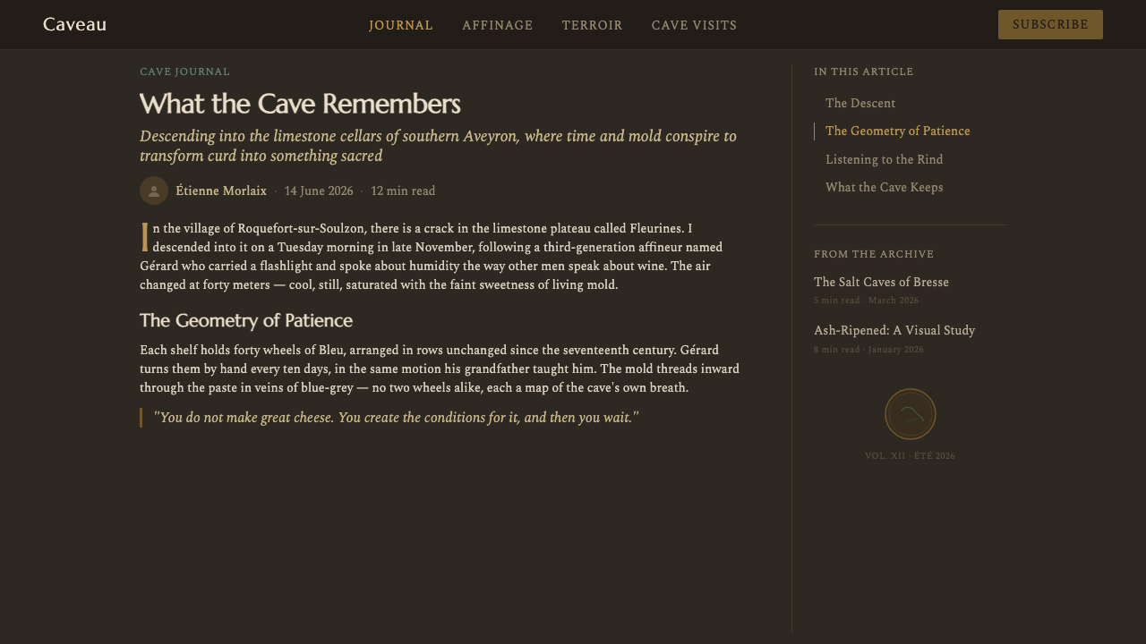
It is worth naming what this system deliberately is not: the bright white, red-and-blue, sanitized visual language of supermarket dairy packaging. Commercial cheese branding tends to hide the mold, the aging, the cave — anything that might read as imperfect — behind clean product photography. This system does the opposite. It treats the mold, the unevenness, and the darkness as the entire point, because in traditional affinage, those things are the flavor.
Who shaped Cheese Affinage Cave?
Affineurs are the cave-based specialists whose craft is entirely devoted to ripening cheese rather than making it — a distinct trade with its own apprenticeship. Working by feel and by eye in low light, they turn wheels, monitor mold spread through pierced channels, and judge readiness by touch and smell rather than instrument, a sensory discipline that has been passed down inside the Combalou caves for generations.
The specific mold strain that gives Roquefort its blue-green veining and distinctive flavor has been cultivated as part of the cheesemaking process for centuries, historically propagated from mold grown on rye bread left in the same caves before it was ever isolated in a laboratory. Its behavior — where and how densely it spreads through a pierced wheel — is what produces the mottled, uneven rind pattern this design system draws its texture language from.
The Appellation d'Origine Contrôlée framework that has protected Roquefort since 1925 does not just protect a name — it legally requires the cheese be aged specifically in these Combalou caves, under oversight of masters who certify that a wheel's ripening meets the tradition's standards. This legal-craft hybrid is unusual: it is one of the few design languages in Curio's library whose visual authenticity is, quite literally, backed by law.
How do you use Cheese Affinage Cave today?
Cheese Affinage Cave is a niche, atmospheric style best reserved for work that wants to signal craft, patience, and tradition — food and beverage brands, artisanal marketplaces, heritage storytelling, and any product that wants to feel handmade and aged rather than manufactured and instant. Because it leans dark and organic, it is not a safe default for general-purpose interfaces; it is a deliberate mood choice.
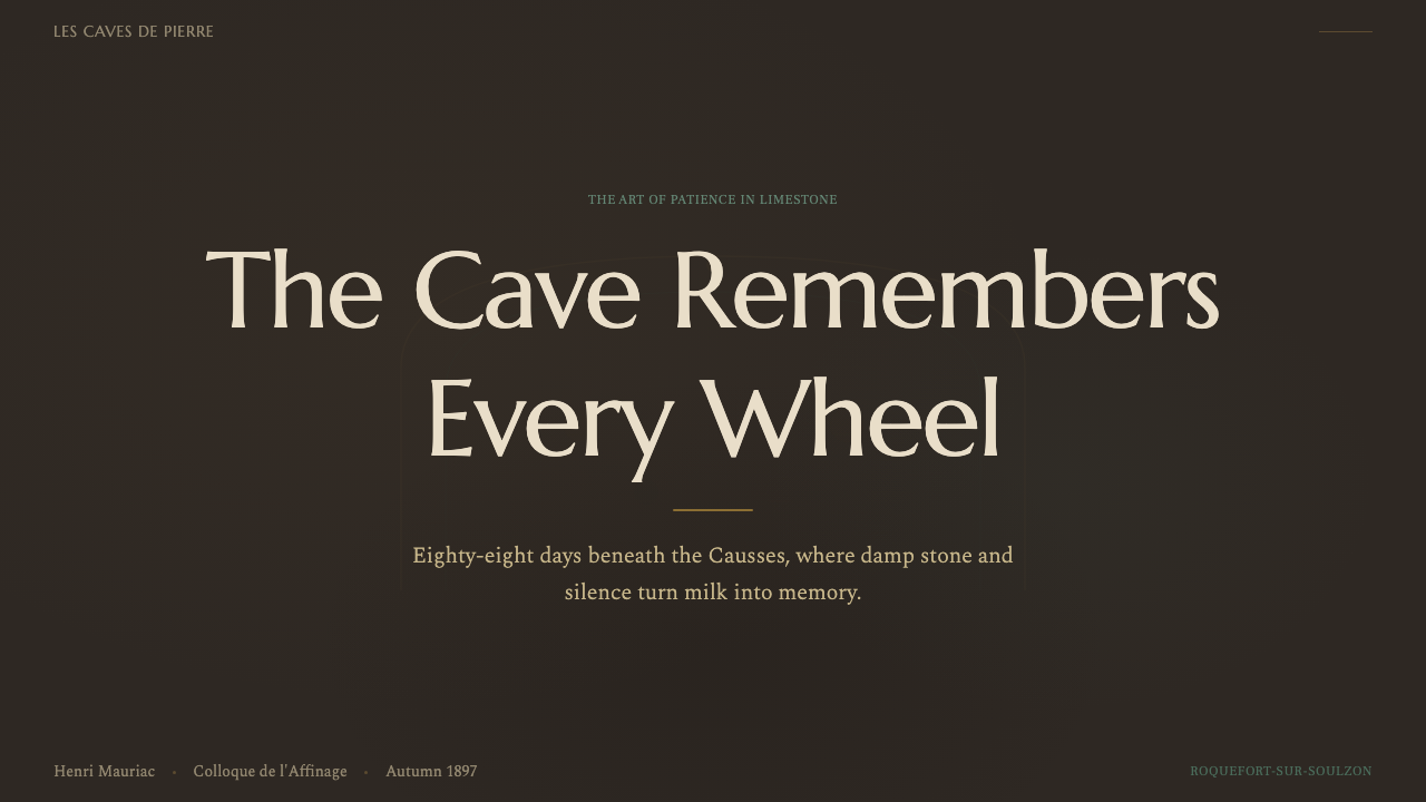
For presentation slides, this style suits cover pages and section dividers more naturally than dense content pages. A cover works well with a large, softly mottled dark field evoking cave stone, the title set in restrained type against it, and one small patch of the mold-vein color used as an accent rather than a background. Content slides should stay sparse: too much text on a dark, textured ground reduces legibility, so this style is better used for narrative, image-forward slides — a single striking photo or diagram per slide — than for data-dense tables. When data does appear, keep it high-contrast and isolate it in a lighter panel rather than setting numbers directly against the mottled dark background.
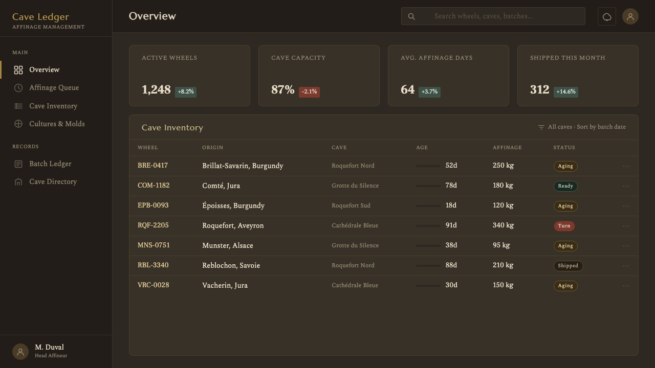
For web interfaces, the style is a strong fit for editorial or storytelling sections — an 'our process' or 'about' page for a food brand, a tasting-notes microsite, a slow-food or fermentation-focused product. It is a poor fit for transactional UI like checkout flows, forms, or dense dashboards, where the low-contrast, atmospheric palette works against quick scanning and task completion. If used in a dashboard context at all, confine it to decorative framing — hero banners, empty states — rather than to the interactive controls themselves.
For editorial and marketing work, this is where the style is most at home: long-form articles about craft and tradition, packaging design for artisanal products, brand worlds for cheese shops, wine cellars, or any 'aged in darkness' product story. Marketing pages benefit from letting the mottled texture breathe across large areas rather than cropping it into small decorative chips — the style's power comes from immersion, not accent use.
A common mistake is treating this as simply 'a brown-and-green earthy palette' and applying it uniformly bright or flat. The whole point is unevenness and low light: a version of this style with crisp, evenly-lit, high-saturation colors loses the sense of a slow biological process and starts to look like a generic 'rustic' theme instead. Keep contrast restrained, let tones vary unevenly across a surface, and resist the urge to brighten it for visibility — the darkness is structural to the idea, not an accident to be corrected.
Cheese Affinage Cave — FAQ
Is this style only for cheese or food brands?
No, though food and beverage is its most natural home. The underlying idea — dark, uneven, patiently-aged surfaces read as evidence of a slow, real process — transfers to any brand built around craft, aging, or tradition: wine and spirits, leather goods, cigars, heritage furniture restoration, even long-form journalism about traditional trades. The common thread is a story where time and hands-on attention are the value proposition, not speed.
Why does the palette avoid bright, appetizing food-photography colors?
Because bright, saturated color is the visual grammar of a different story — freshness, immediacy, mass appeal. Affinage caves tell a story about the opposite: slow transformation in darkness. Using bright colors here would contradict the substance of the tradition it represents. The muted, damp-looking palette is doing real communicative work — it is telling the viewer 'this took time' before a single word of copy does.
Does the mottled, uneven texture idea only work at large scale, like a hero banner?
It works best at a scale large enough to let the irregularity read clearly — a small chip of mottled texture can just look like noise or a dirty image. As a rule of thumb, reserve the uneven, textured treatment for backgrounds, hero areas, and dividers, and keep smaller UI elements like buttons and badges cleaner and higher-contrast so the interface stays usable even as the atmosphere stays immersive.
How is this different from a generic 'rustic' or 'earthy' theme?
A generic rustic theme borrows brown and green tones as a mood shorthand without a specific referent behind them. This system is anchored to one particular, documented process — the pierced wheel, the fleurine airflow, the specific mold strain, the oak shelving — and every visual choice traces back to something observable in that process. The difference shows up in the details: the way mold color breaks through in patches rather than sitting as an even wash, the specific cool-stone undertone behind the palette, the restrained, low-light mood rather than a sunny 'farmhouse' brightness.
What's the folklore versus the documented history here?
The often-repeated story of a shepherd forgetting bread and curd in a cave and returning to find it turned into Roquefort by accidental mold is folklore — a good origin story, told consistently in the region, but not a documented historical event. What is documented is the cheese's presence in French records since the Middle Ages, and its formal legal protection as an Appellation d'Origine Contrôlée since 1925, which locked in the requirement that it be aged specifically in the Combalou caves.
Related design styles
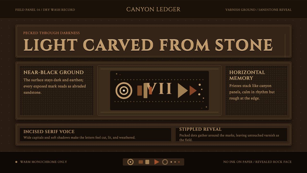 Desert VarnishStone remembers. Sandstone glyphs cut through near-black varnish in stacked f…
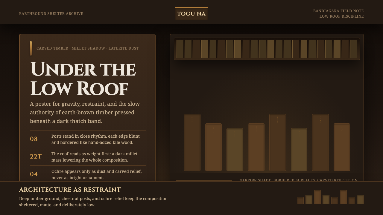 Dogon Toguna Shelter MaliGravity made visible. Deep umber ground, low roof band, chestnut posts in sha…
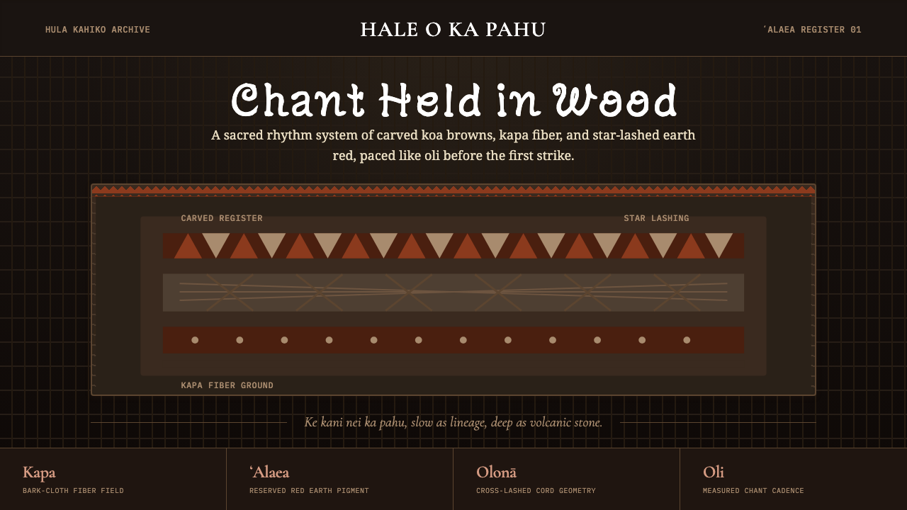 Hawaiian Hula Pahu DrumSacred weight, hand-marked. ʻAlaea red, kapa texture, and stacked carved regi…
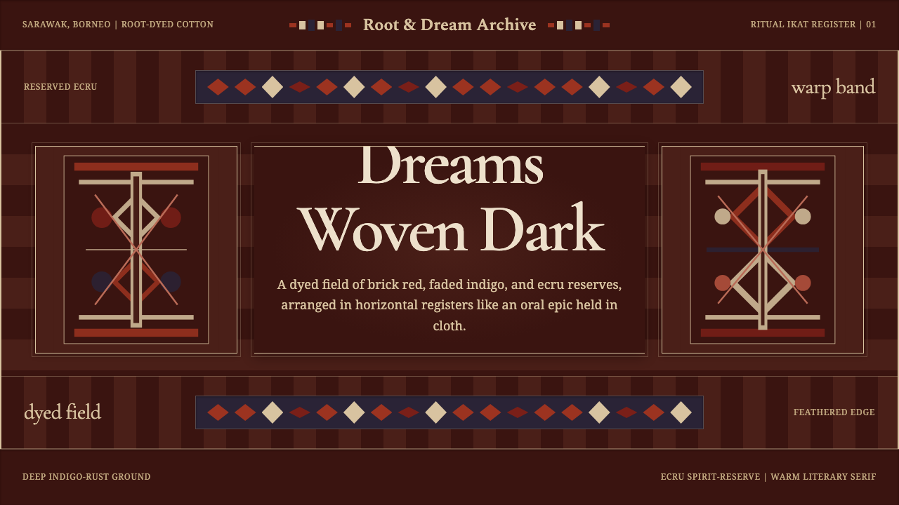 Iban Pua KumbuSacred cloth logic. Indigo-rust bands, ecru reserves, and blurred ikat edges…
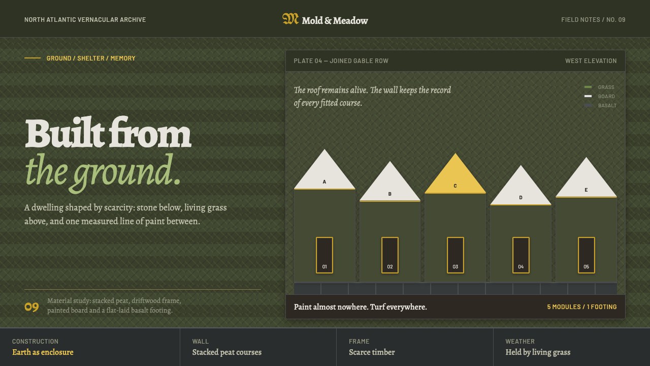 Icelandic Turf HouseThe hillside becomes shelter. Peat coursing surrounds one narrow line of yell…
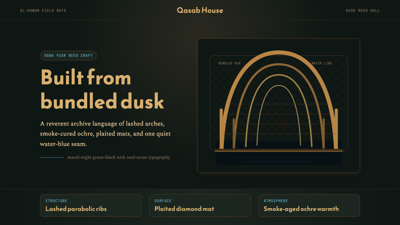 Iraqi Marsh Arab Mudhif ReedReverent reed darkness. Kufi arches, ochre lattice, and one water-blue line h…