What is Iban Pua Kumbu?
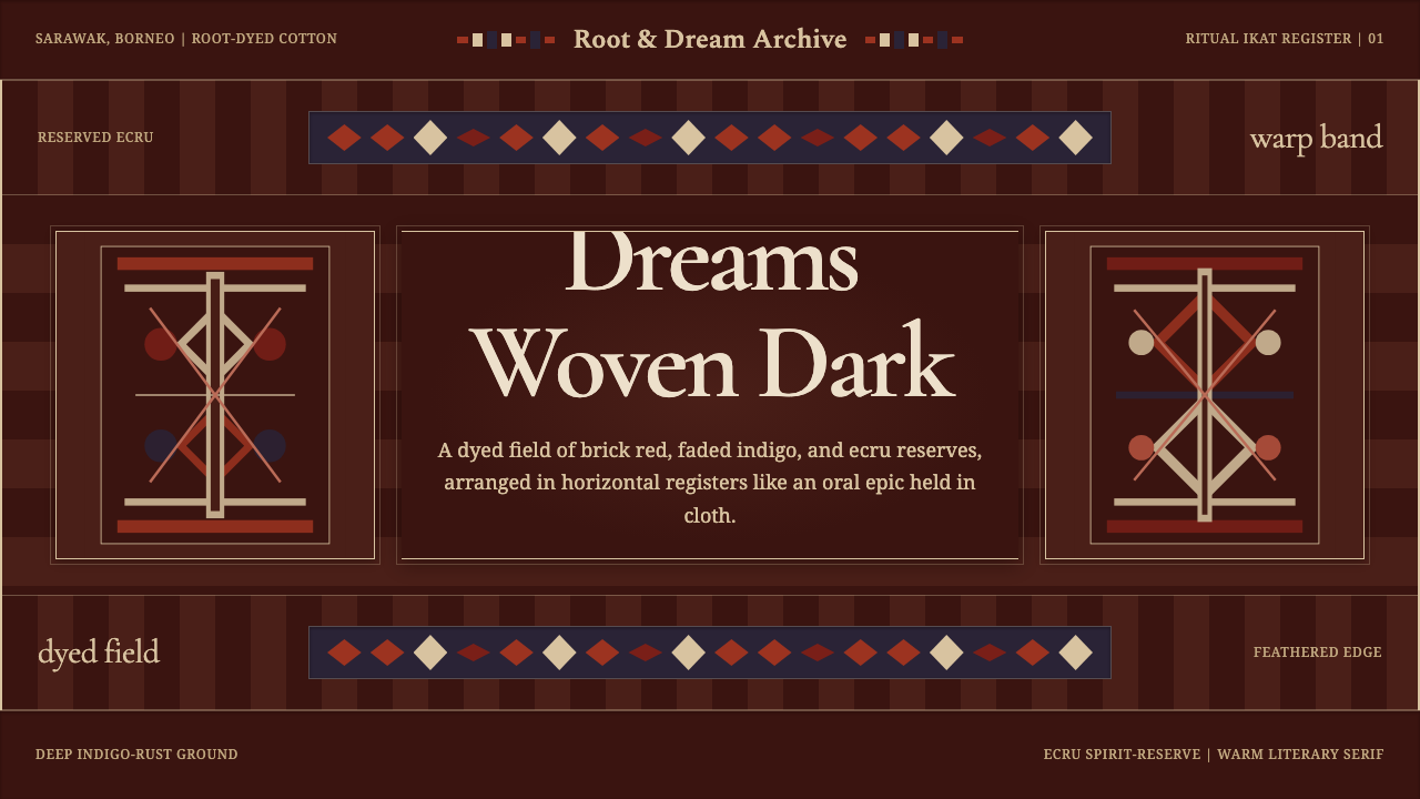
Iban Pua Kumbu turns the logic of a sacred woven blanket into a dark, banded visual language carried by indigo, rust, ecru figures, and the feathered uncertainty of ikat.
Iban Pua Kumbu in brief
Pua kumbu is the ritual ikat blanket of the Iban Dayak communities of Sarawak, Borneo. Traditionally woven from cotton on a backstrap loom, it is shaped by resist dyeing with plant-root colorants: selected threads retain an ecru reserve while the surrounding field develops layers of deep indigo, brick red, rust brown, and crème. The cloth is not simply patterned after weaving. Its imagery is anticipated in the threads, then revealed through the woven structure.
Its visual identity comes from horizontal registers, repeated figures, strong dark grounds, and edges that never appear mechanically sharp. Dye travels slightly along the threads, feathering the boundaries between reserved and colored areas. Hornbill forms and figurative deities emerge through this softened geometry, appearing at once bodily, symbolic, and abstract. Repetition gives the composition continuity, while variations in density and alignment keep it visibly handmade.
As a digital design language, Iban Pua Kumbu should preserve this woven logic rather than imitate cloth as surface decoration. A dark dyed field establishes depth; warm rust and brick tones divide information into bands; ecru motifs act as reserved light rather than applied highlights. Literary serif typography supplies an oral, narrative character, allowing the page to feel assembled thread by thread instead of constructed from anonymous interface parts.
Where does Iban Pua Kumbu come from?
Pua kumbu belongs to a sacred weaving tradition established before 1900 among Iban Dayak communities in Sarawak, on the island of Borneo. Antique textiles document the tradition, but it is not confined to the past: weaving has continued into the present. This continuity matters because the style is not an archaeological reconstruction. It is a living textile language whose recognizable forms survive through repeated acts of dye preparation, thread binding, loom work, and transmission among weavers.
The backstrap loom places weaving in direct relation to the maker’s body. Tension is maintained through the loom and the weaver’s position, making the formation of the cloth a measured physical process. Resist preparation must precede the final image: threads are arranged and protected before dyeing, then woven so that separated marks gather into figures and bands. The characteristic blurred edge is therefore not a decorative effect placed over a finished pattern. It is evidence of how image, dye, and thread meet.
The source tradition identifies Iban master weavers and the women’s warpath as central figures in its cultural frame. Together they place cloth-making within a field of disciplined knowledge, sacred purpose, and female agency. Pua kumbu is consequently more than a palette or collection of motifs. Its authority comes from the labor and ritual logic that organize the textile: repeated bands establish order, reserved figures carry presence, and the dyed ground binds the full composition together.
Natural-dye resist weaving gave the tradition its enduring chromatic character. Indigo does not behave as a neutral dark, and rust is not merely an accent; together they create the atmosphere from which ecru beings and hornbill forms emerge. Brick red and rust brown add warmth, while faded indigo introduces age, distance, and tonal variation. Because the tradition remains continuous, contemporary interpretation must balance legibility with respect, translating its compositional principles without reducing sacred imagery to casual ethnic ornament.
What defines the Iban Pua Kumbu look?
Dyed Color Field
The palette is dark, earthen, and closely related: deep indigo, faded blue, brick red, rust brown, crème, and ecru. Indigo and rust should occupy the broad field rather than compete as isolated accents. Ecru behaves like cloth protected from dye, creating illumination through reserve. The colors should feel absorbed into a shared material ground, never glossy, fluorescent, or digitally detached from one another.
Banded Registers
Composition proceeds in horizontal registers reminiscent of a blanket unfolded across the field of view. Major sections are separated through changes in color, motif density, or rhythm rather than floating containers. Bands can contain titles, narrative passages, data, or repeated symbols, but each should contribute to the larger sequence. The page is read as an accumulated textile rather than a stack of unrelated cards.
Feathered Ikat Edge
Motif boundaries are soft because resist dye migrates along threads. In interpretation, this quality should appear as restrained feathering, broken contours, or slight irregularity, not as atmospheric blur applied indiscriminately. Text remains clear, while larger symbols and separators may carry woven softness. The contrast between readable typography and unsettled motif edges is one of the style’s defining tensions.
Reserved Figures
Hornbill forms and figurative deities appear as ecru presences emerging from the darker weave. Their force comes from reserve and repetition, not illustrative detail. Digital motifs should therefore remain simplified, frontal, and rhythmically integrated with surrounding bands. Where sacred imagery would be inappropriate, abstracted thread-like figures can preserve the relationship between ground and reserve without copying a specific ritual form.
Literary Serif Type
Warm serif typography gives the system the cadence of an oral epic. Headlines should feel stately rather than luxurious, and body text should remain calm enough for sustained reading. Hierarchy comes from changes in scale, spacing, placement, and tonal contrast within the bands. A restrained supporting sans serif may serve navigation or metadata, but it should not displace the narrative authority of the primary serif.
Woven Rhythm
Repetition is essential, but exact mechanical duplication is not. Motifs recur like aligned thread groups, with small shifts in spacing, contour, or tonal intensity preventing sterility. Dense symbolic passages should alternate with quieter dyed areas so that the composition can breathe. The resulting rhythm is ceremonial and cumulative: attention moves across the work through recurrence, pause, and return.

Who shaped Iban Pua Kumbu?
Iban master weavers are the human custodians of the pua kumbu tradition. Their work joins knowledge of cotton, plant-root dyes, resist preparation, bodily loom control, and the alignment of imagery during weaving. The title identifies mastery as an integrated practice rather than a purely visual talent: the final cloth depends on decisions made long before the figures become visible.
The women’s warpath is named within the tradition’s cultural frame alongside its master weavers. It presents weaving as a field of purpose, discipline, and agency rather than passive domestic decoration. For design interpretation, the phrase is a reminder that the cloth’s intensity cannot be separated from the women whose sustained labor, judgment, and inherited knowledge carry the tradition forward.
Hornbill forms are among the recognizable presences carried by the cloth’s brick, rust, crème, and indigo structure. They are not treated as naturalistic wildlife illustration. Their bodies are absorbed into repeated bands and softened by the ikat process, moving between creature, sign, and woven rhythm. This ambiguity gives the imagery its visual authority and resists simplistic pictorial reading.
Figurative deities appear as reserved spirit-figures within the dark weave. Their pale presence depends on the surrounding dyed field: figure and ground are conceived together rather than layered separately. In contemporary use, they establish the sacred register of the source material and therefore demand restraint. Their role is better understood structurally and culturally than copied as a decorative emblem.
How do you use Iban Pua Kumbu today?
For presentation covers, begin with a dark indigo-rust field and a broad horizontal register that carries the title in a warm serif. An ecru abstract motif can emerge from one side as reserved cloth, while quieter bands establish depth above or below it. Content slides should retain the same woven sequence: headings belong to distinct registers, body copy sits in calmer areas, and separators resemble repeated thread marks rather than generic rules.
Data slides work best when information is organized as bands, sequences, and repeated units. Timelines can travel horizontally like woven registers; categorical comparisons can use related indigo, brick, rust, and ecru tones without turning every value into a competing color. Labels must remain crisp even when surrounding motifs have feathered edges. The objective is not to texture a chart, but to make its ordering feel woven into the larger narrative.
For web interfaces, the style suits cultural archives, editorial dashboards, collection browsers, and pricing pages that benefit from gravity and narrative continuity. Navigation can occupy a narrow dyed band, while content sections alternate between dense motif-bearing registers and quiet reading fields. Pricing tiers should be distinguished through tonal fields, border rhythms, or reserved emblems rather than glossy cards. Interactive states may brighten toward ecru or warm rust while preserving the dark textile atmosphere.
Editorial and marketing layouts should use the style’s oral-epic quality. Long-form articles gain from stately serif titles, measured text columns, and section openings marked by a shift in band or motif density. Campaign pages can unfold as chapters, moving from dark introduction to warmer evidence and back to a concentrated closing register. Photography, when present, should be integrated as a tonal field or carefully framed document, not pasted over sacred motifs.
The most common mistake is treating Iban Pua Kumbu as a generalized woven texture. Repeating a decorative pattern behind every panel, sharpening the ikat edges, or combining every source color at equal intensity destroys its hierarchy. Another mistake is copying hornbill or deity imagery without regard for its ritual origin. A responsible interpretation begins with structure—dark ground, reserve, bands, rhythm, and softened boundaries—and uses abstract motifs whenever the cultural role of a specific figure cannot be honored.
Iban Pua Kumbu — FAQ
Is Iban Pua Kumbu simply a type of ikat pattern?
No. Ikat describes the resist-dye relationship between thread preparation and the image revealed through weaving, but pua kumbu is a specific ritual blanket tradition of the Iban Dayak of Sarawak. Its identity includes backstrap-loomed cotton, plant-root dyes, banded composition, reserved spirit-figures, hornbill forms, and a sacred cultural frame. Reducing it to a generic ikat pattern removes the very relationships that make it distinct.
Why are the motif edges blurred?
The softness comes from the resist-dye process. As prepared threads receive dye, color can travel slightly along their fibers, so the boundary between the protected ecru area and the dyed ground becomes feathered. When the threads are woven together, small differences in alignment intensify this living edge. It is a material consequence of the process, not an imitation of shallow focus or a decorative blur.
Can the style be adapted to a light interface?
A light adaptation is possible, but the source system depends strongly on figures emerging from a deep indigo-and-rust ground. Reversing that relationship can weaken its identity. A successful light version should retain darker banded registers around major narrative areas and use ecru as a cloth-like field rather than pure emptiness. Rust, faded indigo, and restrained feathering can then preserve continuity without pretending the entire interface is a dark textile.
Should authentic deity and hornbill motifs be copied into commercial layouts?
Not automatically. The source material identifies pua kumbu as ritual and sacred, so recognizable figures carry more than visual interest. If their cultural role cannot be represented with care, designers should work with the cloth’s abstract principles instead: reserved forms, horizontal registers, softened contours, related earth colors, and cumulative repetition. Structural translation can evoke the design language without turning a sacred figure into an interchangeable brand asset.
How is this style different from adding a textile texture to a page?
Texture changes the appearance of a surface; pua kumbu logic changes how the whole composition is organized. Information must gather into bands, pale forms must read as reserves within a darker field, repetition must create narrative rhythm, and softened motif edges must coexist with clear text. A page can contain no literal fabric texture and still express the system convincingly. Conversely, a woven background alone does not reproduce its structure, process, or sacred gravity.
Related design styles
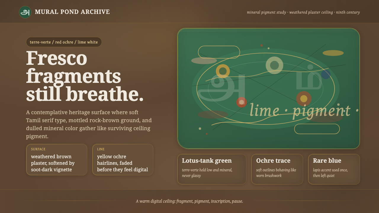 Sittanavasal Jain Cave FrescoBreathes through age. Terre-verte green and ochre lines fade into brown plast…
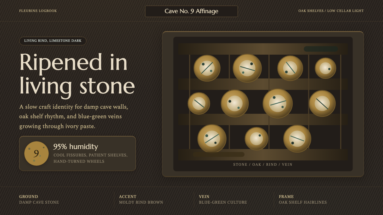 Cheese Affinage CavePatience reads as stone. Rind brown, mold green, and oak shelf grids glow in…
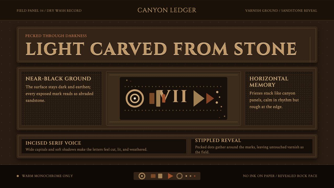 Desert VarnishStone remembers. Sandstone glyphs cut through near-black varnish in stacked f…
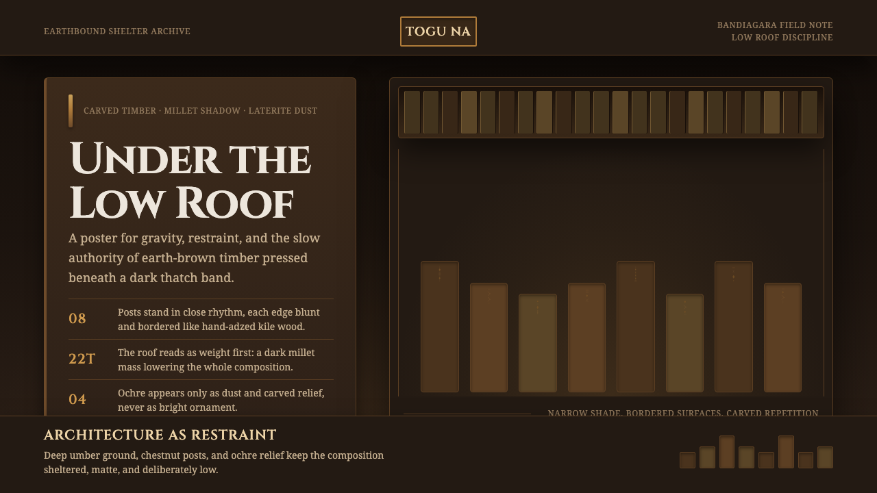 Dogon Toguna Shelter MaliGravity made visible. Deep umber ground, low roof band, chestnut posts in sha…
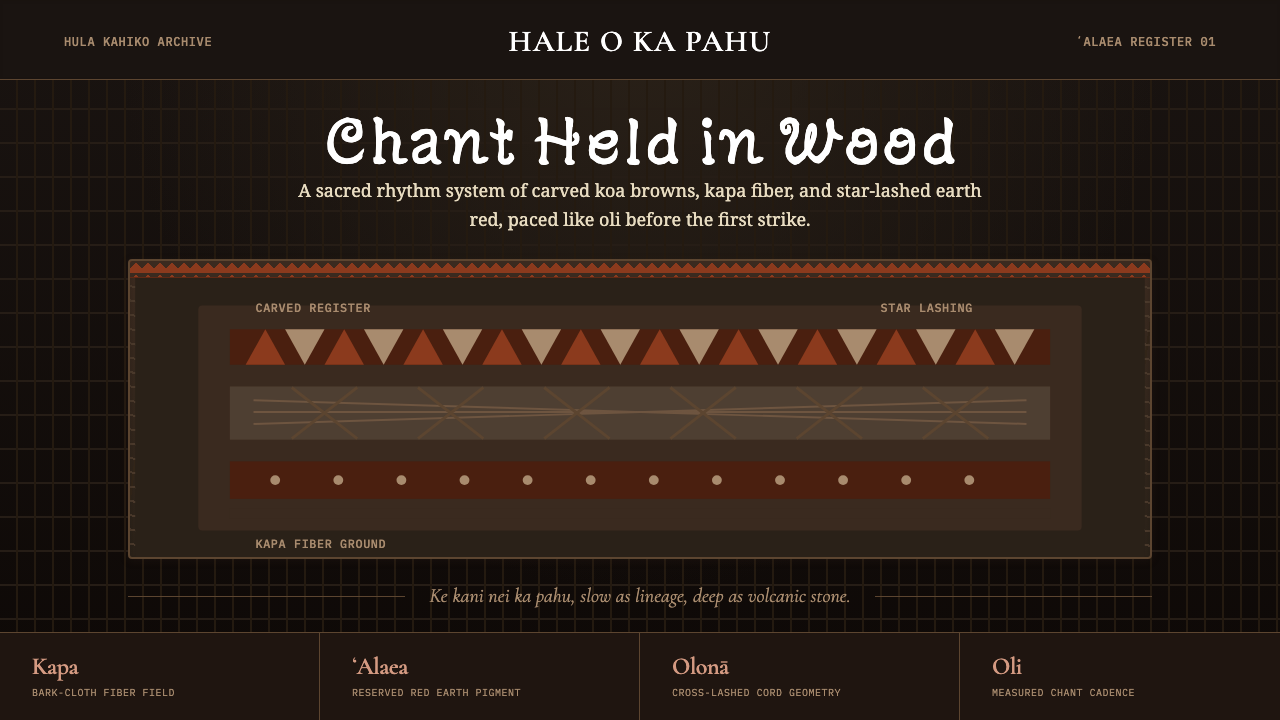 Hawaiian Hula Pahu DrumSacred weight, hand-marked. ʻAlaea red, kapa texture, and stacked carved regi…
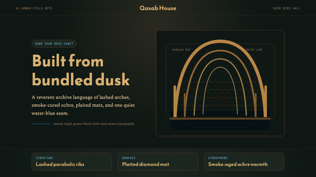 Iraqi Marsh Arab Mudhif ReedReverent reed darkness. Kufi arches, ochre lattice, and one water-blue line h…