What is Altai Kai Epic?
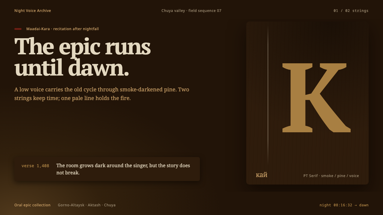
Altai Kai Epic is a design language cut from firelight: smoke-dark browns laid on browns, one pale string, one dull red, and a voice that carries a hero epic until dawn.
Altai Kai Epic in brief
Altai Kai Epic is a dark, tonal visual system drawn from a single object in a single setting: the topshur, a two-string lute of the Altai people of southern Siberia, seen by firelight inside a felt-walled dwelling called an aiyl while a singer performs a hero epic in the guttural voice known as kai. Where most dark interfaces are black, this one is brown. It is the brown of old pine and cedar that decades of woodsmoke have turned almost the colour of the night around it.
Its defining move is separation without lines. Surfaces are laid brown on brown and told apart by tone, a slightly warmer plane here and a slightly deeper one there, rather than by rules, borders or boxes. Against that quiet field the system allows exactly two interruptions: one thin pale line, the colour of a horsehair string catching light, and one dull textile red, the colour of a worn wall hanging, appearing no more than once on any screen.
The light has a single source, and it sits low. Brightness falls off quickly with distance from it, so the edges of a layout recede into darkness while the centre of attention glows only faintly. The effect is of an object that has been handled for generations, worn and warm and slightly dim, rather than a piece in a glass case. This is design as presence, not display, and it suits any subject that deserves to be heard and read slowly.
Where does Altai Kai Epic come from?
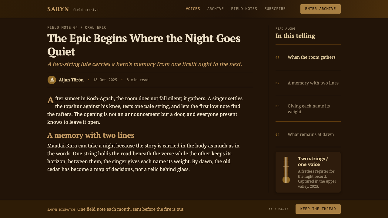
Kai is the Altai word for the guttural voice used to carry hero epics, and the tradition behind it is older than any written record of it. The Altai live in the Altai Republic, a mountainous corner of southern Siberia where Russia meets Kazakhstan, China and Mongolia, and their epics belong to the wider family of Turkic-Siberian oral epic that runs across the steppe and mountain belt of Inner Asia. The source material describes the practice as an oral tradition that predates 1900 and has been performed continuously ever since, which is the honest way to describe something that was never founded on a date. It passed from singer to listener to singer, and it is still going.
The epics themselves are long narrative cycles about heroes and the worlds they cross, and three of them come up again and again: Maadai-Kara, Altai Buuchai and Kogutei. A performer who takes one on is committing to a whole night. The telling begins in the dark and ends at dawn, and the singer, the kaichy, carries the story in memory and shapes it anew in each performance rather than reading it from a page. Because the form is oral, there is no single definitive text to point to; the tradition is the sum of its tellings.
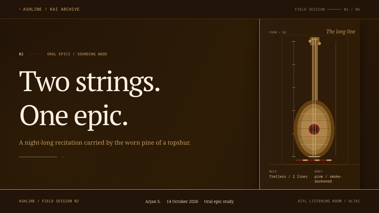
Kai itself belongs to the family usually described as overtone and guttural singing. The singer shapes throat and mouth so that a low, rough fundamental carries bright, whistling partials above it, and the sound is less like one person singing than like a landscape speaking. In epic performance this voice is paired with the topshur, a fretless two-string lute cut from a single block of pine or cedar. Its body is pear-shaped and its peghead is carved, and because the instrument lives close to the hearth, the wood goes dark with smoke over the years. That single-block construction is a craft of its own, which the source lists alongside the singing as part of the heritage.
The tradition is not a museum piece. The source places current ensemble practice from about the 1990s to the present, names the Altai Kai ensemble among its key figures, and locates the living tradition in places such as Gorno-Altaysk, Aktash and the Chuya valley. The design system built on it does not copy a pattern, costume or ornament from this culture. It borrows a condition instead: an old instrument, smoke-dark, lit from low by a fire. It turns that condition into tone, restraint and two carefully rationed accents, and that choice is what keeps it a study in atmosphere rather than a costume.
What defines the Altai Kai Epic look?
Smoke-brown palette
The palette is almost entirely brown: the brown of pine and cedar darkened by years of hearth smoke, ranging from near-black depths to warmer, slightly lifted planes. Nothing is pure black and nothing is pure white. Text is a soft, warm pale rather than a stark one, so that even the lightest element reads as lit by flame instead of by a screen.
Tone instead of rules
Layers are separated by tone, not by rule. Where another system would draw a border, this one steps the background a shade deeper or warmer; where another would add a divider, it leaves a wider quiet gap. The result is a surface that feels carved from a single block, fitting for an instrument made from one piece of wood. It demands a disciplined hand, because without lines every tonal step has to be deliberate and clearly distinguishable.
The pale string
One pale hairline is the brightest linear element in the composition. It stands for the horsehair string, and like the string it is thin, taut and singular: a single rule under a title, a single track in a chart, a single stroke of emphasis. Using it twice weakens it, and using it everywhere turns it into decoration, which is exactly what the system refuses.
The one dull red
A muted textile red, closer to a faded wall hanging than a signal colour, appears no more than once on a screen. It marks the one thing that matters: a primary action, a key figure, a single highlighted word. Because it is dull rather than bright, it warms the composition instead of alarming it, and because it is rationed, it never loses its pull.
Low, fast-falling light
Illumination comes from a single low source and falls away quickly. In practice this means soft vignetting toward the edges, brighter content near the focal point, and shadows that pool rather than outline. Depth is created by darkness gathering, not by raised cards or glossy highlights. The eye is led toward the lit region and the rest of the layout is allowed to fall back into the room.
Worn, handled surfaces
Surfaces look handled, not polished. There is no glass, no gloss, no neon glow and no crisp metallic edge; materials read as wood, felt, wool and horsehair. This is a deliberate stance toward the subject: the instrument is a working object that has been played for years, so the interface should feel used and warm rather than pristine and displayed.
Quiet typography
Type follows the same logic. Pale text sits directly on dark planes with generous space around it, hierarchy comes from size, tone and spacing rather than heavy weight or colour, and nothing shouts. Reading is meant to be slow, closer to listening than scanning.
Who shaped Altai Kai Epic?
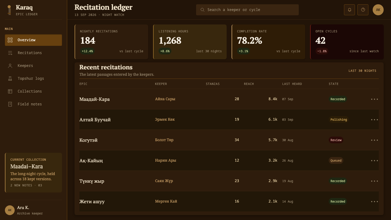
The ensemble is the contemporary performing face of the tradition, with the source dating current ensemble practice from about the 1990s to the present. Ensembles bring the guttural voice and the topshur to audiences beyond the aiyl, and for a designer they are a reminder that the style depicts a living practice with working musicians, not a vanished culture. Credit and context matter when drawing on it.
The kaichy is the epic singer, the person who holds the story in memory and delivers it through kai from nightfall to dawn. The role combines memory, stamina and voice, and it is the human centre of the tradition. The design system is, in a sense, the kaichy's view of the topshur: close, warm, dim, and quiet around a single line of sound.
Maadai-Kara is the epic cycle singled out among this system's key figures and the first of three hero epics named in its introduction. As a cycle, it is performed over long stretches of the night, which is why the style is built for sustained attention rather than quick scanning.
Altai Buuchai and Kogutei are the other two epics named alongside Maadai-Kara. Together the three show the scale of the repertoire: stories long enough to occupy an entire night, each carried by the singer's memory. They explain the system's patience, with its long pauses, slow reading rhythm and content that is allowed to take its time.
How do you use Altai Kai Epic today?
Altai Kai Epic works best when the subject matter shares its patience. It is a system for content that wants to be read slowly in low light, and it asks designers to treat darkness as a material rather than a mode. Before applying it, decide what the one pale line and the one red will mean on every page; those two decisions organise everything else.
For presentation slides, the cover is the strongest page: a deep brown field, a slightly lighter plane that fades in from one side, a title in warm pale type, a single hairline beneath it, and nothing else. A small red mark can sit in one corner, but only if it earns its place. Content slides should be built from tonal planes rather than boxes: let a quiet band of slightly warmer brown hold a pull-quote or a figure, and leave the rest dark. Data slides work when one series takes the pale line and all the others are quiet tones of brown; the single red belongs to the number you want the room to remember.
For web interfaces, the style suits reading-first products: audio and music players, archive and library browsers, long-form stories, documentation for craft or heritage subjects, and dashboards used in dim rooms. Navigation should be typographic and understated, with the active item marked by the pale line. Cards are tonal planes without borders, hover states warm the plane rather than outlining it, and the red is reserved for the one primary action per view. Pricing pages and dense form layouts are harder, since they need many clear separations; solve this with spacing and tonal steps rather than reintroducing rules.
In editorial and marketing work the system suits profiles, oral-history pieces, album and concert pages, museum and archive campaigns, and long scrolling stories. Photography should be warm, dim and close-grained; lighten it only enough to feel lit from below. Pull quotes can sit on a lifted brown plane, and section breaks can be a wide pause in the dark instead of a divider. When writing about the Altai tradition itself, name the people and places accurately, and treat the system as an atmosphere that supports the story, not a costume laid over it.
The most common mistake is to turn the smoke brown into a generic coffee-coloured dark mode and then scatter accents across it: red buttons, red links, red icons, pale rules between every section. That removes the two rationed gestures that give the system its character. A second mistake is adding glow, gloss or sharp white highlights, which make the surface look like new glass instead of an old instrument. Keep one pale line, one red and one low light, and let the rest stay brown.
Altai Kai Epic — FAQ
What is kai?
Kai is the Altai word for the guttural, overtone-rich voice used to carry hero epics such as Maadai-Kara, Altai Buuchai and Kogutei. A singer, or kaichy, performs the epic from memory, traditionally through a night that ends at dawn. It is a living practice in the Altai Republic of southern Siberia, and it belongs to the broader family of overtone and guttural singing.
What is a topshur, and why does it shape the design?
A topshur is a fretless two-string lute cut from a single block of pine or cedar, with a pear-shaped body and a carved peghead darkened by smoke. The design system takes that instrument, seen by firelight inside an aiyl, as its whole premise: brown on brown, one pale horsehair line, one dull textile red, and light from low down.
How is this different from an ordinary dark mode?
An ordinary dark mode inverts a light design: black grounds, white text, borders to separate boxes. This system is dark by origin. Its grounds are layered browns separated by tone rather than lines, its text is a warm pale rather than white, its brightness falls away from a single low source, and it limits accents to one hairline and one red per screen.
Can it be used on a light background?
Not without losing the point. The whole idea is a dim room lit by fire, so a light version would need to be reinterpreted rather than inverted. If a light surface is unavoidable, treat it as aged paper or felt instead of white, keep the same tonal layering without borders, and still allow only one thin dark line and one muted red. For most work it is better to choose a different system than to force this one to be bright.
When should I avoid it?
Avoid it for products that depend on brightness, speed or cheerfulness: children's products, retail promotions, high-energy marketing and dashboards that need many saturated status colours. It is also a poor fit for dense interfaces that need many visible separations. Its strength is calm, sustained attention, and its natural subjects are music, craft, heritage and long-form storytelling.
Related design styles
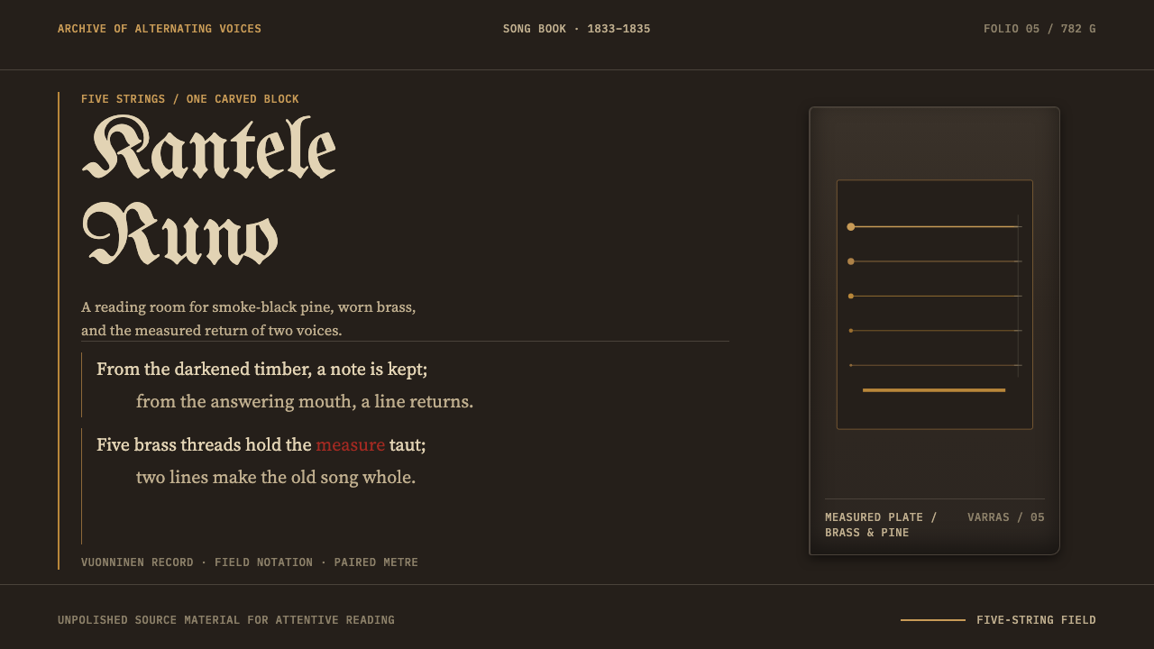 Karelian Kantele & RunoSong becomes an instrument. Soot-black pine, five brass rules, and paired Gar…
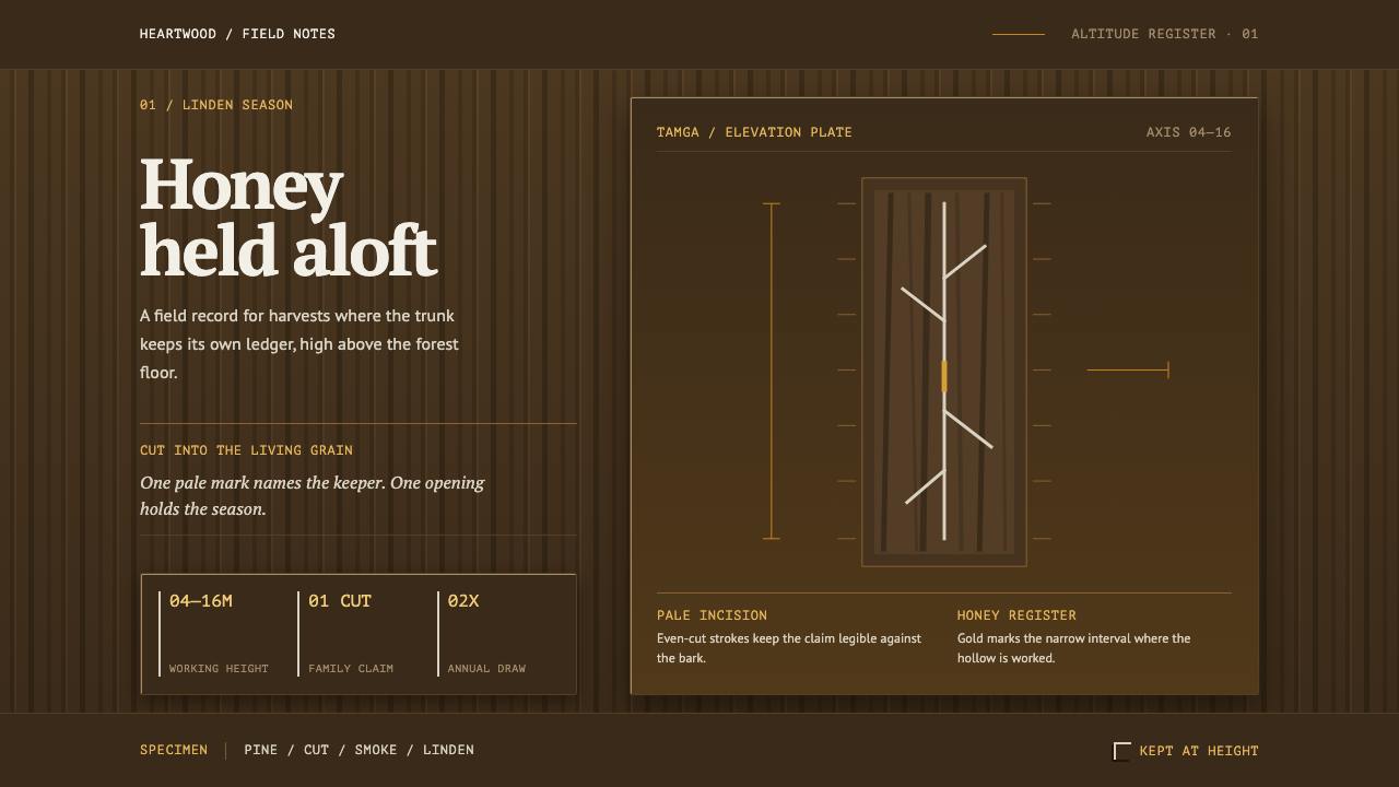 Bashkir Wild HoneyA working forest held on one axis. Pale tamga cuts and honey gold rise throug…
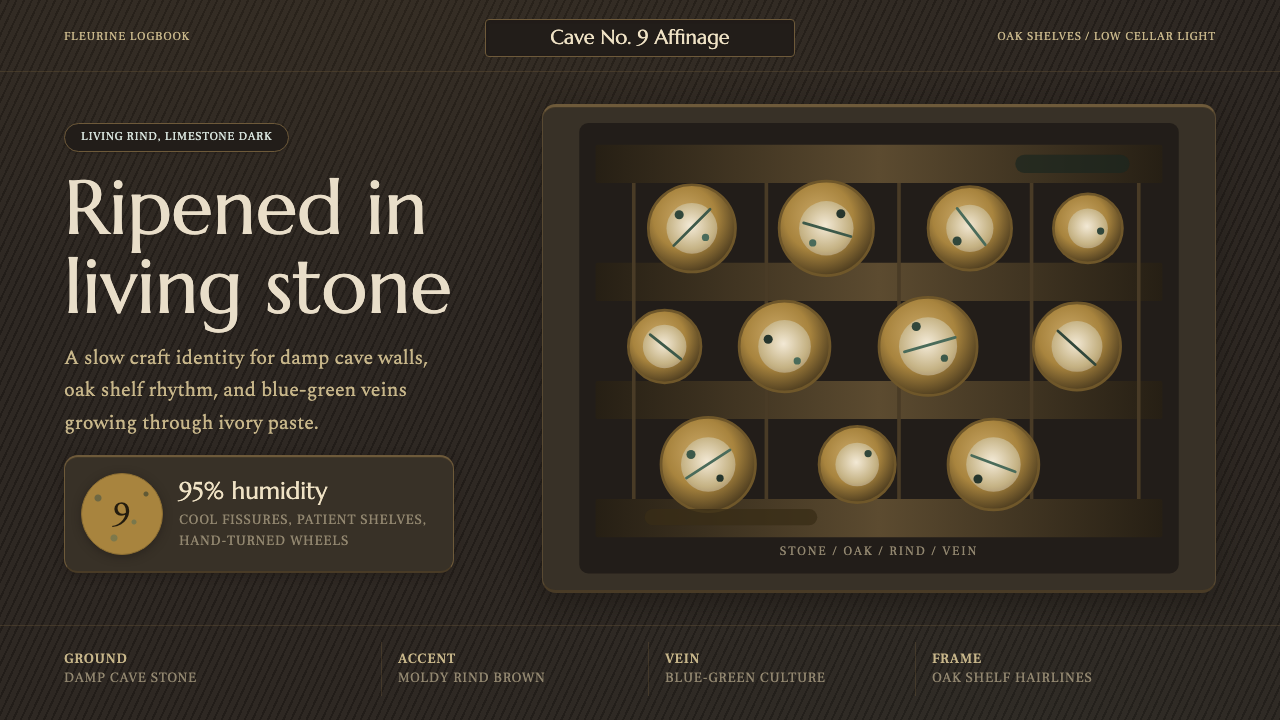 Cheese Affinage CavePatience reads as stone. Rind brown, mold green, and oak shelf grids glow in…
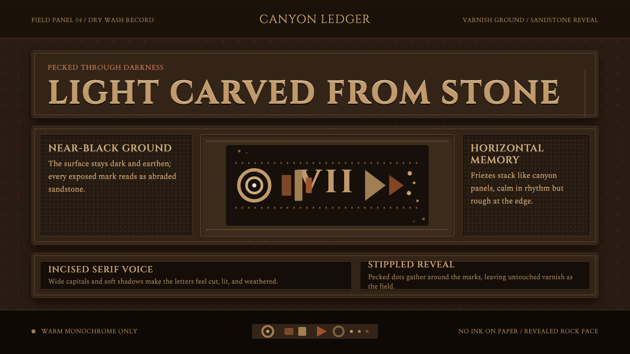 Desert VarnishStone remembers. Sandstone glyphs cut through near-black varnish in stacked f…
 Dogon Toguna Shelter MaliGravity made visible. Deep umber ground, low roof band, chestnut posts in sha…
 Georgian Qvevri Supra FeastHospitality made earthen. Terracotta ground, amber wine, Georgian serif curve…