What is Karelian Kantele & Runo?
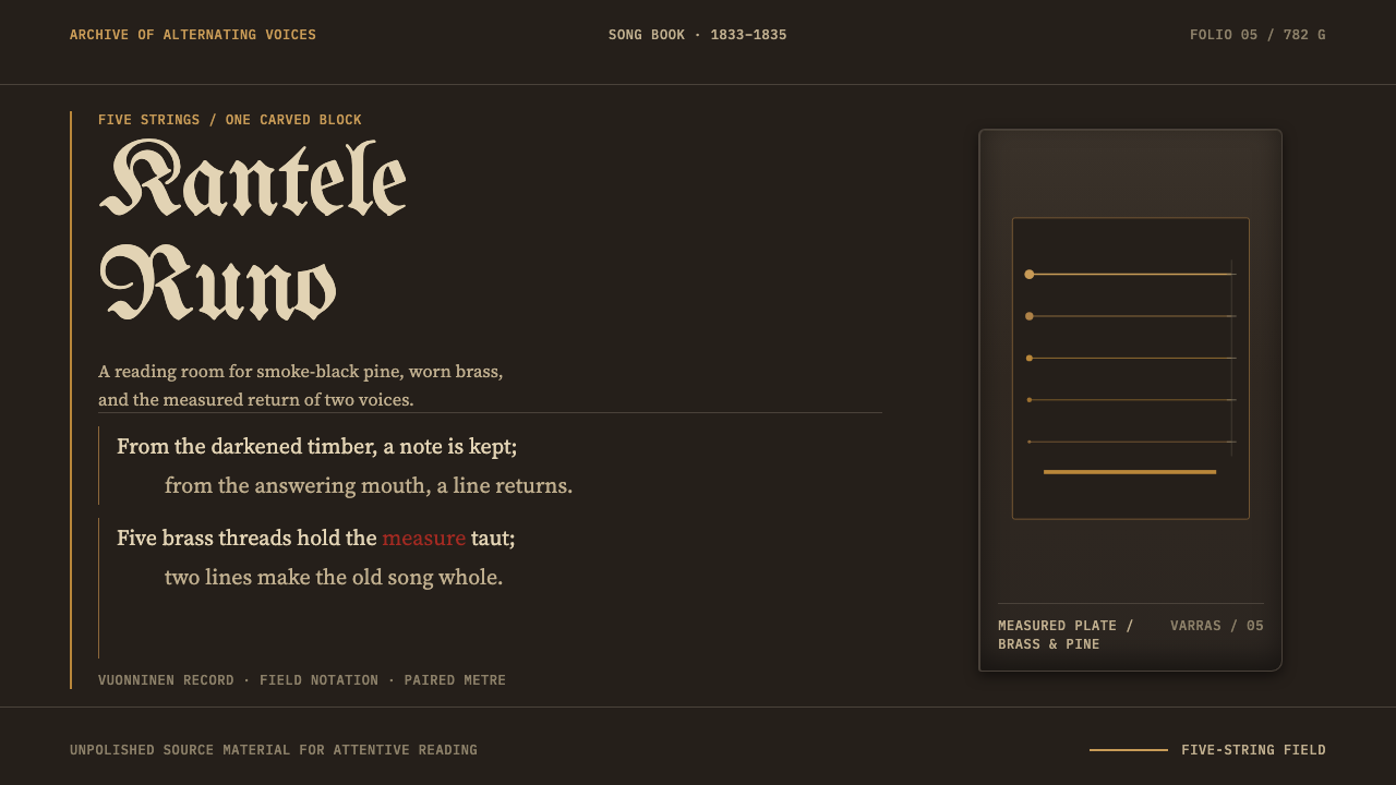
Song becomes an instrument in this style: soot-black pine, five brass rules for strings, and verse set in paired lines, just as the old Karelian runo songs were sung.
Karelian Kantele & Runo in brief
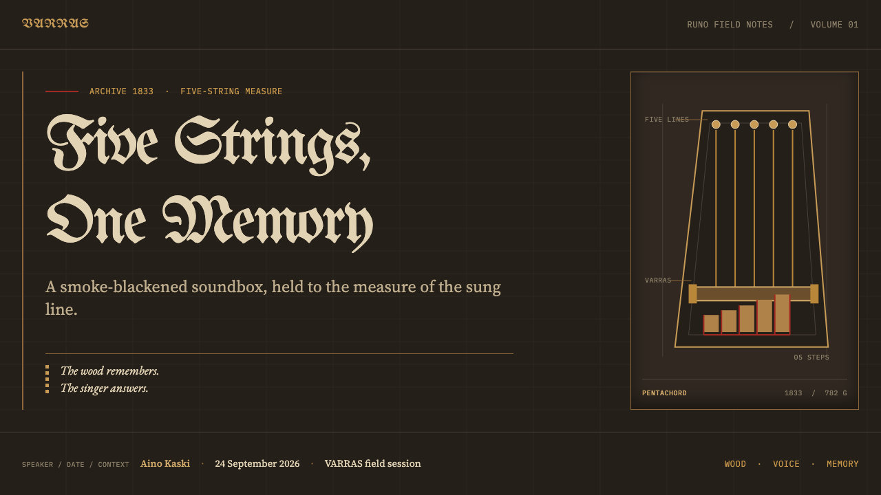
Karelian Kantele & Runo takes the old five-string kantele as its page. The instrument is a plucked zither cut from a single block of pine and hollowed from below, with a soundboard only a few millimetres thick. Its body is black, not from paint but from years of hanging in the smoke cabin, the savupirtti, where the fire's soot settled into the wood. One instrument, belonging to the singer Ontrei Malinen, has the year 1833 cut into its short side and weighs 782 grams. The style treats such a specific, humble, handmade object as the origin of an entire visual language.
The ground is therefore soot-black pine, and the working colour is worn brass, the dull gold of strings and fittings that have been handled for years. Five fine lines run across the field like strings, and a hard crossbar, the varras, holds them in place. Text is set in paired lines in the four-beat trochaic rhythm of the Kalevala metre, because runo songs were sung in couplets, one line answered by another. Typography is chosen by function: a blackletter face for the title, as on the title page of 1835, an old-style serif for verse, a calm text serif for archive notes, and a small sans-serif for dates and labels.
What separates this style from a generic folk look is its refusal to polish. The wood grain carries coal dust, the hollowed face keeps its tool marks, the brass is dark rather than bright, and the handwritten staff lines show their corrections. Imperfection is treated as evidence of use and of the hand. The result is a page that feels like an object that has been played, not a surface that has been rendered.
Where does Karelian Kantele & Runo come from?
The kantele is the plucked string instrument of Finland and Karelia, and the old five-string type is the form closest to its origins. In the source material's example, the whole body, soundboard and frame are cut from one piece of pine, hollowed out from the back so that the thin soundboard can resonate. It is an economical object, with no joinery to speak of and no ornament beyond the marks of its making. The soot that blackens it comes from the smoke cabin, the savupirtti, a chimneyless dwelling in which the fire's smoke filled the room. A kantele hung there was blackened as a by-product of daily life.
The instrument at the centre of this style belonged to Ontrei Malinen, a singer from the village of Vuonninen in Viena Karelia. His kantele has the year 1833 cut into its short side. In 1834 Elias Lönnrot met him, judged him the best singer of his time, and wrote down what he sang. The first edition of the Kalevala followed in 1835, with a preface dated 28 February of that year. The style's date range, 1833 to 1835, therefore spans the making of the instrument, the meeting between singer and collector, and the book that emerged from it.
The songs Lönnrot recorded were runolaulu, runo singing, in the metre that now bears the epic's name. Its line has four beats in a trochaic rhythm, is rich in alliteration, and was typically sung as paired lines, in which one line is answered or echoed by the next. This couplet structure is why the style sets verse in pairs rather than as continuous prose. The kantele's role was to accompany and shape the singing, which is why the style treats voice and instrument as a single object: the strings are the lines, and the lines are the strings.
The wider setting is the nineteenth-century enthusiasm for collecting folk song, and the movement that grew from it, Karelianism, which made Karelia a symbolic homeland for Finnish art and letters. The Kalevala was compiled from oral song, and the region the source material names, Viena Karelia and the Karelian isthmus, now lies on both sides of the Finnish–Russian border, a line that did not exist for the singers themselves. The style's palette of soot, brass and paper is therefore a quiet statement about continuity: the same song, the same smoke and the same wood, whichever side of the border one stands on.
What defines the Karelian Kantele & Runo look?
Soot-Black Pine Ground
The ground is a black that has a source: pine darkened by years of smoke, not a screen switched off. It is warm at the edges, slightly brown in its depths, and it keeps the grain of the wood visible beneath the darkness. Everything else on the page lies on this surface like a thing resting on an instrument.
Worn Brass
Brass is the working colour: a dull, darkened gold for strings, rules, links, fittings and accents. It is never mirror-bright. It looks like metal that has been touched and has dulled, and it contrasts with the soot ground softly enough that the page stays warm and low-lit even at its brightest points.
Five Hairline Strings
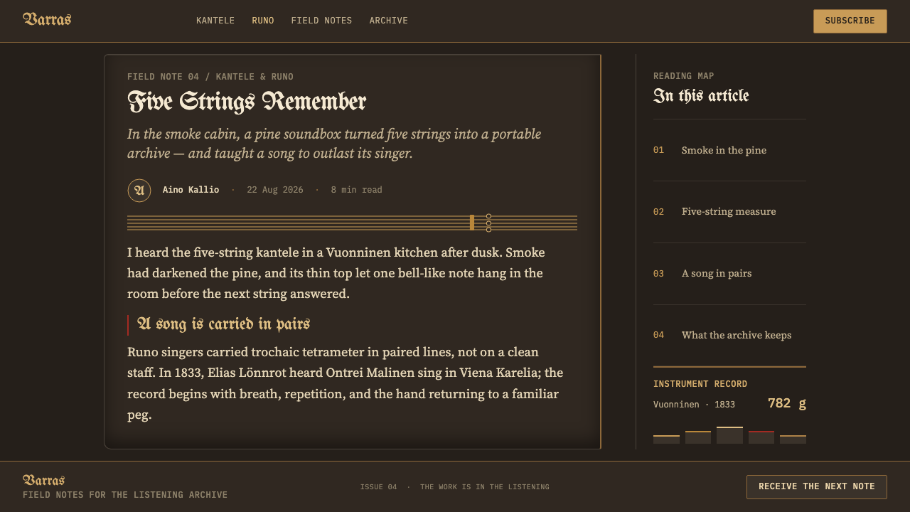
Five fine lines run across the field like the strings of the instrument. They work as dividers, as a background rhythm, as a baseline for text and as the grid beneath data. They are thin enough to disappear when you read and present enough to be felt, so that the page is always faintly tuned.
The Varras Crossbar
Against the hairlines stands one hard, thick horizontal bar, the varras that holds the strings at one end of the instrument. In layout it becomes a header rule, a footer anchor or a heavy divider between major sections. The contrast between the fine strings and the stout bar gives the system its one dramatic structural gesture.
Paired Verse
Verse is set in couplets: two lines, then a clear break, then two more. Lines are left-aligned and keep their natural length, so the trochaic rhythm can be felt in the ragged right edge. Centring is avoided because it destroys the pairing. The page behaves like the song: one voice, one answer, one breath.
Four Typographic Voices
Each kind of text has its own face. A blackletter voice carries titles and ceremonial moments, echoing the first edition's title page. An old-style serif sets the verse. A calm text serif carries archive notes and commentary. A small sans-serif handles dates and labels. The roles are so clearly separated that a reader always knows what kind of text they are in.
Marks of Use
Coal dust sits in the grain, tool marks remain on the hollowed face, the brass has tarnished and the handwritten staff lines show where they were corrected. None of this is smoothed away. Texture and imperfection are the style's evidence that someone made and played the object, and they are what separate it from a clean, synthetic dark theme.
Who shaped Karelian Kantele & Runo?
A singer from the village of Vuonninen in Viena Karelia, and the owner of the kantele at the heart of this style. His instrument has 1833 cut into its short side and weighs 782 grams. Lönnrot met him the following year and, according to the source material, judged him the best singer of his time. Through his songs, one man's voice entered the written record of a whole tradition.
The collector who met Malinen in 1834 and wrote down his songs, and who then compiled the Kalevala, the first edition of which carries a preface dated 28 February 1835. His notebooks are the bridge between an oral tradition and a printed book. The style's handwritten staff lines, archive notes and title-page blackletter all gesture at that bridge.
The source material also points to a tradition larger than its two named individuals: the runolaulu singers of Viena Karelia and the Karelian isthmus who carried the Kalevala metre in memory before anyone wrote it down. Malinen is one voice among many, and the style quietly honours that by treating the song, not the person, as the primary object.
How do you use Karelian Kantele & Runo today?
Karelian Kantele & Runo is a dark, literary and tactile style. It suits subjects where voice, text and archive matter: poetry, literature and publishing, music and audio products, folklore and heritage projects, documentary and long-form journalism, craft brands, and any experience that wants the weight of something handed down. It is not a style for speed or novelty. It is a style for things that sound as if they were meant to be read aloud.
On slides, a cover can show the soot-black ground with five fine brass lines crossing it, the title in a blackletter face at the left, and a brass crossbar anchoring the lower edge. Content slides can set text in couplets: two lines at a time, with a clear gap between pairs. Quotations and verses work particularly well. For data slides, the five lines suggest a gridded chart in which gridlines are the strings and data points are plucked notes, with brass reserved for the series that matters and a quiet neutral for the rest. Keep the number of elements low even though the surface is textured.
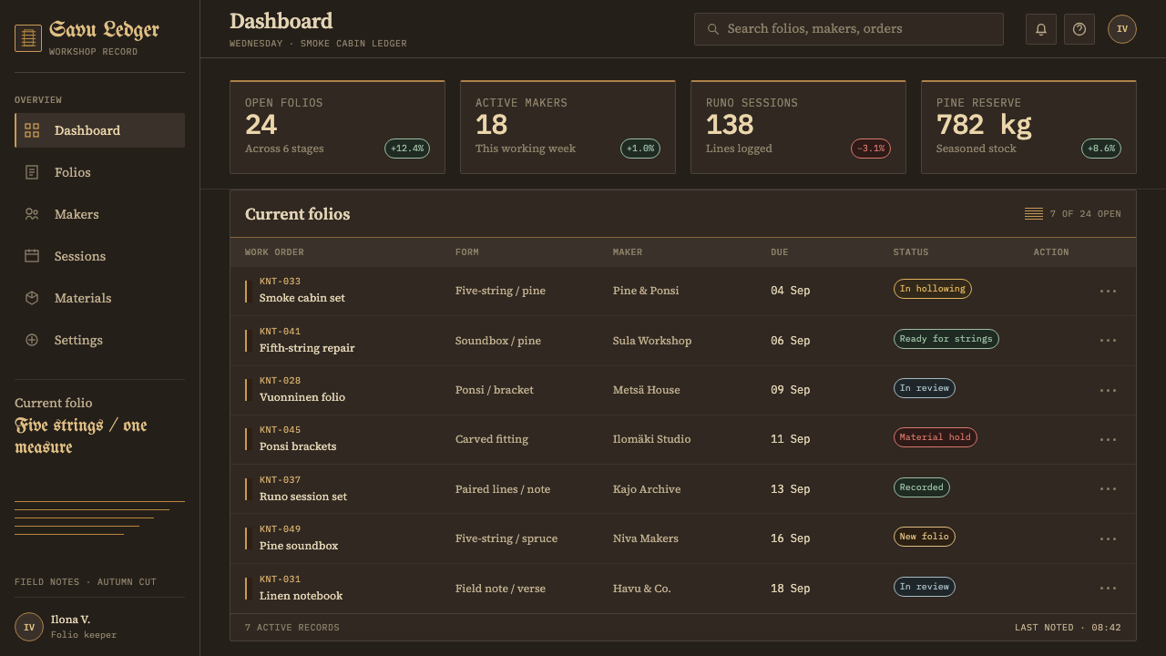
In web interfaces, the style suits reading apps, archives, audio players, lyric and poetry sites, and documentation for creative tools. Use the black ground, brass for links and primary actions, and a hairline-and-crossbar system for dividers and headers. Text blocks should be narrow and left-aligned, with paired lines for verse and quotations. For dashboards, treat the five lines as an underlying grid for the metrics and build hierarchy through weight and brass accent rather than through boxes. On pricing pages, present plans as neighbouring strings of a single instrument, columns separated by hairlines, with the recommended plan struck in brass.
For editorial and marketing work, the style supports essays, annotated editions, album and book campaigns, exhibitions and festival pages. The four typographic voices make it easy to separate a main text, a quotation, an editor's note and a caption without relying on boxes or colours. Use blackletter sparingly, for titles and ceremonial moments only. Photography should be dark, close and tactile: wood grain, tarnished metal, paper, hands.
The most common mistake is to polish. Bright, mirror-like gold, smooth gradients, a perfectly clean black and no sign of wear all destroy the logic of the style, which depends on a surface that shows use. A second mistake is to set body text in blackletter: it is a voice for titles, not paragraphs, and readability suffers quickly. Others include centring verse, which breaks the pairing of lines; filling the page with folk ornament that has nothing to do with the instrument; and presenting the style as generic Nordic decoration. It comes from one instrument, one singer, one collector and one metre, and it should stay that specific.
Karelian Kantele & Runo — FAQ
What is a kantele?
The kantele is a plucked string instrument from Finland and Karelia, of the zither family. The old five-string type described here is cut from a single block of pine, hollowed from below so that a very thin soundboard can resonate. Many such instruments were stored in smoke cabins, which is how they came to be black. They accompany the singing of runo songs.
Who was Ontrei Malinen, and why does the style name him?
Ontrei Malinen was a singer from the village of Vuonninen in Viena Karelia. The kantele that anchors this style belonged to him and has 1833 cut into its short side. In 1834 Elias Lönnrot met him, judged him the best singer of his time and recorded his songs. Naming him keeps the style tied to a particular person and object rather than to a vague idea of folk music.
What is the Kalevala metre?
It is the traditional runo-song metre of Finland and Karelia, named for the epic compiled from such songs. Each line has four beats in a trochaic pattern, with frequent alliteration, and the lines were typically sung in pairs. The style borrows it as a layout principle: verse is set in couplets, left-aligned, so the rhythm can be seen as well as heard.
Why does the style keep imperfections instead of polishing them away?
Because the object is defined by them. The instrument is black from smoke, its hollowed face keeps tool marks, and the notebooks the songs were written in carry corrections. A polished version would describe a different, imaginary object. The marks of use are what make the style feel handed down rather than manufactured.
Is blackletter suitable for the whole page?
No. Blackletter is used here only for titles and ceremonial moments, echoing the title page of the first edition. Verse, notes and labels each have their own, more readable typeface. Setting long passages in blackletter makes them slow and tiring to read, and it dilutes the special authority the style gives to titles.
Related design styles
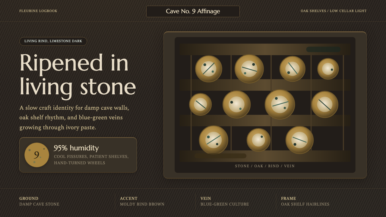 Cheese Affinage CavePatience reads as stone. Rind brown, mold green, and oak shelf grids glow in…
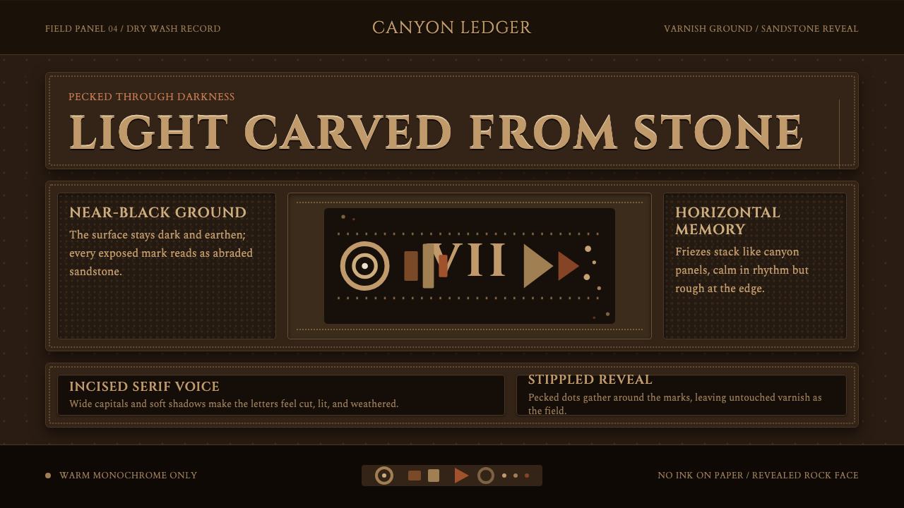 Desert VarnishStone remembers. Sandstone glyphs cut through near-black varnish in stacked f…
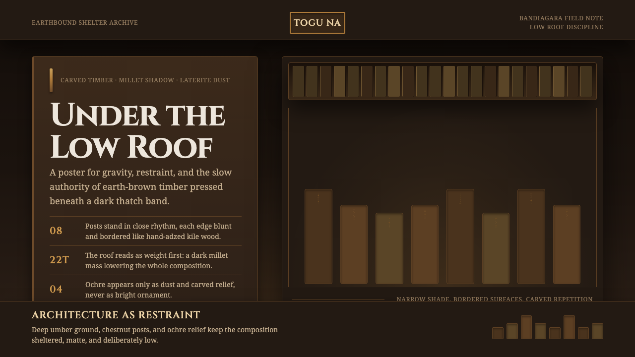 Dogon Toguna Shelter MaliGravity made visible. Deep umber ground, low roof band, chestnut posts in sha…
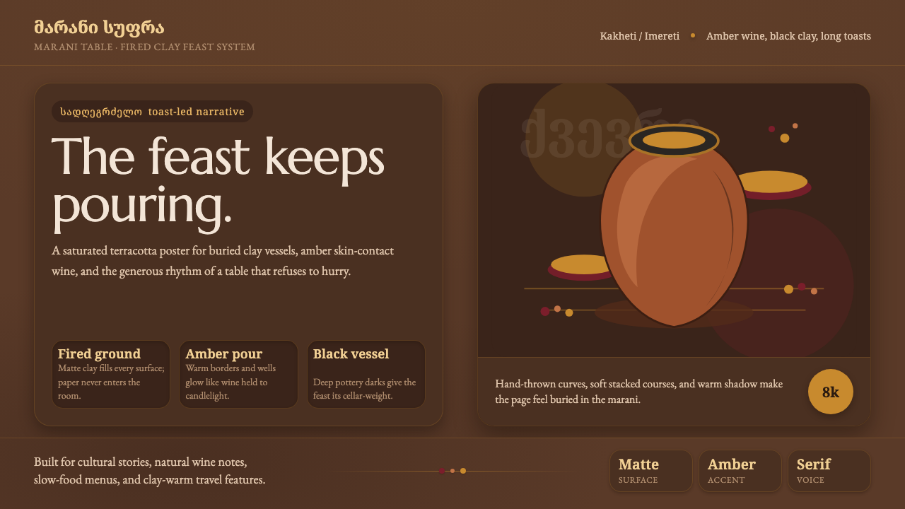 Georgian Qvevri Supra FeastHospitality made earthen. Terracotta ground, amber wine, Georgian serif curve…
 Hawaiian Hula Pahu DrumSacred weight, hand-marked. ʻAlaea red, kapa texture, and stacked carved regi…
 Iban Pua KumbuSacred cloth logic. Indigo-rust bands, ecru reserves, and blurred ikat edges…