What is Georgian Qvevri Supra Feast?
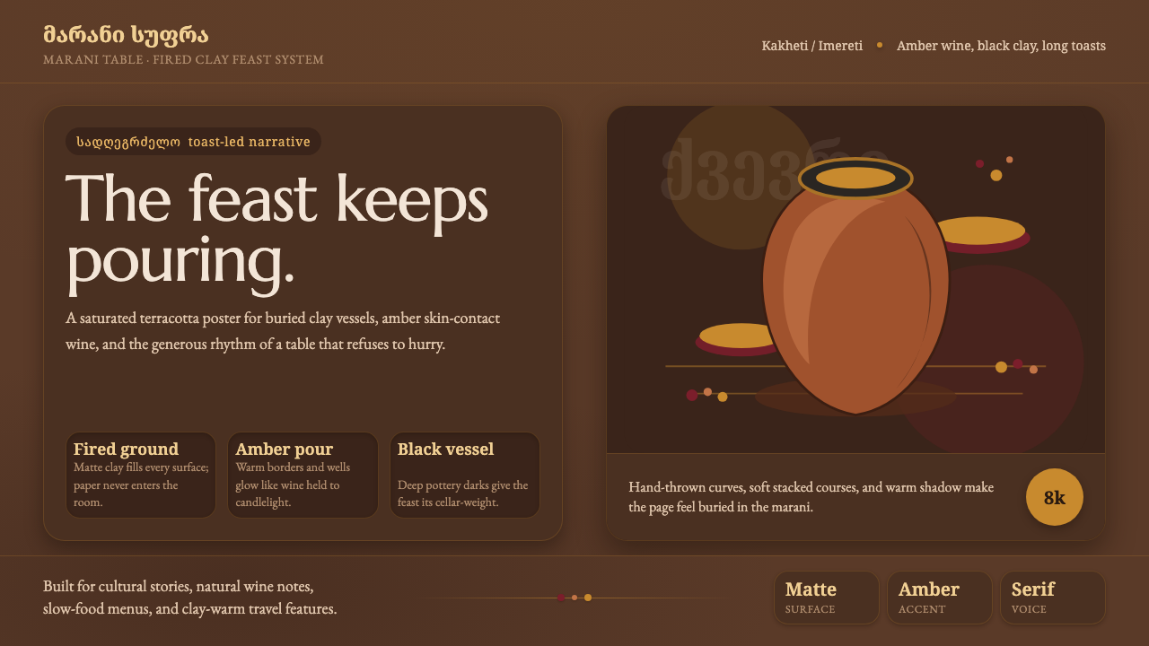
The Georgian qvevri supra turns hospitality into atmosphere: fired-clay earth, amber wine, dark vessels, and serif curves gathered around an endless table.
Georgian Qvevri Supra Feast in brief
The Georgian supra is an endless feast table, and its symbolic center is the qvevri: a handmade, egg-shaped wine jar fired from terracotta and buried in the earth. White grapes remain in contact with their skins for months, emerging as a signature amber wine. The design language draws from this complete chain of material, process, and gathering rather than from a generic idea of rustic decoration.
On screen, the system becomes a saturated fired-clay terracotta-brown ground with amber-wine and wine-red accents, black-clay vessel darks, and Georgian-script serif typography. Surfaces should feel matte, tactile, and hand-thrown. The atmosphere is earthenware rather than paper, and deeply grounded rather than pale, airy, or cream-toned.
Its emotional register is generous but solemn. The darkness gives the amber accents the presence of poured wine, while terracotta keeps the interface warm and physical. Curved letterforms and vessel-like shapes soften the density of the dark field, creating a visual world that feels hosted, gathered, and made by hand.

Where does Georgian Qvevri Supra Feast come from?
The style comes from the meeting of two Georgian traditions: qvevri wine-making and supra feast culture. Its geographic character belongs to Georgia in the Eastern Europe and South Caucasus region, while its temporal character is both traditional and modern. The system therefore carries historical weight without presenting itself as a museum replica.
Qvevri wine-making supplies the visual material. The vessel is handmade, egg-shaped, fired from terracotta, and buried in the earth. Its form suggests containment, depth, and a rounded transition between opening and body. The long contact between white grapes and their skins gives the resulting wine its amber identity, making color inseparable from time, earth, and transformation.
The supra supplies the social structure. It is not merely a meal but an endless table organized around hospitality, with the tamada serving as its toastmaster. That role gives the visual system a human center: information should feel presented to a gathered table, not released into an empty interface. The atmosphere can be ceremonial, but it should remain warm and welcoming.
The qvevri method was inscribed by UNESCO as intangible cultural heritage in 2013. In design terms, that recognition reinforces the distinction between a living cultural practice and a decorative theme. The goal is not to scatter pottery motifs across a layout, but to carry forward the practice's core ideas: earthen material, amber transformation, dark containment, shared table, and attentive hospitality.
What defines the Georgian Qvevri Supra Feast look?
Terracotta Ground
The background is a saturated fired-clay terracotta brown, dense enough to feel architectural and warm enough to remain hospitable. It should read as baked earth rather than neutral brown, with a matte presence that gives every panel the feeling of belonging to a larger vessel or table. Pale paper-like grounds and cream surfaces break the identity of the system.
Amber and Wine
Amber-wine is the luminous accent, carrying the color of the transformed grape and the glow of poured wine. Wine-red deepens the palette without leaving its earthen family. These accents should feel poured, stained, or gathered rather than neon-bright. Their purpose is to mark welcome, emphasis, and moments of attention inside the dark field.
Black-Clay Depth
Black-clay vessel darks provide containment and weight. They are not an empty black void but the near-black body of a fired object, a place where text, charts, and amber details can settle. Use them to distinguish nested surfaces and to create the sense that content is held inside a vessel rather than floating above a background.
Georgian Serif Curves
Typography should carry the visible softness of Georgian-script serif curves. Letterforms need enough presence to stand against the dark ground, yet their contours should keep the composition human and tactile. The type system should feel shaped and hosted, not mechanically neutral. Curved headings, measured text blocks, and restrained hierarchy preserve the atmosphere of a shared table.
Vessel Form
The qvevri's egg-shaped silhouette is the system's quiet structural motif. Rounded containers, tapered transitions, nested openings, and gently swelling forms can organize cards, image crops, badges, or decorative frames. The shape should be used as a reminder of containment and fermentation, not repeated as a literal icon on every surface.
Matte Hospitality
Every surface should feel matte, tactile, and hand-thrown. Avoid visual treatments that make the interface feel glossy, synthetic, or weightless. The design is most convincing when panels seem touchable and slightly imperfect in character, while the information remains clear. Hospitality comes from warmth and material presence, not from decorative abundance.

Who shaped Georgian Qvevri Supra Feast?
The qvevri potters of Kakheti represent the hands behind the vessel: the makers who give fired terracotta its rounded body, depth, and capacity for transformation. In the design system, their presence argues for surfaces that feel formed rather than manufactured, with the qvevri treated as a material relationship instead of a decorative object.
The qvevri potters of Imereti extend the same living craft tradition through another Georgian region. Their collective figure keeps the style connected to place, earth, and continuity. They are best represented through restrained material cues: terracotta density, rounded containment, and the sense that every surface has passed through a process before arriving on screen.
The tamada is the toastmaster of the supra tradition and gives the feast its social direction. As a design figure, the tamada stands for guided attention: someone or something gathers the table, marks the moment, and gives emphasis a human cadence. This makes the system suitable for interfaces that want to feel hosted rather than merely organized.
How do you use Georgian Qvevri Supra Feast today?
For presentation slides, use the dark terracotta field as the continuous setting across cover, content, and data pages. A cover can place the title beside a rounded vessel-like form or an amber accent that feels like poured wine. Content slides should gather text into hosted blocks with clear breathing room, while data slides can use amber for the primary signal, wine-red for secondary emphasis, and black-clay surfaces to hold dense information without making the page feel clinical.
For web interfaces, the style suits dashboards, pricing pages, and other products that need authority without sterility. A dashboard can place metrics inside black-clay panels against terracotta, using amber to identify the active or most important state. Pricing pages can make each tier feel like a vessel with its own weight, while wine-red marks attention or transition. Rounded containment, Georgian serif display type, and matte surfaces keep the system tactile even when the information is highly structured.
For editorial and marketing work, let the page behave like a long table: a strong opening invitation, generous text passages, and carefully placed moments of emphasis. Feature stories can pair a dark earthen ground with amber details and rounded imagery. Marketing pages should foreground hospitality and transformation, showing how something raw becomes something shared. The tone works especially well for food, wine, craft, cultural, and place-based narratives, provided the material language remains specific.
For menus, event pages, or cultural storytelling, use the tamada as an organizing metaphor. The interface can move readers from welcome to context, from context to detail, and from detail back to the shared table. The visual rhythm should feel hosted rather than hurried: dense passages can be balanced by open dark space, while curved forms and warm accents signal where attention should gather.
The common mistake is to reduce the style to generic rustic decoration. Scattering pottery icons, using pale cream backgrounds, or adding many competing warm colors misses the system's discipline. The identity depends on the relationship between fired-clay terracotta, amber wine, wine red, black-clay depth, Georgian serif curves, and matte tactile surfaces. If every element becomes equally ornate or equally colorful, the sense of earth, vessel, and hospitality disappears.

Georgian Qvevri Supra Feast — FAQ
Is Georgian Qvevri Supra Feast simply a rustic style?
No. Its rustic character comes from a specific cultural system: qvevri wine-making, buried fired terracotta, amber transformation, and supra hospitality. Generic rustic design often relies on distressed surfaces or decorative craft references. This system is more disciplined. Its identity comes from the relationship between vessel, earth, wine, dark containment, and the hosted table.
Can the style use a light or cream background?
A light background weakens the approved character of the system. The intended ground is a saturated fired-clay terracotta brown, and the material reference is earthenware rather than paper or cream. If a lighter variation is unavoidable, it should still preserve the feeling of baked earth and matte ceramic. A clean paper-white treatment belongs to another visual language.
How should amber and wine red be balanced?
Amber should carry the clearest sense of poured wine and active attention, while wine red deepens the warmth and provides supporting emphasis. Neither should cover the entire interface indiscriminately. The terracotta ground and black-clay darks need room to remain visible, so accents feel like gathered liquid or marked moments rather than a general wash of color.
Does every page need a qvevri illustration?
No. The qvevri is a structural and material reference, not a mandatory repeated icon. Its influence can appear through rounded containment, vessel-like cropping, dark nested surfaces, terracotta weight, or the feeling that content is held rather than floating. Literal repetition would turn a living cultural reference into surface decoration and reduce the system's subtlety.
Related design styles
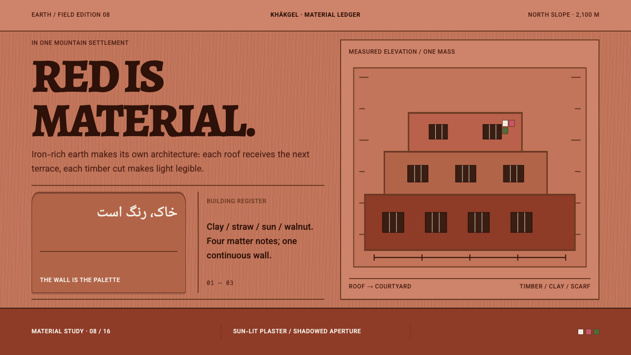 Abyaneh Red VillageRed is material, not decoration. Stepped clay bands and dark timber apertures…
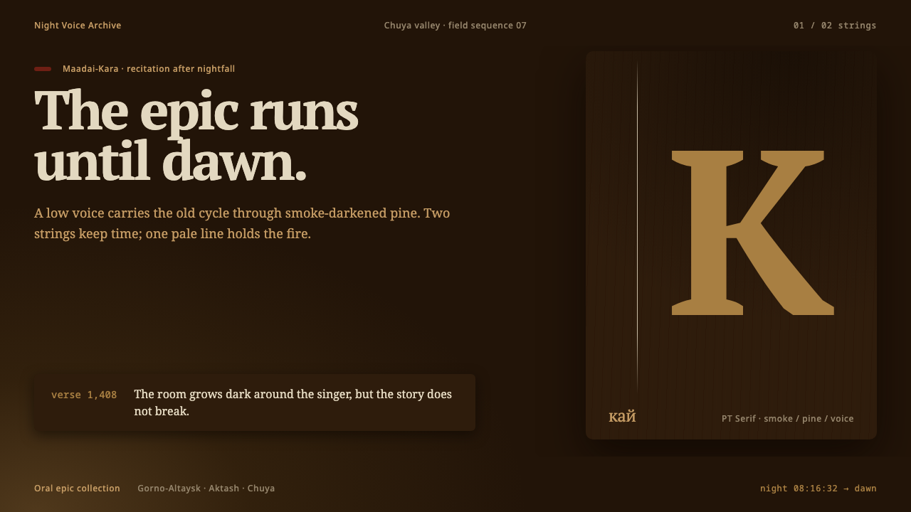 Altai Kai EpicEpic voice burns until dawn. Smoke-brown layers meet one pale string and a si…
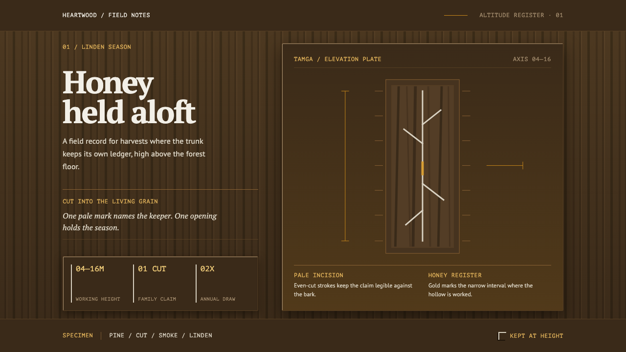 Bashkir Wild HoneyA working forest held on one axis. Pale tamga cuts and honey gold rise throug…
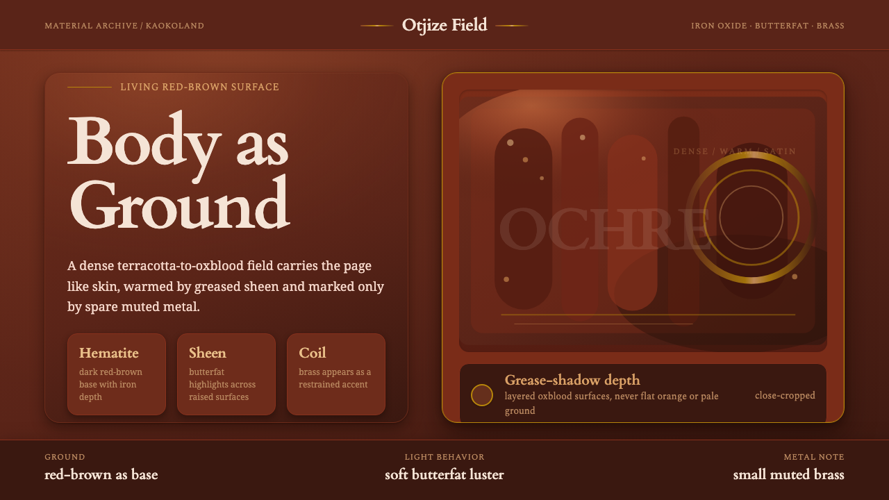 Himba Otjize Ochre NamibiaDense and ritual-warm. Oxblood ground, butterfat sheen, and sparse brass coil…
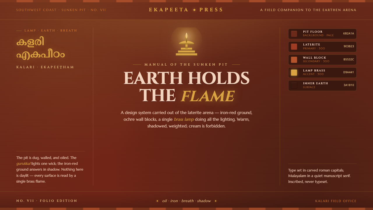 Kalaripayattu Kalari ArenaEarth holds the flame. Iron-red laterite, ochre wall blocks, a single brass l…
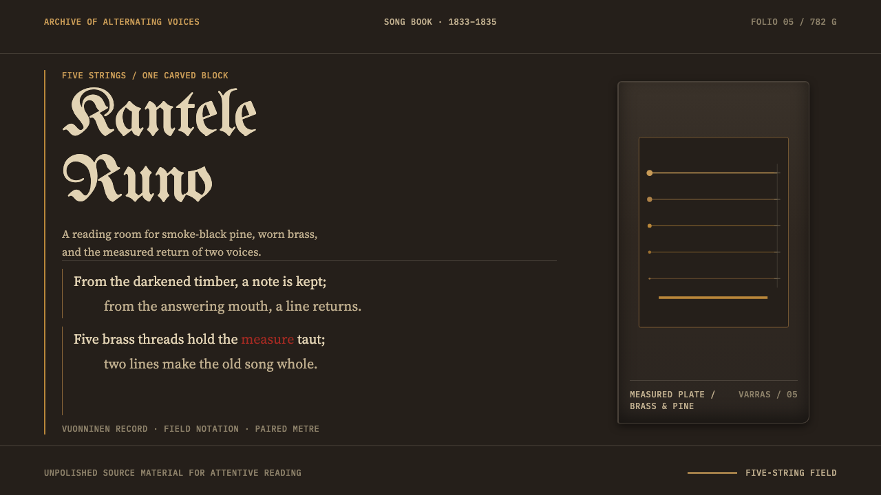 Karelian Kantele & RunoSong becomes an instrument. Soot-black pine, five brass rules, and paired Gar…