What is Kalaripayattu Kalari Arena?
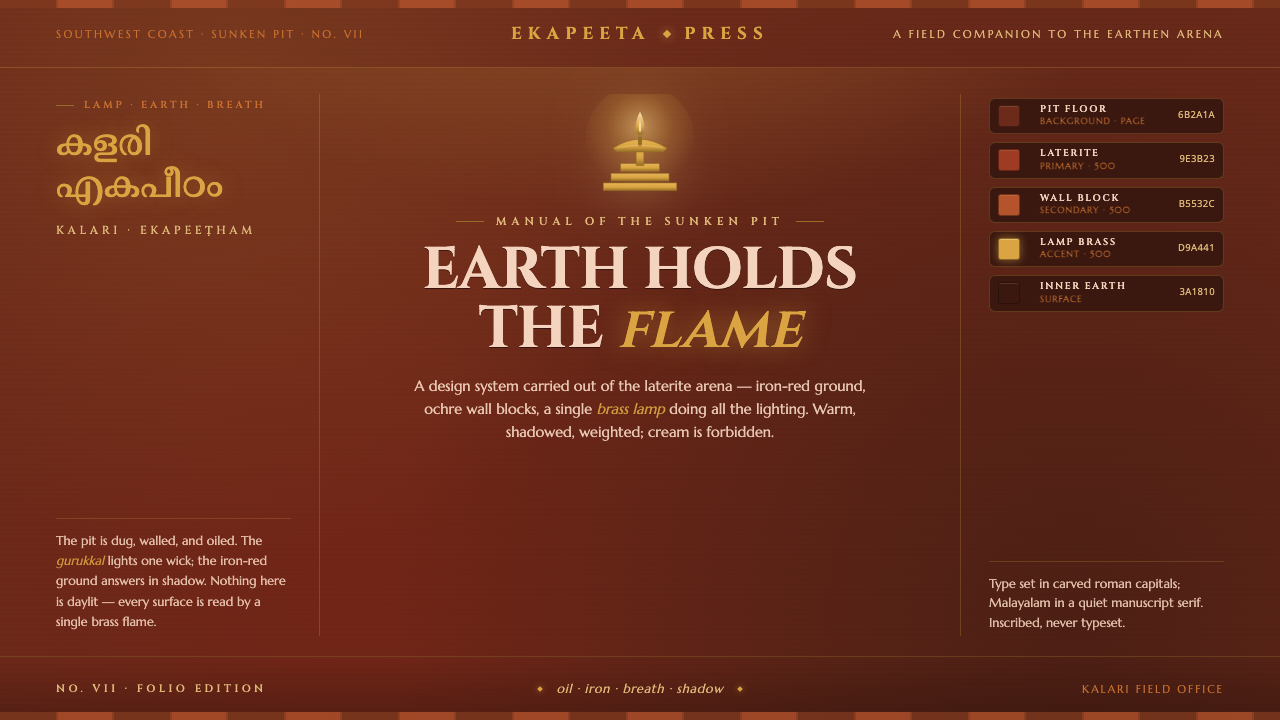
Kalaripayattu Kalari Arena turns the lamp-lit earth pit of Kerala into a warm, dark design language where laterite, brass, ochre, and movement carry the whole visual argument.
Kalaripayattu Kalari Arena in brief
Kalaripayattu is the martial art of Kerala, practised in the kalari: a sunken arena packed with rusty-red laterite earth, enclosed by ochre laterite walls, and illuminated by oil lamps near the ekapeeta deity niche. The resulting atmosphere is not a bright training hall but a concentrated chamber of earth, heat, ritual, and controlled movement. This design system translates that setting into digital form through a dark red-laterite ground, ochre wall blocks, brass-gold lamp light, and restrained highlights that suggest coconut-oil sheen on moving bodies.
The visual identity is built around contrast without becoming cold. Deep red earth provides the dominant field; ochre establishes enclosure and architectural weight; brass appears as the scarce source of illumination and attention. Dark forms should remain present rather than disappearing into blackness, with small oil-slick highlights giving them a tactile edge. The arena is warm and shadowed, never cream, pastel, or weightlessly luminous.
Kalaripayattu Kalari Arena is therefore less a decorative warrior theme than a spatial system. It treats the interface as a ritual pit: the ground holds content, the walls frame it, the lamp marks what matters, and movement gives the composition its energy. Every accent should feel earned by proximity to the lamp, the body, or the earth.
Where does Kalaripayattu Kalari Arena come from?
The source of the style is the kalari itself, a sunken pit whose architecture makes the earth an active participant in practice. The floor is not a neutral surface: it is laterite ground, rusty red and materially present. The walls are not a distant backdrop: ochre laterite blocks create a contained field in which the practitioner moves. This ritual geography gives the design system its basic hierarchy of ground, enclosure, and focus.
Kalaripayattu belongs to Kerala in southwestern India and has deep historical roots, with the tradition surviving from before 1900. Its visual language is inseparable from place. South Asian heat, red earth, laterite construction, and the darkness of an enclosed pit all remain embedded in the palette. The design should consequently feel regional and material rather than like a generic dark interface with a few warm accents.
The key human figure in this system is the gurukkal, the master who gives the arena discipline and direction. Around that authority are the kalari practitioners, whose bodies bring rhythm, flexibility, and controlled force into the space. Their movement is not illustrated as spectacle alone; it becomes a compositional principle. Long gestures, sudden turns, and the tension of a flexible urumi sword can inform how content enters, aligns, and recedes.
At the ekapeeta deity niche, the shrine guardian and the oil lamp establish the arena's sacred center. The lamp is singular and therefore powerful: its brass warmth should not be scattered across every surface. It identifies the important passage, action, or object while leaving the surrounding red earth in shadow. The result is a system rooted in ritual concentration, where darkness is not emptiness but the condition that makes the flame visible.
What defines the Kalaripayattu Kalari Arena look?
Laterite Ground
The dominant ground is dark red laterite, earthy rather than glossy and warm rather than wine-like. It should feel packed, mineral, and slightly irregular, as though content is placed directly into a living arena floor. Near-black red may support depth, but the red earth must remain perceptible. The background carries the identity before any ornament appears.
Ochre Enclosure
Ochre laterite blocks define the arena's walls and thresholds. The color is dry, sun-baked, and architectural, giving the composition a sense of enclosure without introducing polished luxury. Use it for framing surfaces, section boundaries, and structural masses. It should read as wall material before it reads as decoration.
Brass Lamp Focus
Brass deity-lamp gold is the rare luminous accent. It marks a primary action, active state, or moment of revelation, and gains authority precisely because it is not everywhere. The tone should feel aged and warm, closer to oil-lamp metal than electric yellow. A restrained glow may gather around the accent, but the source must remain legible as a lamp.
Oil-Sheen Highlights
Highlights on dark forms should suggest coconut-oil sheen: narrow, smooth, and close to the surface. They give bodies, tools, and selected interface elements a sense of motion without turning the system metallic or glossy overall. The shine is a passing edge, not a full reflective treatment. It works best when surrounded by quiet shadow.
Ritual Geography
The composition should preserve the relationship between pit, wall, practitioner, and shrine niche. Content can be organized as if it occupies positions in the arena: foundational information sits low and grounded, navigation follows the walls, and the most important action approaches the lamp. This creates hierarchy through place rather than through a pile of badges, borders, or competing effects.
Controlled Motion
Motion should borrow from Kalaripayattu rather than from spectacle. Elements may enter with grounded weight, pivot through a clear directional turn, or withdraw into shadow. Transitions should feel deliberate and bodily, like a practitioner changing stance. Avoid weightless floating, playful bouncing, or frantic kinetic decoration; the arena's energy is disciplined.
Who shaped Kalaripayattu Kalari Arena?
The gurukkal is the master figure of the kalari and the source of discipline within the arena. In the design language, that role becomes editorial authority: clear instruction, confident hierarchy, and actions that feel initiated rather than suggested. The gurukkal is not represented through portrait decoration but through the system's composure, direction, and refusal of unnecessary noise.
The practitioners supply the arena with its human rhythm. Their oil-glistened bodies, flexible movement, and use of urumi flexible swords suggest elongated gestures, changing diagonals, and highlights that catch only when a form turns. They are the reason the system must feel active even in stillness: the ground is waiting for movement, not merely displaying information.
The ekapeeta shrine guardian belongs to the arena's point of sacred attention. In the visual system, this figure is expressed through stewardship of the lamp: keeping the warm brass accent focused, protected, and meaningful. The guardian's presence argues against indiscriminate illumination. What is lit should matter, and what remains dark should retain dignity rather than appear unfinished.
How do you use Kalaripayattu Kalari Arena today?
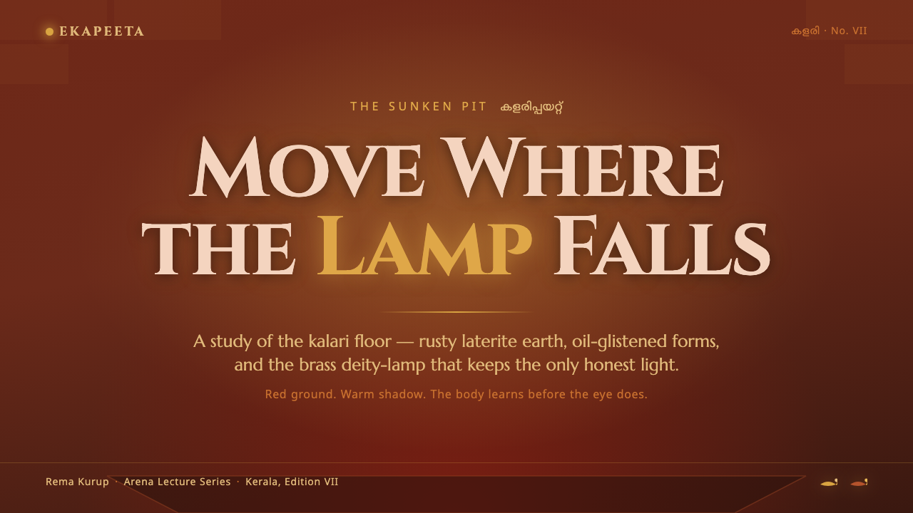
For presentation slides, the style works best when the cover behaves like the entrance to the pit. Use a dark laterite field, a strong ochre structural mass, and one brass-lit point that establishes where attention begins. Content slides should feel like successive positions within the same arena: grounded titles, restrained body copy, and clear directional movement between sections. Data slides can treat charts as training diagrams, using the lamp tone to identify the decisive value while allowing the red ground and ochre frame to carry the rest.
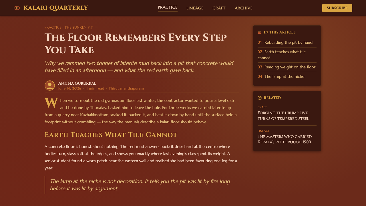
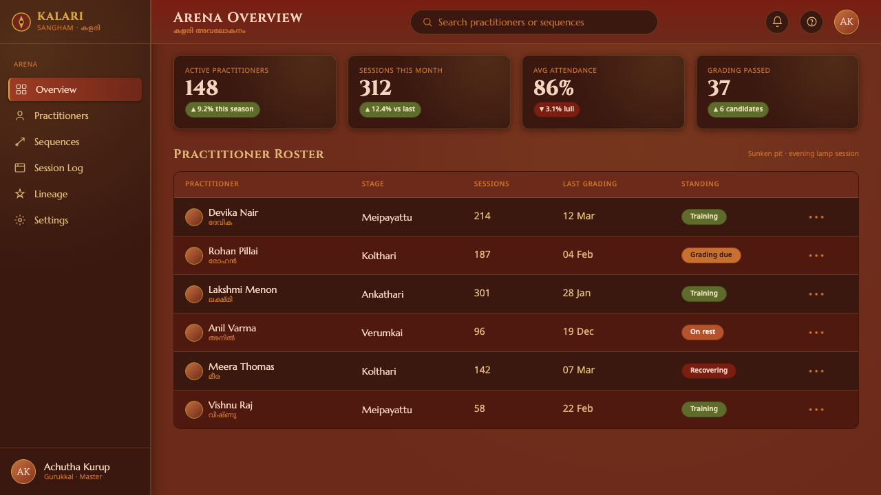
For web interfaces, Kalaripayattu Kalari Arena suits dashboards, operational tools, and pricing pages that need authority without sterile brightness. Keep the main field dark and earthy, use ochre for containers or structural bands, and reserve brass for active navigation, confirmation, or the principal call to action. Panels should feel like wall blocks set into a pit, not floating white cards. Dense information can remain readable when hierarchy comes from placement, contrast, and disciplined spacing rather than a forest of controls.
For editorial and marketing work, the system creates a strong sense of place. Articles can use a deep red opening field, ochre marginal structures, and brass details for metadata or key quotations. Campaign pages may alternate between quiet earth-colored passages and concentrated lamp-lit moments, making the accent feel like an arrival. Imagery should favor bodies in motion, laterite surfaces, oil sheen, and the relationship between enclosed darkness and a small warm source of light.
For brand narratives, the style is especially effective when the product or institution wants to communicate training, heritage, concentration, or earned capability. A short statement can sit low and grounded, while a decisive action is drawn toward the lamp. Forms, menus, and labels should support the choreography of the page. The goal is not to imitate a historical arena literally, but to make every interface choice feel as though it belongs to the same material and ritual world.
The common mistake is turning the system into generic dark luxury by replacing laterite with black, ochre with beige, and brass with indiscriminate gold. That loses the specific identity of Kerala's red earth and oil-lit kalari. Another mistake is spreading the lamp glow across every card and button. The lamp must remain singular in spirit: scarce, warm, and reserved for what deserves attention. Avoid decorative warrior imagery when the layout itself can express discipline and movement.
Kalaripayattu Kalari Arena — FAQ
Is this style meant to look like a bright Indian cultural theme?
No. Its source is a lamp-lit, sunken kalari, so the defining atmosphere is warm darkness rather than brightness. Red laterite, ochre walls, and brass light should emerge from shadow. The system can feel vivid, but its vividness comes from concentrated material contrast, not from a light background or a festival-like spread of color.
How much brass or gold should appear in the interface?
Very little. Brass represents the deity lamp and therefore functions as a focused source of attention. Use it for a principal action, an active state, or a key moment of disclosure. If every element glows, the lamp loses its ritual importance and the arena becomes a generic luxury interface.
Can the system use photography or illustrations of practitioners?
Yes, when the imagery reinforces the material and spatial logic. Practitioners in motion, oil-glistened dark forms, flexible sword gestures, laterite ground, and the small source of lamp light all belong naturally to the system. Images should support the arena's concentration rather than become unrelated spectacle. When no imagery is needed, the layout can still express movement through direction, cropping, and controlled transitions.
Why must the background remain dark red rather than cream or pure black?
Because the ground is the system's first material fact. Cream would make the arena feel bright and detached from its source, while pure black would erase the laterite earth that gives the style its regional identity. A dark red ground preserves both shadow and substance. It lets ochre walls and brass light appear as parts of one place.
Where does this style work best, and where can it struggle?
It works best for experiences centered on training, heritage, discipline, ritual, controlled power, or a strong sense of place. Dashboards, educational materials, cultural programs, and focused brand narratives can benefit from its grounded hierarchy. It may struggle when a product requires cheerful neutrality, airy openness, or soft domestic warmth. In those cases, the dark arena atmosphere can feel too concentrated unless the product's own values genuinely align with it.
Related design styles
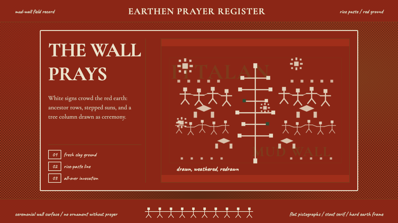 Odisha Saura Tribal MuralSacred density. Rice-white pictographs crowd a red-earth wall in ritual rhyth…
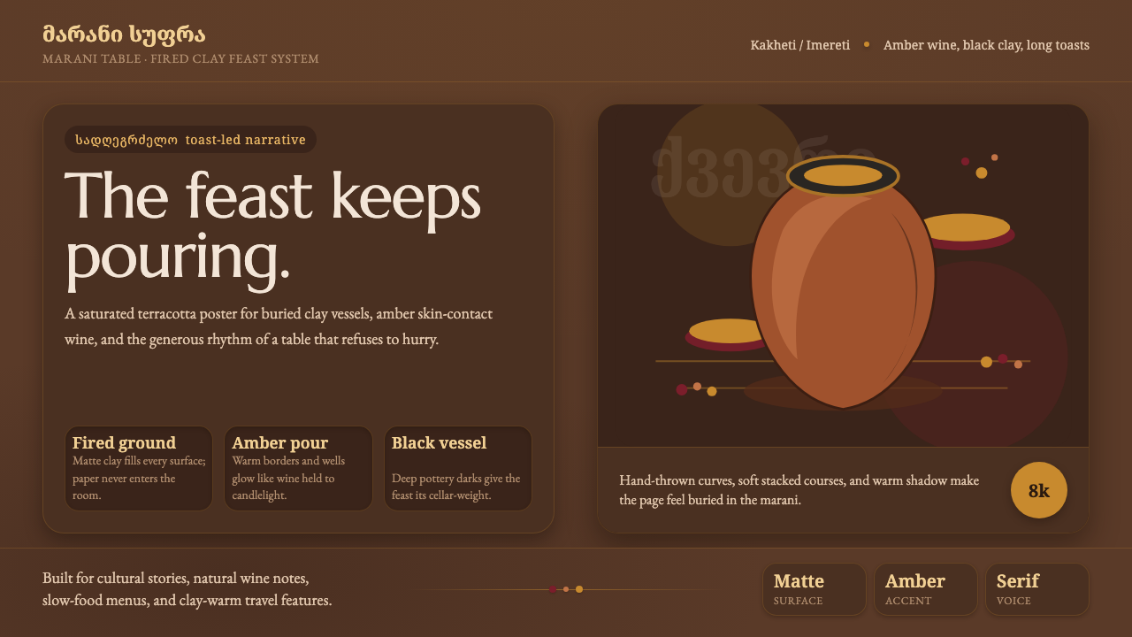 Georgian Qvevri Supra FeastHospitality made earthen. Terracotta ground, amber wine, Georgian serif curve…
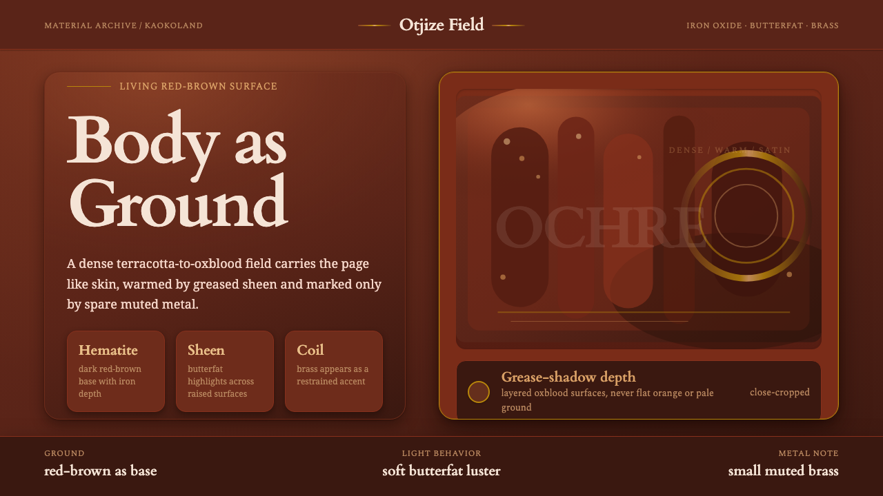 Himba Otjize Ochre NamibiaDense and ritual-warm. Oxblood ground, butterfat sheen, and sparse brass coil…
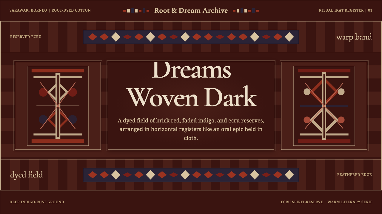 Iban Pua KumbuSacred cloth logic. Indigo-rust bands, ecru reserves, and blurred ikat edges…
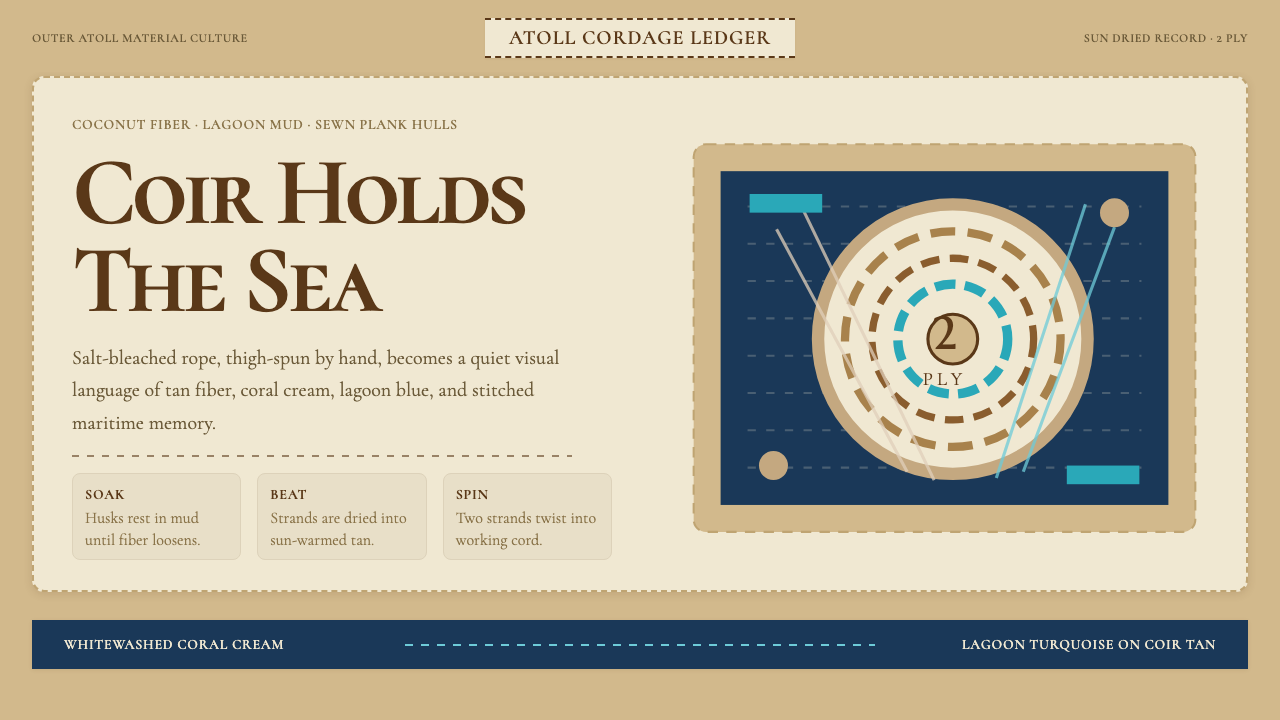 Maldivian Coir (Coconut Rope)Ocean-tested craft. Coir tan, coral cream, Cormorant type, and dashed seam ge…
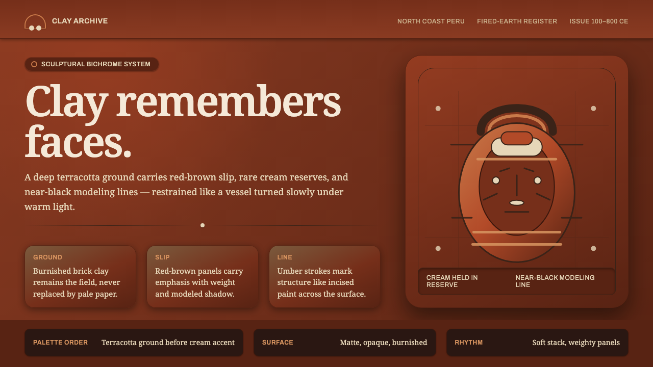 Moche Portrait VesselClay carries the likeness. Terracotta ground, red-brown slip, cream accents,…