What is Abyaneh Red Village?
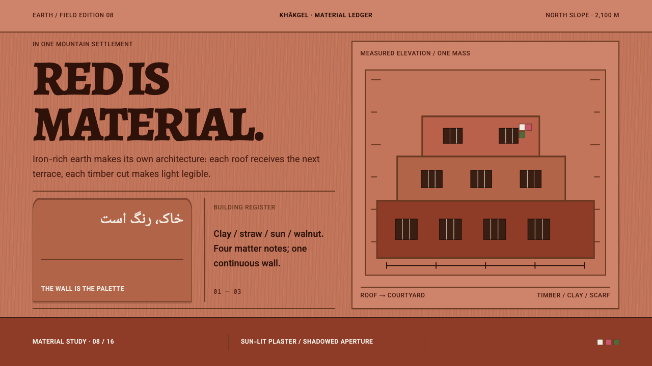
Abyaneh is a village built from the red clay of its own mountainside, and its design language treats that red as a material, not a color: one continuous wall, stepped in bands and pierced by dark timber openings.
Abyaneh Red Village in brief
Abyaneh Red Village is a design style drawn from the earth architecture of Abyaneh, a mountain village in the Karkas range of central Iran. Every wall is plastered in the iron-oxide clay dug from the slope the village stands on, so the red is the material itself, not a wash or a filter laid over something neutral. Flat roofs double as the courtyards of the houses above, and the whole settlement reads as one continuous clay mass stitched through with dark timber.
As a visual system, the style is warm, matte and architectural. The page ground is sunlit plaster. Content sits in stepped bands that climb the layout the way houses climb the hill. Cards are not panels floating over the surface; they are small apertures punched into the wall, framed in dark timber. Brightness is rationed: the white floral headscarf of the village women supplies every light note, and only in scarf-sized fragments, never as a flood.
The ambition is coherence. Because everything in the village is made of the same ground, nothing in the layout is allowed to look as if it came from somewhere else. The style teaches a designer to let one material set the terms for the entire page.
Where does Abyaneh Red Village come from?
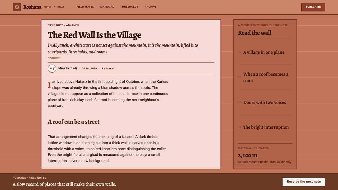
Abyaneh lies in the Barzrud district of Natanz county, in Isfahan province, high in the Karkas range at roughly 2,100 metres above sea level. Its foundations are described as Sassanian, which places the first settlement in the pre-Islamic past, while most of the fabric that stands today dates from the Safavid centuries, roughly the sixteenth to the eighteenth, and onward. The village has been continuously inhabited, which matters for design: what a visitor sees is not a reconstruction but the accumulation of generations repairing and adding to the same walls.
The building tradition behind it belongs to Iranian vernacular earth architecture. The key technique is kahgel, a mud plaster in which clay is worked into a coat that protects the structure and gives the wall its skin. In Abyaneh the clay is rich in iron oxide, so the finished surface is red. The colour is a by-product of the local geology, which is why the village looks so unified: no pigment was ever bought, only dug. The plaster is renewed as it weathers, and the wall stays one material from core to surface.
The layout follows another tradition on the style's list, the terraced hillside settlement. Houses are stacked up the slope so that the flat roof of one is the courtyard of the next. Streets become stairs, and the whole village shows itself as a sequence of steps rather than a grid. Dark timber is added where the clay needs to open: lattice windows, small balconies, lintels and doors. The doors are carved with lines of verse, and each carries a pair of knockers whose different pitch told the household whether a man or a woman was calling. Even the sound of arrival was designed.
Two kinds of people keep this world visible. The village masons and door-carvers made and maintain the walls and the carved openings, and the Iran Cultural Heritage Handicrafts and Tourism Organization is the national body concerned with safeguarding the place. The design system translates all of this literally: the page ground is plaster, the layers are terraces, the cards are apertures, and the only bright notes are scarf fragments.
What defines the Abyaneh Red Village look?
Red as Material
The dominant color is a warm, iron-oxide red used as the substance of the page, not as an accent painted on top. It fills the ground and the large surfaces, and it is allowed to vary slightly from patch to patch the way sun and weathering vary a plaster wall. Because the red is the material, nothing else on the page needs to be saturated to compete with it.
Sunlit Plaster Ground
The ground is matte and light-struck, the red of a wall in afternoon sun rather than a deep shade. This keeps the overall page bright and open even though it is warm and saturated. Surfaces have no gloss, no glass effect and no gradient sheen; if depth is needed, it comes from a clean shift in tone between one terrace and the next.
Stepped Bands
Content is arranged in horizontal bands that step in and out as they rise, the way terraced houses climb a slope. Each band can be offset slightly from its neighbour, so the page has a staircase silhouette on the side. This replaces the usual card grid floating on a blank background with a layout in which every block rests on the one beneath it.
Cards as Apertures
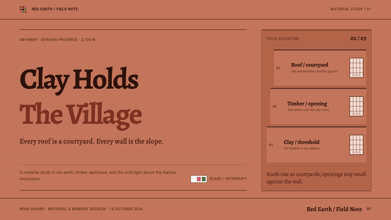
A card is a recess cut into the wall, not a panel placed over it. It is drawn with an inset, dark edge like a window set into thick clay, which means it takes its colour from the opening and not from a drop shadow. Content inside reads as something seen through a window, and the wall around it stays continuous.
Dark Timber Framing
Where the clay opens, dark timber appears: lattice windows, small balconies, lintels, doors. In the interface this becomes a deep brown that carries text, lines, frames and controls. It is the structural colour that holds the red together, giving the page a firm graphic skeleton without needing pure black or any hard drop shadow.
Scarf-Sized Brightness
The only bright, light notes come from the white floral headscarf worn by the village women. In design terms, that is a small, white field patterned with tiny flowers, used in fragments the size of a scarf and never spread across a whole section. This single rule keeps the page from washing out and gives each light accent real impact.
Continuous Mass
In Abyaneh the roof of one house is the courtyard of the next, so there are almost no gaps between buildings. The layout follows suit: sections share edges and stack tightly, with spacing handled by the thickness of the bands themselves instead of wide, empty margins. The page feels like a single dense body rather than separate widgets.
Who shaped Abyaneh Red Village?
The masons and door-carvers of Abyaneh built and maintain the plastered walls, stepped terraces, lattice windows and carved doors that define the village. Their work is the source of every rule in the style: use the local material, renew the surface as it weathers, and put carved detail only where a door or opening needs it.
The village women wear a white headscarf patterned with small flowers, and it is the one thing in the visual world of Abyaneh that supplies bright, light color. The design system borrows the scale as well as the look: white floral fragments about the size of a scarf, scattered as accents rather than used as a ground.
This national body is concerned with the preservation of Iran's built heritage and handicrafts, Abyaneh among them. It anchors the village in a context of conservation and continuing use, which is why the style treats the place as a living settlement to be sustained rather than a picturesque set to be imitated.
How do you use Abyaneh Red Village today?
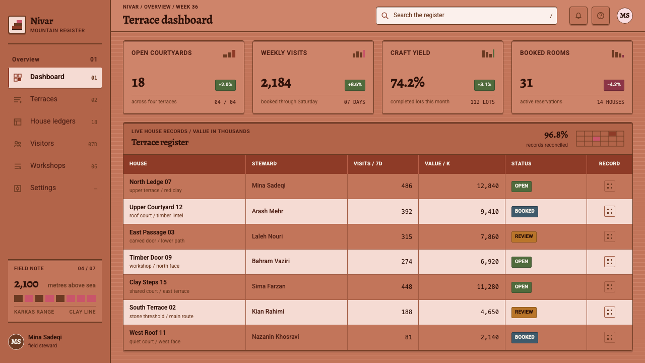
Abyaneh Red Village is useful whenever a project wants to feel rooted, tactile and architectural: heritage and cultural institutions, hospitality and travel, craft and ceramics brands, architecture studios, food and farm products. It is unusual in giving a saturated color a calm, grounded personality, and it supports long, content-rich pages because the stepped structure organises them naturally.
For presentation slides, a cover works as a full field of plaster-red with a single dark timber frame holding the title, and perhaps one small white floral fragment in a corner. Content slides can be built from two or three stepped bands, each holding a heading and a short block of text. Data slides suit horizontal bar charts that climb in stairs, drawn in flat tones of clay and timber, with no gradients; keep the white floral fragment for the single point you most want the audience to notice.
For web interfaces, treat the page as a wall and the components as openings. Navigation sits in a dark timber band; cards, forms and pricing blocks are inset apertures with dark frames; buttons are solid timber-colored blocks with light text. Use stacked sections that share edges rather than float with large gaps. Hover states can deepen the clay tone or thicken the frame, while shadows should be avoided because recessed openings, not raised panels, are what the style is built around.
For editorial and marketing work, the style performs well with photography of landscape, architecture and craft, since the warm red harmonises with earth tones. Article pages can use a narrow column of text inside a plaster band, set against a wider stepped margin for captions. Campaign layouts benefit from the staircase rhythm: each block steps slightly in or out, leading the eye up the page, with the white floral fragment reserved for the call to action.
The usual mistake is to treat the red as a theme colour and then add white cards, soft shadows and cool grey text on top. That reverses the logic of the style, which is that the red is the whole page and everything else is carved out of it. A second mistake is to scatter the white floral motif everywhere; it works only because it is rare and scarf-sized. Keep one material, keep the openings dark and recessed, and ration the light.
Abyaneh Red Village — FAQ
Why is Abyaneh red?
Because the walls are plastered with clay dug from the slope the village stands on, and that clay is rich in iron oxide. The red is the local earth, not an applied pigment. This is why the style treats colour as a material: the whole page is meant to feel like one continuous clay surface, with nothing painted over it.
What is kahgel?
Kahgel is a mud plaster, a coat of worked clay applied to walls in Iranian vernacular earth architecture. It protects the structure and forms the visible skin of the building. In the design system it stands for the idea that the surface and the substance are the same thing, so a layout should not rely on a separate decorative layer to look finished.
How do the cards differ from ordinary UI cards?
Ordinary cards float above the page with a soft shadow. Here a card is a small aperture cut into the wall, drawn as a recess with a dark timber-colored edge. The difference is in the direction of depth: instead of lifting off the surface, the card sinks into it, which keeps the page continuous and removes any need for drop shadows.
Can the style work with a lot of white space?
Not in the usual sense. Abyaneh is a dense, continuous mass, so the layout should be compact and layered, with spacing carried by the bands rather than empty margins. Breathing room still exists, but it comes from the terraces stepping back and from the light, scarf-sized fragments, not from large expanses of blank white.
When does this style struggle?
It struggles in contexts that want cool neutrality, high-tech polish or very data-dense interfaces, where a saturated red ground would tire the eye. It also needs care with accessibility: the red ground and timber text must be kept at comfortable contrast. For products about place, craft, heritage or hospitality, it is a natural and memorable fit.
Related design styles
 Georgian Qvevri Supra FeastHospitality made earthen. Terracotta ground, amber wine, Georgian serif curve…
 Himba Otjize Ochre NamibiaDense and ritual-warm. Oxblood ground, butterfat sheen, and sparse brass coil…
 Iraqi Marsh Arab Mudhif ReedReverent reed darkness. Kufi arches, ochre lattice, and one water-blue line h…
 Kalaripayattu Kalari ArenaEarth holds the flame. Iron-red laterite, ochre wall blocks, a single brass l…
 Merina LambamenaCloth keeps what came before. Russet warp bands stack in Libre Caslon's quiet…
 Moche Portrait VesselClay carries the likeness. Terracotta ground, red-brown slip, cream accents,…