What is Kazakh Dombra?
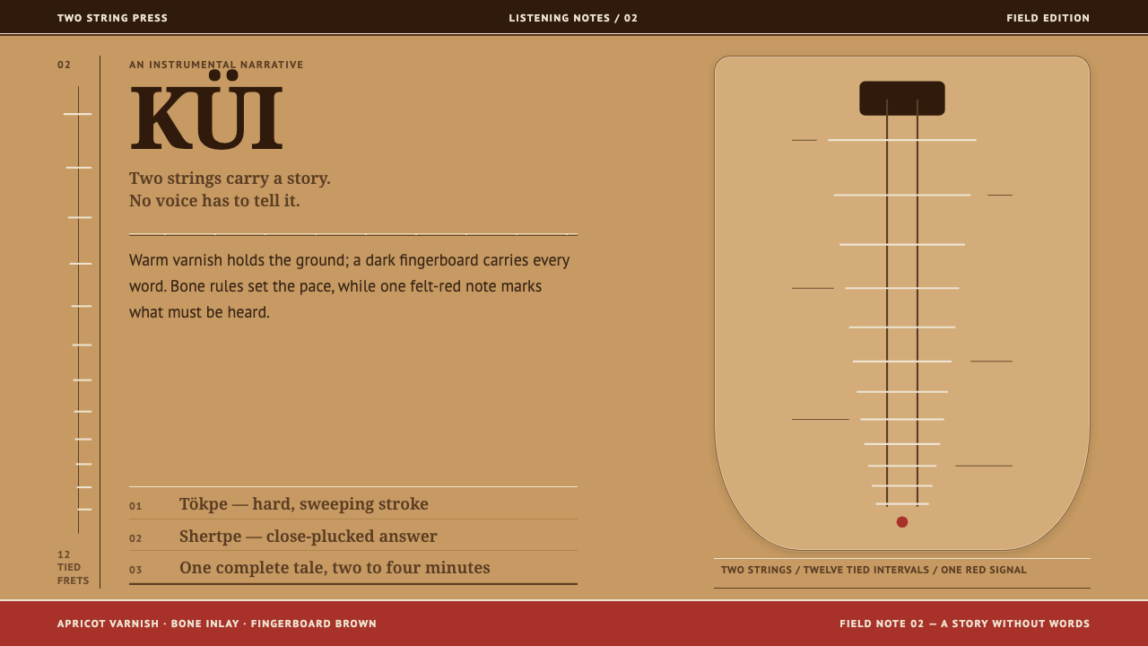
The dombra tells a whole story with two strings, and its design system borrows the instrument's own surfaces: honey varnish, bone hairlines and the rhythm of the frets.
Kazakh Dombra in brief
The dombra is a two-stringed lute of the Kazakh steppe, hollowed from a single block of apricot or mulberry wood. Its body is pear-shaped, its neck is long, and its fingerboard is inlaid with bone and horn. Its repertoire is the kui, a short instrumental piece, a few minutes long, that tells a complete story without a single word.
A design system could easily have been built from steppe clichés: horizons, horsemen, patterned felt. This one refuses them. The library says it takes nothing from postcards and everything from the instrument, and it measures the object directly. The honey-coloured varnish of the soundboard becomes the page ground. The darker back and neck become the primary colour. Bone inlay, stretched into hairline rules, becomes the dividers. The fingerboard supplies the colour of text, and the red felt the instrument rests on becomes the one loud voice in the room.
The layout rhythm is taken from the instrument too: the pear-shaped silhouette, the spacing between frets that tightens as it climbs the neck, and fine lines that arrive in pairs. The result is a warm, light, quiet system, polished like varnished wood, whose single saturated accent arrives as one deliberate red.

Where does Kazakh Dombra come from?
The dombra belongs to the Kazakh steppe, in present-day Kazakhstan and across Central Asia, and the library dates its tradition to before 1900. It is a living instrument, and its characteristic form, the kui, belongs to a culture that carries its stories in sound as well as in speech. The reference notes place kui instrumental storytelling beside Kazakh oral epic performance as parallel ways of keeping memory.
The most celebrated name attached to the repertoire is Kurmangazy Sagyrbaiuly, who lived from 1823 to 1896 and wrote more than sixty kuis. Two of them, Saryarka and Adai, are still played today, which gives the sense of how long a story told without words can last. For a designer the lesson is that a piece of music has structure, development and an emotional arc, even when no text is present. The Curio style asks for the same from a layout.
The library also names two other figures, Dina Nurpeiisova and Tattimbet Kazangapuly, and two playing schools, tökpe and shertpe, which are traditionally described as differing in how the right hand meets the strings. The design system does not require you to tell them apart. What matters is that they prove the instrument has more than one idiom, and that the tradition is a conversation among players rather than a single canonical sound.
In 2014 the dombra kui tradition was inscribed by UNESCO on its intangible cultural heritage list. That recognition belongs to the music as a practice, not to the object as a prop, and it is the right way to read the design system: as an attempt to translate the way the instrument is made and played, rather than to decorate a layout with its silhouette. Everything in the style is measured from the dombra itself.
What defines the Kazakh Dombra look?
Honey-varnished ground
The page ground is the varnished apricot soundboard: a warm, light honey tone with a soft, polished depth, like wood that has been handled and oiled for years. It is light without being white. The tone should feel lit from within, as if grain were just beneath the surface, though no grain pattern is drawn.
Darker back and neck
The primary colour is the deeper tone of the instrument's back and neck. It carries headings, navigation and primary actions, anchoring the light ground like the body of the dombra itself. It should feel warm and woody rather than black, and large areas of it should be rare, so that it reads as a structural member.
Bone-inlay hairlines
The bone inlay on the neck becomes a hairline: a very fine, pale rule used for dividers, card edges and table lines. Hairlines often arrive in pairs, a thin double line that echoes the paired lines measured off the instrument. They give the layout precision and a quiet ornamental rhythm without needing a decorative border.
Fingerboard text
Body text takes its colour from the fingerboard, a dark, warm brown rather than pure black. It sits comfortably on the honey ground and keeps long reading restful. Type is straightforward and humane, with enough openness to feel like a voice rather than a label, and no attempt to suggest folk ornament through novelty letterforms.
One red voice
The red felt under the instrument is the one loud voice in the system. It appears as a single saturated accent: a primary button, one key number, a bookmark in the margin. Because everything else is quiet, one red is enough to command the page. A second red element nearby already weakens the first.
Fret rhythm
On the dombra the spacing between frets tightens as it climbs the neck. The layout borrows that: intervals start generous and grow denser in one direction, in lists, timelines, scales and tables. The effect is a rhythm that feels measured and musical, a sense of acceleration without any animation.
Pear silhouette
The body of the dombra is pear-shaped, wide at the base and narrowing toward the neck. Containers, image masks and key shapes echo this with soft, rounded forms that swell and then taper, never with hard circles or sharp rectangles alone. The silhouette is gentle and slightly asymmetric, like a hand-made object.

Who shaped Kazakh Dombra?
Kurmangazy Sagyrbaiuly lived from 1823 to 1896 and is credited in the library with more than sixty kuis, including Saryarka and Adai, which are still played. He is the clearest proof that a purely instrumental piece can hold a complete story. The Curio style takes this as its brief: a layout should be able to say something whole without relying on slogans or illustration.
Dina Nurpeiisova is named alongside Kurmangazy and Tattimbet as one of the key figures of the dombra repertoire. Her presence in the list is a reminder that the kui is a performed art carried by many hands, not the property of a single composer. For design, it means the system works best when it feels played rather than printed: warm, human and slightly personal.
Tattimbet Kazangapuly is the third key figure the library names for the tradition. Together with the two playing schools, tökpe and shertpe, his entry points to the plurality inside the dombra world: more than one way of playing and more than one voice. Reading him alongside Kurmangazy guards against flattening the instrument into a single stereotype.
How do you use Kazakh Dombra today?
On slides, the dombra system gives covers a warm, musical confidence. Set the title in the deeper neck tone on the honey ground, draw a pair of fine bone-coloured lines beneath it, and keep a single red mark, such as a small badge or number, as the only loud element. Content slides should be spacious, with text in the fingerboard brown and sections divided by hairlines. For data, use tidy bars in the primary tone, with a red bar or marker only for the one value the audience must remember.
On the web, the style suits cultural platforms, music and education products, storytelling tools, bookstores, and any interface that benefits from a calm, light, warm look. Keep the page ground in the honey tone, put navigation and headings in the darker tone, and separate cards with paired hairlines instead of shadows. A pricing page works well with equal panels and a single red call to action. Interactive feedback can be gentle: a shift in the hairline weight or a small red mark beside the selected item.
For editorial and marketing work, the system is built for narrative: long-form essays, album and exhibition pages, travel and heritage storytelling, and brand stories that want to sound human. Use generous leading, quiet pull quotes ruled by paired hairlines, and photographs of hands, wood and instruments. Because the style carries a story in structure, it rewards pages that unfold in sequence. The tone is intimate and unhurried, like a performance.
Because the style is drawn from a real instrument and tradition, it is best credited when used. If your project concerns Kazakh culture or music, name the dombra and the kui, and avoid pairing the system with generic steppe imagery. The library is explicit that the system takes nothing from postcards, so decorating it with horsemen or yurts would work against its point.
The most common mistake is to treat the red as a general accent and spread it across headings, icons and borders. The red felt is the one loud voice in the room, and a second voice changes the character of the whole page. Another is to switch the honey ground for white, which removes the varnished warmth that defines the style. The third is to fill the layout with ornamental dividers and folk motifs. The only ornament here is the paired hairline, and even that should be used with restraint.

Kazakh Dombra — FAQ
What is the dombra and what is a kui?
The dombra is a two-stringed lute of the Kazakh steppe, hollowed from a single block of apricot or mulberry wood, with a long neck inlaid in bone and horn. A kui is the short instrumental piece it plays, a few minutes long, which tells a story with no words at all. Curio's style takes its colours, lines and rhythm from the instrument's own surfaces.
Why does the style avoid steppe imagery?
The reference is explicit that the system takes nothing from postcards and everything from the instrument. Horizons, horsemen and tourist motifs would flatten a living musical tradition into scenery. Measuring the object itself, its varnish, back, neck, inlay, fingerboard and felt, produces a more specific and more respectful result.
Where does each colour come from?
The varnished soundboard gives the page ground, the darker back and neck give the primary colour, bone inlay gives the hairline rules, the fingerboard gives the text colour, and the red felt that the instrument rests on gives the single loud accent. Each choice answers to a physical part of the instrument, which keeps the palette small and explainable.
Why are the hairlines paired and the spacing uneven?
Both come from the instrument. The paired fine lines echo the paired lines read off the instrument, and spacing tightens in one direction because frets sit closer together higher up the neck. The unevenness is a measured rhythm, not a mistake, and it gives lists and tables a musical, accelerating feel without any animation.
Can I use it for a product that is not about music?
Yes. The structure, a warm light ground, a deeper primary, hairline dividers and one decisive accent, transfers well to education, publishing, culture and narrative-led products. Credit the dombra tradition when the project invokes it directly, and otherwise treat the principles as a quiet, human alternative to cooler, more clinical light themes.
Related design styles
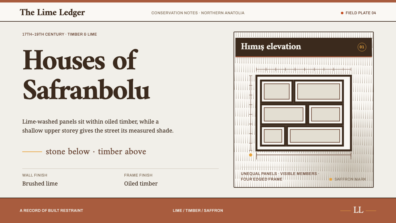 Safranbolu HousesBuilt, not decorated. Lime panels and oiled-timber frames carry a single saff…
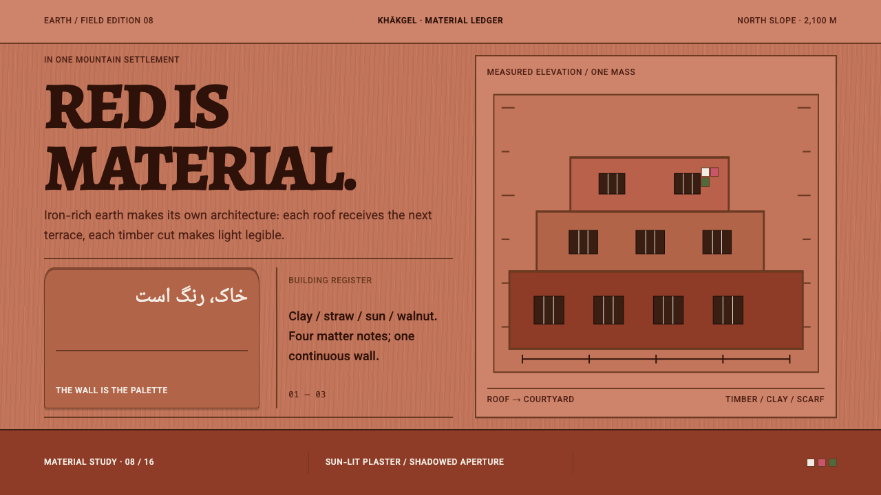 Abyaneh Red VillageRed is material, not decoration. Stepped clay bands and dark timber apertures…
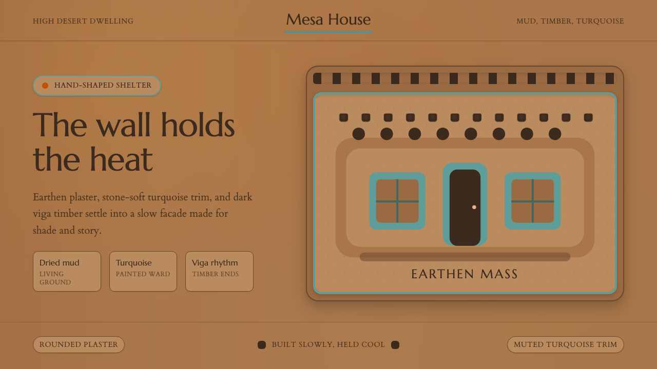 Adobe Pueblo SouthwestFeels made by hand. Earthen tan, turquoise trim, and viga rhythm shape the fr…
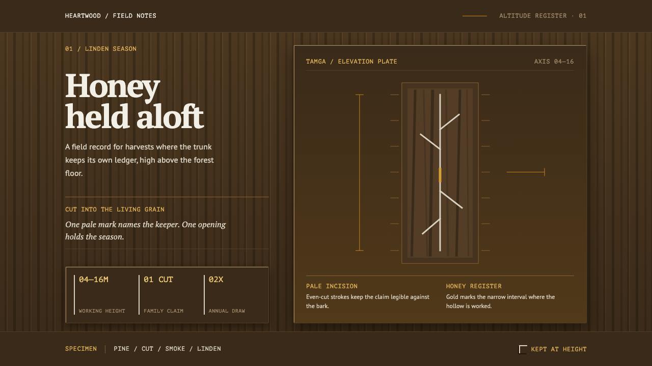 Bashkir Wild HoneyA working forest held on one axis. Pale tamga cuts and honey gold rise throug…
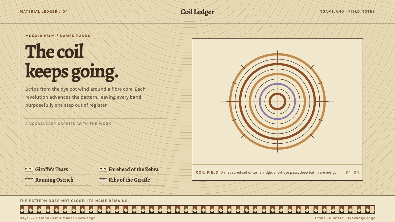 Botswana Coiled BasketThe pattern keeps travelling. Bark-brown stepped bands wind across a straw co…
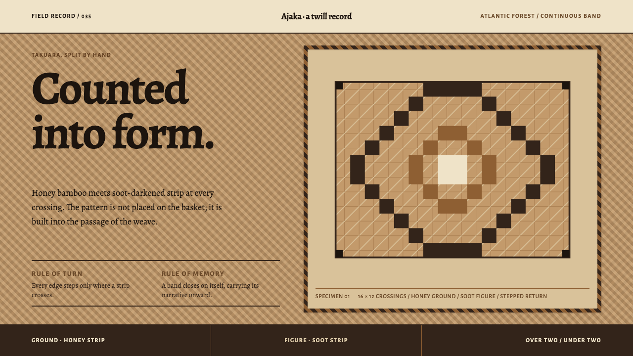 Guaraní Takuara BasketPattern is a record, not garnish. Honey bamboo and soot strips lock into a co…