What is Bashkir Wild Honey?
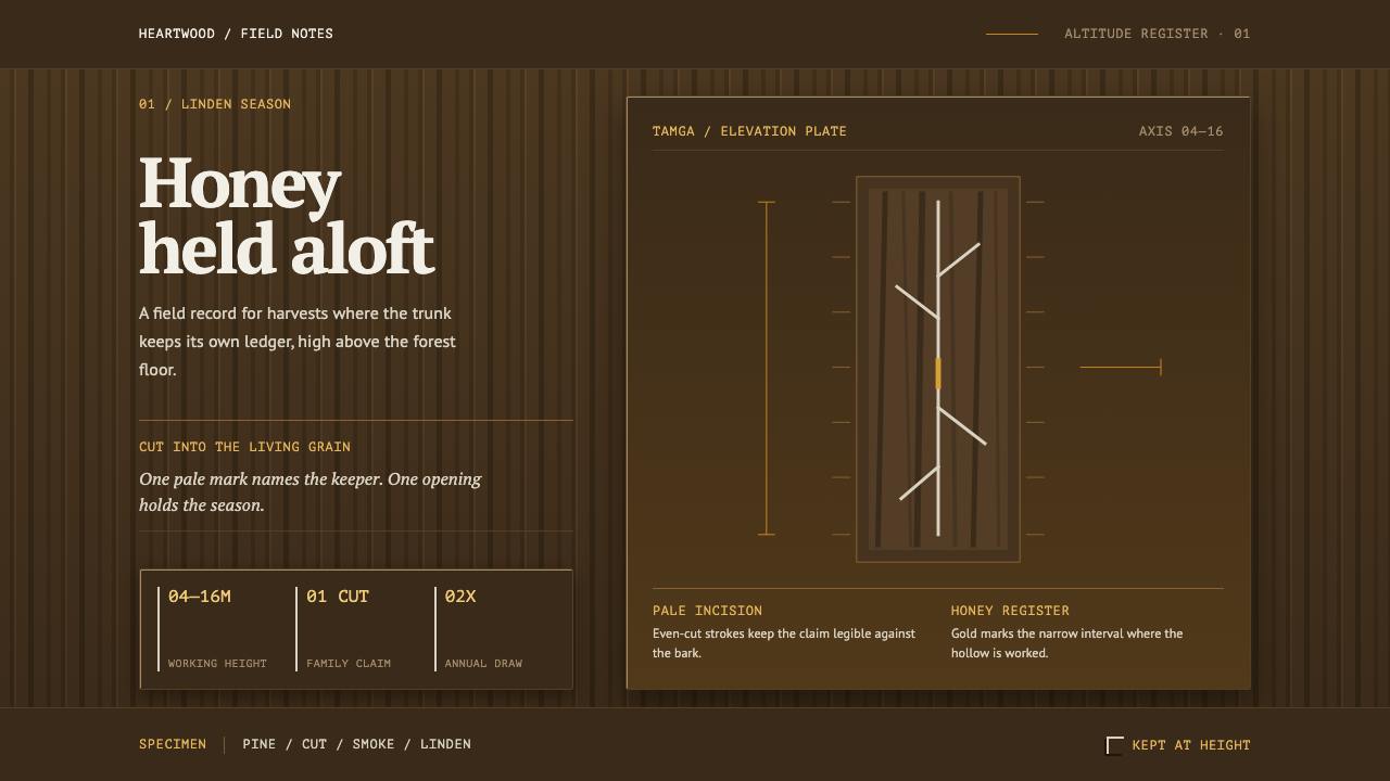
Bashkir Wild Honey takes the trunk of a living tree as its page: deep bark, pale tamga cuts, and honey gold rising along a single vertical axis.
Bashkir Wild Honey in brief
Bashkir Wild Honey is a dark, vertical design language drawn from bortnichestvo, the old practice of keeping bees in the hollows of living trees in the forests of the southern Urals. The look is built from three materials: deep, fissured bark as the ground, honey gold as the one color that glows, and the tamga, a clan mark cut into the tree as straight pale strokes. Everything else in the system follows from the shape of a trunk.
The defining move is that the trunk is the layout. Content is narrow, stacked and hung at height, arranged along a single rising axis, with open space below it. Columns are tall rather than wide. Sections climb rather than spread, and the eye is led upward the way a beekeeper's body is. The page does not ask to be filled; it asks to be climbed, and every element is placed as though it has to be reached.
Just as important is what the style refuses. It is not a cozy cabin or a warm farmhouse look, and the honey gold is not there to sweeten the page. Gold carries the interface because it is the one thing that comes out of the dark, the way honey comes out of a hollow. The tamga is never filled in, only cut. The result is a restrained, working aesthetic made of rope, blade and smoke, in which every mark carries a claim.
Where does Bashkir Wild Honey come from?
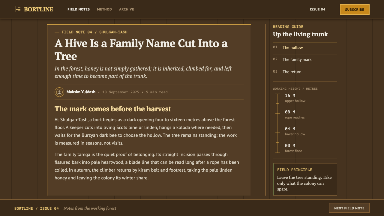
Bortnichestvo is beekeeping done at height. A hollow is cut into a living Scots pine or linden, anywhere from four to sixteen metres above the ground, and left for the native Burzyan dark bee to find. Nothing is built for the bees; the tree is the hive. The beekeeper reaches the hollow from a braided leather belt looped around the trunk, climbing and working in the open air with the tree as the only support. The practice is attested in the southern Urals over centuries and continues to the present day, which makes it less a historical curiosity than a craft with an unbroken line of practitioners.
Ownership is written onto the tree. The tree that holds a hollow belongs to a family, and the claim is cut into the bark as a tamga, a clan sign made of straight incised strokes. The cut opens the dark, fissured surface onto the pale heartwood beneath, so the mark is legible precisely because it exposes a lighter layer under a darker one. This is the visual idea that the design system inherits: a mark that is not painted on, but taken out, a contrast made by subtraction.
The setting is the Burzyansky district of Bashkortostan, in the southern Ural forests of Russia, and the tradition is tied to the Bashkir people and to the particular bee that lives there. The Burzyan dark bee is native to these forests, and keeping it is bound up with conservation as much as with honey. The Shulgan-Tash Nature Reserve, founded in 1958, sits at the center of that story, and the beekeeping families of Shulgan-Tash are the people who carry the practice. The movements named in the record are bortnichestvo itself, the tamga tradition of clan marking, and Bashkir Burzyan bee conservation.
What makes the story useful to a designer is how coherent its materials are. The ground is bark, dark and rough. The mark is a cut, pale and straight. The reward is honey, gold and warm. The body of the work is vertical, because the tree is vertical and the beekeeper's work is done on it. A design that takes these four facts seriously ends up with a narrow rising layout, a deep ground, one glowing accent and incised lines in place of filled shapes, which is exactly the shape of this system.
What defines the Bashkir Wild Honey look?
The Vertical Axis
Layout runs along one rising axis. Columns are narrow, content is stacked against the bark and hung at height, and the page leaves space beneath it as if the ground were far below. Horizontal sprawl, wide card grids and side-by-side comparisons are avoided; the system prefers a single column that the eye climbs. The effect is closer to a tall banner or a standing marker than to a spread-out dashboard.
Deep Bark Ground
The ground is a deep, brown-black bark tone, rough in implication rather than in literal texture. It is a dark system, and darkness here is not a mode switch but a material fact: the surface is a tree. Against it, anything pale or bright reads as light coming through, so contrast is earned from the ground up instead of added on top.
Honey Gold
Honey gold carries the interface. It is the one warm, luminous color, used for the elements that must be found and followed: primary actions, active states, key figures, and the thin line that marks the current position on the axis. Because it is the only glow in a dark field, it stays rare. It reads as honey seen at the mouth of a hollow, not as a decorative gold.
The Cut Tamga
The tamga is never filled, only cut. Marks in this system are made of straight incised strokes that reveal a paler layer beneath the dark surface, so they exist as lines and absences, not as solid shapes. Icons, dividers and emblems follow the same rule. A filled blob would contradict the logic of the system; a thin, straight, pale cut belongs to it.
Straight Strokes
Geometry is made of straight lines at decisive angles, the way a blade moves through bark. There are no soft blobs, no bubbly corners and no organic flourishes pretending to be nature. Curves, if they appear, are the incidental curves of a trunk, not decorative swirls. The honesty of the style lies in being a tool-made mark rather than an illustration of a tree.
Hung at Height
Elements feel suspended rather than seated. Panels hang from the top, headings sit high on their column, and the generous emptiness below creates a sense of drop. This is the visual translation of working on a belt looped around a trunk, with the ground far below. It gives pages a slightly tense, alert quality that suits serious or ritual content.
Rope, Blade and Smoke
The tone is working, not decorative. The materials of the practice are leather, rope, a cutting tool and smoke, and the style borrows their sobriety: little ornament, plain labels, a muted and slightly smoky cast to the dark ground. The system avoids any charm that does not come from labor. Warmth is allowed only where honey would actually be.
Who shaped Bashkir Wild Honey?
These families are the carriers of bortnichestvo as it is practiced today. Each tree that holds a hollow belongs to one of them, and the claim is written into the bark as a tamga. They are the reason the style treats ownership as a visible mark and not as an abstract label. For a designer, they stand for a body of craft knowledge that lives in people and trees at the same time.
Founded in 1958 in the Burzyansky district, the reserve is the institutional setting for protecting the forest and its native bees. It is where the traditional practice and the work of conservation meet. In the record of this style it anchors the one firm date in an otherwise continuous, centuries-long tradition, and it explains why the system treats the forest as something kept, not merely used.
The native dark bee of the Burzyan forests is the quiet protagonist of the story. It finds the hollow on its own and lives in the tree without human housing. Its conservation is one of the named movements in the record. In design terms, the bee is why the interface answers to honey gold: every warm accent in the system is a reference to what this animal produces inside the tree.
How do you use Bashkir Wild Honey today?
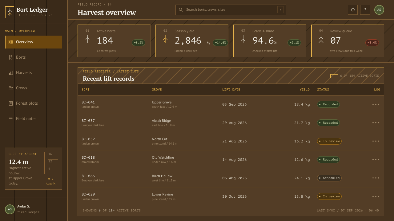
Bashkir Wild Honey is a style for serious, rooted, slightly ritual subject matter. It works best when content has a clear spine, a few precious items and room to breathe, and it falls flat when asked to display crowded, equal-weight information. The core principles are simple to state: keep it vertical, keep it dark, let honey gold be the only glow, and cut marks rather than filling them.
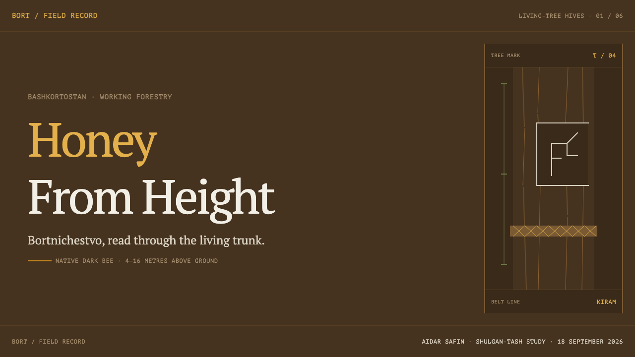
On presentation slides the style suits covers, section breaks and single-idea slides. A cover can be a dark ground with a narrow column of title text placed high, a thin honey gold line rising on one side and a single pale incised mark in a corner. Content slides work as one tall column with plenty of empty space beneath it, and a data slide can present one key figure in gold against the dark rather than a grid of charts. Portrait-format decks and vertical scroll stories are a natural home.
For web interfaces the style fits long single-column pages, craft and provenance stories, heritage brands, specialty food and drink, outdoor and nature organizations, and dark-mode products that want warmth without sweetness. Navigation can run as a slim vertical rail, buttons as gold outlines or gold text on bark, and dividers as pale cut lines. Dense dashboards and multi-column pricing grids are a poor match; if they must exist, use the system for the frame and keep data tables in a calmer, more neutral panel.
In editorial and marketing work the style gives provenance, documentary and field-story content an unusual authority. Long-form articles can run in one narrow column with pull quotes marked by a pale cut, and label-like captions can name place, species or maker. Campaign pages for honey, mead, tools, timber and outdoor craft benefit from the same restraint. Copy should be plain and specific; the style does not forgive flowery writing.
The most common mistake is to read the gold as an invitation to be sweet. Designers add golden gradients, honeycomb patterns, drips and rounded cartoon bees, and the system turns into a generic honey-brand template. The second mistake is filling the tamga with solid color, which breaks the cut-versus-fill logic. Keep the axis narrow, the ground deep, and the marks incised, and let the single glow stay rare.
Bashkir Wild Honey — FAQ
What is bortnichestvo?
Bortnichestvo is the traditional practice of beekeeping in hollows cut into living trees, found in the southern Ural forests, including the Burzyansky district of Bashkortostan. A hollow is cut into a living pine or linden several metres up, left for the native Burzyan dark bee to occupy, and worked from a leather belt looped around the trunk. It has been attested for centuries and continues to the present day.
What is a tamga?
A tamga is a clan or family mark. In this tradition it is cut into the bark of the tree that holds a hollow, as a few straight incised strokes, to show which family owns the tree. The cut opens the dark outer surface onto the pale wood beneath, which is why the mark appears as a light line on a dark field. In the design system it is the model for every icon and divider.
Why is the tamga never filled with color?
Because in the tradition it is a cut, not a painted shape. A tamga is made by removing bark to expose the lighter wood, so it exists as a line and an absence. The design system keeps that logic: marks are thin, straight and pale against the dark ground. Filling them with solid color would turn a claim made by subtraction into a decorative blob and weaken the visual coherence of the whole system.
Is this a rustic, cozy style?
No. Although it uses natural materials and a warm accent, the mood is closer to rope, blade and smoke than to a cabin interior. The work is done at height, with a belt, on a living tree, and the style borrows that alertness. The honey gold is a signal, not a comfort. If you want a cozy cottage look, this is not the system; if you want serious provenance with a restrained warm glow, it is.
Does the style work in a light layout?
It is designed as a dark system, because the ground is bark and the cut mark is pale against it. A light inversion would reverse the logic of the cut, since the tamga reveals a lighter layer under a darker surface. If you must use a light surface, keep the vertical axis and the incised lines, use the dark bark tone for text and marks, and treat honey gold as an accent only where it keeps enough contrast to read.
Related design styles
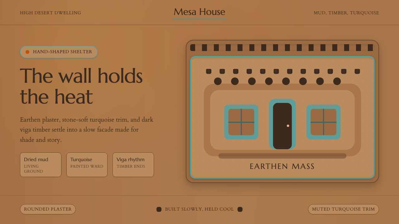 Adobe Pueblo SouthwestFeels made by hand. Earthen tan, turquoise trim, and viga rhythm shape the fr…
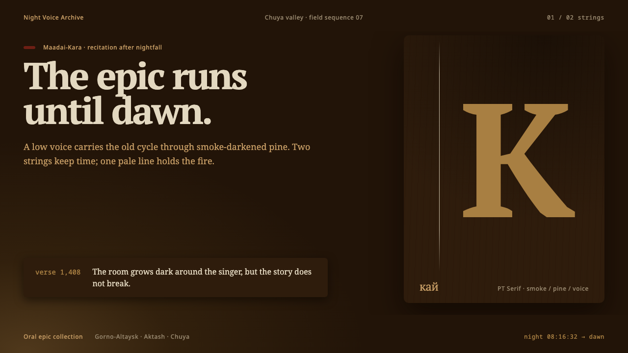 Altai Kai EpicEpic voice burns until dawn. Smoke-brown layers meet one pale string and a si…
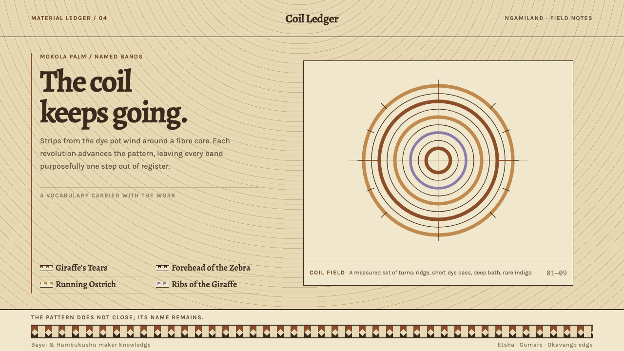 Botswana Coiled BasketThe pattern keeps travelling. Bark-brown stepped bands wind across a straw co…
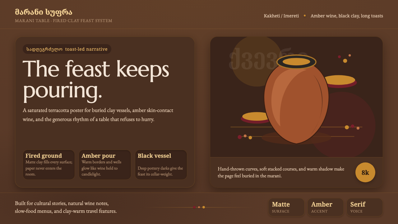 Georgian Qvevri Supra FeastHospitality made earthen. Terracotta ground, amber wine, Georgian serif curve…
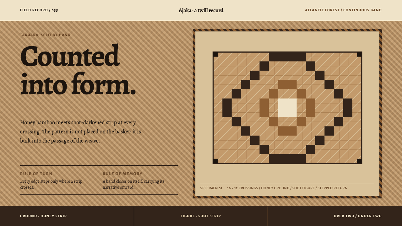 Guaraní Takuara BasketPattern is a record, not garnish. Honey bamboo and soot strips lock into a co…
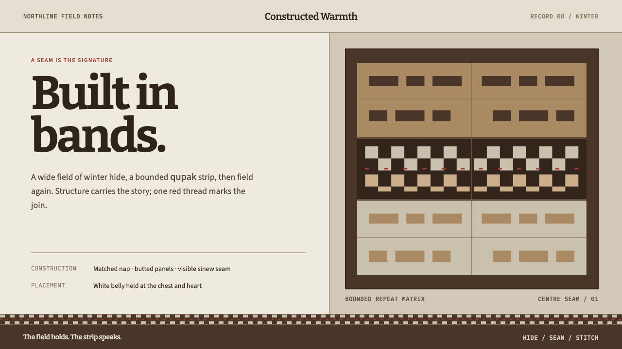 Iñupiat ParkaStructure carries the signature. Caribou-hide bands frame a bounded qupak rep…