What is Himba Otjize Ochre Namibia?
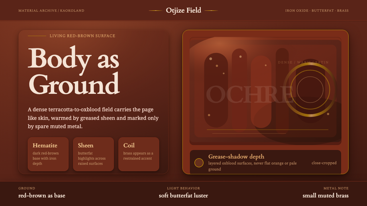
Himba Otjize Ochre turns the body into a living ground of iron-red warmth, butterfat sheen, charcoal depth, and sparse brass ritual.
Himba Otjize Ochre Namibia in brief
Himba Otjize Ochre is rooted in the arid Kaokoland of northwestern Namibia, where Himba women mix ground hematite with goat butterfat and aromatic omuzumba resin to make otjize. The paste is applied daily to skin and plaited hair, producing a surface that is deep red-brown rather than simply painted red: terracotta moves toward oxblood, and the grease catches light across cheekbones, shoulders, and braids.
The visual language begins with the body as ground. The dark ochre-red is not a backdrop placed behind objects; it is the continuous field from which every other element emerges. Butterfat introduces a soft, uneven sheen, while thicker deposits gather charcoal-like shadow. Muted brass and copper neck coils provide the rare metallic interruption, making their scarcity part of the composition.
This is a dense, ritual-warm palette with no appetite for brightness. It avoids vivid orange, pale cream, and decorative abundance in favor of iron, earth, grease, shadow, and restrained metal. The result feels tactile even when translated into a flat visual system: surfaces should appear lived, warmed, and repeatedly handled rather than sterile, polished, or digitally weightless.

Where does Himba Otjize Ochre Namibia come from?
The tradition is a living cultural practice from the Kunene and Kaokoland region of northwestern Namibia, extending from before 1900 through the present day. Its continuity matters to the aesthetic: otjize is not an archival color reference or a reconstructed historical palette, but a material practice renewed through daily preparation and wear.
At its center is the transformation of ground hematite into a body paste. Hematite supplies the deep red-brown earth character; goat butterfat gives the mixture its softened, fat-lustered surface; aromatic omuzumba resin adds another sensory register. Together they create a color that is both mineral and bodily, dry in origin but visually softened by grease.
Application to skin and plaited hair makes the palette inseparable from movement and form. Light does not fall evenly across a flat field. It breaks along the cheekbones, shoulders, and braids, while thicker grease settles into darker areas. The visual result is therefore not a uniform swatch but a living range from terracotta to oxblood, interrupted by sheen and shadow.
The surrounding pastoralist context and the use of ohumba neck coils establish the style’s balance between earth and metal. Brass and copper appear sparingly against the red-brown ground, so they read as deliberate points of attention rather than a second dominant palette. The design language should preserve that hierarchy: the ochre body-ground carries the composition, while metal and charcoal remain selective accents.
What defines the Himba Otjize Ochre Namibia look?
Ochre Ground
The dominant field is a deep ochre-red that moves between terracotta and oxblood. It should feel mineral, dry, and warm at once, with enough darkness to carry the visual weight of the composition. The ground is not a neutral canvas; it is the primary material presence.
Butterfat Sheen
Light should appear to gather softly on selected surfaces rather than spread evenly everywhere. The effect is a muted greasy sheen, closer to warmed skin than polished lacquer. Highlights remain broad and subdued, preserving the grounded character of the palette.
Charcoal Depth
Darkness enters as pooled depth where grease is thickest or surfaces turn away from light. It should read as accumulated material, not as a separate graphic outline. Charcoal gives the warm red ground a sense of density and physical volume.
Sparse Metal
Muted brass and copper appear through the ohumba neck coils as rare, deliberate interruptions. Metal should never compete with the ochre ground. Its role is to mark the eye, introduce a dry glint, and make restraint visible.
Body as Surface
The style treats the body as the ground of the image rather than as a figure placed on top of a background. Forms should feel integrated into the field, with color following contours and material changes creating hierarchy. The composition is embodied, not merely illustrated.
Ritual Warmth
Repeated daily application gives the visual language its sense of care, continuity, and ritual. Nothing should feel casually distressed or artificially rustic. Warmth comes from use and renewal: a surface made meaningful by being prepared, worn, and renewed.

Who shaped Himba Otjize Ochre Namibia?
Himba women are the preparers and wearers of otjize in the supplied cultural account. Their daily application to skin and plaited hair defines the palette as a lived surface, where hematite, butterfat, resin, light, and shadow remain connected to the body.
The pastoralist communities of Kaokoland provide the regional setting for the tradition. Their presence keeps the visual language tied to the arid landscape, daily material practice, and continuity of a living culture rather than to detached decorative styling.
Otjize is the central material figure: ground hematite combined with goat butterfat and aromatic omuzumba resin. It explains why the palette is simultaneously earthy, red-brown, softened by sheen, and associated with daily ritual and protection.
How do you use Himba Otjize Ochre Namibia today?
For presentation slides, use the ochre ground as the organizing field rather than treating it as a decorative cover color. Cover slides can carry one large, quiet composition with a warm red-brown field, a restrained title, and a sparse metallic cue. Content slides should preserve generous breathing room, while data slides can use charcoal for structure and muted brass for a single meaningful emphasis.
For web interfaces, this style suits dashboards and pricing pages that need to feel substantial, tactile, and deliberate. Keep the main field dark and warm, use softened light tones only where reading requires separation, and reserve brass or copper for selected actions, active states, or one important tier distinction. Cards should feel weighty and close to the ground, with depth suggested through tonal layering rather than glossy effects.
For editorial and marketing work, the palette supports intimate storytelling and material-led campaigns. Articles can place dense red-brown fields beside quieter text areas, using sheen-like highlights as rare moments of attention. Marketing pages benefit from a clear rhythm: an immersive ochre opening, restrained product or message blocks, and carefully placed metallic details that feel discovered rather than repeated.
Imagery should be treated as part of the material field. Cropping, shadow, and surface should reinforce the sense of skin, braid, mineral, grease, and metal without turning the subject into a costume or generic tribal motif. The strongest applications preserve density while allowing a few calm areas to keep the composition legible.
The common mistake is to translate the style into bright orange, abundant cream, shiny gold, and generalized ethnic decoration. That loses the specific logic of otjize. The palette should remain dark, red-brown, warm, and materially grounded; brass should stay sparse, sheen should stay soft, and ritual warmth should come from continuity and touch rather than added ornament.

Himba Otjize Ochre Namibia — FAQ
Is Himba Otjize Ochre simply an earthy red palette?
No. Its identity comes from the relationship between ground hematite, goat butterfat, aromatic resin, skin, hair, light, and shadow. A flat earthy red misses the softened sheen, charcoal depth, bodily surface, and daily ritual that make the palette specific.
Can the style use bright orange or pale cream as supporting colors?
They should be avoided as dominant supporting colors. The supplied visual language is dense and warm, built from dark ochre-red, oxblood, charcoal, muted brass, and copper. Bright orange or pale cream would shift the atmosphere away from the material character of otjize.
How should metallic accents be handled?
Use brass and copper sparingly, following the role of the ohumba neck coils in the supplied material. Metal should act as a rare point of attention against the ochre ground, not as a second dominant surface or a field of shine.
What makes the palette feel ritual-warm rather than merely rustic?
The warmth comes from continuity and repeated bodily use. Otjize is prepared and applied daily, and its surface changes with grease, light, contour, and accumulation. The design should communicate care, renewal, protection, and lived material presence rather than simulated roughness.
Related design styles
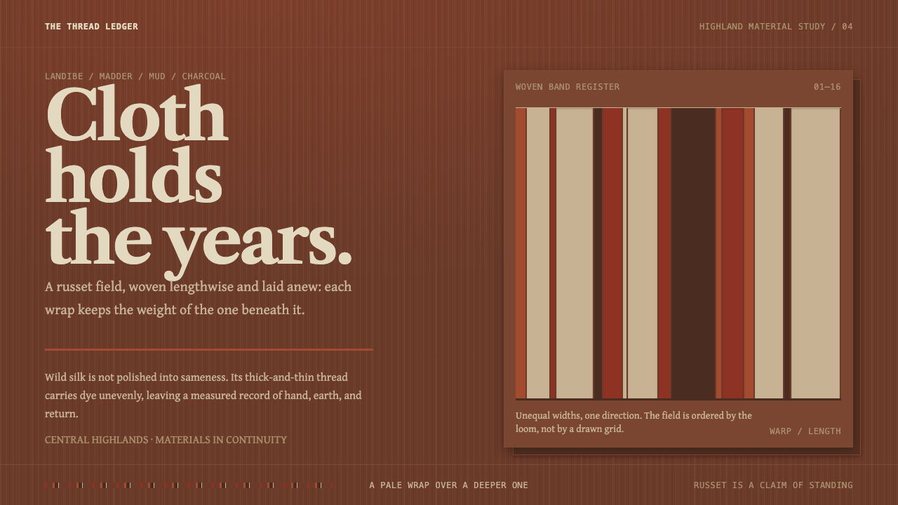 Merina LambamenaCloth keeps what came before. Russet warp bands stack in Libre Caslon's quiet…
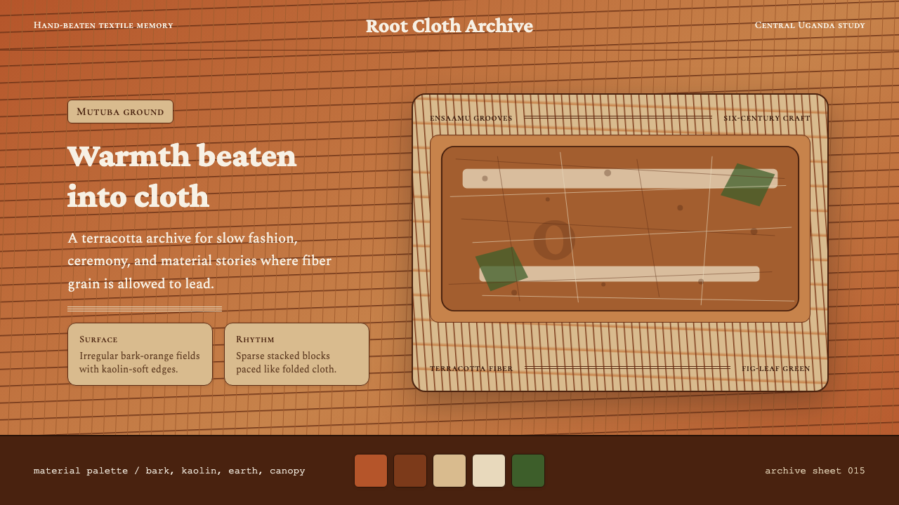 Ugandan Mutuba BarkclothHandmade warmth holds. Terracotta grain, Crimson Pro, and sparse stacked clot…
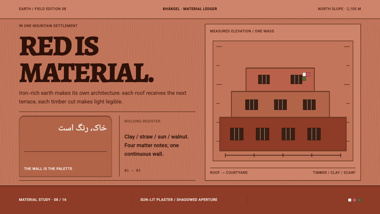 Abyaneh Red VillageRed is material, not decoration. Stepped clay bands and dark timber apertures…
 Botswana Coiled BasketThe pattern keeps travelling. Bark-brown stepped bands wind across a straw co…
 Dogon Toguna Shelter MaliGravity made visible. Deep umber ground, low roof band, chestnut posts in sha…
 Georgian Qvevri Supra FeastHospitality made earthen. Terracotta ground, amber wine, Georgian serif curve…