What is Van Gogh Post-Impressionist?什么是 Van Gogh Post-Impressionist?
Van Gogh turned visible brushwork into emotional language — swirling impasto, sun-scorched yellow, and cobalt blue that vibrates with feeling rather than merely describing a scene.梵高将可见的笔触化为情感语言——旋涌的厚涂、灼热的铬黄与震颤的钴蓝,每一笔都是感受,而非对场景的简单描述。
Van Gogh Post-Impressionist in briefVan Gogh Post-Impressionist 速览
Van Gogh Post-Impressionist design is a visual system rooted in the paintings Vincent van Gogh produced during his most intensive period in southern France, from 1888 through 1890. The aesthetic is built on three inseparable elements: directional impasto brushwork rendered as swirling, energetic marks rather than smooth fills; a palette drawn from the earth pigments and mineral colors available to a nineteenth-century painter in Provence — chrome yellow, cobalt blue, burnt sienna, Prussian green, and warm gallery cream; and an emotional directness that treats every color and every stroke as a carrier of feeling rather than a neutral description of form.梵高后印象派设计体系根植于文森特·梵高在法国南部度过的创作高峰期(1888—1890年)所产生的绘画。这套美学建立在三个不可分割的元素之上:以旋涌、充满能量的可见笔触呈现的有方向性厚涂,而非平滑填充;取自十九世纪普罗旺斯画家所用大地颜料与矿物色料的色板——铬黄、钴蓝、焦赭、普鲁士绿与温暖的画廊奶油色;以及一种将每一种颜色、每一笔触都视为情感载体而非对形态的中性描述的情感直接性。
The style belongs to Post-Impressionism, a broad current that moved beyond Impressionism's concern with light and momentary perception toward something more subjective and structural. Where Impressionism dissolved edges in atmosphere, Van Gogh reinforced them with contour lines borrowed from Japanese woodblock prints — a practice known as Japonisme that was fashionable among Paris avant-garde circles in the 1880s. The result is a world in which objects are simultaneously described and interpreted: a cypress tree is not just recorded but felt, its shape torqued into a flame-like upward spiral, its green deepened almost to black to express a kind of brooding vitality.这种风格属于后印象派——一股超越印象派对光线与瞬间感知之关注、转向更主观与结构性表达的广泛艺术思潮。印象派在大气中消解边缘,梵高则借鉴日本木版画的轮廓线加以强化——这种被称为日本主义(Japonisme)的实践在1880年代的巴黎先锋艺术圈颇为流行。其结果是一个物体同时被描述又被诠释的世界:一棵丝柏树不只是被记录,而是被感受——其形态被扭曲成火焰般向上的螺旋,其绿色被加深至近乎黑色,以表达一种郁郁的生命力。
As a contemporary design language, Van Gogh Post-Impressionism offers warmth, tactility, and expressive richness that cool, geometric modernist styles cannot provide. Surfaces carry the quality of gallery-paper grain and hand-applied pigment. Compositions favor organic movement over rigid grid alignment. Typography draws from the serif traditions of nineteenth-century French printing — letterforms with a classical weight and warmth rather than the neutral efficiency of sans-serif geometry. Applied with fidelity to its source, this aesthetic reads as both historically grounded and viscerally alive.作为当代设计语言,梵高后印象派提供了冷峻几何现代主义风格所无法给予的温暖、触感与表现力。表面带有美术馆纸张的颗粒质感与手工涂绘颜料的印迹。构图偏好有机运动而非僵硬的网格对齐。字体排印汲取十九世纪法国印刷的衬线传统——字形具有古典的分量感与温度,而非无衬线几何字体的中性效率。以忠实于其源头的方式应用,这套美学既有历史的厚重,又有本能上的鲜活。
See the Van Gogh Post-Impressionist design system查看 Van Gogh Post-Impressionist 完整设计系统
Where does Van Gogh Post-Impressionist come from?Van Gogh Post-Impressionist 从何而来?
Vincent van Gogh arrived in Arles in February 1888, having left the grey skies of Paris for what he hoped would be a revelatory encounter with southern light. He was thirty-four years old, had been painting seriously for only about seven years, and was in the grip of an ambition so intense it alarmed even his closest friends. In Arles he rented a portion of the Yellow House on the Place Lamartine and began painting at a rate that was, by any measure, extraordinary: in the fifteen months before his voluntary admission to the Saint-Paul-de-Mausole asylum in Saint-Rémy in May 1889, he produced approximately two hundred paintings and as many drawings.1888年2月,文森特·梵高抵达阿尔勒。他离开了巴黎阴沉的天空,希望与南方的光线相遇,获得某种启示。彼时他三十四岁,认真作画不过七年,却怀抱着一种令最亲密的友人都感到不安的强烈抱负。在阿尔勒,他租下了拉马丁广场黄色小屋的一部分,以任何标准衡量都堪称惊人的速度开始创作:在1889年5月自愿入住圣雷米圣保罗修道院疗养院之前的十五个月里,他创作了约两百幅画作和同等数量的素描。
The Arles period was shaped by two converging influences. The first was Japonisme — Van Gogh had spent years collecting and studying Japanese ukiyo-e woodblock prints in Paris, absorbing their use of bold, flat color areas, thick contour lines, asymmetric composition, and the treatment of natural motifs such as blossoms, water, and horizon lines as abstract decorative elements. These principles gave him a structural logic to organize the intensely saturated color he was experiencing under the Provençal sun. The second influence was Paul Gauguin, whom Van Gogh persuaded to join him in Arles in October 1888 for what he envisioned as an artists' commune. Gauguin pushed toward more memory-based, symbolic composition rather than direct observation; the creative friction between them — which ended catastrophically in December 1888 — deepened Van Gogh's engagement with expressive distortion as a deliberate technique.阿尔勒时期受到两股交汇影响的塑造。其一是日本主义——梵高在巴黎花费多年收集研究日本浮世绘木版画,吸收其大胆的平面色块、粗重的轮廓线、非对称构图,以及将花卉、流水、地平线等自然母题作为抽象装饰元素加以处理的方式。这些原则为他提供了一套结构性逻辑,用以组织他在普罗旺斯阳光下所体验到的强烈饱和色彩。其二是保罗·高更——梵高说服高更于1888年10月来到阿尔勒,加入他所设想的艺术家公社。高更推崇更多依赖记忆的、象征性的构图,而非直接观察;两人之间的创作摩擦——以1888年12月的灾难性结局告终——加深了梵高对表现性变形作为刻意技巧的投入。
The move to the Saint-Paul-de-Mausole asylum at Saint-Rémy in May 1889 did not diminish Van Gogh's output; if anything, it intensified and focused it. The asylum's walled garden, the surrounding wheat fields, olive groves, and the view of the Alpilles mountains visible from his window became obsessive subjects. The Starry Night — now the most recognized painting in the world — was produced here in June 1889. The spiraling, turbulent sky is often read as a projection of Van Gogh's psychological state, but it also represents a fully realized formal solution: the sky becomes a field of directional brushwork that models movement and energy as confidently as any academic painter modeled solid form. His brother Theo's wife, Jo van Gogh-Bonger, who inherited the bulk of the paintings and letters after both men died in 1890 and 1891 respectively, was instrumental in the posthumous construction of Van Gogh's reputation, arranging exhibitions across Europe that established his canonical status by the early twentieth century.1889年5月迁入圣雷米疗养院并未削减梵高的创作,反而使之更加集中和强烈。疗养院的围墙花园、周围的麦田、橄榄树丛,以及从他窗口可见的阿尔皮勒山景,成为他痴迷的主题。如今世界上被认知度最高的画作《星夜》正是在这里于1889年6月诞生的。那旋涡状、汹涌的夜空常被解读为梵高心理状态的投射,但它同时也是一个完全实现的形式解答:天空成为一片有方向性笔触构成的场域,以与任何学院派画家塑造实体形态同样自信的方式,模塑出运动与能量。梵高的弟弟提奥的妻子乔·梵高-邦格尔——在两位男性分别于1890年和1891年相继去世后,继承了大部分画作与信件——对梵高身后声誉的建立起到了关键作用,她在欧洲各地安排展览,在二十世纪初确立了梵高的经典地位。
Post-Impressionism as a movement was named retrospectively by the British art critic Roger Fry in 1910, when he organized the landmark exhibition 'Manet and the Post-Impressionists' in London. Fry used the term to group painters who had begun from Impressionism but moved toward more structured, symbolic, or expressive ends — including Van Gogh, Paul Gauguin, Paul Cézanne, and Georges Seurat. The movements and practices that fed Van Gogh's specific approach included: Impressionism, which gave him the liberation to work from direct observation and use color freely; Japonisme, which gave him compositional structure; Provençal plein-air painting, which kept him tethered to observed landscape even as he distorted it; and a deeply personal theology of labor and empathy rooted in his years as a lay preacher in the Borinage coal district of Belgium during the early 1880s. The earthen, raw quality of his earliest Dutch work — The Potato Eaters of 1885, with its dark, almost monochromatic palette — can be read as the foundation from which the Arles explosion of color becomes all the more dramatic.后印象派作为运动名称,是英国艺术评论家罗杰·弗莱于1910年策划伦敦里程碑式展览「马奈与后印象派」时追溯性命名的。弗莱用这个术语将一批从印象派出发、却走向更具结构性、象征性或表现性目标的画家归为一组——包括梵高、保罗·高更、保罗·塞尚与乔治·修拉。滋养梵高特定方法的运动与实践包括:印象派(给予他从直接观察出发、自由运用色彩的解放);日本主义(赋予他构图结构);普罗旺斯户外写生绘画(即使在变形现实时,仍将他系于观察到的风景);以及根植于他1880年代初在比利时博里纳日煤矿区担任平信徒传教士岁月的深厚个人神学——关于劳动与共情的神学。他最早期荷兰时期作品那种泥土般、原始的品质——1885年《吃土豆的人》那几乎单色的深暗色板——可以被读作阿尔勒时期色彩爆发的基底,正是从这个基底出发,那场爆发才显得如此戏剧性。
What defines the Van Gogh Post-Impressionist look?Van Gogh Post-Impressionist 的视觉特征是什么?
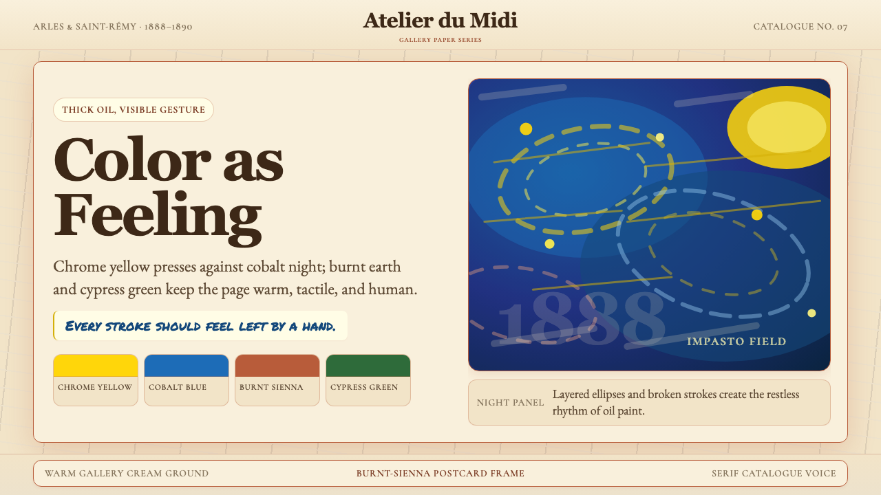
Impasto Brushwork厚涂笔触
The defining mark of Van Gogh's mature style is paint applied in thick, directional ridges that remain visible on the surface — never smoothed into a seamless finish. Each stroke has a purpose and a direction: parallel marks follow the contour of a form, concentric swirls animate a sky or a field, short staccato dabs describe a flower's petals or a blade of grass. In a design context, this translates to textures and surface treatments that suggest hand-applied materiality — grain, directionality, and the deliberate imperfection of a mark made by a human hand rather than a mechanical process.梵高成熟风格的决定性标志是以厚实、有方向性的颜料脊线施色,这些笔迹留在表面,从不被磨平为无缝的光滑效果。每一笔都有其目的与方向:平行笔触追随形态的轮廓,同心旋涡激活天空或麦田,短促的点状戳笔描绘花瓣或草叶。在设计语境中,这转化为暗示手工涂绘质感的肌理与表面处理——颗粒感、方向性,以及人手而非机械过程留下的刻意不完美。
Earth-Pigment and Mineral Color大地颜料与矿物色彩
Van Gogh's palette was constrained by what was available — and affordable — to a nineteenth-century painter working in southern France. Chrome yellow (brilliant, almost acidic, slightly warm), cobalt blue (deep, cool, luminous), burnt sienna (a reddish-brown earth), Prussian green (dark, almost resinous), and the warm cream of unpainted linen: these are the foundational colors. The palette is not subtle in the contemporary muted-tone sense — it is bold and saturated — but it is also grounded, because each color has an earthen or mineral quality that prevents it from reading as synthetic or flat.梵高的色板受限于十九世纪在法国南部工作的画家所能获得和负担得起的颜料。铬黄(明亮,几乎带有酸性,略微偏暖),钴蓝(深邃,冷静,发光),焦赭(红褐色的土色),普鲁士绿(深暗,几乎带有树脂感),以及未涂白的亚麻布的温暖奶油色:这些是基础色彩。这套色板并不是当代审美中那种微妙低调的色调——它大胆而饱和——但同时也是接地气的,因为每种颜色都具有土质或矿物的品质,使其不会被读解为合成或平面化的。
Contour and Japanese Outline轮廓线与日本式勾边
One of Van Gogh's most distinctive structural moves — absorbed from his study of Japanese ukiyo-e prints — is the use of a dark, definitive contour line to bound forms and separate color areas. This line is not the academic outline of Western drawing tradition, which describes the edge of a three-dimensional form viewed in perspective; it is more like a calligraphic boundary that gives each element its own visual territory. In design, this translates to the use of expressive border strokes, outlined type, or illustrated elements where the edge itself is as communicative as the filled area it encloses.梵高最具特征性的结构性手法之一——从他对日本浮世绘版画的研究中吸收而来——是使用深色、确定性的轮廓线来界定形态、分隔色彩区域。这条线不是西方绘画传统中描述透视中三维形态边缘的学院式轮廓;它更像一条书法式边界,赋予每个元素自己独立的视觉领域。在设计中,这转化为富有表现力的边框笔触、带轮廓的字体,或插图元素中边缘本身与其所围合的填充区域同样具有传达力的处理方式。
Warm Ground and Gallery Texture暖底与画廊质感
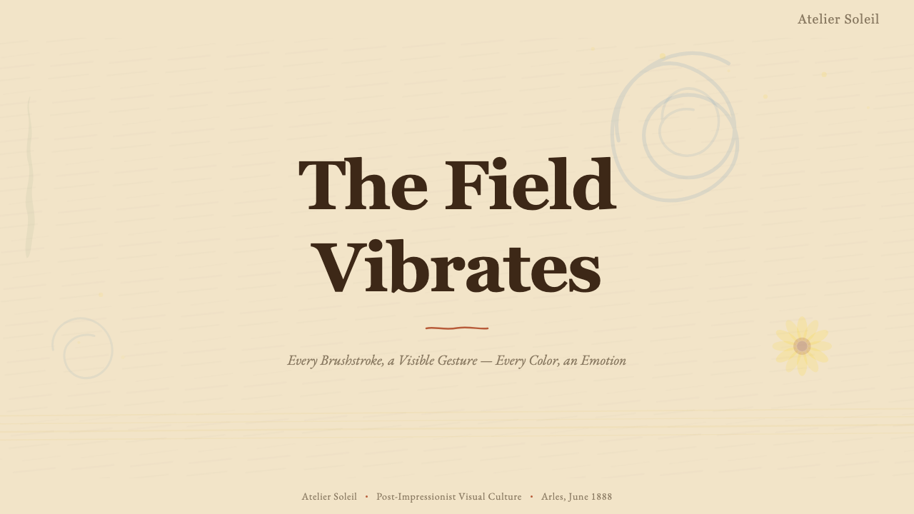
Van Gogh often began on an unprepared or minimally primed linen canvas, and the warm, slightly textured ground shows through his paint layers, contributing to the overall warmth and organic quality of the finished work. In design, this translates to backgrounds that are not cold white or neutral grey but rather a warm, slightly off-white or creamy tone with a subtle papery or fibrous grain. This quality of surface distinguishes the Van Gogh aesthetic from both the clinical white of contemporary minimalism and the stark black of maximalist dark-mode design.梵高常在未上底色或仅简单打底的亚麻布上开始作画,温暖、略带质感的底层透过颜料层显现,为成品带来整体的温度感与有机品质。在设计中,这转化为非冷白或中性灰色的背景,而是略带偏色的温暖奶白或奶油色调,带有微妙的纸质或纤维状颗粒感。这种表面品质将梵高美学与当代极简主义的临床白色以及最大化深色模式设计的冷峻黑色区别开来。
Emotional Color Correspondence情感色彩对应
Van Gogh wrote extensively about the emotional and symbolic meanings he assigned to specific colors — a practice described in his letters to Theo with unusual precision. Yellow signified the sun, warmth, life, and divine energy; blue represented infinity, depth, and spiritual calm; green carried the vitality and sometimes the melancholy of growing things. These are not arbitrary assignments but a consistent symbolic system that gives Van Gogh's color choices a legibility beyond pure aesthetics. A design rooted in this palette can use these color correspondences intentionally: warm yellows for energy and welcome, deep blues for contemplation and trust, earthy greens for nature and growth.梵高在给提奥的信中大量书写他赋予特定颜色的情感与象征意涵——这些描述以罕见的精确度记录了他的色彩思想。黄色意味着太阳、温暖、生命与神性能量;蓝色代表无限、深度与精神宁静;绿色承载生长之物的生命力,有时也带有忧郁。这些并非随意的指派,而是一套一致的象征体系,赋予梵高色彩选择超越纯粹美学的可读性。根植于这套色板的设计可以有意识地运用这些色彩对应:温暖的黄色传递能量与欢迎,深邃的蓝色暗示沉思与信赖,大地色的绿色代表自然与生长。
Organic Dynamism over Geometric Order有机动感优先于几何秩序
Where Bauhaus and Swiss International Style impose the logic of the ruled grid, Van Gogh's visual language follows the logic of observed nature — spirals, undulations, radial patterns, and the irregular rhythms of living forms. Compositions tilt and lean; horizons are rarely centered; foregrounds push forward with exaggerated foreshortening. In design, this means layouts that use diagonal emphasis, curved text paths, asymmetric cropping, and illustrated or textured elements that resist alignment to a strict mathematical grid. The goal is visual energy and aliveness rather than rational clarity.在包豪斯与瑞士国际主义风格强加直尺网格逻辑之处,梵高的视觉语言遵循观察到的自然逻辑——螺旋、起伏、放射状图案,以及生命形态的不规则节律。构图倾斜歪侧,地平线极少居中,前景以夸张的透视缩短向前推进。在设计中,这意味着运用对角线强调、弧形文字路径、非对称裁切,以及抵制严格数学网格对齐的插图或质感元素。目标是视觉上的能量感与鲜活感,而非理性的清晰。
Nineteenth-Century Serif Warmth十九世纪衬线字体的温度
Van Gogh worked in a world shaped by nineteenth-century French printing — the era of classical transitional and old-style serif typefaces, of letterpress printing with its slight impression into the paper, of handwritten correspondence in ink on cream stock. Typography in the Van Gogh style draws from this tradition: letterforms with visible contrast between thick and thin strokes, bracketed serifs, and a warmth that recalls hand-set metal type. The effect is intimate and literary rather than technological or corporate, and pairs naturally with the handmade quality of the surrounding visual elements.梵高生活在一个由十九世纪法国印刷文化塑造的世界——那是古典过渡型与旧式风格衬线字体的时代,是活版印刷在纸面留下轻微压痕的时代,是用钢笔在奶油色纸上手书往来信函的时代。梵高风格的排版从这一传统汲取:字形笔画粗细对比明显,衬线带括弧,散发出令人联想到手工排铅字的温度。效果亲切而富有文学气质,而非技术性或企业化,与周围视觉元素的手工质感自然相融。
See the Van Gogh Post-Impressionist design system查看 Van Gogh Post-Impressionist 完整设计系统
Who shaped Van Gogh Post-Impressionist?谁塑造了 Van Gogh Post-Impressionist?
Van Gogh (1853–1890) was a Dutch painter who spent his formative years as a lay preacher and art dealer before turning to painting seriously in 1881. His transformation from the dark, empathic realism of his Dutch period to the incandescent color and expressive brushwork of his Arles and Saint-Rémy years is one of the most dramatic in art history. In the last two years of his life he produced the works — Sunflowers, The Night Café, Bedroom in Arles, The Starry Night, Wheat Field with Crows — that now define the entire aesthetic. He died in July 1890, largely unrecognized commercially, having sold only one painting during his lifetime.梵高(1853—1890年)是一位荷兰画家,在认真投身绘画(1881年)之前,曾做过平信徒传教士和艺术品经纪人。从荷兰时期黑暗、充满共情的写实主义,到阿尔勒与圣雷米时期灼热的色彩与表现性笔触——这是艺术史上最戏剧性的转变之一。在他生命的最后两年,他创作了如今定义整套美学的作品:《向日葵》《夜晚咖啡馆》《阿尔勒的卧室》《星夜》《麦田上的乌鸦》。他于1890年7月辞世,在商业上几乎默默无闻,一生仅售出一幅画。
Theo van Gogh (1857–1891), Vincent's younger brother and a successful art dealer at the Paris gallery Boussod, Valadon & Cie, was the financial and emotional foundation of Vincent's entire career. He sent a monthly stipend that allowed Vincent to work without commercial pressure, corresponded with him almost daily, and championed Impressionist and Post-Impressionist painters at a time when the Paris market was only beginning to accept them. The 820 surviving letters between the brothers constitute an extraordinary document of artistic thought and brotherly love, and they remain the primary textual source for understanding Van Gogh's intentions and methods.提奥·梵高(1857—1891年),文森特的弟弟,巴黎布索与瓦拉东画廊的成功艺术品经纪人,是文森特整个职业生涯的经济与情感支柱。他每月寄给文森特生活费,使其得以不受商业压力地创作,几乎每日与他通信,并在巴黎市场刚刚开始接纳印象派与后印象派画家之际,积极推广这些画家。兄弟二人之间现存的820封信件构成了一份关于艺术思想与手足深情的非凡文献,至今仍是理解梵高创作意图与方法的首要文字来源。
Jo van Gogh-Bonger (1862–1925) married Theo van Gogh in 1889 and, after his death in January 1891 — just six months after Vincent's — found herself in possession of an enormous collection of paintings, drawings, and letters that the art world had not yet recognized. Over the following decades, she systematically arranged loans and exhibitions across Europe, published a selection of the letters (first in Dutch, then in German translation, then in English), and negotiated sales and gifts to major museums. Without her sustained effort, the Van Gogh canon as we know it — the specific body of works that defines the aesthetic — might never have been assembled into the coherent public legacy it became.乔·梵高-邦格尔(1862—1925年)于1889年嫁给提奥·梵高,在提奥于1891年1月去世(距文森特辞世仅六个月)后,发现自己持有大量艺术界尚未认可的画作、素描与信件。在此后数十年间,她系统性地在欧洲各地安排借展,出版书信选集(先是荷兰语,继而德语译本,再是英语版),并与各大博物馆谈判出售与捐赠事宜。若无她持续不懈的努力,我们今日所知的梵高经典——定义这套美学的特定作品群——或许永远无法被整合成如此连贯的公共遗产。
Paul Gauguin (1848–1903) spent nine turbulent weeks in Arles with Van Gogh from October to December 1888, a collaboration that produced some of the most closely analyzed works in either artist's career. Gauguin's approach — working from memory and imagination, using flat color areas bounded by heavy outlines in a style he called Synthetism — pushed Van Gogh toward greater compositional boldness and symbolic use of color, even as their temperamental differences created constant friction. The episode ended with Van Gogh's famous breakdown in late December 1888. Despite the personal catastrophe, the encounter marks a genuine artistic watershed: after Gauguin's departure, Van Gogh's style became decisively more expressive and less observationally constrained.保罗·高更(1848—1903年)于1888年10月至12月间与梵高在阿尔勒共处了动荡的九周,这段合作产生了两位艺术家职业生涯中被分析最为深入的一批作品。高更的方式——依靠记忆与想象作画,以他称之为综合主义的风格使用被粗重轮廓线界定的平面色块——推动梵高走向更大胆的构图和更具象征性的色彩运用,尽管两人气质上的差异制造了持续的摩擦。这段插曲以1888年12月底梵高著名的精神崩溃告终。尽管是个人层面的灾难,这次相遇却标志着真正的艺术分水岭:高更离开后,梵高的风格变得更具决定性的表现力,观察上的束缚也随之减少。
Roger Fry (1866–1934) was the British art critic and painter who coined the term Post-Impressionism in 1910 for his landmark exhibition in London. He was not himself a painter in the Van Gogh tradition, but his critical framework — which argued that these painters were engaged in a formal and emotional investigation of painting's own means rather than a representation of the external world — gave the movement an intellectual legitimacy that accelerated its acceptance by collectors and institutions. Fry's grouping of Van Gogh with Cézanne, Gauguin, and Seurat under one rubric created the critical vocabulary through which Van Gogh's specific contribution — the emotive use of brushwork and color — could be discussed, compared, and eventually systematized into the design language we work with today.罗杰·弗莱(1866—1934年)是英国艺术评论家与画家,他于1910年在伦敦策划里程碑式展览时创造了后印象派这一术语。他本人并非梵高传统意义上的画家,但他的批评框架——主张这些画家从事的是对绘画自身手段的形式与情感探究,而非对外部世界的再现——赋予了这一运动思想上的正当性,加速了收藏家与机构对其的接纳。弗莱将梵高与塞尚、高更、修拉并置于同一名称之下,创造了批评词汇,借此梵高的特定贡献——笔触与色彩的情感性运用——得以被讨论、比较,并最终被系统化为我们今日所运用的设计语言。
How do you use Van Gogh Post-Impressionist today?今天怎么用 Van Gogh Post-Impressionist?
Van Gogh Post-Impressionist design is best understood as an expressive warmth system — it performs most effectively when the goal is to communicate vitality, emotional authenticity, or artistic prestige, and when the context allows for visual richness rather than demanding neutral austerity. Applying it correctly requires understanding that the style's power comes from specific tensions: saturated color held in check by earthy grounding, organic dynamism balanced against legible hierarchy, and tactile warmth coexisting with intentional compositional structure.梵高后印象派设计最好被理解为一套表现性温暖系统——当目标是传达活力、情感真实性或艺术声望,且语境允许视觉丰富性而非要求中性简朴时,它表现最为出色。正确应用这种风格需要理解:它的力量来自特定的张力——饱和色彩被大地色调所约束,有机动感与清晰的层级结构相平衡,触感温度与刻意的构图结构共存。
For presentation slides, the style works on both cover and content pages but in different registers. A cover page benefits from the full force of the palette: a warm cream ground, a boldly painted illustration or typographic element in chrome yellow or cobalt blue, and a title set in a warm serif with generous weight. The composition should be asymmetric and slightly tilted toward the organic — a brushwork texture field behind the title, a painted border that thickens and thins like a hand-drawn mark. Content slides should pull back from this richness and use it as a structural accent: a warm ground color, clean serif body text, and color reserved for callout blocks, section markers, or data emphasis. Data visualization slides benefit from treating chart elements as painted objects — bars with a slightly brushed edge, color fills that correspond to the warm earth palette rather than clinical primaries.在演示文稿中,这种风格在封面页与内容页上均有效,但方式不同。封面页适合充分发挥色板的全部力量:温暖的奶油底色,以铬黄或钴蓝大胆绘制的插图或字体元素,以及以温暖衬线字体、慷慨字重排印的标题。构图应当非对称,略微向有机感倾斜——标题后方的笔触质感底面,像手绘标记一样粗细变化的绘画式边框。内容页应从这种丰富性中后退,将其作为结构性强调:温暖底色,清晰的衬线正文字体,色彩保留给引用块、章节标记或数据强调。数据可视化幻灯片可将图表元素当作绘制对象处理——带有略微刷涂边缘的柱条,色彩填充对应温暖大地色板而非临床感的原色。
For web interfaces, the style is best suited to brand-forward contexts where emotional resonance matters more than information density: a portfolio landing page, an artist collective's homepage, a cultural institution's event site, a premium editorial publication, or a product that positions itself as handcrafted or artisanal. Dashboard and productivity applications generally do not suit the style — the expressivity that makes a landing page memorable becomes visual noise when a user needs to scan data quickly. On the web, use the warm cream as the background, limit the palette to one dominant earth tone plus the cobalt or yellow as a single accent, and apply brushwork textures as subtle surface treatments rather than aggressive foreground elements. Navigation and interactive components should retain sufficient contrast and clarity to remain fully usable.对于网页界面,这种风格最适合品牌表现力优先、情感共鸣比信息密度更重要的场景:个人作品集落地页、艺术家集体主页、文化机构活动网站、高端编辑出版物,或将自身定位为手工制作或工匠风格的产品。仪表板与生产力应用通常不适合这种风格——在落地页上令人难忘的表现力,在用户需要快速扫描数据时会变成视觉噪音。在网页上,以温暖奶油色作为背景,将色板限制为一种主导大地色调加钴蓝或黄色中的一种作为单一强调色,将笔触质感作为微妙的表面处理而非强势的前景元素。导航与交互组件应保持足够的对比度与清晰度,确保完全可用。
For editorial and marketing work, the Van Gogh style excels at cover design, poster work, and feature article headers where a single image or typographic moment carries the full weight of the communication. A Bauhaus-derived layout organizes through geometry; a Van Gogh-derived layout organizes through composition and color flow — the reader's eye is guided by warm-to-cool color transitions and the directional energy of brushwork rather than by ruled lines and grid anchors. Marketing pages work well when the style's inherent warmth is aligned with the product's values: artisanal food, luxury travel, cultural subscriptions, or premium creative tools. A section that alternates between cream-on-deep-cobalt and warm-yellow-on-cream can carry the full expressive range of the palette without becoming visually unstable.对于编辑与营销内容,梵高风格在封面设计、海报作品及专题文章头图方面表现卓越——这些场景中单一的图像或字体时刻承载着传达的全部分量。包豪斯衍生版面通过几何来组织;梵高衍生版面通过构图与色彩流动来组织——读者的视线被暖色到冷色的色彩过渡和笔触的方向性能量引导,而非被直线与网格锚点所引导。当风格固有的温暖感与产品价值观一致时,营销页面效果最佳:工匠食品、奢华旅行、文化订阅,或高端创意工具。在深钴蓝底奶油字与暖黄底奶油色之间交替的区块,可以承载色板的全部表现幅度,而不会产生视觉上的不稳定。
A common mistake when applying this style is over-texturing — adding grain, brushwork, and impasto effects to every element simultaneously, producing a visual field so busy that hierarchy collapses and reading becomes laborious. Van Gogh's own paintings are not uniformly textured: some areas are smoothly laid in, others built up with thick ridges, and the contrast between these is part of what makes the densely worked areas read as expressive emphasis rather than overall noise. Apply the same principle in design: choose which surfaces carry texture and which are comparatively quiet, and let the contrast do the compositional work. Similarly, resist the temptation to use the full palette simultaneously — one dominant color, one accent, and the warm ground will almost always produce a more coherent result than attempting to deploy chrome yellow, cobalt blue, and burnt sienna at equal weight.应用这种风格时最常见的错误是过度质感化——同时在每个元素上叠加颗粒、笔触和厚涂效果,产生层级崩溃、阅读费力的视觉混乱。梵高自己的画作并不是均匀质感化的:有些区域平整铺就,另一些以厚实颜料脊线堆砌,两者之间的对比正是使密集处理区域被读解为表现性强调而非整体噪音的原因。在设计中应用同样的原则:选择哪些表面承载质感,哪些相对安静,让对比来完成构图工作。同样,克制同时使用全套色板的诱惑——一种主导色、一种强调色加上温暖的底色,几乎总能比同时以等权重部署铬黄、钴蓝和焦赭产生更连贯的结果。
See the Van Gogh Post-Impressionist design system查看 Van Gogh Post-Impressionist 完整设计系统
Van Gogh Post-Impressionist — FAQVan Gogh Post-Impressionist · 常见问题
Is Van Gogh style appropriate for professional or corporate design, or is it too artistic?梵高风格适合专业或企业设计吗,还是说它太过艺术化?
The style is well suited to professional contexts where artistic credibility, cultural prestige, or emotional warmth are genuine values — a museum's digital presence, a creative agency's brand identity, a luxury product's marketing materials, or a publishing platform positioning itself as editorially serious. It is poorly suited to contexts that require the appearance of neutral rationality: financial services dashboards, medical information systems, legal documents, or enterprise SaaS products where user trust depends on calm clarity rather than expressive warmth. The question to ask is not whether the style is 'too artistic' in the abstract, but whether expressivity serves or undermines the specific trust relationship between the product and its users.这种风格非常适合艺术可信度、文化声望或情感温度是真实价值诉求的专业场景——博物馆的数字存在、创意机构的品牌识别、奢侈品的营销材料,或将自身定位为编辑上严肃认真的出版平台。它不适合需要中性理性外观的场景:金融服务仪表板、医疗信息系统、法律文书,或用户信任建立在平静清晰而非表现性温度上的企业SaaS产品。要问的不是这种风格在抽象意义上是否太过艺术化,而是表现力在特定产品与其用户之间的信任关系中是服务于还是破坏了这种关系。
How do I prevent a Van Gogh-inspired design from looking like a greeting card?如何防止梵高风格的设计看起来像一张贺卡?
The greeting-card trap comes from reducing the style to its most superficial elements: sunflower motifs, cheerful yellow, and swirly backgrounds without compositional discipline. To avoid it, anchor the design in the aspects of Van Gogh's work that are less frequently popularized — the dark cobalt and resinous green, the intense psychological weight of his compressed compositions, the hard contour lines borrowed from Japanese printmaking, the earthy ground color rather than bright white. Treat the brushwork as structural rather than decorative: it should define the direction of the eye and the emotional register of the communication, not simply add a 'handmade' feel to an otherwise generic layout. When in doubt, push toward the dramatic and even somber aspects of the palette rather than the sunny ones.陷入贺卡陷阱,是因为将这种风格简化为其最表面的元素:向日葵图案、欢快的黄色,以及没有构图纪律的旋涡背景。要避免这一点,需要将设计锚定在梵高作品中较少被通俗化的方面——深邃的钴蓝与树脂感绿色,他紧凑构图中强烈的心理重量,从日本版画中借来的硬朗轮廓线,大地色的底色而非明亮白色。将笔触作为结构性元素而非装饰性元素处理:它应当界定视线方向和传达的情感基调,而不仅仅是在一个本已平庸的版面上增添一种「手工制作」感。如有疑虑,宁可向色板中戏剧性甚至阴郁的一面推进,而非向阳光明媚的一面。
Can this style work for dark-mode interfaces?这种风格能用于深色模式界面吗?
A dark-mode inversion of the Van Gogh palette is possible but requires significant restraint. The canonical warm cream ground is the style's emotional center; removing it shifts the mood from gallery warmth to something more nocturnal and dramatic — which can work deliberately for certain products (a nighttime reading app, a film platform, a late-night cultural publication) but will feel incongruous for others. On a dark ground, chrome yellow becomes the dominant visual force and must be used with care, as it will overpower cobalt and sienna at any comparable saturation. A successful dark-mode Van Gogh design tends to lean into the night-sky and cypress quality of the palette — the darker, more brooding colors that appear in works like The Starry Night and Café Terrace at Night — rather than transposing the full sunflower-yellow warmth of the Arles daytime paintings.梵高色板的深色模式反转是可能的,但需要相当大的克制。经典的温暖奶油底色是这种风格的情感核心;移除它会将氛围从画廊温度转向更具夜间感和戏剧性的东西——这对某些产品(夜间阅读应用、电影平台、深夜文化出版物)可以是刻意为之的效果,但对其他产品则会显得不协调。在深色底面上,铬黄成为主导性视觉力量,必须谨慎使用,因为它在任何相近饱和度下都会压倒钴蓝和焦赭。成功的深色模式梵高设计倾向于利用色板中夜空和丝柏的品质——出现在《星夜》和《夜晚的咖啡馆露台》等作品中更深沉、更沉郁的色彩——而非将阿尔勒白昼画作中向日葵般温暖的黄色整体移植过来。
What is the difference between Post-Impressionism and Impressionism as design aesthetics?后印象派与印象派作为设计美学有何区别?
Impressionism as a design aesthetic emphasizes soft edges, light-infused color fields, atmospheric diffusion, and the dissolution of hard boundaries — it tends toward the gentle, the luminous, and the momentary. Post-Impressionism in the Van Gogh mode does the opposite: edges are reinforced, colors are intensified and made more saturated, brushwork is made visible and directional rather than blended, and the emotional register is heightened rather than tranquil. Impressionist-inspired design feels like watercolor or soft light; Van Gogh Post-Impressionist design feels like oil paint applied by a forceful hand. In practice, Impressionist aesthetics suit delicate, atmospheric products — perfume, floristry, high-end hospitality — while the Van Gogh aesthetic suits products that want to communicate passion, artistic authenticity, and expressive force.作为设计美学,印象派强调柔软的边缘、充满光感的色彩场域、大气弥漫与硬性边界的消解——它倾向于温柔、发光与瞬间感。梵高模式的后印象派则相反:边缘被强化,颜色被加深并提高饱和度,笔触可见且有方向性而非融合,情感基调被提升而非平静。印象派启发的设计感觉像水彩或柔和光线;梵高后印象派设计感觉像由强有力的手施涂的油彩。在实践中,印象派美学适合精致、氛围性的产品——香水、花艺、高端待客之道——而梵高美学适合希望传达激情、艺术真实性与表现力量的产品。
How much historical accuracy is required when applying this style, and when does it become pastiche?应用这种风格时需要多少历史准确性?何时它会沦为模仿拼贴?
Historical accuracy is not a requirement — the goal is to derive a living design language from the source, not to simulate the nineteenth century. The risk of pastiche arises not from deviation from historical accuracy but from superficiality: using the most recognizable surface elements (swirls, sunflowers, the specific impasto look) without engaging with the underlying structural and emotional logic. A design can use contemporary typefaces, digital production methods, and modern layout conventions and still be genuinely rooted in the Van Gogh aesthetic, provided it is operating from the same set of values — emotional directness, color as feeling, texture as materiality, organic composition over geometric order. Conversely, a design can use period-accurate visual references and still feel like a costume if those references are applied decoratively rather than structurally. The test is whether the style is doing real communicative work or merely adding atmosphere.历史准确性并非要求——目标是从源头衍生出鲜活的设计语言,而非模拟十九世纪。陷入模仿拼贴的风险不来自对历史准确性的偏离,而来自表面化:使用最易识别的表层元素(旋涡、向日葵、特定的厚涂质感),而不触及其背后的结构性与情感性逻辑。一个设计可以使用当代字体、数字生产方式和现代版面惯例,同时仍然真正根植于梵高美学——只要它从同一套价值观出发运作:情感直接性,色彩即感受,质感即物质性,有机构图优先于几何秩序。反之,一个设计可以使用与时代相符的视觉参照,但若这些参照被装饰性而非结构性地应用,仍然会像一件服装。检验标准是:这种风格是否在做真实的传达工作,还是仅仅在增添氛围。
Related design styles相关设计风格
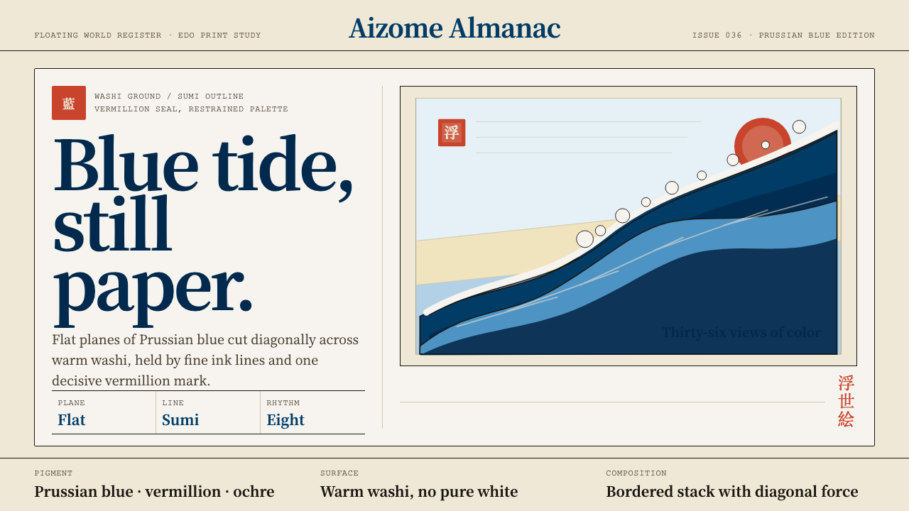 Edo Ukiyo-e (Hokusai)Flat power on paper. Prussian blue diagonals and vermillion seals cut across…纸上有力:普鲁士蓝对角线与朱红印章切入暖和纸。
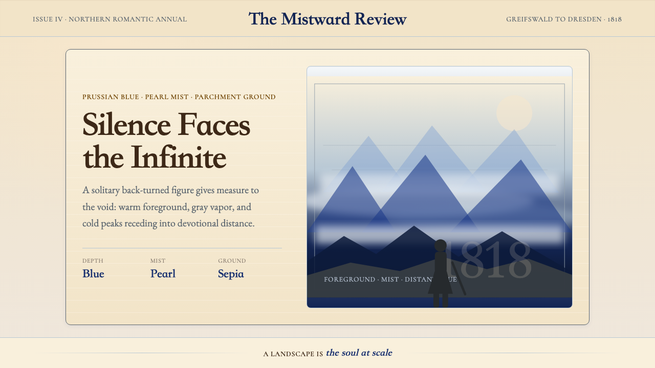 Caspar David FriedrichSilence becomes vast. Prussian blue depth, pearl mist, and parchment framing…寂静变得辽阔:普鲁士蓝纵深、珍珠雾与羊皮纸框层层后退。
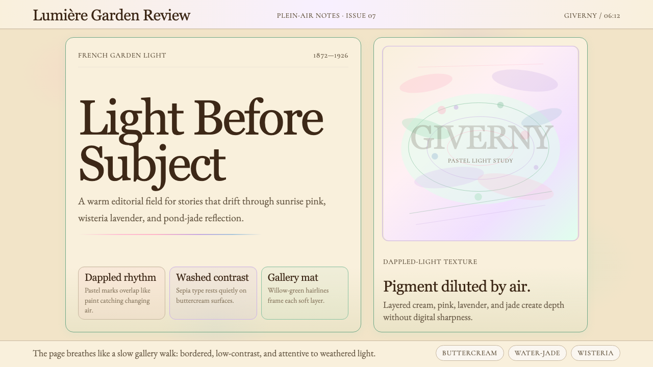 Claude Monet ImpressionistLight becomes the subject. Buttercream, pastel dapples, and Cormorant serif s…光成为主题。奶油底、粉彩斑点与Cormorant衬线柔化画面。
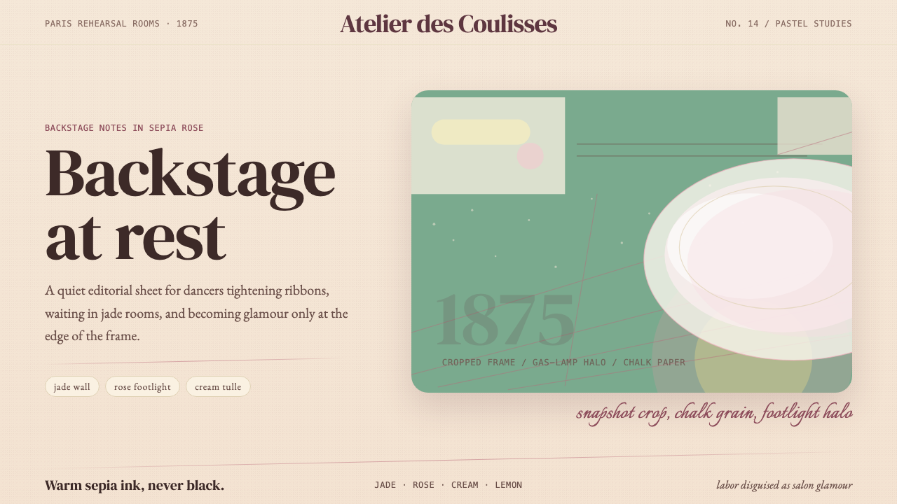 Degas Ballet PastelsBackstage glamour is labor. Jade walls, rose footlights, cropped serifs on cr…后台华丽即劳动。玉墙、玫瑰脚灯与裁切衬线落在奶油纸上。
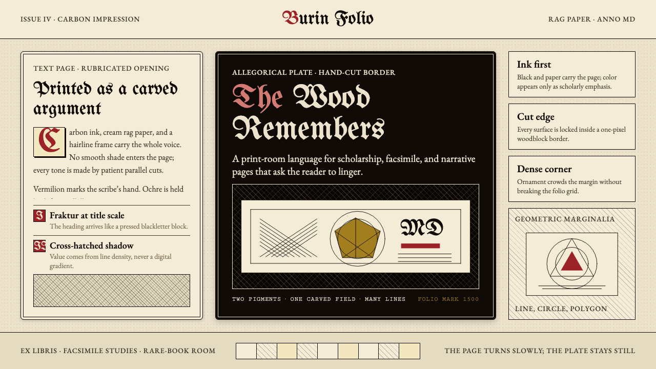 Dürer WoodcutInk remembers everything. Fraktur titles, rag-paper cream, and cross-hatched…木刻记住一切:哥特标题、破布纸奶油色与交叉排线。
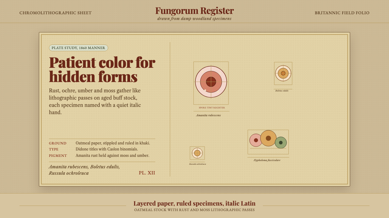 Victorian Mycology PlatePatient field science. Rust and moss specimens sit on stippled buff paper wit…耐心的田野科学。锈红与苔绿标本落在斑点米黄纸上,配斜体拉丁名。