What is Wes Anderson Symmetrical?什么是 Wes Anderson Symmetrical?
Every frame a stage set: Wes Anderson's obsessive symmetry, candy-pastel palette, and handcrafted lettering turned cinema into the most influential design system of the early twenty-first century.每一帧都是布景:韦斯·安德森对对称的执念、糖果粉彩色板与手工字体,将电影变成了二十一世纪初最具影响力的设计系统。
Wes Anderson Symmetrical in briefWes Anderson Symmetrical 速览
Wes Anderson Symmetrical is a design aesthetic derived from the visual language of filmmaker Wes Anderson — most fully articulated in films such as The Royal Tenenbaums (2001), The Life Aquatic with Steve Zissou (2004), The Grand Budapest Hotel (2014), and Asteroid City (2023). Its defining qualities are frontal bilateral symmetry in every composition, a hand-mixed pastel palette built from salmon pink and mint green punctuated by cream and walnut brown, and a pervasive use of vintage letterpress and serif display type that gives every surface the feeling of a lovingly crafted prop.韦斯·安德森对称风格是一种源自电影导演韦斯·安德森视觉语言的设计美学——最完整地体现于《天才一族》(2001)、《水中生活》(2004)、《布达佩斯大饭店》(2014)与《小行星城》(2023)等影片之中。其决定性特征是:每一个构图都遵循正面双侧对称,一套由鲑鱼粉与薄荷绿构建、以奶油色和胡桃棕点缀的手调粉彩色板,以及无处不在的复古凸版印刷与衬线展示字体——赋予每一个表面一种精心制作的道具质感。
The aesthetic belongs to the broader tradition of auteur cinema — filmmaking in which a director's personal vision dominates every visual decision — but it has migrated so completely into graphic design, product packaging, editorial illustration, and digital interfaces that it now functions as a standalone design system. The language is immediately legible without any film reference: symmetry as order, pastels as warmth, hand-painted surfaces as care. It communicates whimsy and precision simultaneously, which is a rare and commercially useful combination.这套美学属于作者电影的宏观传统——即导演的个人视野支配每一个视觉决策的电影创作——但它已如此彻底地迁移至平面设计、产品包装、编辑插图与数字界面,以至于现在作为一套独立设计系统运作。这套语言无需任何电影参照即可立刻被读懂:对称即秩序,粉彩即温暖,手绘表面即用心。它同时传递奇思妙想与精确感——这是一种罕见且具有商业价值的组合。
Unlike historical styles derived from ideological movements, the Wes Anderson aesthetic originates in a single artistic practice. Its coherence comes not from a manifesto but from an extraordinarily consistent body of film work spanning more than twenty-five years. This makes it unusually stable as a design reference: the rules are legible, well-documented across thousands of frames, and more forgiving of interpretation than movement-based styles that carry precise doctrinal requirements.与源自意识形态运动的历史风格不同,韦斯·安德森美学起源于单一艺术实践。它的连贯性不来自宣言,而来自横跨二十五年以上极为一致的电影作品。这使它成为一个异常稳定的设计参照:规则清晰可读,在成千上万帧画面中有据可查,且比那些带有精确教义要求的运动性风格更能宽容诠释的空间。
See the Wes Anderson Symmetrical design system查看 Wes Anderson Symmetrical 完整设计系统
Where does Wes Anderson Symmetrical come from?Wes Anderson Symmetrical 从何而来?
The visual system now called Wes Anderson Symmetrical did not arrive fully formed. Anderson's debut feature Bottle Rocket (1996) showed little of the signature style — it was shot conventionally, with handheld energy and naturalistic color. It was Rushmore (1998) that first displayed the centered compositions, the obsessive set dressing, and the autumnal palette that would define everything that followed. By the time The Royal Tenenbaums (2001) appeared, critics and designers alike were noting that Anderson's films looked unlike anything in contemporary cinema: every shot composed as if for a still photograph, every prop functioning as a character.如今被称为韦斯·安德森对称风格的视觉体系并非一蹴而就。安德森的处女作《瓶装火箭》(1996)几乎未见这种标志性风格——影片以传统方式拍摄,充满手持摄影的动感和自然主义色彩。正是《穿越大吉岭》的前作《青春年少》(1998)首次展现了居中构图、强迫症般的布景陈设与秋日色调,奠定了此后一切作品的基调。到《天才一族》(2001)问世时,影评人与设计师都注意到安德森的电影与当代影坛任何作品都截然不同:每一个镜头都像静止照片般构图,每一件道具都充当角色功能。
Two collaborators were essential to crystallizing the aesthetic. Production designer Adam Stockhausen, who joined Anderson on The Grand Budapest Hotel (2014), brought an architectural precision to the set construction — the film's pastel-painted Mitteleuropean hotel interiors and the iconic Mendl's pastry boxes, with their hand-lettered pink labels, became the most replicated visual references in the style's history. Costume designer Milena Canonero, who had previously worked with Stanley Kubrick on Barry Lyndon and A Clockwork Orange, gave each Anderson cast a color-coded wardrobe system in which characters' palettes relate to their emotional arcs rather than to realistic costume conventions. Prop designer and graphic artist Annie Atkins handled the film's handcrafted paper ephemera — stamps, telegrams, menus, hotel stationery — each item period-accurate and hand-lettered in a way that gave the films an almost archaeological material density.两位合作者对这套美学的结晶至关重要。美术设计师亚当·斯托克豪森在《布达佩斯大饭店》(2014)与安德森合作,将建筑精度带入布景建造——影片中粉彩涂装的中欧大饭店内景,以及那些贴有手写粉色标签的标志性Mendl's糕点盒,成为这套风格历史上被复刻最多的视觉参照。曾为斯坦利·库布里克《巴里·林登》与《发条橙》担任服装设计的米莱娜·卡诺内罗,为安德森的每一部影片建立了一套色彩编码的服装体系,角色的色板与其情感弧线相关联,而非遵循写实的服装惯例。道具设计与平面艺术家安妮·阿特金斯负责影片中手工纸质小物——邮票、电报、菜单、饭店信纸——每件均符合时代且手写完成,赋予影片近乎考古学般的物质密度。
The aesthetic draws on several art-historical sources that Anderson has cited directly. The mid-century European illustrative tradition — particularly the work of Saul Steinberg and the picture books of Tomi Ungerer — informs the style's flattened, storybook quality. The dollhouse paintings of Joseph Cornell, the stage designs of Jacques Tati (whose Mon Oncle and Playtime Anderson has acknowledged as touchstones), and the graphic symmetry of Soviet-era constructivist posters all feed into a sensibility that treats architecture, props, and type as elements of an integrated stage set rather than as separate design disciplines.这套美学直接汲取了安德森多次引用的多个艺术史来源。中世纪欧洲插图传统——尤其是索尔·斯坦伯格的作品与托米·温格尔的图画书——赋予了这套风格其扁平化的绘本质感。约瑟夫·科内尔的玩偶屋绘画、雅克·塔蒂的舞台设计(安德森承认《我的舅舅》与《玩乐时间》是重要参照),以及苏联时期构成主义海报的图形对称感,共同滋养了一种将建筑、道具与字体视为整体舞台布景组成元素的创作感性,而非独立设计学科。
The cultural moment that amplified the style into a global design phenomenon was the intersection of Anderson's peak film output with the rise of Instagram (launched 2010) and the visual culture it generated. The Grand Budapest Hotel's release in 2014 coincided exactly with the platform's emergence as a primary channel for design inspiration. The film's salmon-and-mint palette, its symmetrical compositions photographable in a single square frame, and its abundance of hand-lettered graphic props made it almost algorithmically suited to social-media distribution. Within months of the film's release, the aesthetic had migrated into wedding stationery, café branding, editorial illustration, and independent publishing. By the late 2010s, what had been a cinema auteur's personal vision was operating as a broadly legible commercial design vocabulary.将这种风格放大为全球设计现象的文化时机,是安德森创作高峰期与Instagram兴起(2010年上线)及其所催生的视觉文化的交汇。《布达佩斯大饭店》于2014年上映,恰好与这一平台作为主要设计灵感渠道的崛起同步。影片的鲑鱼粉与薄荷绿色板、可以在单一方形画幅中拍摄的对称构图,以及丰富的手写字体平面道具,使其几乎在算法上就适合社交媒体传播。影片上映数月之内,这套美学已迁移至婚礼文具、咖啡馆品牌、编辑插图与独立出版领域。到2010年代末,曾经属于电影作者个人视野的东西,已作为一套广泛可读的商业设计语言运作。
What defines the Wes Anderson Symmetrical look?Wes Anderson Symmetrical 的视觉特征是什么?
Bilateral Symmetry双侧对称
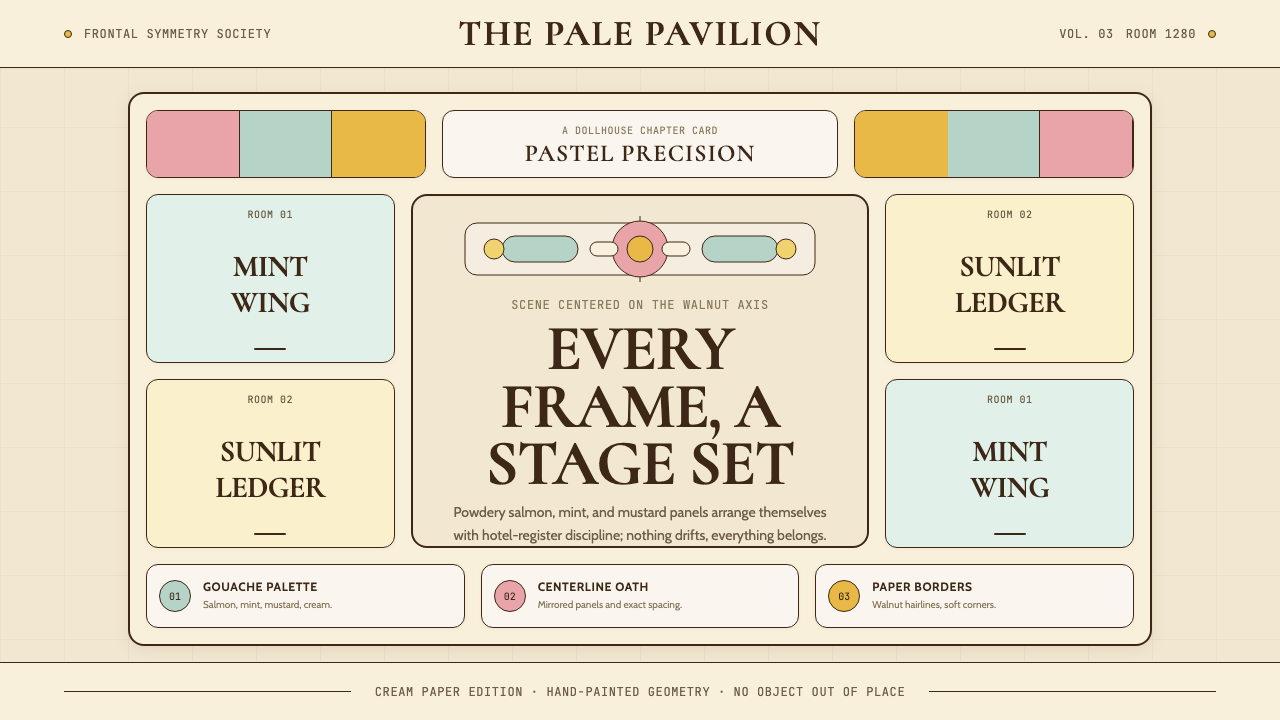
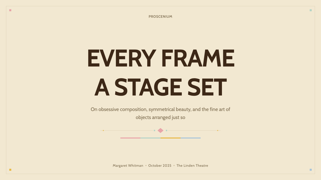
The single most defining rule of the aesthetic: every composition is centered on an invisible vertical axis, with left and right halves mirroring each other in weight and structure. This applies not only to overall layouts but to individual graphic elements — title cards, menus, packaging labels, and on-screen typography are all treated as symmetrical objects. The symmetry is strict but not mechanical; small asymmetries in color or content (a character standing slightly off-center, a label with more text on one side) create life within the grid without breaking the overall bilateral logic.这是这套美学最具决定性的规则:每一个构图都以一条无形的垂直轴为中心,左右两半在重量与结构上相互镜像。这不仅适用于整体版面,也适用于每个单独的图形元素——标题卡、菜单、包装标签与画面内的字体排印,都被视为对称对象。对称是严格的,但非机械的;色彩或内容上的细微不对称(人物站位略微偏离中心,标签一侧文字稍多)在网格内制造生命感,而不打破整体的双侧逻辑。
Candy-Pastel Palette糖果粉彩色板
The palette is built from a family of warm, chalky pastels — salmon pink as the dominant warm tone, mint green as its cool counterpart, cream as the foundational neutral, and walnut brown or deep burgundy as structural dark accents. These hues are consistently desaturated and lightened, giving them a gouache or hand-mixed quality rather than the saturated brightness of digital primaries. The palette reads as warm even when cooler tones like mint or lavender appear, because the overall tonal family leans toward cream rather than white.色板由一组温暖的粉白调粉彩构成——鲑鱼粉作为主导暖色调,薄荷绿作为其清凉对位色,奶油色作为基础中性底色,胡桃棕或深酒红作为结构性深色强调。这些色相始终保持低饱和、浅化处理,呈现出水粉颜料或手调色的质感,而非数字三原色的鲜亮饱满。整体色板即便出现薄荷或薰衣草等偏冷色调,读来仍是温暖的,因为整体色调家族向奶油色而非纯白倾斜。
Vintage Letterpress and Display Type复古凸版与展示字体
Typography in this aesthetic is always a designed object, not just a communication vessel. Display type leans toward mid-century European serif styles — the kind found on railway signage, hotel stationery, and pharmacist labels from the early twentieth century. Letterforms have visible weight and personality; compressed serifs, slab serifs with slight ink-trap characteristics, and titling styles with generous letterspacing all appear. Type is almost always set centered rather than left-aligned, reinforcing the overall symmetry of the composition. Hand-lettered elements are prized: labels, stamps, and captions that appear to have been drawn rather than typeset.在这套美学中,字体排印永远是被设计的对象,而非单纯的传达容器。展示字体倾向于二十世纪中叶的欧洲衬线风格——那种出现在二十世纪初铁路标牌、饭店信纸与药剂师标签上的字体。字形具有可见的重量感与个性;压缩衬线、带有细微墨水阱特征的平板衬线,以及字距宽裕的标题体,都在其中出现。字体几乎总是居中排列而非左对齐,强化了构图整体的对称感。手写元素备受珍视:看起来是手绘而非排印而成的标签、印章与说明文字。
Dollhouse Scale and Depth玩偶屋尺度与空间感
Compositions are organized in theatrical planes rather than natural perspective. Foreground, middle ground, and background are arranged like stage flats — distinct layers at consistent distances — rather than receding in continuous atmospheric perspective. This creates a characteristic shallow depth of field in the spatial imagination of the style, where everything is visible simultaneously and nothing is hidden in blur or fog. Objects and figures appear at scale with each other as if arranged in a diorama or architectural model, giving the style its distinctive toy-like quality.构图以戏剧性平面而非自然透视进行组织。前景、中景与背景像舞台幕布一样排列——以固定间距形成的清晰层次——而非在连续的空气透视中逐渐消退。这在这种风格的空间想象中创造出一种特有的浅景深感:一切同时可见,没有什么被模糊或迷雾所隐藏。物体与人物以立体模型或建筑模型般的比例彼此并置,赋予这种风格其标志性的玩具质感。
Handcraft Material Quality手工物质质感
Every surface in the aesthetic reads as made by hand — paper textures, ink impressions, watercolor washes, and the slight imprecision of letterpress printing all signal a pre-digital material world. This is not roughness or artlessness; it is the appearance of labor and attention. Packaging elements carry the weight and deliberateness of something produced in small quantities with care. The handcraft signal is a counterbalance to the symmetry: the symmetry implies control, but the material quality implies warmth and human presence.这套美学中的每一个表面看起来都像是手工制作的——纸张肌理、油墨压印、水彩晕染,以及凸版印刷的轻微不精准,都指向一个前数字时代的物质世界。这不是粗糙或拙朴,而是劳动与专注的呈现。包装元素承载着精心小批量生产之物的分量与郑重感。手工感是对称性的平衡:对称暗示控制,而物质质感传递温暖与人的在场。
Color-Coded Narrative Structure色彩编码的叙事结构
Following the influence of Milena Canonero's costume approach, the aesthetic uses color not only decoratively but structurally to encode relationships, hierarchies, and categories. Distinct sections of a layout or system can be assigned distinct palette variants — a warm salmon register for one narrative strand, a cooler mint register for another — and the palette itself becomes an organizational device. This is distinct from mere color-coding in information design; it carries emotional weight, so that the warm palette feels cozier and the cool palette feels more distant or elegiac.沿袭米莱娜·卡诺内罗服装设计方法的影响,这套美学使用色彩不仅仅是为了装饰,更是为了结构性地编码关系、层级与类别。版面或系统的不同部分可以被分配不同的色板变体——温暖的鲑鱼粉调对应一条叙事线,清凉的薄荷调对应另一条——色板本身成为组织装置。这与信息设计中单纯的色彩编码不同,它承载着情感重量:温暖色板感觉更温馨,清凉色板感觉更疏离或带有哀愁。
Ruled Lines and Framing Devices直线与框架装置
Thin ruled lines — single or double, in dark brown, deep burgundy, or near-black — appear as structural dividers, border ornaments, and framing elements throughout the aesthetic. These lines function like the walnut molding in a Victorian shadow box: they separate elements while drawing the eye to the symmetrical arrangement within the frame. The ruled line is the aesthetic's primary geometric mark; it appears on labels, title cards, menus, certificates, and packaging wherever a boundary needs to be articulated with elegance rather than with a filled shape.细直线——单线或双线,以深棕、深酒红或近黑色呈现——作为结构分割线、边框装饰与框架元素贯穿整套美学。这些线条的功能如同维多利亚式影盒中的胡桃木线脚:在分隔元素的同时,将目光引向框架内对称排列的内容。直线是这套美学最主要的几何标记,出现在标签、标题卡、菜单、证书与包装上——凡是需要以优雅而非实心形状来界定边界的地方。
See the Wes Anderson Symmetrical design system查看 Wes Anderson Symmetrical 完整设计系统
Who shaped Wes Anderson Symmetrical?谁塑造了 Wes Anderson Symmetrical?
Anderson (born 1969 in Houston, Texas) is the director, writer, and primary visual architect of the aesthetic that bears his name. His films from Rushmore (1998) onward established the centered framing, pastel palette, and handcraft material language that became globally recognized. Anderson has described his approach as treating every frame as a painting and every set as a dollhouse — an architecture of control that paradoxically creates an atmosphere of warmth and nostalgic longing. His influence on visual culture extends far beyond cinema: the aesthetic he developed is now taught in design schools, used in commercial branding, and studied as an example of how a single artist's vision can become a transferable design system.安德森(1969年生于德克萨斯州休斯顿)是以其名字命名的这套美学的导演、编剧与主要视觉建筑师。从《青春年少》(1998)起,他的影片确立了居中构图、粉彩色板与手工物质语言,并获得全球性认知。安德森曾描述自己的创作方式是将每一帧视为一幅画,将每一个布景视为一座玩偶屋——一种控制的建筑,悖论性地创造出温暖与怀旧渴望的氛围。他对视觉文化的影响远超电影本身:他所发展的美学如今在设计学院中被讲授、被用于商业品牌,并被作为单一艺术家的视野如何转化为可移植设计系统的案例加以研究。
Stockhausen is the production designer who gave the Wes Anderson aesthetic its most architecturally precise form, beginning with Moonrise Kingdom (2012) and continuing through The Grand Budapest Hotel (2014), Isle of Dogs (2018), and The French Dispatch (2021). His work on The Grand Budapest Hotel — designing the pastel-painted hotel interiors, the Mendl's pastry shop, and the elaborate mountain cable car station — produced the single most reproduced visual archive in the style's history. Stockhausen's approach treats every room and prop as a graphic design problem, with color, typography, and proportion resolved simultaneously rather than sequentially.斯托克豪森是赋予韦斯·安德森美学最具建筑精度形态的美术设计师,从《月升王国》(2012)开始,延续至《布达佩斯大饭店》(2014)、《犬之岛》(2018)与《法兰西特派》(2021)。他在《布达佩斯大饭店》上的工作——设计粉彩饭店内景、Mendl's糕点店以及精巧的山地缆车站——产生了这套风格历史上被复制最多的单一视觉档案。斯托克豪森的方法将每一个房间和道具视为平面设计问题,同步而非顺序地解决色彩、字体与比例。
Atkins is the graphic designer and prop maker who created the handcrafted paper ephemera that gave The Grand Budapest Hotel — and by extension the entire aesthetic — its material density. Her work on the film included the Mendl's pastry boxes, postage stamps, hotel stationery, telegrams, wanted posters, and travel documents — every item hand-lettered and period-researched to the level of an archivist. Atkins has since written extensively about the craft of graphic prop making, and her approach to centered, symmetrical layout with vintage serif typography and ruled border lines is the most direct template for designers working in this style.阿特金斯是创作了《布达佩斯大饭店》——进而延伸至整套美学——其物质密度所依赖的手工纸质小物的平面设计师与道具制作者。她在影片中的工作包括Mendl's糕点盒、邮票、饭店信纸、电报、通缉海报与旅行证件——每件物品均手写完成,以档案工作者的级别进行时代考证。阿特金斯此后撰写了大量关于平面道具制作工艺的文章,她对居中、对称版面配以复古衬线字体与直线边框的处理方法,是在这种风格中工作的设计师最直接的模板参照。
Canonero is the four-time Academy Award-winning costume designer whose color-coded wardrobe systems for Anderson's films established the principle of palette-as-narrative-structure within the aesthetic. Her work on The Grand Budapest Hotel assigned each time period a distinct palette family — vivid pastels for the 1930s sequences, desaturated tones for the 1960s, near-monochrome for the present day — demonstrating that color in this style is always meaningful rather than merely decorative. Her earlier work with Kubrick on Barry Lyndon, with its period-accurate color palette derived from eighteenth-century oil painting, is a direct precedent for the historically informed palette construction that characterizes the Anderson aesthetic.卡诺内罗是四度奥斯卡获奖服装设计师,她为安德森影片创作的色彩编码服装体系,确立了这套美学中色板即叙事结构的原则。她在《布达佩斯大饭店》的工作为每个时代分配了不同的色板家族——1930年代场景用鲜亮粉彩,1960年代用去饱和色调,当代场景用近乎单色——证明了这种风格中色彩始终是有意义的,而非单纯的装饰。她早年与库布里克合作《巴里·林登》的工作,以源自十八世纪油画的时代准确色板,是韦斯·安德森美学所特有的历史知情色板构建的直接先例。
Tati (1907–1982), the French filmmaker and comedian, is the most frequently cited cinematic precedent for the Wes Anderson aesthetic. His films Mon Oncle (1958) and Playtime (1967) share the Anderson style's commitment to architectural framing, lateral camera movement, and the treatment of built environments as characters in their own right. Tati's use of pastel color — particularly the warm cream and faded terracotta tones of traditional French village architecture in Mon Oncle — prefigures the Anderson palette. Anderson has acknowledged Tati as a direct influence, and the comparison illuminates how the symmetrical stage-set framing tradition connects a mid-century European art cinema sensibility to contemporary graphic design.塔蒂(1907—1982),法国电影导演与喜剧演员,是韦斯·安德森美学最常被引用的电影先例。他的影片《我的舅舅》(1958)与《玩乐时间》(1967)与安德森风格共享对建筑取景、横向摄影机运动的执着,以及将建成环境本身视为角色的处理方式。塔蒂对粉彩色彩的运用——尤其是《我的舅舅》中法国传统村庄建筑的温暖奶油色与褪色赤陶色调——预示了安德森的色板。安德森承认塔蒂是直接影响,这一比照揭示了对称舞台布景取景传统如何将中世纪欧洲艺术电影感性与当代平面设计连接起来。
How do you use Wes Anderson Symmetrical today?今天怎么用 Wes Anderson Symmetrical?
The Wes Anderson Symmetrical aesthetic is among the most immediately legible styles to apply to designed artifacts, because its rules are visual rather than theoretical and its cultural associations — warmth, nostalgia, artisan care, gentle wit — are broadly appealing. Applied correctly, it produces work that feels simultaneously handcrafted and designed, historic and contemporary. Applied carelessly, it collapses into a costume — salmon paint and centered type without the underlying structural logic.韦斯·安德森对称风格是最容易即时读懂的可应用设计风格之一,因为它的规则是视觉性而非理论性的,其文化联想——温暖、怀旧、工匠用心、温和机智——具有广泛的感召力。正确应用时,产出的作品同时感觉是手工制作的与被设计的、历史性的与当代的。粗率应用时,它会沦为一套戏服——鲑鱼粉涂料和居中字体,没有底层结构逻辑的支撑。
For presentation slides, the style excels at both cover pages and content layouts. A cover built in this aesthetic should commit fully to bilateral symmetry: the title centered on axis, flanked by ruled lines above and below, with a pastel field — salmon or mint — occupying a defined rectangular zone behind the type. Decorative typographic details such as a small ornament or a line of small caps beneath the main title reinforce the label-like quality. Content slides should preserve the symmetry in their information hierarchy: two-column layouts should mirror each other in width, bullet points should be treated as centered lines rather than left-aligned lists, and data visualizations should be arranged as centered objects within the slide field rather than anchored to one edge. Chart and graph elements work well when their color palette is drawn from the pastel family, with each data category assigned a distinct pastel tone.在演示文稿中,这种风格在封面页和内容版面上都表现出色。以这套美学构建的封面应当完全遵守双侧对称:标题居中轴线,上下各有直线相夹,鲑鱼粉或薄荷绿的粉彩区块占据字体后方的矩形色区。装饰性字体细节——如主标题下方的小花饰或一行小型大写字母——强化了标签般的质感。内容页应在信息层级中保持对称:双栏版面的两栏宽度应相互镜像,项目符号应作为居中行而非左对齐列表处理,数据可视化应作为居中对象置于幻灯片画面内而非锚定在某一边缘。图表元素在色板取自粉彩家族、每个数据类别分配不同粉彩色调时效果最佳。
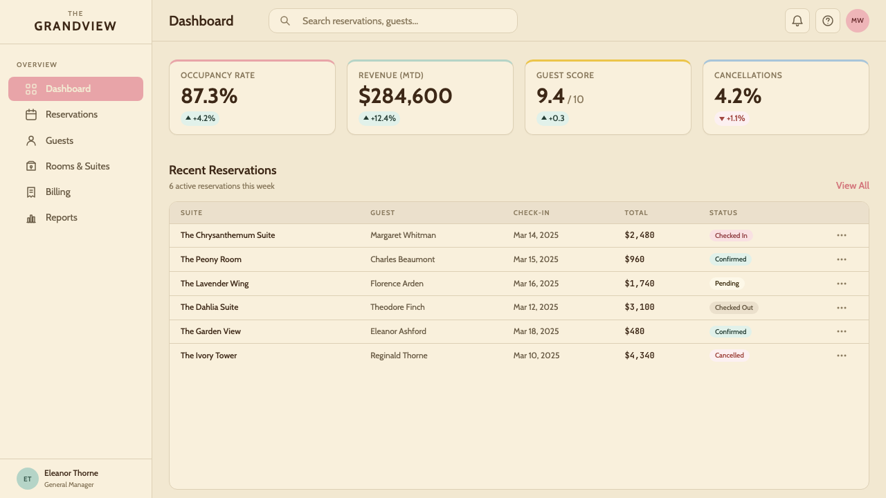
For web interfaces, the style is most naturally suited to landing pages, pricing tables, and editorial sites where the reading experience is unhurried and the brand personality is warm and characterful. A pricing page in this aesthetic organizes tiers as centered card objects with ruled borders, each tier assigned a pastel background drawn from the palette family, with tier names set in a vintage-inflected display serif. Dashboards can adopt the style selectively: the overall page architecture should maintain the symmetrical grid, while data elements — charts, numbers, status indicators — use the pastel palette and ruled borders to give the dashboard a more considered, less default-SaaS appearance. Navigation should be typographic, centered, with generous letterspacing in a compressed serif.在网页界面中,这种风格最自然地适合落地页、定价表与编辑类网站——阅读体验从容不迫、品牌个性温暖而有特色的场景。以这套美学设计的定价页,将价格层级组织为带直线边框的居中卡片对象,每个层级分配色板家族中的一种粉彩背景,层级名称以带复古韵味的展示衬线体排印。仪表板可以选择性地采用这种风格:整体页面架构应维持对称网格,而数据元素——图表、数字、状态指示器——使用粉彩色板与直线边框,使仪表板呈现出更具考量感、更不默认SaaS感的外观。导航应当是字体性的、居中的,压缩衬线体配以宽裕字距。
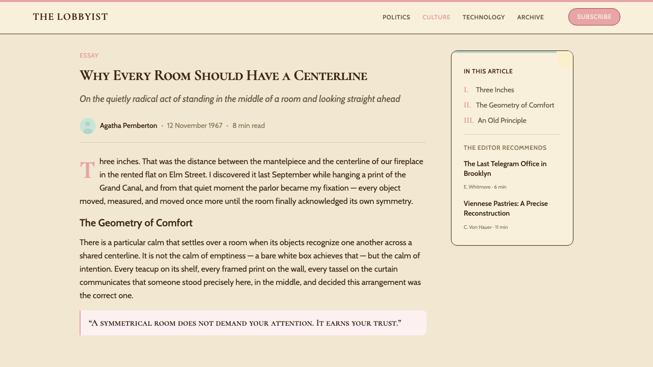
For editorial and marketing applications, the style produces strong results in print-adjacent contexts: book covers, magazine spreads, event posters, product packaging, and brand identity systems for hospitality, food, and independent retail. A book cover in this aesthetic places the title centered on axis with a symmetrical illustration or decorative type element below, the whole composition framed by a thin ruled border inset from the edge. Marketing emails work well in a simplified version of the style: a centered, narrow-column layout with a pastel background panel, a serif headline, and a single call-to-action button styled as a stamped or embossed label element. The style is particularly effective for brands that want to position themselves as carefully made, independent, and not corporate.在编辑与营销应用中,这种风格在接近印刷品的场景中产出强劲效果:书籍封面、杂志跨页、活动海报、产品包装,以及餐饮、食品与独立零售业的品牌识别系统。以这套美学设计的书籍封面,将标题居中轴线,配以其下的对称插图或装饰字体元素,整个构图由从边缘内嵌的细直线边框所框定。营销邮件适合使用这种风格的简化版本:居中的窄栏版面,粉彩背景面板,衬线标题,以及一个被设计成盖章或浮雕标签元素的单一行动号召按钮。对于希望将自身定位为精心制作的、独立的、非企业感的品牌,这种风格尤为有效。
The most common mistake when applying this aesthetic is confusing symmetry with repetition and pastels with mere pinkness. Authentic application requires that the symmetry be compositional — the axis must be felt, not just mathematically present — and that the palette maintain its chalky, desaturated quality rather than drifting toward the high-saturation pastels of candy branding. A second frequent error is treating the handcraft signals as license for visual clutter: genuine restraint is as important here as in any other disciplined aesthetic, and the effective Wes Anderson–derived design is sparse, with each element earning its place on the page as deliberately as a prop placed on a film set.应用这套美学时最常见的错误,是将对称误解为重复,将粉彩误解为单纯的粉红。真正的应用要求对称是构图性的——轴线必须被感知到,而不仅仅是数学上存在——色板必须保持其粉白、低饱和的质量,而非漂移向糖果品牌的高饱和粉彩。另一个常见错误是将手工感信号理解为视觉繁复的许可:真正的克制在这里与任何其他有纪律的美学中一样重要,有效的韦斯·安德森衍生设计是疏朗的,每一个元素都像电影布景上被刻意放置的道具一样,以深思熟虑赢得其在页面上的位置。
See the Wes Anderson Symmetrical design system查看 Wes Anderson Symmetrical 完整设计系统
Wes Anderson Symmetrical — FAQWes Anderson Symmetrical · 常见问题
Is the Wes Anderson aesthetic the same as general vintage or retro design?韦斯·安德森美学和一般的复古设计是同一回事吗?
No — and the distinction matters practically. General vintage or retro design borrows the visual surface of a past era: worn textures, distressed type, faded color. The Wes Anderson aesthetic is not interested in wear or degradation; it presents a past that is idealized, pristine, and precisely art-directed rather than authentically aged. Every element looks as if it was produced yesterday by a meticulous craftsperson working in a historical style. The palette is clean and legible, the ruled lines are sharp, and the type is well-spaced — none of the deliberate roughening that characterizes authentic retro work. Understanding this distinction prevents a common error: adding grungy textures or distress effects to an otherwise correct Wes Anderson composition.不一样——而且这种区别在实践中很重要。一般复古设计借用的是某个过去时代的视觉表面:磨损肌理、做旧字体、褪色色调。韦斯·安德森美学对磨损或退化没有兴趣;它呈现的是一个被理想化的、完好无损的、精确美术指导的过去,而非真实老化的过去。每一个元素看起来都像是昨天由一位精益求精的工匠以历史风格制作的。色板干净清晰,直线边框锋利,字体间距考究——没有任何真正复古作品所特有的刻意粗糙化处理。理解这一区别能防止一个常见错误:在其他方面正确的韦斯·安德森构图上叠加做旧肌理或破损效果。
How strictly does the bilateral symmetry need to be followed?双侧对称需要被多严格地遵守?
The symmetry should be felt as the dominant structural principle, but it does not need to be mathematically perfect in every element. Anderson's own film compositions include many small departures from strict mirroring — a character off-center by a few degrees, a prop that breaks the axis slightly. The key is that the overall impression of each composition reads as symmetrical, which means the major structural elements (the central subject, the dominant text, the framing borders) must align on axis. Small content-level asymmetries — different amounts of text on each side of a label, a figure slightly off-center within a symmetrical door frame — are not violations but are what prevent the style from feeling rigid or robotic.对称应当被感知为主导性的结构原则,但并不需要在每一个元素上都达到数学上的完美。安德森自己的电影构图包含许多对严格镜像的细微偏离——人物偏离中心几度,道具轻微打破轴线。关键在于每一个构图的整体印象读来是对称的,这意味着主要结构元素(中心主体、主导文字、框架边线)必须在轴线上对齐。内容层面的细微不对称——标签两侧文字量不同,人物在对称门框内略微偏离中心——并非违规,而恰恰是防止这种风格感觉死板或机械的原因。
Can this aesthetic work in dark mode or on a dark background?这套美学能在暗色模式或深色背景上使用吗?
Dark mode is genuinely difficult for this aesthetic and should be approached with caution. The entire tonal logic of the style is built on light grounds — cream, pale pastel, near-white — against which warm dark accents (walnut brown, deep burgundy, near-black type) read with clarity and warmth. Inverting this to a dark background fundamentally changes the emotional register: the warmth dissipates, the handcraft pastels become difficult to distinguish, and the composition loses the airy, dollhouse quality that defines the style. If a dark variant is required, the most workable approach is to use a deep, warm navy or charcoal rather than pure black, to retain the pastel palette for type and graphic elements rather than backgrounds, and to accept that the result will be a darker variant of the aesthetic rather than a true dark mode — more like a film shot in dim interior light than a night scene.暗色模式对这套美学来说确实困难,应当谨慎对待。这种风格的整体色调逻辑建立在浅色底面上——奶油色、淡粉彩、近白色——温暖的深色强调(胡桃棕、深酒红、近黑色字体)在其上清晰而温暖地呈现。将其反转为深色背景会从根本上改变情感基调:温暖感消散,手工感粉彩变得难以区分,构图失去定义这种风格的那种轻盈、玩偶屋的质感。如果确需深色变体,最可行的方案是使用深沉温暖的深海军蓝或木炭色而非纯黑,将粉彩色板保留给字体与图形元素而非背景,并接受结果将是这套美学的一个较深的变体,而非真正的暗色模式——更像是在昏暗室内光线下拍摄的电影,而非夜景。
What kinds of brands or products is this style poorly suited for?哪些类型的品牌或产品不适合使用这种风格?
The Wes Anderson aesthetic communicates warmth, artisan care, gentle nostalgia, and a certain literary or cinephile cultural orientation. It struggles wherever the desired brand values are speed, scale, technological authority, or stripped-down rationalism. Enterprise software, financial services communicating precision and trust through austerity, athletic performance brands, and any product where the user primarily values efficiency over charm will find the style working against the communication. The aesthetic is also poorly suited to genuinely multicultural or globally inclusive brand contexts, as its visual language is deeply rooted in a specific European-American mid-century cultural imaginary — its nostalgias are particular rather than universal.韦斯·安德森美学传递温暖、工匠用心、温和怀旧,以及某种文学性或影迷向的文化取向。在期望品牌价值为速度、规模、技术权威或精简理性主义的场合,它会遭遇困境。企业软件、通过克制传递精准与信任感的金融服务、运动表现品牌,以及任何用户主要看重效率而非魅力的产品,都会发现这种风格在与传达目标相抗衡。这套美学也不适合真正多元文化或全球包容性的品牌语境,因为其视觉语言深深根植于特定的欧美中世纪文化想象——它的怀旧是特殊的,而非普世的。
How is this style different from other pastel-palette aesthetics like Cottagecore or Y2K?这种风格与乡村核或Y2K等其他粉彩美学有何不同?
The key differentiator is structure and source. Cottagecore pastels are soft and organic, associated with natural materials, botanical motifs, and informal asymmetry — the opposite of Wes Anderson's architectural precision and bilateral control. Y2K pastels are high-saturation and digitally clean, associated with synthetic materials, ironic maximalism, and early internet kitsch — again, the opposite of the chalky, hand-mixed, pre-digital warmth of the Anderson palette. The Wes Anderson aesthetic is also unusually intellectually grounded for a pastel style: its references are literary, cinematic, and historically specific rather than nostalgic in a vague or generalized sense. Applying it convincingly requires understanding those references, which is why careless applications tend to read as generic pastel rather than as the specific thing.关键的差异化因素在于结构与来源。乡村核的粉彩是柔软有机的,与自然材料、植物母题和非正式不对称相关联——与韦斯·安德森的建筑精度和双侧控制截然相反。Y2K的粉彩是高饱和度、数字化清洁的,与合成材料、反讽式极大主义和早期互联网俗趣相关联——同样与安德森色板的粉白、手调、前数字时代温暖截然相对。韦斯·安德森美学对于一种粉彩风格来说,也有着异常深厚的知识根基:其参照是文学性的、电影性的、历史上具体的,而非模糊或泛化意义上的怀旧。令人信服地应用它需要理解这些参照,这正是为何粗率的应用往往读来像普通粉彩,而非那个具体的东西。
Related design styles相关设计风格
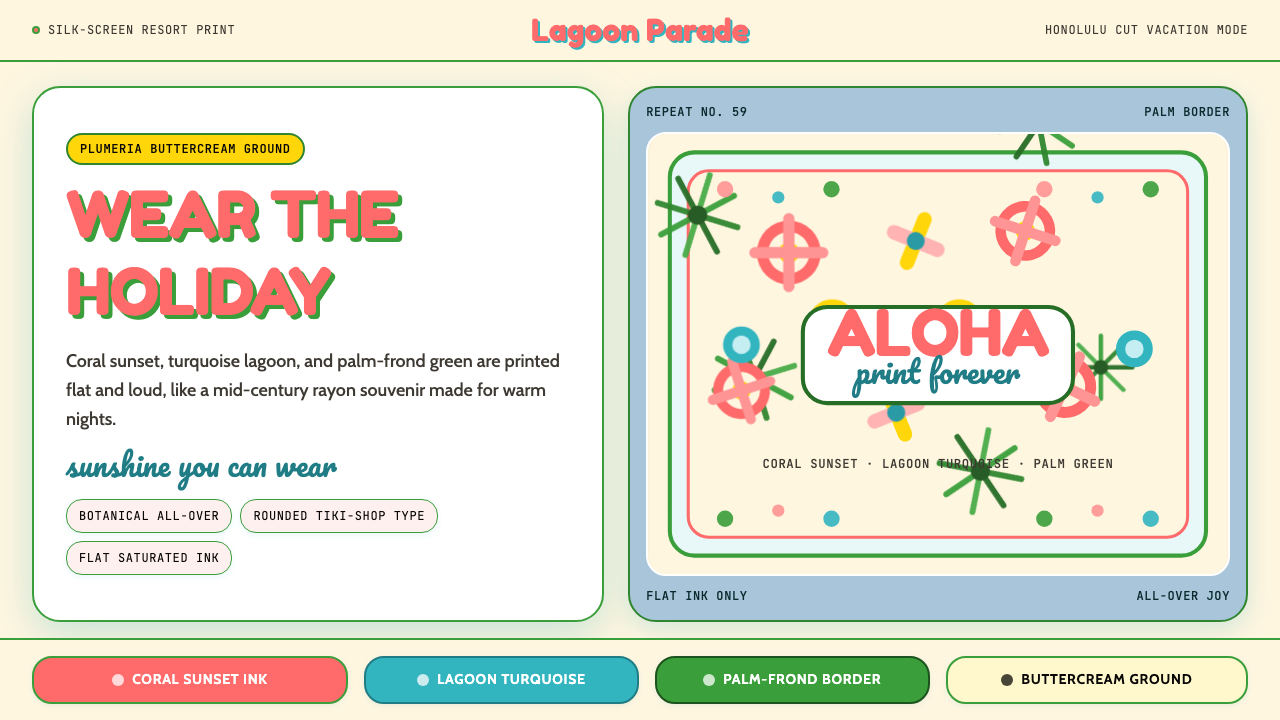 Hawaiian Aloha ShirtThe shirt is the holiday. Buttercream ground, coral Fredoka type, and flat tr…穿上就是假期。奶油底、珊瑚 Fredoka 字与热带平面印花。
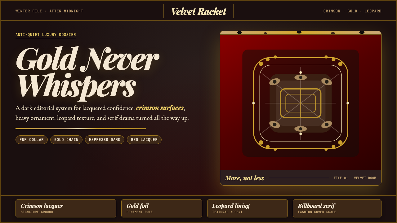 Mob Wife AestheticGlamour refuses restraint. Crimson lacquer, gold foil, leopard texture, billb…奢华拒绝克制:酒红漆面、金箔、豹纹与巨幅 Didone。
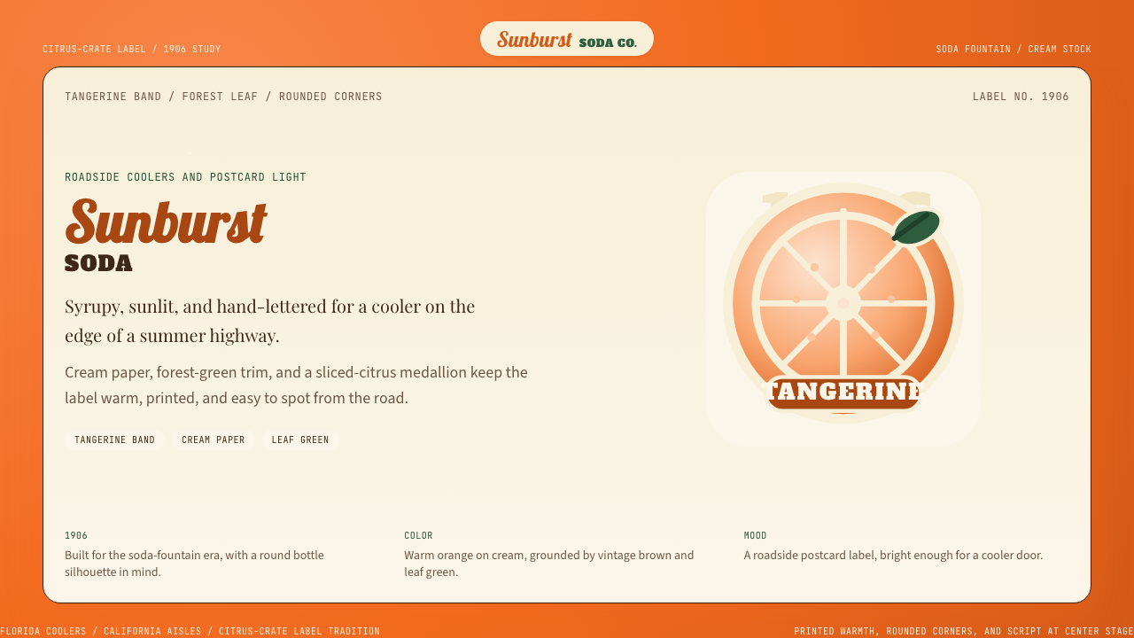 Orange Crush Soda (1906)Syrupy nostalgia. Tangerine, cream, and script make it a postcard label.糖浆般怀旧。橘红、奶油纸与手写体把标签变成明信片。
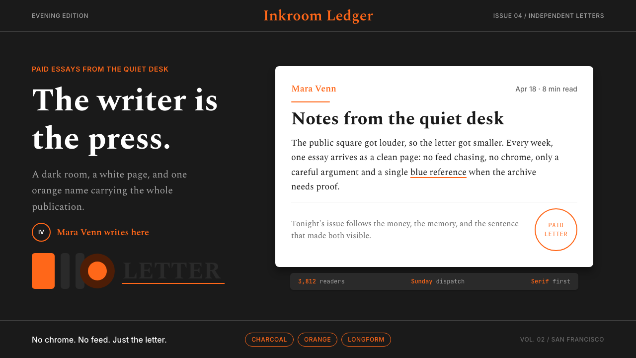 Substack Orange NewsletterLit page, dark room. Orange serif bylines ignite white cards on charcoal.暗室里的亮页。橙色衬线署名点燃炭黑上的白卡。
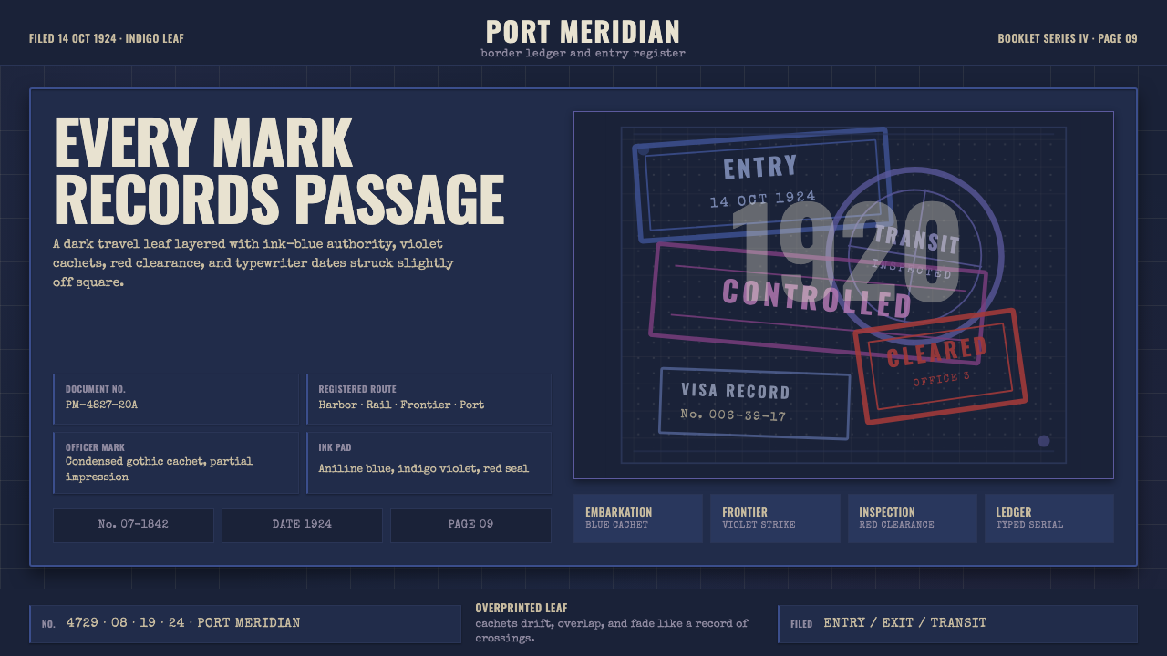 Vintage Passport StampsInk remembers passage. Indigo leaf, blue-violet cachets, red seal, typewriter…墨迹记住过境。靛青纸页、蓝紫印戳与红章叠成档案。
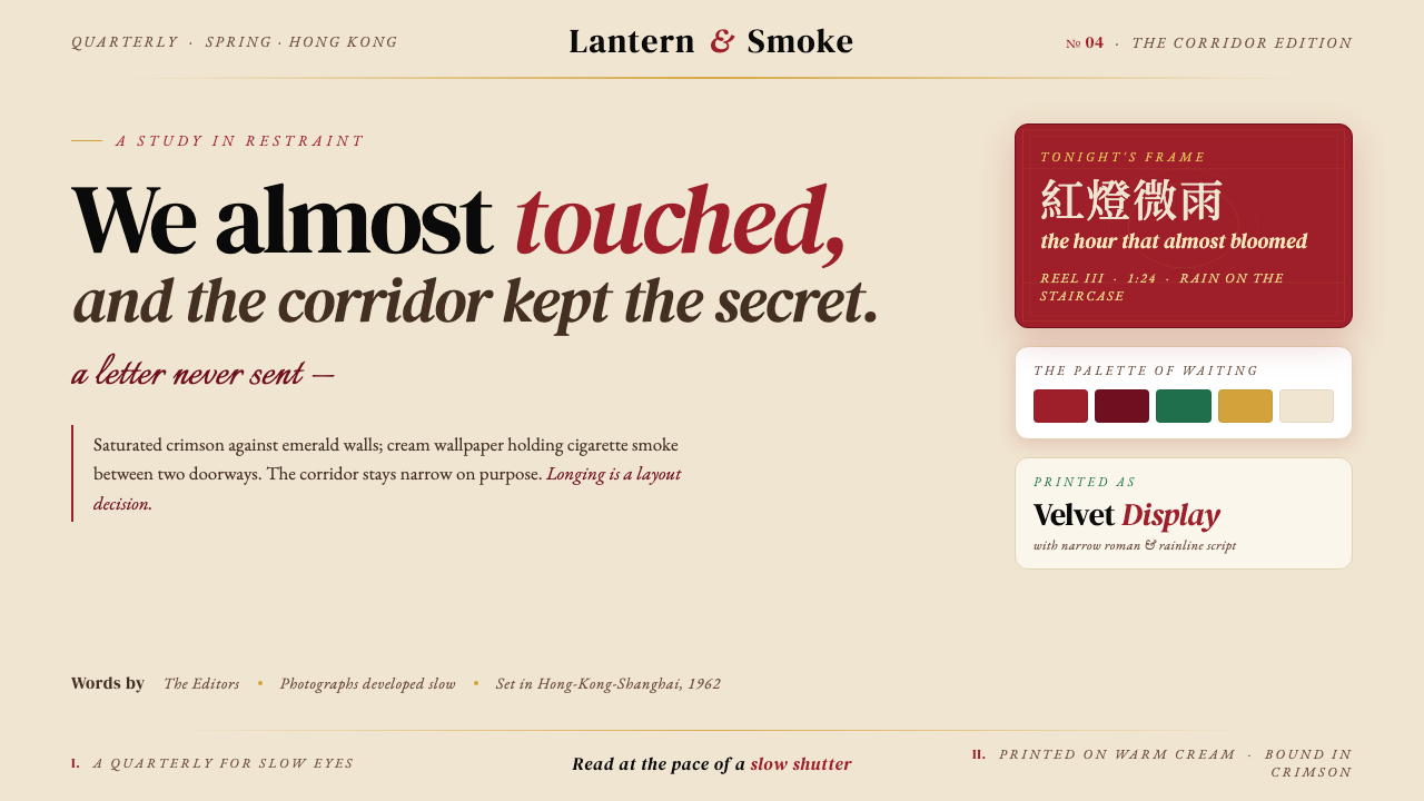 Wong Kar-wai — In the Mood for LoveLonging as a layout decision. Crimson qipao, emerald-jade walls, warm cream —…把克制的思念当作版面:胭脂红、翠玉绿、奶油米——慢门电影写成界面。