What is Wong Kar-wai — In the Mood for Love?什么是 Wong Kar-wai — In the Mood for Love?
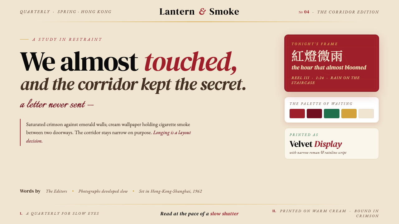
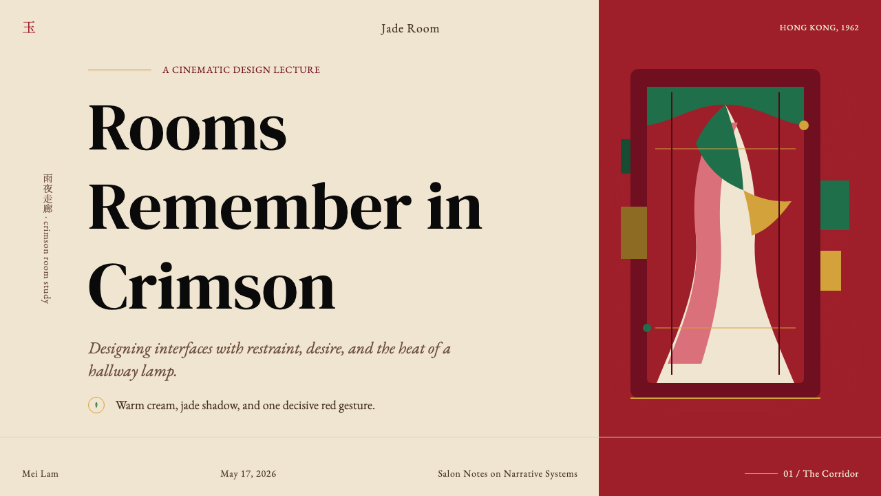
Every frame of In the Mood for Love is an act of longing held perfectly still — saturated crimson, slow shutter, and the architecture of desire.《花样年华》的每一帧都是被凝固的思念——饱和的胭脂红、慢门的光晕、以及欲望的建筑学。
Wong Kar-wai — In the Mood for Love in briefWong Kar-wai — In the Mood for Love 速览
Wong Kar-wai's In the Mood for Love (2000) is not merely a film; it is a fully realized visual system built from saturated color, compressed space, and time deliberately slowed. Set in 1960s Hong Kong, the film follows two neighbors — played by Tony Leung Chiu-wai and Maggie Cheung — who suspect their spouses of having an affair and find themselves drawn toward each other through a series of charged, unconsummated encounters. The emotional grammar of restraint, proximity, and longing is inseparable from the film's visual grammar of crimson qipao silhouettes, emerald-jade tenement walls, warm cream wallpaper, and Christopher Doyle's slow-shutter cinematography.王家卫的《花样年华》(2000)不仅仅是一部电影,更是一套由饱和色彩、压缩空间和被刻意放慢的时间构筑的完整视觉体系。故事发生在1960年代的香港,梁朝伟与张曼玉饰演的两位邻居,在怀疑各自的配偶发生婚外情后,经由一系列克制而暧昧的相遇,彼此靠近却始终未能逾越。克制、贴近与思念的情感语法,与电影的视觉语法密不可分——胭脂红旗袍的剪影、深翠如玉的弄堂墙壁、温润的米白壁纸,以及杜可风慢门镜头下流动的暧昧光影。
What distinguishes this aesthetic from ordinary period nostalgia is its precision. Every element — the weight of a staircase railing, the quality of light bleeding through a rice-paper screen, the exact red of a dress against a green wall — is a compositional decision. The palette is simultaneously saturated and controlled: deep, jewel-toned hues drawn from the wardrobe and architecture of Hong Kong-Shanghai emigrant culture, offset against warm neutrals that absorb rather than reflect light. The result is a visual world that feels simultaneously intimate and sealed — as if the frame itself were a room with walls closing in.这套美学之所以区别于普通的年代怀旧,在于它的精准。每一个元素——楼梯扶手的分量、光线穿透米纸屏风的质感、一件红裙在绿墙前的确切色度——都是构图上的决定。色板同时具有饱和与克制两种品质:浓郁的宝石色调取材于香港-上海移民文化的服饰与建筑,在吸收而非反射光线的暖色中性调中得到平衡。由此形成的视觉世界同时感觉亲密和密封——仿佛画框本身就是一间墙壁不断合拢的房间。
As a design language translated into digital surfaces, this aesthetic is editorial cinema rendered as interface. Type is set in deep-cut serifs and italic flourishes that carry the weight of handwritten correspondence. Layouts breathe like narrow apartment corridors — framed, intimate, deliberately constrained. Color is unapologetically saturated but rigorously curated: one dominant jewel tone anchors the composition while warm neutrals do the structural work. It is the design system of a film that understood longing as a spatial condition.作为一种被翻译到数字界面上的设计语言,这套美学是被装裱成界面的电影散文。字体选用深刻的衬线与斜体花体,承载着手写信件的重量。版面像狭窄的公寓走廊一样呼吸——有框架感、亲密感,刻意约束。色彩不退让地饱和,却经过严格筛选:一种主导的宝石色锚定构图,暖色中性调承担结构工作。这是一套属于一部电影的设计系统——那部电影将思念理解为一种空间状态。
Where does Wong Kar-wai — In the Mood for Love come from?Wong Kar-wai — In the Mood for Love 从何而来?
Wong Kar-wai's visual language did not emerge from a single film or a single collaborator. It accumulated across a decade of Hong Kong New Wave filmmaking that began with his debut, As Tears Go By, in 1988. By the time Chungking Express appeared in 1994 and Happy Together in 1997, Kar-wai had established a working method inseparable from his aesthetic: no complete script before shooting, extended shooting periods, improvisation between director and cinematographer, and a willingness to build a film's visual identity through accumulation rather than plan. In the Mood for Love was shot over fifteen months across multiple locations in Hong Kong, Thailand, and Cambodia — an unusually protracted process that allowed the film's visual obsessiveness to deepen with each session.王家卫的视觉语言并非源于单一的电影或单一的合作者,而是在整整十年的香港新浪潮电影创作中逐渐积累成形——从1988年处女作《旺角卡门》开始算起。到1994年《重庆森林》和1997年《春光乍泄》问世时,王家卫已经确立了一套与其美学密不可分的工作方法:开拍前没有完整剧本,拍摄周期漫长,导演与摄影师之间高度即兴,以及通过积累而非预先规划来建立一部电影的视觉身份。《花样年华》历时十五个月,跨越香港、泰国和柬埔寨多个地点拍摄——这个异乎寻常漫长的过程,让电影的视觉执念在每一次拍摄中都得以加深。
The film's chromatic foundation draws on the material culture of Hong Kong's 1960s Shanghai emigrant community. Wong Kar-wai's own family had relocated from Shanghai to Hong Kong in 1963, and his childhood memories of that community — its fashions, its apartment interiors, its social codes — saturated the film's visual research. Costume designer William Chang sourced or created more than twenty qipao garments in different colorways for Maggie Cheung's character, each one functioning less as wardrobe than as a mood signal: the shade of red telegraphing emotional temperature, the fit and silhouette encoding social constraint. The emerald-jade and deep teal walls came from Chang's meticulous recreation of period tenement interiors in which color was used structurally — as partition, as atmosphere — rather than decoratively.这部电影的色彩基础来自香港1960年代上海移民社区的物质文化。王家卫的家庭于1963年从上海迁居香港,他童年时期对那个社区的记忆——那里的服饰、公寓内饰与社会礼法——浸透了这部电影的视觉研究。服装设计师张叔平为张曼玉饰演的角色置备或定制了二十多件不同色系的旗袍,每一件的功能与其说是服装,不如说是情绪信号:红色的深浅传递情感温度,剪裁与廓形则编码着社会的约束。那些深翠如玉和深青色的墙壁,来自张叔平对年代弄堂内饰的细致复原——在那里,色彩被用于结构性目的,作为隔断、作为氛围,而非作为装饰。
Cinematographer Christopher Doyle, who had already collaborated with Kar-wai on Chungking Express and Happy Together, brought a physical and experimental approach to the camera that was essential to the film's look. His use of slow-shutter and step-printing techniques — shooting at higher frame rates and then printing only selected frames — produced the film's signature blurred-motion sequences: figures moving through corridors and stairwells in smeared, painterly trails of color. This was not digital manipulation but analog experimentation, achieved in the camera and in the printing lab. The effect transforms movement into duration, making every walk up a staircase feel like a memory already in the process of fading.曾与王家卫合作《重庆森林》和《春光乍泄》的摄影师杜可风,为这部电影带来了一种肢体性的、实验性的拍摄方法,这对电影的视觉风格至关重要。他运用的慢快门和抽帧技术——以更高的帧率拍摄,再从中选取特定帧进行印制——制造出电影标志性的运动模糊段落:人物在走廊和楼梯间穿行,留下涂抹般、绘画般的色彩轨迹。这不是数字处理,而是在摄影机和洗印室中完成的模拟实验。这种效果将运动转化为时长,让每一次走上楼梯都感觉像一段正在消逝中的记忆。
In the Mood for Love sits within the tradition of the Hong Kong New Wave, a movement that emerged in the late 1970s and 1980s among filmmakers who had studied abroad — at London Film School, at New York University, at Paris conservatories — and returned to bring European art-cinema sensibilities into a local commercial industry. Directors like Ann Hui, Tsui Hark, and Patrick Tam established the movement's parameters; Wong Kar-wai extended them into a more subjective, temporally fragmented register that drew comparisons to the French Nouvelle Vague and the work of Michelangelo Antonioni. The film's international reception — it won the Best Director prize at the 2000 Cannes Film Festival — confirmed that its visual language had achieved the rare status of being simultaneously rooted in a specific cultural moment and universally legible as a grammar of longing.《花样年华》坐落于香港新浪潮的传统之中。这一运动兴起于1970年代末至80年代,由一批曾留学海外——在伦敦电影学院、纽约大学、巴黎音乐学院——归来后将欧洲艺术电影感性带入本地商业工业的电影人开创。许鞍华、徐克和谭家明等导演确立了这一运动的参数;王家卫则将其延伸至一种更为主观、时间更加碎片化的维度,令人联想到法国新浪潮和安东尼奥尼的作品。这部电影在国际上获得了广泛认可——在2000年戛纳电影节上荣获最佳导演奖——证实其视觉语言已经达到一种罕见的境界:既深植于某一特定的文化时刻,又作为一套思念的语法被普遍地读懂。
What defines the Wong Kar-wai — In the Mood for Love look?Wong Kar-wai — In the Mood for Love 的视觉特征是什么?
Jewel-Saturated Color宝石般的饱和色彩
The palette centers on deep, saturated hues drawn from the wardrobe and interiors of 1960s Hong Kong-Shanghai emigrant culture: crimson and vermilion reds, emerald and teal greens, warm amber yellows, deep indigo. These are not pastels or approximations — they are full-intensity jewel tones. They appear in compression against one another and against warm cream or aged-ivory neutrals that prevent the palette from becoming overwhelming. The logic is not variety but depth: fewer colors, each pushed to its most expressive limit.色板以1960年代香港-上海移民文化服饰与室内陈设中的深度饱和色为核心:胭脂红与朱砂红、翠绿与青色、暖琥珀黄、深靛蓝。这些不是粉彩或近似色——而是全强度的宝石色调。它们彼此压缩并置,同时与温润的奶油色或陈旧象牙色的中性调相互制衡,防止色板变得令人窒息。这套逻辑追求的不是多样,而是深度:更少的色彩,每一种都被推至最具表现力的极限。
Temporal Blur and Slow Shutter时间感的模糊与慢门
One of the film's most recognizable techniques — achieved through step-printing and slow-shutter cinematography — renders moving figures as smeared trails of color against sharp architectural backgrounds. In a design system, this quality is translated into layered semi-transparent surfaces, soft overlapping elements, and the deliberate use of motion blur or depth-of-field effects to convey that some elements exist in a different temporal register than others. Sharpness is reserved for what matters most; everything peripheral softens into atmosphere.电影最具辨识度的技术之一——通过抽帧印制和慢快门摄影实现——将运动中的人物渲染成在清晰建筑背景前的色彩拖尾。在设计系统中,这种品质被转化为分层的半透明界面、柔和的叠压元素,以及对运动模糊或景深效果的刻意运用,以传达某些元素存在于与其他元素不同的时间维度中。清晰度被保留给最重要的内容;一切外围元素则软化成氛围。
Compressed and Framed Space压缩与取景的空间
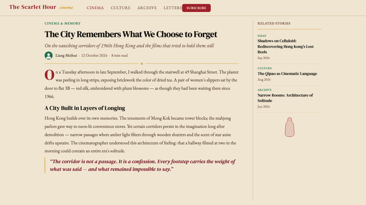
The film's locations — narrow stairwells, corridor kitchens, rooms-within-rooms — impose a vertical, compressed visual logic. Compositions are tightly framed, with doorways and windows acting as frames-within-frames that isolate figures from their environments and charge negative space with emotional weight. In a design context, this translates to narrow column widths, strong vertical rhythm, deliberate use of contained containers and bordered elements, and compositions that use the edges of the frame as active structural elements rather than neutral boundaries.电影的场景——狭窄的楼梯间、走廊厨房、房中房——施加了一种垂直的、压缩的视觉逻辑。构图框取紧凑,门框与窗框作为画中画的取景框,将人物从环境中隔离出来,使负空间充满情感分量。在设计语境中,这转化为窄列宽、强烈的垂直节奏、对内容容器和边框元素的刻意运用,以及将画框边缘作为主动结构要素而非中性边界的构图方式。
Serif Typography with Italic Warmth带有斜体温度的衬线字体
Where the film's language is literary and intimate — the voiceover, the intertitles, the sense of private correspondence — its design equivalent is found in typefaces with strong serifs, visible ink-trap details, and an affinity for italic cuts. The italic is not used for emphasis in the conventional sense but as a default register: the entire system leans slightly, as if penning a letter that will never be sent. This is the opposite of the rational neutrality of a sans-serif system; every letterform carries some memory of the hand that drew it.电影的语言是文学性的、私密的——画外音、字幕卡、私人信件的气息——与之对应的设计语言,存在于那些衬线强烈、墨陷细节可见、对斜体版本有天然亲和力的字体中。斜体的使用不是常规意义上的强调,而是一种默认的姿态:整套系统微微倾斜,仿佛在书写一封永远不会寄出的信。这与无衬线系统的理性中立恰恰相反;每一个字形都承载着某种书写它的手的记忆。
Warm Neutral Grounds暖色中性底面
Rather than the cool white or stark black backgrounds common to contemporary digital design, this aesthetic grounds its saturated colors on warm cream, aged ivory, or deep tobacco tones. These backgrounds absorb light rather than reflecting it, giving the overall surface a tactile, almost material quality — closer to aged paper or linen than to a backlit screen. When dark grounds are used, they lean warm, toward deep amber-black or brown-black rather than cool gray-black.与当代数字设计中常见的冷白或纯黑背景不同,这套美学将其饱和色彩置于暖奶油色、陈旧象牙色或深烟草色的底面上。这些背景吸收而非反射光线,赋予整体界面一种触觉性的、近乎材质般的品质——更接近泛黄的纸张或亚麻布,而非背光屏幕。当使用深色底面时,它们偏向暖调,趋近于深琥珀黑或棕黑,而非冷灰黑。
Restraint as Compositional Principle克制作为构图原则
The film's emotional power comes not from what happens but from what almost happens — the glance not returned, the touch withheld, the words spoken and then unsaid. In design terms, this is the principle of productive omission: whitespace that is not empty but charged, elements placed at the edge of the frame rather than at its center, hierarchy established through absence as much as presence. The system should always feel as if something is being held back — as if the most important thing is just outside the visible area.电影的情感力量不来自发生了什么,而来自几乎发生了什么——没有回应的眼神、被克制的触碰、说出后又收回的话语。在设计语言中,这是生产性省略的原则:留白不是空洞而是充电,元素被置于画框边缘而非中心,层级通过缺席与在场同等地建立。整套系统应当永远感觉有什么东西被压住了——仿佛最重要的事物就在可见区域之外。
Pattern as Texture图案作为肌理
The film's interiors are dense with pattern: floral wallpapers, geometric tile floors, embroidered and printed qipao fabrics. Rather than competing with the color palette, these patterns function as texture — adding depth and historical weight to surfaces without disrupting the dominant chromatic logic. In a design system, this translates to the selective use of fine geometric or floral motifs as background texture, always at low contrast relative to the dominant ground color, so that they read as surface quality rather than independent graphic elements.电影的室内空间密布图案:花卉壁纸、几何地砖、刺绣与印花旗袍面料。这些图案并不与色板竞争,而是作为肌理发挥作用——为界面增添深度与历史分量,而不打乱主导的色彩逻辑。在设计系统中,这转化为对细腻几何或花卉母题作为背景肌理的选择性使用,始终保持相对于主导底色的低对比度,使其作为界面品质而非独立图形元素被感知。
Who shaped Wong Kar-wai — In the Mood for Love?谁塑造了 Wong Kar-wai — In the Mood for Love?
Born in Shanghai in 1958 and raised in Hong Kong from age five, Wong Kar-wai brought the remembered atmosphere of Shanghai emigrant culture directly into his filmmaking. His improvisational working method — shooting without a completed script, building narrative in the editing room — produces films that feel like memory itself: fragmented, repetitive, emotionally over-determined. Across a filmography that includes Days of Being Wild (1990), Chungking Express (1994), Happy Together (1997), and 2046 (2004), he developed a visual and tonal vocabulary now widely recognized as the definitive cinematic grammar of longing. In the Mood for Love, which he has described as a film about suppression — about what people do not say — brought that grammar to its most concentrated expression.王家卫1958年生于上海,五岁随家人迁居香港。他将上海移民文化的记忆氛围直接带入了自己的电影创作。他即兴式的工作方法——无完整剧本开拍,在剪辑室中构建叙事——制造出感觉像记忆本身的电影:碎片化、反复萦绕、情感上过度决定。在包括《阿飞正传》(1990)、《重庆森林》(1994)、《春光乍泄》(1997)和《2046》(2004)在内的作品序列中,他发展出一套现在被广泛认可为思念电影定义性语法的视觉与情调词汇。他本人将《花样年华》描述为一部关于压抑的电影——关于人们不说出口的话——将那套语法带到了最为凝练的表达。
Australian-born cinematographer Christopher Doyle (known in Chinese as 杜可風, Du Kefeng) has been the primary visual architect of Wong Kar-wai's aesthetic across multiple collaborations. Doyle's approach to the camera is physical and intuitive — he often operates handheld, positions the lens at angles that compress or distort space, and uses available and practical light rather than formal studio setups. For In the Mood for Love, his most significant technical contribution was the step-printing technique: shooting certain scenes at higher frame rates and selectively printing frames to create the film's signature slow-motion blur. This was an analog solution that gave the film a painterly, temporally suspended quality that digital post-processing cannot convincingly replicate.澳大利亚出生的摄影师杜可风在与王家卫的多次合作中,是其美学的主要视觉建构者。杜可风对摄影机的处理是肢体性的、直觉性的——他经常使用手持拍摄,将镜头置于压缩或扭曲空间的角度,并使用现场和实用光源而非正式的摄影棚布置。在《花样年华》中,他最重要的技术贡献是抽帧技术:以更高帧率拍摄某些场景,再选择性地印制帧数,制造出电影标志性的慢动作模糊。这是一种模拟解决方案,赋予了电影一种绘画般的、时间暂停的品质,是数字后期处理无法令人信服地复制的。
Production designer and costume designer William Chang (張叔平) is the third essential creative voice in the Wong Kar-wai visual system, having collaborated with the director on virtually every film from the beginning of his career. For In the Mood for Love, Chang sourced and created more than twenty qipao garments for Maggie Cheung, each one calibrated to the emotional register of the scenes in which it appears. His color choices for the film's interior sets — the deep teal walls, the patterned wallpapers, the warm wood and rattan furniture — constitute a material archive of Hong Kong-Shanghai domestic culture that is simultaneously historically precise and aesthetically idealized. Chang's production design is the bridge between the film's historical subject matter and its dreamlike visual intensity.美术指导兼服装设计师张叔平是王家卫视觉系统中第三个不可或缺的创作声音,几乎参与了这位导演从影以来的所有电影。为拍摄《花样年华》,张叔平为张曼玉置备了二十多件旗袍,每一件都与其出现的场景的情感温度精确校准。他为电影室内场景所做的色彩选择——深青色墙壁、花纹壁纸、温润的木材与藤编家具——构成了香港-上海家居文化的物质档案,同时具有历史上的精确性和美学上的理想化。张叔平的美术指导是电影的历史题材与其梦境般视觉强度之间的桥梁。
Tony Leung Chiu-wai (梁朝偉) plays Chow Mo-wan, a newspaper editor who becomes the film's central consciousness. His performance is constructed almost entirely from physical restraint — a glance held a half-second too long, a hand on a shoulder that stops before it becomes a gesture — and it represents the human embodiment of the film's central design principle. In a visual system built on productive omission, Leung's performance demonstrates that presence is most powerful when it withholds. His collaboration with Wong Kar-wai continued in 2046 (2004), where his character's relationship to suppressed desire and memory forms a direct continuation of the mood established in In the Mood for Love.梁朝伟饰演报社编辑周慕云,成为电影的核心意识。他的表演几乎完全由肢体克制构建——一个多凝视半秒的眼神,一只搭上肩膀却在成为姿态之前停住的手——代表着这部电影核心设计原则的人格化体现。在一套建立于生产性省略之上的视觉系统中,梁朝伟的表演证明,在场的力量在克制时最为强大。他与王家卫的合作在《2046》(2004)中延续,其角色与压抑的欲望和记忆的关系,直接延续了《花样年华》所确立的情调。
Maggie Cheung (張曼玉) plays Su Li-zhen, and her physical presence in the film is so thoroughly mediated through costume, framing, and slow-shutter cinematography that her character functions as much as a visual motif as a narrative agent. The parade of qipao — each one in a different saturated colorway, each one fitted to enclose rather than display — transforms her into the film's primary chromatic element. The color of Su Li-zhen's dress in any given scene communicates her emotional state with more precision than dialogue. Cheung won the Best Actress prize at the Berlin International Film Festival for her performance, recognition that her work required the full integration of physical bearing, emotional intelligence, and visual design into a single coherent presence.张曼玉饰演苏丽珍,她在电影中的形体存在被服装、取景和慢门摄影如此彻底地调制,以至于她的角色与其说是叙事主体,不如说是视觉母题。那一袭接一袭的旗袍——每一件都是不同的饱和色系,每一件都裁剪得更像包裹而非展示——将她转化为电影主要的色彩元素。苏丽珍在任何给定场景中的旗袍颜色,以比对话更高的精度传达着她的情感状态。张曼玉因这一表演获得柏林国际电影节最佳女演员奖,这一认可表明,她的工作需要将形体仪态、情感智性与视觉设计完全整合为一种连贯的在场。
How do you use Wong Kar-wai — In the Mood for Love today?今天怎么用 Wong Kar-wai — In the Mood for Love?
The Wong Kar-wai aesthetic is most effective when the work itself has something to withhold — when the design problem calls for emotional depth, intimacy, and the sense that a richer world exists just beyond the visible frame. It is a strong choice for cultural, editorial, luxury, and personal brand work: cinema-related projects, literary journals, fashion lookbooks, travel writing, fine dining, boutique hospitality. It struggles in contexts that require transparency, neutrality, or clinical precision — financial dashboards, medical interfaces, government services.王家卫美学在作品本身有什么需要压住的时候最为有效——当设计问题需要情感深度、亲密感,以及可见画框之外存在着更丰富世界的那种感觉。它是文化、编辑、奢侈品和个人品牌工作的有力选择:与电影相关的项目、文学杂志、时尚视觉书、旅行写作、精致餐饮、精品酒店。在需要透明、中立或临床精确的场景中——金融仪表板、医疗界面、政府服务——它则难以施展。
For presentation slides, the system works best when it is used sparingly and with commitment. A cover slide benefits from a single full-bleed image or color field in one of the palette's deep jewel tones — crimson, teal, or deep amber — with a title set in an italic serif at generous scale against a warm neutral. Resist the temptation to layer multiple palette colors on a single slide; the system's power comes from restraint, not variety. Content slides should treat negative space generously: one idea per slide, body text in a narrow column, call-out text in a contrasting weight of the same serif family. Data slides can adopt a period-inspired aesthetic — charts framed within bordered containers, bars in a single jewel tone against the warm ground — to maintain tonal consistency.对于演示文稿,这套系统在被节制地、坚定地使用时效果最好。封面幻灯片适合以色板中某一种深宝石色——胭脂红、青色或深琥珀色——做单一满幅图像或色彩铺底,将标题以斜体衬线字大尺度置于暖色中性底面上。抵制在单张幻灯片上叠用多种色板颜色的诱惑;这套系统的力量来自克制,而非多样。内容页应当慷慨地对待负空间:一页一个想法,正文排在窄列中,摘引文字使用同一衬线字族的对比字重。数据页可以采用带有年代感的美学——图表框在有边框的容器中,条形以单一宝石色对照暖色底面——以维持情调的一致性。
For web interfaces, this aesthetic suits editorial, portfolio, and long-form reading experiences more naturally than it suits transactional or utilitarian interfaces. A web page in this register uses a warm off-white or cream background, a single primary jewel tone for interactive elements and section accents, and an italic serif for display text with a more neutral companion for body reading. Navigation can be minimal — typographic only, with generous letter-spacing — and section breaks should be marked by thin rules or soft borders rather than bold dividers. Image treatment matters enormously: photography should be warm-toned, slightly desaturated, and cropped tight to focus on detail and texture rather than full-scene documentation.对于网页界面,这套美学更自然地适合编辑类、作品集类和长阅读体验的界面,而非交易型或功能型界面。这种基调的网页使用暖调米白或奶油色背景,以单一主色宝石色调用于交互元素和区块强调,展示文字使用斜体衬线,正文阅读则配以更中性的字体。导航可以是极简的——纯字体,搭配宽松的字母间距——段落分隔应以细线或柔和边框标记,而非粗重分割线。图像处理极为关键:摄影作品应当偏暖调、略微降低饱和度,并紧凑裁切以聚焦于细节与质感,而非完整场景的记录。
For editorial and marketing work — social cards, posters, magazine spreads, campaign visuals — the style lends itself to full-bleed saturated color with typography that is confident and slightly literary. A social card in this aesthetic uses one jewel-tone background color, a single line of italic serif headline in cream or ivory, and perhaps a small flourish or rule as the only graphic element. The feeling should be closer to a film still than to an advertisement. Marketing campaigns benefit from consistency across the palette: choosing two colors from the system — say, crimson and cream — and using only those across a campaign produces stronger work than using the full palette freely.对于编辑与营销工作——社交卡片、海报、杂志跨页、广告视觉——这种风格适合以满幅饱和色搭配自信而略带文学气质的字体。这种美学的社交卡片使用单一宝石色背景,配以奶油或象牙色的单行斜体衬线标题,或许再加一条细线作为唯一的图形元素。整体感觉应当更接近一帧电影剧照,而非一则广告。营销活动受益于色板的一致性:从系统中选取两种颜色——比如胭脂红与奶油色——并在整个活动中只使用这两种,比自由地运用完整色板产生更强的效果。
The most common mistake when applying this aesthetic is mistaking saturation for the system's core principle. Saturated color is one ingredient, but the system's actual logic is compression and restraint: things withheld, space compressed, warmth controlled. Designers who apply the jewel tones to a layout that is otherwise open, airy, and generous in negative space will find that the colors feel decorative rather than structural. The palette needs the narrow frame, the tight crop, and the warm neutral ground to do its work. Similarly, mixing this aesthetic with contemporary flat design or glassmorphism trends undermines the tonal coherence the system depends on — the mood requires commitment.应用这套美学时最常见的错误,是将饱和度误认为系统的核心原则。饱和色彩是一种成分,但这套系统的实际逻辑是压缩与克制:被压住的事物、被收窄的空间、被管控的温度。将宝石色调应用在一个布局宽松、留白慷慨的版面上,设计师会发现那些颜色感觉像装饰而非结构。这套色板需要窄框架、紧裁切和暖色中性底面才能发挥作用。同样,将这套美学与当代扁平设计或玻璃拟态流行趋势混用,会破坏这套系统所依赖的情调连贯性——这种情绪需要完全的投入。
Wong Kar-wai — In the Mood for Love — FAQWong Kar-wai — In the Mood for Love · 常见问题
Is this aesthetic only appropriate for romantic or melancholic subjects?这套美学只适合浪漫或忧郁的主题吗?
Not exclusively, though it does carry a strong emotional signature that cannot be entirely separated from its cinematic origins. The system works wherever the desired feeling is depth, intimacy, and a sense of curated experience — which includes wine, travel, fashion, architecture, literary publishing, and cultural institutions. It is less suited to contexts that need to communicate speed, efficiency, transparency, or clinical precision. The key question to ask is whether the subject has something to withhold — something that rewards the viewer for looking closely. If yes, this aesthetic is likely a strong fit.并非只适合浪漫或忧郁的主题,尽管它确实携带着一种无法完全从其电影起源中剥离的强烈情感特征。这套系统适用于任何需要传达深度、亲密感和精心策划体验感的场景——包括葡萄酒、旅行、时尚、建筑、文学出版和文化机构。它较不适合需要传达速度、效率、透明度或临床精确的场景。关键问题是:这个主题是否有什么需要压住的——某种值得观者仔细审视才能发现的东西。如果是,这套美学很可能高度契合。
How does this style handle light and dark modes?这套风格如何处理明暗两种模式?
The historic and canonical form of this aesthetic is warm-ground light: cream, aged ivory, or warm white backgrounds with saturated jewel tones and deep type. A dark inversion is possible but requires commitment. In a dark mode, the ground should lean toward deep tobacco brown, warm near-black, or aged charcoal — not cool gray or pure black, which kill the warmth that holds the palette together. On a dark ground, the jewel tones shift in behavior: crimson deepens toward burgundy, teal brightens toward aqua. One dominant color works better than several competing hues. The dark variant reads as nighttime in the same world — appropriate for late-evening editorial or atmospheric landing pages — rather than as a fundamentally different design.这套美学的历史标准形式是暖底浅色:奶油色、陈旧象牙色或暖白底面,配以饱和宝石色调和深色文字。深色反转版本是可能的,但需要坚定的执行。在深色模式中,底面应偏向深烟草棕、暖近黑或陈旧炭色——而非冷灰或纯黑,后者会杀死将这套色板凝聚在一起的温度。在深色底面上,宝石色调的表现会发生变化:胭脂红加深向勃艮第,青色提亮向海蓝。单一主色比多种互相竞争的色调效果更好。深色变体应当读起来像同一个世界里的夜晚——适合深夜编辑内容或氛围着陆页——而非一种根本不同的设计。
Can this aesthetic work for data-heavy or information-dense interfaces?这套美学能用于数据密集或信息量大的界面吗?
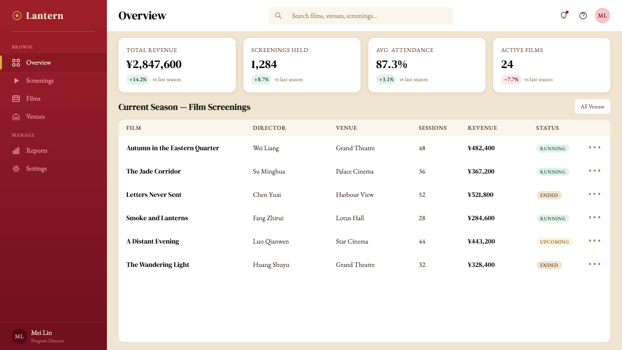
With care, yes. The palette's jewel tones work well as categorical colors in chart legends, provided no more than two or three are used simultaneously — the system is not designed for the large color sets that complex data visualization often requires. The warm neutral ground gives charts a period-editorial quality that can be genuinely distinctive in contexts dominated by cool-white dashboard conventions. The key constraint is density: this aesthetic depends on negative space to function, so data-dense grids need to be given more room than a conventional dashboard would allocate. Think of it as a data visualization aesthetic for annual reports and curated data journalism rather than for real-time operational dashboards.谨慎处理的话,是可以的。这套色板的宝石色调作为图表图例中的分类颜色效果不错,前提是同时使用的色彩不超过两到三种——这套系统并非为复杂数据可视化通常需要的大型色彩集而设计。暖色中性底面赋予图表一种年代性编辑质感,在被冷白仪表板惯例主导的场景中能够真正地独树一帜。关键约束在于密度:这套美学依赖负空间才能正常运作,因此数据密集的网格需要比常规仪表板所分配的更多空间。可以把它理解为年度报告和精心策划的数据新闻的数据可视化美学,而非实时运营仪表板的美学。
How does this style relate to other Asian-influenced or Hong Kong design aesthetics?这套风格与其他亚洲影响或香港设计美学有何关系?
The Wong Kar-wai aesthetic is specific enough that it should not be used as a proxy for Asian design aesthetics generally. It draws on a very particular cultural moment — 1960s Hong Kong-Shanghai emigrant culture — and a very particular artistic sensibility — the Hong Kong New Wave's fusion of European art-cinema technique with local material culture. It shares some chromatic characteristics with certain strands of Japanese wabi-sabi aesthetic (warmth, the beauty of impermanence) but is far more saturated and emotionally insistent. It is distinct from the clean geometric modernism of Taiwanese design or the graphic boldness associated with Japanese commercial culture. Applying it to any Asian cultural context other than the one it references risks a kind of visual conflation that flattens cultural specificity.王家卫美学足够特定,不应被用作亚洲设计美学的通用代理。它汲取自一个非常特殊的文化时刻——1960年代的香港-上海移民文化——以及一种非常特殊的艺术感性——香港新浪潮对欧洲艺术电影技法与本地物质文化的融合。它与日本侘寂美学的某些方向分享了一些色彩特征(温暖、无常之美),但饱和度远更高,情感上也更为坚持。它区别于台湾设计的干净几何现代主义,也区别于与日本商业文化相关联的图形大胆感。将它应用于其所指涉的文化语境以外的任何亚洲文化场景,都有造成一种视觉混同的风险——这种混同会抹平文化的特殊性。
What is the relationship between this design aesthetic and nostalgia — and is that a problem?这套设计美学与怀旧情绪有何关系——这是一个问题吗?
The aesthetic is deeply inflected by nostalgia — but so is the film, deliberately and self-consciously. Wong Kar-wai does not use period detail to recreate the past; he uses it to examine the emotional texture of memory and longing. The design system works the same way: it should not be applied to projects that need to communicate contemporaneity, forward momentum, or innovation as their primary values, because the visual language carries an irremovable backward lean. Used knowingly, this quality is an asset — it signals depth, curation, and an attention to the past that reads as sophistication. The trap is applying it to contexts where it creates dissonance: a startup promising disruption, a technology platform claiming to reinvent the future. The question is whether the nostalgia serves the work or contradicts it.这套美学深刻地被怀旧情绪浸染——但这部电影也是如此,而且是刻意的、自觉的。王家卫并非用年代细节来重现过去;他用它来审视记忆与思念的情感质地。这套设计系统的运作方式相同:它不应被应用于需要以当代性、向前的动量或创新作为主要价值传达的项目,因为这套视觉语言携带着一种无法移除的向后倾斜。有意识地使用时,这种品质是一种资产——它传达深度、精心策展,以及对过去的关注,这种关注被解读为一种老练。陷阱是将它应用于制造不和谐的场景:一个承诺颠覆的初创公司,一个声称重新发明未来的科技平台。问题在于:这种怀旧是服务于作品,还是与之矛盾。
Related design styles相关设计风格
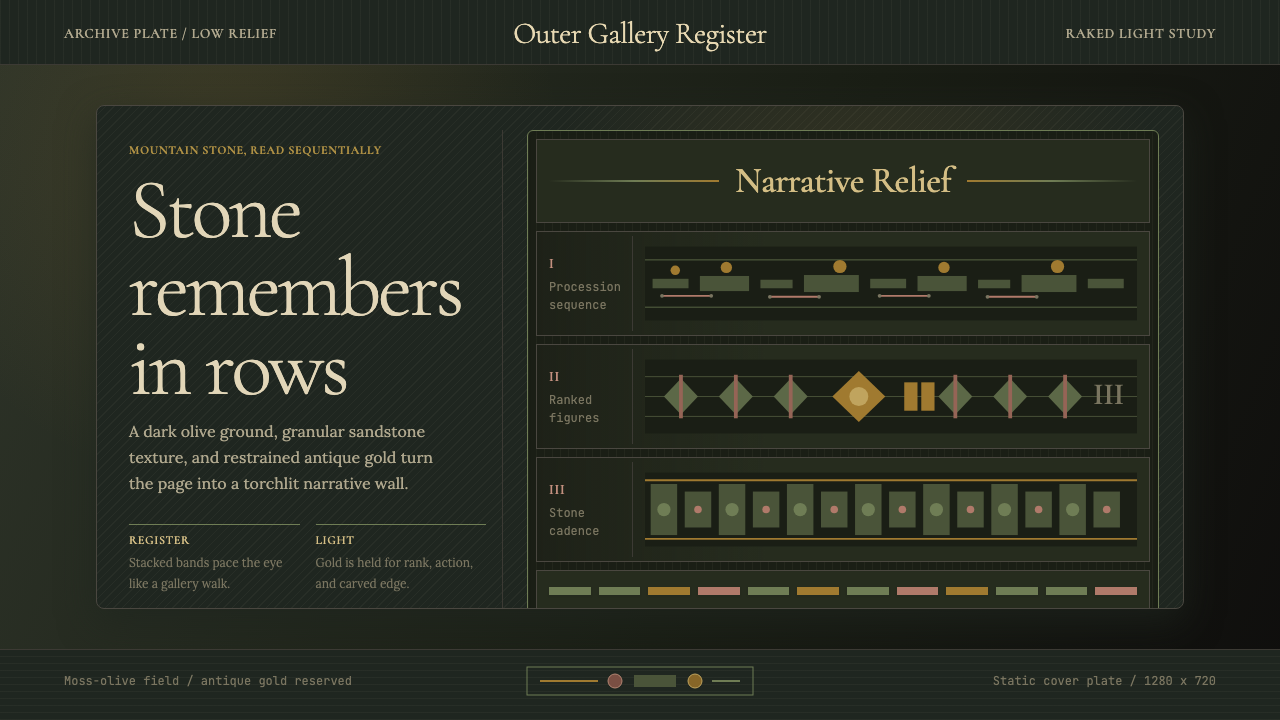 Cambodian Angkor Bas-ReliefStone speaks in shadow. Olive registers and antique gold carve a torchlit arc…石在暗影中叙事:苔绿横栏与古金刻出火光档案。
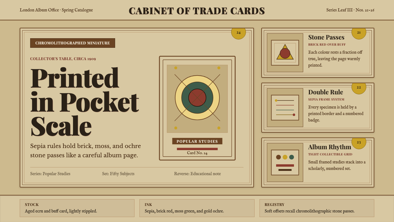 Cigarette Card SetCollectible scholarship. Sepia double-rules, buff stock, and ochre badges fra…收藏级学者气:赭褐双线、米黄卡纸与金赭编号构成套卡秩序。
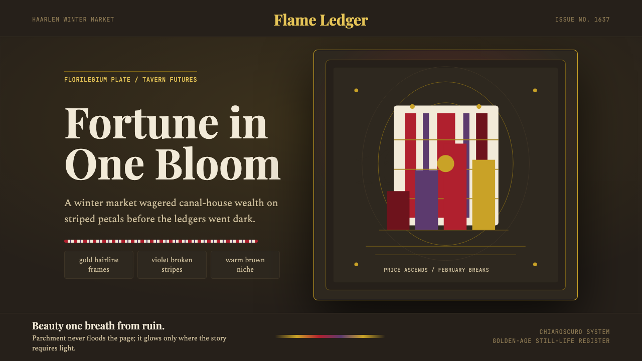 Dutch Tulip ManiaSpeculation burns in shadow. Flame red petals, violet stripes, gold frames on…投机在暗处燃烧:暖棕壁龛中,火红花瓣、紫纹与金框发光。
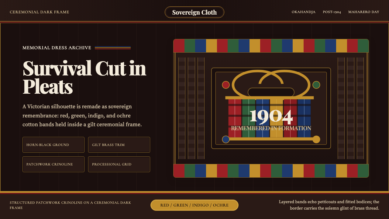 Herero Victorian Dress (Namibia)Memorial wears structure. Red, indigo, green pleats frame gilt brass on dark…纪念有了结构:暗布上红、靛、绿褶柱由黄铜线框起。
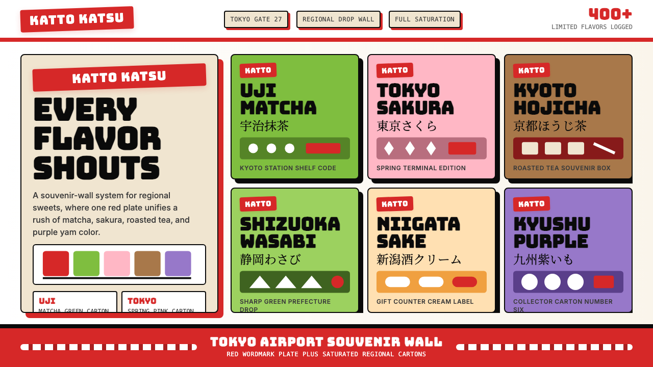 Kit Kat Japan CollectorSouvenir wall joy. Red plates and saturated flavor tiles turn regional sweets…伴手礼墙的快乐。红牌与饱和风味色块把地方甜点变成收藏品。
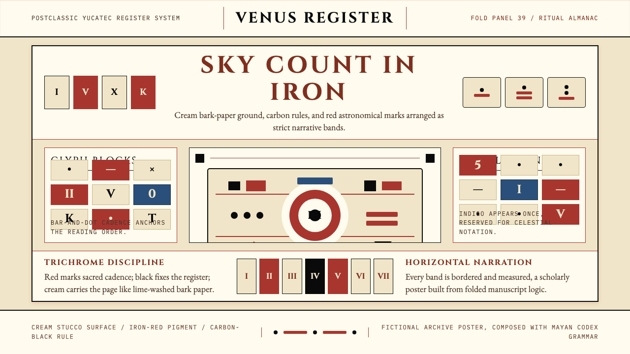 Mayan Dresden CodexSacred astronomy, measured. Cream registers, iron-red glyphs, carbon rules.神圣天文的克制秩序:奶米色横栏、铁红字块、碳黑细线。