What is Kit Kat Japan Collector?什么是 Kit Kat Japan Collector?
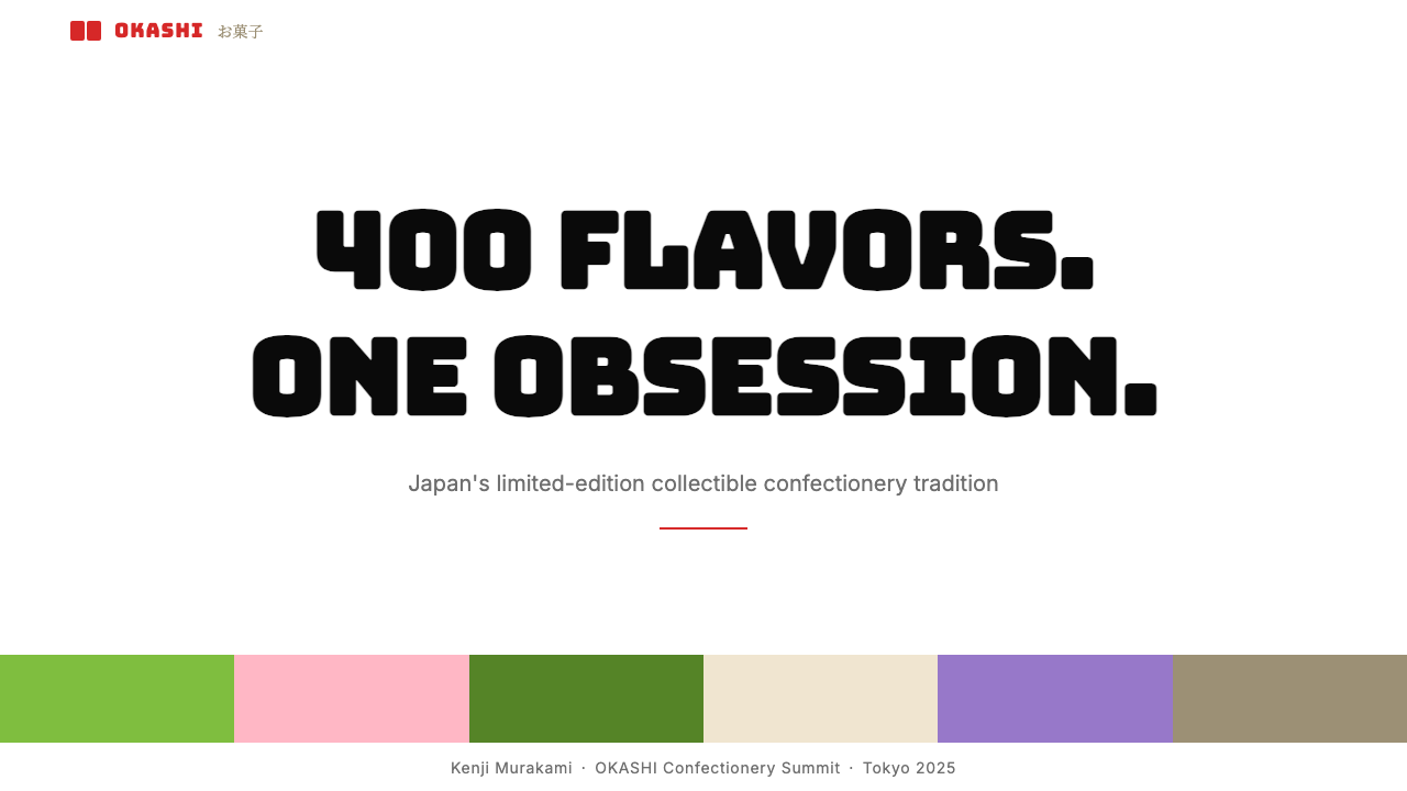
Japan's Kit Kat turned a humble chocolate bar into a souvenir mythology — saturated flavor colors, a red wordmark, and four hundred limited editions that made airport shelves into collector walls.日本 Kit Kat 把一块普通巧克力变成了伴手礼神话——饱和的风味色彩、一个红色字标,以及四百多款限定,让机场货架变成了收藏家的展示墙。
Kit Kat Japan Collector in briefKit Kat Japan Collector 速览
Kit Kat Japan Collector is a visual language derived directly from the packaging system that Nestlé Japan developed for its regional limited-edition Kit Kat line, which launched in earnest in the early 2000s and grew to more than four hundred distinct flavors by the 2020s. Each flavor receives its own dominant packaging color — matcha green, sakura pink, hojicha amber, wasabi yellow-green — and that color saturates the entire box face while a shared red Kit Kat wordmark anchors every variant to a single recognizable family.Kit Kat Japan Collector 这套视觉语言,直接源自雀巢日本为其地区限定 Kit Kat 系列开发的包装体系。该系列于 2000 年代初正式起步,到 2020 年代已累计推出逾四百款不同口味。每款口味拥有专属的主打包装色——抹茶绿、樱花粉、焙茶琥珀、山葵黄绿——这种颜色将整个盒面铺满,而统一的红色 Kit Kat 字标则把所有变体锚定在同一个可识别的家族之下。
The aesthetic is deliberately populist and celebratory rather than restrained or aspirational. Where luxury food brands seek quiet elegance — muted palettes, generous white space, understated type — the Kit Kat Japan system does the opposite. Chunky display lettering shouts flavor names. Colors are pushed to maximum vibrancy. Regional illustrations and flavor cues compete cheerfully for attention on a shelf where dozens of variants stand side by side. The visual experience is the souvenir wall itself: abundant, varied, and unapologetically loud.这套美学是刻意接地气、充满庆典感的,而非克制或高冷的。奢侈食品品牌追求安静的典雅——低饱和色板、慷慨留白、低调字体——Kit Kat 日本体系则反其道而行。粗壮的展示字大声喊出口味名称,色彩被推到最大饱和度,地方插图与口味线索在货架上欢快地争夺注意力,而货架上并排陈列着数十款不同的变体。这种视觉体验本身就是那面伴手礼展示墙:丰盛、多样、毫不掩饰地嘈杂热闹。
As a design style, Kit Kat Japan Collector translates this energy into a set of repeatable principles: high-saturation single-color fields as primary backgrounds, a bold anchor mark or wordmark that unifies all variants, flavor or category names set in chunky rounded display type, and a structured grid that organizes the chaos into rows of clearly distinct but family-coherent tiles. The result is a system that feels festive and collectable while remaining instantly legible from a distance.作为一种设计风格,Kit Kat Japan Collector 将这种能量转化为一套可重复应用的原则:高饱和单色块作为主背景,一个统一所有变体的粗壮锚定标志或字标,以粗圆展示字呈现的口味或类别名称,以及一个将混乱组织成行列分明却家族协调的磁贴式网格结构。最终呈现的体系既有节日感与收藏价值,又能在远距离保持清晰的可读性。
See the Kit Kat Japan Collector design system查看 Kit Kat Japan Collector 完整设计系统
Where does Kit Kat Japan Collector come from?Kit Kat Japan Collector 从何而来?
The Kit Kat brand arrived in Japan in 1973, imported by Fujiya and later managed directly by Nestlé Japan from 1988. For its first decades it was a conventional confectionery product, sold in standard milk chocolate and dark chocolate formats, with no particular claim to cultural significance. The transformation began in the late 1990s and accelerated sharply after 2000, when Nestlé Japan began experimenting with regional flavors tied to Japan's deep tradition of omiyage — the obligation to bring back local food gifts from travel.Kit Kat 品牌于 1973 年进入日本市场,最初由不二家引进,1988 年起由雀巢日本直接经营。在最初的数十年里,它只是一款普通的糖果产品,以标准牛奶巧克力和黑巧克力形式销售,并无特别的文化意义。转变始于 1990 年代末,并在 2000 年后急剧加速——雀巢日本开始尝试与日本深厚的「御土产」(omiyage)传统相结合的地方限定口味。御土产是一种社会习俗,要求出门旅行的人回来时必须带回当地特产食品作为礼物。
The word 'Kit Kat' is phonetically close to 'kitto katsu' in Japanese, an informal expression meaning 'surely win' or 'you'll definitely succeed.' This coincidence gave the bar a built-in association with good luck and exam season encouragement, which Nestlé Japan leaned into deliberately. University entrance exam periods — a source of intense national anxiety — became a key sales moment, with Kit Kat positioned as a gift token of encouragement. The good-luck framing aligned perfectly with omiyage culture: a regionally distinctive, giftable, affordable confection that carries a benevolent message.「Kit Kat」在日语中的发音与「きっと勝つ」(kitto katsu,意为「一定会赢」或「你肯定会成功」)极为接近。这个巧合赋予了这款巧克力一种天然的好运联想,与日本高考季的加油鼓励文化产生了共鸣,雀巢日本也刻意将这一点纳入品牌策略。大学入学考试季——日本全国性焦虑的重要时刻——成为关键销售节点,Kit Kat 被定位为鼓励加油的礼物信物。这种好运框架与御土产文化天衣无缝地契合:一款地区独特、适合馈赠、价格亲民、还带着善意寓意的糖果。
The regional flavor strategy formalized and expanded under Nestlé Japan's brand team in the 2000s, with the pastry chef and culinary director Yasumasa Takagi becoming a notable creative collaborator on prestige flavor development. Takagi worked on upscale variants — including sake, roasted green tea, and specialty strawberry editions — that positioned the brand at the intersection of high craft and mass accessibility. The packaging visual language evolved alongside: each regional or seasonal flavor was assigned its own saturated color identity, creating a coherent family that was nevertheless endlessly varied on the shelf.地区口味战略在 2000 年代由雀巢日本品牌团队正式化并持续扩展,糕点师兼烹饪总监高木康政成为高端口味开发方面重要的创意合作者。高木参与开发了清酒、焙茶、特选草莓等高端变体,将品牌定位在精工制作与大众可及的交汇点上。包装视觉语言也随之演进:每款地区或季节限定口味都被赋予专属的饱和色身份,形成一个统一而又在货架上无尽变化的产品家族。
By the 2010s the system had grown to encompass flavors spanning every region of Japan — shiro strawberry from Hokkaido, purple sweet potato from Okinawa, wasabi from Shizuoka, yuzu from Kochi — and the Tokyo airport Kit Kat specialty stores had become a destination in their own right. The souvenir wall aesthetic — floor-to-ceiling shelves of color-coded boxes, each announcing its flavor in bold type — was no longer an incidental display arrangement but a designed experience that the brand actively cultivated. That wall became the visual template that Kit Kat Japan Collector, as a design language, reproduces and celebrates.到 2010 年代,这个系列已经涵盖了日本每个地区的风味——北海道的白草莓、冲绳的紫薯、静冈的山葵、高知的柚子——东京机场的 Kit Kat 专卖店本身也成为了旅行目的地。那面伴手礼展示墙——从地板到天花板都是按颜色分类、每个盒子都以粗体字宣告自身口味的货架——不再是偶然形成的陈列方式,而是品牌主动培育的设计体验。正是那面展示墙,成为了 Kit Kat Japan Collector 作为设计语言所再现和赞美的视觉原型。
What defines the Kit Kat Japan Collector look?Kit Kat Japan Collector 的视觉特征是什么?
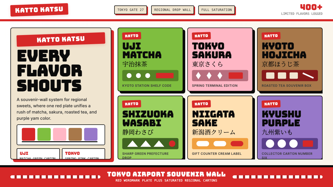
Saturated Single-Hue Fields高饱和单色块
Each variant in the Kit Kat Japan system claims one dominant hue and pushes it to near-maximum saturation across the entire packaging face. Matcha reads as a vivid, slightly dusty green; sakura as a warm, full-bodied pink; hojicha as a deep amber brown; strawberry as a candy-bright red. These colors are not muted or tinted toward neutrality — they are declarative statements of flavor identity. In applied design, this translates to full-bleed color panels that leave no ambiguity about which category or variant a given tile represents.Kit Kat 日本体系中的每款变体都占据一种主导色调,并将其在整个包装面推向接近最大的饱和度。抹茶呈现为鲜活而略带尘雾感的绿色,樱花是温暖饱满的粉色,焙茶是深邃的琥珀棕,草莓是糖果般明亮的红色。这些颜色并非低调或向中性靠拢——它们是口味身份的宣示性陈述。在实际设计中,这转化为满版出血的色彩面板,让人对某个磁贴代表哪个类别或变体毫无疑义。
Unified Anchor Mark统一锚定标志
Across every variant and every hue, the Kit Kat red wordmark appears in a consistent position and weight. This single repeated element is what holds the system together as a family — it tells the viewer that all these wildly different colored boxes are part of one brand, one collection. In design terms, this is a master-brand anchoring device: a fixed visual signature that absorbs the variety of everything around it without changing itself. Applied to other systems, the equivalent is a logo or symbol that appears identically on every variant regardless of background color.无论哪款变体、哪种色调,Kit Kat 的红色字标都以一致的位置和字重出现。这个反复出现的单一元素,是将整个体系凝聚为家族的关键所在——它告诉观看者,所有这些颜色各异的盒子都属于同一品牌、同一系列。从设计角度来看,这是一种母品牌锚定装置:一个固定的视觉签名,能够吸纳周围一切变化,同时自身保持不变。应用于其他体系时,等价物是一个无论背景色如何都以相同形式出现在每款变体上的标志或符号。
Chunky Rounded Display Type粗圆展示字
Flavor names and category labels in the Kit Kat Japan system are set in type that is visibly heavy, rounded at the corners or terminals, and sized for impact rather than elegance. The letterforms communicate friendliness and confidence at the same time — they are not delicate script fonts associated with premium products, nor are they the neutral sans-serifs of utilitarian design. They occupy enough space to be read from across a shelf, and their roundness gives them a tactile, almost edible quality that reinforces the confectionery context.Kit Kat 日本体系中的口味名称和类别标签,使用的字体字重明显偏重,转角或末端带有圆润感,字号的设定以视觉冲击力为优先,而非追求优雅。这些字形同时传递着亲切感和自信——它们既不是与高端产品相关联的纤细手写字体,也不是实用主义设计中性的无衬线体。它们占据足够大的空间,能从货架对面被清晰阅读,而其圆润感赋予它们一种触觉上近乎可食的质感,与糖果语境相互强化。
Tile Grid Structure磁贴网格结构
The souvenir wall experience is organized by an implicit grid — rows and columns of same-size boxes, each a distinct color block, collectively forming a mosaic. This tile logic is foundational to the aesthetic. Individual tiles (boxes, cards, product panels) are self-contained color environments; the grid that holds them creates rhythm and allows comparison. The system tolerates extreme color diversity from tile to tile because each tile is internally consistent. In UI and presentation contexts, this translates to card-based layouts where each card carries a full-bleed background in its category color.伴手礼展示墙的体验由一个隐性网格组织——相同尺寸的盒子排成行列,每个都是独特的色块,共同构成马赛克式的画面。这种磁贴逻辑是整套美学的基础。单个磁贴(盒子、卡片、产品面板)是自足的色彩环境;容纳它们的网格创造出节奏感并允许对比。整个体系能够容忍磁贴与磁贴之间极大的色彩差异,因为每个磁贴内部是一致的。在 UI 和演示场景中,这转化为卡片式布局,每张卡片以其类别颜色作为满版出血背景。
Regional and Seasonal Storytelling地方与季节叙事
Each Kit Kat Japan variant tells a geographic or seasonal story through its color and supporting illustration or imagery. A matcha variant evokes Kyoto and spring tea harvest. A sakura variant signals a specific window of the Japanese year. This layering of place and time onto a color is what makes the system feel encyclopedic and collectable rather than merely varied. In design terms, it means each tile carries metadata — a story — that the color alone begins to encode. Over time, the collection of tiles becomes a map of flavors, places, and seasons.每款 Kit Kat 日本变体都通过其颜色与配套插图或图像,讲述一个地理或季节故事。抹茶变体唤起京都与春季茶园的意象,樱花变体标记日本年历中一个特定的短暂时间窗口。正是这种将地点与时间叠加到颜色上的做法,使整个体系感觉像是一部百科全书,令人想要收藏,而不仅仅是多样化。从设计角度来看,这意味着每个磁贴都携带着元数据——一个故事——而颜色本身已经开始对其进行编码。随着时间推移,这些磁贴的集合成为一张口味、地点与季节的地图。
Joyful Maximalism Within a System体系内的欢乐极大主义
The Kit Kat Japan visual language sits in deliberate opposition to refined-luxury minimalism. It does not seek tranquility or suggest exclusivity through negative space and whispered type. Instead it embraces fullness: the box face is occupied, the color is bold, the type is confident, the illustration is present. This is maximalism, but it is maximalism with structure — every variant follows the same compositional rules even as it screams a different flavor in a different hue. The loudness is the point; the system is what makes the loudness cohere.Kit Kat 日本视觉语言刻意与精致奢华极简主义形成对立。它不追求宁静,也不通过大面积留白和低声细语的字体来暗示排他性。相反,它拥抱充盈:盒面被填满,颜色大胆,字体自信,插图在场。这是极大主义,但它是有结构的极大主义——每款变体遵循相同的构图规则,尽管它用不同的色调大声喊出不同的口味。嘈杂本身就是目的所在;体系才是让嘈杂得以连贯的原因。
Collectibility as a Design Intent收藏性作为设计意图
The Kit Kat Japan system is explicitly designed to be collected, not just consumed. Limited regional editions, seasonal releases, and packaging variations all reinforce the sense that each variant is a discrete, finite artifact worth preserving. The tile aesthetic — each box a self-contained color swatch — translates perfectly to physical display: a shelf of sorted Kit Kat boxes is a visually satisfying color progression. This collectibility principle has design implications: variants must be visually distinct enough to justify acquisition, but coherent enough to read as a unified series when arranged together.Kit Kat 日本体系是被明确设计为用来收藏的,而不仅仅是消费。地区限定版、季节性发售和包装变体,都强化了每款变体作为一件离散、有限、值得保存的物件的感知。磁贴式美学——每个盒子都是一块自足的色彩样本——完美地转化为实体展示效果:一排按序排列的 Kit Kat 盒子,就是一道视觉上令人满足的色彩渐进。这种收藏性原则具有设计启示:变体必须在视觉上足够独特,以证明获取的价值,同时又足够连贯,能在并排陈列时被解读为统一的系列。
See the Kit Kat Japan Collector design system查看 Kit Kat Japan Collector 完整设计系统
Who shaped Kit Kat Japan Collector?谁塑造了 Kit Kat Japan Collector?
The Nestlé Japan brand team, working from the early 2000s onward, developed and systematized the regional limited-edition strategy that transformed Kit Kat from a standard confectionery line into a cultural artifact. Their key insight was to link the product to the omiyage gift-giving tradition and to the phonetic good-luck association with 'kitto katsu.' They oversaw the development of the packaging visual language — the saturated color-per-flavor system, the consistent red wordmark, the tile-like shelf presentation — that became both the product's commercial engine and its aesthetic identity.雀巢日本品牌团队从 2000 年代初开始,开发并系统化了地区限定版战略,将 Kit Kat 从标准糖果产品线转变为一种文化符号。他们的核心洞察是将产品与御土产馈赠传统以及「きっと勝つ」的谐音好运联想紧密相连。他们主导了包装视觉语言的开发——每种口味对应一种饱和色的体系、统一的红色字标、磁贴式货架陈列——这既成为产品的商业引擎,也成为其美学身份。
Yasumasa Takagi, a celebrated Japanese pastry chef, collaborated with Nestlé Japan on the development of high-end prestige Kit Kat variants, including the critically acclaimed Bake! line and various limited specialty flavors. His involvement elevated the brand's credibility in culinary circles while extending the flavor palette into territory — sake, roasted green tea, rare regional fruits — that reinforced the system's encyclopedic and collectable quality. His work demonstrated that the Kit Kat Japan project could span both mass-market accessibility and artisanal craft.高木康政是日本著名糕点师,与雀巢日本合作开发了高端限定 Kit Kat 变体,包括广受好评的 Bake! 系列以及多款特别限定口味。他的参与提升了品牌在烹饪界的公信力,同时将口味版图扩展到清酒、焙茶、稀有地方水果等领域,进一步强化了整个体系的百科全书式与可收藏品质。他的工作证明,Kit Kat 日本项目可以同时跨越大众可及与手工艺精品两个维度。
Not a single person but a designed environment: the Kit Kat specialty stores in Tokyo Narita, Haneda, and other major Japanese airports became a crucial site for the brand's visual language to fully materialize. These stores, with their wall-to-wall shelving of color-coded variants, created the souvenir wall experience that defines the aesthetic. They also turned Kit Kat into a premium souvenir category, competing with traditional crafts and regional sweets as a culturally specific, giftable artifact. The airport retail format is the closest physical equivalent of the tile-grid logic that the design style reproduces.这不是一个具体的人,而是一种被设计的环境:东京成田机场、羽田机场及日本其他主要机场的 Kit Kat 专卖店,成为品牌视觉语言得以完整实现的关键场所。这些门店以满墙按颜色分类的变体货架,创造出定义了这套美学的伴手礼展示墙体验。它们也将 Kit Kat 转变为一个高端伴手礼类别,与传统工艺品和地方特产甜点竞争,成为具有文化特殊性的可馈赠物件。这种机场零售形式,是这套设计风格所再现的磁贴网格逻辑最接近的实体等价物。
The omiyage custom — the social obligation to bring back locally distinctive food gifts from travel — is not a designer but a cultural force that shaped the entire Kit Kat Japan system from the outside. By building a product that plugged directly into this obligation, Nestlé Japan created demand that was self-renewing: every region needed its own flavor, every season needed its variant, every traveler needed a box. The design system's emphasis on regional color-coding and shelf variety is a direct visual translation of omiyage logic: a gift should be unmistakably of a place, and a shelf of gifts should display that variety proudly.御土产习俗——旅行归来必须带回当地特色食品礼物的社会义务——并非一位设计师,而是一种从外部塑造了整个 Kit Kat 日本体系的文化力量。通过构建一款直接插入这种社会义务的产品,雀巢日本创造了可自我更新的需求:每个地区需要自己的口味,每个季节需要自己的变体,每位旅行者需要一盒带回去。设计体系对地区色彩编码和货架多样性的强调,正是御土产逻辑的直接视觉转译:一份礼物应该毫无疑义地属于某个地方,而一排礼物应该自豪地展示这种多样性。
How do you use Kit Kat Japan Collector today?今天怎么用 Kit Kat Japan Collector?
Kit Kat Japan Collector is a high-energy system best deployed when the goal is to make a collection feel celebratory, distinct, and browsable. Before applying it, identify whether your content actually has a collection logic: multiple variants, categories, or options that benefit from being color-differentiated and displayed together. If you are designing a single-product page or a minimal informational layout, this is the wrong system. Where it works brilliantly is anywhere you need the viewer to feel like a collector choosing among delightful, equally-valid options — a flavor is a flavor, a plan is a plan, a region is a region.Kit Kat Japan Collector 是一套高能量体系,最适合在目标是让一个集合看起来充满庆典感、各具特色且易于浏览时部署。在应用之前,先确认你的内容是否真的具有集合逻辑:多款变体、类别或选项,从色彩区分和并排展示中能够获益。如果你设计的是单品页面或极简信息型版面,这套体系并不适合。它能够出色发挥的场景,是任何需要让观看者感觉像是在一批同等可爱的选项中做选择的地方——口味是口味,套餐是套餐,地区是地区。
For presentation slides, Kit Kat Japan Collector is most effective on cover pages and collection overview slides. A cover built on this system uses one vivid full-bleed background color to anchor the mood, sets the presentation title in chunky display type large enough to read from a distance, and places a unifying logo or wordmark in a fixed corner. Collection overview slides benefit from the tile-grid format: each category, product, or section gets its own color panel in a two-by-three or three-by-four grid. Data slides should be treated carefully — the high saturation can overwhelm quantitative content — so use the color system for category labels and chart legends while keeping chart bodies on a near-white or cream ground.在演示文稿中,Kit Kat Japan Collector 在封面页和集合概览页上最为有效。基于这套体系搭建的封面,以一种鲜艳的满版出血背景色定调整体氛围,用足够大的粗圆展示字设置演示标题以便从远处阅读,并在固定角落放置统一品牌的标志或字标。集合概览页适合磁贴网格格式:每个类别、产品或章节在二乘三或三乘四的网格中获得自己的色块面板。数据页需要谨慎处理——高饱和度会压倒定量内容——因此将色彩体系用于类别标签和图例,而将图表主体保持在接近白色或奶油色的底面上。
For web interfaces, the style is a natural fit for category landing pages, flavor or product selectors, pricing tiers, and marketplace browsing experiences. The tile-grid logic maps directly to card-based UI: each card carries its category color as a full-bleed header or background, the card title sits in bold rounded type, and the family is unified by a consistent badge or mark in the brand anchor color. Navigation and body text should be set on a neutral ground — the saturated tiles need breathing room between them, and a neutral global background acts as the mortar that holds the mosaic together. Interactive states (hover, selected) can be indicated by a border in the anchor color rather than by changing the tile color.对于网页界面,这种风格天然适合类别落地页、口味或产品选择器、定价套餐页面,以及市场浏览体验。磁贴网格逻辑直接映射到卡片式 UI:每张卡片以其类别颜色作为满版出血的头部或背景,卡片标题以粗圆字体显示,整个家族由固定出现在品牌锚定色中的徽章或标志统一。导航和正文应设置在中性底面上——高饱和磁贴之间需要呼吸空间,中性的全局背景充当将马赛克粘合在一起的砂浆。交互状态(悬停、选中)可以通过锚定色边框来表示,而不是改变磁贴颜色。
For editorial and marketing work, the system supports product launch announcements, seasonal campaign pages, and regional feature stories where multiple subjects need equal visual weight. A campaign page in this style alternates saturated color sections — each section a different hue representing a flavor, region, or season — with a repeated header element in the anchor color that stitches the scroll experience together. Marketing emails work well with a single-tile approach: one vivid background color per email, flavor name in large display type, and a short description block. Avoid building long-form editorial in this style — dense body text on saturated backgrounds strains readability quickly.对于编辑和营销内容,这套体系适合产品发布公告、季节性活动页面,以及需要给多个主题以同等视觉份量的地区特色故事。这种风格的活动页面,以饱和色区块交替——每个区块以代表口味、地区或季节的不同色调呈现——配合以锚定色重复出现的头部元素,将滚动体验缝合为整体。营销邮件适合单磁贴方式:每封邮件一种鲜艳背景色,以大号展示字呈现口味名称,配一段简短描述文字块。避免用这种风格构建长篇编辑内容——高饱和背景上的密集正文会迅速损害可读性。
The most common mistake when applying Kit Kat Japan Collector is treating the saturation as a license to mix all colors simultaneously at full intensity across a single composition. The system achieves coherence because each tile is a single-color environment — the chaos is organized, not compounded. In practice, this means one dominant hue per slide, card, or section, with the anchor mark providing the only consistent cross-color element. A second mistake is abandoning the grid: the tile system only reads as a collection when items are arranged in a structured, regular layout. Irregular placements dissolve the mosaic logic and turn the high saturation into visual noise rather than organized abundance.应用 Kit Kat Japan Collector 时最常见的错误,是将高饱和度理解为在单个构图中同时以全强度混用所有颜色的许可。这个体系之所以连贯,是因为每个磁贴都是单色环境——混乱是被组织的,而非被叠加的。在实践中,这意味着每张幻灯片、每张卡片或每个区块只有一种主导色调,锚定标志提供唯一跨颜色的一致元素。第二个常见错误是放弃网格:磁贴体系只有在结构规则的布局中排列时才能被解读为一个集合。不规则摆放会瓦解马赛克逻辑,将高饱和度变为视觉噪音而非有序的丰盛。
See the Kit Kat Japan Collector design system查看 Kit Kat Japan Collector 完整设计系统
Kit Kat Japan Collector — FAQKit Kat Japan Collector · 常见问题
Is this style actually minimalist, or is it the opposite?这种风格实际上是极简主义,还是恰恰相反?
It is the opposite of minimalism in spirit, though it is minimal in element count. Kit Kat Japan Collector uses few types of elements — a color field, a mark, a flavor name, sometimes an illustration — but pushes each of them to maximum presence. Minimalism reduces saturation, scale, and density to achieve quiet; this system reduces element variety but maxes out intensity. The result reads as celebratory maximalism even though each individual tile contains relatively few components. If your instinct is to dial things back, add white space, and lower saturation, you are moving toward minimalism and away from this style.在精神上,这与极简主义恰恰相反,尽管它在元素数量上是精简的。Kit Kat Japan Collector 使用的元素类型很少——一个色块、一个标志、一个口味名称,有时加一张插图——但将每一个元素都推向最大程度的存在感。极简主义通过降低饱和度、尺度和密度来实现安静;这套体系减少了元素种类,但将强度拨到最大。结果呈现为充满庆典感的极大主义,尽管每个单独的磁贴包含的组件相对较少。如果你的本能是收敛、增加留白、降低饱和度,那你正在向极简主义靠近,而远离这种风格。
Can this style work for a serious or professional context, like enterprise software?这种风格能用于严肃或专业的场景(比如企业软件)吗?
With careful calibration, yes — but the default energy of the system runs against enterprise conventions. The system works in enterprise contexts when it is used for a specific bounded purpose: a category selector, an onboarding flow where users choose a plan or workspace type, a product catalog within a larger neutral-toned application. In those cases, the saturated tile grid signals 'choose your flavor' in a way that is legible and even playful without undermining the rest of the interface. What does not work is applying it globally to an enterprise product — high saturation across an entire dashboard creates fatigue and undermines data legibility. Treat it as an accent mode, not a global theme.经过谨慎校准是可以的——但这套体系的默认能量与企业惯例相抵触。该体系在企业场景中适用于特定有限的目的:类别选择器、用户选择套餐或工作区类型的入门流程、较大中性色调应用内部的产品目录。在这些场景中,饱和度磁贴网格以「选择你的口味」的方式发出信号,这种方式清晰甚至带有趣味性,而不会破坏界面的其余部分。不适合的是将其全局应用于企业产品——整个仪表板的高饱和度会造成视觉疲劳并损害数据可读性。将它视为强调模式,而非全局主题。
How do you handle typography in this style without it becoming overwhelming?在这种风格中如何处理字体排印,而不让它显得过于压迫?
The key is to treat type as a supporting element within the color field, not as a competing layer on top of it. In the Kit Kat Japan packaging, the flavor name is large and bold, but it occupies a fraction of the box face — the color field remains the dominant visual element. In applied design, this means the card title or label should be sized for confident readability rather than for maximum impact, and the body text (if any) should be set in a clean, undecorated weight on the color background. Avoid decorative or script type — the rounded display style is appropriate for the hero label, but body and supporting text should be restrained. White or near-white type on saturated backgrounds almost always outperforms dark type for legibility and visual balance.关键是将字体视为色块内的支撑元素,而非叠加在上面的竞争图层。在 Kit Kat 日本包装中,口味名称大而粗重,但它只占盒面的一小部分——色块仍然是主导视觉元素。在实际设计中,这意味着卡片标题或标签应以自信的可读性为尺度,而非以最大冲击力为目标,正文(如有)应以干净、无装饰的字重设置在彩色背景上。避免装饰性或手写字体——圆润展示风格适合主标签,但正文和辅助文字应保持克制。在高饱和背景上,白色或接近白色的字体在可读性和视觉平衡上几乎总是优于深色字体。
What is the difference between this style and generic 'colorful card' design?这种风格与普通的「彩色卡片」设计有什么区别?
The difference is system coherence and the anchor mark. Generic colorful card design assigns colors to categories for differentiation, but the cards often lack a unifying element that reads as family membership — each card is just a different color. Kit Kat Japan Collector adds two structural layers: an anchor mark that appears identically on every tile regardless of its background color, and a consistent compositional template (color field, flavor label in the same position and weight, mark in the same corner) that makes every variant feel like part of a curated series. The analogy is the difference between a drawer full of mismatched socks and a sock collection displayed in a grid — both have variety, but only one has system.区别在于体系连贯性和锚定标志。普通的彩色卡片设计将颜色分配给类别以示区分,但卡片通常缺少一个能被解读为家族成员身份的统一元素——每张卡片只是颜色不同而已。Kit Kat Japan Collector 增加了两个结构层次:一个无论背景色如何都以相同形式出现在每个磁贴上的锚定标志,以及一个一致的构图模板(色块、处于相同位置和字重的口味标签、处于同一角落的标志)——使每款变体都感觉像是精心策划的系列的一部分。这就像抽屉里一堆不配对的袜子与网格陈列的袜子收藏之间的区别——两者都有多样性,但只有一个有体系。
Does this style require actual product illustrations or photos to work?这种风格是否需要实际的产品插图或照片才能有效运作?
No — the system works with color and type alone, and in many contexts that is the cleaner application. The Kit Kat Japan packaging does use flavor illustrations and photography, but these serve as supporting storytellers rather than structural elements. In UI and presentation contexts, a tile that is simply a saturated color field with a bold label and an anchor mark already carries the full visual logic of the system. Illustrations can add richness and regional specificity when the content calls for it — a regional flavors page might benefit from small local motifs — but they are never required. The color itself does the primary communicative work; everything else is embellishment.不需要——这套体系仅凭颜色和字体就能运作,在许多场景中这也是更简洁的应用方式。Kit Kat 日本包装确实使用了口味插图和摄影,但这些是作为辅助叙事者而非结构性元素存在的。在 UI 和演示场景中,一个仅由饱和色块、粗体标签和锚定标志构成的磁贴,已经承载了这套体系的完整视觉逻辑。当内容有需要时,插图可以增加丰富性和地区特色——地区风味页面可能受益于小的地方图案点缀——但它们从来不是必须的。颜色本身完成主要的传达工作;其他一切都是点缀。
Related design styles相关设计风格
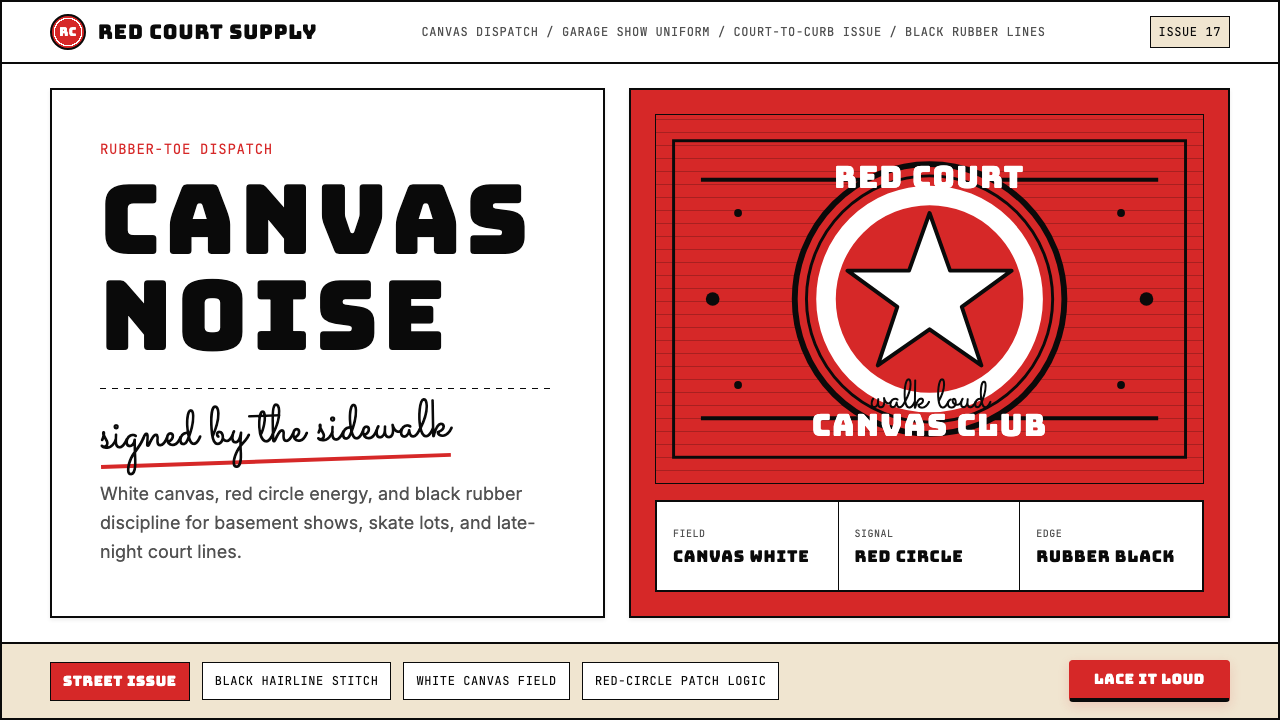 Converse Chuck TaylorPopulist and loud. Saturated red circles, Bungee type, black stitch lines on…平民而响亮:饱和红圆、Bungee 粗字、白帆布上的黑色缝线。
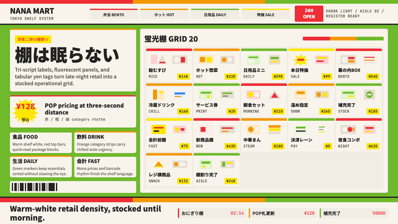 Japanese Konbini 7-ElevenAlways stocked, always bright. Green canopy, warm shelves, POP yen tags, tigh…永远明亮、永远满架。绿底暖白货架、POP日元价签与便当格。
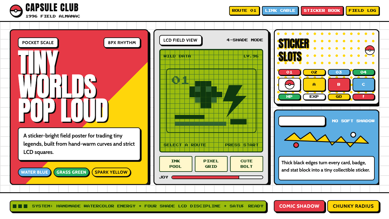 Pokémon Game BoyKawaii meets cartridge logic. Capsule red, LCD green, Anton heft, and 8px gri…卡哇伊撞上卡带逻辑:胶囊红、LCD绿、Anton粗字与8px网格同屏。
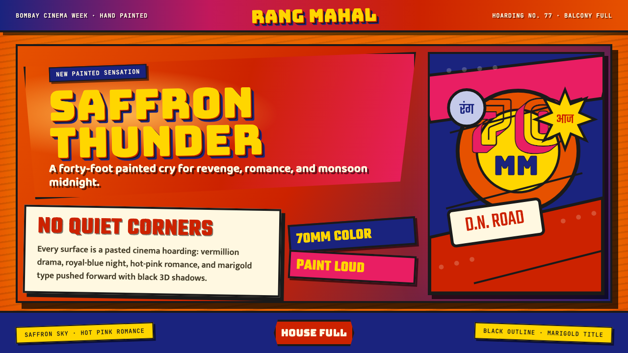 Bollywood Poster Art (1970s)Subtlety is unaffordable. Saffron fields, Bungee shadows, diagonal hoarding d…节制太便宜:藏红花底、Bungee黑影与斜向招贴制造十米戏剧。
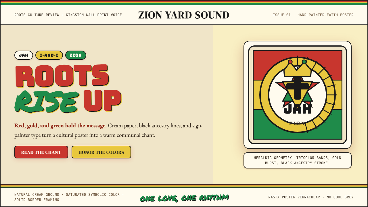 Caribbean Rastafarian (Jamaica)Warm faith, loud color. Red-gold-green bands and black poster type carry the…温暖信仰,高饱和发声:红金绿横带与黑色海报字承载吟唱。
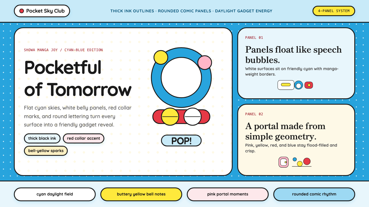 DoraemonChildhood joy, inked bold. Cyan fields, white panels, red collars, and rounde…童年快乐被粗线描出:青蓝底、白面板、红项圈与圆润漫画字。