What is Japanese Konbini 7-Eleven?什么是 Japanese Konbini 7-Eleven?
Japanese konbini never close, never dim, and never waste a centimeter — 7-Eleven Japan's tri-stripe identity and bento-grid logic turned the convenience store into a visual system as precise as a surgical instrument.日本便利店永不打烊、永不熄灯、永不浪费一厘米——7-Eleven日本的红橙绿三色条纹标识与便当格网格逻辑,将便利店变成了一套精密如手术器械的视觉系统。
Japanese Konbini 7-Eleven in briefJapanese Konbini 7-Eleven 速览
Japanese konbini aesthetic is the visual language that emerged from the operational demands of Japan's convenience store chains — principally 7-Eleven Japan, which began franchising in 1974 and grew into a nationwide infrastructure of more than 56,000 stores. The style is defined by a specific set of constraints: fluorescent ceiling light that must render every product attractively at any hour, shelving measured to the millimeter, price communication that must be legible in a fraction-of-a-second glance, and a trilingual environment where kanji, katakana, and Latin script coexist on the same label. The result is not a style chosen for aesthetic reasons but a visual system that evolved under competitive and operational pressure and crystallized into something immediately recognizable.日本便利店美学是从便利店连锁的运营需求中生长出来的视觉语言——核心是1974年开始在日本加盟展店、最终扩张至全国56,000余家门店的7-Eleven日本。这种风格由一组特定约束所定义:荧光天花板灯光必须在任何时刻都能让每件商品显得有吸引力;货架精确到毫米;价格信息必须在零点几秒的瞥视中完成传达;标签上的汉字、片假名与拉丁文必须共存于同一空间。它不是因为审美原因而被选择的风格,而是在竞争与运营压力下演化出来的视觉系统,并最终结晶为一眼可辨的形态。
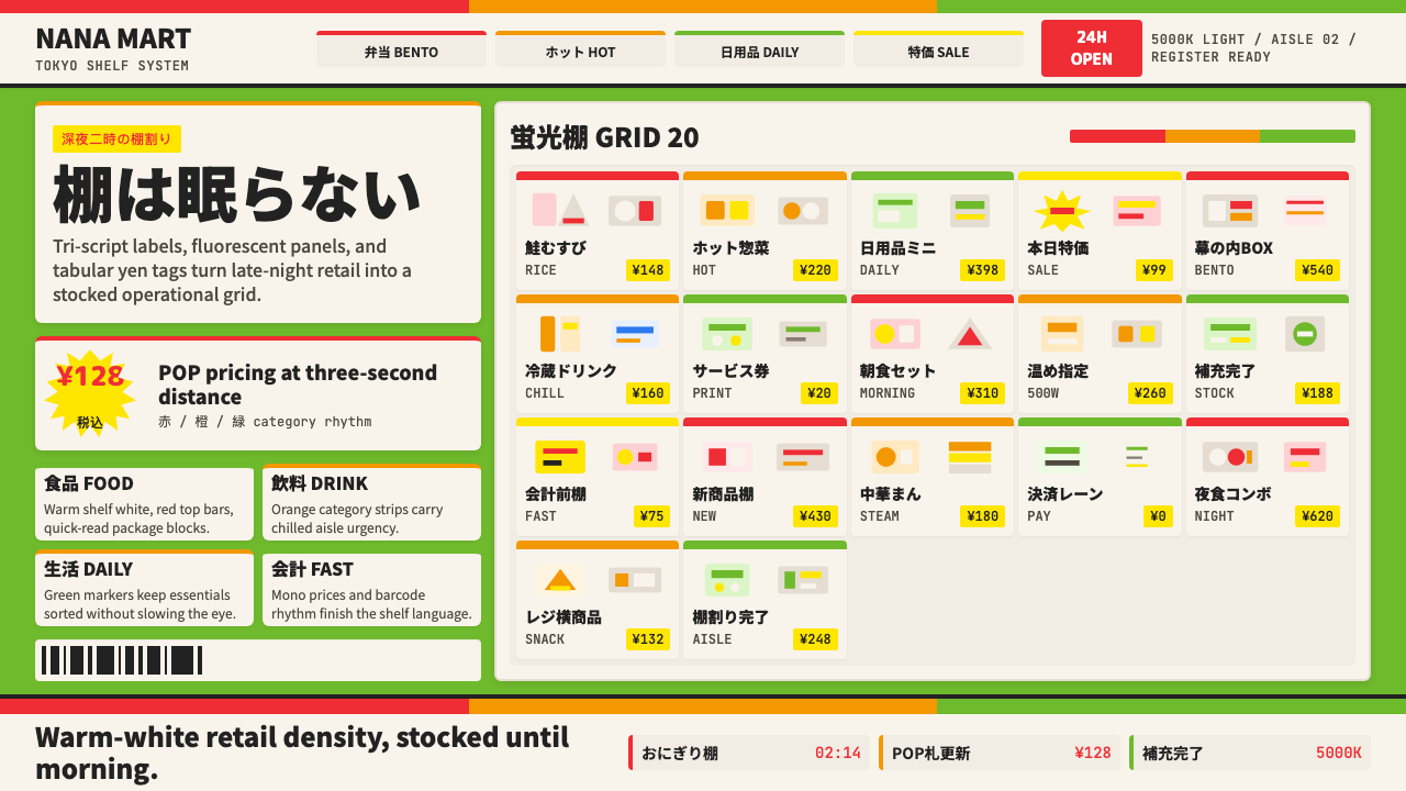
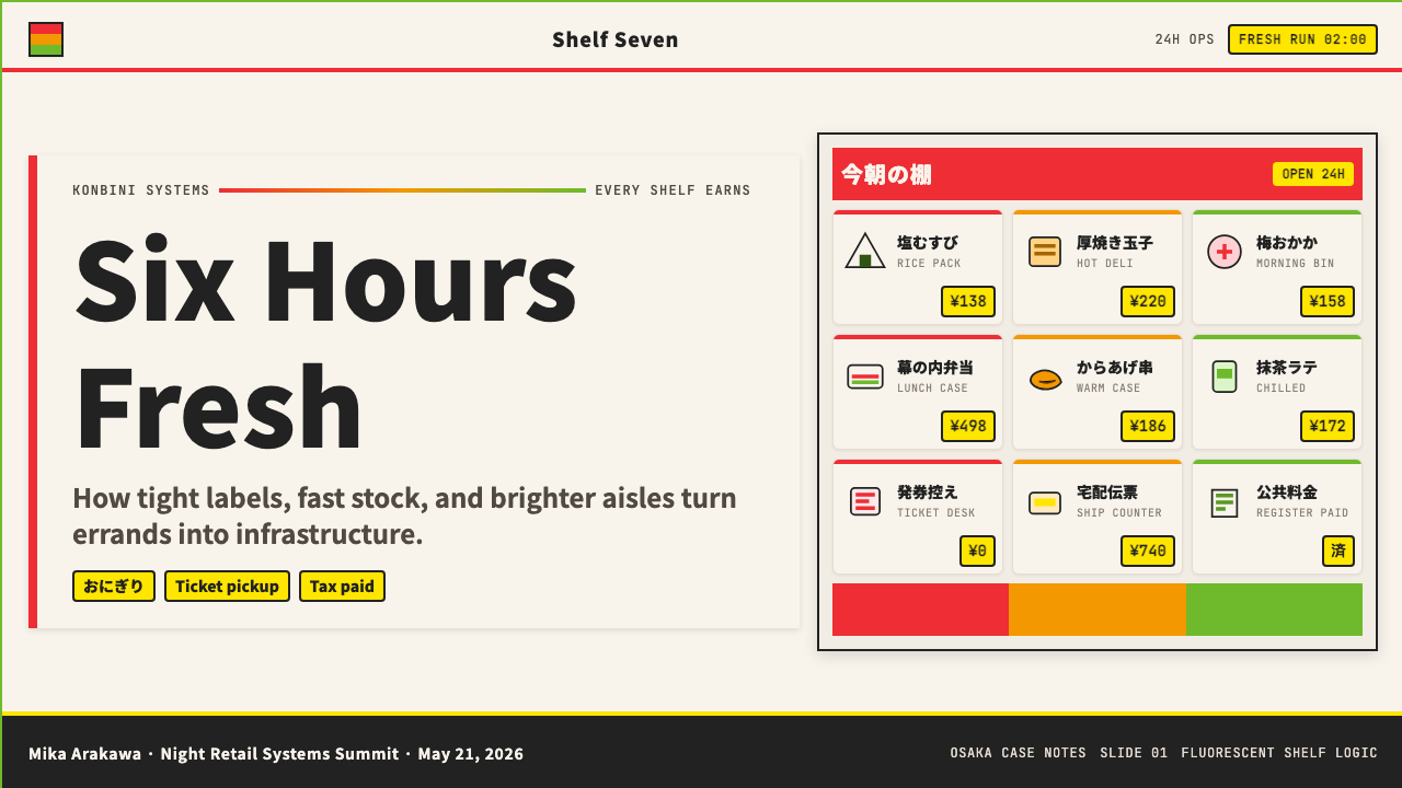
The core visual signature is the 7-Eleven tri-stripe: a bold horizontal banding of red, orange, and green that runs across signage, packaging, and digital surfaces. These three colors were not selected for symbolic reasons in the Western sense — they function as a proprietary identification system, a flag that reads correctly even in peripheral vision, even when the store is seen through rain or fog at highway speed. Inside, the warm-white shelf surface creates a consistent neutral ground that makes every product photograph sharply under the overhead tubes. Shelf labels and product tags follow the POP (Point of Purchase) convention: starburst shapes, bold yen numerals, kanji-heavy descriptors, and brightly blocked color fields that interrupt the neutral shelf ground deliberately.核心视觉标志是7-Eleven的三色条纹:红、橙、绿三色粗壮横带贯穿招牌、包装与数字界面。这三种颜色并非出于西方意义上的象征目的——它们作为专属识别系统运作,一面即便在余光中、即便透过雨雾在高速公路速度下也能被正确读取的旗帜。店内,暖白色货架表面提供一致的中性底面,让每件商品在顶部灯管下清晰呈像。货架标签与商品价签遵循POP(销售点)惯例:爆炸星形、粗壮日元数字、汉字密集的商品描述,以及刻意打断中性货架底面的鲜艳色块。
Where Bauhaus stripped ornament in search of structural purity, konbini design accumulates information in search of transactional efficiency. The two aesthetics appear opposite, but they share a ruthless elimination of anything that does not serve a function. In konbini, that function is selling: every visual element exists to guide the eye toward a product, a price, or a promotion. The resulting density — which can seem overwhelming to the uninitiated — is calibrated precisely for a customer who has entered the store knowing they have three minutes and ten possible decisions to make.包豪斯剥除装饰以追求结构纯粹,便利店设计则积累信息以追求交易效率。两种美学表面对立,却共享一种对任何非功能性元素的无情清除。在便利店中,功能就是销售:每个视觉元素的存在都是为了引导目光走向某件商品、某个价格或某项促销。由此产生的密度——对初次接触者而言可能令人不安——是为一类特定顾客精确校准的:他们入店时已知自己只有三分钟、十个可能的决定要做。
See the Japanese Konbini 7-Eleven design system查看 Japanese Konbini 7-Eleven 完整设计系统
Where does Japanese Konbini 7-Eleven come from?Japanese Konbini 7-Eleven 从何而来?
The story of Japanese 7-Eleven begins in 1973, when Ito-Yokado, a Japanese supermarket operator, licensed the 7-Eleven brand from the Southland Corporation in Dallas, Texas. The first Japanese 7-Eleven opened in Koto-ku, Tokyo, in May 1974. What followed over the next two decades was not merely a transplant of the American model but a fundamental reinvention. Toshifumi Suzuki, who would become the dominant executive force behind the chain's expansion, recognized early that Japanese consumers expected a different relationship with a store than American consumers did. Proximity mattered more than size. Product freshness mattered more than variety. The supply chain was redesigned from scratch: multiple daily deliveries replaced the American weekly model, and the concept of tightly controlled freshness windows for rice balls, sandwiches, and hot foods became a defining feature of the system.日本7-Eleven的故事始于1973年,日本超市运营商伊藤洋华堂从美国德克萨斯州达拉斯的南地公司取得7-Eleven品牌授权。第一家日本7-Eleven于1974年5月在东京江东区开业。此后二十年间发生的,不仅仅是美国模式的移植,而是一次根本性的重新发明。最终成为连锁扩张主导力量的铃木敏文早早意识到:日本消费者对一家商店有着不同于美国消费者的期待关系。距离比面积更重要,商品新鲜度比品类丰富度更重要。供应链从零重建:每日多次配送取代了美国的每周配送模式,对饭团、三明治和热食的严格新鲜度窗口管理,成为这套系统的定义性特征。
The visual identity of Japanese 7-Eleven evolved in parallel with its operational model. The American tri-stripe logo — red, green, and orange horizontal bands — was retained, but its application in Japan became denser and more systematic. Through the 1980s and 1990s, as the chain expanded from hundreds to thousands of stores, the visual language of shelf labeling, product photography, and POP signage was codified into internal standards. Akira Kosugi and design teams working within 7-Eleven Japan and its product development subsidiaries shaped the look of private-label packaging — the Seven Premium and Seven Gold lines — which required a visual language that communicated quality above the house brand norm while still reading as konbini merchandise rather than department store goods.日本7-Eleven的视觉识别与其运营模式并行演化。美国的红橙绿三色条纹标志被保留,但在日本的应用变得更加致密和系统化。经历1980至1990年代从数百家到数千家门店的扩张,货架标签、商品摄影与POP招牌的视觉语言被编纂成内部标准。小杉章与在7-Eleven日本及其商品开发子公司工作的设计团队,塑造了自有品牌包装的面貌——Seven Premium与Seven Gold产品线——这要求一套既能传达超越普通自有品牌质感、又仍被识别为便利店商品而非百货商场商品的视觉语言。
The POP tag — the starburst or oval burst shape containing a bold yen price — has roots in Japanese advertising traditions that predate convenience stores. Japanese street markets and department store food halls had used handwritten price explosion tags since at least the postwar period, and the konbini simply mechanized and systematized this tradition. By the 1990s the digitally typeset POP burst had become a visual shorthand for affordability and freshness that Japanese consumers processed automatically. Tadahiro Wakabayashi and others working in retail display and promotional material production helped formalize these conventions across the industry.POP价签——那种包含粗体日元价格的爆炸星形或椭圆爆破形——有着早于便利店的日本广告传统根基。日本街市与百货商场食品区至少从战后时期起就使用手写价格爆破标签,便利店只是将这一传统机械化和系统化了。到1990年代,数字排版的POP爆破形已成为日本消费者自动处理的「实惠与新鲜」视觉速记符。脇坂忠弘等从事零售陈列与促销物料制作的人士,帮助将这些惯例在行业内规范化。
By the 2000s, 7-Eleven Japan had become the largest convenience store chain in the world by store count, and its visual system had achieved the status of a cultural infrastructure. The green canopy, the tri-stripe facade, the warm interior light visible from the street at midnight — these had become orientation points in Japanese urban life in the way that postal boxes or traffic signals function. When 7-Eleven Japan's parent company, Ito-Yokado, acquired the Southland Corporation in 1991, the direction of influence formally reversed: the Japanese subsidiary was now setting design and operational standards that the American original was being asked to study.到2000年代,7-Eleven日本已按门店数量成为全球最大的便利店连锁,其视觉系统取得了文化基础设施的地位。绿色雨篷、三色条纹外立面、午夜时分从街道可见的温暖室内灯光——这些已在日本城市生活中成为方位标志,其功能如同邮筒或交通信号灯。当7-Eleven日本的母公司伊藤洋华堂于1991年收购南地公司后,影响力方向正式逆转:日本子公司如今在制定设计与运营标准,而美国原版被要求前来学习。
What defines the Japanese Konbini 7-Eleven look?Japanese Konbini 7-Eleven 的视觉特征是什么?
Tri-Stripe Color Identity三色条纹色彩标识
The foundational color move is a horizontal banding of red, orange, and green — three colors that read as warm and energetic together, creating an immediate proprietary signal. These are not symbolic colors in the way Bauhaus primary colors carry psychological theory; they are identification colors, functioning more like a flag than a palette. The three stripes appear at different scales across every touchpoint: enormous on exterior facades, condensed on packaging labels, reduced to a thin rule on receipt headers. The consistency of this banding across scales is what makes the system feel systematic rather than decorative.最基础的色彩动作是红、橙、绿三色横向条带——三种并置后呈现温暖与活力感的颜色,制造即时的专属信号。这些不是包豪斯三原色那种承载心理学理论的象征色;它们是识别色,功能更接近旗帜而非色板。三条纹以不同尺度出现在每个接触点:外立面上巨大,包装标签上压缩,收银小票页眉上缩减为细线。这种跨尺度的一致性,使这套系统感觉是系统性的而非装饰性的。
Warm-White Neutral Ground暖白中性底面
The shelf surface, the interior wall treatment, and the dominant ground for product photography all tend toward a warm, slightly yellowish white rather than a cool or blue-shifted white. This is an operational decision with aesthetic consequences: warm white light and warm white surfaces cause food products — especially onigiri wrappers, bento containers, and pastry packaging — to read as appetizing rather than clinical. The warmth also softens the high-density visual environment, preventing the store from feeling like a warehouse despite its information density.货架表面、店内墙面处理,以及商品摄影的主导底面,均倾向于一种带有轻微黄调的暖白,而非冷色或偏蓝的白。这是一个具有美学后果的运营决定:暖白光线与暖白表面使食品——尤其是饭团包装、便当容器和烘焙品包装——呈现出令人食欲大开而非实验室感的视觉效果。暖调也柔化了高密度视觉环境,防止店内在信息密度如此之高的情况下感觉像仓库。
POP Burst Price TagsPOP爆破价格标签
The starburst or irregular-outline burst shape containing a yen price is one of the most recognizable micro-elements of the konbini visual system. It functions as a deliberate interruption: placed against the neutral shelf surface, the burst catches peripheral vision and telegraphs a single piece of information — this item has a price worth noting. The typography inside the burst is always high-contrast and dominated by the numeral; kanji or katakana modifiers appear in a secondary scale. The burst shape itself has no fixed geometry — it may have five points or twelve — but it is always irregular and always reads as energetic rather than refined.包含日元价格的爆炸星形或不规则轮廓爆破形,是便利店视觉系统中最具辨识度的微观元素之一。它作为一种刻意的打断而存在:置于中性货架底面上,爆破形捕捉余光并以最简洁方式传递单一信息——这件商品有个值得注意的价格。爆破形内部的排版始终是高对比度的,以数字为主导;汉字或片假名修饰语以次级尺度出现。爆破形本身没有固定几何形态——可能有五个尖角,也可能有十二个——但它始终是不规则的,始终给人以活跃感而非精炼感。
Bento-Grid Product Layout便当格商品布局
The bento box — a compartmentalized container in which each food occupies a precisely bounded cell — is the structural metaphor for how konbini visual systems organize product information. Category zones on shelves are hard-bounded; product photography in promotional materials arranges items in tight grids with minimal gaps; packaging designs divide their surface into functional zones for nutritional information, product name, ingredient callouts, and barcode. This grid logic is not the airy, breathing grid of editorial design; it is a compression grid, designed to maximize the number of distinct pieces of information that can be conveyed within a fixed area.便当盒——每种食物各占一个精确边界格子的隔层容器——是便利店视觉系统组织商品信息方式的结构隐喻。货架上的品类区域有硬性边界;促销材料中的商品摄影以紧密网格、极小间距排列商品;包装设计将表面划分为营养信息、商品名称、配料说明和条形码各自所属的功能区域。这种网格逻辑不是编辑设计那种通透、有呼吸感的网格;它是压缩网格,被设计用来在固定面积内最大化可传达的不同信息片段数量。
Trilingual Typography Hierarchy三语排版层级
Japanese konbini operate in a genuinely trilingual typographic environment: kanji provides semantic density and cultural grounding; katakana handles foreign loan words, product names, and phonetic rendering; Latin script covers brand names, ingredient terminology, and increasingly product identity. On a single label these three scripts may appear within millimeters of one another, and the visual system must make them coexist legibly. The hierarchy is typically kanji-dominant for product category names and main descriptors, katakana for modifiers and flavor notes, and Latin for brand or tier identity. Size, weight, and color differentiate the three registers rather than physical separation.日本便利店在真正意义上的三语排版环境中运作:汉字提供语义密度与文化锚点;片假名处理外来词、商品名称与音译;拉丁文覆盖品牌名称、配料术语,以及日益增多的商品身份信息。一张标签上这三种文字可能在数毫米之内相互比邻,视觉系统必须让它们共存并各自清晰可读。层级通常是:汉字主导商品品类名称与主要描述语,片假名用于修饰语和口味注释,拉丁文用于品牌或等级识别。尺寸、字重和颜色区分三种字体语系,而非物理分隔。
Hyper-Operational Signage Logic超运营性标牌逻辑
Every sign in a konbini is designed for a customer in motion: ceiling hangers visible from the store entrance, shelf edge strips readable while walking the aisle, register-area prompts visible during checkout, window graphics readable from the sidewalk. The hierarchy of communication is always transactional first — where is the thing, what does it cost, what promotion is active — and atmospheric second. Seasonal and promotional campaigns update the surface decoration while the structural signage system underneath remains constant. This layered approach means the store can feel fresh without the navigational system being disrupted.便利店里的每一块标牌都是为移动中的顾客而设计的:天花板吊牌从入口处可见,货架边条标签在走道行进时可读,收银区提示在结账时可见,橱窗图形从人行道上可读。信息传达的层级始终是交易优先——东西在哪里、多少钱、有什么促销——氛围感居次。季节性和促销性内容更新表面装饰,而底层的结构性标牌系统保持不变。这种分层方式意味着门店可以保持新鲜感,而不打乱导航系统。
Product Photography as Information商品摄影即信息
Konbini product photography — on packaging, on shelf talkers, on promotional posters — treats the photograph as a dense information carrier rather than an aspiration image. The product is typically shot from directly above or from a slight three-quarter angle that reveals maximum surface. Ingredients are often shown separately arranged around the hero product. The background is white or the warm-white that matches shelf surface. There is no lifestyle context, no hand reaching for the product, no environmental staging. The goal is to communicate what is inside the package as efficiently as possible, because the customer making a decision about an onigiri or a bento has seconds, not minutes.便利店商品摄影——无论是包装上的、货架卡片上的,还是促销海报上的——将照片视为高密度信息载体而非愿景图像。商品通常从正上方或略带角度的四分之三视角拍摄,以呈现最大可见表面。配料常常被单独陈列于主角商品四周。背景为白色或与货架表面匹配的暖白色。没有生活方式语境,没有伸手取物的手,没有环境场景布置。目标是尽可能高效地传达包装内有什么——因为对饭团或便当做决策的顾客只有秒级时间,而非分钟级。
See the Japanese Konbini 7-Eleven design system查看 Japanese Konbini 7-Eleven 完整设计系统
Who shaped Japanese Konbini 7-Eleven?谁塑造了 Japanese Konbini 7-Eleven?
Suzuki joined Ito-Yokado in the early 1960s and became the principal architect of 7-Eleven Japan's expansion and operational philosophy. He championed the policy of multiple daily deliveries — replacing the weekly American model — and the tight freshness windows that made onigiri and bento a core rather than a peripheral category. His insistence on treating each store as a data collection point, adjusting product mix daily based on sales data, shaped the visual environment as much as any designer: a system that tracks what sells and restocks continuously produces a particular kind of density and product confidence in its displays.铃木敏文于1960年代初加入伊藤洋华堂,成为7-Eleven日本扩张与运营哲学的主要设计者。他力主以每日多次配送取代美式每周配送模式,以及使饭团和便当从边缘品类跃升为核心品类的严格新鲜度窗口管理。他坚持将每家门店视为数据采集点、根据销售数据每日调整商品结构——这对视觉环境的塑造不亚于任何设计师:一套持续追踪销售并补货的系统,产生了陈列上特有的密度感与商品自信感。
Kosugi worked within the product development and private-label design sphere of 7-Eleven Japan's supply chain organization. The Seven Premium and Seven Gold product lines required a visual identity that could sit on the same shelf as national brands without being mistaken for them, while signaling a quality premium over standard house goods. The design language developed for these lines — restrained color, clean photography, structured typography — became a secondary visual register within the konbini environment that complemented the promotional intensity of POP signage with relative quietness.小杉章在7-Eleven日本供应链体系的商品开发与自有品牌设计领域工作。Seven Premium与Seven Gold产品线需要一套视觉识别,能与全国性品牌并排陈列而不被混淆,同时传达出超越普通自有商品的品质感。为这些产品线开发的设计语言——克制的色彩、干净的摄影、有结构的排版——在便利店环境中形成了一套次级视觉语系,以相对安静的姿态补充POP招牌的促销强度。
Wakabayashi's work touched the retail display and in-store promotional material conventions that shaped how konbini signage systems were structured and updated seasonally. The system of seasonal campaign overlays — in which a consistent structural scaffold receives a new surface treatment for cherry blossom season, summer fireworks, autumn harvest, and winter holiday — requires a production logic as rigorous as the visual logic itself. His contributions helped establish the rhythm of visual renewal that allows the konbini environment to feel perpetually current without rebuilding its fundamental navigation.脇坂忠弘的工作涉及零售陈列与店内促销物料惯例,这些惯例塑造了便利店标牌系统的结构方式及其季节性更新模式。季节性主题叠加系统——以一套一致的结构脚手架为春季樱花、夏日烟火、秋收和冬日节庆分别换上新的表面处理——需要与视觉逻辑同样严格的生产逻辑。他的贡献帮助建立了视觉更新的节奏,使便利店环境能够保持永远当下的新鲜感,而不必重建其基础导航体系。
No single designer can be credited with the konbini visual system at the level of, say, Paul Rand credited with IBM or Massimo Vignelli with the New York subway. The system emerged from the internal standards teams, package design vendors, and display material producers who worked within 7-Eleven Japan's supply chain from the 1980s onward. Their collective contribution was the codification of conventions — the exact proportion of a shelf edge label, the type hierarchy on a POP burst, the photography brief for a new bento line — that made the visual system reproducible across tens of thousands of locations without losing coherence.便利店视觉系统无法像保罗·兰德之于IBM或马西莫·维格内利之于纽约地铁那样归功于某一位设计师。这套系统是从1980年代起在7-Eleven日本供应链体系内工作的内部标准团队、包装设计供应商和陈列物料生产商共同涌现出来的。他们的集体贡献,是对惯例的编纂——货架边条标签的精确比例、POP爆破形的排版层级、新款便当产品线的摄影简报——使这套视觉系统能够在数万家门店中被复制,而不失去一致性。
The original American 7-Eleven, founded in Dallas in 1927 as an ice dock and converted to a convenience store format in the postwar period, provided the tri-stripe logo and the brand name that Japanese licensees received in 1973. The irony of the relationship is complete: by 1991, when Ito-Yokado acquired the struggling American parent, the visual and operational standards had been so thoroughly developed in Japan that the Japanese subsidiary had become the de facto global standard-setter. The American origin is now largely a historical footnote in the story of a visual system that evolved in Tokyo.美国原版7-Eleven于1927年在达拉斯以冰块销售站起家,在战后时期转型为便利店业态,提供了1973年日本被授权方所获得的三色条纹标志与品牌名称。这段关系的讽刺意味是完整的:到1991年伊藤洋华堂收购陷入困境的美国母公司时,视觉与运营标准已在日本得到如此彻底的发展,以至于日本子公司已成为事实上的全球标准制定者。美国起源如今在这套演化于东京的视觉系统的故事中,更多只是历史脚注。
How do you use Japanese Konbini 7-Eleven today?今天怎么用 Japanese Konbini 7-Eleven?
Japanese konbini aesthetic is one of the most useful styles for designers who need to communicate density, freshness, and commercial confidence simultaneously. It is not a minimalist style — it is a maximum-information style disciplined by operational necessity. Applying it correctly means understanding that every element earns its place by serving a navigational, transactional, or freshness-signaling function. When all elements are doing their job, the result reads as energetic rather than cluttered.日本便利店美学是需要同时传达密度、新鲜感和商业自信的设计师最实用的风格之一。它不是极简主义风格——它是以运营必要性为约束的最大信息量风格。正确应用它,意味着理解每个元素都通过服务于导航、交易或新鲜度信号功能来赢得其存在的权利。当所有元素各司其职时,结果呈现出活力感而非杂乱感。
For presentation slides, the konbini system offers a distinctive alternative to both the austere minimalism and the bloated corporate template that dominate most decks. Cover slides work well with a bold tri-color stripe occupying a third or more of the slide height, with the title in strong, somewhat compact type against the remaining white or warm-white ground. Content slides should lean into the bento-grid metaphor: use visible dividers or tight cell structures to organize information zones, label each zone clearly with a category name in a high-contrast style, and use color fills sparingly to signal importance rather than decoration. Data slides can take on the POP burst as a functional element — a key metric or callout number surrounded by an irregular burst outline reads as a price tag for an insight, giving data a commercial urgency that standard charts rarely achieve.在演示文稿中,便利店视觉系统为设计师提供了一种有别于主导大多数幻灯片的简朴极简主义和臃肿企业模板的独特选择。封面页适合以占据幻灯片三分之一乃至更多高度的粗壮三色条纹为主体,标题以强劲、略带压缩感的字体置于剩余的白色或暖白底面上。内容页应当深入运用便当格的隐喻:用可见分隔线或紧密格子结构组织信息区域,以高对比度风格的品类名称清晰标注每个区域,谨慎使用色块填充以标示重要性而非装饰。数据页可以将POP爆破形作为功能性元素——用不规则爆破轮廓包围一个关键指标或引用数字,读起来像某个洞察的价格标签,赋予数据一种普通图表很少能达到的商业紧迫感。
For web interfaces, the style is especially effective for e-commerce product listing pages, food delivery menus, and any dashboard where real-time status or pricing needs to be scanned quickly. The approach: commit to a warm-white or very light cream background rather than a cool white, use a tight grid with minimal gutters for product cards, and adopt the shelf-label convention for category headers — bold, high-contrast, optionally with a colored background strip that runs the full width of the category row. Avoid gradients and soft shadows; the konbini world uses hard-bordered containers and flat color fills. Pricing should be typographically dominant — the number larger than any accompanying text — with promotional labels borrowing the starburst or burst-outline shape.对于网页界面,这种风格对电商商品列表页、外卖菜单,以及任何需要快速扫描实时状态或定价信息的仪表板尤为有效。方法如下:选择暖白或非常浅的奶油底,而非冷色调白色;商品卡使用极小间距的紧密网格;品类标题采用货架标签惯例——粗壮、高对比度,可选全宽色带背景条。避免渐变和柔和阴影;便利店世界使用硬边框容器和平铺色块填充。价格排版应当占主导地位——数字大于任何配套文字——促销标签借用爆炸星形或爆破轮廓形状。
For editorial and marketing work, the aesthetic offers an immediately recognizable and culturally specific visual language that communicates authenticity for food-related, Japan-adjacent, or urban-life-adjacent content. A marketing page designed in this register might use a warm-white ground, a tri-stripe header element, bento-grid product photography, and POP-style callout bubbles for key value propositions. Editorial layouts can use the shelf-label logic to organize section headers, treating each section like a category zone in a store. The style works well for packaging design and point-of-purchase material in the food and beverage space, where the association with the freshness and reliability of the Japanese konbini supply chain is a genuine brand asset.对于编辑与营销内容,这种美学提供了一种直接可辨且具有文化特定性的视觉语言,能为与食品相关、与日本相邻或与都市生活相邻的内容传达真实感。以这种语系设计的营销页面,可能使用暖白底、三色条纹页眉元素、便当格式商品摄影,以及POP风格的关键价值主张提示气泡。编辑版面可以用货架标签逻辑组织分节标题,将每个章节视为店内的一个品类区域。这种风格在食品与饮料领域的包装设计和销售点物料上表现出色,在那里,与日本便利店供应链的新鲜度和可靠性的联想是真实的品牌资产。
A common mistake when applying konbini aesthetic is treating density as permission for disorder. The konbini system achieves its density while remaining navigable because every element is bound to a grid, every color follows a consistent assignment logic, and every typographic hierarchy is maintained without exception. Designers who borrow the surface markers — the starburst shapes, the yen-style numeral emphasis, the warm white ground — without building the underlying grid discipline produce layouts that read as busy rather than efficient. The second common error is choosing the wrong chromatic register: the tri-stripe colors are warm, and the supporting palette should follow — introducing cool blues or desaturated neutrals into a konbini-style layout creates a tonal conflict that undermines the system's commercial warmth.应用便利店美学时最常见的错误,是将密度理解为无序的许可。便利店系统在保持密度的同时维持可导航性,是因为每个元素都被约束在网格中,每种颜色都遵循一致的赋值逻辑,每个排版层级都被毫无例外地维护。设计师借用表面标记——爆炸星形、日元式数字强调、暖白底面——却不建立底层网格纪律,会产生读起来繁忙而非高效的版面。第二个常见错误是选择错误的色调语系:三色条纹是暖调的,辅助色板也应当如此——在便利店风格版面中引入冷蓝色或去饱和中性色,会产生破坏这套系统商业温度感的色调冲突。
See the Japanese Konbini 7-Eleven design system查看 Japanese Konbini 7-Eleven 完整设计系统
Japanese Konbini 7-Eleven — FAQJapanese Konbini 7-Eleven · 常见问题
Is konbini design the same as general Japanese graphic design?便利店设计和日本平面设计是同一回事吗?
No. Japanese graphic design is an enormously broad field that includes everything from the restrained elegance of traditional publishing and high-end fashion houses to the maximalist energy of manga and pachislot advertising. Konbini design is a specific subset defined by its retail and operational context. It shares certain features with the broader category — the trilingual typographic environment, a high tolerance for information density — but its particular visual signature (the tri-stripe, the POP burst, the bento grid) is specific to the convenience store format and the competitive environment between major chains including 7-Eleven, Lawson, and FamilyMart.不是。日本平面设计是一个极其宽广的领域,涵盖从传统出版物与高端时尚品牌的克制优雅,到漫画与柏青哥广告的最大化能量。便利店设计是由零售与运营语境所定义的特定子集。它与更广泛类别共享某些特征——三语排版环境、对高信息密度的高容忍度——但其特定视觉标志(三色条纹、POP爆破形、便当格)是便利店业态及7-Eleven、罗森、全家之间竞争环境所特有的。
Can this style work for luxury or premium brands?这种风格适合奢侈品或高端品牌吗?
With significant modification. The raw konbini style — POP bursts, dense grids, tri-stripe color — reads as mass-market and affordable, which is precisely its cultural power in its native context. For a premium brand to borrow from this aesthetic, it would need to extract the structural logic (the bento grid, the product-photography directness, the shelf-label typographic confidence) while discarding the markers of mass-market price communication (the starburst tags, the high-chroma promotional colors). The Seven Premium and Seven Gold lines within 7-Eleven Japan itself demonstrate this possible middle register: konbini structure with quieter execution. The result signals quality within the konbini context without signaling premium in the luxury sense.需要重大修改。原始便利店风格——POP爆破形、密集网格、三色条纹——传达的是大众市场与经济实惠感,这正是它在原生语境中的文化力量所在。对于高端品牌借用这种美学,需要提取其结构逻辑(便当格、商品摄影的直接性、货架标签式的排版自信),同时舍弃大众市场价格传达的标志物(爆炸星形标签、高饱和度促销色)。7-Eleven日本自身的Seven Premium与Seven Gold产品线展示了这种可能的中间语系:便利店结构配以更安静的执行。结果在便利店语境中传达品质感,但不是奢侈品意义上的高端感。
How does konbini aesthetic handle dark mode or dark backgrounds?便利店美学如何处理深色模式或深色背景?
The historic konbini environment is resolutely light: white or warm-white grounds dominate both the physical store and the packaging. A dark inversion is not part of the native visual language. However, the 7-Eleven tri-stripe — with its red, orange, and green on black — was used in early American signage and has been seen in some nighttime promotional contexts in Japan, where the colors read as neon-adjacent. A dark interpretation of konbini style would work best by treating the black as a night-store backdrop and the tri-stripe as a lit canopy element, while preserving the POP burst and bento-grid logic. The risk is that on a dark ground the system loses the freshness and warmth associations that make the style commercially effective — it slides toward the adjacent aesthetic of night-market signage rather than the 24-hour operational confidence of the store itself.便利店的历史环境是坚定的浅色系:白色或暖白底面主导实体门店和包装两个领域。深色反转不属于原生视觉语言。然而,7-Eleven的红橙绿三色条纹配黑底,确实在早期美国招牌中被使用过,并在日本一些夜间促销场景中出现,彼时这些颜色呈现出接近霓虹灯的质感。便利店风格的深色诠释最有效的做法是将黑色视为夜间门店背景,将三色条纹作为被点亮的雨篷元素,同时保留POP爆破形与便当格逻辑。风险在于:在深色底面上,这套系统会失去使这种风格在商业上有效的新鲜感与温度感联想——它会向夜市招牌的相邻美学滑动,而非呈现出门店本身24小时运营的自信感。
What makes konbini design different from other retail design systems?便利店设计与其他零售设计系统有什么不同?
Most retail design systems are built around aspiration: the supermarket evokes abundance and freshness through wide aisles and natural-light palettes; the department store communicates luxury through generous white space and restrained signage; the pharmacy communicates clinical trust through cool whites and systematic organization. Konbini design is built around transaction speed. Every decision — shelf height, label typeface scale, POP burst frequency, trilingual hierarchy — is optimized for a customer who is completing a decision in seconds, not minutes. The result is a design system that would be inappropriate for contexts where deliberation is desired, but that is extraordinarily effective when the product and the context call for immediate legibility and commercial confidence.大多数零售设计系统围绕愿景建构:超市通过宽阔通道和自然光色板唤起丰盛与新鲜感;百货商场通过慷慨留白和克制标牌传达奢华;药店通过冷调白色和系统性组织传达临床可信度。便利店设计则围绕交易速度建构。每个决定——货架高度、标签字体尺寸、POP爆破形频率、三语层级——都针对以秒而非分钟完成决策的顾客进行优化。结果是一套在希望顾客细细考量的场景中会显得不适宜,但在商品与语境呼唤即时可读性和商业自信感时极为有效的设计系统。
Is it appropriate to use the actual 7-Eleven tri-stripe in design work?在设计作品中直接使用7-Eleven三色条纹合适吗?
The tri-stripe in its exact form — and certainly combined with the 7-Eleven wordmark — is proprietary intellectual property and should not be used in commercial work without licensing. The broader visual principles it represents — a bold horizontal banding of warm, energetic colors used as a primary identification system — are a legitimate design approach that can be applied with different colors, different proportions, and different contexts without infringing on the specific mark. The goal in design work is to capture the structural logic and cultural resonance of the konbini system, not to reproduce its specific brand assets. Designers should treat the tri-stripe as an inspiration and reference point, not a template.确切形式的三色条纹——尤其是与7-Eleven文字标志组合使用——是专有知识产权,未经授权不应在商业作品中使用。它所代表的更广泛视觉原则——以粗壮横向带状的暖色、活力色作为主要识别系统——是一种合法的设计方法,可以用不同颜色、不同比例、不同语境加以运用,而不侵犯特定商标。设计工作的目标是捕捉便利店系统的结构逻辑与文化共鸣,而非复制其具体品牌资产。设计师应将三色条纹视为灵感与参照点,而非模板。
Related design styles相关设计风格
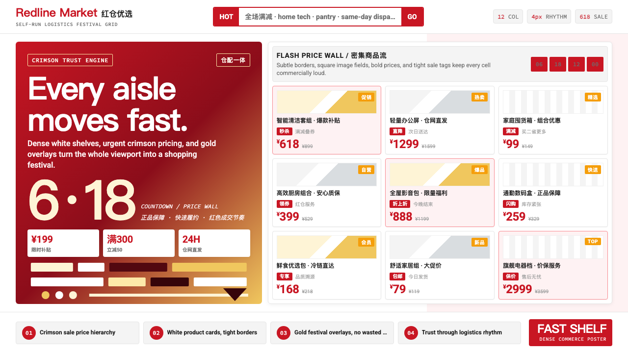 JD.com (京东)Urgency earns trust. Deep red prices pack a white 12-column grid with gold fe…急迫也可信:深红价格挤满白色12栏网格,金色大促点燃节奏。
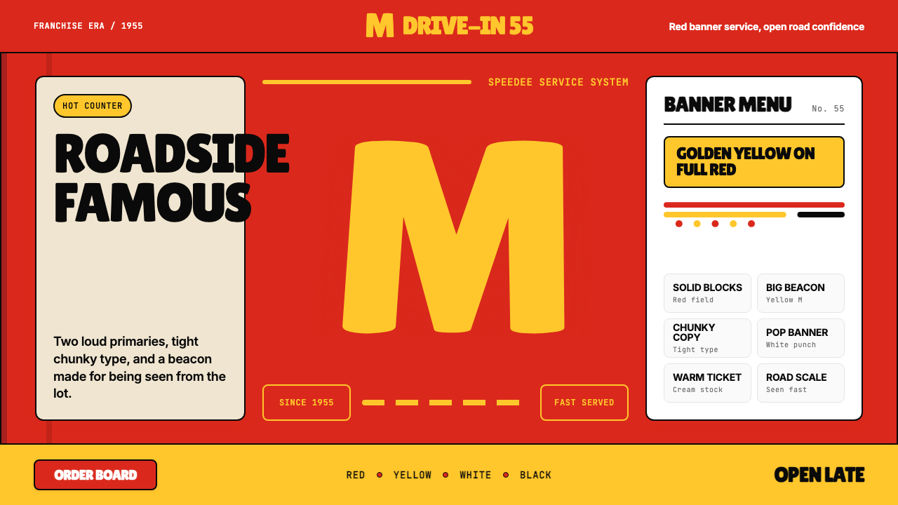 McDonald's Golden ArchesRoadside famous. Saturated red, hot yellow, and chunky type shout from 1955.路边即识别:饱和红、热黄与厚重字体喊出1955。
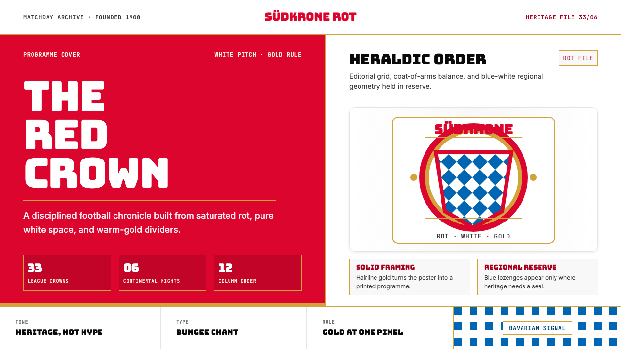 Bayern Munich (Rot)Heritage, not hype. Saturated rot fields, gold rules, and blue lozenges enfor…传统胜过喧哗:饱和红、金细线与蓝白菱格建立秩序。
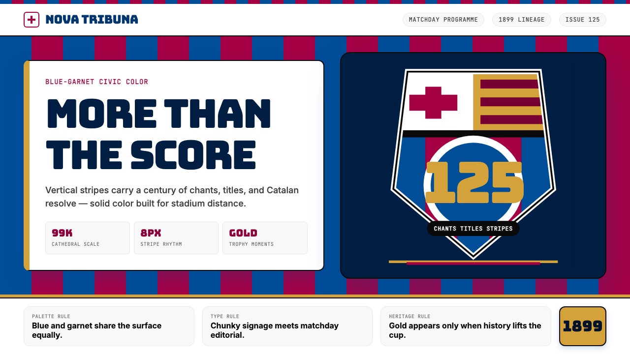 FC Barcelona (Blaugrana)Stadium heritage, not nostalgia. Blue-garnet stripes, Bungee type, gold heral…不是怀旧,是球场传承。蓝石榴红竖纹、Bungee 字体与金色纹章发声。
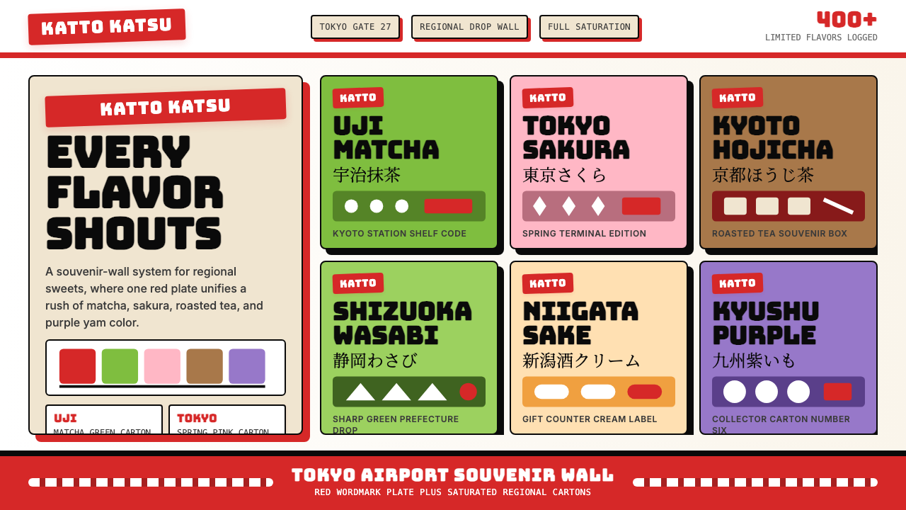 Kit Kat Japan CollectorSouvenir wall joy. Red plates and saturated flavor tiles turn regional sweets…伴手礼墙的快乐。红牌与饱和风味色块把地方甜点变成收藏品。
 Converse Chuck TaylorPopulist and loud. Saturated red circles, Bungee type, black stitch lines on…平民而响亮:饱和红圆、Bungee 粗字、白帆布上的黑色缝线。