What is JD.com (京东)?什么是 JD.com (京东)?
JD.com turned deep crimson and dense grids into the unmistakable grammar of Chinese e-commerce trust — where every pixel earns its place by selling.京东将深红与密集网格锻造成中国电商信任感的专属语法——每一个像素都以销售为己任。
JD.com (京东) in briefJD.com (京东) 速览
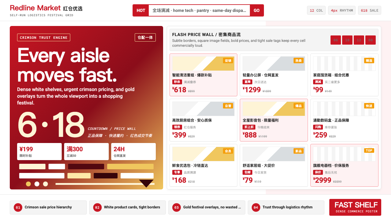
JD.com's visual identity is one of the most commercially refined design systems in the world. It is built on a specific shade of deep crimson that the brand has claimed as its own, deployed against crisp white grounds in a dense multi-column grid that maximizes the number of products a user can see at a single glance. The system communicates two things simultaneously: festive urgency and institutional dependability — the energy of a shopping festival and the confidence of a company that owns its own warehouses and delivery fleet.京东的视觉体系是全球商业化程度最高的设计系统之一。它以品牌专属的深红色为核心,铺展在洁白底面上的密集多栏网格中,最大化用户单次视野内能看到的商品数量。这套系统同时传递着两层信息:节日的紧迫感与机构级的可信赖——既有购物大促的狂欢能量,又有自营仓储物流的底气。
At its core, the style is a negotiation between information density and legibility. Chinese e-commerce users are highly trained scanners who make purchasing decisions in fractions of a second; the design system responds by making price the largest, heaviest typographic element on any product card, surrounding it with visual cues — crossed-out original prices, promotional badges, countdown timers, gold-accent sale tags — that tell the full commercial story before the user consciously reads a word.这套风格的核心是信息密度与可读性之间的精密博弈。中国电商用户是高度训练有素的视觉扫描者,在零点几秒内完成购买决策;设计系统为此将价格设计为商品卡片上最大、最醒目的排版元素,并在其周围布置一整套视觉线索——划线原价、促销标签、倒计时、金色大促角标——让用户在有意识阅读任何文字之前,就已完整接收到商业信息。
The style is also deeply seasonal. During the 618 Shopping Festival in June and Singles Day in November, the palette shifts toward an intensified red-and-gold combination drawn from the visual vocabulary of Chinese New Year celebration. These promotional overlays sit on top of the everyday system rather than replacing it, creating a layered visual language that can escalate from standard retail mode to full festival mode with a predictable set of additions.这套风格还具有鲜明的季节性。每逢六月的618年中大促与十一月的双十一,整体色调会向更强烈的红金组合倾斜,借用中国春节视觉语汇中的喜庆能量。这些大促覆层叠加在日常系统之上,而非取而代之,形成一套可预期升级的分层视觉语言——从常规零售模式平滑切换至全节日模式。
Where does JD.com (京东) come from?JD.com (京东) 从何而来?
JD.com traces its origins to 1998, when Liu Qiangdong opened a small counter in Beijing's Zhongguancun electronics district selling magneto-optical storage products. The company operated as a physical retail chain until 2003, when an outbreak of SARS forced the stores to close. Faced with no foot traffic, Liu pivoted to online sales, initially through forum posts and later through a purpose-built website launched in 2004. This forced transition proved decisive: JD.com would become one of the first major Chinese retailers to recognize that the internet was not a supplement to physical retail but a fundamentally different commerce infrastructure.京东的历史可追溯至1998年。彼时刘强东在北京中关村电子卖场开设了一个小柜台,销售磁光存储产品。公司以实体零售连锁的形式运营,直至2003年非典疫情迫使门店关闭。面对断绝的客流,刘强东转型线上销售,最初通过论坛发帖,后于2004年建立专属网站。这次被迫转型意义深远:京东将成为最早认识到互联网不是实体零售补充,而是全新商业基础设施的中国大型零售商之一。
The visual identity evolved through two distinct phases. In the early online years, JD.com's design language was broadly similar to that of other Chinese e-commerce platforms — busy, color-heavy, and organized around a red-dominant palette that most Chinese internet retailers used to signal discount and excitement. The deep crimson associated with JD.com today began to consolidate as a proprietary visual asset in the mid-2000s, as the company grew into a genuine national retailer and needed to distinguish itself from the sprawling Taobao marketplace model that Alibaba was building.视觉体系经历了两个截然不同的演变阶段。早期线上化阶段,京东的设计语言与其他中国电商平台大同小异——信息繁密、色彩浓烈、以多数中国互联网零售商惯用的红色主导色系传递折扣与兴奋感。如今与京东深度绑定的深红色,在2000年代中期随着公司成长为真正意义上的全国性零售商而逐渐固化为专属视觉资产——彼时品牌迫切需要将自身与阿里巴巴正在构建的淘宝开放平台模式区别开来。
The company's self-owned logistics network, built from approximately 2007 onward, fundamentally shaped its visual culture. While Alibaba operated as a platform connecting third-party sellers and buyers, JD.com controlled its own inventory and delivery. This operational difference expressed itself visually: where Taobao felt like a bazaar — chaotic, individually branded, seller-defined — JD.com developed a more unified, more institutional aesthetic that telegraphed reliability. The use of a consistent crimson across all touchpoints, combined with the famous JOY dog mascot introduced in later years, reinforced the message that users were dealing with a single coherent company rather than a marketplace of strangers.从2007年前后自建的物流网络,从根本上塑造了京东的视觉文化。阿里巴巴以平台模式连接第三方卖家与买家,京东则自营库存与配送。这一运营差异在视觉上形成了对应的分野:淘宝如同集市——喧闹、风格各异、由卖家自定义;京东则发展出更统一、更具机构感的美学,传递出可靠的信号。全触点使用一致的深红色,加上后来推出的萌趣JOY狗吉祥物,共同强化了一个核心信息:用户面对的是一家有凝聚力的完整公司,而非陌生人组成的集市。
The 618 Shopping Festival, established by JD.com around 2010 as a company anniversary promotion each June 18th, was both a commercial event and a design forcing function. Building an annual promotional campaign of sufficient scale to compete with Alibaba's Singles Day required developing a scalable visual system capable of accommodating thousands of product categories, dozens of participating brands, and both homepage hero banners and individual product-level pricing graphics. The red-gold promotional palette that now defines the festival mode was refined through successive 618 and Singles Day campaigns during the 2010s, converging on a system that balanced maximum visual energy with enough structural order to remain shoppable under conditions of high cognitive load.京东于2010年前后以公司周年纪念日(6月18日)为契机设立的618年中大促,既是商业事件,也是设计体系的催化剂。构建一套规模足以与阿里巴巴双十一抗衡的年度促销活动,要求开发出能够容纳数千商品品类、数十参与品牌、首页主视觉横幅与单品级价格图形的可扩展视觉系统。如今定义大促模式的红金配色,正是在2010年代历届618与双十一的迭代中精炼而成——在最大视觉能量与足够结构秩序之间找到平衡,确保在高认知负荷下依然保持良好的购物可操作性。
What defines the JD.com (京东) look?JD.com (京东) 的视觉特征是什么?
Signature Red标志性红色
The defining element of the JD.com palette is a deep, saturated crimson that carries both Chinese festive meaning and brand authority. It is not the orange-leaning red of urgency signage, nor the bluish-red of Coca-Cola — it sits in a specific range that reads as simultaneously traditional (evoking Spring Festival decorations and lucky envelopes) and contemporary (signaling digital confidence and retail scale). This color appears on every primary call-to-action — the buy button, the price tag, the promotional badge — while the surrounding canvas stays white to maximize contrast and readability.京东色板的核心是一种深邃、饱和的深红,同时承载中国节庆寓意与品牌权威。它既不是偏橙调的紧迫感警示红,也不是可口可乐的偏蓝调红——它落在一个特定区间,同时散发出传统气息(令人联想到春节装饰与红包)与当代感(传递数字自信与零售规模)。这个颜色出现在每一个主要行动号召上——购买按钮、价格标签、促销角标——而周围的画布保持白色,以最大化对比度与可读性。
Dense Grid Architecture密集网格架构
The layout system is built on a multi-column grid calibrated to display maximum product count without visual chaos. Product cards are tightly packed, with consistent spacing that is generous enough to allow breathing room between items but minimal enough to preserve density. The grid is hierarchical rather than uniform: featured products and promotional placements occupy larger grid cells while standard listings fill the tighter sub-grid. This architecture is optimized for the browsing behavior of experienced Chinese e-commerce shoppers, who scan horizontally and vertically simultaneously and expect to find a large selection above the fold.布局系统建立在多列网格之上,经过精密校准以在不造成视觉混乱的前提下展示最多商品。商品卡片紧凑排布,间距控制在既给予单品足够呼吸空间、又尽量保留整体密度的精妙节点。网格是层级化的而非均质的:精选商品与促销位占据更大的网格单元,标准商品列表填满更细密的子网格。这套架构针对有经验的中国电商购物者的浏览行为优化——他们同时进行横向与纵向扫描,期望在首屏看到充足的选品数量。
Price Typography价格排版
Price numerals are the typographic hero of the JD.com design system. They appear in the largest, heaviest weight on any product card, set in a rounded but confidently structured letterform that reads clearly at small sizes. The sale price appears in the signature red, while the original or crossed-out price appears in a lighter gray, creating an immediate visual hierarchy that communicates the discount without requiring the user to calculate. Promotional prices during major sales events may be accompanied by additional contextual labels — indicating membership pricing, coupon reduction, or tiered purchase incentives — each in its own consistent typographic style.价格数字是京东设计系统中的排版主角。它们以商品卡片上最大、最重的字重出现,字形圆润而骨架有力,在小尺寸下依然清晰可辨。促销价以标志性红色呈现,原价或划线价以较轻的灰色出现,形成即时可感知的视觉层级,让用户无需计算便能读懂折扣幅度。大促期间,价格下方可能附带额外的上下文标签——标注会员价、优惠券减免或阶梯购买激励——每种标签都有各自一致的排版风格。
Red-Gold Festival Mode红金节日模式
During major promotional events — most prominently the 618 Shopping Festival in June and Singles Day in November — the standard red-and-white system extends into a red-and-gold register. Gold is drawn from the visual vocabulary of Chinese New Year: it connotes fortune, abundance, and celebration. In festival mode, banner backgrounds shift to rich red fields, headlines and countdown timers gain gold accents, and decorative motifs borrow from traditional Chinese festive imagery — coins, ribbons, and geometric prosperity patterns. This overlay system is designed to escalate emotional intensity without abandoning the underlying grid logic.在重大促销活动期间——最典型的是六月的618年中大促与十一月的双十一——标准红白系统向红金色域扩展。金色取自中国新年的视觉词汇:寓意财富、丰盛与喜庆。节日模式下,横幅背景转为浓郁红色调,标题与倒计时获得金色强调,装饰母题借鉴中国传统节庆图像——铜钱、彩带与几何吉祥纹样。这套覆层系统的设计目标是在不抛弃底层网格逻辑的前提下,将情绪强度提升至最高。
JOY Mascot IntegrationJOY吉祥物融合
The JOY dog — a metallic-silver cartoon dog rendered in a smooth, almost toy-like three-dimensional style — provides moments of personality relief within an otherwise commerce-dense interface. The mascot appears at moments of brand delight: empty states, successful order confirmations, holiday greetings, and mascot-themed promotional campaigns. Its silver-and-white coloring is deliberately neutral against the dominant red system, ensuring it does not compete with commercial information while still anchoring an emotional register that humanizes the brand. JOY is a studied contrast to the functional density of the rest of the design system.JOY狗——一只以银色金属感呈现、造型圆润近乎玩具风格的三维卡通狗——在信息高度密集的商业界面中提供了性格点缀的喘息空间。这个吉祥物出现在品牌温度需要升温的时刻:空状态页面、订单确认成功、节日祝福与吉祥物主题促销活动。其银白配色刻意保持中性,不与主导性的红色系争抢视线,同时构建起一个令品牌更具人情味的情感维度。JOY是整套设计系统高度功能化密度中经过深思熟虑的一处对照。
Promotional Badge System促销标签体系
JD.com operates an extensive system of visual badges that attach to product cards to convey deal status, shipping speed, authenticity guarantee, and membership benefits. Each badge type has a consistent color and shape within the system: shipping speed indicators, authenticity labels for imported goods, membership-exclusive price markers, and flash-sale countdown indicators all occupy a designated position within the product card grid. The cumulative effect of multiple badges on a single card is deliberate — it creates information density that signals a rich commercial ecosystem without relying on prose description.京东运行着一套附着于商品卡片的完整视觉标签体系,用以传递促销状态、配送速度、正品保障与会员权益。每种标签类型在系统内都有固定的颜色与形状:配送速度指示、进口商品正品标、会员专属价标记与闪购倒计时标签,各自占据商品卡片网格中的指定位置。单张卡片上多个标签并存的视觉效果是刻意为之——它在不依赖文字描述的前提下,以信息密度传递出丰富商业生态的信号。
Carousel and Hero Banner Rhythm轮播与主视觉横幅节奏
Homepage and category-page hero banners are treated as high-impact editorial spaces within an otherwise grid-organized environment. They rotate on a short interval, creating kinetic rhythm that contrasts with the static product grid below. Each banner is a self-contained visual unit: a strong background color field (most often red or a brand color supplied by the featured merchant), a product or lifestyle photograph, and a headline and price call-out set in large, confident type. The rotation speed and visual weight of banners are calibrated to draw the eye upward from the product grid, then release attention back downward once the banner cycle completes.首页与品类页的主视觉横幅被视为高冲击力的编辑空间,与下方整齐的商品网格形成对比。横幅以较短间隔自动轮播,制造出与静态商品网格相映成趣的动态节奏。每张横幅都是自足的视觉单元:强烈的背景色调(最常见的是红色或商家提供的品牌色)、商品或生活方式摄影、大号醒目字体设置的标题与价格呼吁语。轮播速度与横幅的视觉重量经过校准,先将用户视线从商品网格引向上方,轮播结束后再自然释放注意力回归网格。
Who shaped JD.com (京东)?谁塑造了 JD.com (京东)?
Liu Qiangdong founded JD.com in 1998 as a physical electronics retailer in Zhongguancun and led the company's pivot to e-commerce during the 2003 SARS epidemic. His insistence on building a self-owned logistics network — against the asset-light platform orthodoxy of the time — defined not only JD.com's operational model but its visual identity: the red courier uniforms, the branded delivery vehicles, and the uniform product packaging became extensions of the JD.com design system into the physical world. Liu's emphasis on authenticity and anti-counterfeiting, in contrast to Taobao's open marketplace model, also shaped the brand's visual communication of trust and institutional credibility.刘强东于1998年在中关村创立京东,起初是一家实体电子产品零售商,并在2003年非典疫情期间主导了公司向电商的转型。他坚持自建物流网络——这在当时与主流的轻资产平台模式相悖——不仅定义了京东的运营模式,也塑造了其视觉体系:红色快递员制服、品牌化配送车辆与统一产品包装,成为京东设计系统向物理世界的延伸。刘强东对正品保障与反假货的强调,与淘宝开放平台模式形成对比,也深刻影响了品牌在视觉传播中对信任感与机构公信力的表达方式。
Xu Lei served as President of JD Retail and later as CEO of JD.com, overseeing the period during which the company's design and brand system matured into its current form. Under his leadership, JD.com invested significantly in brand marketing — including the JOY mascot program and major co-branding campaigns with international luxury and premium consumer brands — that elevated the visual identity beyond its origins in discount electronics retail toward a broader quality positioning. The expansion of JD.com into categories including fresh food, fashion, and international goods required the design system to accommodate a wider tonal range while preserving the core red-and-white structural identity.徐雷先后担任京东零售总裁与京东集团CEO,任期内公司设计与品牌体系臻于成熟。在他的主导下,京东在品牌营销上大力投入——包括JOY吉祥物计划与多个国际奢侈品及高端消费品牌的联名合作——使品牌视觉体系从折扣电子产品零售的起点,向更宽泛的品质定位跃升。京东向生鲜、时尚与国际商品等品类的扩张,要求设计系统在容纳更宽色调范围的同时,保持核心的红白结构性标识不动摇。
The internal design and brand team at JD.com is responsible for maintaining one of the most operationally demanding design systems in digital commerce. Managing a platform that displays millions of SKUs across hundreds of categories — while maintaining visual coherence from the homepage hero banner to the individual product detail page to the physical delivery box — requires a system approach rather than a project approach to design. The team has developed and enforced template libraries, component systems, and seasonal campaign frameworks that allow thousands of merchant partners to participate in JD.com's promotional calendar without breaking the structural consistency of the overall platform experience.京东内部的设计与品牌团队负责维护数字商业领域运营需求最为苛刻的设计系统之一。管理一个跨越数百品类展示数百万SKU的平台——同时维护从首页主视觉横幅到单品详情页再到实体配送包装箱的视觉连贯性——需要将设计作为系统工程而非项目工程来对待。团队开发并推行了模板库、组件系统与季节性活动框架,使数以千计的商家合作伙伴能够参与京东的促销日历,而不破坏整体平台体验的结构一致性。
The JOY dog mascot was developed as part of JD.com's broader brand humanization initiative, representing a deliberate counterpoint to the commerce density that dominates the platform's everyday interface. The design brief for JOY balanced the need for cross-cultural appeal — as JD.com expanded its international aspirations — with deep resonance in the Chinese cultural context, where dogs carry positive connotations of loyalty and good fortune. The three-dimensional, metallic-silver rendering was chosen to give JOY a premium, contemporary feel distinct from the flat cartoon mascots common to other Chinese internet brands, while the character's expressions and poses were designed to convey warmth and reliability consistent with JD.com's service promise.JOY狗吉祥物作为京东品牌人格化战略的组成部分而诞生,有意与平台日常界面主导性的商业密度形成对照。JOY的设计任务书在跨文化吸引力(配合京东国际化布局)与深度本土共鸣之间寻求平衡——在中国文化语境中,狗承载着忠诚与好运的正向寓意。三维银色金属感的造型被选定,是为了赋予JOY区别于其他中国互联网品牌常见扁平卡通吉祥物的高品质、当代感;而角色的表情与姿态则被设计成与京东服务承诺相符的温度与可靠感。
The 618 Shopping Festival — named for JD.com's founding anniversary on June 18 — is not a person but a cultural institution that has been as formative to JD.com's visual identity as any individual designer. Established around 2010 and gradually growing into a national retail event that now rivals Singles Day in scale, 618 forced JD.com to develop a scalable promotional design system capable of handling simultaneous campaigns across every product category. The creative demands of producing a visually coherent festival experience at this scale, year after year, drove the maturation of the red-gold palette, the promotional badge system, and the modular banner architecture that now define the JD.com aesthetic during its highest-traffic periods.以京东成立纪念日(6月18日)命名的618年中大促——与其说是某一个人,不如说是一种文化机构——对京东视觉体系的塑造力不亚于任何一位具体的设计师。618约于2010年前后创立,逐渐成长为规模可媲美双十一的全国性零售事件,驱使京东开发出能够同时承载所有品类促销活动的可扩展促销设计系统。年复一年地在如此体量下产出视觉连贯的节日体验,这一创意需求推动了红金配色、促销标签体系与模块化横幅架构的成熟——它们如今共同定义了京东在最高流量时段的美学面貌。
How do you use JD.com (京东) today?今天怎么用 JD.com (京东)?
The JD.com design language is well suited to contexts where commercial urgency, product density, and consumer trust must all be communicated at once. It is not a style that achieves elegance through restraint; it achieves impact through disciplined abundance. Applying it well requires understanding the internal logic of the system — the hierarchy of color signals, the role of density versus breathing room, and the difference between promotional escalation and visual noise.京东设计语言非常适合需要同时传递商业紧迫感、商品密度与消费者信任的场景。这不是一种通过克制实现优雅的风格,而是通过有序丰盛实现冲击力的风格。要用好它,需要理解系统内部的运作逻辑——色彩信号的层级关系、密度与呼吸空间的角色分配,以及促销升级与视觉噪音之间的边界。
For presentation slides, the JD.com aesthetic works effectively on both cover and content pages oriented around commercial or product-launch narratives. A cover slide benefits from the approach's signature high-contrast structure: a deep red field occupying a substantial portion of the slide, with a headline in bold white type and a secondary element — a product image, a key metric — given strong visual presence against the dark ground. Content slides should use the white-dominant register with red reserved for primary data points, headline figures, and calls to action. Data slides take on the character of a retail dashboard: bold numbers in the signature red anchor the key metric, with supporting figures in black and contextual labels in gray. Avoid distributing red evenly across all data elements — it should emphasize the single most important number on each slide.在演示文稿中,京东美学对以商业叙事或新品发布为核心的封面页与内容页均有良好的适配性。封面幻灯片适合使用这套风格标志性的高对比结构:深红色调占据幻灯片的主要面积,配以粗重白色字体标题,以及一个在深色底面上具有强烈视觉存在感的次要元素——商品图像或关键数据。内容页应切换至白色主导的色调,红色仅用于主要数据点、核心数字与行动号召。数据页具有零售仪表板的特质:以标志性红色呈现的粗重数字锚定核心指标,支撑数字用黑色,上下文标签用灰色。避免将红色均匀分布在所有数据元素上——它应当强调每张幻灯片上唯一最重要的数字。
For web UI design, particularly dashboards, pricing pages, and product catalog interfaces, the system transfers directly. Establish a multi-column grid with consistent gutter spacing, use white as the primary background, and deploy the deep crimson exclusively for interactive states, primary buttons, pricing callouts, and alert conditions. Card components should have defined borders or light shadows rather than borderless floating — the system's legibility depends on clear edge definition at high product density. Promotional or featured sections can use a red background field to signal elevated priority without requiring additional typographic weight. Navigation and utility elements should remain neutral — dark gray or black — to preserve the chromatic impact of red for content that actually requires action.对于网页UI设计,尤其是仪表板、定价页面与商品目录界面,这套系统可以直接迁移应用。建立具有一致间距的多列网格,以白色为主要背景,将深红色专门用于交互状态、主要按钮、价格呼吁与告警条件。卡片组件应有明确的边框或轻投影,而非无边框悬浮——系统在高商品密度下的可读性依赖于清晰的边缘定义。促销或精选区域可以红色背景色块标示优先级提升,无需额外的字体重量支撑。导航与功能性元素应保持中性——深灰或黑色——以保留红色对真正需要操作的内容的色彩冲击力。
For editorial and marketing work — campaign landing pages, promotional emails, social cards — the style supports a poster-like boldness that communicates scale and confidence. Full-width banner sections can use the deep red as the primary background with gold-accent typographic elements for a high-energy festival register. Promotional countdown timers, price-reveal mechanics, and tiered-offer structures are all native to this visual language and translate directly into marketing communication design. When adapting for editorial contexts outside of explicit promotions, reduce the promotional badge density and lead with product photography at greater scale — the photography does commercial work while the red typography provides structural anchor.对于编辑与营销内容——大促落地页、促销邮件、社交卡片——这套风格支持传递规模感与自信感的海报式大胆设计。全宽横幅区域可以深红为主背景,配以金色强调排版元素,呈现高能量节日感。促销倒计时、价格揭示机制与阶梯优惠结构都是这套视觉语言的本土元素,可以直接转化为营销传播设计。在非明确促销的编辑语境下应用时,降低促销标签密度,以更大尺度的商品摄影为主导——摄影完成商业说服工作,红色排版提供结构锚点。
The most common mistake when applying the JD.com design language is confusing density with disorder. The system operates at high information density, but each element has a fixed position in a deliberate hierarchy. Introducing additional colors beyond the core red-white-gold system — purple, teal, or orange accents — breaks the chromatic logic and produces visual noise rather than richness. Similarly, using red for too many competing elements simultaneously removes its ability to signal priority: if every label, border, and button is red, nothing is. Reserve the signature crimson for the single most important commercial signal on any given surface, and let the surrounding white ground do the work of contrast.应用京东设计语言最常见的错误,是将密度与混乱混为一谈。这套系统以高信息密度运转,但每个元素在刻意构建的层级中都有固定的位置。在核心红-白-金系统之外引入额外颜色——紫色、青绿色或橙色强调——会打破色彩逻辑,产生视觉噪音而非丰富感。同样,将红色同时用于过多相互竞争的元素,会剥夺它标示优先级的能力:如果所有标签、边框与按钮都是红色,则没有任何东西是重要的。将标志性深红保留给任何给定界面上唯一最重要的商业信号,让周围的白色底面完成对比的工作。
JD.com (京东) — FAQJD.com (京东) · 常见问题
Is the JD.com style the same as general Chinese e-commerce design?京东风格等同于通用中国电商设计吗?
They share common roots but are distinct. Early Chinese e-commerce design was broadly red-dominant across all platforms, reflecting a shared understanding that red signals discount and festivity to Chinese consumers. JD.com's style has evolved away from that generic starting point toward a more specifically branded system: a proprietary shade of crimson rather than generic red, a more institutionally ordered grid rather than the bazaar-like chaos of early Taobao, and the JOY mascot as a brand-specific personality layer. The main differentiator is institutional versus marketplace feeling — JD.com's design system communicates a single coherent company, while the generic Chinese e-commerce aesthetic reflects the aggregate noise of thousands of individual sellers.两者有共同起点,但已形成明显差异。早期中国电商设计在所有平台上普遍以红色为主导,反映了一种共识:红色向中国消费者传递折扣与喜庆信号。京东的风格已从那个通用起点演进为更具品牌专属性的系统:是专属色调的深红而非通用红,是机构感更强的有序网格而非早期淘宝集市式的喧闹,以及作为品牌专属性格层的JOY吉祥物。最核心的区别在于机构感与集市感的对立——京东设计系统传递的是一家有凝聚力的完整公司,而通用中国电商美学反映的是数千个体卖家叠加的噪音。
Can the JD.com style work for non-retail contexts?京东风格能应用于非零售场景吗?
The style's core vocabulary — high-contrast red-and-white, dense information grids, strong price typography — is deeply optimized for retail contexts and reads as commercial in almost any application. That said, specific elements of the system translate well to other high-information-density contexts: internal dashboards for logistics or operations teams benefit from the system's ability to surface key metrics at a glance; pricing pages for software products can borrow the tiered-offer visual structure; data-heavy editorial designs can use the bold numeral treatment for pull-quote statistics. The key is selective adoption — using the structural logic of the system without importing the full promotional register, which will feel out of place in a non-retail context.这套风格的核心词汇——高对比度红白、密集信息网格、强势价格排版——深度针对零售场景优化,在几乎任何应用中都会被读解为商业属性。也就是说,系统中的特定元素确实能够迁移至其他高信息密度场景:物流或运营团队的内部仪表板可受益于系统即视感的核心指标呈现能力;软件产品定价页可借鉴阶梯优惠的视觉结构;信息量大的编辑设计可使用粗重数字风格呈现引用统计数据。关键在于选择性采用——使用系统的结构逻辑,而不导入完整的促销语态,后者在非零售语境中会显得格格不入。
How does the JD.com style handle premium or luxury product positioning?京东风格如何处理高端或奢侈品的定位需求?
This is a genuine tension within the system. JD.com has invested significantly in building credibility with premium and luxury brands — its self-owned logistics and anti-counterfeiting position make it attractive to brands that would never sell through an open marketplace. In practice, the platform handles this by creating differentiated sub-environments: premium product pages reduce information density, increase image scale, use more generous spacing, and suppress the promotional badge layer. The signature red may retreat to a single accent or disappear entirely in favor of neutral dark typography on a white ground. This modulation demonstrates that the base system is a default rather than a constraint — luxury mode on JD.com is essentially a subtraction exercise.这是系统内部真实存在的张力。京东在与高端品牌和奢侈品牌建立信任方面投入了大量资源——自营物流与正品保障体系使其对永远不会入驻开放集市的品牌具有吸引力。实践中,平台通过构建差异化子环境来处理这一问题:高端商品详情页降低信息密度、扩大图片尺寸、使用更充裕的间距,并压制促销标签层。标志性的红色可能退缩为单一强调色,甚至完全消失,让位于白底上的中性深色排版。这种可调性表明,基础系统是一种默认设定而非约束——京东上的奢侈品模式本质上是一个做减法的练习。
Why does JD.com use such high information density rather than a cleaner layout?京东为何选择如此高的信息密度,而非更简洁的布局?
The density reflects a deep understanding of its user base rather than a design oversight. Research consistently shows that experienced Chinese online shoppers interpret sparse layouts as a sign of limited selection — the visual abundance signals a large, trustworthy inventory. High density also reflects the practical reality of Chinese smartphone usage patterns: users scroll quickly, tap frequently, and expect to see a large number of options before making a purchase decision. The design system's density is calibrated for this behavior, not for the contemplative browsing pattern of a minimalist lifestyle brand. This is why direct aesthetic comparisons to Western e-commerce platforms — which tend toward more whitespace and fewer products per viewport — often misread JD.com's density as noise rather than intentional design.高密度反映的是对用户群体的深刻理解,而非设计失误。研究持续表明,有经验的中国网络购物者会将稀疏的布局解读为选品有限的信号——视觉上的丰盛暗示着庞大且可信赖的库存。高密度也反映了中国智能手机使用模式的现实:用户快速滚动、频繁点击,在做出购买决策之前期望看到大量选项。设计系统的密度正是为这种行为模式校准的,而非为极简生活方式品牌的沉思式浏览体验。这正是为什么将京东与倾向于更多留白、每屏更少商品的西方电商平台进行直接审美比较,往往会将京东的密度误读为噪音,而非刻意为之的设计。
How should the JD.com festive register be used without feeling like a costume?如何使用京东节日模式而不让人感觉是在生搬硬套?
The festive red-gold overlay works because it is a genuine cultural signifier — not just a color combination but a visual vocabulary that Chinese audiences recognize and respond to emotionally as tied to celebration and fortune. When applying this register outside of JD.com itself, the key is contextual legitimacy: the red-gold combination makes sense for a product launch that coincides with a major Chinese festival, a brand communication targeting Chinese diaspora audiences, or a promotional campaign explicitly celebrating a milestone. It does not make sense as a generic excitement palette applied to contexts with no festival connection. The festive register also requires the structural discipline of the underlying system — without the grid logic and typographic hierarchy of the base JD.com aesthetic, the red-gold combination quickly tips into generic festive decoration rather than a purposeful commercial communication.节日红金覆层之所以有效,是因为它是真实的文化符号——不仅仅是一种配色,而是中国受众能够辨认并在情感上将其与喜庆和财运联结的视觉语汇。在京东以外的场景应用这套语态时,关键在于语境的正当性:红金组合在与重要中国节日同期举办的新品发布、面向海外华人群体的品牌传播,或明确庆祝某一里程碑的促销活动中是合理的,但作为毫无节日关联语境的通用兴奋感配色,则毫无依据。节日语态还需要底层系统的结构纪律约束——脱离基础京东美学的网格逻辑与排版层级,红金组合会迅速滑落为通用节庆装饰,而非有目的的商业传播。
Related design styles相关设计风格
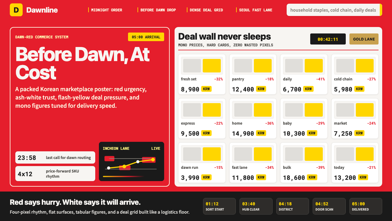 Coupang Rocket DeliveryUrgency made trustworthy. Rocket red, flash yellow, mono prices and packed gr…可信的紧迫感。火箭红、闪黄价格与密集网格推进速度。
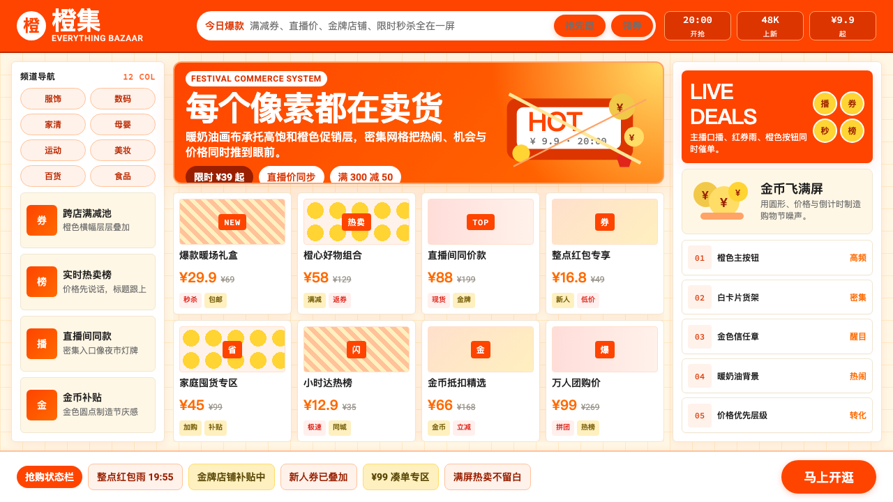 Taobao (淘宝)Every pixel sells. Orange on cream, dense price grids and gold coins shout ab…每个像素都在卖货。橙色压在奶油底上,密集价格网格与金币喊出丰盛。
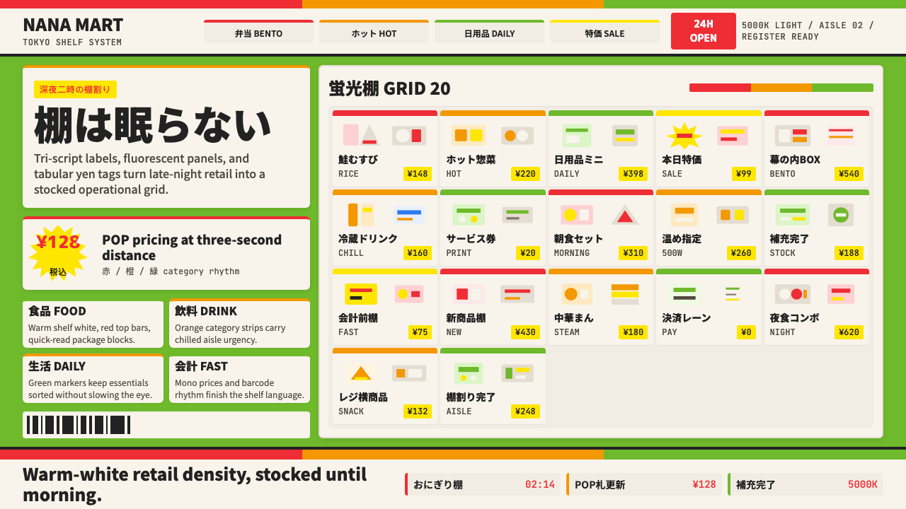 Japanese Konbini 7-ElevenAlways stocked, always bright. Green canopy, warm shelves, POP yen tags, tigh…永远明亮、永远满架。绿底暖白货架、POP日元价签与便当格。
 Adobe Creative CloudUnified, not uniform. Red anchor, white space, and saturated app tiles organi…统一而不单一:红色锚点、留白与高饱和应用方块组织整套工具。
 Cohere Coral-AIEnterprise AI feels humane. Coral panels, sky-blue chips, and organic curves…企业 AI 有人情味:珊瑚面板、天蓝标签与有机曲线软化网格。
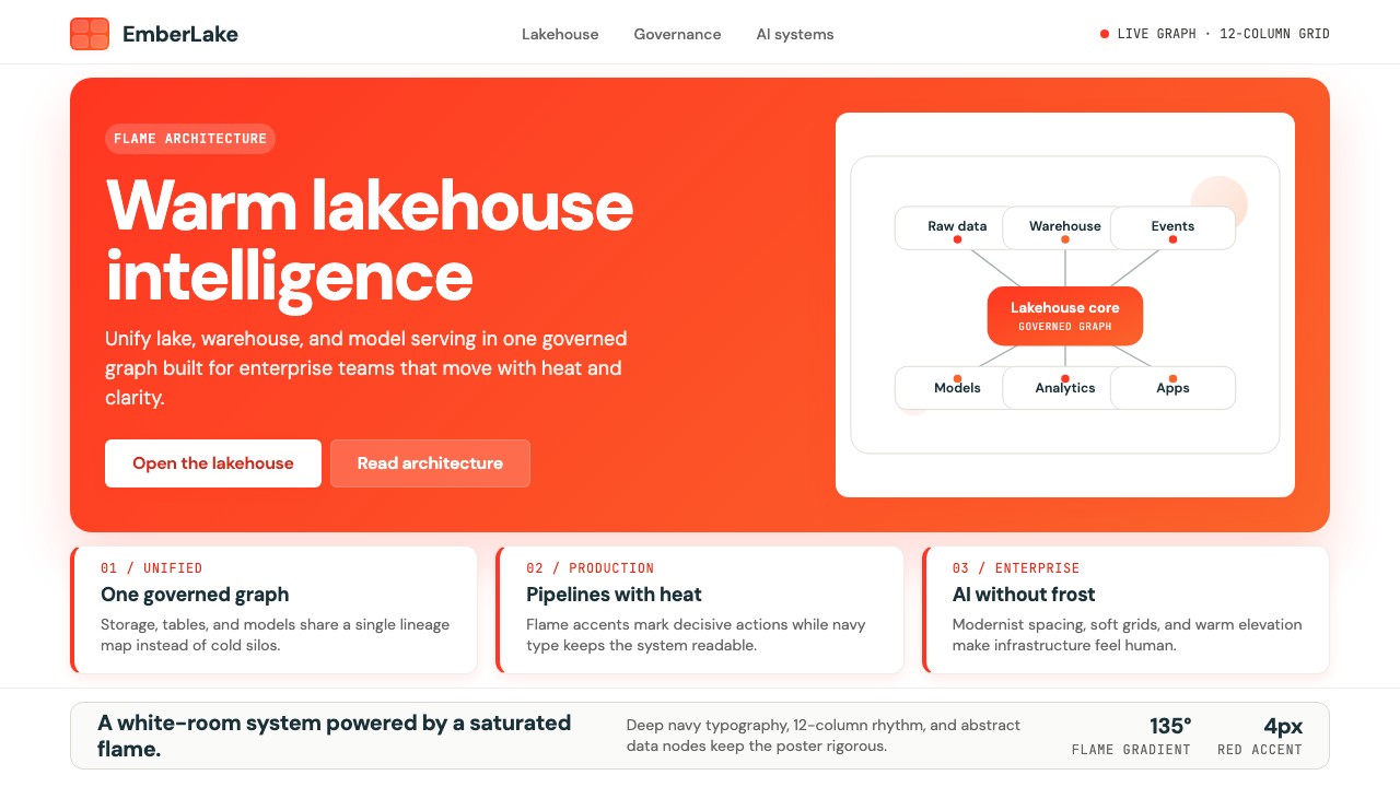 Databricks LakehouseWarm enterprise confidence. Flame red-orange gradients meet DM Sans and clean…温暖的企业信心:红橙火焰渐变配 DM Sans 与洁净数据图。