What is Cohere Coral-AI?什么是 Cohere Coral-AI?
Cohere's brand proves that enterprise AI can feel warm — coral panels, sky-blue chips, and organic curves make machine intelligence seem almost approachable.Cohere 的品牌证明了企业级 AI 也可以有人情味——珊瑚面板、天蓝标签与有机曲线,让机器智能变得近乎亲切。
Cohere Coral-AI in briefCohere Coral-AI 速览
Cohere Coral-AI is the visual design language of Cohere, an enterprise large-language-model platform founded in Toronto in 2019. The style combines a warm coral-pink ground with a complementary sky-blue accent, anchored by cream whites, and softened throughout by organic, blob-like illustration forms. Where most AI companies reach for cold metallics, stark neutrals, or severe monochrome, Coral-AI leans into warmth — treating enterprise software as something that should feel conversational and human-scaled rather than imposing and clinical.Cohere Coral-AI 是 Cohere 的视觉设计语言。Cohere 是一家于 2019 年在加拿大多伦多创立的企业大语言模型平台。这套风格将温暖的珊瑚粉底色与天空蓝强调色相互呼应,以奶油白为基底,并以有机的、类似斑块的插画形式贯穿始终,形成整体的柔和气质。在大多数 AI 公司选择冷峻的金属感、严苛的中性色或近乎单色的克制时,Coral-AI 坚定地走向温暖——将企业软件视为一种应当令人感到对话式、人性化的产品,而非压迫感十足的冷峻工具。
The aesthetic rests on three interlocking ideas. First, warmth as a strategic differentiator: coral-pink is physiologically associated with approachability, and deploying it as a primary brand ground is a deliberate departure from the cool restraint of dominant AI platforms. Second, organic form as counterpoint to technical content: the curving illustration style — loose biomorphic shapes reminiscent of mid-century scientific diagrams abstracted into pure color areas — softens the angularity inherent in data-heavy interfaces. Third, modernist type discipline: a clean, contemporary sans-serif used at clear hierarchical scales keeps the palette from tipping into informality.这套美学建立在三个相互交织的理念之上。其一,温暖作为战略差异化:珊瑚粉在生理层面与亲切感相关联,将其作为主要品牌底色,是对主流 AI 平台冷调克制的刻意背离。其二,有机形态作为技术内容的对位:曲线化的插画风格——宽松的生物形态,令人联想到二十世纪中叶科学图表被抽象为纯粹色块——软化了数据密集型界面固有的棱角感。其三,现代主义字体纪律:清晰层级的当代无衬线字体,使整套色板不会滑入过度随意。
The result is a visual register that reads simultaneously as technically credible and humanly accessible — an important balance for an enterprise product competing on both capability and developer experience. Coral-AI sits distinctly apart from OpenAI's restrained grayscale minimalism, Anthropic's letterpress-inflected cream, and the generic deep-blue professionalism of legacy enterprise software. It is, in its own terms, a 2020s argument that AI infrastructure can carry warmth without sacrificing authority.最终效果是一套视觉语域,同时传递出技术可信度与人文亲切感——这对于一个既要在能力层面也要在开发者体验层面展开竞争的企业产品而言,是至关重要的平衡。Coral-AI 与 OpenAI 的克制灰度极简主义、Anthropic 的铅印奶油温润,以及传统企业软件的通用深蓝专业感,都形成了鲜明区别。在自己的坐标系中,它是 2020 年代的一种主张:AI 基础设施可以承载温暖,而不必牺牲权威。
See the Cohere Coral-AI design system查看 Cohere Coral-AI 完整设计系统
Where does Cohere Coral-AI come from?Cohere Coral-AI 从何而来?
Cohere was founded in 2019 by Aidan Gomez, Ivan Zhang, and Nick Frosst — three researchers who had worked at Google Brain in Toronto. Gomez is a co-author of the 2017 paper "Attention Is All You Need," the landmark publication that introduced the Transformer architecture now foundational to essentially every large language model in existence. The company launched at a moment when the enterprise LLM market was rapidly forming, with organizations across finance, healthcare, and logistics beginning to recognize that private, customizable, on-premises-deployable language models would be a competitive necessity.Cohere 由 Aidan Gomez、Ivan Zhang 和 Nick Frosst 于 2019 年创立,三位创始人均曾在多伦多的 Google Brain 工作。Gomez 是 2017 年论文《Attention Is All You Need》的合著者之一——这篇里程碑式的论文引入了 Transformer 架构,而该架构如今是几乎所有大型语言模型的根基。公司成立于企业级 LLM 市场迅速成形的时期:金融、医疗、物流等行业的组织开始意识到,私有的、可定制的、可在本地部署的语言模型将成为一种竞争必需品。
The current Cohere visual identity — defined by the coral-pink and sky-blue palette, the organic illustration style, and the modernist sans-serif discipline — emerged through a brand refresh that solidified during the early-to-mid 2020s as the company scaled. The decision to build around coral rather than the blue or gray that dominates enterprise software was a deliberate positioning choice. It acknowledged a broader cultural shift: that the 2020s enterprise user was increasingly a developer or knowledge worker who had formed aesthetic expectations through consumer-grade products, and who would respond to warmth and clarity over severity and abstraction.Cohere 当前的视觉识别系统——以珊瑚粉和天蓝色调色板、有机插画风格与现代主义无衬线字体纪律为特征——在公司规模扩张的 2020 年代初至中期通过一次品牌焕新而最终确立。选择以珊瑚色而非主导企业软件领域的蓝色或灰色为核心,是一个蓄意的定位选择。它承认了一个更广泛的文化转变:2020 年代的企业用户越来越多地是开发者或知识工作者,他们通过消费级产品形成了审美期待,会对温暖与清晰产生更强的共鸣,而非对严苛与抽象。
The warm-modernist AI brand aesthetic that Cohere helped define exists within a broader movement of post-Transformer AI company identity work. Where first-generation AI product design often borrowed the cold futurism of science fiction — dark interfaces, glowing elements, terminal aesthetics — companies like Cohere sought a vocabulary rooted in craft, conversation, and approachability. The organic curve illustration tradition Cohere embraced has antecedents in mid-century information design, particularly in the scientific and educational publishing of the 1950s and 1960s, where biological and systemic concepts were rendered as flowing, interlocking shapes rather than rigid diagrams.Cohere 参与定义的「温暖现代主义 AI 品牌美学」存在于后 Transformer 时代 AI 公司身份建构的更宏观运动之中。第一代 AI 产品设计往往借用科幻小说的冷峻未来主义——暗色界面、发光元素、终端机美学——而 Cohere 等公司则寻求一种植根于手工感、对话感与亲切感的视觉词汇。Cohere 所采用的有机曲线插画传统,其先例可追溯至二十世纪中叶的信息设计,尤其是 1950 和 1960 年代的科学与教育出版领域——那个时代的生物与系统概念以流动的、相互交织的形态而非刚硬图表加以呈现。
As Cohere expanded its enterprise reach — building Command, Embed, and Rerank model families, and competing directly with OpenAI and Anthropic for large-scale commercial contracts — the visual identity had to carry increasing weight. The coral-pink ground needed to read as credible in contexts ranging from a developer documentation portal to a slide deck presented to a Fortune 500 board. The success of Coral-AI as a system is partly the success of that credibility argument: warmth and authority are not opposites when the underlying palette is precise, the type is disciplined, and the illustration language is consistent.随着 Cohere 扩展其企业覆盖范围——构建 Command、Embed 和 Rerank 模型家族,并直接与 OpenAI 和 Anthropic 竞争大规模商业合同——视觉识别系统需要承载日益增长的品牌重量。珊瑚粉底色需要在从开发者文档门户到面向财富 500 强董事会的演示文稿等各种场景中都显得可信。Coral-AI 作为一套系统的成功,部分正是那个可信度论证的成功:当底层色板精确、字体纪律严明、插画语言一致时,温暖与权威并非对立。
What defines the Cohere Coral-AI look?Cohere Coral-AI 的视觉特征是什么?
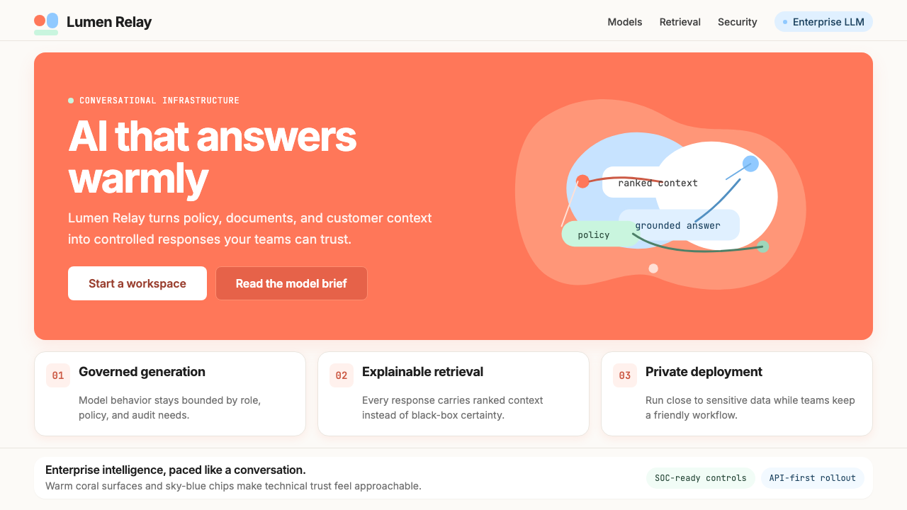
Coral-Pink Ground珊瑚粉底色
The most distinctive element of Coral-AI is its use of a warm, medium-saturation coral-pink as a primary surface color — not as an accent or highlight, but as the ground itself. This is unusual in enterprise software, where backgrounds are almost universally near-white, light gray, or dark navy. The coral ground creates an immediate warmth that signals approachability, and its medium saturation prevents it from reading as either frivolous or aggressive. It works in harmony with cream whites and is robust enough to carry black type without legibility issues.Coral-AI 最具辨识度的元素,是将温暖的中饱和度珊瑚粉用作主要表面色——不是作为强调色或点缀色,而是作为底色本身。这在企业软件中极为罕见,因为该领域的背景几乎普遍是接近白色、浅灰或深海军蓝。珊瑚底色制造出一种即时的温暖感,传递出亲切可及的信号;其中等饱和度既不显得轻浮,也不显得咄咄逼人。它与奶油白和谐共存,也足够稳健,能够在不影响可读性的前提下承载黑色文字。
Sky-Blue Accent天蓝强调色
Against the coral ground, a clear, airy sky-blue functions as the primary accent — appearing on chips, tags, interactive states, and informational callouts. The two colors are complementary in temperature rather than hue: coral is warm and advancing, sky-blue is cool and receding. This thermal contrast creates natural visual hierarchy without resorting to high-contrast value differences or aggressive saturation. The sky-blue reads as data-linked and trustworthy, softening what might otherwise feel like the coral palette alone overreaching into the consumer-lifestyle register.在珊瑚底色的衬托下,清透轻盈的天蓝色作为主要强调色出现——用于标签、交互状态和信息提示框。这两种颜色在色温而非色相上形成互补:珊瑚色温暖而前进,天蓝色冷静而后退。这种冷暖对比制造了自然的视觉层级,无需依赖高对比度的明暗差异或强烈的饱和度。天蓝色带有数据关联感与可信度,它的存在软化了单独使用珊瑚调色板时可能越界进入消费生活方式领域的风险。
Organic Blob Illustration有机斑块插画
Cohere's illustration language uses loose, curving biomorphic shapes — sometimes overlapping, sometimes isolated — rendered as flat color areas without outlines or gradients. These forms abstract neural-network and biological-system metaphors into pure aesthetic objects: they suggest interconnection, flow, and distributed intelligence without representing anything literally. The absence of hard edges and right angles in the illustration layer provides a deliberate visual relief from the inherent grid-discipline of the interface components they accompany.Cohere 的插画语言使用宽松的曲线生物形态——有时相互叠压,有时独立存在——以无轮廓、无渐变的平面色块呈现。这些形态将神经网络与生物系统的隐喻抽象为纯粹的审美对象:它们暗示互联、流动与分布式智能,而不进行任何字面描绘。插画层中硬边与直角的缺席,为其所搭配的界面组件固有的网格纪律提供了刻意的视觉缓冲。
Modernist Sans-Serif Discipline现代主义无衬线字体纪律
Typography in Coral-AI is governed by a contemporary, geometrically inflected sans-serif used at clearly differentiated scales and weights. Headlines carry authority through generous size and confident weight; body text is set at a comfortable reading size in a lighter weight; labels and metadata appear at compact scales in regular or medium weight. The typographic system acts as ballast against the warmth of the palette — it is the element that keeps Coral-AI from sliding toward softness at the expense of technical credibility.Coral-AI 的字体排印以带有几何倾向的当代无衬线字体为核心,在清晰区分的字号与字重层级下运作。标题通过充裕的尺寸与自信的字重传递权威;正文以舒适的阅读字号配合较轻的字重呈现;标签与元数据以紧凑字号、regular 或 medium 字重出现。字体排印系统充当色板温暖感的压舱石——它是防止 Coral-AI 以牺牲技术可信度为代价而滑入柔弱的关键元素。
Flat Surface, Minimal Depth Cues平面表面,极简深度暗示
Despite the warmth of the palette, Coral-AI maintains a fundamentally flat surface logic. Shadows, when used, are subtle and functional rather than naturalistic — they signal elevation and interaction affordance rather than simulate a light source. Cards and panels are distinguished from their backgrounds primarily through color surface differences rather than dramatic depth effects. This flatness keeps the visual system legible at high information density and prevents the warmth of the coral palette from degrading into visual noise.尽管色板温暖,Coral-AI 在根本上仍维持着平面化的表面逻辑。投影若有使用,则是微妙而功能性的,而非自然主义的——它们传递层高与交互可供性,而非模拟光源。卡片与面板主要通过色彩表面差异而非戏剧性的深度效果与背景区分。这种平面性保证了视觉系统在高信息密度下的可读性,也防止珊瑚色板的温暖感退化为视觉噪音。
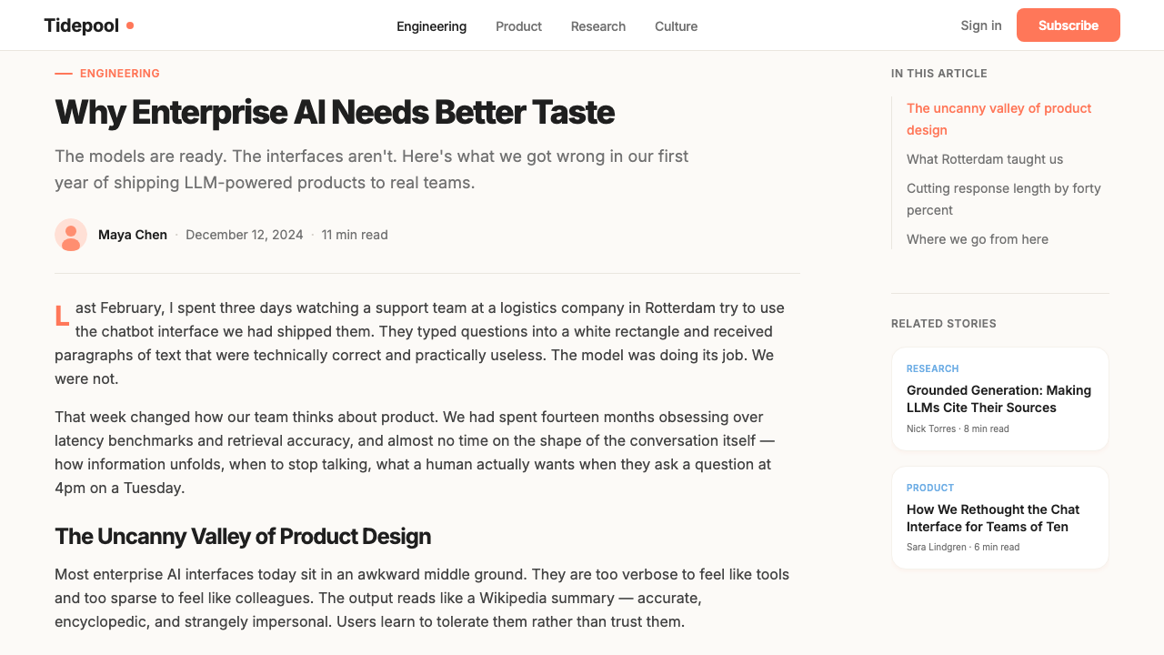
Cream-White as Neutral Anchor奶油白作为中性锚点
Cream-white functions throughout Coral-AI as the system's neutral — used for text fields, modal backgrounds, content areas where sustained reading is required, and as the foil that makes the coral ground feel warm rather than overpowering. It is a slightly warmer white than pure optical white, which prevents the two from clashing while maintaining sufficient contrast for legibility. Much of the system's balance depends on the ratio of coral surface to cream surface being carefully managed: too much coral and the interface feels hectic; too much cream and the warmth disappears.奶油白在 Coral-AI 中始终充当系统的中性色——用于文本输入框、模态框背景、需要持续阅读的内容区域,以及作为衬托色让珊瑚底色感觉温暖而非压迫。它比纯光学白略带暖意,既防止两者产生视觉冲突,又保持足够的对比度以保障可读性。系统的大部分平衡取决于珊瑚表面与奶油表面的占比被细心管理:珊瑚色过多,界面会显得急躁;奶油白过多,温暖感则随之消失。
Neural-Network Visual Metaphor神经网络视觉隐喻
Running through Cohere's illustration and decoration system is a recurring visual metaphor of nodes, connections, and distributed networks — rendered in the same organic, non-literal illustration language rather than as technical diagrams. These motifs reference the Transformer architecture underlying the company's products without explaining it, functioning more like a brand mark than a schematic. They appear most prominently in hero sections and editorial imagery, creating continuity between the product's technical identity and its visual personality.贯穿 Cohere 插画与装饰系统的,是节点、连接与分布式网络的反复视觉隐喻——以同样有机、非字面的插画语言呈现,而非技术图解。这些母题引用了公司产品底层的 Transformer 架构,却不作任何解释,其功能更像品牌标记而非示意图。它们最显著地出现在首屏区域和编辑性图像中,在产品的技术身份与其视觉个性之间建立连续性。
See the Cohere Coral-AI design system查看 Cohere Coral-AI 完整设计系统
Who shaped Cohere Coral-AI?谁塑造了 Cohere Coral-AI?
Gomez co-founded Cohere and serves as CEO. Before Cohere, he was a researcher at Google Brain in Toronto, and is a co-author of the 2017 paper "Attention Is All You Need" — the work that introduced the Transformer architecture. His academic background and the paper's status as a foundational document of modern AI gives Cohere a distinctive origin story, and the brand's positioning as technically credible yet humanly accessible partly reflects Gomez's public persona as a researcher who communicates AI's possibilities in accessible terms.Gomez 是 Cohere 的联合创始人兼首席执行官。在创立 Cohere 之前,他是多伦多 Google Brain 的研究员,也是 2017 年论文《Attention Is All You Need》的合著者之一——该论文引入了 Transformer 架构。他的学术背景以及这篇论文作为现代 AI 奠基性文献的地位,赋予了 Cohere 独特的起源叙事;品牌在技术可信度与人文亲切感之间的定位平衡,也在一定程度上折射出 Gomez 作为能以通俗语言传达 AI 可能性的研究者的公众形象。
Zhang is co-founder and CTO of Cohere, responsible for the technical architecture of the platform. As the engineering counterpart to Gomez's research profile, Zhang represents the implementation side of Cohere's founding story — translating Transformer research into a production-grade enterprise API. The dual identity of Cohere's founding team, combining research authorship with engineering execution, informs the brand's positioning between academic credibility and enterprise reliability.Zhang 是 Cohere 的联合创始人兼首席技术官,负责平台的技术架构。作为 Gomez 研究背景的工程对等方,Zhang 代表了 Cohere 创始故事中的实现维度——将 Transformer 研究转化为生产级企业 API。Cohere 创始团队兼具研究著作权与工程执行力的双重身份,共同塑造了品牌在学术公信力与企业可靠性之间的定位。
Frosst is co-founder of Cohere and, outside the company, a musician known for performing under his own name. His background spans AI research at Google Brain and creative practice — a combination that is unusual among AI company founders and that may contribute to Cohere's willingness to invest in a brand aesthetic with genuine warmth and personality. Frosst's public profile as both a researcher and a musician signals that the human and the technical are not opposites, which aligns with the brand's core visual argument.Frosst 是 Cohere 的联合创始人,公司之外还是一位以本名演出的音乐人。他的背景横跨 Google Brain 的 AI 研究与创意实践——这种组合在 AI 公司创始人中极为罕见,或许也是 Cohere 愿意投资于一套具有真实温度和个性的品牌美学的原因之一。Frosst 作为研究者与音乐人的公众形象,传递出人性与技术并非对立的信号,这与品牌核心视觉主张高度契合。
As part of Cohere's design and product leadership, Nair has been involved in shaping the visual and interaction systems that translate the Coral-AI brand language into functional product surfaces — including the Cohere platform, API documentation, and developer tooling. The challenge his team navigated was making a warm, expressive brand language operational at the component level without losing its personality to the generic conventions of enterprise UI frameworks.作为 Cohere 设计与产品领导层的一员,Nair 参与塑造了将 Coral-AI 品牌语言转化为功能性产品界面的视觉与交互系统——包括 Cohere 平台、API 文档与开发者工具。他的团队所需应对的核心挑战,是在组件层面让这套温暖、富有表现力的品牌语言落地运作,同时不让其个性消融于企业 UI 框架的通用惯例之中。
How do you use Cohere Coral-AI today?今天怎么用 Cohere Coral-AI?
Cohere Coral-AI is a remarkably versatile style for contemporary design work precisely because its warmth is intentional and structured rather than accidental. Applying it well requires understanding that the coral-pink is a load-bearing element of the system — it is not a background tint to be easily substituted. The sky-blue accent, the cream-white neutral, and the organic illustration register all calibrate against the coral ground. Change the ground and the whole system requires rebalancing.Cohere Coral-AI 对当代设计实践来说是一套极具适应性的风格,正是因为它的温暖是有意为之且结构化的,而非偶然的。正确应用这套风格需要理解:珊瑚粉是系统的承重元素——它不是一个可以轻易替换的背景色调。天蓝强调色、奶油白中性色与有机插画都是相对珊瑚底色校准的。改变底色,整个系统就需要重新平衡。
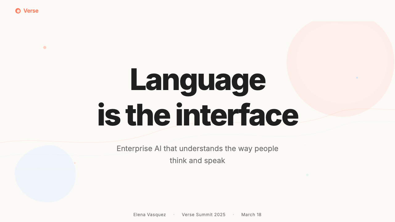
For presentation slides, Coral-AI is strongest when the cover uses the full coral ground with the headline set in a large, confident sans-serif weight. Organic blob forms in sky-blue or cream can occupy the right-hand half or a lower corner, establishing the illustration register early. Content slides work best on cream-white grounds with coral used as a section indicator or accent on data callouts — this prevents the coral from becoming fatiguing across a long deck. Data slides suit a diagrammatic approach: use coral and sky-blue as the primary data-series colors, keep gridlines light and near-invisible, and let the warmth of the palette make even dense charts feel approachable rather than intimidating.在演示文稿中,Coral-AI 在封面页使用完整珊瑚底色配合大号、自信字重的无衬线标题时最为强势。天蓝或奶油色的有机斑块形态可占据右半侧或下方角落,及早建立插画语域。内容页在奶油白底色上效果最佳,珊瑚色用于章节指示或数据标注的强调——这可防止珊瑚色在长篇演示中造成视觉疲劳。数据页适合示意图式的处理方式:以珊瑚色和天蓝色作为主要数据系列颜色,保持网格线轻薄几乎不可见,让色板的温暖使即便密集的图表也显得平易近人,而非令人生畏。
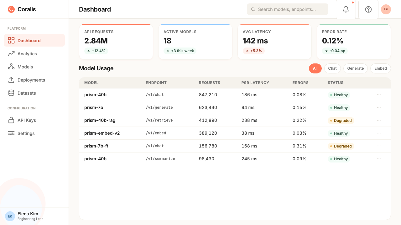
For web interfaces and dashboards, Coral-AI is well-suited to overview screens, onboarding flows, and marketing-facing surfaces. Developer documentation portals benefit from restraint: use cream-white as the primary document background with coral reserved for interactive elements, warnings styled with sky-blue, and the organic illustration appearing only in empty states or hero banners. Pricing pages are a natural fit for the style's warmth — coral-ground feature cards or tier headers, cream-white body content, and sky-blue for highlighted or recommended tiers create a system that feels both persuasive and trustworthy.对于网页界面和仪表板,Coral-AI 尤其适合概览屏幕、引导流程和面向营销的表面。开发者文档门户需要克制:以奶油白作为主要文档背景,将珊瑚色保留给交互元素,以天蓝色点缀警示,有机插画仅出现在空状态或首屏横幅中。定价页面是这套风格温暖感的天然舞台——珊瑚底色的功能卡片或等级标题、奶油白的正文内容区域、天蓝色用于高亮或推荐等级,构成一套既有说服力又令人信任的系统。
For editorial and marketing contexts, the style supports strong, poster-like compositions. A Coral-AI editorial spread uses the full coral ground for section openers, transitions to cream for long-form reading sections, and employs the organic illustration as chapter dividers or sidebar elements. Marketing one-pagers or social cards work well with the coral ground filling the majority of the surface, the organic blobs creating compositional movement, and the headline set large enough to read as a single confident statement. Email templates structured with a coral header block, cream content area, and sky-blue call-to-action button carry the system's warmth effectively into the inbox.在编辑与营销场景中,这套风格支持强劲的海报式构图。Coral-AI 编辑双页跨版以珊瑚底色开启章节,在长篇阅读段落过渡至奶油色,并以有机插画作为章节分隔或侧边栏元素。营销单页或社交卡片在珊瑚底色占据大部分画面、有机斑块制造构图律动、标题足够大以形成单一有力陈述时效果最佳。以珊瑚色标题区块、奶油白内容区域、天蓝行动号召按钮构建的电子邮件模板,能有效地将这套系统的温暖感传递至收件箱。
A common mistake when applying Coral-AI is using the coral-pink too uniformly — filling every surface with the same hue at the same saturation so that the warmth stops reading as warmth and starts reading as a design error or an overpowering brand statement. The system earns its warmth through contrast with the cream-white and sky-blue. Another pitfall is treating the organic illustration as mere decoration rather than as a structural element: blob forms dropped randomly onto a layout become visual clutter rather than compositional counterweight. They work when they are given scale, placement intentionality, and white space to breathe against.应用 Coral-AI 时最常见的错误是过度均匀地使用珊瑚粉——将每一个表面都以相同色相、相同饱和度填充,导致温暖感不再被解读为温暖,而是开始被解读为设计失误或压迫性的品牌宣示。这套系统的温暖感是通过与奶油白和天蓝色的对比来实现的。另一个常见陷阱是将有机插画视为单纯的装饰而非结构性元素:随机丢放在版面上的斑块形态会变成视觉杂乱,而非构图上的平衡砝码。只有在被赋予足够的尺度、有意的位置安排,以及足够的留白空间去呼吸时,它们才能真正发挥作用。
See the Cohere Coral-AI design system查看 Cohere Coral-AI 完整设计系统
Cohere Coral-AI — FAQCohere Coral-AI · 常见问题
Is Coral-AI suitable for dark-mode interfaces?Coral-AI 适合深色模式界面吗?
Dark mode is possible but requires significant recalibration. The coral-pink ground that defines the style loses its warmth register almost entirely when transposed to a dark context — it tends to read either as oversaturated or as a harsh accent rather than a welcoming ground. A dark Coral-AI variant works better when the coral is demoted to accent-only use, sky-blue becomes the primary interactive signal, and a very deep, slightly warm near-black takes the place of the coral ground. The organic illustration retains more of its personality in dark mode than the palette does, so leaning into it can help preserve the style's character. Expect the dark variant to feel more like a technical-AI aesthetic and less like the original warm humanist register.深色模式是可能的,但需要大幅重新校准。定义这套风格的珊瑚粉底色在转置到深色语境时几乎完全失去其温暖语域——它往往显得过度饱和,或作为刺目的强调色而非亲切的底色。深色 Coral-AI 变体在珊瑚色降级为仅作强调色、天蓝色成为主要交互信号、以极深且略带暖意的近黑色替代珊瑚底色时效果更佳。有机插画在深色模式下比色板更能保留自己的个性,因此加大对它的运用有助于保存这套风格的气质。请预期深色变体会更接近技术型 AI 美学,而非原版的温暖人文主义语域。
How does Coral-AI differ from other warm-toned enterprise design systems?Coral-AI 与其他暖色调企业设计系统有何不同?
Most warm-toned enterprise design systems — those using amber, peach, or terracotta — treat warmth as a secondary layer: the primary interface is neutral, and warm color appears as accent or brand marker. Coral-AI is unusual in using warm coral-pink as a primary surface, making the warmth structural rather than decorative. Additionally, the combination of a warm ground with an organic illustration language and a specifically AI-product framing places it in a distinct category. It is not lifestyle warmth, wellness warmth, or food-brand warmth — it is engineered warmth, warmth in the service of technical approachability, which gives it a character that other warm-toned systems do not share.大多数暖色调企业设计系统——那些使用琥珀色、蜜桃色或赤陶色的——将温暖视为次要层:主要界面是中性的,暖色作为强调色或品牌标记出现。Coral-AI 的不寻常之处在于将温暖的珊瑚粉用作主要表面色,使温暖成为结构性的而非装饰性的。此外,暖色底色与有机插画语言以及特定 AI 产品框架的组合,将其置于一个独特的类别中。这不是生活方式的温暖、健康领域的温暖,或食品品牌的温暖——这是工程化的温暖,服务于技术亲切感的温暖,赋予了它其他暖色调系统所不具备的气质。
Can the style work for non-AI products?这套风格能用于非 AI 产品吗?
Yes, with some adaptation. The Coral-AI palette and layout principles are not inherently AI-specific — a SaaS analytics tool, a developer productivity platform, or even a design tool could carry the same warmth effectively. The element most tightly coupled to the AI context is the organic blob illustration, which derives much of its meaning from the neural-network associations it carries in a machine-learning brand environment. In a non-AI context, those forms need to be grounded in a different conceptual metaphor — perhaps biological systems, social networks, or data flows — or replaced with a different illustration approach that delivers the same softening effect. The palette and typography transfer more cleanly than the illustration system.可以,但需要一些调整。Coral-AI 的色板与版面原则并非天然与 AI 绑定——一款 SaaS 分析工具、开发者效率平台,甚至设计工具都可以有效地承载同样的温暖感。与 AI 语境联系最紧密的元素是有机斑块插画:它的大部分意义源于其在机器学习品牌环境中所携带的神经网络联想。在非 AI 语境中,这些形态需要植根于不同的概念隐喻——也许是生物系统、社交网络或数据流——或者被能够实现同等柔化效果的不同插画方式所替代。色板与字体排印比插画系统更易于迁移。
How should the organic illustration be balanced against data-heavy content?有机插画应如何与数据密集型内容取得平衡?
The organic illustration works as counterweight, not as competition. In a data-heavy context — a dashboard with dense charts, a report with multiple data tables — the illustration should be confined to structural boundaries: a hero section at the top, an empty-state placeholder, a sidebar accent. The body of the data content should sit on cream-white with the illustration absent, so that the quantitative information has room to be read precisely. The mistake is scattering organic blob forms across content-heavy areas where they read as distracting noise. Think of the illustration as marking the thresholds of the experience — entry, exit, and transition — rather than inhabiting the working space itself.有机插画作为平衡砝码而存在,而非竞争对手。在数据密集型场景中——密布图表的仪表板、包含多个数据表格的报告——插画应被限制在结构性边界内:顶部的首屏区域、空状态占位符、侧边栏点缀。数据内容的主体应置于奶油白底色上,插画缺席,以便定量信息有空间被精确阅读。错误的做法是将有机斑块形态散落于内容密集区域,使其沦为令人分心的视觉噪音。将插画视为标记体验阈值的元素——入口、出口与过渡——而非居住于工作空间本身。
What is the most common mistake when teams try to replicate the Cohere look?团队尝试复制 Cohere 外观时最常见的错误是什么?
The most common mistake is reducing Coral-AI to its palette and treating the coral-pink as a simple brand color swap applied over a generic enterprise layout. The result looks like a tinted version of a standard SaaS template rather than the Cohere visual system. What teams miss is that the coral works because it is structural — it grounds the whole composition — and because it is supported by a very specific set of companions: the particular quality of sky-blue, the warmth of the cream-white, the organic illustration at appropriate scale, and the typographic discipline that provides contrast. The second most common mistake is over-using the organic blobs, allowing them to appear as wallpaper rather than as purposeful compositional elements. Cohere uses them sparingly and at scale; many attempts use them repeatedly at small size, which reduces them to pattern and strips them of presence.最常见的错误是将 Coral-AI 简化为其色板,并将珊瑚粉视为应用于通用企业版面之上的简单品牌换色。结果看起来像标准 SaaS 模板的着色版本,而非 Cohere 的视觉系统。团队所忽视的是:珊瑚色之所以有效,在于它是结构性的——它为整个构图奠基——也在于它被一套非常具体的搭档所支撑:特定品质的天蓝色、奶油白的温度感、适当尺度的有机插画,以及提供对比的字体排印纪律。第二常见的错误是过度使用有机斑块,让它们如同墙纸般出现,而非有目的的构图元素。Cohere 对它们的使用是克制且有尺度的;许多仿制尝试以小尺寸重复使用,这使它们退化为图案,剥夺了其存在感。
Related design styles相关设计风格
 Adobe Creative CloudUnified, not uniform. Red anchor, white space, and saturated app tiles organi…统一而不单一:红色锚点、留白与高饱和应用方块组织整套工具。
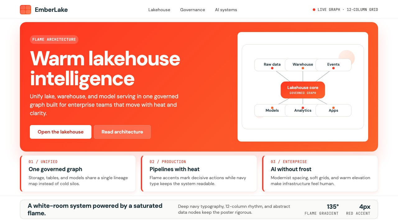 Databricks LakehouseWarm enterprise confidence. Flame red-orange gradients meet DM Sans and clean…温暖的企业信心:红橙火焰渐变配 DM Sans 与洁净数据图。
 GitLab 2023DevOps in daylight. Tanuki orange-to-purple gradient, Inter, warm enough for…DevOps 走出暗色房间:标志性狸猫橙紫渐变、宽松行高、Inter 字体——…
 Postman 2024Warm APIs feel approachable. Orange gradients, Inter headlines, and dark mono…温暖的 API 专业感:橙色渐变、Inter 标题与深色等宽代码块。
 Android Bugdroid GreenFriendly tech, reduced to geometry. Vivid green pops from Grey 900 and rounde…友好科技化为几何:明绿从 Grey 900 与圆润字形中跃出。
 AsanaCalm productivity breathes. Cream canvas, lavender panels, coral-blue-yellow…安静生产力会呼吸:奶油画布、薰衣草面板与三色圆点。