About JD.com (京东)
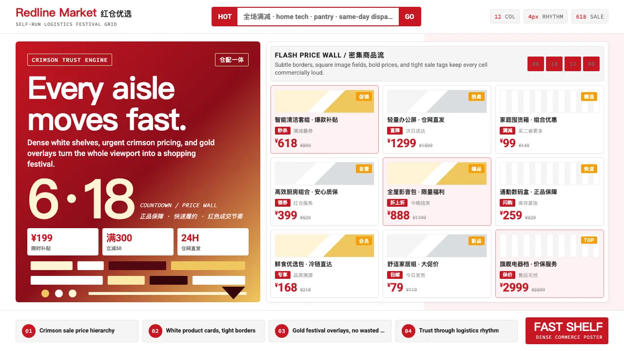
JD.com's visual identity is built on urgency and trust — the deep crimson #C81623 signals both Chinese festive energy and the confidence of a self-logistics retail giant. Dense product grids, bold price typography, and red-gold promotional overlays create the unmistakable rhythm of a 618 or Singles Day shopping festival.
The system pairs Source Han Sans for bilingual clarity with a 12-column dense layout that prioritizes information density over whitespace. Every surface serves commerce: carousel banners rotate promotions, product cards stack tight with crossed-out prices and sale tags, and the metallic-silver JOY dog mascot punctuates moments of brand delight.
- Origin
- Beijing, China
- Era
- 1998 founded; online since 2004; current visual ~2020–2024
- Key figures
- Liu Qiangdong (Richard Liu) · Xu Lei · JD Brand Team · JOY mascot designer
- Movements
- Chinese e-commerce wars · Self-owned-logistics retail · 618 Shopping Festival culture
JD.com (京东) design spec
Colors
Typography
The other 11 sections — buttons, cards, spacing, motion, techniques and more — open once you unlock. Download the DESIGN.md or send it to your AI in one click. Unlock once, yours forever.
Sign up nowStyles similar to JD.com (京东)
Also inspired by brands & products, with a close feel.
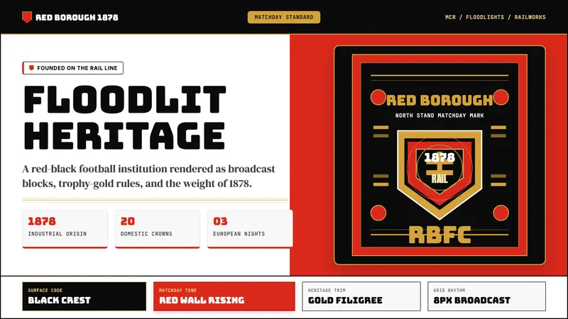 Manchester United (Red Devils)Heritage hits like a chant. Red-black blocks, Bungee type, and gold filigree hold the pitch.
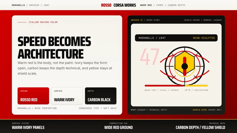 Ferrari Rosso Corsa (1947)Speed becomes architecture. Racing red, warm ivory, and carbon-black panels.
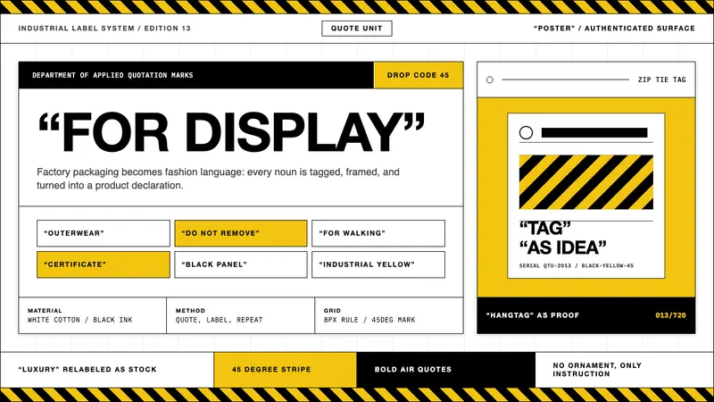 Off-White (Virgil Abloh era)Industrial irony, labeled. Yellow stripes and Helvetica quotes turn luxury into factory stock.
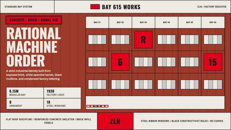 Baťa Zlín Functionalist BrandMachine-age precision. Brick red, concrete bands, and Oswald type lock into a 6.15m grid.