What is Coupang Rocket Delivery?什么是 Coupang Rocket Delivery?
Coupang's Rocket Delivery design language weaponizes urgency into trust — rocket red, flash pricing, and a photographic grid so dense it runs at the speed of a predawn conveyor belt.Coupang 火箭配送的设计语言将紧迫感转化为信任——火箭红、闪购价格与密集摄影网格,以黎明前传送带的速度奔涌而来。
Coupang Rocket Delivery in briefCoupang Rocket Delivery 速览
Coupang Rocket Delivery design is the visual identity of South Korea's dominant e-commerce platform, built entirely around a single operating promise: order at midnight, receive before sunrise. Every element in the system — the branded carton, the mobile top-bar, the product grid, the price callout — exists to make that promise visible and believable. The result is a design language that is dense, photographic, price-forward, and saturated with urgency without ever tipping into anxiety.Coupang 火箭配送设计,是韩国最强势电商平台的视觉识别体系,它围绕一个核心承诺构建:午夜下单,日出前送达。系统中的每个元素——品牌快递箱、手机置顶导航栏、商品网格、价格标注——都存在于让这一承诺变得可见、可信的目的之中。最终形成的设计语言密集、摄影驱动、价格优先,充满紧迫感却从不滑向焦虑。
The aesthetic is defined by three interlocking pillars. First, a bold primary red that functions as both brand color and operational signal — red here does not mean danger, it means speed and reliability. Second, a photographic grid philosophy that fills every viewport with real product images, prioritizing visual abundance over breathing room, because abundance communicates availability. Third, a typographic hierarchy that places price and discount rate at the visual apex of every card, treating the number itself as the primary design object.这套美学由三根相互咬合的支柱定义。其一,大胆的主色调红——它既是品牌色,也是运营信号:在这里,红色不意味着危险,它意味着速度与可靠。其二,摄影网格哲学——用真实商品图片填满每一个视口,以视觉丰盛优先于留白,因为丰盛传递的是充足的货源与即时的可得性。其三,字体层级——在每张商品卡的视觉顶端放置价格与折扣率,将数字本身作为首要设计对象。
What makes the system distinctive is not any single element but the way these pillars reinforce each other at scale. A page of Coupang product listings reads as a single rhythmic field — red accents pulsing across a photographic grid, prices bold and immediate — that communicates operational speed through visual density rather than through animation or empty white space. It is the aesthetic of a logistics machine that has been tuned to perfection.令这套系统与众不同的,不是任何单一元素,而是这三根支柱在规模上相互强化的方式。一屏 Coupang 商品列表,读来如同一片有节奏的视觉原野——红色强调点在摄影网格中有规律地跳动,价格粗重而即时——它通过视觉密度而非动效或空白来传递运营速度。这是一台被调校至极致的物流机器的美学。
See the Coupang Rocket Delivery design system查看 Coupang Rocket Delivery 完整设计系统
Where does Coupang Rocket Delivery come from?Coupang Rocket Delivery 从何而来?
Coupang was founded in Seoul in 2010 by Bom Kim, a Harvard Business School dropout who had observed the dominance of Amazon and Groupon and believed a similar model, adapted to South Korea's extreme urban density and its consumers' expectation of near-instant service, could redefine Korean commerce. The company's early years were defined by rapid iteration on business model rather than visual identity: it tried group buying, social commerce, and open marketplace formats before committing to the vertically integrated direct-retail model that would power Rocket Delivery.Coupang 由 Bom Kim 于2010年在首尔创立。这位哈佛商学院的辍学生曾深入观察亚马逊与 Groupon 的主导地位,并相信:一套适应韩国极端城市密度与消费者对近乎即时服务之期待的类似模式,足以重塑韩国商业。公司早年以商业模式的快速迭代为主轴,视觉识别尚未成型:它先后尝试团购、社交电商与开放集市形态,最终才确立为支撑火箭配送的垂直整合直营模式。
The Rocket Delivery service launched in 2014, and with it came the first clear articulation of the visual system. The name and concept were Kim's deliberate provocation — rocket as literal aspiration, not metaphor. The branded carton became the first physical expression of the identity: a white box with a bold red stripe and the Coupang logotype, designed to be unmistakable at 5 AM on a doorstep in Songpa-gu. The delivery window — order before midnight, receive before 7 AM — was the constraint around which the entire visual language was engineered. Urgency had to be communicated in every element, from the app push notification typography to the checkout button color.火箭配送服务于2014年上线,随之而来的是视觉系统的首次清晰表达。品牌名称与概念是 Kim 的刻意挑衅——火箭作为字面意义上的抱负,而非隐喻。品牌快递箱成为识别体系的第一个实体表达:白色箱体、粗红条纹、Coupang 字标,设计目标是在松坡区清晨五点的门廊前一望即知。「午夜前下单、早七点前送达」的时间窗口,是整套视觉语言得以建构的约束条件。从 App 推送通知的字体到结账按钮的颜色,紧迫感必须在每一个元素中同时传递。
The current visual identity matured between 2018 and 2021, a period that coincided with SoftBank Vision Fund's major investment, the explosive growth of Coupang's Fulfillment and Logistics by Coupang (CLC) infrastructure, and the global acceleration of e-commerce during the pandemic years. Design lead Tony Kim and logistics architect Kil Hyung-jin worked in parallel — supply chain and visual system evolving together — producing a design language that is, in a deep sense, the visual face of an operational system rather than a marketing exercise. The red of Rocket Delivery is the red of the branded box truck at 3 AM, not the red of an advertising campaign.当前视觉识别在2018年至2021年间趋于成熟,这一时期恰与软银愿景基金的重大投资、Coupang 物流履约基础设施的爆发式扩张,以及疫情年代全球电商加速相互交叠。设计负责人 Tony Kim 与物流架构师 Kil Hyung-jin 并行推进——供应链与视觉系统同步演化——最终产生了一套在深层意义上作为运营系统视觉面孔的设计语言,而非一次营销练习。火箭配送的红色,是凌晨三点品牌厢式货车的红色,不是广告战役的红色。
Coupang's NYSE listing in March 2021 brought the brand to international attention and cemented the visual identity as a corporate asset. The IPO materials, investor presentations, and subsequent brand rollouts all maintained the density, the photographic grid, and the price-forward hierarchy that had defined the app since 2018. It became the first major e-commerce brand to demonstrate that a design system could be built directly from logistics logic — that the fastest supply chain and the boldest visual identity could be expressions of the same underlying ambition. Analysts noted that Coupang was the only e-commerce company to have forced Amazon to exit a developed market, and that its design language was a material contributor to the trust that made this possible.2021年3月,Coupang 在纽约证券交易所上市,将这套品牌推向国际视野,并将视觉识别确立为企业资产。IPO 材料、投资者演示文稿及后续品牌推广,均保持了自2018年以来定义这款 App 的密集感、摄影网格与价格优先的层级秩序。它成为首个证明设计系统可以直接从物流逻辑中生长而来的主流电商品牌——最快的供应链与最大胆的视觉识别,可以是同一种底层野心的两种表达。分析人士指出,Coupang 是唯一一家迫使亚马逊退出发达市场的电商公司,而其设计语言是构筑这种信任的重要贡献者。
What defines the Coupang Rocket Delivery look?Coupang Rocket Delivery 的视觉特征是什么?
Rocket Red as Operational Signal火箭红——运营信号色
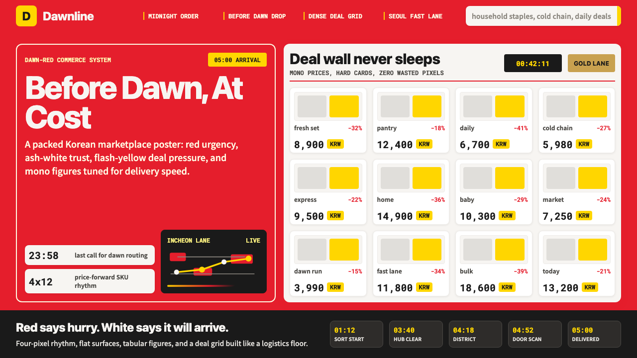
The dominant hue is a saturated, warm red drawn directly from the Coupang brand system and applied at maximum presence: header bars, call-to-action buttons, discount badges, delivery promise banners, and the branded carton all share the same red. Unlike reds used in danger or sale contexts elsewhere, Coupang red carries a specific semantic payload — speed, reliability, and arrived. It is not used sparingly as accent; it is the ground against which everything else reads.主色调是一种饱和的暖红,直接源自 Coupang 品牌系统,并以最大存在感铺展:顶部导航栏、行动按钮、折扣徽章、配送承诺横幅与品牌快递箱共享同一种红。不同于其他语境中用于危险或促销的红,Coupang 红承载着特定的语义——速度、可靠、已送达。它不以强调色的克制姿态出现,而是作为一切内容赖以读取的底色。
Flash Yellow for Price Urgency闪黄——价格紧迫色
A high-energy yellow, almost electric, appears exclusively in price-urgency contexts: countdown timers, limited-time deal badges, and lightning-deal event headers. Its role is strictly functional — to signal that a price or window is temporary and demands immediate attention. Yellow never migrates into structural or decorative use. The combination of rocket red and flash yellow across a product grid produces the visual temperature of a trading floor or a sports scoreboard: high-stakes, real-time, never static.一种高能量的黄色——近乎电光色——专属出现于价格紧迫场景:倒计时器、限时特惠徽章与闪购活动标题。其角色严格功能性——标示某个价格或时间窗口的临时性,要求即时关注。黄色从不流入结构或装饰用途。火箭红与闪黄在商品网格中的并置,产生了交易所大厅或体育计分板般的视觉温度:高风险、实时、永不静止。
Photographic Grid Density摄影网格密度
Product photography fills every available cell in the grid with minimal margin. Images are shot clean — products on white or near-white fields, cropped tightly — so that each card reads as a flat, legible object rather than a styled editorial image. The density is deliberate: a full viewport of forty product images communicates warehouse abundance and immediate availability more effectively than any headline. Coupang's grid does not breathe; it accumulates.商品摄影以极小的边距填满网格的每一个格子。图片拍摄简洁——商品置于白色或近白色底面上,紧密裁切——使每张卡片读来如同一个扁平、清晰的对象,而非经过编排的杂志图像。密集是刻意为之的:满视口的四十张商品图,比任何标题更有效地传递了仓库丰盛感与即时可得性。Coupang 的网格不呼吸,它积累。
Price-First Typography价格优先的字体排印
Within each product card, the typographic hierarchy is unambiguous: the discounted final price is set at the largest size, in the heaviest weight, positioned immediately below the product image. The original price appears struck-through and smaller. The discount percentage — rendered in the flash yellow or brand red — sits adjacent to the final price as a validation signal. Product name and seller details occupy a smaller, lighter tier beneath. This ordering reverses the conventional editorial hierarchy in which product identity leads and price follows.在每张商品卡中,字体层级明确无歧义:折后最终价格以最大尺寸、最重字重呈现,紧接商品图片之下。原价以划线形式出现,字号更小。折扣率——以闪黄或品牌红渲染——紧邻最终价格,作为验证信号。商品名称与卖家信息占据其下更小、更轻的层级。这一排序颠覆了传统编辑层级中商品身份在先、价格在后的惯例。
Persistent Navigation Anchoring持久置顶导航锚定
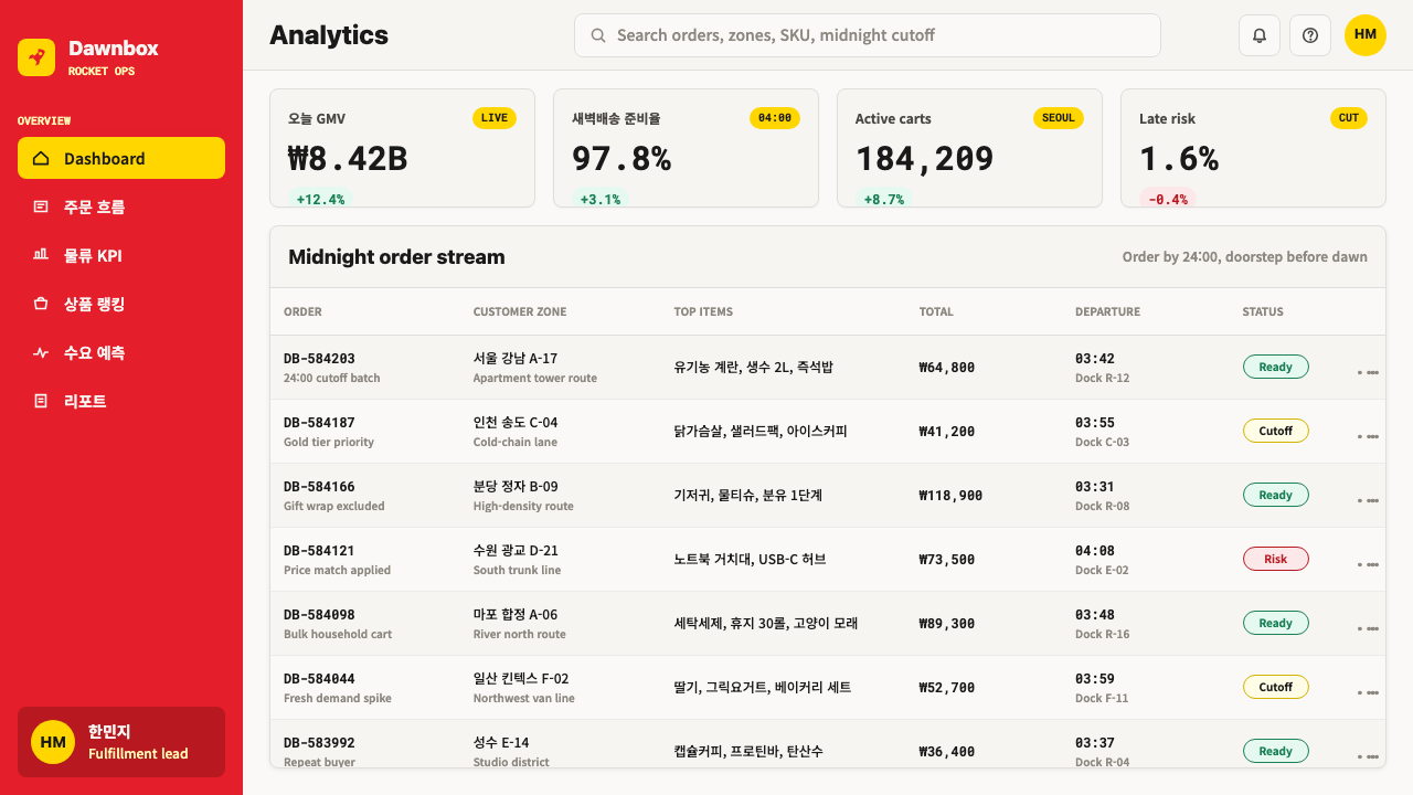
The top navigation bar remains fixed during scroll and carries the Rocket Delivery promise persistently — a banner or badge that communicates expected delivery time relative to the current hour. This is not a conventional UI pattern applied decoratively; it is an operational readout embedded in the interface. On desktop, the equivalent is a delivery-promise strip directly below the global header. The effect is that every page state, regardless of content, communicates the platform's core differentiator without requiring the user to seek it out.顶部导航栏在滚动时保持固定,并持续承载火箭配送承诺——一条横幅或徽章,相对于当前时刻传达预期送达时间。这不是装饰性应用的常规 UI 模式,而是嵌入界面的运营读数。在桌面端,等价物是紧接全局标题之下的配送承诺条带。效果是:无论内容如何,每一个页面状态都在无需用户主动寻找的情况下传递平台的核心差异化优势。
Rocket and Chevron Motion Language火箭与箭头动效语言
Directional chevrons and stylized rocket icons appear as recurring micro-motifs across the interface — in category navigation, delivery progress indicators, and promotional banners. They are not illustrative; they function as directional signals in a wayfinding system. The rocket symbol specifically anchors the Rocket Delivery sub-brand within the broader Coupang interface, appearing on packaging, order-tracking screens, and app icons. This consistent motif vocabulary makes the delivery promise legible at a glance across every surface.方向箭头与风格化的火箭图标作为反复出现的微型母题贯穿界面——出现在品类导航、配送进度指示器与促销横幅中。它们不是插图性的,而是作为导视系统中的方向信号发挥作用。火箭符号专门在更广泛的 Coupang 界面中锚定火箭配送子品牌,出现在包装、订单追踪页面与 App 图标上。这套一致的母题词汇使配送承诺在每一个界面上一目了然。
White Space as Exception, Not Rule留白作为例外,而非规则
Coupang's interface treats white space instrumentally rather than aesthetically. It appears between cards to prevent visual merge, around price figures to isolate them for immediate legibility, and in checkout flows where cognitive clarity is paramount. It does not appear as a general compositional value or as a signal of premium positioning. This inverts the conventional relationship between density and quality: Coupang's density communicates operational confidence rather than cheapness, because every element in the grid is earning its place through price and availability information.Coupang 的界面将留白作为工具性手段而非美学价值来对待。留白出现在卡片之间以防止视觉粘连,出现在价格数字周围以使其孤立而即时可读,出现在认知清晰至关重要的结账流程中。它不作为一种普遍的构图价值或高端定位信号出现。这颠覆了密集与品质之间的常规关系:Coupang 的密集传达的是运营自信而非廉价感,因为网格中的每一个元素都在以价格和可得性信息赚取其存在的正当性。
See the Coupang Rocket Delivery design system查看 Coupang Rocket Delivery 完整设计系统
Who shaped Coupang Rocket Delivery?谁塑造了 Coupang Rocket Delivery?
Bom Kim founded Coupang in 2010 after dropping out of Harvard Business School, having identified that South Korea's extreme urban density and consumer expectations for fast service created a structural opening for a vertically integrated e-commerce platform. His decision to own the last mile — rather than outsourcing delivery — was the strategic move that produced the Rocket Delivery brand, the Coupang Logistics Service driver corps (Coupang Friends), and ultimately the design language that made the logistics promise visible. Under his leadership, Coupang became the only e-commerce company to have displaced Amazon in a developed market.Bom Kim 于2010年从哈佛商学院辍学后创立 Coupang,他判断出韩国极端的城市密度与消费者对快速服务的期待,为垂直整合电商平台创造了结构性机遇。他选择自营最后一公里——而非外包配送——是催生火箭配送品牌、Coupang 物流配送员体系(Coupang Friends)以及最终使物流承诺可见化的设计语言的战略决定。在他的领导下,Coupang 成为唯一一家在发达市场将亚马逊挤出的电商公司。
As Coupang's design lead during the 2018–2021 consolidation period, Tony Kim was responsible for systematizing the visual language that had emerged from rapid iteration into a coherent brand system. His key contribution was aligning the design system with logistics reality rather than with conventional e-commerce aesthetics: the red came from the delivery carton, the density came from the fulfillment center floor, and the price hierarchy came from the consumer research showing that Korean shoppers scanned price before product name. The result was a design system in which every rule had an operational justification.作为2018至2021年整合时期 Coupang 的设计负责人,Tony Kim 负责将快速迭代中形成的视觉语言系统化为连贯的品牌体系。他的核心贡献在于将设计系统与物流现实对齐,而非与传统电商美学对齐:红色源自快递箱,密集感源自履约中心的地面现实,价格层级源自消费者研究——韩国消费者在浏览商品名称之前先扫视价格。最终形成的是一套每条规则都有运营正当性支撑的设计系统。
Kil Hyung-jin architected the logistics infrastructure that made Rocket Delivery operationally possible, including the fulfillment center network, the Coupang Friends driver system, and the overnight sortation processes that underpin the dawn delivery promise. His work is relevant to the design history because the visual identity was built backward from the logistics capability: designers were given the delivery window as a constraint and asked to make it visible and trustworthy. The design system is, in this sense, a translation of Kil's engineering into consumer-facing language.Kil Hyung-jin 是使火箭配送在运营上成为可能的物流基础设施的架构师,包括履约中心网络、Coupang Friends 配送员体系,以及支撑黎明配送承诺的夜间分拣流程。他的工作与设计历史相关,是因为视觉识别是从物流能力反向建构的:设计师被赋予配送时间窗口作为约束条件,被要求将其变得可见且可信。从这个意义上说,设计系统是将 Kil 的工程逻辑翻译为消费者可感知语言的成果。
SoftBank Vision Fund's investment in Coupang — ultimately exceeding three billion dollars — provided the capital to build the fulfillment center network at scale and to establish the Coupang Friends driver corps as a full-time employed workforce rather than gig workers. This capital decision had a direct design consequence: because Coupang owned the entire delivery chain, the brand could appear on every physical touchpoint from the sortation center uniform to the doorstep carton, creating a coherent physical-to-digital brand experience that no marketplace model could replicate. The SoftBank relationship also accelerated the push toward the NYSE listing and the brand formalization that followed.软银愿景基金对 Coupang 的投资——最终超过三十亿美元——提供了大规模建设履约中心网络的资本,并使 Coupang Friends 配送员体系得以以全职员工而非零工形式运营。这一资本决策产生了直接的设计后果:由于 Coupang 自营整条配送链,品牌可以出现在从分拣中心制服到门廊快递箱的每一个实体触点上,创造出任何集市模式都无法复制的、从物理到数字的连贯品牌体验。软银关系也加速了向纽约证券交易所上市的推进,以及随之而来的品牌正规化进程。
How do you use Coupang Rocket Delivery today?今天怎么用 Coupang Rocket Delivery?
Coupang Rocket Delivery design is most effective when applied to contexts where operational speed and price confidence are the primary value propositions. It is an aggressive, trust-through-density style that works against contexts calling for premium restraint, editorial calm, or aspirational lifestyle positioning. Before applying it, identify whether the product's core promise is efficiency and value — if yes, the style reinforces that promise at every visual level; if no, the density and urgency will feel misaligned.Coupang 火箭配送设计在运营速度与价格信心是首要价值主张的场景中最为有效。它是一种激进的、以密集感建立信任的风格,不适用于需要高端克制、编辑宁静或生活方式向往定位的语境。应用前,首先判断产品的核心承诺是否为效率与价值——若是,这种风格在每一个视觉层面强化该承诺;若非,密集感与紧迫感将显得错位。
For presentation slides, the style is best deployed in sales decks, logistics capability presentations, e-commerce pitch decks, and investor materials for operational businesses. A cover slide in this language uses a full-bleed photographic background — warehouse interior, delivery vehicle at speed, doorstep carton — with the deck title set in heavy, large-scale type against a red or dark overlay. Content slides should adopt the card-grid logic: information organized into equal-weight cells, each with a metric or claim at the typographic apex and supporting detail beneath. Data slides treat charts as operational dashboards: axis labels minimal, key figures set at headline scale, color used only for the rocket red data series that represents the core metric.在演示文稿中,这种风格最适合部署于销售提案、物流能力展示、电商融资演示以及运营型企业的投资者材料。此语言下的封面页使用全出血摄影背景——仓库内景、高速行进中的配送车辆、门廊快递箱——标题以粗重、大尺度字体叠于红色或深色遮罩之上。内容页应采用卡片网格逻辑:信息组织成等权重的单元格,每格以数据指标或核心主张置于字体层级顶端,支撑细节位于其下。数据页将图表作为运营仪表板处理:坐标轴标签极简,关键数字以标题字号呈现,颜色仅用于代表核心指标的火箭红数据系列。
For web interfaces and digital dashboards, the style translates well to e-commerce admin panels, fulfillment tracking interfaces, pricing comparison tools, and marketplace management systems. Apply the persistent-header pattern: a fixed top bar that always displays the most time-critical information — current SLA status, pending orders, next pickup window. Use the product-grid density for inventory views. Deploy rocket red for active states, alerts, and primary call-to-action elements; reserve flash yellow for threshold warnings and countdown contexts. Keep background fields white or very light; the color weight of the red and the typographic weight of the price figures provide all the visual structure needed.在网页界面与数字仪表板中,这种风格适用于电商后台管理面板、履约追踪界面、比价工具以及集市管理系统。应用持久标题栏模式:一个固定的顶部区域,始终显示最具时间紧迫性的信息——当前 SLA 状态、待处理订单、下一个取货窗口。将商品网格密度用于库存视图。以火箭红用于激活状态、警报与主要行动按钮;将闪黄保留给阈值警告与倒计时场景。背景字段保持白色或极浅色;红色的色彩重量与价格数字的字体重量已提供所有所需的视觉结构。
For editorial and marketing applications — launch announcements, promotional landing pages, event materials — the style works at poster scale. A promotional banner in this language is photographic at full bleed, with a bold price or percentage figure dominating the composition, the Rocket Delivery promise set in a red band across the lower third, and a high-contrast call-to-action button at the anchor point. Marketing pages for operational products benefit from the alternating content-block pattern: a section establishing the product grid against white, alternating with a red-ground section where the delivery promise is stated in maximum-scale type. Countdown timers with flash yellow accents can anchor limited-time offers.在编辑与营销应用中——发布公告、促销落地页、活动物料——这种风格在海报尺度发挥效果。此语言下的促销横幅以全出血摄影为底,以大胆的价格或折扣率数字主导构图,火箭配送承诺设置于下三分之一的红色色带上,高对比度行动按钮锚定于底部。运营型产品的营销页面受益于交替内容块模式:在白色底面上展示商品网格的区块,与以红色底面最大尺度字体陈述配送承诺的区块相互交替。配有闪黄强调的倒计时器可为限时优惠锚定视觉焦点。
The most common mistake when applying this design language is treating the density as aesthetic rather than informational. Designers who import the visual density without importing the underlying information structure produce layouts that feel cluttered rather than abundant — a grid full of large images with no price hierarchy reads as noise, not speed. The second common mistake is applying the full red-and-yellow palette simultaneously across structural elements; in the authentic system, flash yellow appears only in time-urgency contexts, and rocket red is consistent rather than layered with competing accent colors. The system's power comes from the discipline of each color having a single clear semantic role.应用这套设计语言时最常见的错误,是将密集感作为美学而非信息来对待。将视觉密度导入而不导入底层信息结构的设计,产生的是显得杂乱而非丰盛的版面——一个充满大图却没有价格层级的网格,读来是噪声而非速度。第二个常见错误是在结构性元素上同时使用完整的红黄色板;在真实系统中,闪黄仅出现于时间紧迫语境,火箭红是一致性色而非叠加竞争强调色的底色。这套系统的力量来自每种颜色只担任单一明确语义角色的纪律。
See the Coupang Rocket Delivery design system查看 Coupang Rocket Delivery 完整设计系统
Coupang Rocket Delivery — FAQCoupang Rocket Delivery · 常见问题
Is Coupang Rocket Delivery style appropriate for luxury or premium products?Coupang 火箭配送风格适合奢侈品或高端产品吗?
No — and the tension is structural rather than superficial. Luxury design communicates value through scarcity signals: generous white space, restrained color use, small-scale precision typography, and deliberate slowness of visual rhythm. Coupang design communicates value through abundance signals: density, immediacy, price prominence, and speed. These are not compatible approaches. Applying the Coupang system to a luxury product would undercut the premium positioning at the level of the visual grammar, not merely in color choices. The style is appropriate for value, convenience, and operational excellence propositions — categories where trust comes from transparent efficiency, not from exclusivity.不适合——而且这种张力是结构性的,而非表面的。奢侈品设计通过稀缺信号传递价值:大量留白、克制的用色、小尺度精准字体与刻意缓慢的视觉节奏。Coupang 设计通过丰盛信号传递价值:密集、即时、价格显著与速度感。这两套方法不兼容。将 Coupang 系统应用于奢侈品,会在视觉语法层面而非仅在色彩选择上侵蚀高端定位。这种风格适合价值、便利与运营卓越的价值主张——在这些品类中,信任来自透明的效率,而非排他性。
Can this design language work in a Western or European market context?这套设计语言能在西方或欧洲市场语境中使用吗?
The core mechanics — price-forward hierarchy, photographic grid density, urgency color coding — are not culturally specific to Korea and translate well across markets where e-commerce is value-driven. Amazon, Shopee, Flipkart, and Temu all operate in similar design registers, suggesting that the high-density, price-prominent approach resonates across geographic markets when the value proposition is speed and savings. What may require adaptation is the red dominance: in some European markets, red carries stronger stop or danger connotations that may require modulating the saturation or using it more selectively. The typographic hierarchy and grid density principles apply universally.核心机制——价格优先的层级、摄影网格密度、紧迫感色彩编码——并非韩国特有的文化产物,在电商以价值驱动的各市场中均可良好迁移。亚马逊、Shopee、Flipkart 与 Temu 均在相似的设计语域中运营,表明当价值主张是速度与节省时,高密度、价格显著的方法在不同地理市场均能引发共鸣。可能需要调适的是红色的主导性:在部分欧洲市场,红色携带更强烈的停止或危险联想,可能需要调低饱和度或更有选择性地使用。字体层级与网格密度原则则具有普遍适用性。
How does Rocket Delivery design differ from generic promotional e-commerce design?火箭配送设计与通用促销电商设计有何不同?
Generic promotional e-commerce design uses urgency as decoration — countdown timers applied to products without real scarcity, red applied to prices that are not meaningfully discounted, density used because convention dictates it. Coupang's system uses urgency as operational truth: the countdown reflects a real delivery window tied to the fulfillment center cutoff time, the red reflects a real brand anchored in physical logistics infrastructure, the density reflects a real inventory depth. The visual language is credible because it has an operational referent. When designers apply this style without that operational grounding, the result tends to read as aggressive rather than trustworthy — urgency without substance, density without abundance. The discipline of the authentic system is what separates confident from chaotic.通用促销电商设计将紧迫感作为装饰使用——倒计时器被应用于并无真实稀缺性的商品,红色被应用于并无实质折扣的价格,密集感因惯例而为之。Coupang 的系统将紧迫感作为运营真相使用:倒计时反映与履约中心截单时间挂钩的真实配送窗口,红色反映锚定于物理物流基础设施的真实品牌,密集感反映真实的库存深度。这套视觉语言之所以可信,是因为它有运营指涉物。当设计师在缺乏运营基础的情况下应用这种风格时,结果往往读来是攻击性而非可信赖的——有紧迫感却无实质,有密集度却无丰盛感。真实系统的纪律,正是将自信与混乱区隔开来的东西。
What happens to this style in a dark-mode context?这种风格在深色模式语境下会如何?
The Coupang system was designed for light backgrounds — white and very light grey fields against which rocket red and flash yellow operate at full signal strength. A dark inversion presents specific challenges: on dark grounds, rocket red loses some of its assertiveness and can shift toward warmth rather than urgency; flash yellow on dark becomes very dominant and may need to be used even more selectively. A dark variant works best when the background is a deep neutral rather than pure black, rocket red is used at slightly reduced surface area, and the photographic product images — which remain light-ground in their own composition — provide the visual anchor. The delivery promise banner remains the strongest element to retain at full red in a dark context.Coupang 系统是为浅色背景设计的——白色与极浅灰色的底面,使火箭红与闪黄以全信号强度运作。深色反转带来特定挑战:在深色底面上,火箭红会失去部分强势感,可能向温暖而非紧迫方向偏移;深色上的闪黄变得非常主导,可能需要更有选择性地使用。深色变体的最佳方案:背景使用深中性色而非纯黑,火箭红在面积上略有收缩,而商品摄影图片——其自身构图仍保持浅色底面——提供视觉锚点。在深色语境中,配送承诺横幅是最值得保持全红的元素。
Is it possible to apply this style without using the exact Coupang red?能在不使用 Coupang 特定红色的情况下应用这种风格吗?
Yes — the design language is defined by its structural logic and information hierarchy, not by a proprietary color value. The red in the system functions as a consistent, saturated, warm-toned primary that signals operational presence and reliability. Any color can play this role provided it meets the same functional criteria: high saturation for visibility at distance, warm-to-neutral tone for trustworthiness rather than alarm, and consistent application across every brand touchpoint from packaging to interface. The flash yellow accent role can similarly be filled by any high-energy contrasting hue that reads as urgent and temporary. The constraint is consistency — whatever primary color is chosen must appear at every operational touchpoint without variation, because the system's credibility comes from that consistency.可以——这套设计语言由其结构逻辑与信息层级定义,而非由某个专有色值定义。系统中的红色作为一致的、饱和的、暖调主色发挥作用,标示运营存在感与可靠性。任何颜色都可以担任这一角色,只要满足相同的功能标准:高饱和度以确保远距离可见性,暖调至中性调以传递可信赖而非警报感,以及在从包装到界面的每一个品牌触点上的一致应用。闪黄的强调色角色同样可以由任何高能量的对比色来填充,只要其读来紧迫而临时。约束是一致性——无论选择何种主色,它都必须在每一个运营触点上无差异地出现,因为系统的可信度正来自这种一致性。
Related design styles相关设计风格
 Adobe Creative CloudUnified, not uniform. Red anchor, white space, and saturated app tiles organi…统一而不单一:红色锚点、留白与高饱和应用方块组织整套工具。
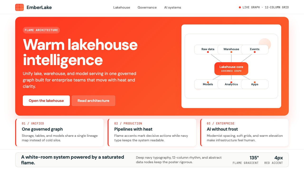 Databricks LakehouseWarm enterprise confidence. Flame red-orange gradients meet DM Sans and clean…温暖的企业信心:红橙火焰渐变配 DM Sans 与洁净数据图。
 Atlassian Jira BlueWarm enterprise teamwork. Saturated blue cards on cream make status feel huma…温暖的企业协作:奶油底上的饱和蓝卡片,让状态更有人味。
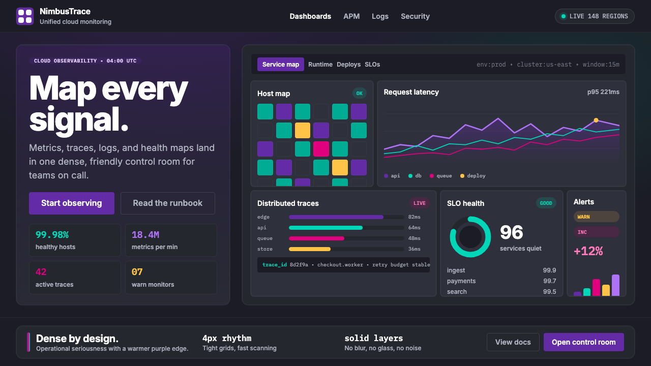 DatadogSerious telemetry, friendly pulse. Purple dark grids pack charts, badges, and…严肃监控也亲近:紫色暗网格塞满图表、徽章与追踪。
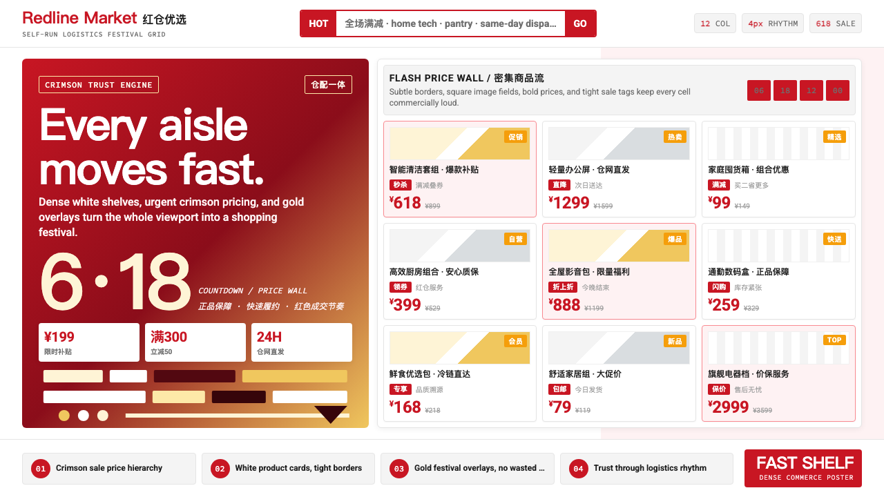 JD.com (京东)Urgency earns trust. Deep red prices pack a white 12-column grid with gold fe…急迫也可信:深红价格挤满白色12栏网格,金色大促点燃节奏。
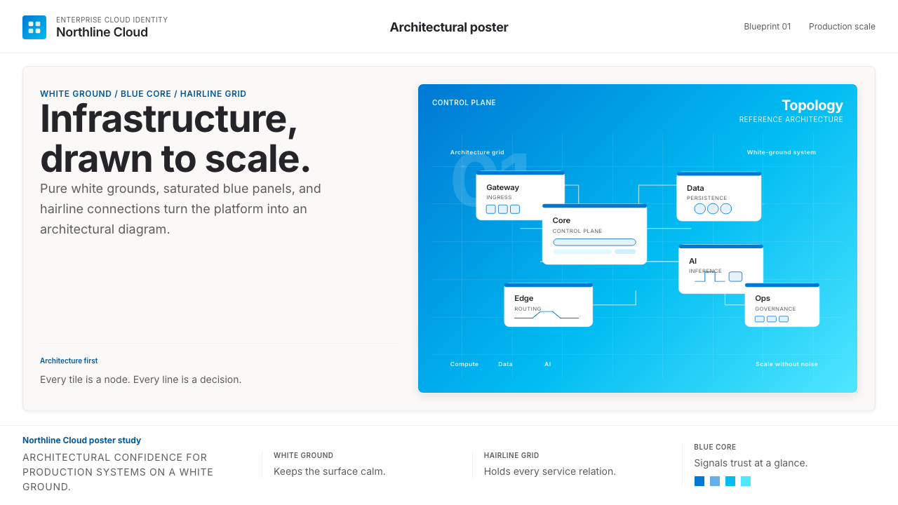 Microsoft AzureEnterprise calm, sharply diagrammed. White ground, saturated blue, hairline l…企业气质很稳。白底、饱和蓝和细线构成架构图。