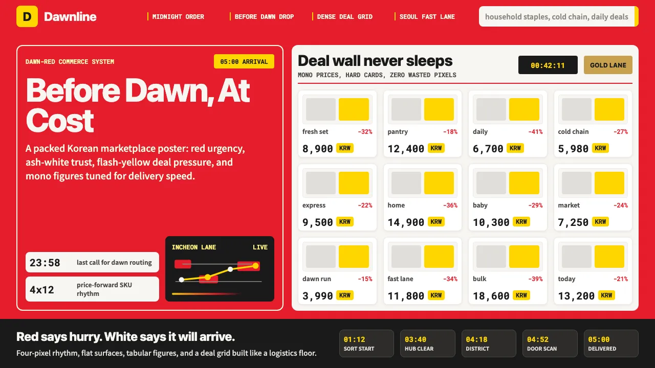
About Coupang Rocket Delivery
Coupang's Rocket Delivery identity is built on urgency and trust: rocket red dominates every touchpoint, from the branded carton on your doorstep at 5 AM to the persistent top-nav bar on mobile. The design system is dense, photographic, and price-forward — a visual language that communicates "order now, arrive before dawn" without a single wasted pixel.
- Origin
- South Korea, Seoul (Songpa-gu)
- Era
- 2010 founded; current visual identity 2018–present; NYSE listing March 2021
- Key figures
- Bom Kim · Tony Kim · Kil Hyung-jin · SoftBank Vision Fund
- Movements
- Korean e-commerce vertical-integration · dawn-shipping logistics design · mobile-first commerce UI
Coupang Rocket Delivery design spec
Colors
Background
Surface
Primary
Secondary
Accent
Text
Typography
PretendardHeadings
Noto Sans KRBody
Roboto MonoMono
Unlock for 1 credit
The other 11 sections — buttons, cards, spacing, motion, techniques and more — open once you unlock. Download the DESIGN.md or send it to your AI in one click. Unlock once, yours forever.
Sign up nowHave an account? Sign in
Styles similar to Coupang Rocket Delivery
Also inspired by brands & products, with a close feel.
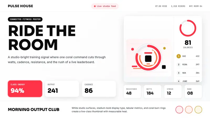 Peloton Fitness Coral (2020)Studio-bright urgency. Coral rings, Sora caps, and leaderboard grids drive the heat.
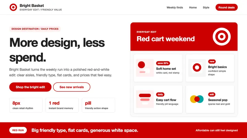 Target — Bullseye RedCheap-chic feels warm. Red bullseyes, pill CTAs, and white space make value look designed.
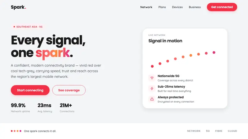 Singtel Modern BrandKeeps the red loudest on screen. Vivid Singtel red on cool tech-grey, with a gradient dot spark arc.
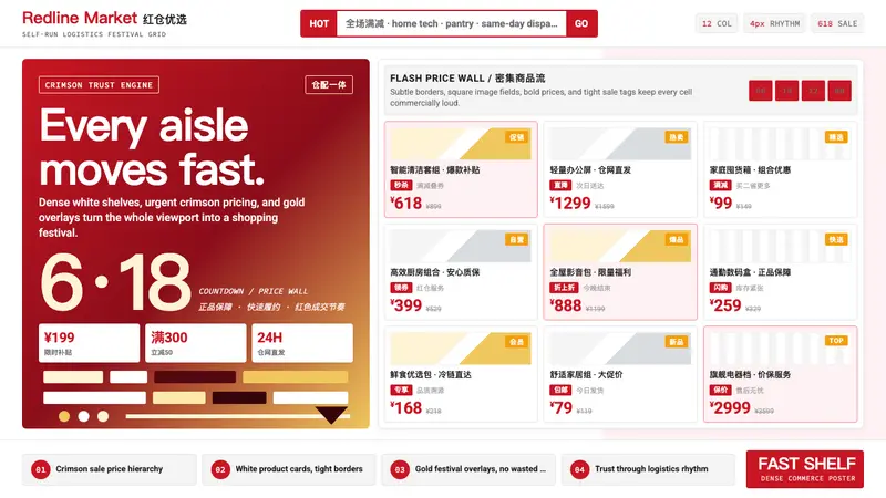 JD.com (京东)Urgency earns trust. Deep red prices pack a white 12-column grid with gold festival hits.