About Target — Bullseye Red
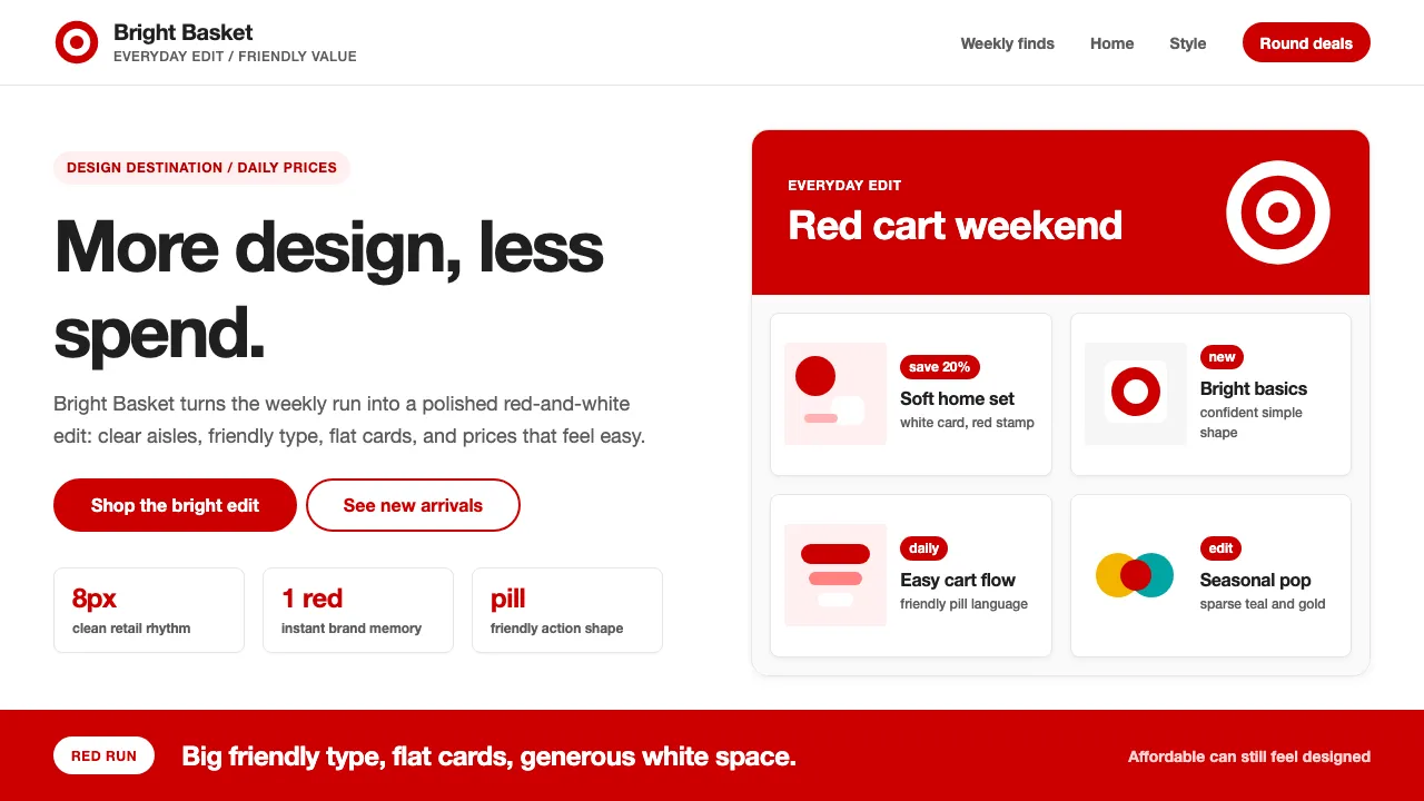
Target turned the American discount store into a design destination. Since John Geisse's concentric-circle Bullseye mark in 1968, the brand has paired a single unmistakable red with generous white space and friendly, approachable typography — proving that affordable doesn't mean ugly.
The visual system is radically simple: Target Red #CC0000 on white, pill-shaped buttons, lifestyle photography, and big confident type. Designer collaborations (Michael Graves, Isaac Mizrahi, Liberty of London) reinforced the "expect more, pay less" ethos that made Target the anti-Walmart.
- Origin
- Minneapolis, Minnesota, USA
- Era
- 1962 founded; Bullseye logo 1968; current visual ~2018–2024
- Key figures
- John Geisse · Robyn Waters · Brian Cornell · Wieden+Kennedy
- Movements
- American mass-market discount retail · Cheap-chic design democratization · Mass retail brand-design renaissance
Target — Bullseye Red design spec
Colors
Typography
The other 11 sections — buttons, cards, spacing, motion, techniques and more — open once you unlock. Download the DESIGN.md or send it to your AI in one click. Unlock once, yours forever.
Sign up nowStyles similar to Target — Bullseye Red
Also inspired by brands & products, with a close feel.
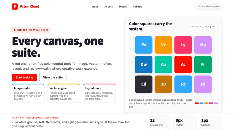 Adobe Creative CloudUnified, not uniform. Red anchor, white space, and saturated app tiles organize the suite.
 Gojek SuperappCity speed, ordered. Electric green tile grid turns rides, food, and pay into calm flow.
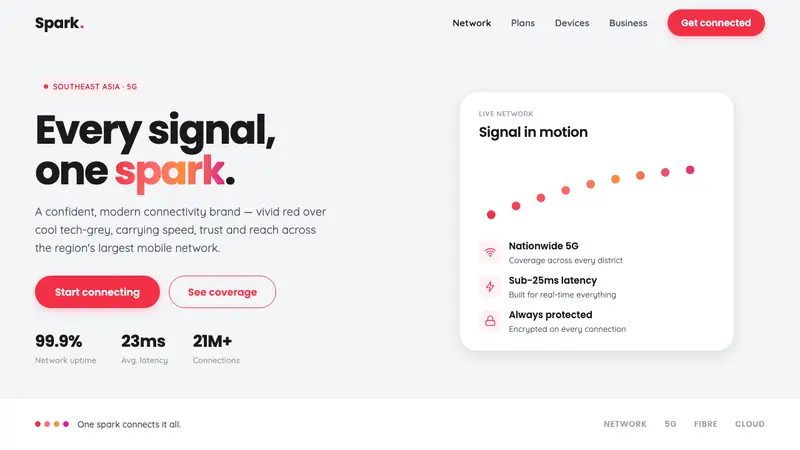 Singtel Modern BrandKeeps the red loudest on screen. Vivid Singtel red on cool tech-grey, with a gradient dot spark arc.
 Sentry 2023Debugging gets weird on purpose. Purple-pink gradients, Inter heft, and doodled bugs.