What is Target — Bullseye Red?什么是 Target — Bullseye Red?
Target proved that a single fearless red, an open white field, and a perfectly round bullseye could turn a discount store into America's most beloved design brand.Target用一抹无畏的红、大片留白和一个完美圆形靶心,将折扣零售店变成了美国最受喜爱的设计品牌。
Target — Bullseye Red in briefTarget — Bullseye Red 速览
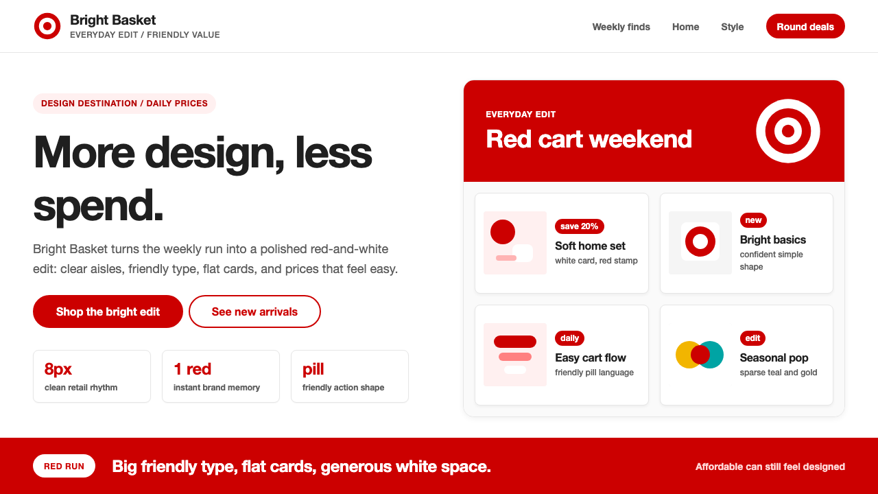
Target — Bullseye Red is the visual design system built around Target Corporation's iconic brand identity: a saturated, warm red paired with generous white space, approachable rounded typography, and lifestyle imagery that feels aspirational yet grounded. The system communicates that good design is not a luxury reserved for the wealthy — it is a right that belongs to every shopper pushing a cart through a big-box aisle.Target Bullseye Red是围绕塔吉特公司标志性品牌视觉所建立的设计系统:一种饱满而温暖的红色,搭配大面积留白、亲切的圆润字体,以及兼具向往感与生活气息的摄影图像。这套系统传递出一个信念——好的设计不是富人的专属,而是每一位推着购物车走进大卖场的顾客应有的权利。
At its core, the aesthetic is radically restrained. The dominant red reads as cheerful and confident rather than aggressive or alarming, anchoring every touchpoint from store signage to digital interfaces. White space is used with unusual generosity for a mass-market brand, giving the composition room to breathe and lending each visual element far more presence than its modest price point might suggest. The result is a look that feels simultaneously warm and polished.这套美学体系的核心是极度克制。主导性的红色读来欢快而自信,而非咄咄逼人,它锚定了从店铺标识到数字界面的每一个触点。留白的运用对大众零售品牌而言异乎寻常地慷慨,给构图留出呼吸空间,使每个视觉元素的存在感远超其价签所暗示的分量。最终呈现出一种既温暖又精致的观感。
Where most discount retail design piles on noise — competing promotional bursts, crowded grids, clashing color accents — Target's system practices discipline. Pill-shaped buttons, bold confident headline type, and clean product photography work together to signal that affordability and aesthetics are not opposites. The brand's famous designer collaborations made this argument concrete: the same visual system that carried a five-dollar spatula carried a Michael Graves kettle with equal elegance.大多数折扣零售设计充斥着噪音——竞相争夺注意力的促销爆炸标、拥挤的网格、冲突的色彩强调——而Target的系统恰恰奉行纪律。药丸形按钮、粗重自信的标题字体与干净的产品摄影协同作用,共同传递出一个信号:平价与美学并非对立。品牌著名的设计师联名合作将这一论点落到实处:同一套视觉系统,能以同等优雅承载一把五美元的锅铲,也能承载一把迈克尔·格雷夫斯设计的水壶。
See the Target — Bullseye Red design system查看 Target — Bullseye Red 完整设计系统
Where does Target — Bullseye Red come from?Target — Bullseye Red 从何而来?
Target opened its first store in Roseville, Minnesota, in 1962, founded by John Geisse as a value-oriented division of the Dayton Company. From the start, Geisse envisioned something different from the drab utilitarian discount retailers of the era — a store where the shopping environment itself would be part of the appeal. The ambition was modest in its early form, but it planted the seed of what would eventually become a systematic design philosophy.1962年,约翰·盖斯在明尼苏达州罗斯维尔开设了第一家Target门店,作为达顿公司旗下注重性价比的零售部门。从一开始,盖斯就设想做出与当时那些单调功利的折扣零售商截然不同的东西——一家让购物环境本身成为吸引力一部分的商店。这一抱负在早期形态上还颇为朴素,但它埋下了日后成长为系统性设计哲学的种子。
The bullseye mark arrived in 1968, when the corporation commissioned a concentric-circle logo that would become one of the most recognized brand symbols in American retail history. Simple, geometric, and inherently dynamic, the bullseye translated perfectly to storefront fascia, shopping bags, and, decades later, to app icons and social media avatars. Its pure circular form aligns the brand with precision and intention — the antithesis of the clearance-rack chaos it surrounded.靶心商标诞生于1968年,公司委托设计了一枚同心圆标志,它后来成为美国零售史上最具辨识度的品牌符号之一。简洁、几何、内在充满张力,靶心图形能完美适配门店外立面、购物袋,以及数十年后的应用图标和社交媒体头像。纯粹的圆形将品牌与精准和意图联结在一起——恰恰是它所身处的那片清仓货架混乱景象的反面。
The transformation from mere discount retailer to genuine design destination accelerated in the 1990s and early 2000s under the creative direction of Robyn Waters, Target's trend and product director. Waters initiated the first wave of designer collaborations — bringing architects, industrial designers, and fashion names into a mass-retail context that had never before taken such partnerships seriously. Michael Graves designed a celebrated line of housewares beginning in 1999. Isaac Mizrahi brought fashion-forward clothing to the chain. Liberty of London contributed print textiles. Each collaboration reinforced the central brand promise: you can expect design intelligence here, at prices you can actually afford.从普通折扣零售商到真正设计目的地的蜕变,在1990年代和2000年代初因创意总监罗宾·沃特斯的推动而加速。沃特斯是Target的趋势与产品总监,她发起了第一波设计师联名浪潮——将建筑师、工业设计师和时装名人引入一个此前从未认真对待此类合作的大众零售语境。迈克尔·格雷夫斯从1999年起设计了广受好评的家居系列;艾萨克·米兹拉希为连锁店带来时尚前卫的服装;伦敦Liberty百货贡献了印花织物。每次合作都在强化品牌的核心承诺:在这里,你能获得设计智识,而价格是你真正负担得起的。
The visual language that now defines the brand consolidated around 2018 to 2024, shaped in part by campaigns developed with the advertising agency Wieden+Kennedy. Under CEO Brian Cornell, who took the helm in 2014, Target made design consistency a strategic priority alongside its physical store renovation program. The digital expansion of the brand — apps, website, self-checkout interfaces — demanded that the bullseye red system perform equally well on screens of every size and at every fidelity. The result is a design system mature enough to remain coherent from a highway billboard to a mobile push notification thumbnail.如今定义这个品牌的视觉语言,大约在2018年至2024年间趋于成熟,部分由广告代理商Wieden+Kennedy的系列战役塑造而成。在2014年接任CEO的布莱恩·康奈尔领导下,Target将设计一致性与实体门店翻新计划共同列为战略重点。品牌的数字化扩张——应用、网站、自助结账界面——要求靶心红系统在每种尺寸、每种清晰度的屏幕上都同样出色。最终的成果是一套足够成熟的设计系统,从高速公路广告牌到移动端推送通知的缩略图,都能保持连贯一致。
What defines the Target — Bullseye Red look?Target — Bullseye Red 的视觉特征是什么?
The Anchor Red锚定色:靶心红
The defining element of the system is a single, unmistakable warm red — saturated enough to command attention at scale, yet balanced enough to feel approachable rather than alarming. It operates as the sole chromatic anchor across every medium: on white backgrounds it reads as celebratory; on product photography it acts as a frame; on digital interfaces it signals interactivity. The palette is deliberately monochromatic — there is no secondary accent color jockeying for attention.这套系统的核心是一种独一无二的暖红色——饱和度足以在大尺幅中令人一眼注目,却又足够平衡,读来亲切而非刺眼。它在所有媒介中作为唯一的色彩锚点发挥作用:在白色背景上,它传递喜悦感;在产品摄影中,它充当框架;在数字界面上,它标示可交互性。整个色板刻意保持单色调——没有第二种强调色与之争夺注意力。
White Space as Strategy留白作为战略
For a brand that sells everything from groceries to furniture, the consistent deployment of generous white space is a remarkable act of restraint. White space separates Target's visual language from the cluttered tradition of promotional retail. Rather than filling every centimeter with product or price information, the layouts breathe — and that breathing room is precisely what elevates the perceived quality of whatever occupies it.对于一个从食品杂货到家具无所不卖的品牌而言,始终如一地使用大面积留白是一种了不起的克制行为。留白将Target的视觉语言与拥挤混乱的促销零售传统区隔开来。版面不是用产品或价格信息填满每一寸空间,而是让它呼吸——正是这种呼吸空间,提升了其中任何占位元素的感知品质。
Pill-Shaped UI Forms药丸形界面元素
Pill-shaped buttons, tags, and containers are a signature of the brand's interface vocabulary. The rounded rectangle — midway between the full circle of the bullseye and the hard rectangle of a grid block — reads as friendly and approachable, softening what might otherwise be a clinical red-and-white scheme. Applied consistently to calls to action, category pills, and price badges, this form language gives the system warmth without resorting to ornament.药丸形按钮、标签与容器是品牌界面语汇的标志性元素。圆角矩形——介于靶心的完整圆形与网格块的硬边矩形之间——读来友好而易于亲近,为原本可能显得临床化的红白配色方案增添了柔和感。这种形态语言被一致地应用于行动号召、分类标签和价格徽章,赋予整个系统温度,而不必借助任何装饰。
Bold Headline Typography粗重的标题排印
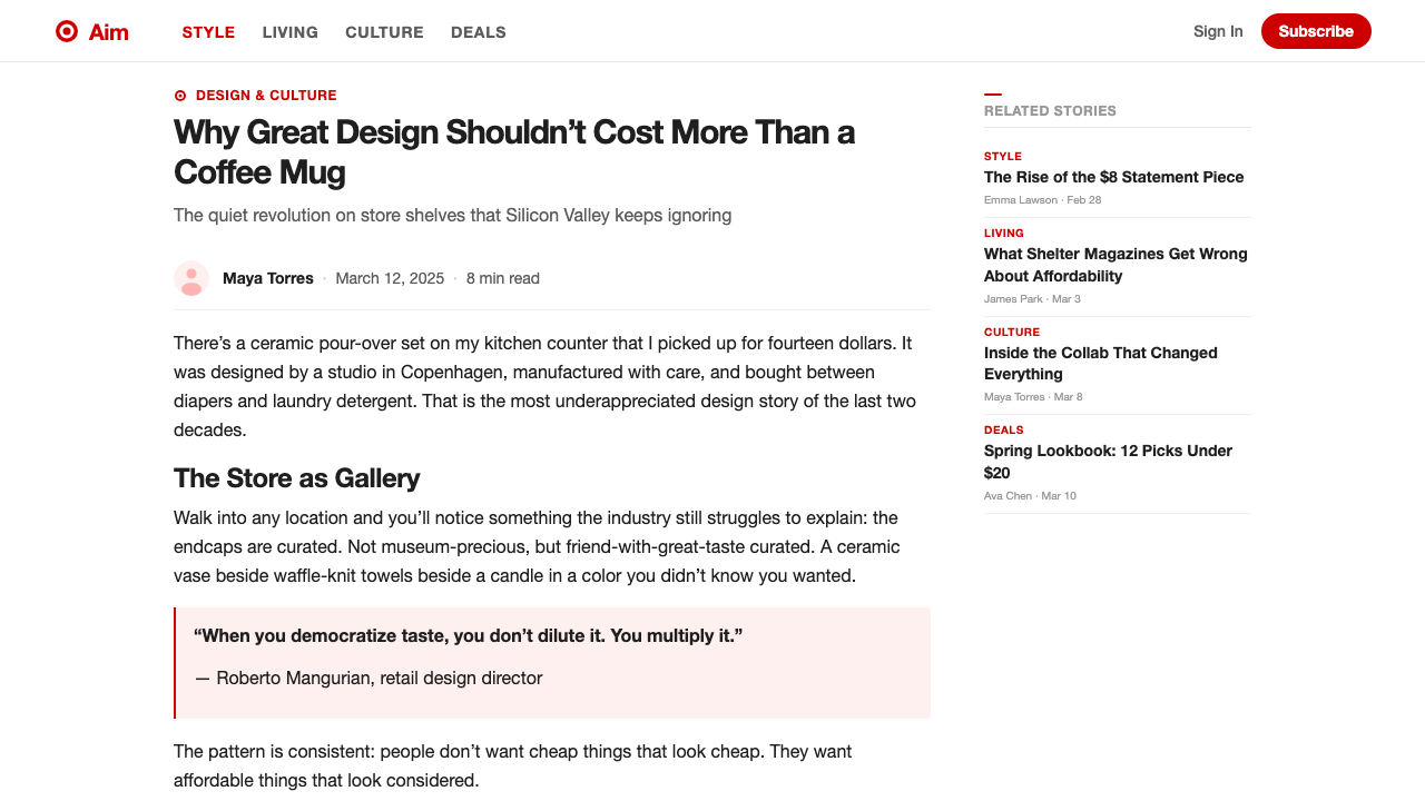
Headlines in the Target system are set with exceptional confidence — heavy weight, generous size, and short line lengths that allow each line to land with impact. The typefaces are warm and legible rather than geometric and cold: slightly humanist in their proportions, with a friendliness that complements the brand's approachable positioning. Hierarchy is clear and fast to read, with body text staying quiet so that the primary message lands first.Target系统中的标题排印充满自信——字重厚重,字号慷慨,短行长使每一行都能形成冲击力。所选字体温暖可读,而非几何冷峻:比例上略带人文主义气息,其亲切感与品牌平易近人的定位相辅相成。层级清晰,阅读迅速,正文保持低调,让主要信息优先抵达读者眼前。
Lifestyle Photography with Red Accents带红色点缀的生活方式摄影
Product and campaign photography in the system is bright, natural-light, and styled to look achievable — real-looking kitchens, bedrooms, and outdoor spaces populated with aspirational but not intimidating choices. Red appears within the photographs themselves as a recurring accent: a cushion, a pan, a shopping bag, a child's jacket. This technique stitches the brand color directly into the narrative world of the image rather than treating photography and branding as separate layers.系统中的产品与活动摄影明亮、采用自然光,风格化地呈现出一种触手可及的感觉——看起来真实的厨房、卧室和户外空间,配以令人向往却不令人生畏的选择。红色作为反复出现的点缀色融入照片本身:一只靠垫、一口煎锅、一个购物袋、一件儿童夹克。这种手法将品牌色直接编织进图像的叙事世界,而非将摄影与品牌形象视为彼此独立的图层。
The Bullseye as Geometric Anchor靶心作为几何锚点
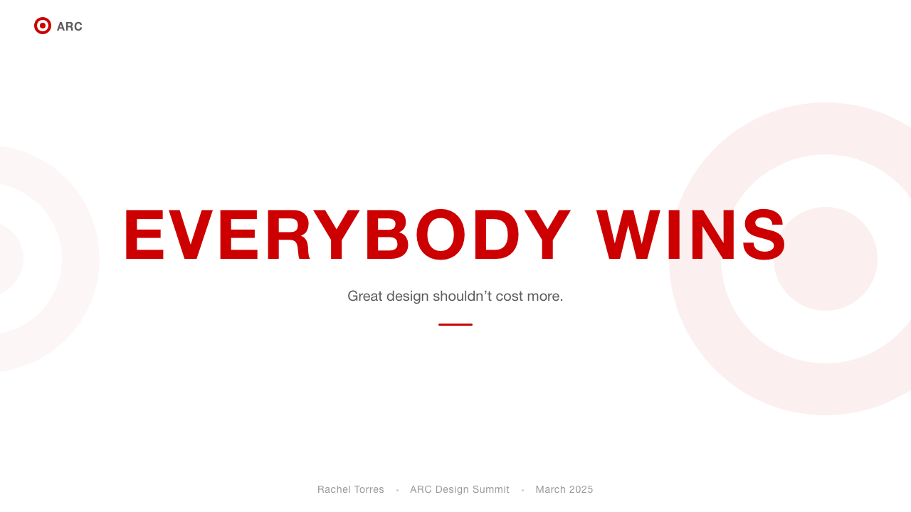
The concentric-circle bullseye is not merely a logo — it is a compositional device. When used as a background element, a crop guide, or a framing motif, it introduces a sense of focus and intentionality that distinguishes Target campaigns from generic retail imagery. The circle's perfect geometry implies precision, and its target-like nature implies that the brand knows exactly what it is aiming for. Even in layouts where the logo is absent, the circular logic — cropped round images, circular badges — persists.同心圆靶心不仅仅是一个标志——它是一种构图装置。当被用作背景元素、裁切引导或框架母题时,它引入了一种专注感和意图感,使Target的活动视觉区别于普通的零售图像。圆形的完美几何形态暗示精准,而靶心的射击意涵暗示品牌对自己的目标了然于心。即便在标志缺席的版面中,这种圆形逻辑——圆形裁切图像、圆形徽章——依然延续。
Warmth Without Ornamentation无装饰的温度
Perhaps the most disciplined achievement of the Target visual system is that it feels warm — inviting, human, approachable — without resorting to decorative ornament, sentimental illustration, or textural embellishment. The warmth comes entirely from the color temperature of the red, the humanist proportions of the type, and the lived-in quality of the photography. No additional design elements are needed to convey friendliness; the fundamental choices carry that message without any decorative tax.Target视觉系统最有纪律的成就,或许在于它在不借助装饰性元素、感伤插图或质感点缀的情况下,呈现出温暖——邀请、人性化、易于亲近的感觉。这种温度完全来自红色的色温、字体的人文主义比例,以及摄影图像所呈现的生活质感。传递亲切感无需额外的设计元素;基础性的设计选择本身已承载了这一信息,无需任何装饰代价。
See the Target — Bullseye Red design system查看 Target — Bullseye Red 完整设计系统
Who shaped Target — Bullseye Red?谁塑造了 Target — Bullseye Red?
Geisse founded the Target division within the Dayton Company in 1962 and conceived of it from the outset as a value retailer with genuine aesthetic ambitions — not merely a warehouse for cheap goods. His foundational vision that affordable shopping could be a pleasurable, well-designed experience set the cultural trajectory that the brand has followed for more than six decades. The bullseye mark commissioned under his leadership in 1968 remains, with minimal revision, the centerpiece of one of America's most recognized brand identities.盖斯于1962年在达顿公司内创立了Target事业部,并从一开始就将其构想为一个拥有真正美学抱负的性价比零售商,而非仅仅是廉价商品的仓库。他关于平价购物可以是一种令人愉悦、设计精良的体验的创始愿景,奠定了这个品牌此后超过六十年所遵循的文化轨迹。1968年在他的领导下委托创作的靶心商标,经历极少修改,至今仍是美国最具辨识度品牌视觉形象的核心。
As Target's vice president of trend, design, and product development through the 1990s and into the early 2000s, Waters was the chief architect of the brand's transformation into a design destination. She championed the first designer collaborations, identifying undervalued creative talent willing to work at mass-market scale and price points. Her philosophy — that trends do not belong exclusively to luxury retail — democratized access to design-forward products and built the cultural credibility that made Target a media and cultural phenomenon beyond its retail category.整个1990年代至2000年代初,沃特斯担任Target趋势、设计与产品开发副总裁,是品牌蜕变为设计目的地的主要设计师。她力主推动了第一批设计师联名合作,发掘出愿意在大众市场规模和价位上工作的被低估的创意人才。她的理念——潮流不是奢侈品零售的专属——使设计前沿产品的获取途径更加平民化,并建立了文化公信力,使Target成为超越零售品类的媒体与文化现象。
Graves was among the first major architects and designers to collaborate with Target, launching a housewares collection in 1999 that brought postmodern design sensibility to mass-market kitchenware. His teakettles, toasters, and kitchen accessories sold in the millions and proved that design-literate consumers existed at every income level — they simply had not been offered well-designed options at accessible prices. The Graves partnership became the proof of concept for Target's entire designer collaboration strategy.格雷夫斯是最早与Target合作的重要建筑师和设计师之一,1999年推出的家居系列将后现代设计感带入了大众市场的厨房用品领域。他设计的水壶、烤面包机和厨房配件销量以百万计,证明了有设计素养的消费者存在于每一个收入层次——他们只是从未被提供过在实惠价格下设计精良的选择。格雷夫斯的合作成为Target整个设计师联名战略的概念验证。
The Portland-based advertising agency shaped the tone and visual language of Target's marketing campaigns across multiple decades, helping to define the brand's voice as witty, warm, and quietly confident. Their work demonstrated that the bullseye red system could carry genuine narrative and emotional weight, not simply promotional mechanics. W+K's campaigns treated Target shoppers as culturally aware adults — an unusually respectful posture for mass-retail advertising — and this tone of address became inseparable from the brand's design identity.这家总部位于波特兰的广告代理商在数十年间塑造了Target营销活动的基调与视觉语言,帮助定义了品牌机智、温暖而静静自信的声音。他们的工作证明,靶心红系统能够承载真正的叙事与情感重量,而不仅仅是促销机制。Wieden+Kennedy的活动将Target购物者视为有文化意识的成年人——这在大众零售广告中是一种不同寻常的尊重姿态——而这种表达语调已与品牌的设计身份密不可分。
Cornell became Target's CEO in 2014 and oversaw a comprehensive brand and operational renewal that made design consistency a company-wide discipline. Under his leadership, Target accelerated its physical store redesign program, invested in owned-brand product lines with genuine design quality, and extended the visual system coherently into digital commerce. Cornell's tenure demonstrated that the bullseye red design language is not merely a marketing choice but a strategic platform — one capable of supporting a multi-channel retail business across radically different customer touchpoints.康奈尔于2014年出任Target CEO,主持了全面的品牌与运营复兴,将设计一致性确立为全公司范围内的纪律。在他的领导下,Target加速了实体门店的重新设计计划,投资于具有真实设计品质的自有品牌产品线,并将视觉系统连贯地延伸至数字电商。康奈尔的任期证明,靶心红设计语言不仅仅是一种营销选择,更是一个战略平台——一个能够在截然不同的客户触点上支撑多渠道零售业务的平台。
How do you use Target — Bullseye Red today?今天怎么用 Target — Bullseye Red?
Applying the Target — Bullseye Red design language to your own work requires understanding that its apparent simplicity is the result of careful discipline, not the absence of decisions. The system works because every element reinforces the same feeling: confidence without arrogance, warmth without clutter, quality without pretension. Before adding any element, ask whether it strengthens or dilutes that feeling.将Target Bullseye Red设计语言应用于自己的工作,需要理解它表面上的简洁是严格纪律的产物,而非决策的缺失。这套系统之所以有效,是因为每个元素都在强化同一种感觉:自信而不傲慢,温暖而不杂乱,品质而不矫饰。在添加任何元素之前,先问自己:这是在强化还是稀释那种感觉?
For presentation decks, the system delivers maximum impact on cover slides: a single large circle or bullseye shape in the signature red against a white ground, with a headline set in heavy type at confident scale. The circle need not be an exact replica of the Target logo — any bold circular form activates the same compositional logic. Content slides should maintain the white-space discipline, using the red exclusively for key data points, highlighted metrics, or section-opening accents. On data slides, charts and graphs take on the role of geometric forms: bars and segments colored in the red-and-white palette, with neutral gray available for secondary data series. The system's confidence translates directly to authoritative data presentation without requiring decorative scaffolding.对于演示文稿,这套系统在封面页上能产生最大冲击力:白色底面上一个大圆形或靶心形状以标志性红色呈现,标题以粗重字体自信地大尺寸排布。圆形不必是Target标志的精确复制——任何大胆的圆形都能激活同样的构图逻辑。内容页应保持留白纪律,将红色仅用于关键数据点、高亮指标或章节开篇强调。数据页上,图表和图形承担起几何形态的角色:柱条和扇区以红白色板着色,中性灰色可用于次要数据系列。这套系统的自信感直接转化为权威的数据呈现,无需任何装饰性脚手架。
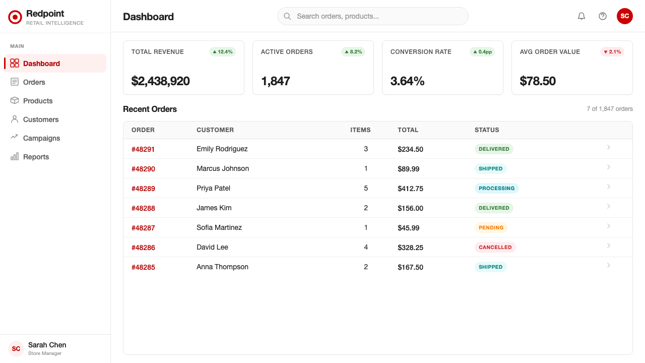
For web interfaces and dashboards, the Bullseye Red system is especially powerful on pages where action and decision are the primary user goal. Pricing pages benefit from the system's natural hierarchy: a dominant red tier card reads as recommended or featured, while white-background alternatives recede naturally. Navigation and interactive elements — buttons, tabs, toggles — should carry the red consistently so that the eye always knows where action lives. For information-dense dashboards, the white background and limited color palette reduce cognitive load dramatically; red should appear only on values that require immediate attention, such as alerts or primary KPIs, leaving the majority of the interface neutral to let those signals stand out.对于网页界面和仪表板,Bullseye Red系统在以行动和决策为主要用户目标的页面上尤为强大。定价页面得益于系统天然的层级感:一张主导性的红色产品卡读来像是「推荐」或「精选」,白色背景的替代选项则自然退至次位。导航和交互元素——按钮、标签页、开关——应一致地使用红色,使眼睛始终知道行动入口在哪里。对于信息密集的仪表板,白色背景和有限的色彩范围大幅降低了认知负荷;红色只应出现在需要即时关注的数值上,如警示或主要KPI,其余大部分界面保持中性,让这些信号得以凸显。
For editorial and marketing applications, the style rewards bold compositional thinking. Hero sections work best when the red occupies a substantial area — not a stripe or a small badge, but a ground that images or type can sit against. Editorial layouts benefit from a clear typographic hierarchy: a very large primary headline, a medium subhead, and small body text set in a readable width, with the red reserved for pull quotes, section labels, or key statistics. Marketing materials — posters, event graphics, social cards — can lean into the bullseye motif as a compositional device, using circular crops or circular overlays to add brand-aligned focus to photographic content. The pill shape from the brand's button vocabulary also translates well to labels, tags, and promotional badges in offline contexts.对于编辑和营销应用,这种风格奖励大胆的构图思维。英雄区域在红色占据大面积区域时效果最佳——不是一条色带或一个小徽章,而是能让图像或文字置于其上的底色。编辑版面受益于清晰的排印层级:一个极大的主标题、一个中等副标题,以及在舒适行宽内排布的小正文,红色保留给引用语、章节标签或关键数据。营销物料——海报、活动图形、社交卡片——可以借助靶心母题作为构图装置,使用圆形裁切或圆形叠加为摄影内容增添品牌一致的焦点感。品牌按钮语汇中的药丸形也能在线下场景的标签、标识和促销徽章中良好适配。
A common mistake when working with this design system is treating the red as one color among several rather than the sole chromatic statement. Adding a second accent color — teal for data, orange for warnings, purple for categories — immediately dilutes the system's power and makes the interface feel generic. Similarly, deploying the red at small scale for decorative purposes rather than reserving it for meaningful signals trains the eye to ignore it, undermining the very hierarchy the system is built to create. The discipline of using red sparingly and purposefully is what makes every instance of it feel intentional. When in doubt, add more white space rather than adding more color.使用这套设计系统时最常见的错误,是将红色视为众多色彩之一,而非唯一的色彩声明。添加第二种强调色——用蓝绿色标示数据、用橙色标示警告、用紫色标示分类——会立即稀释系统的力量,使界面显得普通。同样,将红色小面积地用于装饰目的,而非将其保留给有意义的信号,会训练眼睛忽视它,从而破坏这套系统赖以建立的层级感。克制而有目的地使用红色,才能使它的每一次出现都显得有意为之。当你不确定时,宁可增加留白,也不要增加色彩。
See the Target — Bullseye Red design system查看 Target — Bullseye Red 完整设计系统
Target — Bullseye Red — FAQTarget — Bullseye Red · 常见问题
Does this style only work in red and white, or can I introduce other colors?这种风格只能用红白两色,还是可以引入其他颜色?
The system's power comes from its chromatic restraint — the single warm red against white is the entire palette for a reason. You can introduce a neutral such as a warm light gray or a very pale warm tone for background differentiation, and dark charcoal for secondary text is often preferable to pure black. However, introducing a true second accent color — any hue with meaningful saturation — breaks the hierarchy that makes the red legible as a signal. If your content genuinely requires a second signal color, treat it as a subdued, lower-saturation variant and use it only for secondary states, never competing with the primary red.这套系统的力量来自于它的色彩克制——单一暖红色对白色的组合是整个色板,这是有原因的。你可以引入暖浅灰或非常淡的暖色调用于背景区分,深炭色用于次要文字通常也比纯黑更好。然而,引入真正的第二种强调色——任何具有明显饱和度的色相——都会打破使红色作为信号可读的层级感。如果你的内容确实需要第二种信号色,将其处理为低饱和度的次级变体,仅用于次要状态,绝不与主红色竞争。
How do I apply the style without it looking like a Target advertisement?如何应用这种风格而不让它看起来像Target的广告?
The key is to use the underlying design principles rather than the specific brand marks. Avoid the literal bullseye logo and the specific red that is uniquely associated with Target. Instead, apply the systemic logic: one dominant warm color on white, generous negative space, confident headline type, pill-shaped interactive elements, and lifestyle photography with color accents that echo the primary hue. At that level of abstraction, the design language reads as warm and confident retail-adjacent design — not as a brand appropriation. The principles are far more transferable than the specific marks.关键在于使用底层设计原则,而非特定的品牌标记。避免使用字面上的靶心标志和Target专属的特定红色。转而应用系统性逻辑:一种主导的暖色调对白色,慷慨的负空间,自信的标题字体,药丸形交互元素,以及带有呼应主色调的色彩点缀的生活方式摄影。在这种抽象层面上,设计语言读来是温暖而自信的零售相邻设计——而非品牌挪用。这些原则的可移植性远远大于特定的品牌标记。
Is this system appropriate for premium or luxury products?这套系统适合高端或奢侈品类吗?
With care, yes — but it requires a significant shift in proportion and restraint. Luxury contexts call for even more white space, smaller and lighter headline type, photography with more editorial distance, and the warm red used at far smaller scale and lower frequency. The Bullseye Red system in its standard form signals accessibility and warmth, which are values that work against traditional luxury positioning. If you want the clean confidence of the system without the mass-market friendliness, pull back the saturation of the dominant color, increase the size of negative space areas dramatically, and reduce the red to a single small but precise accent — more like a wax seal than a storefront.谨慎使用的话可以——但这需要在比例和克制程度上做出显著调整。奢侈语境需要更大面积的留白、更小更轻的标题字体、拍摄距离更远的编辑风格摄影,以及规模更小、频率更低地使用暖红色。Bullseye Red系统的标准形态传递的是亲近感和温度,这些价值与传统奢侈品定位相悖。如果你想要这套系统的干净自信,而不要大众市场的亲切感,那就降低主导色的饱和度,大幅增加负空间面积,并将红色缩减为单一小而精准的点缀——更接近一枚蜡印,而非一面门店外立面。
How does this design system work on dark backgrounds?这套设计系统在深色背景上效果如何?
The system is fundamentally a light-ground design language — white or very light backgrounds are where it performs best and most authentically. A dark inversion is possible, particularly for special contexts like app dark mode or nighttime event visuals, but the warm red can shift in character against a dark ground, sometimes reading as richer and more dramatic, sometimes as less welcoming. On a near-black background, the red and white roles essentially invert: white becomes the text color and structural element, and the red retreats to accent use only. The pill shapes and bold typography translate well to dark versions, but the sense of open spaciousness that white space creates is harder to replicate — negative space on dark feels more dramatic and less inviting.这套系统从根本上是一种浅色底面的设计语言——白色或非常浅的背景是它表现最佳、最为原汁原味的环境。深色反转版本是可能的,尤其适用于应用深色模式或夜间活动视觉等特殊场景,但暖红色在深色底面上的性格可能会发生变化,有时读来更丰富戏剧化,有时则减少了亲切感。在接近黑色的背景上,红白两色的角色基本对调:白色成为文字颜色和结构性元素,红色退至仅作点缀使用。药丸形和粗重字体能够良好适配深色版本,但白色留白所创造的开阔空旷感则更难复现——深色背景上的负空间感觉更具戏剧性,而不那么亲切。
What kinds of projects benefit most from this design language?哪类项目最能从这种设计语言中获益?
The Bullseye Red system performs best in contexts where approachability, clarity, and action-orientation are primary values. Consumer-facing e-commerce and retail interfaces, promotional landing pages, event programs, lifestyle product catalogues, and brand presentations aimed at broad audiences all benefit from its confident warmth. It is well-suited to projects that need to feel trustworthy and accessible without feeling corporate or cold. Where the system struggles is in contexts that require gravitas, complexity, or cultural specificity — medical or legal documents, highly technical dashboards serving expert users, or any context where the brand must position itself above the mass market. In those cases, the friendliness that is the system's greatest strength can work against the required tone.Bullseye Red系统在亲近感、清晰度和行动导向是主要价值的场景中表现最佳。面向消费者的电商和零售界面、促销落地页、活动节目单、生活方式产品目录,以及面向广泛受众的品牌展示,都能从其自信的温度中获益。它非常适合那些需要让人感到可信赖、易于亲近,而又不流于企业化或冷漠的项目。这套系统力不从心的地方,是需要庄重感、复杂性或文化特殊性的场景——医疗或法律文件、服务于专业用户的高度技术性仪表板,或任何品牌需要将自身定位于大众市场之上的场景。在这些情况下,系统最大的优势——亲切感——反而会与所需的语调背道而驰。
Related design styles相关设计风格
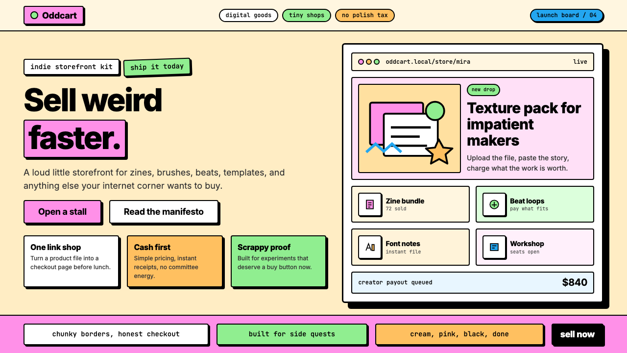 Gumroad CreatorGeoCities by way of Memphis. Hot pink, chunky black borders, hard offset shad…孟菲斯遇上 GeoCities:亮粉、奶油底、粗黑边框、硬阴影——刻意天真粗犷…
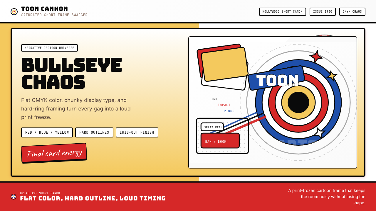 Looney Tunes (Warner Bros.)Pure cartoon chaos. Bull's-eye rings, Bungee type, and red-blue-yellow blocks.纯卡通混乱。牛眼环、粗壮标题字与红蓝黄块面。
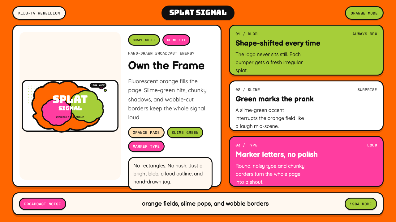 Nickelodeon Orange Splat (1984)Kids own the screen. Orange fields, slime-green pops, and wobble borders do t…孩子掌控屏幕。橙底、史莱姆绿点缀和歪斜边框一起喊话。
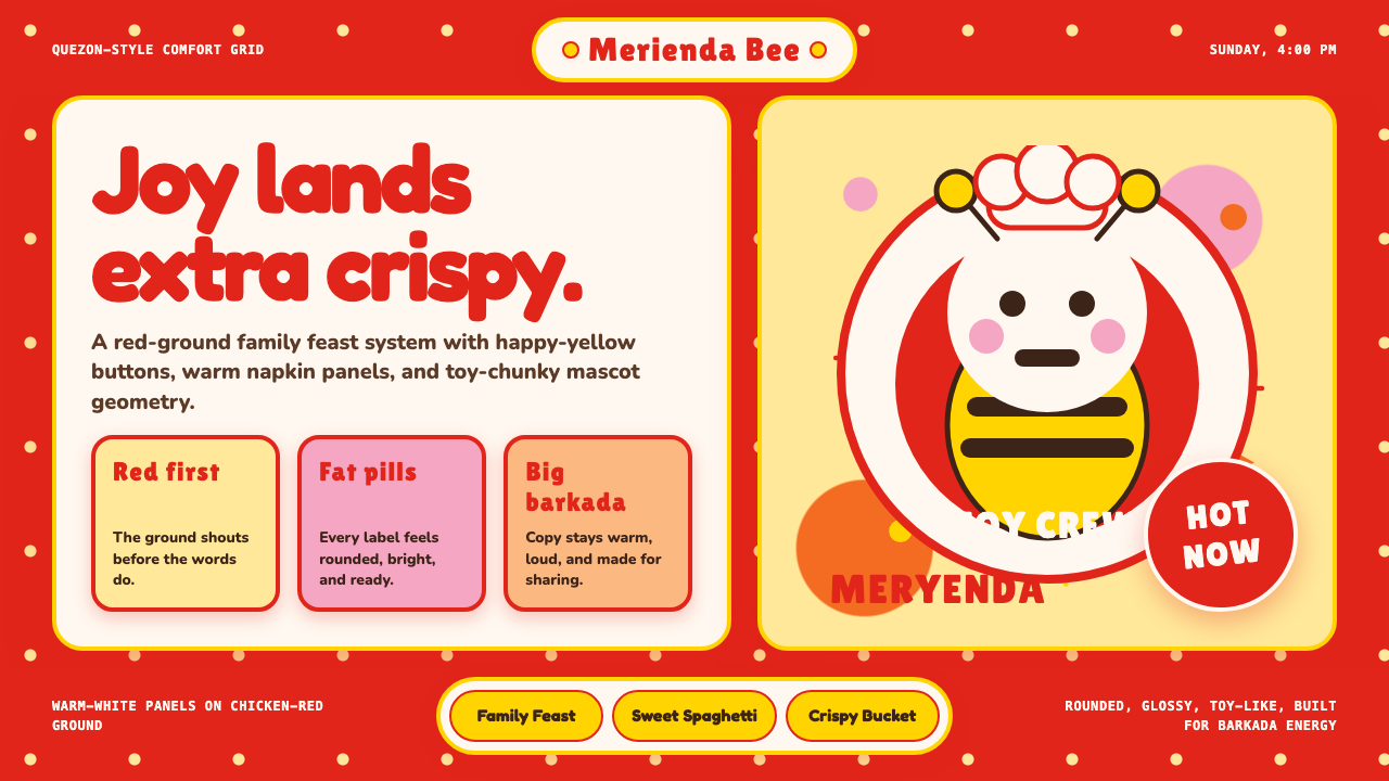 Philippines Jollibee Bee MascotJoy shouts first. Red ground, Fredoka curves, yellow pills, chunky grid.欢乐先喊出来:红底、Fredoka圆字、黄色胶囊与厚实网格。
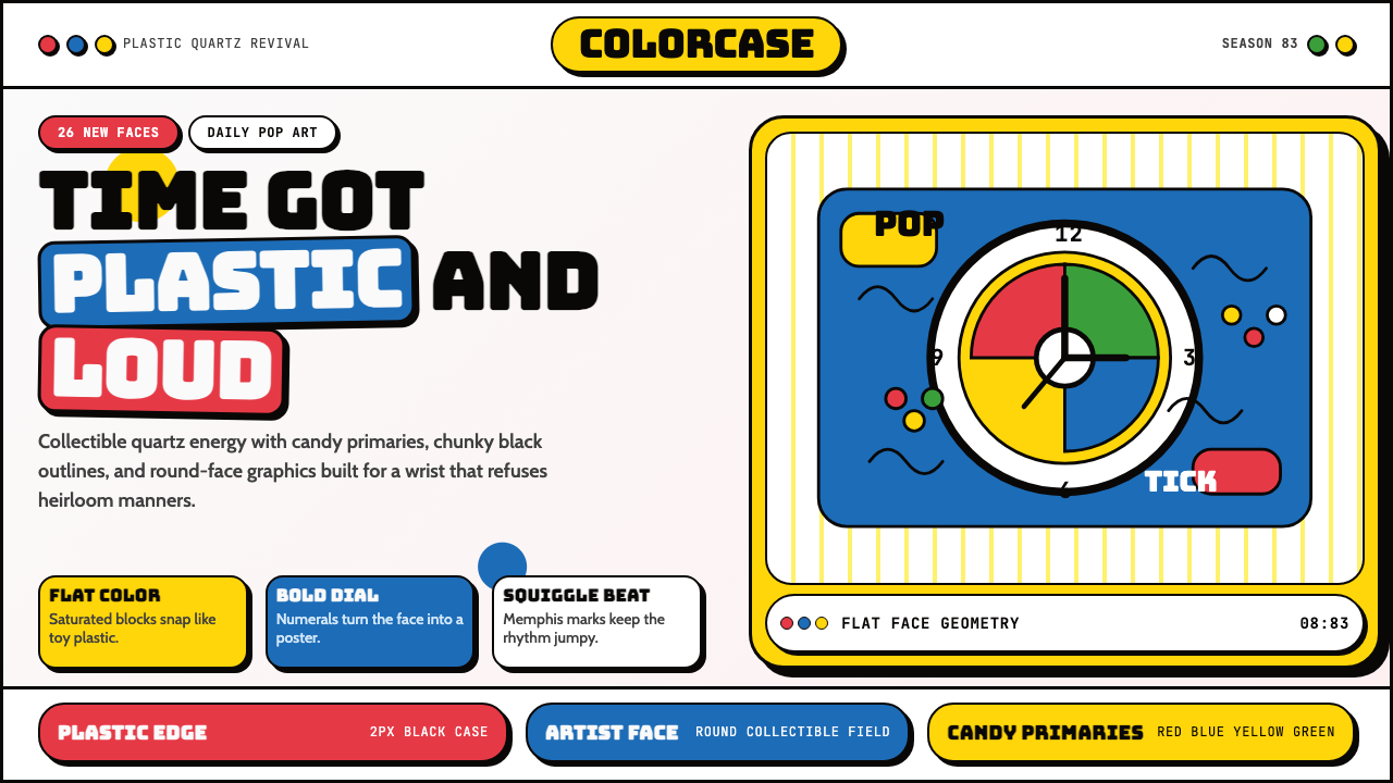 Swatch Watch (1983)Pop plastic optimism. Bungee type, candy primaries, round dials and squiggles…塑料乐观主义:Bungee 字体、糖果三原色、圆表盘与波浪线一起跳响。
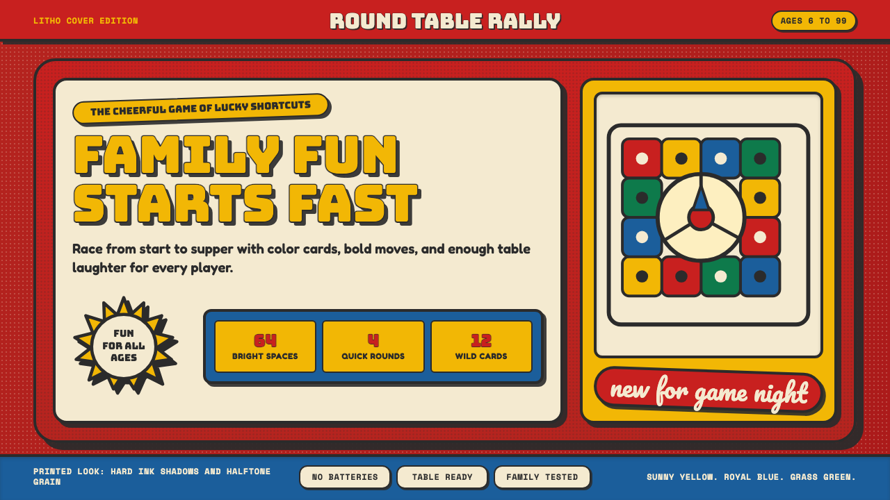 Vintage Board Game BoxShelf appeal shouts. Fire-engine red, Bungee lockups, yellow bursts, and ink…货架感在喊:消防红底、Bungee 标题、黄爆炸章与硬黑影。