What is Gumroad Creator?什么是 Gumroad Creator?
Hot pink on cream, chunky black borders, hard offset shadows — Gumroad made neo-brutalism the unofficial uniform of the indie creator economy.亮粉配奶油、粗黑边框、硬朗偏移阴影——Gumroad 让新野蛮主义成为独立创作者经济的非官方制服。
Gumroad Creator in briefGumroad Creator 速览
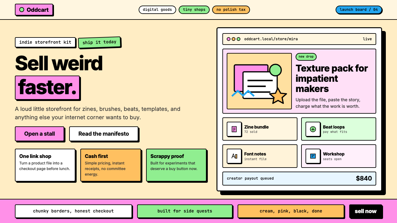
Gumroad Creator is the visual design language pioneered by the indie-creator commerce platform Gumroad: a self-conscious neo-brutalist aesthetic built on hot pink and cream grounds, thick black borders that ring every card and button, and hard-edged offset shadows that give flat elements a punchy, almost hand-stamped presence. It is deliberately loud where mainstream SaaS design is quiet, deliberately simple where Silicon Valley polish is complex.Gumroad Creator 是独立创作者商务平台 Gumroad 开创的视觉设计语言:一套自觉的新野蛮主义美学,以亮粉色和奶油底色为基底,粗黑边框包围每一张卡片和按钮,硬边偏移阴影赋予平面元素一种力道十足、近乎手工盖章的存在感。它在主流 SaaS 设计安静的地方刻意喧嚣,在硅谷精致感复杂的地方刻意简单。
The style draws on two unlikely ancestors — the Memphis Group's maximalist joy in bold color and flat pattern, and the raw sincerity of 1990s personal web pages on GeoCities. Both sources were considered naive or low-status at the time; Gumroad Creator rehabilitates that naivety as a virtue, arguing visually that authenticity and personality matter more than refinement. The result is a design system that feels like it was made by a person, not by a committee, which is precisely the point for a platform built around individual creators.这种风格源自两个意想不到的祖先——孟菲斯设计小组对粗犷色彩与平面图案的极致热爱,以及 GeoCities 时代 1990 年代个人主页的原生真诚。两者在当时都被视为天真或低档;Gumroad Creator 将这种天真重新定义为美德,在视觉上主张:真实个性比精致打磨更重要。对于一个围绕个体创作者构建的平台而言,这套设计系统感觉像是由一个真实的人而非一个委员会创作的——这正是其核心所在。
At its core, Gumroad Creator is a grid-based, high-contrast system. Flat fills replace gradients everywhere. Square or barely-rounded corners signal directness. The palette is narrow and unapologetic. Type is bold, chunky, and stacked simply. Hand-drawn doodle accents appear as decoration — a rare concession to playfulness that reinforces the human-made quality of the whole. Nothing whispers; everything announces.从本质上看,Gumroad Creator 是一套基于网格、高对比度的系统。平面色填充取代了所有渐变。方形或近乎直角的圆角传达直接感。色板极为克制,毫不道歉。字体粗壮有力,层叠简洁。手绘涂鸦偶尔点缀其中,作为一种对趣味性的罕见让步,强化了整体的手工质感。没有任何东西在低语;一切都在宣告。
See the Gumroad Creator design system查看 Gumroad Creator 完整设计系统
Where does Gumroad Creator come from?Gumroad Creator 从何而来?
Gumroad was founded in 2011 by Sahil Lavingia, who had previously worked as a designer at Pinterest before leaving to build a simpler way for creators to sell digital products directly to their audiences. The platform's original visual identity was relatively conventional for its era — a clean, startup-friendly face that fit comfortably alongside the SaaS aesthetic norms of the early 2010s. It was competent but unremarkable, a design that could have belonged to any of a dozen similar platforms.Gumroad 由 Sahil Lavingia 于 2011 年创立。在此之前,他曾任 Pinterest 设计师,后来离开以构建一种让创作者直接向受众销售数字产品的更简单方式。平台最初的视觉形象对其时代而言相当传统——一张干净、友好的创业公司面孔,与 2010 年代初期的 SaaS 美学规范融洽共存。设计称职但平淡,可以属于十几个类似平台中的任何一个。
The pivotal shift came around 2021 when Gumroad underwent a deliberate brand redesign that rejected the company's earlier minimalism in favor of something that would be immediately, unmistakably distinct. The redesign embraced neo-brutalism — a movement that was emerging in web design circles as a reaction against the era's prevailing soft-shadow glassmorphism and neutral-toned enterprise UI. Neo-brutalism reclaimed the raw, structural honesty of architectural brutalism and applied it to digital interfaces: visible borders, flat fills, hard shadows, unpolished energy.决定性的转变发生在 2021 年前后,Gumroad 进行了一次刻意的品牌重塑,摒弃了公司早期的极简主义,转而追求某种会立刻、无误地与众不同的东西。这次重塑拥抱了新野蛮主义——一场在网页设计圈兴起的运动,作为对当时流行的柔阴影玻璃拟态与中性色调企业 UI 的反动。新野蛮主义重新占有了建筑野蛮主义那种原生、结构性的诚实,并将其应用于数字界面:可见边框、平面填充、硬阴影、未经打磨的能量感。
Lavingia's background as a designer gave the rebrand its unusual self-awareness. The new visual direction did not simply follow a trend; it made an argument. A platform for independent creators selling PDFs, courses, and templates needed a face that said 'this is built by people like you' — not 'this is a venture-backed enterprise suite.' The hot pink on cream palette and the chunky black borders were chosen precisely because they looked nothing like Stripe, Notion, or Linear. The conspicuous anti-elegance was the message.Lavingia 作为设计师的背景赋予了这次品牌重塑不同寻常的自觉性。新的视觉方向不仅仅是跟随潮流,而是在表达一种立场。一个面向独立创作者销售 PDF、课程和模板的平台,需要一张能传达「这是像你一样的人构建的」而非「这是一套风投支持的企业套件」的面孔。亮粉配奶油的色板和粗壮的黑色边框之所以被选中,正是因为它们看起来完全不像 Stripe、Notion 或 Linear。这种刻意的反精致感本身就是信息。
The timing aligned with a broader cultural moment: the rise of the creator economy, the mainstreaming of digital-first independent work, and a growing fatigue with the homogenized Figma-era UI that had come to dominate software interfaces. Gumroad's neo-brutalist identity became a visual shorthand for creator-first values across the wider industry. Other indie platforms, creator tools, and personal brand sites began adopting similar aesthetic signatures — thick borders, offset hard shadows, flat color — in recognition that the style communicated a particular kind of authenticity that polished corporate design could not.这一时机与更广泛的文化时刻不谋而合:创作者经济的崛起、数字优先独立工作的主流化,以及人们对主导软件界面的同质化 Figma 时代 UI 日益增长的审美疲劳。Gumroad 的新野蛮主义视觉形象成为整个行业「创作者优先」价值观的视觉速记。其他独立平台、创作者工具和个人品牌网站开始采用类似的美学标志——粗边框、偏移硬阴影、平面色——因为这种风格所传达的特定真实感是精致的企业设计无法复制的。
What defines the Gumroad Creator look?Gumroad Creator 的视觉特征是什么?
Color Palette色彩体系
The signature Gumroad Creator palette centers on a vivid, warm pink used as the primary brand and accent color, deployed against an off-white or warm cream background. Black is used heavily — for borders, type, and shadows — and serves as the structural backbone that gives the palette its graphic punch. Secondary colors, when they appear, are equally saturated and flat: bright yellow, lime green, sky blue. There are no desaturated neutrals and no soft pastels; every color earns its place by being unambiguous.Gumroad Creator 的标志性色板以鲜明、温暖的粉色为核心主色与强调色,搭配米白或暖奶油底色。黑色被大量使用——用于边框、文字和阴影——作为赋予色板图形力度的结构骨架。辅助色(若出现)同样饱和且平面:亮黄、黄绿、天蓝。没有去饱和的中性色,没有柔和粉彩;每一种颜色都以明确无歧义的方式证明自身存在的意义。
Border System边框系统
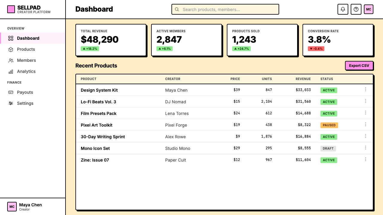
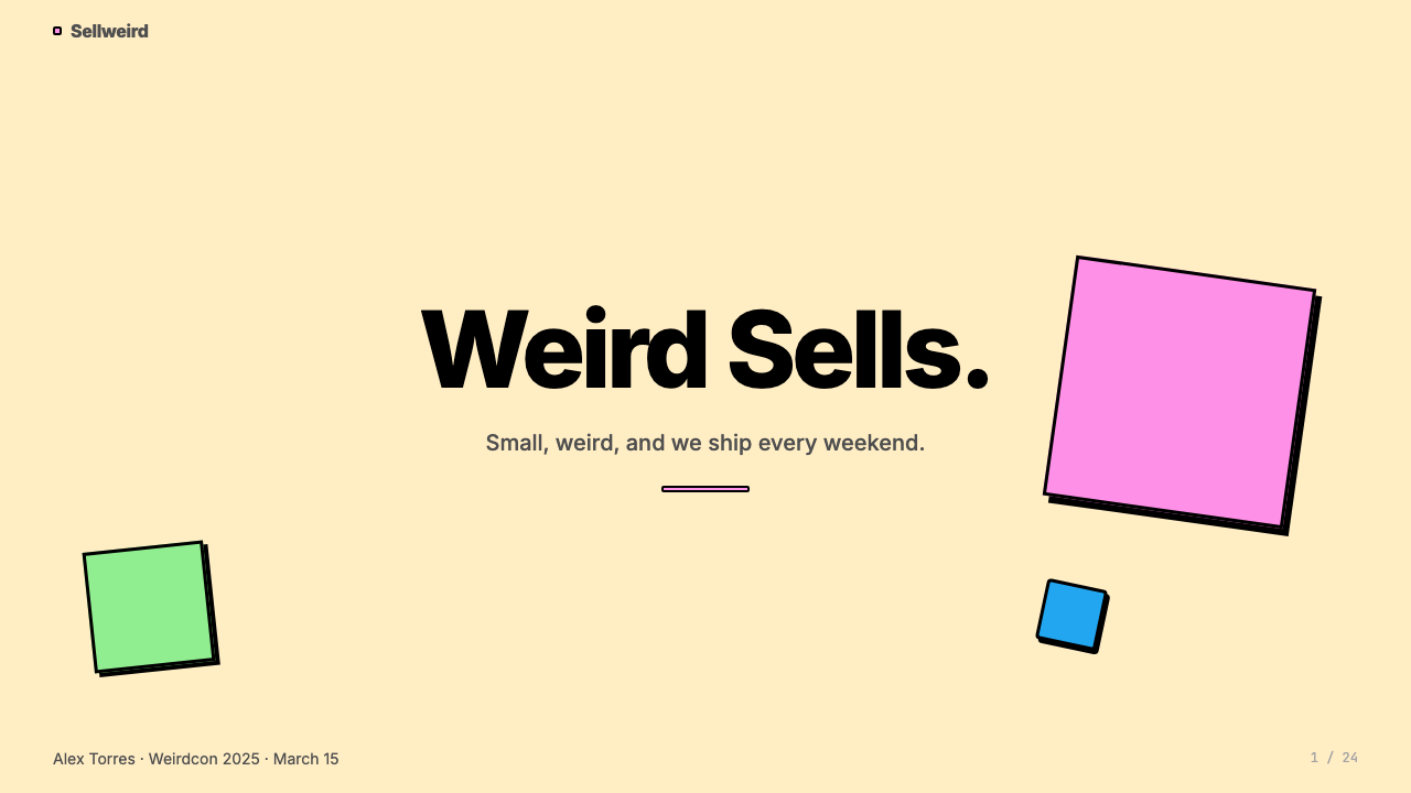
Thick, solid black borders are the single most distinctive feature of the style. Every interactive element — cards, buttons, input fields, modal dialogs — is outlined with a border that is far heavier than conventional UI norms. This border weight gives individual elements a clear, almost comic-book quality, separating them sharply from their background and from each other. The border system replaces shadow and color-shift as the primary means of defining element boundaries.粗实黑色边框是这种风格最具辨识度的单一特征。每个交互元素——卡片、按钮、输入框、模态对话框——都被一条远重于常规 UI 规范的边框所勾勒。这种边框重量赋予单个元素清晰、近乎漫画式的品质,将它们与背景和彼此之间鲜明地分隔开来。边框系统取代了投影和颜色偏移,成为定义元素边界的主要手段。
Hard Offset Shadow硬朗偏移阴影
Cards and prominent elements cast a hard, solid-color shadow that is offset at a consistent angle — typically down and to the right. Unlike soft drop shadows that simulate natural light, this shadow is rendered as a flat black shape with no blur, no gradient, and no feathering. The combination of thick border plus hard shadow gives elements a stacked, dimensional quality, as though each card were a physical object lifted slightly off the page. This technique is the most imitated aspect of the neo-brutalist aesthetic.卡片和显著元素投射出一道硬朗、实色的阴影,以固定角度偏移——通常向下偏右。与模拟自然光线的柔和投影不同,这道阴影被渲染为无模糊、无渐变、无羽化的平面黑色形状。粗边框加硬阴影的组合赋予元素一种叠层的立体感,仿佛每张卡片都是稍微从页面上翘起的实体对象。这种技法是新野蛮主义美学中被模仿最多的方面。
Typography字体排印
Type in the Gumroad Creator style is bold, matter-of-fact, and hierarchical without being elaborate. Headlines are set large and heavy — sometimes playfully so — while body text maintains a readable but direct tone. The style avoids delicate or highly refined serif typefaces; the preference runs toward sturdy, humanist, or display grotesques that hold their weight at any size. Letter-spacing is kept natural rather than artificially expanded. Type often sits in tight, blocky arrangements that mirror the grid-like quality of the overall layout.Gumroad Creator 风格中的字体排印粗壮、直率,层级分明但不繁复。标题设置得大而厚重——有时带有玩味——而正文则保持可读但直接的调性。这种风格回避精致纤细的衬线字体,偏向结实的人文主义或展示性无衬线体,在任何尺寸下都能保持字重。字母间距保持自然,而非人为拉宽。文字常以紧凑的块状排列,呼应整体布局的网格感。
Flat Fill and Zero Gradient平面填充与零渐变
Every color region in the Gumroad Creator vocabulary is a flat, even fill. Buttons are one solid color; backgrounds are one solid color; icons and illustrations are flat. There are no gradients, no glows, no color transitions of any kind. This absolute flatness is part of what gives the style its graphic, print-like clarity — the visual logic is immediately legible because there is no atmospheric depth to parse. The flatness also makes the hard offset shadow read as a deliberate stylistic choice rather than an accident.Gumroad Creator 语汇中的每个色彩区域都是均匀的平面填充。按钮是单一实色,背景是单一实色,图标和插图也是平面的。没有渐变,没有发光效果,没有任何形式的颜色过渡。这种绝对的平面性正是赋予这种风格图形感、印刷式清晰度的原因之一——视觉逻辑一目了然,因为没有需要解读的氛围深度。平面性也使得硬偏移阴影呈现为刻意的风格选择,而非意外。
Grid and Blocky Layout网格与块状布局
Gumroad Creator layouts are organized on a visible, fairly rigid grid where elements snap into columns and rows without much visual tension or off-grid placements. Cards stack in uniform arrays; sections break cleanly at full width. The blocky quality extends to shape language as well: containers are rectangular, corners are square or minimally rounded, and the overall impression is of tiles or building blocks assembled with confident directness rather than refined spatial composition. Negative space is used generously, but always in regular intervals.Gumroad Creator 的版面在可见、相当刚性的网格上组织,元素整齐卡入列和行,没有太多视觉张力或脱离网格的放置。卡片以均匀的阵列叠放,各区块在全宽处干净断开。块状感延伸至形状语言:容器为矩形,圆角方或极小,整体印象是以自信、直接的方式拼组的瓷砖或积木,而非经过精雕细琢的空间构图。留白被慷慨使用,但始终以规律间距呈现。
Hand-Drawn Doodle Accents手绘涂鸦点缀
One distinguishing concession to decoration in an otherwise austere system is the selective use of hand-drawn doodle elements — small sketched arrows, stars, underlines, bracket shapes, or simple illustrated figures that appear as overlays or annotations. These doodles humanize the otherwise geometric and gridded composition, reinforcing the message that a real person made this thing. They are used sparingly so that their informal energy stands out rather than becoming visual noise, and they echo the personality-forward communication style of the creator economy.在这套在其他方面相当简朴的系统中,有一个显著的装饰让步:选择性地使用手绘涂鸦元素——小型素描箭头、星形、下划线、括号形状或简单的插画人物,作为叠加层或注释出现。这些涂鸦使否则几何化、网格化的构图充满人情味,强化了「这是一个真实的人做的东西」的信息。它们的使用保持克制,以便其非正式的能量突出而非成为视觉噪音,并呼应创作者经济中以个性为先的沟通风格。
See the Gumroad Creator design system查看 Gumroad Creator 完整设计系统
Who shaped Gumroad Creator?谁塑造了 Gumroad Creator?
Lavingia founded Gumroad in 2011 after leaving his role as a designer at Pinterest. His design background made the 2021 brand rebrand unusually intentional — the shift to neo-brutalism was a deliberate philosophical statement about creator-first values, not merely a trend adoption. As the public face of the company, Lavingia's transparent, anti-corporate communication style on social media mirrored and amplified the brand aesthetic, helping Gumroad Creator become associated with a broader ethos of radical simplicity and creator empowerment.Lavingia 于 2011 年离开 Pinterest 设计师职位后创立了 Gumroad。他的设计背景使 2021 年的品牌重塑异常自觉——转向新野蛮主义是一种关于创作者优先价值观的刻意哲学声明,而非单纯的趋势追随。作为公司的公众形象,Lavingia 在社交媒体上透明、反企业化的沟通风格映照并放大了品牌美学,帮助 Gumroad Creator 与极致简单和创作者赋权的更广泛精神相关联。
The Memphis Group — the Italian design collective formed around Ettore Sottsass in Milan in 1981 — is the most direct historical precedent for Gumroad Creator's color sensibility and pattern logic. Memphis rejected the functionalist austerity of late modernism in favor of bold color combinations, flat geometric patterns, and a joyful anti-elitism that treated decoration as a legitimate design statement. While Gumroad Creator does not reproduce Memphis motifs directly, it inherits the same conviction that high saturation, visual boldness, and deliberate rule-breaking can be forms of honesty rather than vulgarity.孟菲斯设计小组——1981 年在米兰围绕 Ettore Sottsass 组成的意大利设计集体——是 Gumroad Creator 色彩感性和图案逻辑最直接的历史先例。孟菲斯拒绝晚期现代主义的功能主义严苛,转而拥抱大胆的色彩组合、平面几何图案,以及一种将装饰视为合理设计声明的欢乐反精英主义。虽然 Gumroad Creator 并不直接复制孟菲斯母题,但它继承了同样的信念:高饱和度、视觉大胆感和刻意打破规则可以是诚实的形式,而非粗俗。
The aesthetic of GeoCities — the web-hosting platform that ran from 1994 to 2009 and defined early personal homepage culture — is the second major influence on Gumroad Creator's sensibility. GeoCities pages were typically made by non-designers: tiled backgrounds, bright colors, visible borders, animated GIFs, and general disregard for the restraint norms that professional graphic design upheld. Gumroad Creator selectively rehabilitates this visual energy — particularly the unapologetic brightness and the hand-assembled quality — as a signal of authenticity in a design environment that had become overly polished.GeoCities——这个运营于 1994 至 2009 年、定义了早期个人主页文化的网络托管平台——的美学是影响 Gumroad Creator 感性的第二大来源。GeoCities 页面通常由非设计师制作:瓷砖式背景、鲜艳颜色、可见边框、动态 GIF,以及对专业平面设计所坚守的克制规范的普遍漠视。Gumroad Creator 选择性地重新肯定了这种视觉能量——尤其是毫不道歉的明亮度和手工拼装感——将其作为在过度精致的设计环境中真实性的信号。
Gumroad's rebrand emerged just as neo-brutalism was crystallizing as a named movement in web design, roughly between 2020 and 2023. The broader movement — associated with designers and studios who wanted to push back against the glassmorphism, neutral-palette enterprise UI, and shadow-heavy card-based layouts that had dominated the previous decade — provided the theoretical framing within which Gumroad's specific choices made sense. Gumroad Creator became one of the most widely cited practical examples of neo-brutalism applied at product scale, influencing not just aesthetics but also the discourse about what visual design communicates about company values.Gumroad 的品牌重塑恰好发生在新野蛮主义作为一场有名称的运动在网页设计领域结晶的时刻,大约在 2020 至 2023 年间。更广泛的运动——与那些希望反击此前十年主导地位的玻璃拟态、中性色调企业 UI 和重阴影卡片式布局的设计师和工作室相关联——提供了使 Gumroad 具体选择有意义的理论框架。Gumroad Creator 成为新野蛮主义在产品规模上应用的最广为引用的实际范例之一,不仅影响美学,也影响了关于视觉设计如何传达公司价值观的讨论。
How do you use Gumroad Creator today?今天怎么用 Gumroad Creator?
Gumroad Creator translates most naturally to contexts that celebrate individual authorship and creative commerce — landing pages for digital products, personal portfolio sites, course or workshop sales pages, and any interface where the designer or founder wants the product to feel made by a person, not manufactured by a corporation. The key to applying it effectively is committing fully to its system: the thick border, the hard shadow, and the flat fill work as a cohesive unit. Picking only one or two of these elements without the others produces an inconsistent result that reads as unfinished rather than stylistically bold.Gumroad Creator 最自然地适用于颂扬个体创作和创意商务的场景——数字产品落地页、个人作品集网站、课程或工作坊销售页面,以及任何设计师或创始人希望产品感觉「由一个真实的人制作」而非「由企业工厂生产」的界面。有效应用它的关键是对其系统的完全承诺:粗边框、硬阴影和平面填充作为一个有机整体发挥作用。只选择其中一两个元素而忽略其余,会产生不一致的效果——看起来是未完成的,而非大胆的风格选择。
For presentation slides, the style excels on cover pages and section dividers. A cover benefits from a large block of the signature pink anchoring one quadrant, with the title set in heavy, oversized type on the cream field. The thick-border-plus-hard-shadow treatment works particularly well for feature callout boxes within content slides — applying it to a stat, quote, or key term makes that element jump off the slide without requiring animation. Data slides should lean into the style's grid quality: simple bar charts rendered in the flat primary palette, with axis lines drawn as visible thick rules, feel native to the aesthetic. Avoid soft drop shadows on charts — they break the flat-and-hard visual grammar.对于演示文稿,这种风格在封面页和章节分隔页上表现出色。封面适合用一大块标志性粉色锚定某个象限,标题以粗重、超大字体设置在奶油色底面上。粗边框加硬阴影的处理方式在内容幻灯片的特色引用框中尤为有效——将其应用于数据、引言或关键词,可以让该元素从幻灯片上跳出,而无需动画效果。数据幻灯片应充分利用这种风格的网格品质:以平面主色渲染的简单柱状图,坐标轴线以可见的粗线条绘制,在视觉上与美学高度契合。避免在图表上使用柔和投影——它们会打破平面与硬朗的视觉语法。
For web interfaces, Gumroad Creator is an especially strong fit for pricing pages, product feature grids, and checkout flows where scannable hierarchy and trust signals are important. Define a clear column grid and let card components carry the thick-border treatment consistently. Use the hard offset shadow to distinguish interactive elements (cards that link, buttons that act) from static display elements (labels, metadata text). Reserve the signature pink for primary calls-to-action and active states; use cream as the dominant background and black as the typographic baseline. Navigation bars and footers look best in a solid black background with cream or white type, anchoring the page without requiring any decorative treatment.对于网页界面,Gumroad Creator 特别适合定价页面、产品功能网格和结账流程,在这些场景中可扫描的层级和信任信号至关重要。定义清晰的列网格,让卡片组件统一承载粗边框处理。使用硬偏移阴影区分交互元素(可链接的卡片、可操作的按钮)与静态展示元素(标签、元数据文字)。将标志性粉色保留给主要行动号召和激活状态;用奶油色作为主导背景,黑色作为字体基准色。导航栏和页脚在纯黑背景配奶油或白色文字时效果最佳,可以在无需任何装饰处理的情况下锚定页面。
For editorial and marketing applications, the style supports a poster-like directness. A hero section that pairs an oversized headline in heavy type with a single color block behind it, bounded by a thick border, does the work of dozens of smaller graphic elements. Marketing emails in this language use minimal columns — ideally one — with prominent bordered call-to-action buttons in the signature pink and generous cream space around them. Avoid the temptation to add photographic backgrounds or textured overlays; the style's power comes from the graphic flatness, and texture dilutes that signal. If imagery is necessary, crop photographs to hard-edge rectangular shapes and frame them with the border system.对于编辑和营销应用,这种风格支持海报式的直接感。一个将超大粗重标题与单一色块(以粗边框为界)配对的英雄区块,能完成几十个较小图形元素的工作。这种语言的营销邮件使用最少的列——理想情况下只有一列——配以醒目的有边框行动按钮(使用标志性粉色)和周围慷慨的奶油空间。避免添加摄影背景或纹理叠加;这种风格的力量来自图形的平面性,纹理会稀释这种信号。如果必须使用图像,将照片裁剪为硬边矩形,并用边框系统进行框架处理。
The most common mistake when applying Gumroad Creator is using soft or blurred drop shadows anywhere in the layout. A soft shadow immediately breaks the neo-brutalist contract and pulls the design back toward the polished SaaS aesthetic the style is actively rejecting. Similarly, rounding corners beyond a minimal amount loses the blocky, direct quality that is essential to the system — overly rounded corners slide toward the friendly-rounded-SaaS look rather than the confident-direct-creator look. A second common error is overloading the palette: the signature pink is bold enough that using it for more than the primary accent and call-to-action areas makes the layout feel chaotic rather than confident. Let cream and black do most of the work; pink is a signal, not a fill.应用 Gumroad Creator 时最常见的错误是在版面任何地方使用柔和或模糊的投影。柔和阴影会立即打破新野蛮主义的契约,将设计拉回到这种风格正在主动拒绝的精致 SaaS 美学。同样,将圆角程度超过最低限度,会失去系统所依赖的块状、直接品质——过度圆润的圆角会滑向友好圆润的 SaaS 感,而非自信直接的创作者感。第二个常见错误是色板过载:标志性粉色已经足够大胆,若将其用于主要强调和行动号召区域之外的更多地方,版面会呈现混乱而非自信。让奶油色和黑色承担大部分工作;粉色是一个信号,不是填充色。
See the Gumroad Creator design system查看 Gumroad Creator 完整设计系统
Gumroad Creator — FAQGumroad Creator · 常见问题
Is Gumroad Creator the same as neo-brutalism, or is it a specific variant?Gumroad Creator 和新野蛮主义是同一回事,还是一种特定变体?
Gumroad Creator is best understood as a specific, highly recognizable instance of neo-brutalism rather than the whole movement. Neo-brutalism as a broader trend encompasses many different interpretations — some much rawer and more typographically extreme, others more restrained. Gumroad's version is distinctive for its consistent pink-and-cream palette, its relatively clean grid structure, and its use of hand-drawn doodle accents that soften the system's graphic intensity with a human touch. A pure neo-brutalist approach might use black and white exclusively, or embrace much more chaotic layout energy. Gumroad Creator is neo-brutalism made commercially approachable — bold enough to be memorable, organized enough to be usable.Gumroad Creator 最好被理解为新野蛮主义的一个特定、高度可辨识的实例,而非整个运动本身。新野蛮主义作为更广泛的趋势涵盖许多不同的诠释——有些更为原生和字体极端,有些则更为克制。Gumroad 的版本因其一致的粉色奶油色板、相对干净的网格结构,以及使用手绘涂鸦点缀为系统图形强度注入人情温度而与众不同。纯粹的新野蛮主义方法可能完全使用黑白,或拥抱更混乱的版面能量。Gumroad Creator 是商业上可接受的新野蛮主义——足够大胆以令人难忘,足够有序以便于使用。
Can this style work for a corporate or enterprise product, or does it only suit indie brands?这种风格适用于企业级产品吗,还是仅适合独立品牌?
The style can technically be applied to any product, but it carries strong semantic freight: it communicates informality, individual personality, and an explicit rejection of corporate-enterprise conventions. For a product targeting individual consumers, small businesses, or creator-economy participants, that signal is an asset. For a product targeting large enterprise buyers — where trust is built through signals of institutional stability, precision, and scalability — the style's deliberate anti-corporate energy works against the brief. Enterprise buyers have been trained to associate visual polish with professional reliability; Gumroad Creator's aesthetic reads as the opposite of that. The style is best saved for contexts where its values align with the audience's values.这种风格在技术上可以应用于任何产品,但它承载着强烈的语义负荷:它传达非正式感、个人个性,以及对企业惯例的明确拒绝。对于面向个人消费者、小型企业或创作者经济参与者的产品,这种信号是一种资产。对于面向大型企业买家的产品——在那里,信任是通过机构稳定性、精确性和可扩展性的信号建立的——这种风格刻意的反企业能量会与目标相悖。企业买家已被训练成将视觉精致感与专业可靠性相关联;Gumroad Creator 的美学传达的是与此相反的信号。这种风格最好保留给其价值观与受众价值观一致的场景。
How do I avoid the layout feeling chaotic given the high visual intensity of this style?考虑到这种风格的高视觉强度,如何避免版面感觉混乱?
The key discipline is grid rigidity. Because the individual elements in a Gumroad Creator layout are visually loud — thick borders, hard shadows, saturated color — the grid structure must be unusually strict to hold them together. Resist the temptation to use off-grid placements, overlapping elements, or irregular spacing between components. Every element should snap to a clear column or row. Similarly, resist adding multiple accent colors simultaneously; the pink works precisely because it appears rarely against the cream and black backdrop. Generous, consistent negative space between sections is the other essential control — it gives each loud element room to read before the next one arrives.关键纪律是网格的严格性。因为 Gumroad Creator 版面中的单个元素视觉上已经很响亮——粗边框、硬阴影、饱和色彩——网格结构必须异常严格以将它们凝聚在一起。抵制使用脱离网格的放置、重叠元素或组件间不规则间距的诱惑。每个元素都应整齐地卡入清晰的列或行中。同样,抵制同时添加多种强调色;粉色之所以有效,正是因为它在奶油和黑色背景下出现得较少。各区块之间慷慨、一致的负空间是另一个必要的控制手段——它为每个响亮的元素提供被读取的空间,然后再迎来下一个。
Does the style work in a light-on-dark or fully dark layout?这种风格在浅色在暗色背景或完全深色版面中有效吗?
A dark inversion is possible but requires careful adjustment. The canonical Gumroad Creator palette is light-ground — the cream background is not incidental but structural, providing the warm, slightly analog feeling that offsets the sharpness of the black borders and hard shadows. On a dark ground, the hard shadow loses much of its legibility because dark shadows on dark backgrounds have little contrast. To adapt the style to dark mode, the offset shadow typically needs to shift to a lighter or colored fill — often the signature pink itself — which maintains the dimensional effect while providing contrast. The thick black border must also shift to a light or colored border. The result can be effective but feels more aggressive and less warm than the standard palette.深色反转版本是可能的,但需要仔细调整。标准的 Gumroad Creator 色板是浅底色的——奶油色背景并非偶然,而是结构性的,提供了一种温暖、略带模拟感的氛围,平衡了黑色边框和硬阴影的锐利感。在深色底面上,硬阴影大部分清晰度会丧失,因为深色阴影在深色背景上对比度有限。为适应深色模式,偏移阴影通常需要改为较浅或有色的填充——通常是标志性粉色本身——这样在保持立体感的同时提供对比度。粗黑边框也必须转变为浅色或有色边框。结果可以有效,但感觉比标准色板更具攻击性、温度感更低。
How does Gumroad Creator relate to other contemporary styles like Stripe or Notion?Gumroad Creator 与 Stripe 或 Notion 等其他当代风格有何关联?
Gumroad Creator is in many respects a deliberate negation of the Stripe and Notion schools of design. Stripe's visual identity is characterized by precise geometric illustration, a controlled blue-and-white palette, subtle gradients, and a sense of refined engineering craft — it communicates institutional trust and technical precision. Notion's design language is neutral, flexible, and deliberately recessive — a canvas that does not impose personality. Both prioritize professional legibility and scalability over individual expression. Gumroad Creator inverts these priorities: it foregrounds personality and individuality at the expense of neutrality and polish. Understanding the three in relation to each other helps clarify the semantic territory each occupies: Stripe for fintech trust, Notion for cognitive flexibility, Gumroad Creator for creator authenticity.Gumroad Creator 在许多方面是对 Stripe 和 Notion 设计学派的刻意否定。Stripe 的视觉形象以精确的几何插图、受控的蓝白色板、微妙渐变和精致工程感为特征——它传达机构信任和技术精准。Notion 的设计语言中性、灵活、刻意内敛——一块不强加个性的画布。两者都将专业可读性和可扩展性置于个人表达之上。Gumroad Creator 颠倒了这些优先级:它将个性和独特性置于前景,以中性感和精致感为代价。理解三者之间的关系有助于厘清各自占据的语义领域:Stripe 代表金融科技信任,Notion 代表认知灵活性,Gumroad Creator 代表创作者真实性。
Related design styles相关设计风格
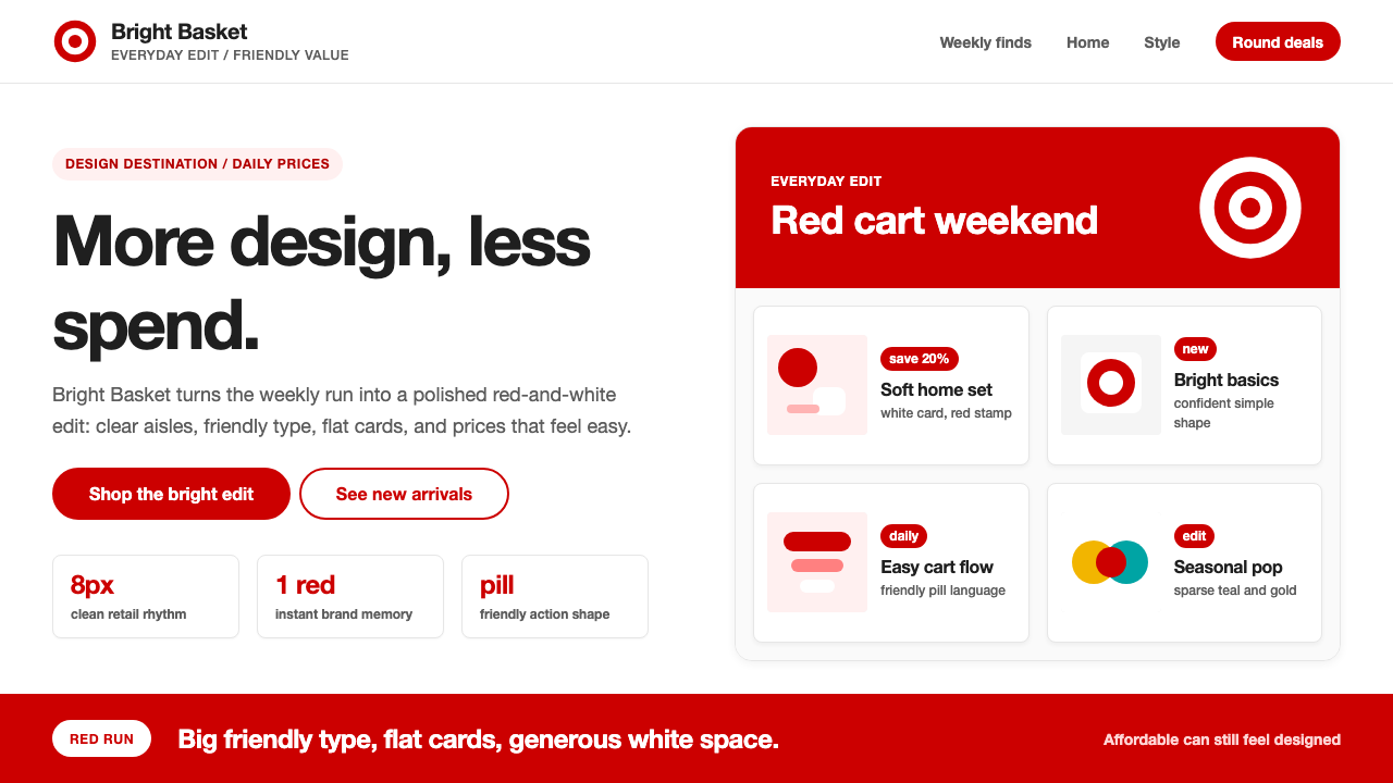 Target — Bullseye RedCheap-chic feels warm. Red bullseyes, pill CTAs, and white space make value l…平价也有设计感:红色靶心、药丸按钮与留白,让日常消费更亲切。
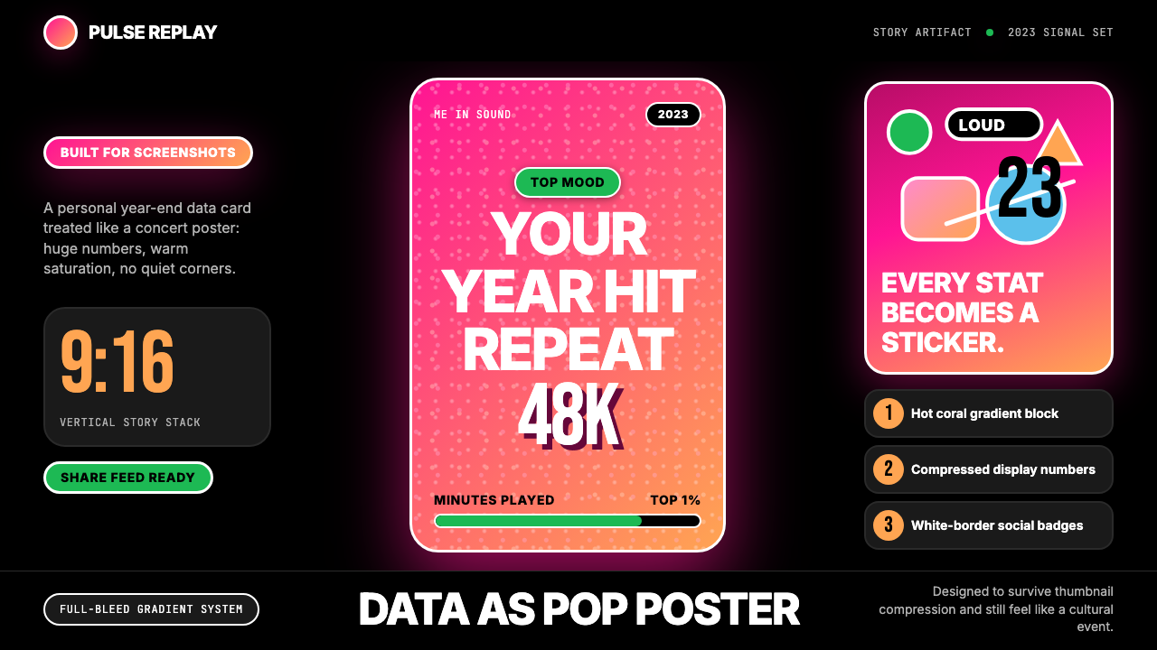 Spotify Wrapped 2023Social data goes neon. Hot pink-orange gradients, huge Inter stats, sticker b…社交数据变霓虹:粉橙渐变、巨型数字、贴纸徽章。
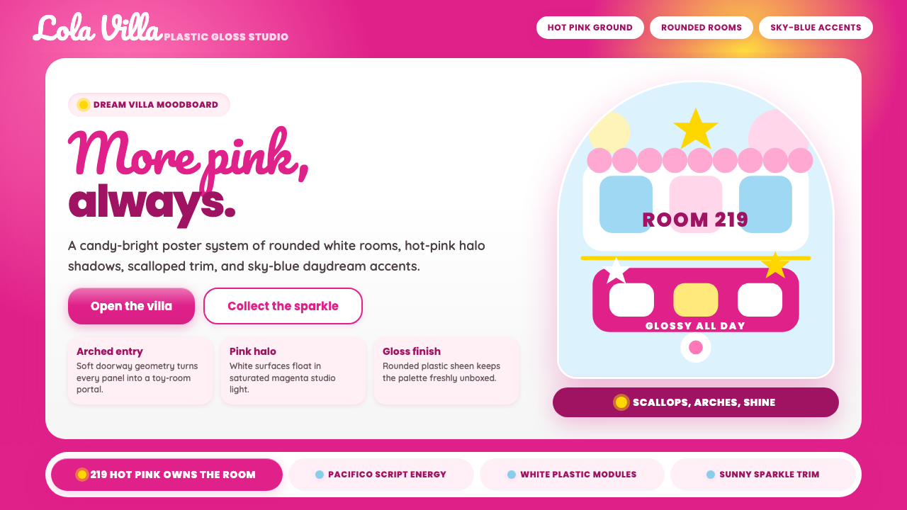 Barbie DreamhousePink is the whole world. Hot magenta ground, Pacifico script, scallops and gl…粉色就是全世界:洋红底、Pacifico手写、扇贝边与亮面拱门。
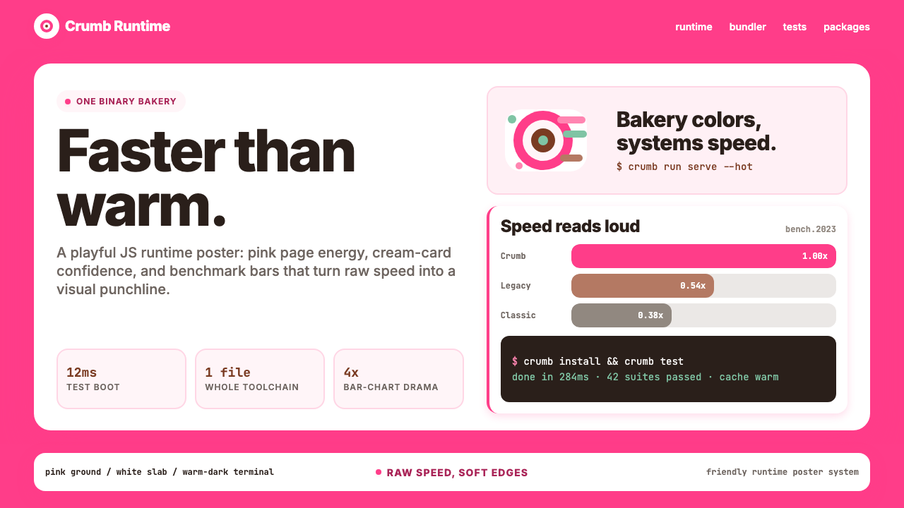 Bun JS Runtime Pink 2023Dev speed gets bakery-bright. Hot pink grounds white slabs, mono bars, and wa…开发速度像烘焙店一样明亮:热粉底、白卡片、等宽基准条与暖黑终端。
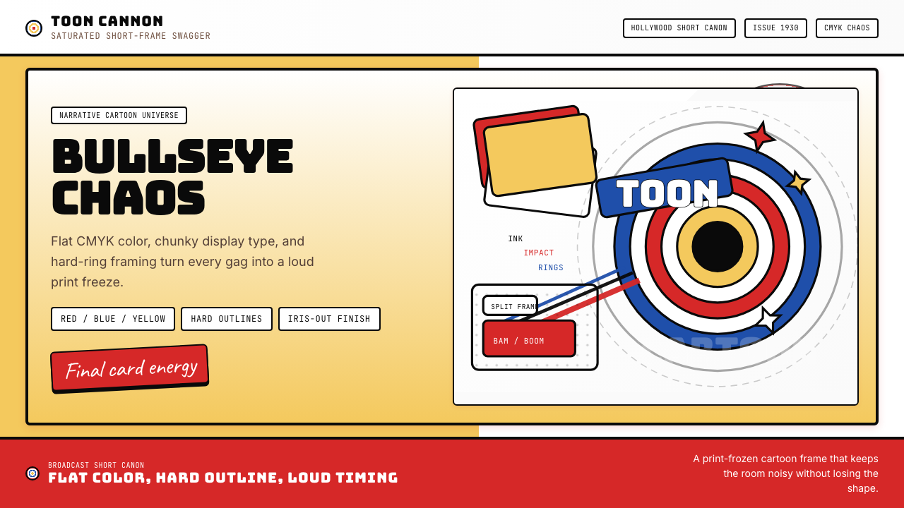 Looney Tunes (Warner Bros.)Pure cartoon chaos. Bull's-eye rings, Bungee type, and red-blue-yellow blocks.纯卡通混乱。牛眼环、粗壮标题字与红蓝黄块面。
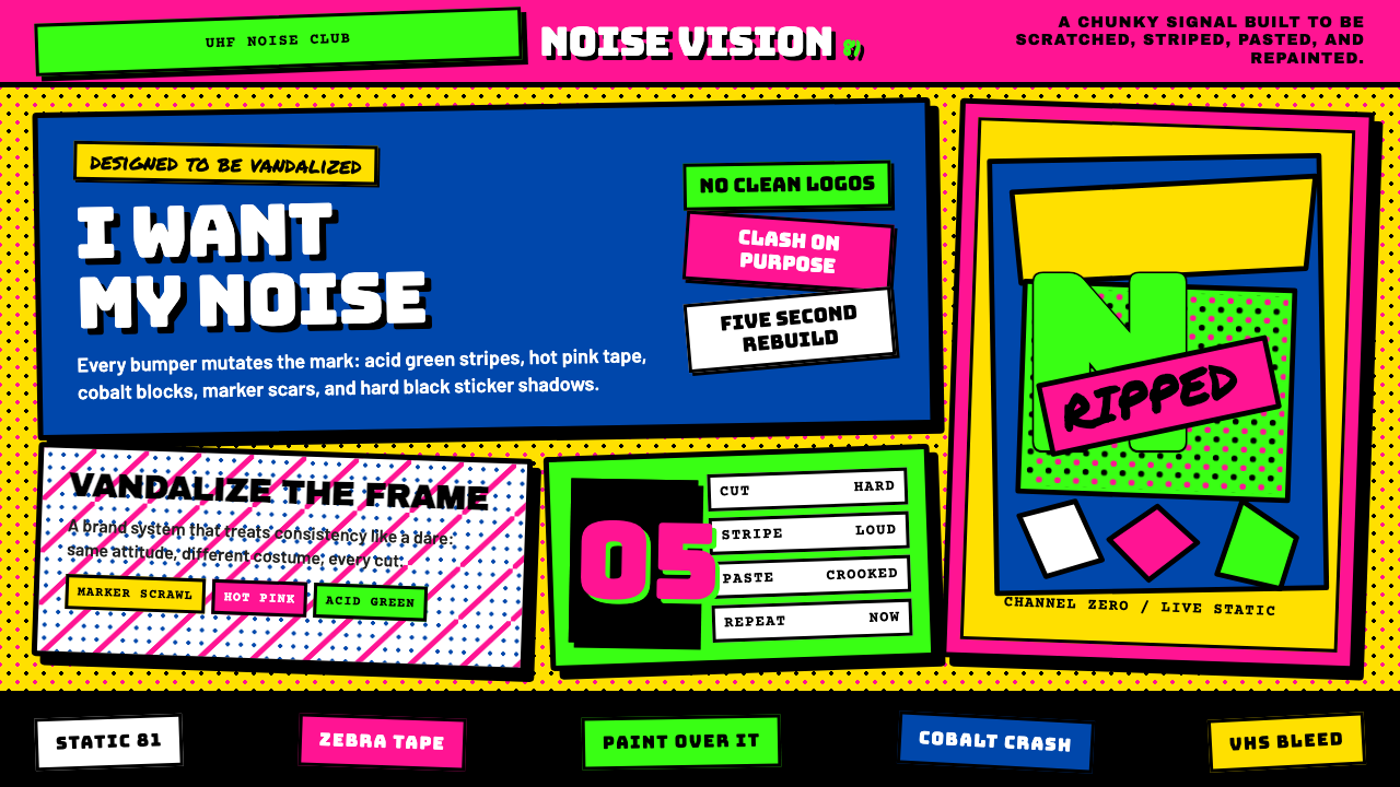 MTV Launch Identity (1981)Built to be vandalized. Hot pink, acid green, Bungee blocks, and crooked stic…天生被涂鸦:热粉酸绿、Bungee方块字与歪贴纸黑框。