Design style guide设计风格指南
What is Spotify Wrapped 2023?什么是 Spotify Wrapped 2023?
Spotify Wrapped 2023 proved that personal data could become a cultural spectacle — by designing every stat card to feel like a concert poster made just for you.Spotify Wrapped 2023 证明了一件事:只要设计对了,个人数据也能变成全民狂欢的视觉盛事——每一张数据卡都像是专属于你的演唱会海报。
Spotify Wrapped 2023 in briefSpotify Wrapped 2023 速览
Spotify Wrapped 2023 is the visual language behind Spotify's annual year-in-review campaign, reaching its most fully realized form in the "Sound Town" and "Me in 2023" edition released in late 2023. The design system turns listening statistics into shareable social artifacts: saturated pink-coral-orange gradients stretch across full-bleed mobile canvases, enormous display numerals announce listening totals, and sticker-style character illustrations add a playful, personalized dimension to what could otherwise be dry data.Spotify Wrapped 2023 是 Spotify 年度听歌总结活动背后的视觉语言,在 2023 年底发布的"Sound Town"与"Me in 2023"版本中达到了最完整的呈现形态。这套设计系统把听歌数据变成了可分享的社交货币:高饱和的粉色-珊瑚-橙色渐变铺满整个移动端竖屏,巨大的展示型数字宣告着收听总量,贴纸风格的角色插画则为原本枯燥的数据赋予了俏皮而私人的气息。
The system is built entirely around the 9:16 vertical story format. Every composition is engineered to survive the ruthless compression of a social media feed — high contrast, bold shapes, and intense color saturation ensure that even a tiny thumbnail on a crowded screen reads as distinct and energetic. The design has no interest in subtlety; its purpose is to be seen, shared, and immediately recognizable as the same visual family across hundreds of millions of individual user cards.整套系统完全围绕 9:16 竖版故事格式构建。每一幅构图都经过严格优化,以确保在社交媒体信息流的无情压缩中依然存活——高对比度、粗壮的形态、强烈的色彩饱和度,让即便是信息流里最小的缩略图也能清晰传递出那种独特的活力感。这套设计对微妙毫无兴趣,它存在的目的就是:被看见、被分享,并且在数亿张用户专属卡片中立刻被认出是同一个视觉家族的成员。
What distinguishes Wrapped 2023 from earlier editions is the degree to which the visual language became a cultural phenomenon in its own right. The gradient palette, the sticker characters, and the oversized stat typography were copied and parodied across creative industries far beyond music streaming. For several weeks each December, the Wrapped aesthetic becomes a shared visual vocabulary — and the 2023 edition is widely regarded as the high-water mark of that achievement.让 Wrapped 2023 区别于历届版本的,是它的视觉语言在多大程度上成为了一种独立的文化现象。那套渐变色板、贴纸角色和超大数据字体被音乐流媒体之外的诸多创意领域争相模仿与戏谑解构。每年十二月的那几周,Wrapped 美学成为一套共享的视觉语汇——而 2023 年版被普遍认为是这项成就的巅峰之作。
See the Spotify Wrapped 2023 design system →查看 Spotify Wrapped 2023 完整设计系统 →
Where does Spotify Wrapped 2023 come from?Spotify Wrapped 2023 从何而来?
Wrapped began in 2016 as a relatively modest end-of-year feature called "Year in Music," giving users a simple breakdown of their most-listened artists and songs. The visual presentation was functional but unremarkable. Over the following years, Spotify's design team — led from the Stockholm headquarters and anchored in New York — incrementally transformed the feature from a static report into a dynamic, card-based story experience optimized for social sharing. The shift from desktop-first to mobile-first was decisive, moving the design center of gravity from information display to social spectacle.Wrapped 始于 2016 年,彼时它还只是一个相对朴素的年末功能,名为"Year in Music",仅向用户提供最常听的歌手与歌曲的简单统计。视觉呈现功能性有余,亮点不足。在随后几年里,Spotify 的设计团队——以斯德哥尔摩总部为基地、在纽约设有重要据点——逐步将这一功能从静态报告转变为以卡片为单位、专为社交分享优化的动态故事体验。从桌面端优先转向移动端优先的战略转向是决定性的,设计的重心从信息呈现彻底迁移向了社交奇观。
Rasmus Wängelin, a designer closely associated with the Wrapped creative direction, and collaborators including Marisa Gallagher, helped establish the bold visual vocabulary that the campaign became known for. Their approach drew on the language of concert poster design, zine culture, and the maximalist energy of early-2000s music graphics, filtered through the technical constraints and sharing conventions of Instagram Stories and TikTok. The result was a design system that felt simultaneously nostalgic and forward-looking — warm and tactile in its gradient richness, yet optimized for a purely digital, highly compressed delivery format.与 Wrapped 视觉创意方向关系密切的设计师 Rasmus Wängelin,以及包括 Marisa Gallagher 在内的合作者,共同确立了这个活动赖以成名的大胆视觉语汇。他们的方法汲取了演唱会海报设计、独立杂志(zine)文化以及千禧年初音乐图形的最大化能量,再经由 Instagram Stories 和 TikTok 的技术限制与分享惯例加以过滤。最终的成果是一套视觉系统——它给人以怀旧与前瞻并存的感觉:渐变色彩的丰富质感里有温度和触感,却又被完美优化为一种纯数字的、高度压缩的传播格式。
The 2023 edition arrived at a moment when the Wrapped format was already a cultural institution. The design team escalated the visual intensity deliberately: the pink-coral-orange gradient palette became warmer and more saturated than in previous years, sticker-style character illustrations replaced the more abstract graphic elements of earlier editions, and the typography grew bolder and more display-oriented. The "Sound Town" feature — which assigned users to a real-world city based on their listening patterns — added a conceptual layer that gave the visuals a geographic identity to animate.2023 年版出现时,Wrapped 的格式早已是一项文化惯例。设计团队有意升级了视觉强度:粉色-珊瑚-橙色渐变色板比往年更温暖、更饱和;贴纸风格角色插画取代了早期版本中更为抽象的图形元素;字体变得更粗壮、更具展示感。"Sound Town"功能——根据用户的收听模式将其与真实世界的某座城市相匹配——则在概念层面增添了地理身份感,为视觉叙事提供了更丰富的维度。
The broader cultural context matters too. By 2023, the year-in-review format had proliferated across virtually every major platform: Apple Music had its Replay, Netflix had its year-end recaps, BeReal had its own version. Spotify had to distinguish itself not only from competing music services but from the entire ecosystem of data-storytelling that it had helped to pioneer. The answer was to lean further into emotional warmth, visual maximalism, and the irreducible sense of personal identity that the Wrapped aesthetic communicated — the feeling that this data belonged to you and nobody else.更宏观的文化背景同样值得关注。到 2023 年,年终总结格式已经在几乎所有主流平台上遍地开花:Apple Music 有 Replay,Netflix 有年终回顾,BeReal 也推出了自己的版本。Spotify 不仅要在竞争性的音乐服务中突围,还要在一整个它自己帮助开创的数据叙事生态中保持独特性。答案是:进一步押注情感温度、视觉最大化,以及 Wrapped 美学所传递的那种不可替代的个人身份感——那种"这是我的数据,只属于我"的感觉。
What defines the Spotify Wrapped 2023 look?Spotify Wrapped 2023 的视觉特征是什么?
Gradient Color as Identity渐变色即身份
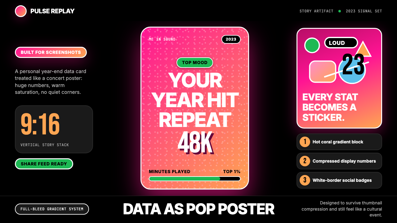
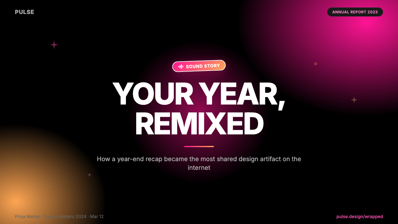
The defining visual signature of Wrapped 2023 is its gradient palette: a warm arc running from electric pink through coral into vivid orange. Unlike the subtle, atmospheric gradients common in contemporary UI design, Wrapped gradients are saturated to the point of intensity — they read as neon in darkness, as heat in light. The gradient is not an accent; it is the background, the atmosphere, the emotional register of the entire system. When deployed across a card, it creates an immediate sense of energy and warmth that transforms a row of statistics into something that feels personal and celebratory.Wrapped 2023 最具辨识度的视觉标志,是它的渐变色板:一条从电光粉红经珊瑚橙过渡至鲜艳橙黄的暖色弧线。与当代 UI 设计中常见的微妙、氛围性渐变截然不同,Wrapped 的渐变被推到了饱和度的极限——在暗处如霓虹灼灼,在亮处如热浪翻涌。渐变不是点缀,它是背景、是氛围、是整套系统的情感基调。当它铺满一张卡片,原本一行行数据便被转化为某种私人的、值得庆祝的东西。
Oversized Display Typography超大展示字体
Numbers and short text fragments are set at scales that would be considered recklessly large in conventional information design. A listening total might occupy the majority of a card's vertical space; an artist name might bleed off the edge of the frame. This typographic maximalism serves two purposes: first, it ensures legibility at thumbnail size on any social feed; second, it transforms the data point itself into a graphic element. The numerals are not merely informative — they are compositional anchors, and their sheer scale conveys importance and pride.数字和短文本片段被设置在常规信息设计中会被认为鲁莽的超大尺度上。一个收听总量数字可能占据卡片纵向空间的大半;一个歌手名字可能溢出画面边缘。这种字体最大主义服务于两个目的:其一,确保在任何社交信息流的缩略图尺寸下依然清晰可辨;其二,将数据本身转化为一个图形元素。这些数字不仅仅在传递信息——它们是构图的锚点,而它们的绝对体量传递着一种重要感与自豪感。
Sticker-Style Character Illustration贴纸风格角色插画
The 2023 edition introduced a family of character illustrations rendered in a style that deliberately evokes physical stickers: bold outlines, flat fills, a slightly raised or dimensional quality that suggests the illustration could be peeled off the screen and applied elsewhere. These characters range from abstract mascot figures to representations of musical genres personified. They bring a tactile, collectible quality to the digital cards — an analog warmth in a purely digital context — and give the system a playful personality that pure data visualization could never achieve.2023 年版引入了一系列角色插画,其风格刻意唤起实体贴纸的质感:粗重轮廓线、平涂色块填充,以及一种略微隆起的立体感——让人感觉这些插画随时可以从屏幕上揭下来贴到别处。这些角色从抽象的吉祥物形象到被拟人化的音乐流派代表形象,各有不同。它们为数字卡片带来了一种实体感与收藏品质——一种在纯数字语境中的模拟温度——也赋予这套系统一种纯粹的数据可视化永远无法企及的俏皮个性。
Full-Bleed Mobile Canvas全出血移动端画布
Every design decision in Wrapped 2023 flows from the choice to treat the mobile story frame — a tall, narrow rectangle viewed in portrait orientation — as the primary and only canvas. There are no margins, no white space at the edges, no breathing room between the design and the frame boundary. The gradient fills the entire screen. The typography runs to the edges. This full-bleed approach, which would feel cramped in other contexts, reads as immersive and enveloping in the story format — the user is inside the card, not looking at it.Wrapped 2023 的每一个设计决定都源自一个根本选择:将移动端故事帧——一个竖向持握时高而窄的矩形——视为唯一的画布。没有留白,没有边缘的呼吸空间,设计与画框边界之间毫无间距。渐变铺满整个屏幕,字体延伸至边缘。这种全出血处理在其他语境下会令人感到逼仄,在故事格式中却呈现为一种沉浸感和包裹感——用户是在卡片内部,而不是在看卡片。
Social-Feed Legibility Engineering社交信息流可读性工程
Wrapped cards are designed to survive radical compression. When a card is shared to a social story or appears as a small preview in a feed, it must still communicate identity and energy. This requirement drives the high-contrast color choices, the avoidance of fine detail, and the bold typographic scale. Nothing in the system depends on fine typography, subtle gradient transitions, or detailed illustration that would disappear at small size. Every element is tested against its smallest probable viewing context, which is the conceptual reverse of how most design systems are built.Wrapped 卡片是为极限压缩而设计的。当一张卡片被分享到社交故事流,或以小尺寸预览图出现在信息流中时,它必须依然能传递身份感和活力感。这一要求驱动了高对比度的色彩选择、对精细细节的回避,以及大胆的字体尺度。系统中没有任何元素依赖于缩小后会消失的精细排版、微妙渐变过渡或细节丰富的插画。每个元素都针对其最小可能的观看场景进行测试——这是绝大多数设计系统构建逻辑的反向操作。
Personalization at Scale规模化个人化
One of the most technically and conceptually ambitious aspects of Wrapped is that the design system must feel personal while being generated at scale for hundreds of millions of users. The solution is a template architecture in which the structural grammar — gradient background, oversized numeral, character illustration, short text label — remains constant, while the specific data inputs (the number, the artist names, the assigned Sound Town) create genuine individuality within that framework. The result is a paradox: the most widely distributed graphic design campaign of its season, and yet something that feels uniquely yours.Wrapped 最具技术野心与概念野心的一个方面在于:这套设计系统必须在为数亿用户批量生成的同时,依然让每个人感觉到专属感。解决方案是一套模板架构——结构性语法保持不变(渐变背景、超大数字、角色插画、简短文字标签),而具体的数据输入(那个数字、那些歌手名、那座被分配的"Sound Town")则在这个框架内制造出真实的个体差异。结果是一个悖论:它是那个季节传播最广的平面设计活动,却同时让每个人感觉那是只属于自己的东西。
Maximalism as Brand Trust最大化主义即品牌信任
Wrapped 2023 operates in deliberate opposition to the restrained, neutral aesthetic that has dominated consumer tech design for over a decade. Where most platforms favor quiet backgrounds, systematic spacing, and controlled color, Wrapped asserts that the moments worth celebrating deserve a visual register to match — loud, warm, unapologetically saturated. This maximalism is not a lapse of discipline; it is itself a design decision with clear cultural stakes. It signals that Spotify understands the emotional significance of music in its users' lives, and that the data is not merely informational but experiential.Wrapped 2023 刻意与过去十余年主导消费科技设计的克制、中性美学形成对立。当大多数平台偏爱安静的背景色、系统性的间距和受控的色彩时,Wrapped 断言:值得庆祝的时刻理应拥有与之匹配的视觉基调——响亮、温暖、毫不掩饰的饱和。这种最大化主义不是失控,它本身就是一个有着清晰文化意涵的设计决定。它传递出一个信号:Spotify 理解音乐在用户生命中的情感重量,那些数据不只是信息,它们是体验。
See the Spotify Wrapped 2023 design system →查看 Spotify Wrapped 2023 完整设计系统 →
Who shaped Spotify Wrapped 2023?谁塑造了 Spotify Wrapped 2023?
A designer centrally associated with Spotify's Wrapped creative direction, Wängelin helped establish and evolve the bold visual vocabulary that the campaign became known for. His work on Wrapped reflects a sustained commitment to treating data visualization as emotional design — not merely representing information accurately, but ensuring that the act of seeing your own numbers generates a genuine feeling of recognition and celebration.Wängelin 是与 Spotify Wrapped 视觉创意方向最紧密相关的设计师之一,他帮助确立并持续演进了这个活动赖以成名的大胆视觉语汇。他在 Wrapped 上的工作体现了一种持续的信念:数据可视化应当是情感设计——不只是准确呈现信息,而是确保当用户看到自己的数字时,会真实地感受到一种被看见的喜悦。
A designer and creative collaborator involved in the Wrapped visual system, Gallagher contributed to the campaign's evolution into the social-media-optimized story format that millions of users share each December. Her work reflects the broader Spotify design team's discipline of testing every visual element at the thumbnail scale that social feeds impose — a constraint that shaped the entire visual grammar of the campaign.Gallagher 是参与 Wrapped 视觉系统的设计师与创意合作者,她为这个活动演化为数百万用户每年十二月争相分享的社交媒体故事格式做出了贡献。她的工作体现了 Spotify 设计团队更广泛的纪律——在社交信息流所要求的缩略图尺度下测试每一个视觉元素,这一约束塑造了整个活动的视觉语法。
The Wrapped visual system is the product of a distributed in-house design organization, headquartered in Stockholm and anchored in New York, that has iterated on the campaign's visual language since 2016. The team's collective achievement is a design system that scales to hundreds of millions of individually generated cards while maintaining the sensation of personal authorship — a technically and conceptually sophisticated problem that the 2023 edition solved with particular clarity.Wrapped 视觉系统是 Spotify 分布式内部设计团队的集体成果——该团队总部位于斯德哥尔摩,在纽约设有重要据点,自 2016 年起持续迭代这个活动的视觉语言。这个团队的集体成就是一套能够扩展至数亿张个人化生成卡片、同时维持私人定制感的设计系统——这是一个技术上与概念上都极为复杂的命题,2023 年版以特别清晰的方式给出了答案。
While not a person, the Instagram Stories format — introduced in 2016 — functions as a decisive shaping force on the Wrapped aesthetic. The 9:16 aspect ratio, the full-screen immersive canvas, and the tap-to-advance interaction model all created the technical constraints within which Wrapped's visual language evolved. Understanding Wrapped requires understanding that the story format is not a container into which a design is placed, but the generative condition from which the entire visual grammar is derived.虽然不是一个人,Instagram Stories 格式——2016 年推出——作为一种决定性的塑造力量对 Wrapped 的美学产生了深远影响。9:16 的纵横比、全屏沉浸式画布和点击前进的交互模式,共同构成了 Wrapped 视觉语言在其中演化的技术约束条件。理解 Wrapped,必须理解:故事格式不是一个用来放置设计的容器,而是整套视觉语法得以生成的根本前提。
How do you use Spotify Wrapped 2023 today?今天怎么用 Spotify Wrapped 2023?
Applying the Wrapped 2023 aesthetic to a new context requires clarity about what the system is actually doing: it uses emotional warmth, saturated color, and bold typographic scale to make data feel personal and celebratory. These principles transfer most cleanly to contexts where you have genuine data that belongs to a specific person or group — usage summaries, achievement milestones, progress reports, event recaps — and where the goal is not just to inform but to generate a feeling of recognition and pride.将 Wrapped 2023 美学应用到新语境中,首先需要清楚这套系统究竟在做什么:它用情感温度、高饱和色彩和大胆的字体尺度,让数据显得私人且值得庆祝。这些原则最顺畅地迁移到这类场景中:你拥有真实的、属于特定个人或群体的数据——使用量摘要、成就里程碑、进度报告、活动回顾——且目标不只是告知,而是唤起一种被看见的喜悦感。
For presentation slides, the style works best when used for a single dramatic reveal moment rather than sustained throughout an entire deck. A Wrapped-derived cover slide pairs a full-bleed warm gradient with one dominant number or short phrase at oversized scale; the sticker illustration element can be replaced with a bold icon or logotype treated at similar scale. Content slides should pull back to a simpler palette — using one accent color from the gradient family against a near-white or black ground — to avoid gradient fatigue. Data slides within this system work well when key numbers are set very large and explanatory text is kept to a minimum.在演示文稿中,这种风格最适合用于单一的戏剧性揭晓时刻,而非贯穿整套幻灯片。一张 Wrapped 风格的封面页将全出血暖渐变与超大尺度的主导数字或短语相结合;贴纸插画元素可以用相同尺度处理的粗壮图标或标志来替代。内容页应当退回更简洁的色板——以渐变色系中的某一种强调色配近白或黑色底面——以避免渐变疲劳。在这套系统中,数据页的做法是将关键数字放大到极限,解释性文字保持最少。
For web interfaces, the aesthetic is best suited to celebratory or milestone-focused contexts: onboarding completion screens, achievement unlocked states, annual report microsites, or campaign landing pages. Sustained use across a full dashboard or navigation system tends to exhaust users — the intensity that makes a single card memorable becomes oppressive when it appears on every screen. A practical approach is to use the full gradient and typographic scale for hero states and key moments, then transition to a restrained version — a single tonal color, standard type sizes — for surrounding content.对于网页界面,这种美学最适合庆祝性或里程碑聚焦的场景:引导流程完成屏、成就解锁状态、年度报告微站,或活动落地页。在整套仪表板或导航系统中持续使用往往会令用户疲惫——让单张卡片令人难忘的那种强度,在每屏都出现时就变成了一种压迫感。实用的做法是:在英雄区域和关键时刻使用完整的渐变与字体尺度,然后在周围内容中过渡到一个克制版本——单一的同色系颜色,标准的文字大小。
For editorial and marketing contexts, the style has strong applications in social-first content where the final destination is a story or feed post rather than a long-form page. Sponsored content, event announcements, and campaign summary graphics all benefit from the bold compositional logic: one dominant visual element (a number, a name, a short phrase), a saturated background that establishes energy, and minimal supporting text. The sticker character approach translates naturally to mascot-forward brand identities or campaign-specific character assets. Print applications are possible but require care — the gradient intensity that reads as vibrant on a backlit screen can appear overwhelming in print without adjustment.在编辑与营销语境中,这种风格在以故事或信息流帖子为最终目的地的社交优先内容中有很强的应用空间。品牌内容、活动公告和活动总结图表都受益于这套大胆的构图逻辑:一个主导视觉元素(一个数字、一个名字、一个短语)、一个建立活力感的饱和背景,以及极少的支撑文字。贴纸角色的方式自然地迁移到吉祥物驱动的品牌形象或活动专属角色资产中。印刷应用是可行的,但需要谨慎——在背光屏幕上显得生动的渐变强度,未经调整地出现在印刷品上可能会显得过于压迫。
A common mistake when applying this style is using the gradient as decoration rather than as atmosphere. In the Wrapped system, the gradient is the entire ground — it is not applied on top of white space or used as a banner element within a larger layout. A gradient used as a partial element or a card accent tends to look like a Wrapped reference rather than a coherent application of the aesthetic. Either commit fully — full-bleed, full-saturation — or step back to a solid color derived from the same warm family. The other common error is overloading the card with information; the Wrapped format is built around one primary message per card, and adding a second or third message of equal scale undermines the system's entire visual logic.应用这种风格时最常见的错误是把渐变当作装饰而非氛围来使用。在 Wrapped 系统中,渐变是整片底面——它不是叠加在留白上方的元素,也不是大版面中的横幅元素。作为局部元素或卡片点缀出现的渐变往往看起来像是对 Wrapped 的引用,而非这套美学的连贯应用。要么全力投入——全出血、全饱和度——要么退回同一暖色系中的某一纯色。另一个常见错误是向卡片里塞入过多信息;Wrapped 格式的构建逻辑是每张卡片一条主要信息,加入同等分量的第二、第三条信息会瓦解整套系统的视觉逻辑。
See the Spotify Wrapped 2023 design system →查看 Spotify Wrapped 2023 完整设计系统 →
Spotify Wrapped 2023 — FAQSpotify Wrapped 2023 · 常见问题
Is the Wrapped gradient a fixed set of colors, or does it vary year to year?Wrapped 的渐变是固定的色彩方案,还是每年都会变化?
The palette evolves each year as part of Spotify's creative refresh, but certain qualities remain consistent: the gradients are warm-toned, running from pink or magenta toward orange or coral, and they are always pushed to a high saturation level that reads as vivid rather than pastel. The 2023 edition is particularly associated with a pink-to-orange arc that veers more toward coral warmth than earlier editions, which leaned more toward magenta and purple. Adapting the aesthetic to your own work does not require replicating the exact tones — the principle is warmth, intensity, and a gradient that spans enough of the spectrum to feel energetic.色板每年都会随着 Spotify 的创意更新而演变,但某些品质始终一致:渐变是暖色调的,从粉色或洋红向橙色或珊瑚色过渡,且始终被推到高饱和度——呈现出生动感而非粉彩感。2023 年版尤其以粉色到橙色的弧线著称,比早期版本(更偏洋红与紫色)更靠近珊瑚暖色。将这种美学应用于自己的作品时,并不需要复制精确的色调——原则是温暖、强烈,以及一条跨越足够宽光谱、令人感到充满活力的渐变。
How does Wrapped differ from other social-media data visualization aesthetics, like Apple Music Replay?Wrapped 与其他社交媒体数据可视化美学(比如 Apple Music Replay)有何不同?
Apple Music Replay and similar data-storytelling campaigns tend toward a restrained, premium aesthetic — dark backgrounds, controlled typography, a sense of quiet exclusivity. Wrapped takes the opposite stance: it maximizes warmth, saturation, and visual noise in deliberate contrast to the understated norm. The sticker illustrations, the oversized numerals, the full-bleed gradients are all legible signs of a design that wants to be shared, celebrated, and recognized across a noisy social feed. Where Replay feels like a private acknowledgment, Wrapped is designed to function as public celebration.Apple Music Replay 及类似的数据叙事活动倾向于一种克制、高级感的美学——深色背景、受控的排版、一种安静的专属感。Wrapped 采取了完全相反的立场:它刻意在最大化温暖感、饱和度与视觉能量上与这种低调的常规形成对比。贴纸插画、超大数字、全出血渐变——所有这些都是清晰可辨的信号,说明这是一套想要被分享、被庆祝、在嘈杂的社交信息流中被认出的设计。Replay 给人以私下确认的感觉,Wrapped 则被设计为公开的庆典。
Can this aesthetic work for a non-music brand, or is it too closely associated with Spotify?这种美学能用在非音乐品牌上吗,还是说它与 Spotify 的关联太深?
The Wrapped aesthetic is currently strongly associated with Spotify — using its exact gradient palette and typographic style in a new context will likely read as a Wrapped reference rather than an independent design system. The more productive approach is to extract the underlying principles — emotional warmth through saturated gradients, the primacy of a single large data point, the sticker illustration sensibility — and reinterpret them with your own color palette and illustration language. The core idea of treating data as celebration rather than as information is fully transferable. The specific visual execution is not, at least until the association with Spotify fades.目前,Wrapped 美学与 Spotify 的关联非常紧密——在新语境中使用完全相同的渐变色板和字体风格,大概率会被解读为对 Wrapped 的引用,而非独立的设计系统。更有成效的方法是提取其底层原则——通过高饱和渐变传递情感温度、以单一大数据点为核心、贴纸插画的感性——然后用你自己的色板和插画语言重新诠释它们。"把数据当作庆典而非信息"这个核心理念是完全可迁移的。具体的视觉执行方式则不然,至少在 Spotify 的关联感淡去之前是如此。
Does the Wrapped style work in dark mode and light mode equally well?Wrapped 风格在深色模式和浅色模式下的效果同样好吗?
The Wrapped system is essentially gradient-mode — neither conventionally dark nor light, because the gradient background eliminates the neutral-ground question entirely. This makes it unusual among design systems in that there is no simple dark-mode or light-mode variant to manage; the gradient is the mode. When adapting the aesthetic to interfaces that need to toggle between dark and light states, the practical approach is to treat the gradient as a reserved state (used for hero moments, celebration screens) and use a dark or light solid background for the surrounding interface. The gradient can shift slightly — warmer and lighter for a light context, deeper and more vivid for a dark context — but maintaining saturation in both directions is essential.Wrapped 系统本质上是一种渐变模式——既非传统意义上的深色也非浅色,因为渐变背景完全消除了中性底面的问题。这让它在设计系统中显得不同寻常:没有一个简单的深/浅色模式变体需要管理,渐变本身就是模式。在将这种美学应用于需要在深浅模式间切换的界面时,实用的做法是将渐变作为一种保留状态(用于英雄区域、庆祝屏幕),在周围界面中使用深色或浅色纯色背景。渐变可以略作调整——在浅色语境中更温暖明亮,在深色语境中更深沉鲜艳——但在两个方向上都保持饱和度至关重要。
What are the biggest risks of applying this style badly?错误地应用这种风格,最大的风险是什么?
The two most common failure modes are inconsistency and overextension. Inconsistency happens when elements from the Wrapped vocabulary — the gradient, the oversized type, the sticker illustrations — are used in isolation without the structural commitment that makes them coherent: a card with a warm gradient but small, conservative typography looks like an accident rather than a design choice. Overextension happens when the style is applied to contexts that require sustained reading or complex navigation — a dense documentation site, a multi-step form, a data table — where the visual intensity works against comprehension. The Wrapped aesthetic is calibrated for a specific emotional beat: a single moment of recognition. Outside of that beat, it tends to exhaust rather than energize.最常见的两种失败模式是不一致和过度延伸。不一致发生在 Wrapped 词汇的元素——渐变、超大字体、贴纸插画——被孤立使用、却没有使其连贯的结构性承诺时:一张有暖渐变但字体小而保守的卡片看起来像是意外,而非设计决定。过度延伸发生在这种风格被应用到需要持续阅读或复杂导航的场景时——密集的文档网站、多步骤表单、数据表——视觉强度在这些场景中会损害理解而非辅助理解。Wrapped 美学是为一种特定的情感节拍而校准的:一个被看见的瞬间。在这个节拍之外,它往往令人疲惫,而非激活能量。
Related design styles相关设计风格
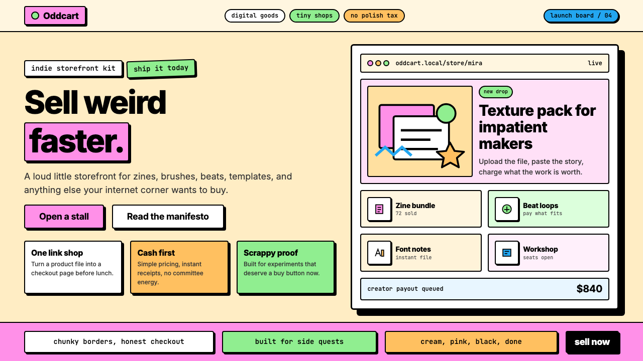 Gumroad CreatorGeoCities by way of Memphis. Hot pink, chunky black borders, hard offset shad…孟菲斯遇上 GeoCities:亮粉、奶油底、粗黑边框、硬阴影——刻意天真粗犷…
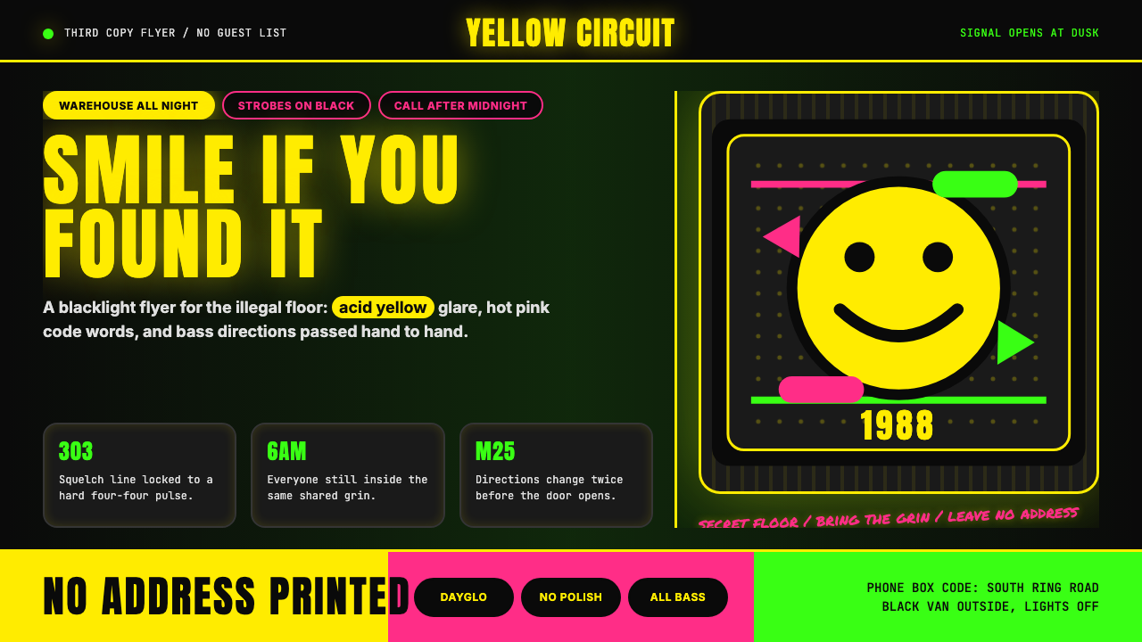 Acid House Smiley (1988)Rave energy hits first. Acid yellow on black, Anton caps, smiley glow.锐舞能量先撞上来。黑底酸黄、Anton大写与笑脸辉光。
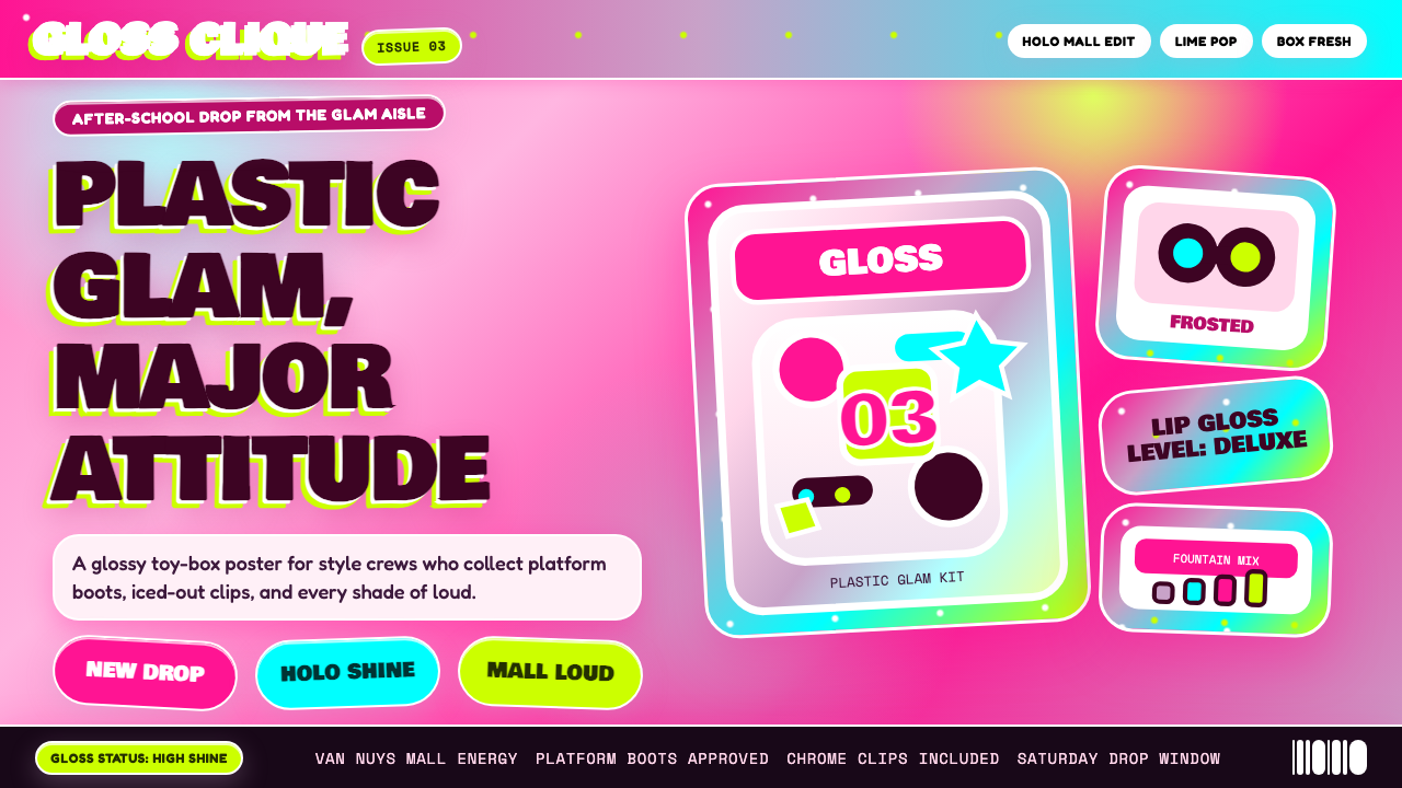 Bratz Doll 2003Y2K maximalism, mall-glossy. Hot-pink gradients, holographic lavender, chunky…Y2K 极繁的商场美学:热粉渐变、全息薰衣草紫、厚重展示字体——拆开 Brat…
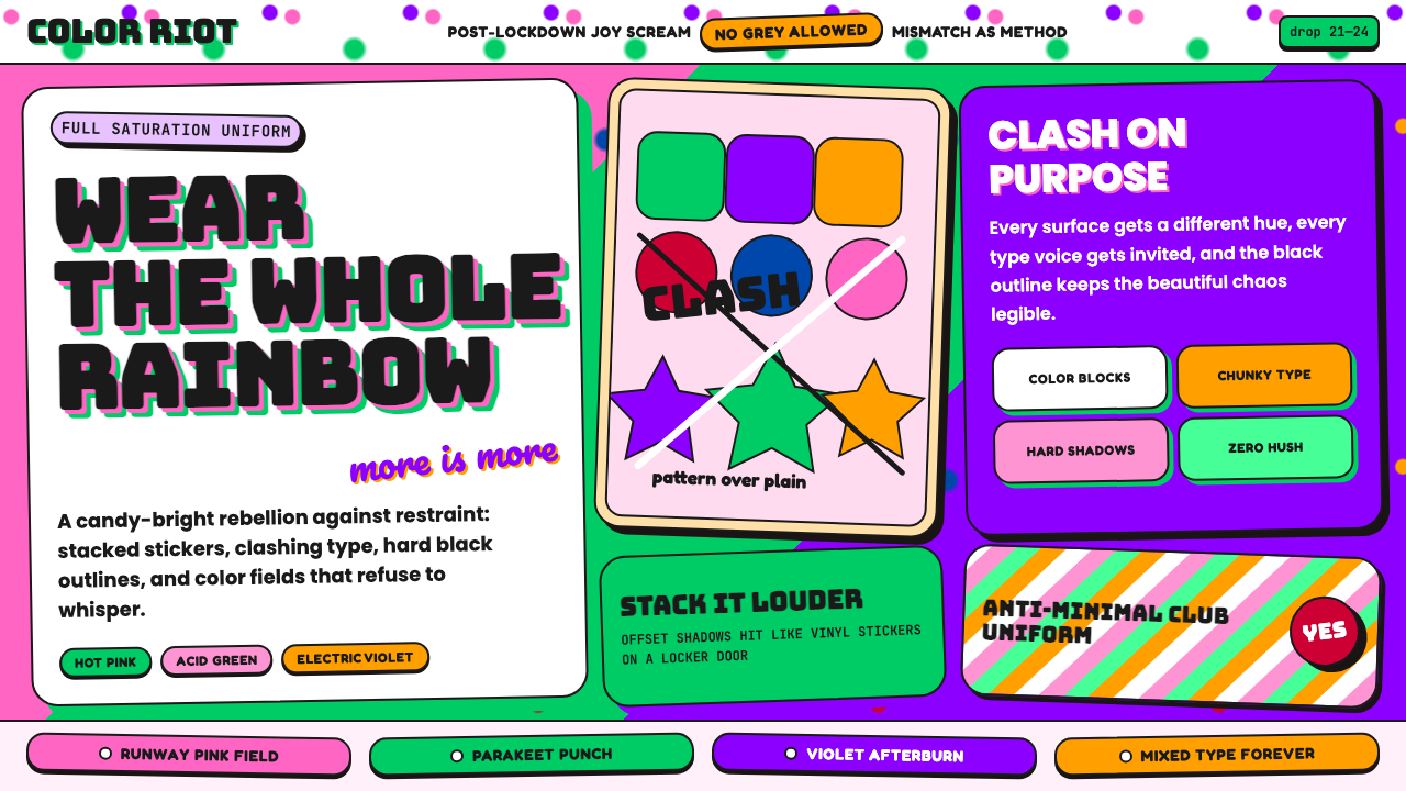 Dopamine Dressing / MaximalismJoy refuses restraint. Hot pink, parakeet green, Bungee type, and brick shado…快乐拒绝克制:热粉、鹦鹉绿、Bungee 粗字和砖块阴影猛烈相撞。
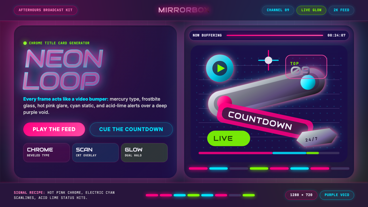 MTV Y2K (2000s)Maximum-volume Y2K. Hot pink chrome, cyan scanlines, and lime hits burn over…高音量千禧感:粉铬、青色扫描线与酸橙光烧过紫色虚空。
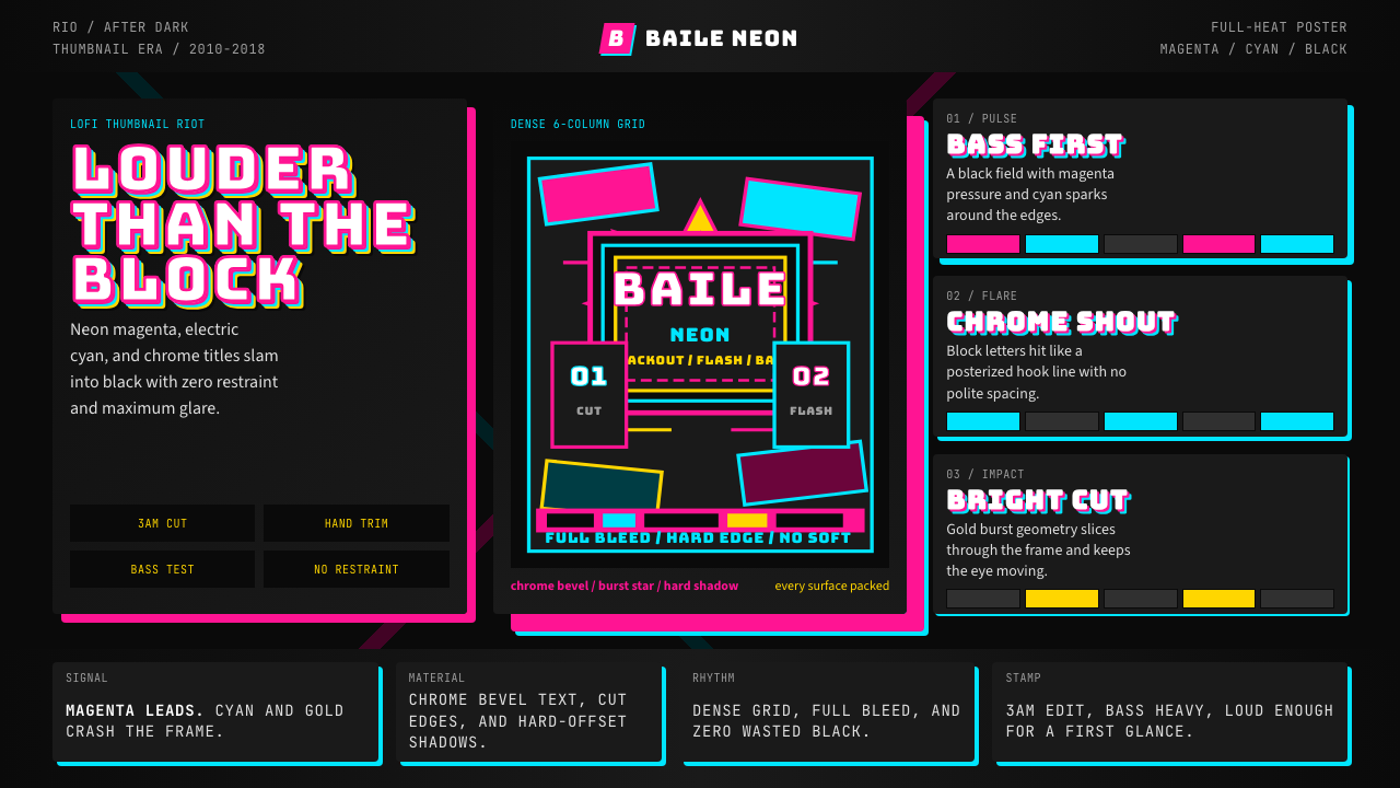 Funk Carioca FavelaMaximalist and unruly. Magenta, cyan, and chrome slam into black at thumbnail…极繁又躁动。洋红、电青与镀铬在黑底上硬碰硬。