What is Bratz 2003?什么是 Bratz 2003?
Bratz 2003 is the visual language of early-2000s mall-girl culture distilled into a design system — hot-pink gradients, holographic shimmer, and chunky attitude-laden type that radiates unapologetic maximalism.Bratz 2003 是千禧年初期美国商场少女文化的视觉精华——热粉渐变、全息光晕、厚重张扬的展示字体,散发着毫不收敛的极繁主义气息。
Bratz 2003 in briefBratz 2003 速览
Bratz 2003 is a visual design system rooted in the aesthetic of early-2000s American mall culture at its most oversaturated and unapologetic. It draws its core vocabulary from the original Bratz doll brand launched by MGA Entertainment in 2001 — a product deliberately conceived to challenge Barbie's dominance with attitude, edge, and a visual identity that refused to be subtle. By 2003, the brand's design language had reached its defining peak: hot-pink gradient fills, holographic lavender surfaces, chrome-effect highlights, rounded display type with heavy personality, and an overall sensibility that felt like opening a fresh doll box under the fluorescent lights of a shopping mall.Bratz 2003 是一套植根于千禧年初期美国商场文化的视觉设计系统,充斥着过饱和的色彩与毫不收敛的张扬个性。它的核心词汇来自 MGA Entertainment 于2001年推出的 Bratz 玩偶品牌——这个产品从一开始就被设计成以态度、锋芒和拒绝含蓄的视觉形象来挑战芭比的主导地位。到2003年,品牌的设计语言达到了定义性的巅峰:热粉渐变填充、全息薰衣草紫表面、铬金属高光效果、带有浓烈个性的圆润展示字体,以及一种仿佛在商场荧光灯下拆开崭新娃娃盒的整体感官体验。
The style belongs to the broader Y2K maximalist movement — a short, intense period of graphic design culture roughly spanning 1999 to 2005, in which digital production tools first made gradients, glitter overlays, and complex color meshes effortlessly achievable, and designers embraced that possibility with gleeful excess. Bratz occupied a specific and influential corner of this moment: it was aimed at pre-teen girls, it was deeply commercial, and it was executed with a surprising degree of visual consistency that made it instantly recognizable and obsessively imitable. The palette of hot pink, holographic lavender, chrome silver, and white gloss became a coherent signature rather than accidental coincidence.这种风格属于更广泛的 Y2K 极繁主义运动——一段大约跨越1999至2005年的短暂而强烈的平面设计文化时期。在那个年代,数字制作工具首次让渐变、闪光叠加和复杂色彩网格的实现变得轻而易举,设计师们以欣喜若狂的过剩感拥抱这种可能性。Bratz 占据了这一时刻一个特定而有影响力的角落:它面向前青少年女孩,具有高度商业属性,却以令人意外的视觉一致性加以执行,使其极易辨认且令人痴迷地被模仿。热粉、全息薰衣草紫、铬银与白色光泽的色盘组合,成为一种连贯的签名,而非偶然的巧合。
Decades later, Bratz 2003 re-emerged as a reference style in its own right. The Y2K aesthetic revival of roughly 2022 to 2024 drew directly on this visual language, and a new generation of designers — particularly those working in social media graphics, fashion branding, and nostalgic editorial — found that the Bratz visual system offered something that contemporary minimalism could not: exuberance, tactility, and immediate emotional legibility. Today it is used intentionally as a complete aesthetic position, not merely as retro decoration.数十年后,Bratz 2003 以一种独立的参考风格重新浮现。大约2022至2024年间兴起的 Y2K 美学复兴直接援引了这套视觉语言,新一代设计师——尤其是那些活跃于社交媒体图形设计、时尚品牌与怀旧编辑领域的创作者——发现 Bratz 视觉系统提供了当代极简主义所无法给予的东西:丰盛感、触感质地,以及即时可读的情感张力。如今它被作为一种完整的美学立场有意识地使用,而非仅仅作为复古装饰。
Where does Bratz 2003 come from?Bratz 2003 从何而来?
The Bratz story begins in Van Nuys, California, at the offices of MGA Entertainment. Carter Bryant, a Mattel employee, sketched the original concept around 1999 and 2000: fashion dolls with oversized heads, exaggerated features, and a street-style sensibility that felt meaningfully different from Barbie's wholesome proportions. Bryant brought the concept to Isaac Larian, MGA's founder and CEO, and the first Bratz dolls reached stores in 2001. The launch was immediately controversial — Mattel would eventually file extensive intellectual property litigation — but commercially, it was a sensation. Bratz sold millions of units in its first year and established itself as the first genuine rival to Barbie's market dominance since the doll's introduction in 1959.Bratz 的故事始于加利福尼亚州范奈斯的 MGA Entertainment 办公室。美泰员工卡特·布莱恩特大约在1999至2000年间勾勒出最初概念:拥有超大头部、夸张面部特征和街头时尚感性的时装娃娃,与芭比的健康比例感觉截然不同。布莱恩特将概念带给了 MGA 创始人兼首席执行官艾萨克·拉里安,第一批 Bratz 娃娃于2001年上架销售。这次发布立即引发了争议——美泰最终提起大规模知识产权诉讼——但在商业上,它是一场轰动。Bratz 第一年售出数百万件,确立了自己作为自1959年芭比娃娃问世以来市场主导地位的首个真正竞争者的地位。
The visual identity that accompanied the doll line was not incidental to its success. MGA commissioned a graphic design language for packaging, advertising, and licensed merchandise that amplified the dolls' attitude into a coherent brand world. The palette — saturated hot pink as the dominant hue, softened by holographic lavender and anchored by chrome-effect metallics — was chosen to communicate energy, femininity, and desirability without Barbie's pastel restraint. Packaging designers used gradient mesh techniques that were technically demanding for print production of that era, giving boxes and blister cards a glossy, almost luminous quality that stood out aggressively on retail shelves.伴随这条娃娃产品线的视觉形象对其成功并非可有可无。MGA 委托设计了一套覆盖包装、广告与授权商品的平面设计语言,将娃娃的态度放大为一个连贯的品牌世界。色盘——以饱和热粉为主导色调,由全息薰衣草紫柔化,以铬金属效果锚定——被选来传递活力、女性气质与渴望感,同时摒弃芭比的粉彩克制。包装设计师使用了对当时印刷生产而言技术要求颇高的渐变网格技法,赋予盒子和泡罩包装一种光泽的、几乎发光的质感,在零售货架上极具视觉冲击力。
The years 2003 to 2005 marked the brand's visual apex. Licensed products flooded into every category — stationery, clothing, electronics accessories, cosmetics, video games — and the visual system scaled across all of them with surprising consistency. The typography evolved toward chunky, rounded display letterforms with dimensional effects: beveled edges, inner glows, and drop shadows that gave text a plastic, almost sculptural quality echoing the physical dolls themselves. This was not accidental; the design brief effectively asked for type that looked like it could be a molded plastic logo on a toy package.2003至2005年间是品牌视觉形象的巅峰时期。授权产品涌入每一个品类——文具、服装、电子配件、化妆品、电子游戏——而视觉系统以令人惊讶的一致性跨越所有这些品类延伸。字体演变为带有立体效果的粗圆展示字形:斜角边缘、内发光和投影赋予文字一种塑料质感、近乎雕塑般的品质,呼应了实体娃娃本身。这并非偶然;设计规范实际上要求字体看起来像玩具包装上的模压塑料标志。
The broader cultural moment shaped the aesthetic as profoundly as any design brief. The early 2000s were a period when digital production tools — gradient mesh in Adobe Illustrator, layer styles in Photoshop — had become accessible enough for commercial print studios to use aggressively. The resulting aesthetic across advertising, packaging, and entertainment graphics was uniformly high-gloss: everything shimmer, everything gradient, everything catching light. Bratz sat at the premium end of this aesthetic for its target market, which meant that its designers pushed the gloss, the holographic effects, and the saturated palette further than most. The result was a visual language that was simultaneously of its moment and extreme enough to remain distinctly recognizable decades later.更广泛的文化时刻对这种美学的塑造不亚于任何设计规范。2000年代初期,数字制作工具——Adobe Illustrator 中的渐变网格、Photoshop 中的图层样式——已经足够普及,可供商业印刷工作室大量使用。由此产生的跨广告、包装和娱乐图形的整体美学统一高光泽:一切都闪耀,一切都渐变,一切都捕捉光线。Bratz 在其目标市场的同类产品中处于高端,这意味着设计师将光泽感、全息效果和饱和色盘推向极致。结果是一套既属于那个时代、又足够极端以至于数十年后依然清晰可辨的视觉语言。
What defines the Bratz 2003 look?Bratz 2003 的视觉特征是什么?
Color色彩
The palette is built around a small set of extremely saturated, high-energy hues. Hot pink — vivid, warm, and insistent — functions as the dominant signature. Holographic lavender provides a cooler counterpoint with a shimmery, iridescent quality that shifts subtly depending on context. Chrome silver and white act as structural highlights, amplifying the sense of gloss and light-catching surface. Black is used sparingly and primarily for typographic contrast rather than as a field color. The overall effect is one of aggressive luminosity: every surface appears to glow or reflect, and no hue retreats into the background willingly.色盘围绕一组极度饱和、充满能量的色调构建。热粉——鲜艳、温暖而持续存在——充当主导性的品牌签名色。全息薰衣草紫提供了一种更冷的对位,带有随语境微妙变化的闪烁虹彩质感。铬银与白色作为结构性高光,放大了光泽感和光线捕捉表面的质感。黑色用量克制,主要用于字体对比而非大面积铺底。整体效果是一种攻击性的明亮:每一个表面都显得在发光或反射,没有任何色调愿意退入背景。
Gradients and Gloss渐变与光泽
Gradients are not a secondary element in this system — they are its defining structural technique. The characteristic hot-pink gradient does not transition simply from one tone to another; it moves through multiple steps, often incorporating a near-white highlight at one edge and deepening toward a more saturated magenta or cool rose at the other, with an inner glow suggesting an internal light source. Holographic surfaces layer additional color variation, implying that the material itself shifts color. These complex gradient meshes are what make the style technically challenging to replicate authentically: simple two-stop gradients miss the luminous, multi-tonal quality that defines the original.在这套系统中,渐变不是次要元素,而是定义性的结构技法。标志性的热粉渐变并非简单地从一个色调过渡到另一个;它经历多个步骤,往往在一侧边缘融入近似白色的高光,在另一侧加深至更饱和的洋红或冷玫瑰色,内发光则暗示着一个内在光源的存在。全息表面叠加了额外的色彩变化,暗示材质本身在变换颜色。这些复杂的渐变网格正是使这种风格难以真实复制的技术挑战所在:简单的双色点渐变无法呈现原作中那种发光的、多色调的品质。
Typography字体排印
Display type in the Bratz visual system is chunky, rounded, and loaded with dimensional effects. Letterforms are wide and heavy, with terminals that curve rather than cut. Beveling and embossing give type a plastic-molded appearance — the letters seem to have thickness, to protrude slightly from the surface, in deliberate visual reference to molded toy packaging. Inner glows and outer glows further dissolve the boundary between letter and background, creating a soft luminous halo effect. Script and italic variants are used for emotional emphasis, with exaggerated slopes and sweeping descenders. Hierarchy is established through extreme size contrast rather than weight variation alone.Bratz 视觉系统中的展示字体粗壮、圆润,并充满立体效果。字形宽厚,字母末端以弧线收尾而非直切。斜角和浮雕效果赋予字体一种塑料模压的外观——字母看起来有厚度,略微从表面突出,有意在视觉上呼应模压玩具包装的质感。内发光和外发光进一步消融了字母与背景之间的边界,营造出柔和的光晕效果。手写体与斜体变体用于情感强调,带有夸张的倾角和大幅舒展的降部。层级关系通过极度的尺寸对比建立,而不仅依赖于字重的变化。
Surface Texture and Glitter表面质感与闪光
Where the Bauhaus refused all surface texture on principle, Bratz 2003 treats texture as a primary expressive tool. Glitter overlays — tiny, randomized sparkle patterns rendered at high density — are applied to backgrounds, type fills, and decorative elements alike, giving the impression of a material that catches and throws light in multiple directions simultaneously. Holographic foil effects simulate the color-shifting quality of real iridescent materials. Soft, airbrushed gradients on skin tones and clothing suggest the smooth, almost poreless surfaces of the dolls themselves. These layered textural techniques create depth and richness without relying on hard shadow or photographic realism.包豪斯从原则上拒绝一切表面质感,而 Bratz 2003 则将质感作为首要的表达工具。闪光叠加——以高密度渲染的细小、随机闪光图案——被应用于背景、字体填充和装饰元素,给人以一种材质在多个方向同时捕捉和散射光线的印象。全息箔效果模拟了真实虹彩材料的色彩变换质感。肤色和服装上柔和的喷枪式渐变,暗示了娃娃本身那种光滑、几乎无毛孔的表面。这些层叠的质感技法在不依赖硬边阴影或摄影写实主义的情况下,创造了深度与丰富感。
Geometry and Shape几何形与造型
The Bratz visual system shares one instinct with many playful commercial aesthetics of its era: a strong preference for rounded forms over angular ones. Corners are softened, containers become pill shapes or rounded rectangles, dividers use wavy curves rather than straight lines. Stars, hearts, and flowers appear as decorative motifs, typically rendered with the same gradient and glow treatments as type. Silhouettes of the dolls themselves — wide head, large eyes, pouting lips — function as recurring brand shapes that anchor compositions and signal the aesthetic immediately. This geometry communicates approachability and fun rather than structure and authority.Bratz 视觉系统与那个时代许多活泼商业美学共享一种本能:对圆润形态的强烈偏好,而非棱角分明。边角被柔化,容器变为胶囊形或圆角矩形,分隔线使用波浪曲线而非直线。星形、心形和花朵作为装饰母题出现,通常以与字体相同的渐变和发光手法呈现。娃娃本身的轮廓——宽大的头部、大眼睛、嘟嘟的嘴唇——作为反复出现的品牌形状,锚定构图并立即传递出这套美学的信号。这种几何形态传递的是亲切感与趣味性,而非结构感与权威性。
Layout and Composition版式与构图
Compositions in this style are centripetal rather than grid-driven: elements cluster toward a central figure or focal point — typically a doll, a character face, or a typographic logo — with decorative elements radiating outward like sparks. Background space is rarely left quiet; it is filled with gradient fields, glitter texture, or secondary decorative motifs. This density is intentional and characteristic: the style does not use negative space as breathing room but as an opportunity for additional visual richness. Layering is deep — five or more distinct visual planes are common — and the overall effect rewards close looking, revealing details that are not immediately obvious at first glance.这种风格的构图是向心型而非网格驱动型:元素向中心人物或焦点聚集——通常是一个娃娃、一张角色面孔或一个字体标志——装饰性元素如火花般向外辐射。背景空间极少留白;它被渐变色场、闪光质感或次级装饰母题填满。这种密度是刻意且具有特征性的:这种风格不将负空间作为呼吸余地,而将其视为增添视觉丰富性的机会。分层深度很高——五个或更多独立的视觉平面十分常见——整体效果在仔细观看后会得到回报,揭示出第一眼并不立即显现的细节。
Attitude and Emotional Register态度与情感基调
Perhaps the most important characteristic of Bratz 2003 is its emotional posture. Unlike aesthetics grounded in authority, refinement, or restraint, this one is built entirely around self-expression, confidence, and playful defiance. The visual excess is not a failure of taste — it is the point. More is more. The glossier, the more saturated, the more layered, the better. This attitude shapes every design decision: typography should feel alive and expressive, color should feel loud and proud, surface should feel luxurious and indulgent. Designs that apply the palette and technique while restraining the attitude produce something that looks like a cautious imitation rather than a genuine realization of the style.Bratz 2003 最重要的特征或许是它的情感姿态。与那些建立在权威、精致或克制之上的美学不同,这套体系完全围绕自我表达、自信和玩味式的叛逆而构建。视觉上的过剩并非品位的失败——它本身就是目的。多即是多。越有光泽、越饱和、越多层次,越好。这种态度塑造了每一个设计决定:字体应当感觉鲜活且富有表现力,色彩应当感觉响亮而自豪,表面应当感觉奢华而纵情。那些只应用了色盘和技法却克制了态度的设计,产出的是谨慎的模仿,而非这种风格的真正实现。
Who shaped Bratz 2003?谁塑造了 Bratz 2003?
Carter Bryant was the designer who sketched the original Bratz doll concept while employed at Mattel, around 1999 and 2000. His central creative decisions — the oversized head, the exaggerated facial features, the street-fashion sensibility — established the physical identity that the graphic design system then had to serve. Bryant's aesthetic instinct was to create something deliberately at odds with Barbie's proportional idealism, and this confrontational spirit embedded itself in every downstream visual decision, from the hot-pink packaging to the attitude-laden typography. His departure from Mattel and move to MGA sparked years of litigation that became one of the most prominent intellectual property disputes in the toy industry.卡特·布莱恩特是在供职于美泰期间(约1999至2000年间)勾勒出 Bratz 娃娃原始概念的设计师。他的核心创意决定——超大头部、夸张面部特征、街头时尚感性——确立了实体形象的基础,平面设计系统随后必须服务于这一基础。布莱恩特的美学本能是创造出一种刻意与芭比的比例理想主义相悖的东西,而这种对抗精神融入了每一个后续的视觉决定之中,从热粉包装到充满态度的字体设计无不如此。他从美泰离职并加入 MGA 一事引发了长达数年的诉讼,成为玩具行业最著名的知识产权纠纷之一。
Isaac Larian, founder and CEO of MGA Entertainment, made the commercial and creative bets that allowed the Bratz visual identity to become as extreme as it did. Where a more conservative executive might have moderated the hot-pink gradients or toned down the holographic effects to reduce production cost or risk, Larian backed the maximalist vision and the expensive print techniques required to execute it faithfully. His willingness to position Bratz as a genuine rival to Barbie — not just a market follower — meant that the brand had to project confidence and distinctiveness through its visual identity, which directly encouraged the designers to push further. Larian remained a combative public figure throughout the Mattel litigation and continued leading MGA through a Bratz revival in the 2010s.MGA Entertainment 创始人兼首席执行官艾萨克·拉里安做出了商业和创意上的押注,使 Bratz 的视觉形象得以发展到如此极端的程度。更保守的高管可能会为了降低成本或风险而对热粉渐变加以节制,或淡化全息效果;而拉里安则支持了极繁主义的愿景以及忠实执行所需的昂贵印刷技术。他将 Bratz 定位为芭比的真正竞争者——而非市场跟随者——的意愿,意味着品牌必须通过视觉形象投射自信与独特性,这直接鼓励设计师不断突破边界。在与美泰的诉讼期间,拉里安始终是一个好战的公众人物,并在2010年代继续领导 MGA 推动 Bratz 的复兴。
The second life of Bratz 2003 as a design reference was not driven by a single creator or institution but by a diffuse community of designers, stylists, and visual artists active primarily on social media platforms between roughly 2020 and 2024. This community — operating under the broad umbrella of Y2K aesthetic revival — excavated, documented, and recontextualized the visual language of early-2000s commercial design, treating Bratz packaging and advertising as source material on equal footing with editorial fashion photography and MTV graphics. Their work gave a new generation of designers vocabulary and permission to use the style intentionally. The revival made clear that the Bratz visual system had coherence and staying power beyond nostalgia.Bratz 2003 作为设计参考的第二次生命,并非由单一创作者或机构推动,而是由大约2020至2024年间活跃于社交媒体平台上的一个分散的设计师、造型师和视觉艺术家社群所驱动。这个社群在广泛的 Y2K 美学复兴旗帜下运作,挖掘、记录并重新语境化了2000年代初期商业设计的视觉语言,将 Bratz 包装和广告视为与编辑时尚摄影及 MTV 图形平等地位的原始素材。他们的工作为新一代设计师提供了词汇和有意识使用这种风格的许可。这场复兴清晰地表明,Bratz 视觉系统拥有超越怀旧情感的连贯性与持久力。
The anonymous in-house and contracted design teams at MGA Entertainment between 2001 and 2006 deserve recognition as the actual authors of the Bratz visual language. Working under commercial constraints and tight production schedules, they developed the packaging design, advertising graphics, and licensed merchandise templates that established and maintained the style across thousands of distinct products. The technical choices they made — the specific gradient techniques, the typographic dimensionality, the approach to holographic surface simulation — defined what Bratz looked like, and those choices proved stable enough to be replicated across an enormous licensed product ecosystem. Their work constitutes one of the most consistent applications of a single visual identity in mass-market toy history.2001至2006年间在 MGA Entertainment 工作的匿名内部及外包设计团队,值得被认可为 Bratz 视觉语言的真正作者。在商业约束和紧迫的生产时间表下,他们开发了包装设计、广告图形和授权商品模板,在数千种不同产品中确立并维护了这一风格。他们做出的技术选择——特定的渐变技法、字体的立体感、全息表面模拟的处理方式——定义了 Bratz 的视觉面貌,而这些选择被证明足够稳定,得以在庞大的授权产品生态系统中被复制。他们的工作构成了大众市场玩具史上最为一致的单一视觉形象应用之一。
How do you use Bratz 2003 today?今天怎么用 Bratz 2003?
Bratz 2003 is a maximalist style, and applying it requires committing to excess rather than restraint. The first principle is that every surface is an opportunity for visual richness: backgrounds should not be flat or neutral, type should not be simply colored, and decorative elements should not be held back for fear of clutter. Designers accustomed to working in minimalist or corporate systems often under-apply this style — the result looks like a timid approximation rather than a genuine realization. The correct approach is to lead with the gradient, layer the texture, and then evaluate whether the composition reads clearly before pulling anything back.Bratz 2003 是一种极繁主义风格,应用它需要拥抱过剩而非克制。第一原则是:每一个表面都是视觉丰富性的机会——背景不应是平淡或中性的,字体不应只是简单着色,装饰元素不应因担心杂乱而被克制。习惯于极简或企业风格体系工作的设计师往往会对这种风格应用不足——结果看起来像是胆怯的近似,而非真正的实现。正确的方法是以渐变为先导,叠加质感,然后在评估构图是否清晰可读之后再考虑是否要收缩。
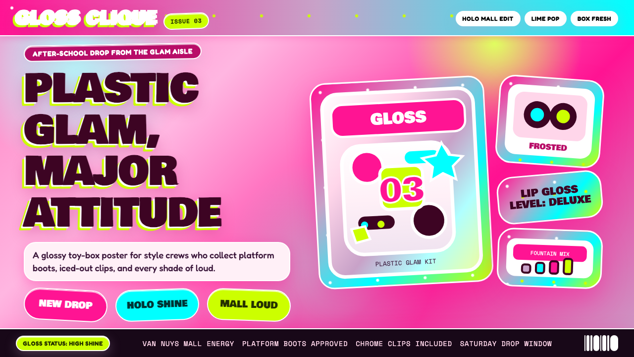
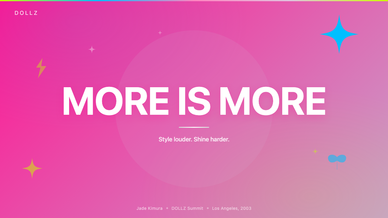
For presentation slides, the style works most powerfully on cover and section-break pages where bold visual impact is the priority. A cover built in this aesthetic should combine a dominant gradient background — moving from hot pink to a cooler lavender or rose — with a large, dimensionally treated title in centered or slightly off-center placement. Decorative stars, sparkle accents, or glitter-texture overlays can fill the remaining space without compromising legibility. Content slides require more discipline: the gradient background can be retained, but type must be large enough and contrasted enough to remain scannable. Data slides work when chart elements — bars, pie segments, line fills — carry the gradient treatment, turning the data visualization itself into an expressive visual object rather than a neutral diagram.在演示文稿中,这种风格在封面和章节间隔页上最具力量,因为在那些地方大胆的视觉冲击是首要目标。以这套美学构建的封面页应将主导性渐变背景——从热粉过渡至更冷的薰衣草紫或玫瑰色——与居中或略偏心放置的大号立体感标题相结合。装饰性星形、闪光点缀或闪光质感叠加可以填充剩余空间,而不损害可读性。内容页需要更多的纪律性:渐变背景可以保留,但字体必须足够大、对比度足够高以保持可扫描性。当图表元素——柱条、饼图扇区、折线填充——也承载渐变处理时,数据页的效果最佳,将数据可视化本身变成一个富有表现力的视觉对象,而非中性的图示。
For web interfaces and digital products, Bratz 2003 is most appropriate for platforms aimed at younger audiences, fashion and beauty contexts, entertainment, and any brand positioning that relies on exuberance and fun over authority and professionalism. Landing pages and hero sections benefit from full-screen gradient backgrounds with heavily styled headline type; scrolling content sections can soften the treatment, using the palette at lower saturation with the bold gradient reserved for calls to action, highlights, and interactive states. Card components work well when given a gloss treatment — a subtle inner highlight at the top edge simulating a light source — and interactive elements such as buttons should carry the full saturated pink with white or chrome type rather than muted alternatives.对于网页界面和数字产品,Bratz 2003 最适合面向年轻受众的平台、时尚与美妆语境、娱乐内容,以及任何品牌定位依赖于丰盛感和趣味性而非权威性和专业性的场景。落地页和首屏区域受益于全屏渐变背景配合强烈风格化的标题字体;滚动内容区域可以软化处理,以较低饱和度使用色盘,将大胆渐变保留给行动号召、高亮区域和交互状态。卡片组件在给予光泽处理时效果最佳——顶部边缘的微妙内高光模拟光源——按钮等交互元素应承载完整饱和的热粉,配以白色或铬金属字体,而非柔和的替代色。
For editorial and marketing applications, the style is particularly effective for social media graphics, promotional posters, event branding, and fashion-adjacent editorial contexts. Social cards should fill the entire frame with gradient and texture, treating the background as a designed surface rather than a container for floating elements. Marketing emails can use the style for header blocks and promotional banners while maintaining a lighter, cleaner treatment for body content to preserve readability at the scale of body text. Physical print applications — poster design, packaging — are where the style was originally invented, and they reward the most committed application: the more layers of gradient, texture, and dimensional type, the more authentic the result.对于编辑与营销应用,这种风格在社交媒体图形、促销海报、活动品牌和时尚相关的编辑语境中尤为有效。社交卡片应以渐变和质感填满整个画面,将背景视为一个被设计的表面,而非漂浮元素的容器。营销邮件可在头部区块和促销横幅中使用这种风格,同时对正文内容保持更轻盈、更干净的处理以保证正文字号下的可读性。实体印刷应用——海报设计、包装——是这种风格最初被发明的领域,它们回报最坚定的应用方式:渐变、质感和立体字体的层次越多,结果越真实。
A common mistake when applying Bratz 2003 is selecting the color palette and gradients while neglecting the dimensionality of the typography. Flat, unadorned type set in pink against a pink gradient background produces neither legibility nor authenticity — the original system works precisely because the type fights for its own visual presence through beveling, glow effects, and strong tonal contrast. A second common error is applying the style to contexts where it actively conflicts with the product's values: financial services, medical information, legal platforms, and professional B2B tools require trust signals that this style actively undermines. The aesthetic communicates play, energy, and self-expression — when those values align with the product, it works; when they do not, the mismatch reads immediately and damages credibility.应用 Bratz 2003 时最常见的错误是选取了色盘和渐变,却忽视了字体的立体感。在粉红渐变背景上叠加平淡无装饰的粉红字体,既不能实现可读性,也无法实现真实性——原始系统之所以有效,正是因为字体通过斜角、发光效果和强烈的色调对比,为自身的视觉存在而战。另一个常见错误是将这种风格应用于与产品价值观积极冲突的场景:金融服务、医疗信息、法律平台和专业 B2B 工具需要信任信号,而这种风格恰恰会主动破坏它们。这套美学传递的是玩味、能量和自我表达——当这些价值观与产品对齐时,它有效;当它们不对齐时,这种错位会立即被读出,并损害可信度。
Bratz 2003 — FAQBratz 2003 · 常见问题
Is Bratz 2003 the same as the broader Y2K aesthetic?Bratz 2003 和更广泛的 Y2K 美学是同一回事吗?
They overlap but are distinct. The Y2K aesthetic is a broad umbrella covering graphic design, fashion, and product design from roughly 1998 to 2005, characterized by a shared enthusiasm for digital production techniques — gradients, chrome effects, translucency, and futurist geometry — across many different cultural contexts. Bratz 2003 is a specific and highly coherent subset of Y2K aesthetics, distinguished by its particular palette of hot pink and holographic lavender, its overtly feminine and attitude-laden posture, its emphasis on glossy rounded forms over metallic angular ones, and its deep roots in mass-market toy and mall culture. You can be working in the Y2K aesthetic without invoking Bratz — futurist chrome typography and alien metallics read as Y2K without reading as Bratz. But Bratz is always Y2K.两者有交集,但并不相同。Y2K 美学是一个宽泛的涵盖性概念,涵盖大约1998至2005年间的平面设计、时尚和产品设计,以对数字制作技术的共同热情为特征——渐变、铬金属效果、半透明感和未来主义几何——跨越许多不同的文化语境。Bratz 2003 是 Y2K 美学中一个特定且高度连贯的子集,以其特有的热粉与全息薰衣草紫色盘、明显女性化且充满态度的姿态、对光泽圆润形态而非金属棱角形态的强调,以及其深植于大众市场玩具和商场文化的根源而有别于其他。你可以在 Y2K 美学框架内工作而不援引 Bratz——未来主义铬金属字体和外星感金属质感读起来是 Y2K,但不读作 Bratz。但 Bratz 始终是 Y2K。
Can this style be used for professional or business contexts?这种风格可以用于专业或商业场景吗?
With care, yes — but the context must be chosen deliberately. Bratz 2003 communicates exuberance, playfulness, and self-expressive confidence; it does not communicate sobriety, precision, or institutional authority. It works in professional contexts where those values are assets rather than liabilities: fashion brand presentations, entertainment pitch decks, beauty and lifestyle product launches, youth-oriented marketing campaigns, and creative agencies positioning themselves as bold and culturally fluent. It does not work for financial reporting, medical information, legal documentation, or any context where users need to trust the source before they can engage with the content. The test is whether the aesthetic's emotional register matches the emotional need of the audience in that specific context.经过慎重考量,可以——但语境必须被刻意选择。Bratz 2003 传递的是丰盛感、趣味性和自我表达的自信;它不传递沉稳、精确或机构权威。它在那些以上价值观是资产而非负债的专业场景中有效:时尚品牌演示、娱乐提案幻灯片、美妆与生活方式产品发布、面向年轻受众的营销活动,以及将自身定位为大胆且具有文化敏感度的创意机构。它不适用于财务报告、医疗信息、法律文件,或任何用户需要先建立信任才能与内容互动的场景。检验方法是:这套美学的情感基调是否与特定场景中受众的情感需求相匹配。
How do I keep the style legible when everything is competing for attention?当所有元素都在争夺注意力时,如何保持风格的可读性?
Legibility in a maximalist style depends on establishing clear hierarchy through contrast rather than through restraint. The key principle is tonal contrast: text must be significantly lighter or darker than the background it sits on, regardless of how complex that background is. Glow effects around type — which are characteristic of the style — actually serve a legibility function, creating a local area of contrast immediately around each letterform. A second tool is size: in a visually busy composition, type that is large enough to claim its own territory does not compete with decorative elements — it dominates them. The mistake is using medium-sized, medium-weight type in a medium color against a complex background, which produces a composition where everything competes at the same visual weight and nothing wins.极繁主义风格中的可读性依赖于通过对比而非克制来建立清晰的层级关系。关键原则是色调对比:文字必须明显比它所在的背景更浅或更深,无论这个背景多么复杂。字体周围的发光效果——这是这种风格的特征之一——实际上服务于可读性功能,在每个字形的周围立即创造出一块局部对比区域。另一个工具是尺寸:在视觉上繁忙的构图中,足够大以主张自身领域的字体并不与装饰元素竞争——而是主导它们。错误做法是在复杂背景上使用中等大小、中等字重、中等颜色的字体,这会产生一个所有元素以相同视觉分量竞争、无一胜出的构图。
How does this style age, and will it look dated quickly?这种风格会怎样随时间演变?它会很快显得过时吗?
Bratz 2003 already aged once — it was considered dated from roughly 2007 to 2020 — and then experienced a significant critical and commercial revival. This pattern suggests something important: the style has enough internal coherence and cultural specificity to function as a deliberate historical reference rather than simply appearing accidentally old. Designs that use it knowing exactly what they are referencing — early-2000s mall culture, Y2K maximalism, the specific visual language of the Bratz brand — read as intentional and even sophisticated. Designs that use it inadvertently, because some of its surface characteristics drifted into current commercial aesthetics without the full system, will look dated faster. The key is intentionality: this is a style you cite, not one you accidentally wander into.Bratz 2003 已经老化过一次——大约在2007至2020年间被认为是过时的——然后经历了一次显著的批评性和商业性复兴。这一模式揭示了重要的事实:这种风格具有足够的内部连贯性和文化特殊性,能够作为一种刻意的历史参考而发挥作用,而不是仅仅显得偶然陈旧。那些清楚地知道自己在援引什么的设计——2000年代初期的商场文化、Y2K 极繁主义、Bratz 品牌的特定视觉语言——读起来是刻意的,甚至是老练的。那些无意间使用它的设计——因为这套体系的某些表面特征在没有完整系统支撑的情况下漂移进了当代商业美学——会更快显得过时。关键在于意图性:这是一种你有意援引的风格,而非你偶然误入的风格。
What is the right way to adapt Bratz 2003 without copying it literally?如何在不字面复制的情况下恰当地改编 Bratz 2003?
The most generative approach is to identify which specific characteristics carry the most aesthetic weight and lead with those, while allowing the others to recede or be reinterpreted. The hot-pink gradient and the dimensional typography are the two elements most immediately recognizable as Bratz-specific; if you retain both, the style is clearly legible even if glitter, holographic lavender, and some of the other surface details are simplified or recontextualized. Conversely, using holographic effects and rounded type in a palette that does not include hot pink produces a visual that reads as Y2K or frosted-pop but not specifically as Bratz. Adaptation also works well when the style's attitude is retained while the color is shifted: a full-on maximalist gradient system in warm amber and cream, or in rich blue and silver, borrows the structural logic without reproducing the signature palette.最具创造性的方法是识别出哪些具体特征承载了最多的美学分量,以这些特征为先导,同时允许其他特征退居幕后或被重新诠释。热粉渐变和立体字体是最直接被识别为 Bratz 特有的两个元素;如果保留这两者,即使闪光效果、全息薰衣草紫和其他一些表面细节被简化或重新语境化,这种风格仍然清晰可读。相反,在不含热粉的色盘中使用全息效果和圆润字体,产出的视觉读作 Y2K 或冰霜流行风,但不特别读作 Bratz。当保留这种风格的态度而改变色彩时,改编也同样有效:在温暖的琥珀色与奶油色中,或在浓郁的蓝色与银色中构建的完整极繁主义渐变系统,借用了结构逻辑,而没有复制标志性色盘。
Related design styles相关设计风格
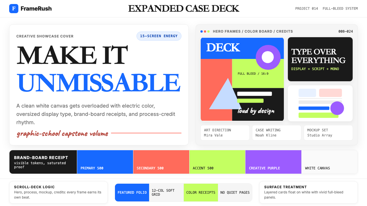 Behance Maximalist PortfolioPortfolio volume at max. Electric blue, coral and lime stack into a full-blee…作品集音量拉满:电光蓝、珊瑚橙与酸橙绿堆成全出血案例板。
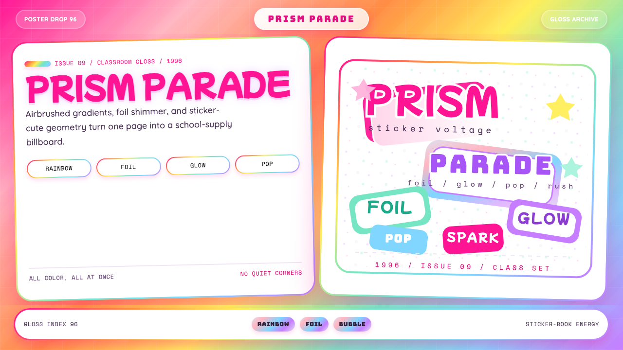 Lisa Frank Rainbow (90s)Pure sticker-saturation. Rainbow gradient, magenta glow, foil shimmer, bubbly…纯粹贴纸饱和。彩虹渐变、品红辉光、全息闪片、胖圆字体。
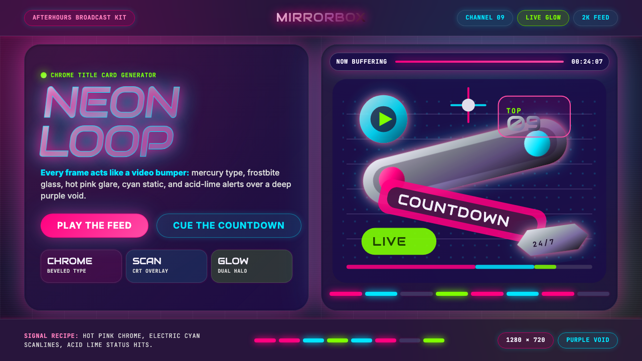 MTV Y2K (2000s)Maximum-volume Y2K. Hot pink chrome, cyan scanlines, and lime hits burn over…高音量千禧感:粉铬、青色扫描线与酸橙光烧过紫色虚空。
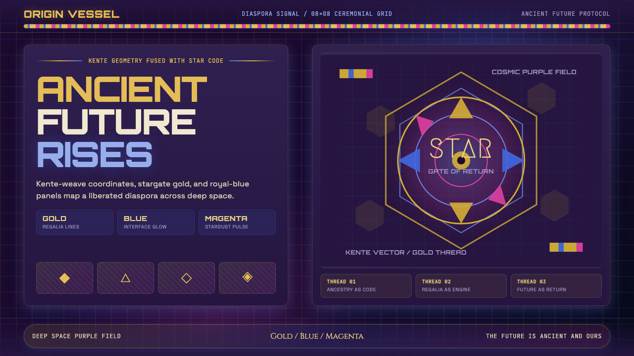 AfrofuturismAncient future, fully luminous. Gold kente grids cut through cosmic purple an…古老未来自带光芒:金色肯特网格切开宇宙紫与蓝色辉光。
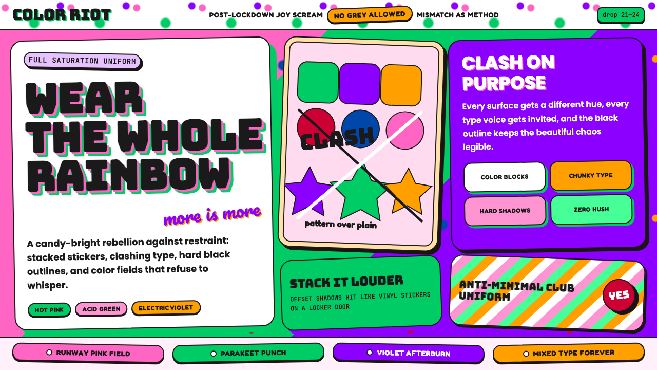 Dopamine Dressing / MaximalismJoy refuses restraint. Hot pink, parakeet green, Bungee type, and brick shado…快乐拒绝克制:热粉、鹦鹉绿、Bungee 粗字和砖块阴影猛烈相撞。
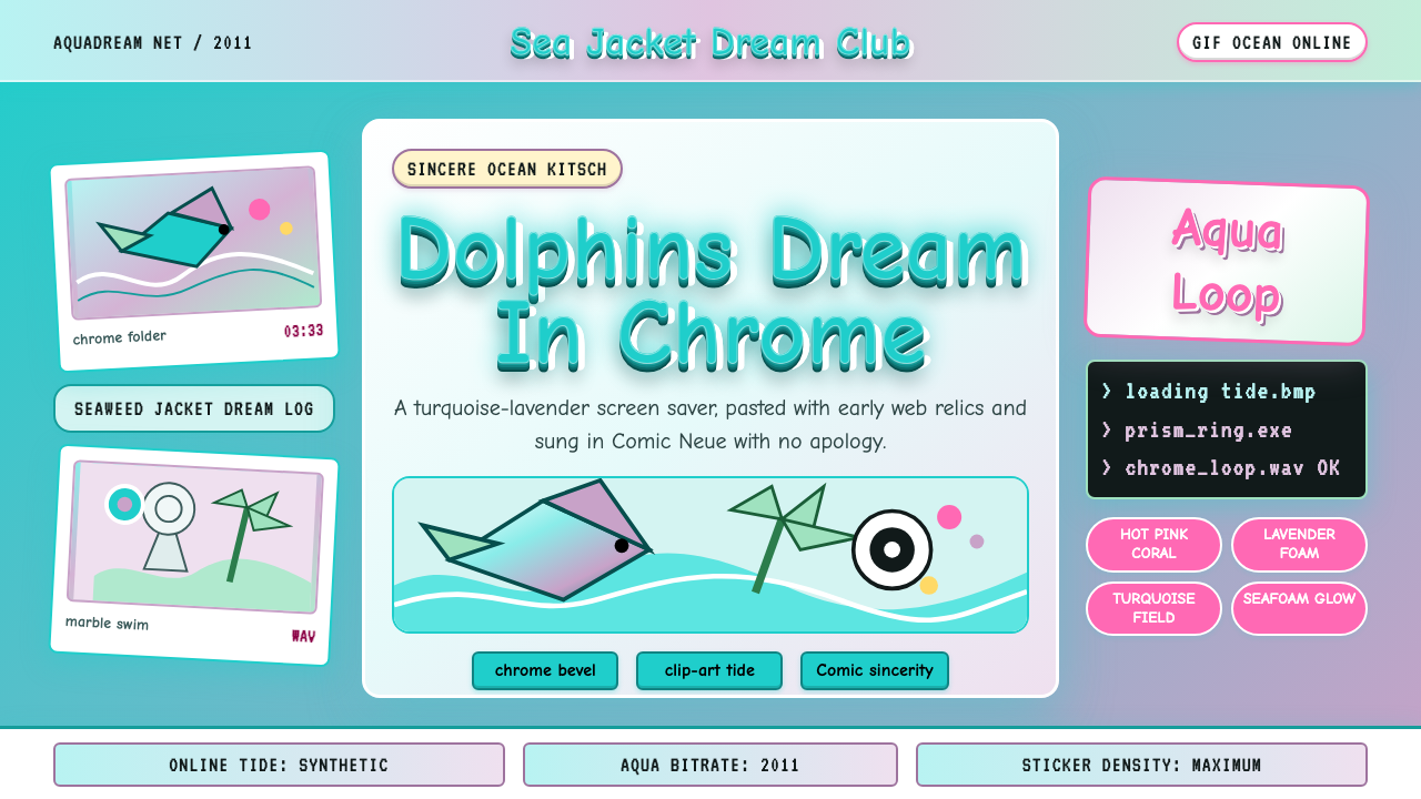 Seapunk 2011Sincere ocean kitsch. Turquoise gradients, Comic Neue chrome, and clip-art do…真诚的海洋俗艳:青绿渐变、Comic Neue 铬字与海豚剪贴画相撞。