What is Lisa Frank Rainbow (90s)?什么是 Lisa Frank Rainbow (90s)?
Lisa Frank turned every color of the rainbow up to maximum simultaneously — and made an entire generation of American kids believe that was the only correct setting.Lisa Frank 将彩虹的每一种颜色同时拨到最大——并让整整一代美国孩子相信,这是唯一正确的设置。
Lisa Frank Rainbow (90s) in briefLisa Frank Rainbow (90s) 速览
Lisa Frank Rainbow is an American maximalist visual style rooted in the school-supply branding of the late 1980s and 1990s. Its defining qualities are total chromatic saturation — every band of the visible spectrum deployed at once, without hierarchy or restraint — combined with airbrushed gradients that blend those colors into seamless, luminous transitions. The aesthetic pairs this chromatic intensity with soft, rounded geometry: bubble-letter type, sticker-cute animal illustrations, and holographic foil surfaces that appear to shift color as they catch the light.Lisa Frank 彩虹风格是一种植根于1980年代末至1990年代学生文具品牌的美国极致主义视觉风格。其核心特质是全色谱饱和——可见光谱的每一个色带同时出现,不分主次、毫无克制——与喷绘渐变相结合,将这些颜色融合为顺滑而发光的过渡。这种色彩强度与柔和圆润的几何造型并置:气泡字体、贴纸感十足的动物插图,以及随光线变化而变色的全息箔片表面。
Where most design systems treat color as a tool for hierarchy — one hue leads, others support — the Lisa Frank system treats color as the message itself. The goal is not clarity or emphasis but pure sensory delight: an overwhelming, celebratory saturation that communicates abundance, joy, and a kind of gleeful refusal to be subtle. Animal subjects — dolphins, tigers, pandas, unicorns — appear in colors that have no relationship to nature, wrapped in gradient coats that cycle through pink, violet, teal, and gold within a single shape.在大多数设计系统将色彩视为层级工具的地方——一种主色领导,其余辅佐——Lisa Frank 系统将色彩本身视为信息。目标不是清晰或强调,而是纯粹的感官愉悦:一种压倒性的、庆典式的饱和感,传递着丰盛、喜悦,以及一种对克制的欢快拒绝。动物主题——海豚、老虎、熊猫、独角兽——以与自然毫无关联的色彩呈现,披着在单一形体内循环穿越粉红、紫罗兰、青绿与金色的渐变外衣。
The style belongs to a specific moment in American commercial culture, when airbrushed illustration was the dominant technique for youth-market goods and holographic materials had just become affordable for mass-production packaging. It predates the internet era's flat-design aesthetic by a full decade, and its maximalism stands in near-total opposition to every subsequent design trend — making it immediately legible as a period artifact and giving it the nostalgic power that has driven its cult revival since the mid-2010s.这种风格属于美国商业文化的一个特定时刻:喷绘插图是青少年市场商品的主流技法,全息材料刚刚变得足够廉价可用于大规模量产包装。它比互联网时代的扁平化设计美学早了整整十年,其极致主义与此后每一种设计趋势几乎形成全面对立——这使它立刻可被识别为一件时代文物,也赋予它在2010年代中期以来驱动亚文化复兴的怀旧力量。
See the Lisa Frank Rainbow (90s) design system查看 Lisa Frank Rainbow (90s) 完整设计系统
Where does Lisa Frank Rainbow (90s) come from?Lisa Frank Rainbow (90s) 从何而来?
Lisa Frank Inc. was founded in 1979 in Tucson, Arizona, by Lisa Frank, then in her early twenties, alongside her then-partner James Green. The company's initial product line centered on stickers — a format that suited Frank's illustration style: small, self-contained, intensely colored images that rewarded close inspection. The sticker format also established the visual logic that would define the brand: each image was a complete, fully saturated world in miniature, with no background left uncolored and no detail left dull.Lisa Frank 公司于1979年由当时二十出头的 Lisa Frank 与其当时的伴侣 James Green 共同创立于亚利桑那州图森市。公司最初的产品线以贴纸为核心——这种形式契合 Frank 的插图风格:小型、自足、色彩浓烈的图像,经得起细细端详。贴纸形式也确立了将定义整个品牌的视觉逻辑:每张图像都是一个完整的、充分饱和的微型世界,没有一处背景留白,没有一个细节显得暗淡。
The visual identity that would make the brand famous crystallized through the 1980s as airbrushing technology became more accessible and the school-supply market grew competitive. Frank's illustrators developed a house style built on photorealistic animal subjects — rendered with anatomical plausibility but draped in physically impossible color schemes — set against gradient backgrounds that moved from one saturated hue to another without any neutral break. By the mid-1980s, this style was appearing on Trapper Keeper binders, folders, lunch boxes, and pencil cases distributed through mass-market retailers across the United States.随着喷绘技术愈发普及、学生文具市场竞争日趋激烈,令品牌声名大噪的视觉识别在整个1980年代逐渐成型。Frank 的插画师们发展出一套品牌内部风格:以具备解剖学可信度却披着物理上不可能的配色方案的动物为主题,置于从一种饱和色无缝过渡到另一种的渐变背景之上,中间没有任何中性色作为缓冲。到1980年代中期,这种风格已出现在美国各地大型零售商销售的 Trapper Keeper 活页夹、文件夹、午餐盒与铅笔盒上。
The brand reached its cultural apex in the early-to-mid 1990s, coinciding with the peak popularity of holographic and iridescent materials in consumer goods. Foil accents — originally limited to metallic highlights in illustrations — expanded into fully holographic product surfaces: binders whose covers shifted between multiple colors as they tilted under fluorescent classroom lighting, sticker sheets backed with prismatic foil, notebooks whose spines caught and fractured light. Annual revenue reportedly exceeded sixty million dollars at this peak. The company employed hundreds of artists and operated a campus-like facility in Tucson that became locally legendary.品牌在1990年代初至中期达到其文化顶点,与消费品中全息和彩虹变色材料的流行高峰相互呼应。箔片点缀——最初仅限于插图中的金属高光——扩展为完全全息化的产品表面:活页夹封面在教室荧光灯下倾斜时在多种颜色间变幻,贴纸页以棱镜箔片为底衬,笔记本书脊捕捉并折射光线。据报道,年营收在这一峰值时期超过六千万美元。公司雇用了数百名艺术家,在图森运营着一处如校园般的设施,在当地广为传颂。
The brand's decline in the early 2000s followed broader shifts in youth culture — the rise of internet aesthetics, the mainstreaming of minimalism, and changing retail patterns as big-box office-supply chains displaced the variety stores where Lisa Frank products had thrived. The company contracted significantly but never disappeared. A cult revival began around 2010 and accelerated after 2017, driven by nostalgia content on social platforms and a broader cultural rehabilitation of 1990s maximalism as an antidote to the austerity that had dominated design for the preceding decade. Collaborations with fashion brands, cosmetics companies, and apparel retailers introduced the visual system to audiences who had not experienced its original context.2000年代初品牌的衰落伴随着青少年文化的更广泛转变——互联网美学的兴起、极简主义的主流化,以及零售格局的变化(大型办公用品连锁取代了此前 Lisa Frank 产品得以蓬勃生长的杂货店)。公司规模大幅收缩,但从未消失。亚文化复兴约于2010年前后萌芽,并在2017年后加速,由社交平台上的怀旧内容与1990年代极致主义的更广泛文化平反所推动——彼时人们将其视为统治前十年设计界的极简主义风潮的解药。与时装品牌、美妆公司和服装零售商的联名合作,将这套视觉系统带到了从未经历其原始语境的受众面前。
What defines the Lisa Frank Rainbow (90s) look?Lisa Frank Rainbow (90s) 的视觉特征是什么?
Full-Spectrum Color全色谱色彩
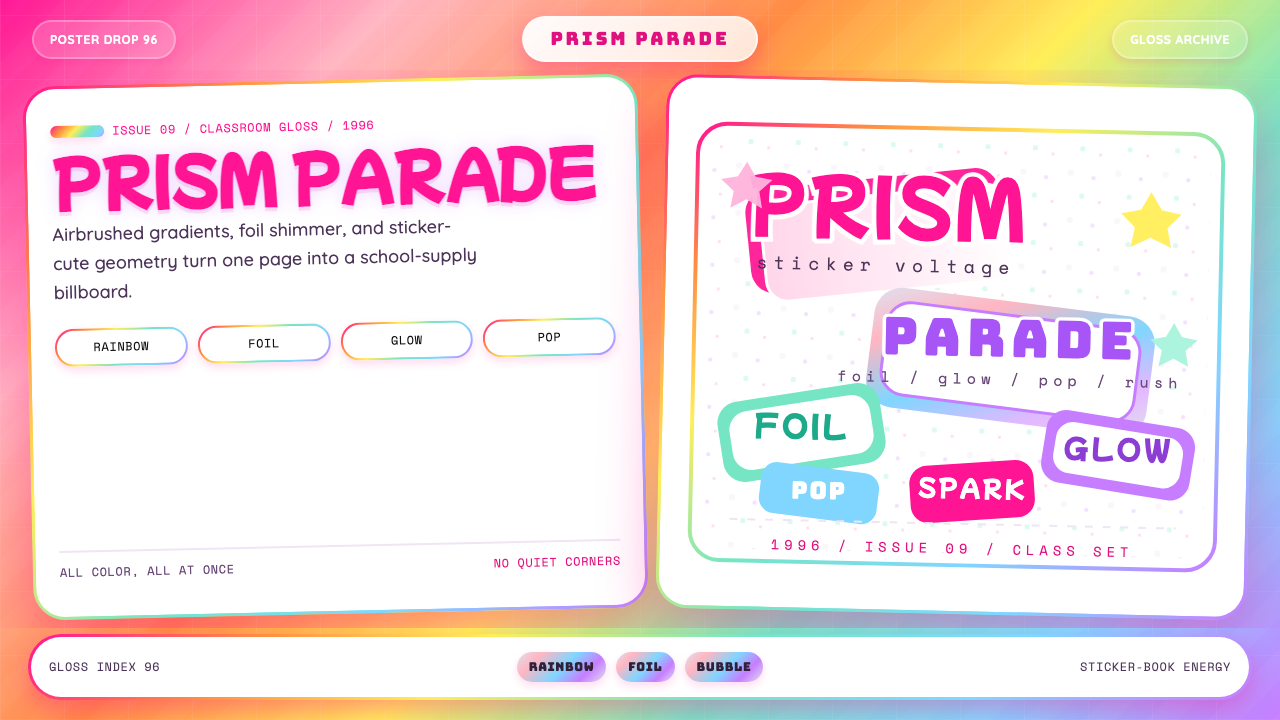
The palette does not select from the spectrum — it uses all of it. Red, orange, yellow, green, blue, violet, and magenta appear simultaneously, typically at their maximum chromaticity. No color functions as a neutral ground; even backgrounds are saturated. The hierarchy among colors, when it exists at all, is established by brightness and the direction of gradients rather than by restraint or proportion. Hot pink and electric teal are the two most characteristic anchor hues — the ones that most reliably signal the style at a glance.色板不从光谱中选择——它使用全部。红、橙、黄、绿、蓝、紫与品红同时出现,通常处于各自的最大色度。没有任何颜色充当中性底色;即便是背景也是饱和的。色彩之间的层级——即便存在——也是由亮度与渐变方向确立的,而非由克制或比例决定。热粉与电光青绿是两种最具代表性的锚定色调——它们最能在一瞥之间点明这种风格。
Airbrushed Gradient喷绘渐变
The defining technical signature is the soft, seamless gradient transition between saturated hues — a visual effect achieved historically through airbrush illustration and replicated digitally through radial and linear blends. Colors do not border each other with hard edges; instead they dissolve into one another through intermediate tones. These gradients appear in backgrounds, in the coats of animal subjects, and in letterforms, giving every element a softly glowing, almost luminous quality. The gradients never trend toward neutral — they move from one saturated color to another, sometimes cycling through three or four hues within a single shape.最具决定性的技法标志是饱和色调之间柔和、顺滑的渐变过渡——这种视觉效果历史上由喷绘插图实现,在数字领域通过放射性与线性混合加以复现。颜色彼此之间没有硬边分界;它们通过中间色调相互溶解。这些渐变出现在背景中、动物主题的皮毛上,以及字母造型上,赋予每个元素一种柔和发光、近乎荧光的品质。渐变从不趋向中性——它们从一种饱和色移向另一种,有时在单一形体内循环穿越三到四种色调。
Holographic and Foil Shimmer全息与箔片闪光
A defining material accent of the original products was holographic foil — surfaces that fractured ambient light into prismatic rainbow fragments and appeared to change color as viewing angle shifted. In digital applications, this effect is approximated through iridescent gradient overlays, animated shimmer effects, and surfaces that seem to contain multiple hues simultaneously. The foil shimmer adds a dimension of optical instability: the style is not fully resolved from a fixed viewpoint but rewards movement, suggesting an almost magical material quality. This shimmer is a significant part of what distinguishes the style from ordinary saturated palettes.原始产品最具特色的材质点缀是全息箔片——能将环境光分解为棱镜彩虹碎片的表面,随观察角度变化而改变颜色。在数字应用中,这种效果通过彩虹变色渐变叠加、动态闪光效果,以及看似同时包含多种色调的表面来近似实现。箔片闪光增添了一种光学不稳定性的维度:这种风格从固定视角看并不完全呈现,而是对运动有所回应,暗示一种近乎魔法的材质品质。这种闪光是使该风格有别于普通饱和色板的重要组成部分。
Rounded, Sticker-Cute Geometry圆润贴纸式几何
Every hard corner is softened. Letterforms are chubby and rounded, as though inflated from within. Animal and character illustrations have large, rounded heads relative to their bodies, wide eyes, and simplified features that read clearly at small sizes. Compositional shapes — speech bubbles, borders, badges — are uniformly rounded-rectangle or oval. There are no sharp angles; the entire visual vocabulary refuses any geometry that could feel aggressive or adult. This softness is not minimalism but invitation — the shapes communicate safety, friendliness, and tactile appeal.每一个硬角都被柔化。字母造型圆润胖乎,仿佛从内部充气膨胀。动物与角色插图的头部相对于身体更大更圆,有着宽大的眼睛和在小尺寸下仍清晰可读的简化特征。构图形状——对话泡泡、边框、徽章——统一采用圆角矩形或椭圆形。没有尖锐角度;整套视觉词汇拒绝任何可能令人感觉有攻击性或过于成熟的几何形态。这种柔和不是极简主义,而是邀请——这些形状传递安全感、友好感与触觉吸引力。
Magenta Glow and Shadow品红辉光与阴影
Where drop shadows and glow effects appear, they lean heavily toward saturated magenta or hot pink rather than neutral gray or black. A magenta glow behind a white letterform does not suggest a light source in the physical sense — it intensifies the color temperature of the composition and creates the impression that elements are self-luminous. This colored glow is one of the most characteristic finishing treatments in the style: it integrates shadows and glows into the chromatic system rather than treating them as neutral structural scaffolding.当投影与辉光效果出现时,它们强烈偏向饱和品红或热粉色,而非中性灰或黑色。白色字母后方的品红辉光在物理意义上并不暗示一个光源——它强化了构图的色温,并营造出元素自发光的印象。这种有色辉光是该风格最具特色的收尾处理之一:它将阴影与辉光整合进色彩系统,而非将其视为中性的结构性脚手架。
Impossible Animal Subjects超现实动物主题
The brand's iconographic center is the animal subject rendered in chromatic impossibility: leopards with rainbow-gradient spots, pandas with violet and gold fur, dolphins leaping through skies the color of cotton candy. The animals are recognizable by silhouette and simplified anatomy but exist in color worlds entirely detached from nature. This combination — familiar creature, impossible palette — is central to the style's charm. The animals function as emotional anchors: they are cute, non-threatening, and relatable, while the color treatment elevates them into a kind of fantasy that belongs entirely to the visual system.品牌最具标志性的图像核心是以色彩不可能性呈现的动物主题:带有彩虹渐变斑纹的豹,披着紫罗兰与金色皮毛的熊猫,在棉花糖色天空中跃起的海豚。这些动物以轮廓与简化的解剖特征可被辨认,但存在于与自然完全脱离的色彩世界中。这种组合——熟悉的生物,不可能的色板——是该风格魅力的核心。动物充当情感锚点:它们可爱、无威胁性、令人亲近;而色彩处理将它们提升至一种完全属于这套视觉系统的幻想之境。
Chubby Display Type胖圆展示字体
Headline type in the Lisa Frank style is heavy, rounded, and often three-dimensional — letterforms that appear to have volume, sometimes with gradient fills that cycle through the same rainbow spectrum as the surrounding artwork. The type never reads as serious or authoritative; its roundedness and weight communicate playfulness and accessibility. Outlines in contrasting colors — white on a dark gradient, or a magenta ring around a yellow letterform — add definition and further integrate type into the chromatic system. Legibility is maintained through high contrast between letter fill and background, even when both are saturated.Lisa Frank 风格的标题字体粗重、圆润,通常带有立体感——字母造型显现出体积感,有时以与周围插图循环相同彩虹光谱的渐变填充。字体从不显得严肃或权威;其圆润与分量传递玩心与亲和力。对比色轮廓——深色渐变上的白色,或黄色字母周围的品红环——增加清晰度,并进一步将字体整合进色彩系统。即便字母填充与背景都是饱和色,可读性仍通过二者之间的高对比度得以维持。
See the Lisa Frank Rainbow (90s) design system查看 Lisa Frank Rainbow (90s) 完整设计系统
Who shaped Lisa Frank Rainbow (90s)?谁塑造了 Lisa Frank Rainbow (90s)?
The founder and creative director whose name became synonymous with the style. Frank, born in 1955, began creating commercially licensed illustrations in the 1970s before establishing her own company in Tucson in 1979. She retained creative control over the brand's visual direction throughout its peak years, developing the house illustration style that combined photorealistic animal anatomy with maximally saturated, gradient-driven color. Her decision to target the school-supply market — a category with low aesthetic expectations that she dramatically upended — proved decisive. Frank's personal brand identity became inseparable from the company's, and her face, name, and signature appeared on products as part of the brand's appeal.公司创始人与创意总监,其名字已与这种风格融为一体。Frank 生于1955年,在1970年代便开始创作商业授权插图,并于1979年在图森市创立了自己的公司。在品牌巅峰时期,她始终保持对视觉方向的创意主导权,发展出将写实动物解剖结构与最大饱和度渐变色彩相结合的品牌内部插图风格。她选择进入学生文具市场——一个审美期待极低而被她戏剧性颠覆的品类——被证明具有决定性意义。Frank 的个人品牌形象与公司品牌形象变得不可分割,她的脸、名字与签名作为品牌吸引力的组成部分出现在产品之上。
Co-founder of Lisa Frank Inc. and Frank's business partner during the formative years of the company. Green played a key role in the operational and commercial development of the brand through the 1980s, helping to secure the retail distribution deals that put Lisa Frank products into mass-market stores nationwide. The personal and professional relationship between Frank and Green — which eventually ended acrimoniously — became part of the brand's documented history, surfacing in later journalistic accounts of the company's internal culture during its peak period. Green's business influence helped transform what began as an illustration practice into a manufacturing and licensing operation at national scale.Lisa Frank 公司联合创始人,公司创立初期 Frank 的商业伙伴。在整个1980年代,Green 在品牌运营与商业发展中发挥了关键作用,协助争取到将 Lisa Frank 产品推入全美大型零售商的分销协议。Frank 与 Green 之间的私人与职业关系——最终以不愉快告终——成为品牌有据可查历史的一部分,在后来关于公司巅峰时期内部文化的新闻报道中浮出水面。Green 的商业影响力帮助将一个最初的插图实践转化为全国规模的制造与授权运营。
The visual output associated with the brand was not the work of a single artist but of a large, closely managed team of illustrators working within strict brand guidelines at the Tucson studio. At its peak the company employed well over a hundred artists — a production model closer to animation studio or fashion house than to an individual illustrator's practice. The illustrators developed and refined the house style: the specific way gradients were blended, the proportion of animal features, the way holographic highlights were integrated. Their collective, largely uncredited contribution is the actual authorship of the visual style that became a cultural phenomenon.与品牌相关联的视觉产出并非某一位艺术家的作品,而是在图森工作室严格品牌规范下工作的大型、紧密管理的插画师团队的集体成果。公司在鼎盛时期雇用了超过一百名艺术家——这种生产模式更接近动画工作室或时装公司,而非个人插画师的实践。插画师们发展并精炼了品牌内部风格:渐变混合的具体方式、动物特征的比例、全息高光的整合方式。他们集体的、几乎未被署名的贡献,是对那个成为文化现象的视觉风格的真正创作。
Less a figure than a structural condition: the competitive landscape of the American school-supply industry in the late 1980s and 1990s created the specific demand environment that the Lisa Frank style was optimized to win. Mass-market retailers gave brands significant shelf space for back-to-school seasons, and differentiation through surface design was a primary competitive lever. The Trapper Keeper binder — licensed through Mead — became the style's most iconic vehicle, reaching millions of students annually. Understanding the style requires understanding this market context: it was designed to win the attention of an eight-to-twelve-year-old in a crowded retail aisle, and every visual choice reflects that specific performance requirement.与其说是一个人物,不如说是一种结构性条件:1980年代末至1990年代美国学生文具行业的竞争格局,创造了 Lisa Frank 风格被优化以赢取的特定需求环境。大型零售商为开学季品牌提供了大量货架空间,而通过表面设计实现差异化是主要竞争手段。通过 Mead 公司授权生产的 Trapper Keeper 活页夹成为这种风格最具标志性的载体,每年触达数百万学生。理解这种风格需要理解这一市场语境:它被设计为在拥挤的零售货架前赢得八到十二岁孩子的注意力,每一个视觉选择都反映了这一特定的表现要求。
How do you use Lisa Frank Rainbow (90s) today?今天怎么用 Lisa Frank Rainbow (90s)?
The Lisa Frank style is a maximalist system, which means its rules operate differently from restraint-based aesthetics like Bauhaus or Swiss Style. Applying it correctly does not mean avoiding choices — it means committing fully. Half-measures read as failure: a layout that uses two saturated colors instead of the full spectrum, or rounds corners slightly but not dramatically, will feel like a broken version of the style rather than a thoughtful restraint of it. The question is not whether to use all the color, but whether the context calls for the style at all.Lisa Frank 风格是一套极致主义系统,这意味着它的规则运作方式与包豪斯或瑞士风格等基于克制的美学截然不同。正确应用它不意味着回避选择——而是意味着彻底投入。半途而废会显得像失败:一个版面只使用了两种饱和色而非完整的光谱,或是将角落稍稍圆润但不够戏剧化,看起来会像是这种风格的残缺版本,而非对它的深思熟虑的克制。问题不在于是否使用所有色彩,而在于该语境是否需要这种风格。
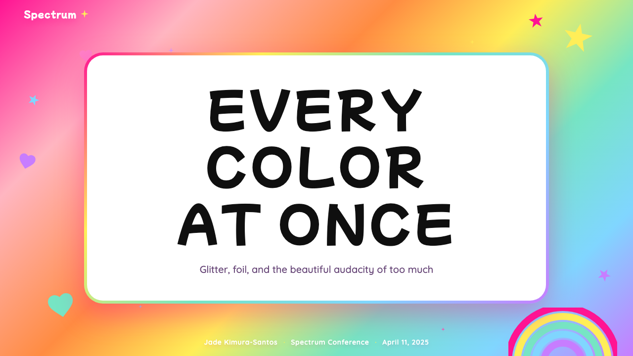
For presentation slides, the Lisa Frank style is most effective on cover and section-opener pages where sensory impact is the primary goal. A cover benefits from a full-spectrum gradient background — moving through multiple hues — with a chubby, rounded headline set in white with a magenta or violet glow. Animal or illustrated mascot elements can anchor corners or bleed off edges. Content slides require more discipline: maintain the gradient or saturated background but limit the number of active visual elements so that information remains readable. Data slides work against type in white or very light tones on saturated grounds, with accent colors drawn from the full-spectrum palette to differentiate categories. Avoid mimicking corporate data-visualization conventions — bars and charts in this style should feel like stickers, not spreadsheets.对于演示文稿,Lisa Frank 风格在以感官冲击为首要目标的封面和章节开篇页上最为有效。封面适合使用全色谱渐变背景——穿越多种色调——配以白色胖圆标题与品红或紫罗兰辉光。动物或插图吉祥物元素可以锚定角落或出血至页面边缘。内容页需要更多纪律:保持渐变或饱和背景,但限制活跃视觉元素的数量,以确保信息仍可阅读。数据页将文字以白色或极浅色调置于饱和底面上,从全色谱色板中取色来区分不同类别。避免模仿企业数据可视化惯例——这种风格中的柱状图与图表应该有贴纸感,而非电子表格感。
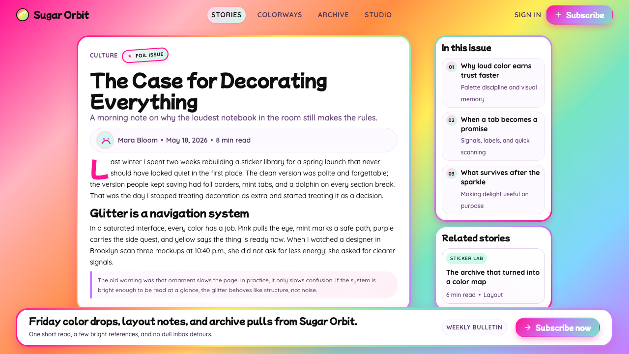
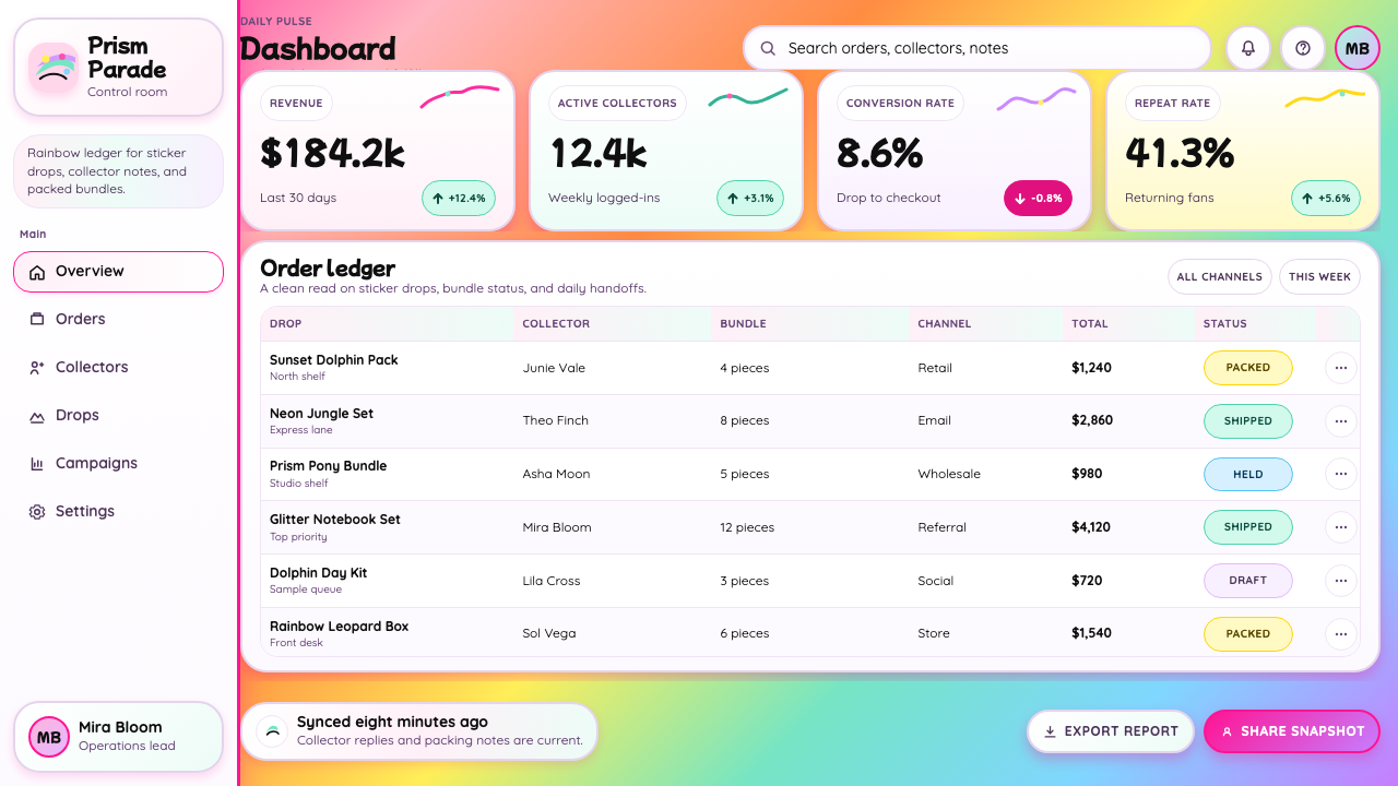
For web interfaces, the style suits contexts where delight and personality are core product values: children's platforms, entertainment products, gaming, creative tools, or any brand that explicitly positions itself against corporate minimalism. Dashboards and utility interfaces are generally hostile territory unless the product's emotional register is intentionally playful. When applying the style to a web UI, use gradient backgrounds as hero and section-break treatments rather than for entire application chrome; reserve saturated interactive colors for calls to action and primary navigation; ensure that text sits against surfaces where contrast is unambiguous — the style's chromatic intensity can easily compromise legibility if text color is not managed carefully. Pricing and feature pages benefit from a bold header treatment with gradient-filled section backgrounds transitioning between hues.对于网页界面,这种风格适合愉悦感与个性是核心产品价值的场景:儿童平台、娱乐产品、游戏、创意工具,或任何明确将自身定位为反对企业极简主义的品牌。仪表板和实用工具界面通常是不友好的领域,除非产品的情感基调刻意带有玩心。将这种风格应用于网页界面时,将渐变背景用作英雄区域与章节分隔处理,而非整个应用界面框架;将饱和交互色保留给行动号召与主要导航;确保文字置于对比度毫无歧义的表面上——如果文字颜色管理不当,这种风格的色彩强度很容易损害可读性。定价与功能页面受益于大胆的标题处理与各部分之间渐变背景的色调过渡。
For editorial and marketing applications, the style excels in contexts that want to signal nostalgia, energy, celebration, or a deliberate rejection of corporate seriousness. A marketing page built in this style should commit to the gradient at page-section level — alternating between different full-spectrum grounds rather than between gradient and white. Typography should be display-weight and rounded for headlines; supporting text can use a plainer typeface as long as it sits against a sufficiently contrasting ground. Sticker-style illustrated elements, speech bubbles, and badge-style callouts are appropriate compositional devices that reinforce the style's visual language. The style is exceptionally effective for social card formats, thumbnail imagery, and any square or vertical format where the ratio of background to content is high.对于编辑与营销应用,这种风格在希望传递怀旧、能量、庆典感,或刻意拒绝企业严肃性的场景中表现出色。以这种风格构建的营销页面应在页面章节层面彻底投入渐变——在不同的全色谱底面之间交替,而非在渐变与白色之间交替。标题字体应使用展示级别的粗重圆润字体;辅助文本可以使用更朴素的字体,只要它置于对比度足够的底面上。贴纸式插图元素、对话泡泡和徽章式标注是适当的构图手段,能强化这种风格的视觉语言。这种风格对于社交卡片格式、缩略图图像,以及任何背景与内容比例较高的正方形或竖向格式,效果格外突出。
A common and decisive mistake when applying this style is treating it as a color palette exercise — selecting a few saturated colors and applying them to an otherwise conventional layout — rather than as a total aesthetic commitment. The style's power comes from chromatic simultaneity: the coexistence of multiple saturated hues at full strength, mediated by gradient transitions that unify them. A layout that picks two colors from the rainbow and leaves the rest out is not a restrained Lisa Frank — it is a different style entirely. Similarly, rounding corners slightly without embracing the full bubble-letter, sticker-cute geometry of the type and illustration style produces an incoherent hybrid. If the context does not permit full commitment, a different visual system will serve better.应用这种风格时最常见也最致命的错误,是将其视为一项调色板练习——从饱和色中选取几种,应用到其他方面依然常规的版面上——而非视为一种全面的美学承诺。这种风格的力量来自色彩共时性:多种饱和色同时以全强度共存,由渐变过渡加以统一。一个从彩虹中挑选两种颜色、其余不管的版面,不是被克制了的 Lisa Frank——而是一种完全不同的风格。同样,角落被轻微圆润化,却没有拥抱字体与插图风格中完整的气泡字体、贴纸式可爱几何,只会产生不连贯的混合体。如果语境不允许全面投入,另一套视觉系统会更好地服务于目的。
See the Lisa Frank Rainbow (90s) design system查看 Lisa Frank Rainbow (90s) 完整设计系统
Lisa Frank Rainbow (90s) — FAQLisa Frank Rainbow (90s) · 常见问题
Is Lisa Frank Rainbow suitable for professional or B2B contexts?Lisa Frank 彩虹风格适合专业或 B2B 场景吗?
Rarely, and with significant caveats. The style communicates abundance, joy, and playful exuberance — values that can work in consumer entertainment, gaming, and youth-focused products, but that conflict sharply with the authority and clarity expected in enterprise software, financial services, legal tools, or healthcare. The few B2B applications where it succeeds tend to be brands that have made a deliberate, self-aware choice to stand against category convention — a creative tools company deliberately positioning against gray-and-white enterprise aesthetics, for example. Even then, the full-spectrum maximalism is usually modulated: gradient backgrounds without the full animal illustration vocabulary, rounded UI elements without the bubble-letter display type. Pure unmodulated Lisa Frank in a B2B context reads as a category error, not a bold choice.极少,且有相当大的条件限制。这种风格传递的是丰盛、喜悦与顽皮活力——这些价值观在消费娱乐、游戏和面向青少年的产品中可以奏效,但与企业软件、金融服务、法律工具或医疗保健所期待的权威性与清晰度形成尖锐冲突。少数成功应用于 B2B 的案例,往往是品牌做出了刻意而自知的选择,主动对抗所在品类的惯例——例如,一家创意工具公司刻意与灰白色企业美学形成对立定位。即便如此,全色谱极致主义通常也会被调节:有渐变背景但没有完整的动物插图词汇,有圆润的界面元素但没有气泡字体展示字。在 B2B 语境中未经调节的纯粹 Lisa Frank 风格,读来像一个品类错位,而非大胆选择。
How does this style differ from other pastel or kawaii aesthetics?这种风格与其他粉彩或卡哇伊美学有何不同?
The critical distinction is saturation and simultaneity. Kawaii aesthetics — and most pastel design systems — operate at reduced saturation: colors are soft, light, and often close to white. They create a sense of gentleness and quiet. Lisa Frank operates at the opposite extreme: colors are fully saturated and multiple hues appear together at full strength, mediated only by gradient transitions. The effect is not quiet — it is loud, celebratory, and slightly overwhelming by design. Kawaii also typically limits its palette to a small set of soft hues and uses a great deal of white or near-white negative space. Lisa Frank leaves almost no neutral ground: every surface is occupied by saturated color. The rounded geometry and cute subject matter may look superficially similar, but the chromatic philosophy is fundamentally different.关键区别在于饱和度与共时性。卡哇伊美学——以及大多数粉彩设计系统——以降低的饱和度运作:色彩柔和、明亮,通常接近白色。它们营造出一种温柔与宁静感。Lisa Frank 则在相反的极端运作:色彩完全饱和,多种色调以全强度同时出现,仅由渐变过渡加以调和。效果不是安静的——它是喧嚣的、庆典式的,设计上略带压迫感。卡哇伊通常也将色板限制在少量柔和色调上,并使用大量白色或接近白色的留白。Lisa Frank 几乎不留中性底色:每一个表面都被饱和色彩占据。圆润几何与可爱主题在外表上可能看起来相似,但色彩哲学从根本上不同。
Can this style work in a dark or night-mode layout?这种风格能在深色或夜间模式版面中运作吗?
Yes, and in some ways a dark ground enhances the style's luminous qualities. Saturated rainbow gradients on a very dark — near-black but not pure black — background read as glowing, which amplifies the holographic shimmer effect that is central to the style's appeal. The key adjustment is to treat the dark ground as a neutral field that makes colors pop rather than as a design statement in itself. Magenta glow effects and white outline treatments on letterforms become especially effective in dark contexts. The challenge is maintaining legibility: body text should be set in white or very light tones, and the number of simultaneously active saturated hues in any one section should be managed so that foreground and background elements remain distinguishable. A dark Lisa Frank variant also aligns well with the style's holographic heritage — foil and glitter read naturally against dark grounds.可以,而且在某些方面深色底面能增强这种风格的发光品质。在极深——接近黑色但非纯黑——的背景上,饱和彩虹渐变会呈现出发光感,从而放大这种风格吸引力核心的全息闪光效果。关键调整是将深色底面视为让颜色跳脱出来的中性场域,而非本身的设计陈述。品红辉光效果与字母上的白色轮廓处理在深色语境中尤为有效。挑战在于维持可读性:正文应以白色或极浅色调设置,任何单一章节内同时活跃的饱和色调数量应加以管理,以确保前景与背景元素可以区分。深色 Lisa Frank 变体也与这种风格的全息传统高度契合——箔片与闪粉在深色底面上呈现自然。
What is the difference between authentic Lisa Frank style and generic 90s nostalgia aesthetics?真正的 Lisa Frank 风格与泛泛的九十年代怀旧美学有何区别?
Generic 1990s nostalgia design tends to borrow surface markers — teal and purple together, bold geometric shapes, sans-serif type — without committing to the specific chromatic logic that makes Lisa Frank distinctive. Lisa Frank is defined by three interlocking qualities that must coexist: full-spectrum simultaneity (not just two or three 90s-ish colors, but all of them at once), airbrushed gradient transitions between those colors (not flat fills or hard-edged blocks), and the sticker-cute illustrated subject matter (usually animals, often in physically impossible chromatic schemes). A design that uses teal and magenta with some rounded shapes is borrowing 90s visual shorthand. A design that puts a rainbow-gradient dolphin against a magenta-to-violet-to-teal background with bubble-letter type and foil shimmer is doing Lisa Frank. The specificity of the gradient technique and the illustrated subject matter are the distinguishing features most often omitted in pastiche.泛泛的1990年代怀旧设计倾向于借用表面标志——青绿与紫色并置、大胆几何形态、无衬线字体——而不投入使 Lisa Frank 与众不同的具体色彩逻辑。Lisa Frank 由三种必须共存的相互交织的品质所定义:全色谱共时性(不只是两三种带有九十年代气息的颜色,而是同时出现所有颜色)、这些颜色之间的喷绘渐变过渡(而非平面填充或硬边色块),以及贴纸可爱风格的插图主题(通常是动物,常以物理上不可能的色彩方案呈现)。一个使用青绿与品红加一些圆润形状的设计是在借用九十年代的视觉速记。而一个将彩虹渐变海豚置于品红到紫罗兰到青绿背景上、配以气泡字体和箔片闪光的设计,才是在做 Lisa Frank。渐变技法与插图主题的特殊性是赝品中最常被省略的区分性特征。
How should this style handle typography when the background is already extremely busy?当背景已经极度繁复时,这种风格应当如何处理字体排印?
The standard solution in the original brand's product design was contrast through weight and outline, not through simplification of the background. Body text and headline type were set in white or near-white with a contrasting outline — typically a darker tone from the same hue family as the local background color — and often with a drop shadow in a saturated complementary color. This creates legibility not by quieting the background but by armoring the type against it. In practice, this means: use white as the primary type color across all saturated gradient backgrounds; add an outline in a contrasting dark or complementary saturated tone; reserve magenta or violet drop shadows for display headlines only; and avoid setting body text at small sizes against the most complex parts of gradient backgrounds — the sections where multiple hues are transitioning simultaneously are the hardest zones for type legibility.原始品牌产品设计中的标准解决方案是通过字重与轮廓营造对比,而非简化背景。正文与标题字体以白色或近白色设置,配以对比色轮廓——通常是与局部背景色同色系的较深色调——以及饱和互补色的投影。这种方式不是通过安抚背景来创造可读性,而是通过为字体增加装甲来对抗背景。实践中,这意味着:在所有饱和渐变背景上以白色作为主要字体颜色;添加对比深色或饱和互补色调的轮廓;将品红或紫罗兰投影仅保留用于展示级标题;避免在渐变背景最复杂的部分以小字号设置正文——多种色调同时过渡的区域是字体可读性最困难的地带。
Related design styles相关设计风格
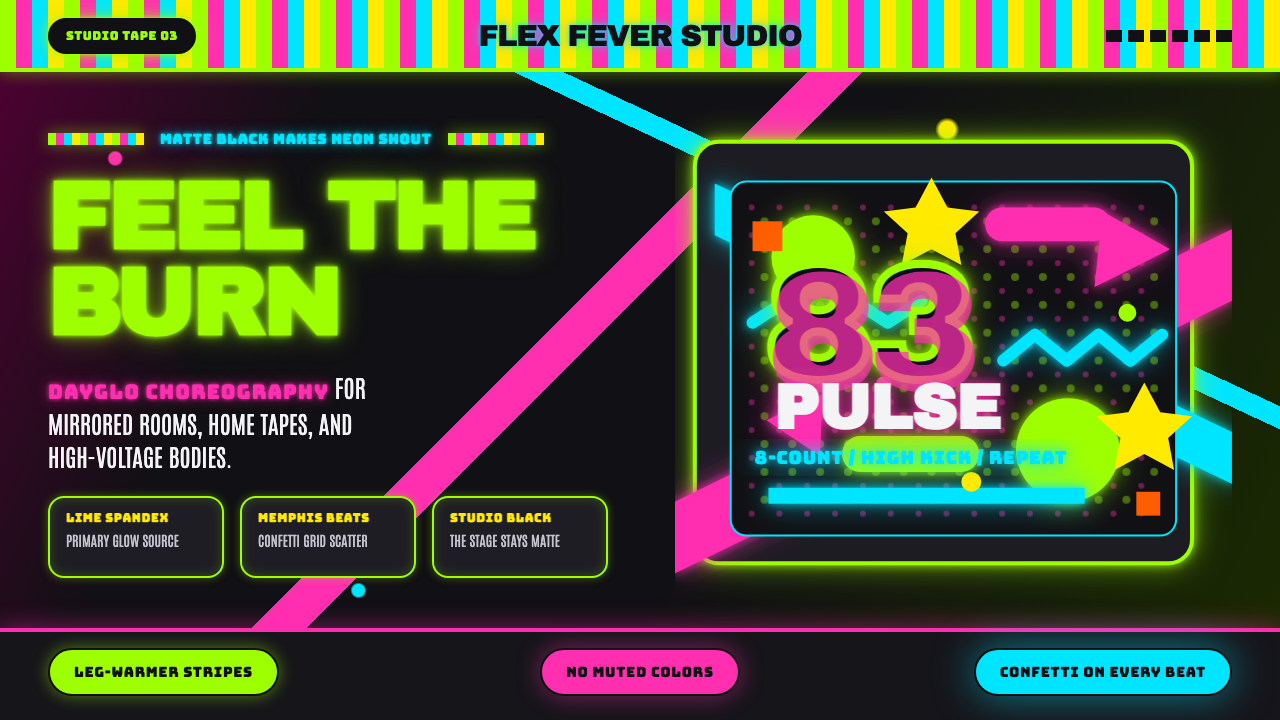 80s Aerobics Fluoro SpandexNeon refuses restraint. Lime spandex, pink-cyan confetti, and black-stage typ…霓虹拒绝克制:荧光绿氨纶、粉蓝彩屑与黑场大字一起燃烧。
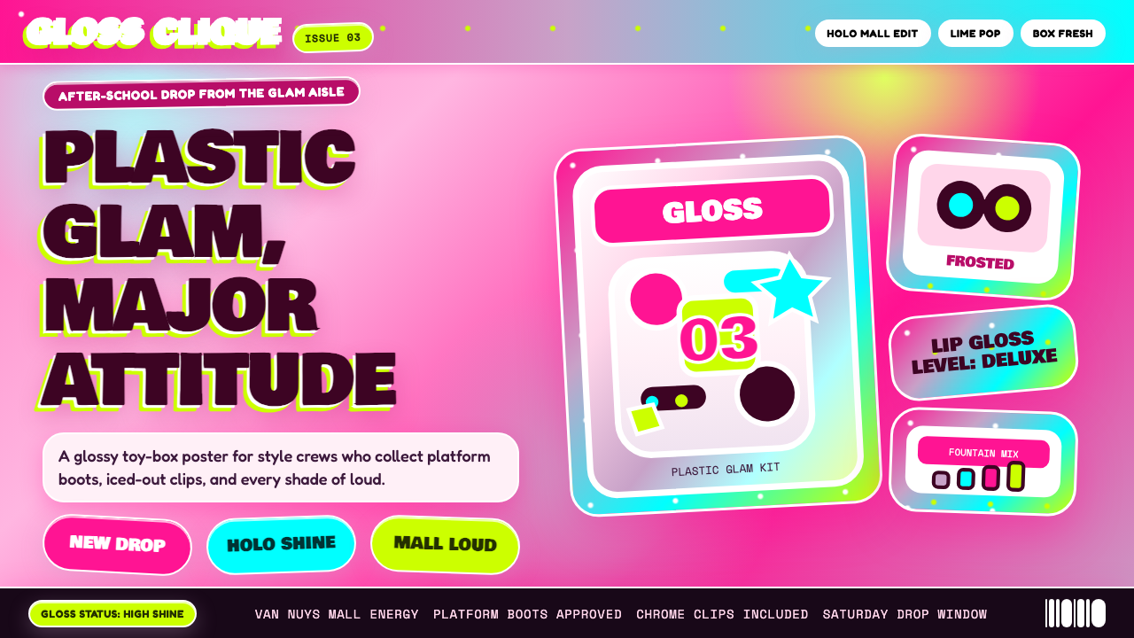 Bratz Doll 2003Y2K maximalism, mall-glossy. Hot-pink gradients, holographic lavender, chunky…Y2K 极繁的商场美学:热粉渐变、全息薰衣草紫、厚重展示字体——拆开 Brat…
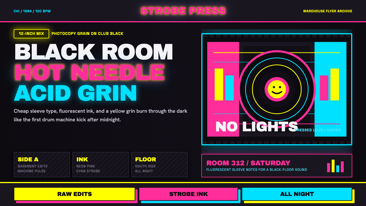 Chicago HouseDarkness starts the track. Neon pink, yellow and cyan hit black like Xerox st…黑暗先起拍。霓虹粉、黄与青打在黑底上,像复印频闪。
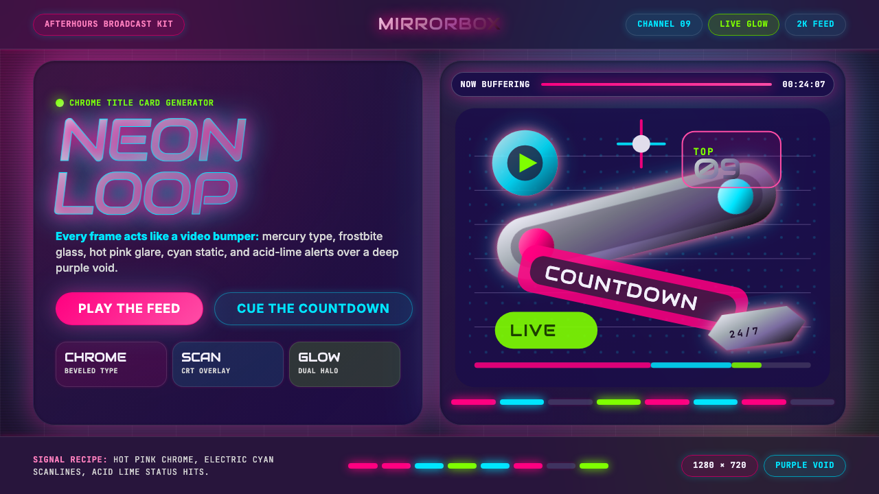 MTV Y2K (2000s)Maximum-volume Y2K. Hot pink chrome, cyan scanlines, and lime hits burn over…高音量千禧感:粉铬、青色扫描线与酸橙光烧过紫色虚空。
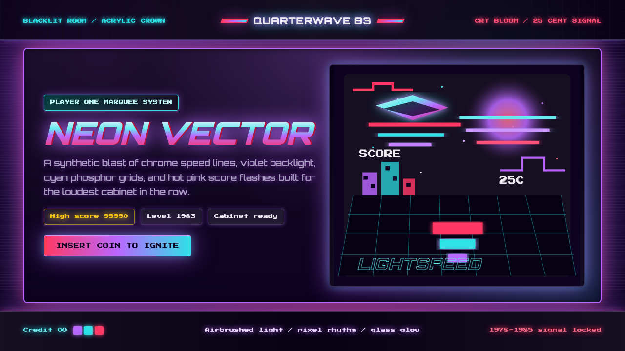 Arcade Cabinet MarqueeToo loud to ignore. Black-indigo glass, violet glow, cyan grids, hot-pink arc…刺眼才对。黑靛玻璃、霓虹紫光、电青网格与品红像素字。
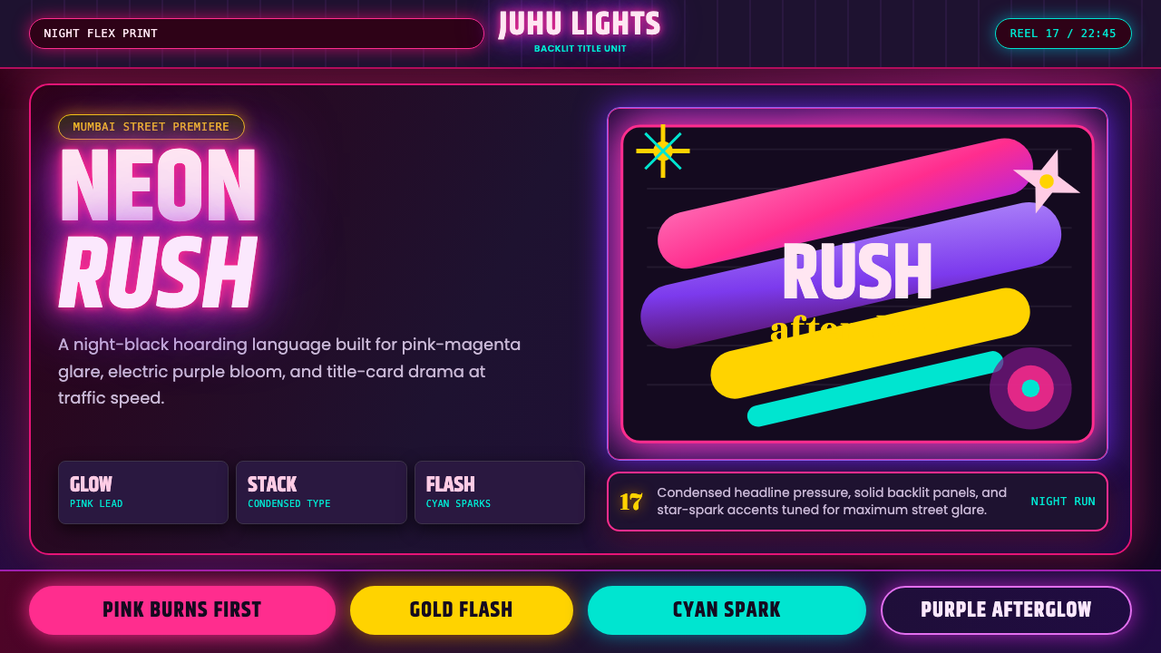 Bollywood Neon MumbaiMumbai pop burns bright. Khand stacks glow over night-black, with pink-purple…孟买流行灼亮:Khand 堆叠夜黑底,粉紫霓虹与星芒爆闪。