What is Seapunk 2011?什么是 Seapunk 2011?
Seapunk crashed ashore in 2011 as a single Tumblr dream about a seaweed jacket — and surfaced as the internet's most earnest collision of nineties nautical kitsch, GIF-compressed turquoise, and deliberate bad taste.2011年,海朋克以一条关于海藻皮夹克的梦境推文冲上岸边——成为互联网最真诚的碰撞:九十年代航海俗艳、GIF压缩青绿色调与刻意的坏品味融为一体。
Seapunk 2011 in briefSeapunk 2011 速览
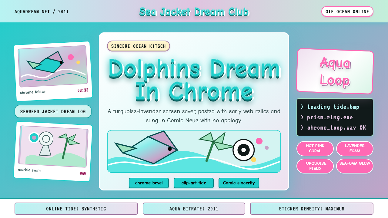
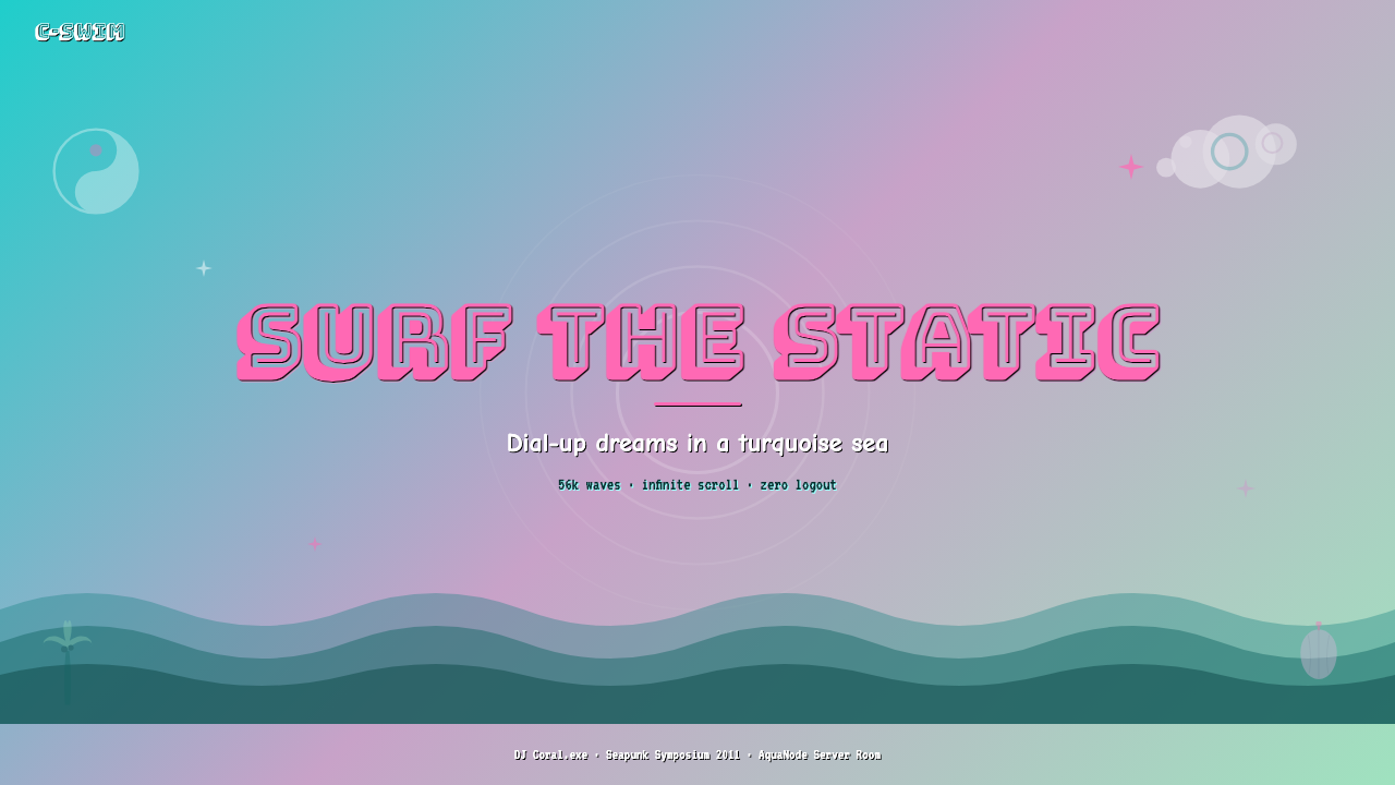
Seapunk is a 2011 internet microaesthetic born on Tumblr, defined by the collision of early-nineties nautical computer graphics — dolphins leaping through pixelated waves, marble busts floating in void space, Yin-Yang symbols spinning on tiled backgrounds — with the irreverent irony of the early social-web. Its color world is saturated and watery: deep turquoise, seafoam green, and lavender dominate, lit by the pale glow of early CRT monitors and drenched in gradient washes that recall period screensavers and CD-ROM title screens.海朋克是2011年诞生于Tumblr的互联网微美学,以九十年代早期航海电脑图形——跃过像素化浪花的海豚、漂浮在虚空中的大理石半身像、在平铺背景上旋转的阴阳符号——与早期社交网络的戏谑精神的碰撞为核心。其色彩世界饱和而水润:深青绿色、海沫绿与薰衣草紫占据主导,被早期CRT显示器的苍白光晕映照,淹没在令人想起同期屏幕保护程序与CD-ROM标题画面的渐变色浪中。
The aesthetic is self-consciously kitsch and self-consciously sincere — a combination that sounds contradictory but is essential to understanding the movement. Seapunk did not mock its source material. It recycled nineties ocean imagery with genuine affection, treating clip-art dolphins and chrome-beveled WordArt headings not as failures of taste but as an underappreciated vernacular. Text is treated as a graphic object: chrome or liquid-metal lettering, heavy drop shadows at exaggerated offsets, and Comic Sans deployed with full awareness of its cultural baggage as an act of aesthetic defiance.这种美学是刻意的媚俗,同时也是刻意的真诚——这个听似矛盾的组合,却是理解这场运动的关键。海朋克并不嘲弄其素材来源,而是带着真实的情感循环利用九十年代的海洋图像,将剪贴画海豚与铬金属立体字视为被低估的民间视觉语言,而非品味失误。文字被当作图形对象处理:铬质或液态金属质感的字母,以夸张角度偏移的粗重投影,以及带着完整文化包袱自觉使用的Comic Sans——一种审美上的宣言式反叛。
Visually, seapunk work is layered and dense rather than spare. Multiple translucent elements overlap on tiled or gradient backgrounds. GIF animation is structural, not incidental — animated starfish, looping wave patterns, and blinking text belong to the image, not just to its delivery format. The overall effect is deliberately overwhelming in the way a beachside souvenir shop is overwhelming: joyful visual noise organized around a coherent chromatic identity.在视觉上,海朋克作品是层叠而密集的,而非简洁的。多个半透明元素叠加在平铺或渐变背景之上。GIF动画是结构性的,而非附属的——动态海星、循环波浪图案与闪烁文字属于图像本身,而不仅仅是其传播格式。整体效果是刻意的视觉压迫感,如同海滨纪念品商店的视觉噪音:围绕一个连贯色彩身份组织起来的欢腾。
Where does Seapunk 2011 come from?Seapunk 2011 从何而来?
The movement can be dated with unusual precision. On May 27, 2011, the Twitter account @LILINTERNET — operated by a young Chicago-based musician and internet artist — posted a tweet describing a vivid dream: a leather jacket covered in seaweed, the word 'seapunk' as the name for whatever this was. The tweet propagated quickly through Tumblr reblogs and music-adjacent internet communities. Within weeks, a loose creative cluster had formed around the term, producing music, visual art, and fashion under its banner.这场运动可以被以罕见的精确度定位于一个时刻。2011年5月27日,推特账号@LILINTERNET——由一位居于芝加哥的年轻音乐人兼网络艺术家操持——发布了一条推文,描述了一个生动的梦境:一件覆满海藻的皮夹克,以及「seapunk」这个词作为这一切的名称。这条推文迅速通过Tumblr的转发经济传播至音乐圈与邻近的网络社群。几周之内,一个松散的创作集群已在这个词的旗帜下集结,产出音乐、视觉艺术与时尚作品。
The cultural raw material was already abundant. Early-nineties CD-ROM design, desktop publishing aesthetics, low-polygon oceanic CGI from period nature documentaries, and the visual grammar of nineties rave flyers all fed into seapunk's image bank. What the movement supplied was a curatorial sensibility: it identified these sources as beautiful rather than embarrassing, ironic rather than naive, and worth treating as a genuine design vocabulary. Albert Redwine and the Coral Records Internazionale crew were among the most visible early practitioners, producing music releases and visual identities that codified what seapunk imagery looked and sounded like.文化原材料早已充裕。九十年代早期的CD-ROM设计、桌面出版美学、同期自然纪录片中的低多边形海洋CGI,以及九十年代锐舞传单的视觉语法,共同填充了海朋克的图像库。这场运动提供的是一种策展感性:它将这些来源识别为美丽的而非令人尴尬的,反讽的而非幼稚的,值得作为真正设计词汇对待的。Albert Redwine与Coral Records Internazionale的同仁是最早且最显眼的实践者之一,制作了将海朋克图像与声音加以规范化的音乐发行物与视觉识别系统。
Tumblr's infrastructure was inseparable from the aesthetic's character. The platform's reblog economy rewarded visual density and immediate recognizability. GIF support made animation a native part of any image. The absence of strict layout templates meant that seapunk blogs could pile clip-art, tiled ocean textures, and multicolored text into pages that were themselves objects of the aesthetic rather than neutral containers for it. The movement lived inside its medium in a way that made it difficult to fully translate to any other platform.Tumblr的平台基础设施与这种美学的气质不可分割。该平台的转发经济奖励视觉密度与即时识别性。GIF支持使动画成为任何图像的原生组成部分。缺乏严格版面模板意味着海朋克博客可以将剪贴画、平铺海洋纹理与多色文字堆叠成页面——这些页面本身就是美学的对象,而非中性的容器。这场运动以一种令其难以被完整移植到其他任何平台的方式,活在了自己的媒介之中。
In 2012, seapunk received its most high-profile mainstream moment when Rihanna's team used the visual vocabulary wholesale for a Saturday Night Live performance. The ocean blue lighting, underwater CGI, and digital wave imagery were unmistakably derived from the Tumblr movement. The appropriation caused a minor internet controversy and a broader conversation about how quickly subcultural internet aesthetics could be absorbed into commercial pop production — a dynamic that would recur with vaporwave, cottagecore, and every subsequent microaesthetic. The seapunk community largely viewed the event as confirmation that the movement had already peaked, with its most interesting phase belonging to 2011 and early 2012.2012年,蕾哈娜团队在一场《周六夜现场》表演中原封不动地挪用了这套视觉词汇,使海朋克获得了其最高知名度的主流时刻。海洋蓝灯光、水下CGI与数字波浪图像,无可争辩地源自这场Tumblr运动。这次挪用引发了小范围的互联网争议,以及关于亚文化互联网美学能以多快速度被商业流行生产吸收的更广泛讨论——这一动态此后在蒸汽波、田园风以及每一场后续微美学中不断重演。海朋克社群普遍将这一事件视为运动已达峰值的确认,其最有趣的阶段属于2011年与2012年初。
What defines the Seapunk 2011 look?Seapunk 2011 的视觉特征是什么?
Color色彩
The palette orbits deep turquoise and seafoam green as its anchoring hues, with lavender, soft coral, and electric periwinkle as secondary accents. Colors are applied at high saturation and often as gradients — horizontal washes that shift from one underwater hue to another, evoking period screensavers and nineties multimedia title screens. Black is used sparingly; near-black navy serves as the primary dark tone. White appears mainly as the ground for chrome lettering effects. The overall chromatic effect is luminous and slightly overexposed, like a sunlit shallow sea viewed through a CRT monitor.色板以深青绿色与海沫绿为锚定色,以薰衣草紫、柔珊瑚色和电气矢车菊蓝为次级强调色。色彩以高饱和度应用,且常以渐变形式出现——从一种水下色调平移至另一种的横向色浪,唤起同期屏幕保护程序与九十年代多媒体标题画面的记忆。黑色使用克制,近黑的深海军蓝充当主要暗色调。白色主要作为铬质字母效果的底色。整体色彩效果明亮而略带过曝感,如同透过CRT显示器观看阳光照耀的浅海。
Typography字体排印
Seapunk typography is deliberately anti-hierarchical in the modernist sense: Comic Sans is used with full awareness, deployed as an aesthetic statement rather than a mistake. Chrome or liquid-metal bevel effects applied to headlines are structural — the three-dimensional quality of the letterform is the design. Drop shadows appear at large, exaggerated offsets rather than subtle close-cropped positions, producing a floating, depth-heavy effect. Type is often outlined, glowing, or set against tiled pattern backgrounds in ways that would be considered unreadable by conventional standards, but which are legible within the aesthetic's logic of deliberate sensory abundance.海朋克的字体排印在现代主义意义上是刻意反层级的:Comic Sans带着完整的自觉被使用,作为审美宣言而非失误存在。应用于标题的铬质或液态金属斜面效果是结构性的——字形的三维质量本身就是设计。投影以大幅度夸张偏移而非微妙的近端位置出现,产生漂浮的、深度感沉重的效果。文字常被描边、发光,或设置在平铺图案背景之上——以常规标准衡量近乎不可读,但在这套刻意感官丰溢的美学逻辑中是清晰的。
Motifs and Iconography母题与图像志
The seapunk image bank draws heavily from early-nineties computer clip-art and low-polygon CGI rendered in the period's characteristic flat-shaded style: dolphins, palm trees, sea turtles, starfish, tropical fish, conch shells, and Yin-Yang symbols. Ancient marble busts — a motif the movement shares with early vaporwave — appear floating in aquatic environments, creating a temporal collision between classical antiquity and early digital aesthetics. These objects are typically silhouetted or presented without environmental context, floating freely on gradient or tiled backgrounds.海朋克的图像库大量取材于九十年代早期的电脑剪贴画与以当时特有的平面着色风格渲染的低多边形CGI:海豚、棕榈树、海龟、海星、热带鱼、海螺壳与阴阳符号。古代大理石半身像——一个与早期蒸汽波共享的母题——漂浮在水下环境中,制造出古典时代与早期数字美学之间的时间碰撞。这些物体通常以剪影形式呈现,或脱离环境语境,自由漂浮在渐变或平铺背景之上。
Texture and Pattern纹理与图案
Tiled backgrounds are central to seapunk's visual identity — repeating patterns of waves, water surfaces, tropical fish, or geometric ocean-derived forms fill fields that in other aesthetics would be left as solid color. These tiles are drawn from early web design conventions and period CD-ROM interfaces, where tiling was a practical response to technical memory constraints that the movement repurposes as a stylistic value. Overlapping translucent or semi-transparent layers, lens flares, scanline effects, and pixelated noise add additional texture, producing an image surface that is dense and materially rich rather than clean.平铺背景是海朋克视觉身份的核心——重复的海浪、水面、热带鱼或源自海洋的几何形图案,填满了在其他美学体系中会以纯色处理的区域。这些平铺图案取自早期网页设计惯例和同期CD-ROM界面,在那里平铺是对技术内存限制的实用回应——而这场运动将其重新转化为一种风格价值。叠加的半透明或透明图层、镜头光晕、扫描线效果与像素化噪点为图像增添了额外的纹理,产生出密集且材质丰富的图像表面,而非干净简洁的效果。
Animation and GIF Culture动画与GIF文化
GIF animation is not decoration in seapunk — it is a fundamental structural element. Looping animated elements, including spinning Yin-Yang symbols, cycling wave patterns, and blinking or scrolling marquee text, are integral parts of the composition rather than additions layered over a static base. The GIF format's technical limitations — its restricted color palette, visible dithering, and harsh looping cuts — are embraced as aesthetic properties rather than worked around. Seapunk images are often meant to be experienced as moving, and a static export of a seapunk composition loses a primary dimension of the aesthetic.在海朋克中,GIF动画不是装饰——它是基本的结构性元素。循环的动态元素,包括旋转的阴阳符号、循环的波浪图案,以及闪烁或滚动的字幕文字,是构图的有机组成部分,而非叠加在静态底图之上的附加物。GIF格式的技术局限——受限的色板、可见的抖动与生硬的循环切点——被视为美学属性加以拥抱,而非设法绕过。海朋克图像往往需要以动态方式体验,一幅海朋克构图的静态导出会失去这种美学的主要维度。
Sincerity and Irony真诚与反讽
Unlike many aesthetics that engage with low-brow or kitsch source material at ironic distance, seapunk insists on sincerity. The dolphins are not jokes. The Comic Sans is not a wink. The nineties ocean clip-art is genuinely loved rather than condescendingly appreciated. This combination of ironic self-awareness — these practitioners knew their sources were culturally stigmatized — and genuine affection is the movement's defining emotional register. Work that applies seapunk imagery purely as parody misses this core quality and reads as hollow rather than exuberant.与许多以反讽距离处理低俗或媚俗素材的美学不同,海朋克坚持真诚。海豚不是玩笑。Comic Sans不是眨眼示意。九十年代的海洋剪贴画是真实热爱的,而非居高临下地欣赏的。这种反讽式自我意识——实践者们知道他们的素材在文化上是被污名化的——与真实情感之间的组合,是这场运动的决定性情感基调。将海朋克图像纯粹用作模仿讽刺的作品错过了这一核心品质,读来空洞而非欢腾。
Density and Layering密度与层叠
Seapunk compositions favor visual density over breathing room. Negative space is not a design value in this aesthetic — it is an absence waiting to be filled with another wave, another dolphin, another glowing outline. Elements are layered rather than arranged, overlapping and sometimes competing for the eye in ways that a designer trained in modernist principles would describe as chaotic. Within the aesthetic's own logic, however, this density is coherent: it mirrors the visual experience of a reef, a tide pool, or the nineties multimedia interfaces from which the movement draws its grammar.海朋克构图偏爱视觉密度而非呼吸空间。留白在这种美学中不是设计价值——它是等待被另一道海浪、另一只海豚、另一个发光轮廓填满的缺席。元素是被层叠的,而非被排列的,以一种受现代主义原则训练的设计师会形容为混乱的方式相互叠压、争夺视线。然而在这种美学自身的逻辑之内,这种密度是连贯的:它镜射出礁石、潮池,或这场运动从中汲取语法的九十年代多媒体界面的视觉体验。
Who shaped Seapunk 2011?谁塑造了 Seapunk 2011?
@LILINTERNET, a Chicago-based musician and internet artist active in early Tumblr-era online communities, is credited with coining the term 'seapunk' in a May 2011 tweet describing a dream about a seaweed-covered leather jacket. This single post became the nominal origin point of an entire subcultural aesthetic movement. Whether the term would have crystallized a pre-existing visual sensibility or actively created one remains debated, but @LILINTERNET's role as the movement's naming event is uncontested. Their music releases in 2011 and 2012 helped define the sonic counterpart to the visual aesthetic.@LILINTERNET是一位活跃于早期Tumblr时代网络社群的芝加哥音乐人兼网络艺术家,被公认为在2011年5月的一条描述海藻皮夹克梦境的推文中创造了「seapunk」一词。这条推文成为整个亚文化美学运动的名义起点。这个词究竟是结晶了早已存在的视觉感性,还是主动创造了它,至今仍有争议——但@LILINTERNET作为这场运动命名事件的角色无可争辩。他们在2011至2012年间发布的音乐作品有助于界定视觉美学的声音对应物。
Albert Redwine was one of the most visible early visual practitioners of seapunk, producing artwork and visual identities for releases in the movement's orbit. His work helped translate the aesthetic from a loosely shared Tumblr sensibility into a more codified visual language with recognizable conventions. Along with the Coral Records Internazionale crew, he was instrumental in demonstrating that seapunk could sustain a consistent visual system across multiple projects rather than remaining a scattered collection of individual Tumblr posts.Albert Redwine是海朋克最早且最显眼的视觉实践者之一,为这场运动轨道内的发行物制作了图像作品与视觉识别系统。他的工作有助于将这种美学从Tumblr上松散共享的感性,转化为拥有可识别惯例的更为规范化的视觉语言。与Coral Records Internazionale的同仁一道,他有力地证明了海朋克能够跨越多个项目维持连贯的视觉系统,而非停留为Tumblr个人帖子的零散集合。
Coral Records Internazionale was a loosely organized label and creative collective that operated at the center of seapunk's most active period between 2011 and 2013. The crew produced music releases, visual art, and online content that collectively defined what the seapunk aesthetic looked and sounded like in its most concentrated form. Their work on Tumblr and affiliated platforms served as reference material for the broader community's understanding of what seapunk meant visually, and their releases helped associate the aesthetic with a specific sonic character that persisted into the vaporwave era.Coral Records Internazionale是一个松散组织的厂牌与创意团体,在2011至2013年海朋克最活跃的时期处于运动中心。这个团体制作了音乐发行物、视觉艺术作品与网络内容,共同以最集中的形式界定了海朋克美学的视觉与声音面貌。他们在Tumblr及附属平台上的工作成为更广泛社群理解海朋克视觉意义的参考材料,他们的发行物有助于将这种美学与一种延续进蒸汽波时代的特定声音性格相关联。
Rihanna's 2012 Saturday Night Live performance did not create seapunk but became its most discussed moment of mainstream contact. Her team's use of underwater CGI environments, oceanic lighting, and digital wave imagery drew directly from the Tumblr movement's established visual grammar. The performance sparked debate about the speed at which subcultural internet aesthetics are absorbed into commercial production and whether such absorption constitutes appreciation, appropriation, or simply the normal diffusion of visual ideas. For the seapunk community, the event marked a transition: the aesthetic's underground period was definitively over.蕾哈娜2012年在《周六夜现场》的表演并未创造海朋克,却成为其与主流接触中被讨论最多的时刻。她的团队对水下CGI环境、海洋灯光与数字波浪图像的运用,直接取材于Tumblr运动已确立的视觉语法。这场表演引发了关于亚文化互联网美学被商业生产吸收的速度,以及这种吸收究竟构成欣赏、挪用还是仅仅是视觉想法的正常扩散的争论。对于海朋克社群而言,这一事件标志着一个转变:这种美学的地下时期已明确结束。
Seapunk cannot be attributed to individual authors in the way that many art movements can, because it emerged from the collective reblog economy of early Tumblr. The platform's architecture — where any post could be reblogged with additions, where aesthetic communities formed around shared visual sensibilities rather than institutional affiliations, and where anonymity and pseudonymity were standard — meant that the aesthetic was genuinely co-authored by hundreds of contributors whose individual names were rarely preserved. This distributed authorship is itself a historical fact about how internet microcultures of the 2011 era operated.海朋克不能像许多艺术运动那样被归功于个别作者,因为它涌现自早期Tumblr的集体转发经济。这个平台的架构——任何帖子都可以被附加内容地转发,美学社群围绕共享的视觉感性而非机构归属而形成,匿名与化名是常态——意味着这种美学是由数百位贡献者真正共同创作的,而他们的个人姓名很少被保存下来。这种分布式创作权本身就是关于2011年时代互联网微文化运作方式的历史事实。
How do you use Seapunk 2011 today?今天怎么用 Seapunk 2011?
Seapunk is one of the few historical internet aesthetics that translates effectively into contemporary design contexts precisely because its rules are specific and its chromatic identity is strong. Applying it correctly requires committing to the aesthetic's emotional register — sincere kitsch, not ironic distance — and understanding that the style's density is a feature, not a problem to be solved by modernist restraint.海朋克是为数不多能有效转化为当代设计语境的历史性互联网美学之一,恰恰因为它的规则具体,色彩身份强烈。正确应用它,需要投入这种美学的情感基调——真诚的媚俗,而非反讽距离——并理解这种风格的密度是一种特性,而非需要用现代主义克制解决的问题。
For presentation slides, seapunk works best as a full-commitment cover treatment or as a themed deck where the visual language is maintained consistently across every slide. A cover benefits from a gradient field in turquoise-to-lavender, with chrome or outlined headline type and at least one floating clip-art motif — a dolphin, a conch shell, a marble bust — placed deliberately in the composition. Content slides should carry the gradient background and tiled texture through, with body text set in a clean contrasting face to maintain readability. Data visualizations benefit from the palette's high saturation: bars and segments in seafoam, coral, and periwinkle read vividly against the aquatic background. A half-and-half approach — seapunk cover, neutral content slides — defeats the aesthetic's logic by treating it as decoration rather than identity.在演示文稿中,海朋克最适合作为完全投入的封面处理,或作为视觉语言在每一页幻灯片上一致维持的主题套件。封面适合以青绿渐变至薰衣草紫的色场为底,配以铬质或描边标题字,以及至少一个刻意置入构图的浮动剪贴画母题——海豚、海螺壳或大理石半身像。内容页应延续渐变背景与平铺纹理,正文以高对比度的干净字体设置以维持可读性。数据可视化得益于这套色板的高饱和度:海沫绿、珊瑚色与矢车菊蓝的柱条与扇区在水下背景上鲜明突出。半途而废的做法——海朋克封面配以中性内容页——将这种美学降格为装饰,而非身份,这违背了它的逻辑。
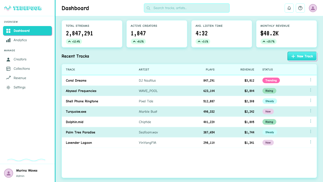
For web interfaces, seapunk is most at home in contexts where expressive visual identity outweighs navigational clarity: promotional microsites, event landing pages, artist portfolios, and music release pages. Dashboard and productivity applications are a poor fit because the aesthetic's density works against the rapid scanning that functional interfaces require. When applying seapunk to a web context, commit to tiled or gradient backgrounds throughout, use animated elements sparingly but deliberately, and ensure that interactive affordances — buttons, links, inputs — are visually distinguished from the decorative layer through size and contrast rather than visual quiet.在网页界面上,海朋克最适合表现性视觉身份优先于导航清晰度的语境:推广微型网站、活动落地页、艺术家作品集与音乐发行页面。仪表板与生产力应用是糟糕的选择,因为这种美学的密度与功能性界面所需的快速扫描相对抗。将海朋克应用于网页语境时,应全程坚持平铺或渐变背景,克制但刻意地使用动画元素,并确保交互可供性——按钮、链接、输入框——通过尺寸与对比度与装饰层视觉区分,而非依赖视觉宁静来区分。
For editorial and marketing work, the style supports immersive branded environments rather than informational hierarchies. A seapunk-inflected event poster or album cover works well because the density and chromatic intensity translate into physical media. Marketing pages for music events, digital art shows, or internet-culture retrospectives are natural fits. Body copy should be set in a high-contrast clean typeface against the gradient or tiled background rather than in decorative display type, preserving the aesthetic's character in the environment while maintaining readable content. The style struggles in contexts requiring professional authority — financial services, healthcare, B2B software — where the aesthetic reads as playful rather than competent.在编辑与营销工作中,这种风格支持沉浸式品牌环境而非信息层级。海朋克风格的活动海报或专辑封面效果出色,因为密度与色彩强度能在实体媒介上转化。音乐活动、数字艺术展或互联网文化回顾展的营销页面是天然的适配场景。正文应以高对比度干净字体设置在渐变或平铺背景之上,而非使用装饰性展示字体,以在保留美学性格的同时维持可读内容。这种风格在需要专业权威感的语境中表现欠佳——金融服务、医疗保健、B2B软件——在那里这种美学被解读为玩乐而非专业。
A common mistake when applying seapunk is treating turquoise as the sole signal of the aesthetic while discarding the other elements that give it meaning — the density, the motifs, the chrome type effects, and above all the sincere relationship to its source material. A minimal layout with a teal gradient is not seapunk; it is just teal. The other common error is using the aesthetic's kitsch elements as ironic quotation rather than genuine commitment, which produces work that reads as condescending to its source. Seapunk requires its practitioner to find the nineties ocean imagery genuinely compelling rather than merely amusing — and that shift in attitude is the whole design brief.应用海朋克时最常见的错误,是将青绿色作为这种美学的唯一信号,同时丢弃赋予它意义的其他元素——密度、母题、铬质文字效果,以及最重要的,与素材来源的真诚关系。一个带有蓝绿渐变的极简版面不是海朋克;它只是蓝绿色而已。另一个常见错误是将这种美学的媚俗元素作为反讽引用而非真诚投入,这会产生一种对其来源居高临下的作品。海朋克要求实践者发现九十年代的海洋图像是真正令人着迷的,而非仅仅有趣的——这种态度上的转变,就是全部的设计简报。
Seapunk's relationship to vaporwave is worth understanding before deploying either aesthetic. Both movements drew from early-nineties digital visual culture and shared motifs like marble busts and Yin-Yang symbols. Vaporwave, which emerged in 2013 and after, is more melancholic, more compressed in its color range toward pastels and desaturated pinks, and more concerned with corporate aesthetics and consumerist critique. Seapunk is warmer, wetter, more saturated, and emotionally affirmative rather than elegiac. Using the two interchangeably will produce incoherent results; they share vocabulary but not grammar.
Seapunk 2011 — FAQSeapunk 2011 · 常见问题
What is the difference between seapunk and vaporwave?海朋克与蒸汽波有什么区别?
Seapunk came first, emerging from Tumblr in 2011, while vaporwave crystallized as a distinct aesthetic around 2013. Both movements drew on early-nineties digital visual culture and share certain motifs — marble busts and Yin-Yang symbols appear in both. The emotional registers are different, however. Seapunk is warm, saturated, and emotionally affirmative; its color world skews toward deep ocean blues and greens with high saturation, and its relationship to nineties kitsch is genuinely loving. Vaporwave is cooler, more melancholic, and more concerned with consumerist critique; its palette runs toward desaturated pastels and neon pinks, and it treats the corporate aesthetics of the eighties and nineties with a more ironic, elegiac distance. Using the two interchangeably in a design context will produce inconsistent results — they share visual vocabulary but not emotional grammar.海朋克出现在前,于2011年从Tumblr涌现,而蒸汽波作为独特美学在2013年前后结晶成形。两场运动都取材于九十年代早期的数字视觉文化,共享某些母题——大理石半身像与阴阳符号在两者中都有出现。然而它们的情感基调截然不同。海朋克是温暖的、高饱和的、情感上肯定的;它的色彩世界偏向高饱和度的深海蓝绿,它与九十年代媚俗的关系是真实热爱的。蒸汽波更冷峻,更忧郁,更关注消费主义批判;它的色板倾向于去饱和的粉彩与霓虹粉,以更为反讽、感伤的距离对待八九十年代的企业美学。在设计语境中将两者互换使用会产生不一致的结果——它们共享视觉词汇,但不共享情感语法。
Can seapunk be applied in a minimal or restrained way?海朋克可以以极简或克制的方式应用吗?
It can be referenced in a restrained way, but the result will be a derivative rather than an authentic application of the aesthetic. Seapunk's visual logic depends on density, layering, and chromatic intensity — these are not surface qualities that can be removed while preserving the underlying identity. A design that takes only the turquoise gradient or only the chrome type effect will borrow the aesthetic's most recognizable signal while discarding the system that gives it meaning. If the project context calls for restraint, it may be worth asking whether seapunk is the right choice at all, rather than attempting a minimal version that risks reading as generic rather than seapunk.可以以克制的方式引用它,但结果将是这种美学的衍生物,而非真实应用。海朋克的视觉逻辑依赖于密度、层叠与色彩强度——这些不是可以去除同时保留底层身份的表面特质。一个只借用青绿渐变或只借用铬质字体效果的设计,将拿走这种美学最易识别的信号,同时丢弃赋予它意义的系统。如果项目语境要求克制,不如质问海朋克是否是正确的选择,而非尝试制作一个读来像通用设计而非海朋克的极简版本。
Why is Comic Sans considered a legitimate aesthetic choice in seapunk rather than a mistake?为什么在海朋克中Comic Sans被视为合法的审美选择,而非失误?
Comic Sans became culturally stigmatized during the nineties and early two-thousands as a signifier of design incompetence — it was the typeface that appeared on lost-pet flyers and corporate birthday cards, the face you used when you did not know any better. Seapunk's relationship to Comic Sans is meta-aware: its practitioners knew exactly what cultural baggage the typeface carried and used it anyway, as a deliberate act of aesthetic refusal. In this context, Comic Sans is not a failure of taste but a statement about taste — an argument that the professional design community's hierarchy of acceptable and unacceptable typefaces is itself arbitrary and worth challenging. This is a key instance of seapunk's broader principle that sincere engagement with stigmatized material is more interesting than ironic distance from it.Comic Sans在九十年代至二十一世纪初成为设计无能的文化污名象征——它是出现在失宠传单和公司生日卡上的字体,是你不知道更好选择时使用的字体。海朋克与Comic Sans的关系是元自觉的:它的实践者完全知道这种字体携带着怎样的文化包袱,却依然使用它,作为一种刻意的审美拒绝行为。在这个语境中,Comic Sans不是品味的失败,而是关于品味的声明——一个论点,主张专业设计社群关于可接受与不可接受字体的层级本身是任意的,值得挑战。这是海朋克更广泛原则的关键例证:对污名化材料的真诚接触,比对其保持反讽距离更为有趣。
How does seapunk handle the tension between nostalgia and irony?海朋克如何处理怀旧与反讽之间的张力?
Seapunk resolves this tension by refusing to choose between them. It is simultaneously nostalgic — genuinely affectionate toward the nineties internet and desktop publishing aesthetics it recycles — and aware of the cultural position that nostalgia occupies, which gives it an ironic dimension without making irony the primary mode. This is sometimes described as post-ironic sincerity: the practitioners know the material is considered kitsch, they know that liking it can be read as ironic performance, and they choose to mean it anyway. The result is an aesthetic that reads differently depending on the viewer's relationship to the source material — those who grew up with nineties multimedia will experience seapunk as nostalgic; those who encounter it fresh will experience it as kitsch. Both readings are valid within the aesthetic's own logic.海朋克通过拒绝在两者之间选择来化解这种张力。它同时是怀旧的——对它所循环利用的九十年代互联网与桌面出版美学抱有真实的情感——也意识到怀旧所占据的文化位置,这赋予了它反讽的维度,而不使反讽成为主要模式。这有时被描述为后反讽的真诚:实践者知道这些材料被视为媚俗,知道喜欢它可以被解读为反讽表演,并且选择无论如何都是认真的。结果是一种根据观者与素材来源关系的不同而呈现不同解读的美学——与九十年代多媒体一同成长的人将把海朋克体验为怀旧;初次接触的人将把它体验为媚俗。在这种美学自身的逻辑之内,两种解读都是有效的。
What happened to seapunk after 2012, and does it have a contemporary legacy?2012年之后海朋克发生了什么?它有当代遗产吗?
After the Rihanna Saturday Night Live moment in late 2012, seapunk as an active scene largely dissipated. Many of its key visual practitioners moved on to other projects, and the Tumblr ecosystem that had sustained it began to fragment. The aesthetic's direct descendant is vaporwave, which absorbed many of its motifs — particularly the marble busts and early CGI objects — while shifting the emotional register from warmth to melancholy and the color world from saturated ocean blues to desaturated pastels. Seapunk's broader legacy lies in demonstrating that internet-native microcultures could produce coherent aesthetic systems with as much internal logic as any institutionally produced art movement, and that the compressed, meme-accelerated timescale of Tumblr-era culture could produce aesthetic movements with genuine historical specificity — dated, yes, but in ways that carry real information about the moment of their production.在2012年末的蕾哈娜《周六夜现场》事件之后,海朋克作为一个活跃场景基本上消散了。许多核心视觉实践者转向了其他项目,维系它的Tumblr生态系统开始碎片化。这种美学最直接的后裔是蒸汽波,它吸收了许多母题——尤其是大理石半身像与早期CGI物体——同时将情感基调从温暖转向忧郁,将色彩世界从高饱和度的海洋蓝绿转向去饱和的粉彩。海朋克更广泛的遗产在于证明了:互联网原生的微文化能够产生与任何机构产出的艺术运动同等内在逻辑的连贯美学系统;Tumblr时代文化的压缩、表情包加速时间尺度,能够产生具有真实历史特殊性的美学运动——是的,带着时代印记,但以携带其产生时刻真实信息的方式印记。
Related design styles相关设计风格
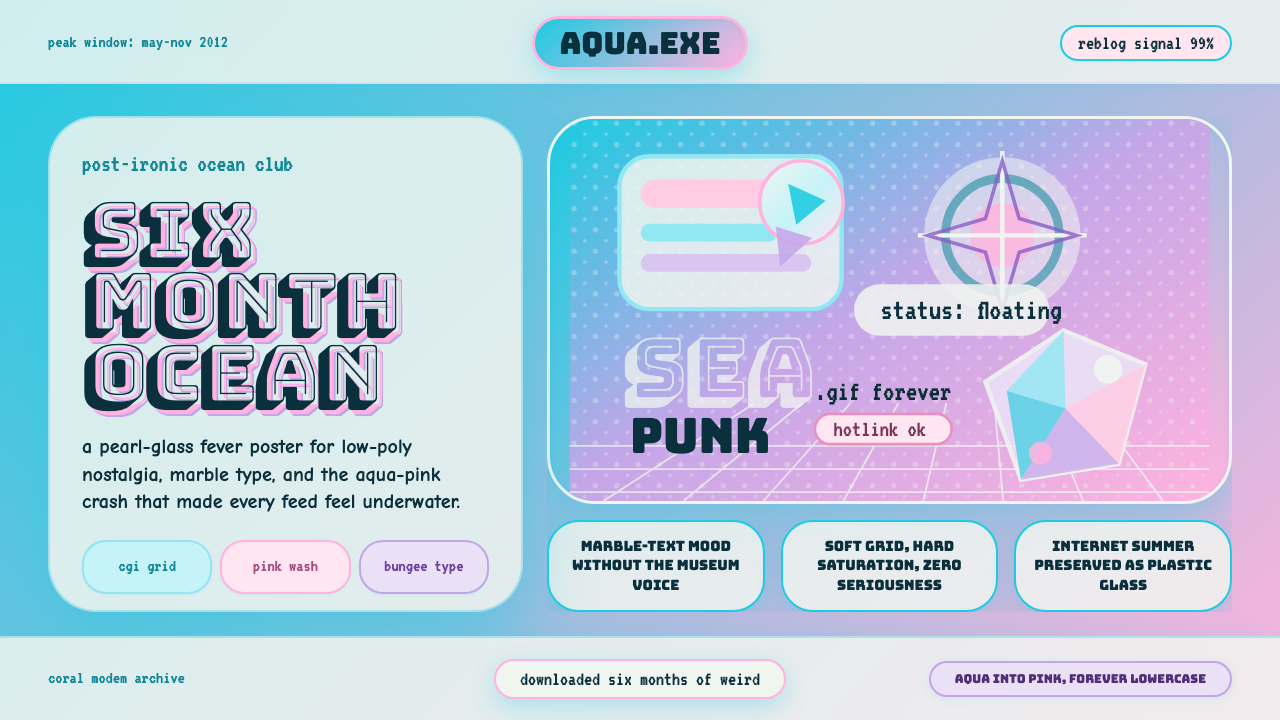 Seapunk Tumblr (2012)Burns bright then crashes. Aqua-pink wash, Bungee type, glassy CGI-grid colla…短暂燃烧后坠落。水蓝粉渐变、Bungee字与玻璃CGI网格拼贴。
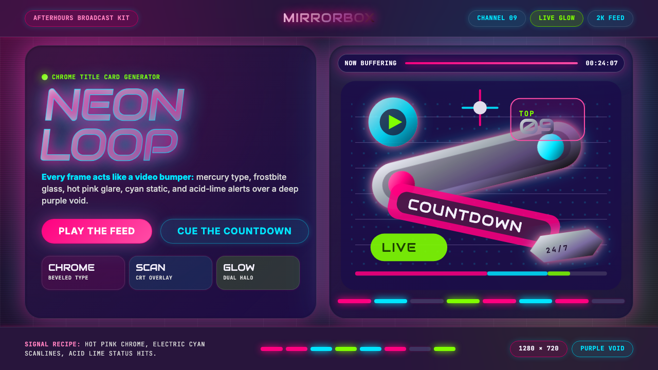 MTV Y2K (2000s)Maximum-volume Y2K. Hot pink chrome, cyan scanlines, and lime hits burn over…高音量千禧感:粉铬、青色扫描线与酸橙光烧过紫色虚空。
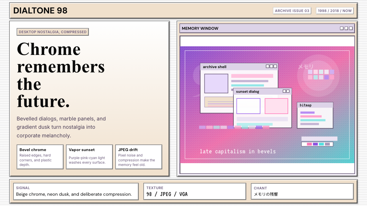 Windows 98 VaporwaveCorporate melancholy glows. Bevelled panels and purple-pink-cyan dusk do the…企业忧郁发光。凸起面板与紫粉青渐变撑起画面。
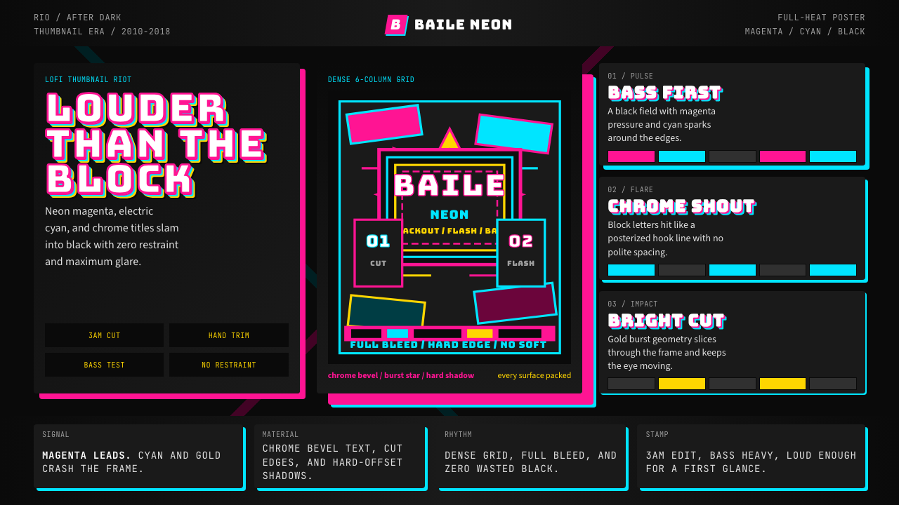 Funk Carioca FavelaMaximalist and unruly. Magenta, cyan, and chrome slam into black at thumbnail…极繁又躁动。洋红、电青与镀铬在黑底上硬碰硬。
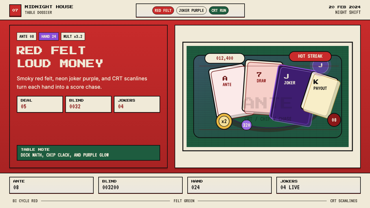 Balatro Poker RoguelikeLate-night poker math with a grin. Bicycle red, felt green, and CRT scanlines.深夜扑克数学感。自行车牌红、毛毡绿和CRT扫描线。
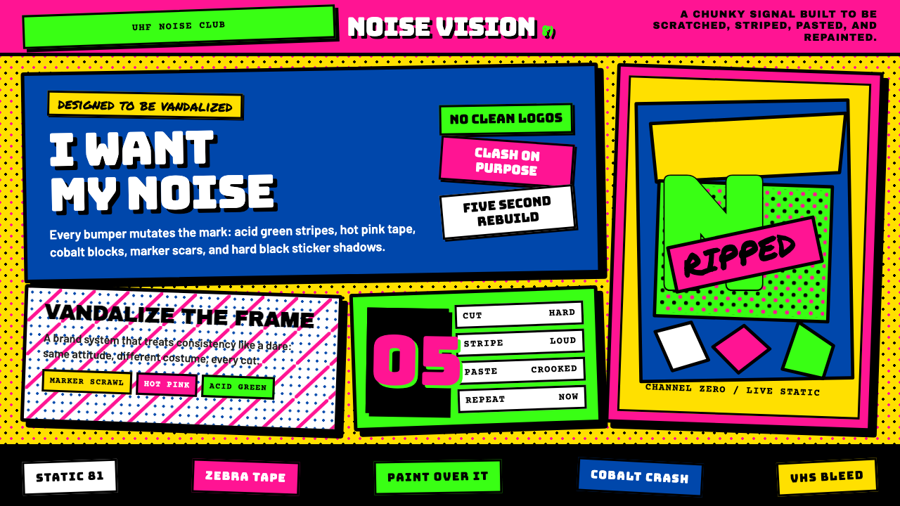 MTV Launch Identity (1981)Built to be vandalized. Hot pink, acid green, Bungee blocks, and crooked stic…天生被涂鸦:热粉酸绿、Bungee方块字与歪贴纸黑框。