What is Balatro Poker Roguelike?什么是 Balatro Poker Roguelike?
Balatro distills the smoky romance of the poker table into a visual language of casino-felt green, Bicycle-card red, and CRT scanlines — proving that a solo developer with a strong aesthetic instinct can define a genre.Balatro 将扑克桌的烟雾浪漫提炼成一套视觉语言——赌场毛毡绿、自行车牌红与CRT扫描线——证明一个拥有强烈美学直觉的独立开发者可以定义一个品类。
Balatro Poker Roguelike in briefBalatro Poker Roguelike 速览
Balatro Poker Roguelike is the visual design system born from the 2024 indie game Balatro — a single-player card game that blends poker hand-building with roguelike run structures. Its aesthetic is not borrowed from any prior game genre but assembled from real-world gambling culture: the deep baize green of a casino card table, the Bicycle playing-card red that has anchored American card design since the 1880s, the purple-edged neon glow of 1980s arcade marquees, and the CRT scanline filter that wraps the entire experience in a layer of smoky, late-night analog warmth.Balatro 扑克肉鸽是由2024年独立游戏 Balatro 衍生出的视觉设计系统——这款单人卡牌游戏将扑克牌型构建与肉鸽跑图结构融为一体。它的美学并非借用自任何既有游戏类型,而是从真实赌博文化中拼贴而来:赌场牌桌的深绿色毛毡、1880年代以来主导美国扑克牌设计的自行车牌红、1980年代街机招牌边沿的霓虹紫光,以及将整个体验包裹在深夜模拟暖意中的CRT扫描线滤镜。
The system is defined by a small but highly deliberate palette and a set of layout rules that prioritize legibility under tension — because roguelike games ask players to read many numbers quickly under pressure. Card faces snap to a portrait proportion that echoes real playing cards. Score counters use monospaced type so that digit changes never cause layout jitter. Gold chip accents punctuate winning moments. Every visual element earns its place by serving the core feedback loop: play cards, score points, understand consequences.这套系统以一组精心设定的色彩和版式规则为骨架,核心目标是在压力下保持可读性——因为肉鸽游戏要求玩家在紧张状态下快速读取大量数字。牌面采用与真实扑克牌呼应的竖版比例。得分计数器使用等宽字体,确保数字变化时版面不发生抖动。金色筹码点缀每一个得胜时刻。每个视觉元素都因服务于核心反馈循环而存在:出牌、得分、理解后果。
What makes the Balatro style unusually transferable outside gaming is its disciplined mix of nostalgia and precision. The CRT texture and neon palette carry emotional warmth that pure minimalism cannot, while the grid-locked card layouts and monospaced counters carry the legibility of a good dashboard. It is a system that looks handmade but behaves like an information display — which is why designers have found it useful for data-heavy interfaces, editorial layouts, and presentations that want personality without chaos.Balatro 风格之所以在游戏之外具有罕见的可移植性,在于它对怀旧感与精确性的克制混合。CRT质感与霓虹色板携带着纯粹极简主义无法传递的情感温度,而网格锁定的牌面布局与等宽计数器又具备优秀仪表板的可读性。这是一套看起来手工制作、运作起来却像信息展示界面的系统——这正是设计师在数据密集界面、编辑排版和希望有个性而不混乱的演示文稿中发现其价值的原因。
See the Balatro Poker Roguelike design system查看 Balatro Poker Roguelike 完整设计系统
Where does Balatro Poker Roguelike come from?Balatro Poker Roguelike 从何而来?
Balatro was built almost entirely by a single developer operating under the pseudonym LocalThunk, working from Brandon, Manitoba, a mid-sized city on the Canadian prairies. The game was released on February 20, 2024, after roughly two years of solo development. LocalThunk has remained anonymous, declining interviews and public appearances while speaking through the game's Steam page and occasional social media posts — a decision that redirected all attention toward the work itself rather than the creator's biography.Balatro 几乎完全由一位以 LocalThunk 为笔名运作的独立开发者独自完成,他在加拿大草原省份马尼托巴州的中等城市布兰登工作。游戏于2024年2月20日发布,此前经历了大约两年的独立开发。LocalThunk 始终保持匿名,婉拒采访与公开露面,仅通过游戏的 Steam 页面和偶尔的社交媒体帖子发声——这一决定将所有注意力重新导向作品本身,而非创作者的履历。
The visual system was not drawn from a formal design background but assembled through close study of real gambling ephemera: vintage Bicycle and Bee playing-card decks, casino chip sets, felt table surfaces, and the particular green that casino operators have used for decades because it reduces eye strain under artificial light. The CRT scanline layer was added to evoke the early video poker terminals and slot machine screens of the 1980s and early 1990s — the exact moment when gambling and digital display technology first converged in popular culture. This layering of pre-digital gambling nostalgia onto a digital card game creates the system's core emotional texture.这套视觉系统并非出自正式设计背景,而是通过对真实赌博周边物件的仔细研究拼贴而成:复古自行车牌与蜜蜂牌扑克套装、赌场筹码组、毛毡桌面,以及赌场运营商沿用数十年、因其在人造光下减少眼睛疲劳而被选用的那种特定绿色。CRT扫描线层的加入是为了唤起1980年代至1990年代初期的早期视频扑克终端和老虎机屏幕——恰好是赌博与数字显示技术在大众文化中首次融合的时刻。将前数字时代赌博怀旧感叠加到数字卡牌游戏上,构成了这套系统的核心情感质感。
The game's publisher, Playstack, and its composer LouisF contributed to the surrounding context — the soundtrack's late-night jazz and accordion cues reinforce the visual system's smoky backroom atmosphere. But the aesthetic decisions appear to have been driven almost entirely by LocalThunk, making Balatro a rare case of a coherent, finished design language emerging from a single sensibility rather than a collaborative process.游戏发行商 Playstack 和作曲家 LouisF 为周边语境作出了贡献——配乐中的深夜爵士与手风琴音符强化了视觉系统的烟雾密室氛围。但美学决策似乎几乎完全由 LocalThunk 主导,使 Balatro 成为一套连贯、完整的设计语言从单一感性而非协作过程中涌现的罕见案例。
Balatro won The Game Awards Best Independent Game and BAFTA Game of the Year in 2024, bringing its visual identity to an exceptionally wide audience. The game's success within the indie roguelike and deckbuilder community — a genre boom that had been building since games like Slay the Spire (2019) and Monster Train (2020) — coincided with a broader revival of CRT-aesthetic and pixel-art visual styles across indie game development. Balatro is distinctive within this revival, however, because its reference points are not retro gaming but retro gambling: the aesthetic is drawn from physical card and casino culture rather than from 8-bit or 16-bit screen memory.Balatro 荣获2024年TGA最佳独立游戏奖与BAFTA年度游戏奖,将其视觉识别系统带到了异常广泛的受众面前。游戏在独立肉鸽与卡组构建社群中的成功——这一品类热潮自《杀戮尖塔》(2019年)和《怪兽列车》(2020年)起持续积聚——与独立游戏开发中更广泛的CRT美学与像素艺术视觉风格复兴同步发生。然而 Balatro 在这场复兴中具有独特性:它的参照系不是复古游戏,而是复古赌博——其美学汲取自实体纸牌与赌场文化,而非8位或16位屏幕记忆。
What defines the Balatro Poker Roguelike look?Balatro Poker Roguelike 的视觉特征是什么?
Casino-Ground Palette赌场底色板
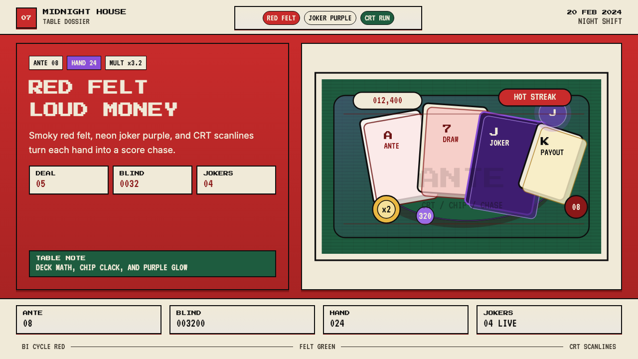
The palette is anchored by three historically grounded colors: the deep baize green of a card table felt (a hue that casino operators have standardized for over a century because it reduces eye strain under tungsten light), the particular warm red of a Bicycle playing-card back (a red that reads as festive and authoritative simultaneously), and a neon purple-violet borrowed from 1980s arcade marquee lighting. Against these three, gold appears as a consistent accent for score displays and high-value items, and off-black serves as the universal background for night-mode panels. The palette is dense and saturated rather than muted — it wants to be read across a room.色板由三种有历史依据的颜色锚定:牌桌毛毡的深绿色(赌场运营商沿用逾百年的色调,因其在钨丝灯下减少眼睛疲劳)、自行车扑克牌背面的特定暖红(一种同时传递节庆感与权威感的红),以及借用自1980年代街机霓虹灯牌的霓虹紫紫罗兰。在这三者之上,金色作为得分显示与高价值物品的一致强调色出现,近黑色则作为夜间模式面板的通用背景。整套色板浓郁饱和而非低沉克制——它需要被从房间另一端读到。
CRT Scanline OverlayCRT扫描线叠层
A horizontal scanline texture is applied as a global overlay across the entire visual field, simulating the phosphor-line structure of cathode-ray tube monitors from the 1980s and early 1990s. The scanlines are subtle enough to read through but prominent enough to shift the perceived surface from crisp digital to tactile analog. Their primary function is atmospheric: they make every color feel slightly warmer, slightly more worn, and slightly more private — as if the game is running on a terminal tucked into the back corner of a casino lounge. The texture also unifies elements that would otherwise feel disparate, acting as a consistent ground beneath the card graphics, UI panels, and background.水平扫描线纹理作为全局叠层覆盖整个视野,模拟1980年代至1990年代初期阴极射线管显示器的磷光线结构。扫描线足够细腻,可透过其阅读内容,但又足够显眼,足以将感知表面从清脆数字质感转变为触觉模拟质感。其主要功能是氛围营造:它使每种颜色都感觉稍暖、稍显磨损、稍显私密——仿佛游戏正在赌场休息室角落某台终端上运行。这种纹理也将原本可能显得散漫的元素统一起来,作为牌面图形、界面面板与背景之下的一致底层。
Card-Grid Layout卡牌网格布局
All card objects are sized and positioned according to a portrait proportion that closely matches a physical playing card — roughly the ratio of a standard Poker-size card. Cards snap to a grid rather than floating freely, which means the layout reads as orderly even when the table is full. The grid spacing is generous enough to allow each card to breathe individually, while the overall array reads as a single organized field. This discipline means that adding or removing cards from the hand produces a layout shift that feels deliberate rather than accidental — a quality that carries directly into slide and dashboard design when the style is applied outside gaming.所有牌面对象按照与实体扑克牌紧密匹配的竖版比例调整尺寸和定位——大约是标准扑克牌的长宽比。牌面吸附到网格上而非自由漂浮,这意味着即使桌面满牌,版面依然呈现出有序感。网格间距足够宽松,使每张牌能够独立呼吸,而整体阵列又被读作一个统一的有组织场域。这种纪律意味着从手牌中增减牌张会产生一种感觉刻意而非偶然的版面位移——当这种风格被应用于游戏之外的幻灯片和仪表板设计时,这种品质可以直接移植。
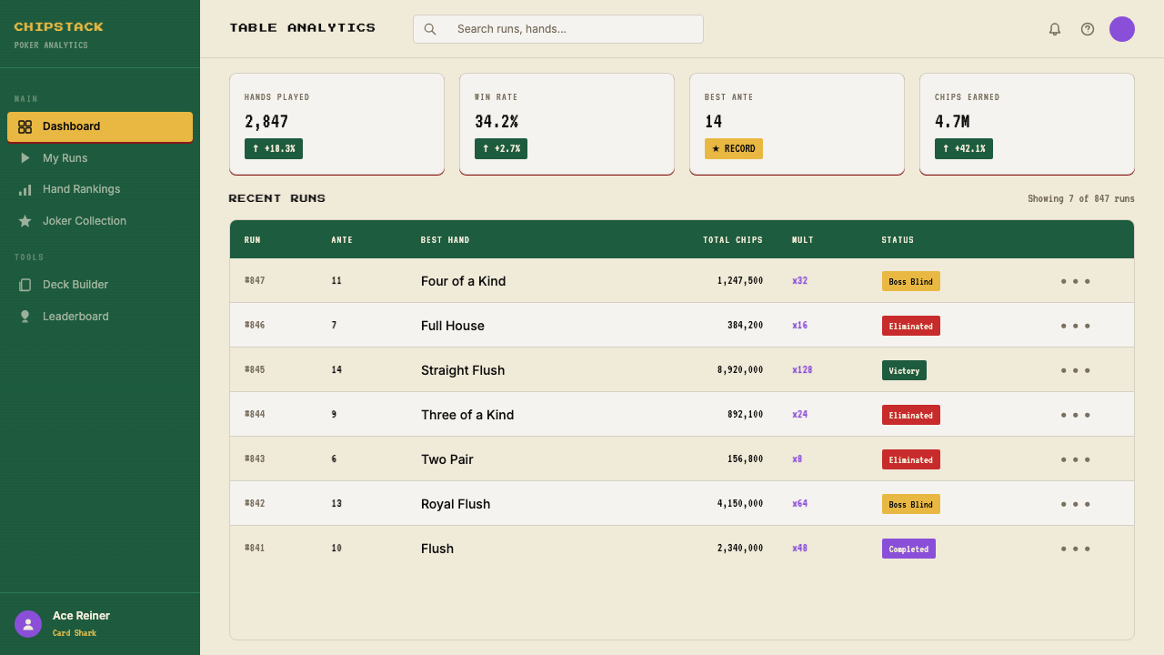
Monospaced Score Typography等宽得分字体
Score counters, chip tallies, and numerical multipliers are displayed in monospaced type — a deliberate choice from the world of terminals and cash registers rather than of graphic design. The monospaced character means that as numbers tick upward, each digit occupies the same horizontal space regardless of whether it is a one or an eight; the counter does not shift left or right as values change. This is a functional decision with a strong aesthetic signature: the counters feel mechanical, like an odometer or a slot machine reel, rather than like a contemporary app badge. Headline and card-title type uses a bolder, pixel-influenced display face that references arcade high-score boards.得分计数器、筹码汇总与数字倍数均以等宽字体显示——这是一个刻意来自终端机与收银机世界而非平面设计世界的选择。等宽字符意味着随着数字向上跳动,每个数字占据相同的水平空间,无论是一还是八;计数器在数值变化时不会左右移动。这是一个具有强烈美学印记的功能性决定:计数器感觉机械,像里程表或老虎机转轮,而非当代应用程序徽章。标题与牌名字体使用更粗重的像素风格展示字体,参照街机高分榜的字样。
Gold Accent Hierarchy金色强调层级
Gold — a warm, metallic yellow rather than a bright primary — is used sparingly and consistently as the signal for high value. It appears on chip stacks, on bonus multiplier labels, on legendary-tier joker card frames, and on any UI element that represents the player's most consequential resource. The restraint in its use is what gives it power: because gold appears only where something matters most, the eye learns to trust it as a signal rather than treating it as decoration. This is a lesson from physical chip design — casino chips use gold accents precisely because the color is not used anywhere on the felt table surface itself.金色——一种温暖的金属黄色,而非明亮的原色——被克制而一致地用作高价值信号。它出现在筹码堆、奖励倍数标签、传奇级小丑牌边框,以及任何代表玩家最关键资源的界面元素上。对其使用的节制正是赋予它力量的原因:因为金色只在最重要的地方出现,眼睛学会将其视为信号而非装饰。这是从实体筹码设计中汲取的教训——赌场筹码使用金色点缀,恰恰是因为这种颜色在毛毡桌面本身上完全不使用。
Layered Depth Without Gradients无渐变的分层深度
The Balatro interface creates a strong sense of depth — cards float above the table, panels sit above the background, tooltips hover above panels — without relying on soft drop shadows or gradient fills. Depth is achieved through a combination of hard-edged borders, slight scale differences between layers, and the CRT overlay that visually recedes the background relative to foregrounded UI elements. The result is a depth hierarchy that is clear to read even on lower-quality displays. This approach echoes the physical layering of actual card game components: the felt beneath the cards, the cards themselves, the chips stacked above the cards.Balatro 界面创造了强烈的层深感——牌面浮于桌面之上,面板置于背景之上,工具提示悬于面板之上——却不依赖柔和的投影或渐变填充。深度通过硬边边框、各层之间细微的尺寸差异,以及在视觉上使背景相对前景界面元素退后的CRT叠层三者的组合来实现。结果是一个即使在较低质量显示器上也清晰可读的深度层级。这种方法与真实卡牌游戏组件的实体分层呼应:毛毡在牌面之下,牌面本身,筹码堆叠在牌面之上。
Joker-Card Expressionism小丑牌表现主义
The game's joker cards — the most powerful and visually varied objects in the system — are each illustrated in a cartoonish, expressive style that deliberately breaks from the clean grid of the playing-card UI. Each joker has a unique face, a distinct color personality within the overall palette, and a small illustrated vignette that communicates its effect through visual metaphor. This controlled injection of character and illustration into an otherwise disciplined grid system is one of the Balatro aesthetic's most instructive qualities: the expressiveness of the joker cards earns its place because it is contained within a defined card-shaped frame and never bleeds into the surrounding UI.游戏的小丑牌——系统中最强大、视觉上最多变的对象——每一张都以卡通、表现性的风格绘制,刻意打破扑克牌界面整洁网格的规则。每张小丑牌都有独特的面孔、在整体色板内的独特色彩个性,以及一个通过视觉隐喻传达其效果的小型插图场景。这种将角色感与插图克制地注入一个本已严整的网格系统的做法,是 Balatro 美学最具启示性的品质之一:小丑牌的表现力之所以能够立足,是因为它被限定在一个既定的牌形边框内,从未溢出至周围的界面。
See the Balatro Poker Roguelike design system查看 Balatro Poker Roguelike 完整设计系统
Who shaped Balatro Poker Roguelike?谁塑造了 Balatro Poker Roguelike?
LocalThunk is the anonymous solo developer who designed, programmed, and directed Balatro from its inception through commercial release. Working from Brandon, Manitoba, they made nearly all aesthetic decisions — palette, typography style, CRT overlay, card proportions — without a design team or art director. The choice to remain pseudonymous has kept the focus entirely on the work itself. LocalThunk's background is not in professional game development or graphic design, which may explain why the visual system draws so directly from physical source material (real card decks, casino furniture) rather than from conventions of prior video game art.LocalThunk 是匿名独立开发者,从立项到商业发行独自设计、编写并主导了 Balatro 的全程开发,工作地点在加拿大马尼托巴省布兰登。几乎所有美学决策——色板、字体风格、CRT叠层、牌面比例——都在没有设计团队或美术总监的情况下由其一人完成。选择保持匿名将所有注意力完全聚焦于作品本身。LocalThunk 的背景并非专业游戏开发或平面设计,这或许解释了为何这套视觉系统如此直接地从实体原材料(真实牌组、赌场家具)汲取灵感,而非借鉴既有电子游戏美术的惯例。
Playstack is the London-based indie game publisher that partnered with LocalThunk to bring Balatro to market across multiple platforms. While their direct contribution to the visual design system is limited — the core aesthetic predates the publishing agreement — Playstack played a role in the game's marketing presence and platform deployment, decisions that shaped how the Balatro visual identity was presented to press and storefronts. Their track record with other mid-scale indie titles gave LocalThunk distribution reach that reinforced the aesthetic's cultural spread.Playstack 是总部位于伦敦的独立游戏发行商,与 LocalThunk 合作将 Balatro 推向多个平台。尽管他们对视觉设计系统的直接贡献有限——核心美学早于发行协议形成——Playstack 在游戏营销呈现与平台部署中发挥了作用,这些决策影响了 Balatro 视觉识别系统在媒体和游戏商店中的呈现方式。他们在其他中型独立作品上的经验为 LocalThunk 提供了发行覆盖面,进一步强化了这套美学的文化传播。
LouisF composed the Balatro soundtrack, a collection of late-night jazz, accordion, and ambient casino-lounge cues that form the auditory complement to the visual system. The music is unusual for an indie roguelike in that it avoids the chiptune and electronic palettes common to the genre, instead referencing the same physical gambling world that the visual design draws from. This cross-modal coherence — where the sonic and visual references are both drawn from mid-century casino culture — is part of what gives the overall Balatro aesthetic its unusual solidity. A design system that extends into sound as well as image is notably harder to imitate superficially.LouisF 创作了 Balatro 的游戏原声带——一组深夜爵士、手风琴与环境赌场休息室音符,构成视觉系统的听觉补充。这部音乐在独立肉鸽游戏中颇为罕见:它回避了该品类常见的芯片音调与电子音色,转而参照视觉设计所汲取的同一个实体赌博世界。这种跨模态的一致性——声音与视觉参照系都指向二十世纪中期赌场文化——是 Balatro 整体美学具有异常稳固性的部分原因。一套延伸至声音与图像的设计系统,在表面上要难以模仿得多。
While not a person, the Bicycle brand — produced by the United States Playing Card Company since 1885 — is a direct visual ancestor of the Balatro aesthetic. The Bicycle card back design, with its interlocking red scrollwork on a white ground, established the specific shade of warm playing-card red that Balatro samples. The card's portrait proportions, the feel of its face-card illustration style, and even the semantic weight of the suits (spades, hearts, clubs, diamonds) are all active references within the game. Understanding the Bicycle card as a designed artifact helps explain why the Balatro palette feels authoritative rather than arbitrary.尽管并非真实人物,自行车品牌——美国扑克牌公司自1885年起出品——是 Balatro 美学的直接视觉祖先。自行车牌背面设计以白底上相互交织的红色涡卷构成,确立了 Balatro 取样的那种温暖扑克牌红的特定色调。牌的竖版比例、人头牌插图风格的质感,乃至四种花色(黑桃、红心、梅花、方块)的语义分量,都是游戏中的活跃参照。将自行车牌理解为一个被设计的人工制品,有助于解释为何 Balatro 色板感觉权威而非随意。
How do you use Balatro Poker Roguelike today?今天怎么用 Balatro Poker Roguelike?
The Balatro style is most effective in contexts where the designer wants high legibility paired with strong atmosphere — situations where the work needs to feel alive and specific rather than generic and polished. Applying it correctly requires understanding its two registers: the disciplined grid and monospaced legibility system on one hand, and the saturated palette and CRT warmth on the other. The two registers must be held in balance; losing either one collapses the aesthetic into either a generic dark-mode dashboard or a vague retro pastiche.Balatro 风格在设计师希望将高可读性与强氛围结合的场景中最为有效——那些需要感觉鲜活而具体、而非通用而精致的情境。正确应用它需要理解其两个维度:一方面是严整的网格与等宽可读性系统,另一方面是饱和色板与CRT温度。两个维度必须保持平衡;失去任何一个,美学便会崩塌为要么是泛泛的深色仪表板,要么是模糊的复古仿制品。
For presentation slides, the style works particularly well for covers and section dividers that need immediate visual impact. A cover built in this system might place a large card-shaped frame at center, set the title in a bold display face with slight pixel texture, and ground the whole composition in the deep casino green with a gold accent. Content slides should lean into the grid discipline: treat each information block as a card object with a consistent border treatment, use monospaced type for any numerical data, and reserve the neon accent color for the single most important figure on each slide. Data slides benefit from treating charts as card objects — bar charts with bordered frames and casino-palette coloring read as part of the system rather than as inserted graphics.在演示文稿中,这种风格尤其适合需要即时视觉冲击的封面页和章节分隔页。用这套系统构建的封面可以将一个大型牌形边框置于中心,用带有轻微像素质感的粗重展示字体设置标题,并以深赌场绿配合金色强调色为整个构图奠基。内容页应充分发挥网格纪律:将每个信息块视为一个带有一致边框处理的牌面对象,对所有数字数据使用等宽字体,将霓虹强调色保留给每张幻灯片上最重要的单个数字。数据页得益于将图表视为牌面对象——带有边框的柱状图和赌场色板配色读起来像是系统的一部分,而非插入的图形。
For web UI, the Balatro aesthetic is well-suited to dashboards, analytics interfaces, and any product that presents numerical information as its primary content. The approach: establish a dark near-black background as the base layer, use bordered card components with slight hard-edge shadow for information panels, apply monospaced type to all counters and metrics, and use the gold accent exclusively for the highest-priority value on any given screen. The CRT texture can be applied as a subtle full-page overlay or omitted entirely for a cleaner read — the grid and palette carry the style without it. Pricing pages work well with the system's chip-and-tier metaphor: each pricing tier reads as a card object, and the recommended tier receives the gold accent treatment.对于网页界面,Balatro 美学非常适合仪表板、分析界面,以及任何以数字信息为主要内容的产品。方法如下:以深近黑色背景作为基础层,为信息面板使用带有硬边轻微投影的边框卡片组件,对所有计数器和指标应用等宽字体,将金色强调色专门用于任意给定屏幕上优先级最高的数值。CRT纹理可以作为细腻的全页叠层应用,也可以完全省略以获得更干净的阅读效果——网格与色板在没有它的情况下也能支撑这种风格。定价页面非常适合这套系统的筹码与等级隐喻:每个定价层级读作一个牌面对象,推荐层级获得金色强调处理。
For editorial and marketing work, the style supports a poster-sensibility that photograph-heavy layouts cannot achieve through the palette alone. A feature article opener might use the casino-green as a full-bleed background, set the headline in the bold display face at very large scale, and introduce a card-shaped image container rather than a freeform bleed image. Marketing one-pagers benefit from treating section headers as card labels — a bordered chip-style container for each section title gives the page consistent internal rhythm. The joker-card illustration principle is instructive here: contained, expressive character illustration within a defined frame works well for product mascots, feature icons, or any illustrated element that needs personality without overwhelming the surrounding information.对于编辑与营销工作,这种风格支持一种以大量照片的版面仅凭色板所无法实现的海报感。特写文章的开篇可以将赌场绿作为满版背景,以极大尺度的粗重展示字体设置标题,并引入牌形图片容器而非自由的满版出血图像。营销单页得益于将章节标题视为牌面标签——每个章节标题使用带边框的筹码式容器,为页面提供一致的内部节奏。小丑牌插图原则在这里很有启发性:在既定边框内的有所约束而富有表现力的角色插图,非常适合产品吉祥物、功能图标,或任何需要个性而不淹没周围信息的插图元素。
A common mistake when applying this style is over-relying on the CRT scanline texture as a substitute for structural discipline. The texture creates atmosphere, but it does not organize information. Designs that lead with the CRT effect and neglect the underlying grid and color hierarchy produce work that reads as a costume rather than a system — visually noisy and difficult to scan. The correct sequence is to establish the card-grid structure, color hierarchy, and monospaced type logic first, then apply the CRT overlay as a finishing layer. Similarly, the neon purple-violet should be used with the same restraint as the gold accent — it is a signal color, not a background treatment.应用这种风格时最常见的错误是过度依赖CRT扫描线纹理来替代结构纪律。纹理创造氛围,但不组织信息。以CRT效果为先、忽视底层网格与色彩层级的设计,产出的作品读起来像是一套服装而非一个系统——视觉上嘈杂、难以扫读。正确的顺序是先建立牌面网格结构、色彩层级和等宽字体逻辑,然后将CRT叠层作为最终修饰层应用。同样,霓虹紫罗兰色应与金色强调色保持同等克制——它是一种信号色,而非背景处理手段。
See the Balatro Poker Roguelike design system查看 Balatro Poker Roguelike 完整设计系统
Balatro Poker Roguelike — FAQBalatro Poker Roguelike · 常见问题
Is the Balatro style only appropriate for gaming-related projects?Balatro 风格只适合与游戏相关的项目吗?
No. The style's game origin is a source of its emotional texture, not a limitation on its application. The underlying system — a dark ground with high-contrast bordered card components, a disciplined color hierarchy, and monospaced numerical displays — functions as well in a financial analytics dashboard or a conference presentation as it does in a game UI. What the style brings to non-gaming contexts is atmosphere: a sense that the interface takes its information seriously and has a specific point of view. Projects where this directness would feel appropriate include data products, developer tools, design tools, poker and card game adjacent apps, and any brand that wants to project confidence and specificity rather than approachability and warmth.不。这种风格的游戏起源是其情感质感的来源,而非其应用的限制。底层系统——深色底面配以高对比度边框卡片组件、严整的色彩层级和等宽数字显示——在金融分析仪表板或会议演示中与在游戏界面中同样有效。这种风格带给非游戏场景的是氛围:一种界面认真对待其信息、并有特定立场的感觉。这种直接性可能适用的项目包括数据产品、开发者工具、设计工具、扑克与卡牌游戏相关应用,以及任何希望传递自信与独特性而非亲和力与温暖感的品牌。
How does the Balatro style differ from generic dark-mode design?Balatro 风格与通用深色模式设计有何不同?
Generic dark-mode design typically uses neutral near-black backgrounds, subtle elevation shadows, and a single brand-color accent. It aims for universality and inoffensiveness. The Balatro style is distinguished by its specificity: the background is not a neutral dark but a saturated casino green or deep felt tone; the card-grid structure is not a generic card component pattern but a reference to physical playing-card proportions; the type system includes a deliberately retro pixel-influenced display face that generic dark-mode avoids. The CRT scanline overlay is the most obvious differentiator, but the deeper difference is that every element in the Balatro system carries a historical reference rather than a neutral design-system token. Applying one without the others produces a confused result.通用深色模式设计通常使用中性近黑色背景、细腻的高度阴影和单一品牌色强调。它追求通用性与无冒犯性。Balatro 风格以其特殊性著称:背景不是中性深色,而是饱和的赌场绿或深毛毡色调;卡片网格结构不是通用卡片组件模式,而是对实体扑克牌比例的参照;字体系统包含一种通用深色模式刻意回避的复古像素风格展示字体。CRT扫描线叠层是最明显的区分标志,但更深层的区别在于:Balatro 系统中的每个元素都携带历史参照,而非中性的设计系统标记。只应用其中一个而不配合其他元素,会产生混乱的结果。
Can the Balatro aesthetic work on a light background?Balatro 美学能在浅色背景上运作吗?
It is possible but significantly more difficult. The system's atmosphere depends heavily on the contrast between its saturated accent colors and a deep background — the neon purple and gold only sing against dark grounds. On a light background, these same accents tend to read as garish rather than dramatic. If a light-background version is required, the recommended approach is to invert selectively: keep the card components on a casino-green or near-black ground even if the overall page background is light, treating the cards as dark islands in a lighter sea. The CRT overlay does not translate to light backgrounds at all and should be omitted. The monospaced type system and card-proportion grid remain fully usable on light grounds.这是可能的,但难度显著更高。这套系统的氛围在很大程度上依赖饱和强调色与深色背景之间的对比——霓虹紫与金色只在深色底面上才能发光。在浅色背景上,同样的强调色往往读起来俗艳而非戏剧性。如果需要浅色背景版本,推荐的做法是选择性地反转:即便整体页面背景是浅色,也将卡片组件保持在赌场绿或近黑色底面上,将牌面视为浅色大海中的深色小岛。CRT叠层在浅色背景上完全无法转化,应当省略。等宽字体系统和牌面比例网格在浅色底面上仍然完全可用。
What is the right way to handle illustration within this style?在这种风格中处理插图的正确方式是什么?
The joker-card system provides the model: character illustration belongs inside defined frames, not loose on the page. Each illustrated element should live within a card-shaped or chip-shaped border that contains its expressiveness and prevents it from competing with the surrounding information hierarchy. Style-wise, the illustration language should lean toward bold outline, limited color fills drawn from the main palette, and a slightly cartoonish or caricature quality — not photorealism, not flat vector minimalism, but the kind of illustrative energy you would find on a vintage cigarette card or a theatrical poster from the early twentieth century. Photography is generally discouraged within the system; if used, it should be treated as high-contrast and tightly cropped rather than ambient and full-frame.小丑牌系统提供了范本:角色插图属于既定边框内,而非松散地置于页面上。每个插图元素都应存在于一个牌形或筹码形边框内,用边框限制其表现力,防止其与周围的信息层级竞争。就风格而言,插图语言应倾向于粗重轮廓、从主色板中提取的有限色彩填充,以及略带卡通或夸张漫画质感——不是写实摄影,不是平面矢量极简主义,而是在古董香烟牌或二十世纪初戏剧海报上可以找到的那种插图活力。摄影在这套系统内通常不被鼓励;若使用,应以高对比度和紧密裁切处理,而非以环境光感的满框方式呈现。
How should the CRT scanline effect be implemented without making the interface feel like a Halloween decoration?如何在不让界面感觉像万圣节装饰的情况下实现CRT扫描线效果?
Restraint in opacity is the entire answer. The scanline overlay in the original Balatro game is subtle enough that many players do not consciously notice it — they only feel its effect as a warmth and slight softness in the color rendering. An opacity that is just visible at close inspection but invisible at normal viewing distance is the target. Common mistakes include setting the scanline too dark (which creates a harsh striped pattern that competes with content), setting the line spacing too wide (which creates a venetian-blind effect rather than a phosphor glow), or applying the effect only to certain components rather than globally. The scanline should function as a surface quality of the entire screen — like the grain of a film photograph — not as a decorative frame applied to selected elements.对不透明度的克制是全部答案。原版 Balatro 游戏中的扫描线叠层足够细腻,许多玩家不会有意识地注意到它——他们只是将其效果感受为色彩渲染中的温度与轻微柔化。目标是在近距离检视时刚好可见、在正常观看距离时不可见的不透明度。常见错误包括:将扫描线设置得过暗(会产生与内容竞争的粗糙条纹图案)、将线间距设置得过宽(会产生百叶窗效果而非磷光发光感),或仅将效果应用于某些组件而非全局应用。扫描线应当作为整个屏幕的表面质感发挥作用——如同胶片照片的颗粒感——而非作为应用于特定元素的装饰性边框。
Related design styles相关设计风格
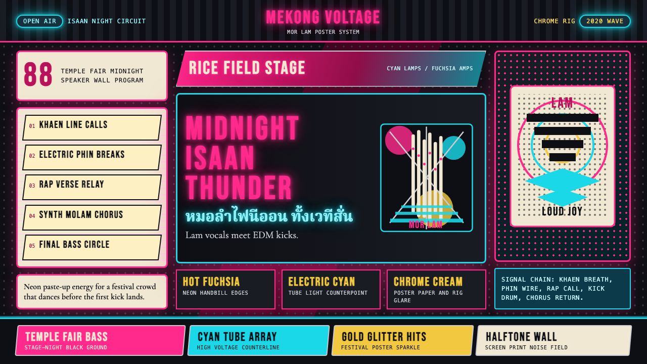 Thai Mor Lam Isaan (2020)Joy at maximum volume. Fuchsia-cyan neon, chrome type, and halftone grids hit…最大音量的欢愉:黑底上洋红青霓虹、铬字与网点格爆发。
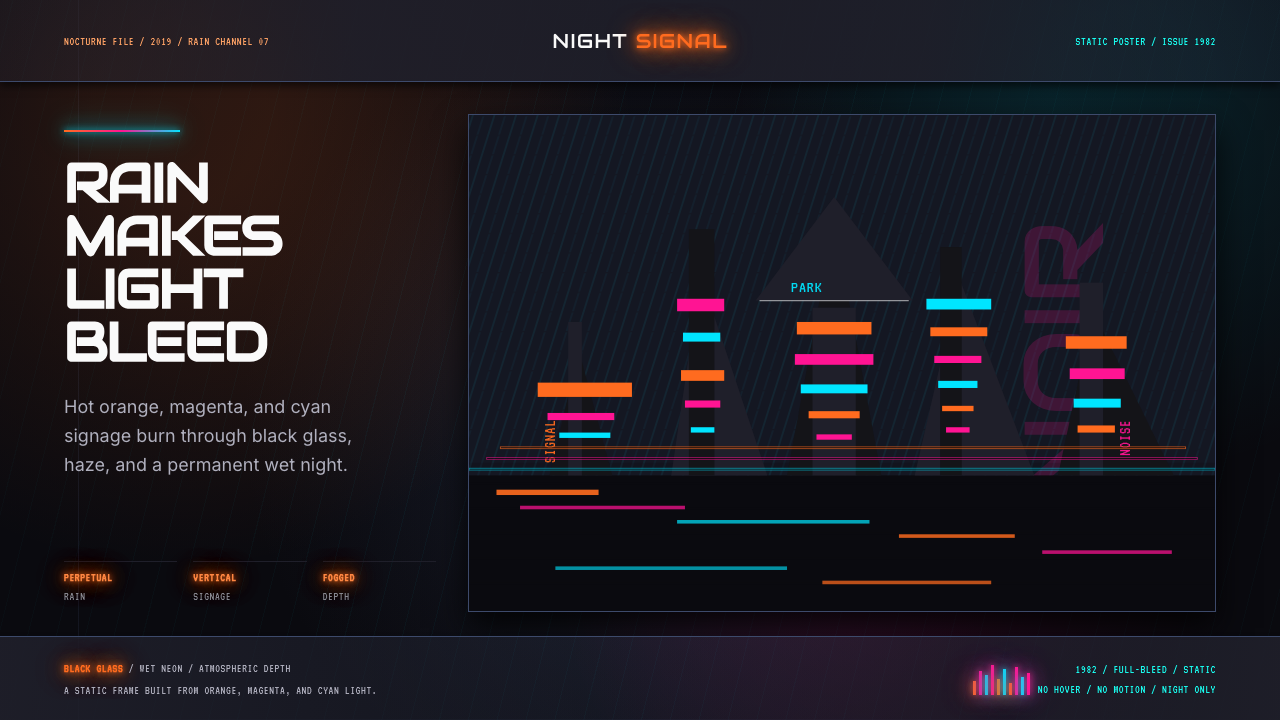 Blade Runner 1982 Neon NoirRain-soaked noir. Orange, magenta, and cyan neon cut black glass.雨夜黑色电影。橙洋红青霓虹切开黑玻璃。
 Cartoon Network 90s BlocksKids-cable noise, squared. Black-white checkerboards crash into hot-yellow Bu…方块化的儿童有线电视噪音:黑白棋盘撞上热黄 Bungee 字块。
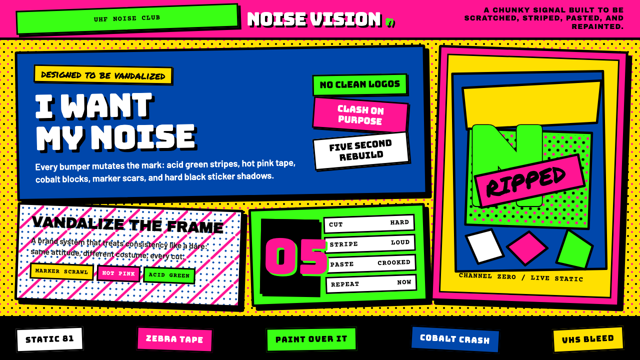 MTV Launch Identity (1981)Built to be vandalized. Hot pink, acid green, Bungee blocks, and crooked stic…天生被涂鸦:热粉酸绿、Bungee方块字与歪贴纸黑框。
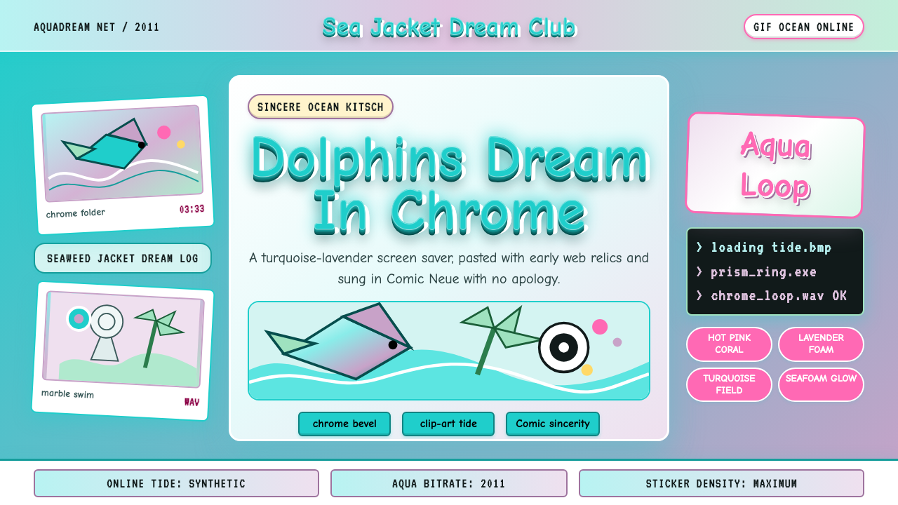 Seapunk 2011Sincere ocean kitsch. Turquoise gradients, Comic Neue chrome, and clip-art do…真诚的海洋俗艳:青绿渐变、Comic Neue 铬字与海豚剪贴画相撞。
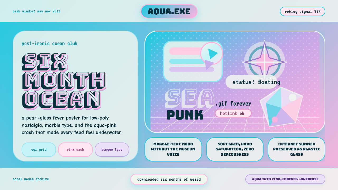 Seapunk Tumblr (2012)Burns bright then crashes. Aqua-pink wash, Bungee type, glassy CGI-grid colla…短暂燃烧后坠落。水蓝粉渐变、Bungee字与玻璃CGI网格拼贴。