Design style guide设计风格指南
What is Thai Mor Lam Isaan (2020)?什么是 Thai Mor Lam Isaan (2020)?
Mor lam is joy at maximum volume — a collision of khaen mouth-organ tradition, synth-pop electricity, and neon-drenched festival spectacle that turned northeastern Thailand's night skies incandescent.摩兰是最大音量的欢愉——笙口风琴传统、合成器流行电音与霓虹浸透的庙会奇观相撞,将泰国东北的夜空点燃。
Thai Mor Lam Isaan (2020) in briefThai Mor Lam Isaan (2020) 速览
Thai Mor Lam Isaan (2020) is a design aesthetic rooted in the live concert culture of northeastern Thailand's Isaan region, where Lao-ethnic communities have cultivated a distinctive musical tradition for centuries. The visual language distills the sensory overload of a stadium-scale mor lam festival: deep stage-black grounds, blazing fuchsia-magenta neon, electric cyan accents, chrome-silver surfaces, and glitter-gold highlights, all organized through halftone-print textures and the bold collage logic of hand-printed concert posters.泰国摩兰依善(2020)是一套根植于泰国东北依善地区现场演唱会文化的设计美学。这片土地上的寮裔社群世代传承着独特的音乐传统。这套视觉语言提炼了体育场级摩兰庙会的感官过载:深沉的舞台夜黑底色、灼热的洋红霓虹、电光青强调色、铬银表面与金粉高光,以网点印刷质感和手印演唱会海报的拼贴逻辑加以组织。
The system captures a specific moment — the 2020s — when mor lam underwent a full-scale EDM fusion, with performers arriving on hydraulic stages flanked by LED towers, fog machines, and laser rigs borrowed from international pop concerts. The design language that emerged is simultaneously vernacular and spectacular: it carries the grain of photocopied provincial flyers and the scale of a Times Square billboard. Nothing here is shy, and nothing is accidental — every visual decision amplifies the joyful excess that defines the music.这套系统捕捉了一个特定时刻——2020年代,摩兰完成了与 EDM 的全面融合:表演者踏上液压升降舞台,两侧是 LED 灯塔、烟雾机与从国际流行演唱会借来的激光装置。由此生长出的设计语言,同时是本土的与壮观的——它既有省城复印传单的颗粒感,又有时代广场广告牌的体量。这里没有任何羞怯,没有任何偶然——每一个视觉决定都在放大定义这种音乐的欢乐过剩。
Unlike design systems derived from fine-art movements or corporate brand manuals, Mor Lam Isaan's aesthetic comes from the street, the temple fairground, and the festival stage. Its authority is collective and communal rather than authored by any single designer. That populist origin gives it an irreducible vitality: this is not a style designed to impress critics; it is a style designed to make thousands of people feel, simultaneously, that the night will never end.与源自纯艺术运动或企业品牌手册的设计系统不同,摩兰依善美学来自街头、庙会广场与节庆舞台。它的权威是集体性的、社群性的,而非出自任何单一设计师之手。这种平民主义起源赋予了它不可消减的生命力:这不是一种为了打动评论家而设计的风格,而是一种为了让成千上万的人同时感受到「今夜永不落幕」而设计的风格。
See the Thai Mor Lam Isaan (2020) design system →查看 Thai Mor Lam Isaan (2020) 完整设计系统 →
Where does Thai Mor Lam Isaan (2020) come from?Thai Mor Lam Isaan (2020) 从何而来?
The khaen, a free-reed mouth organ made from bamboo pipes, is the ancestral instrument of Isaan and Lao musical culture. Its sound — breathy, droning, capable of complex polyphony — has accompanied agricultural festivals, spirit rituals, and courtship singing across the Mekong basin for centuries. Mor lam, literally 'expert in lam singing,' describes the vocal tradition built around the khaen, in which skilled singers improvise verse on themes of love, politics, and village life. By the late nineteenth century, traveling mor lam troupes were the dominant popular entertainment across northeastern Thailand.笙(khaen)是由竹管制成的自由簧口风琴,是依善与寮裔音乐文化的祖传乐器。它的声音——气息感、持续低鸣、能演奏复杂的复调——在湄公河流域陪伴了几个世纪的农业节庆、灵魂仪式与求偶对唱。摩兰(mor lam,字面义为「擅长兰(lam)唱腔者」)描述的是围绕笙所建立的声乐传统,熟练的歌手即兴吟唱爱情、政治与村庄生活等主题。至十九世纪末,巡回演出的摩兰戏班已成为泰国东北最主要的大众娱乐形式。
Electrification transformed the tradition beginning in the 1970s. Amplified khaen, electric phin lutes, drum kits, and eventually synthesizers entered the mor lam ensemble, producing a hybrid sound that could fill outdoor festival spaces with genuine force. The concert stage grew accordingly: lights, chrome scaffolding, and hand-painted banners announced performers in a visual language that was part carnival, part religious pageant, part professional wrestling promotion. By the 1990s, stars like Jintara Poonlarp and Lamyai Haitongkam were selling out venues across the northeast and carrying the Isaan cultural identity to Bangkok's migrant worker communities.电气化从 1970 年代开始改变这一传统。扩音笙、电鼓琵琶(phin)、架子鼓乃至合成器进入摩兰乐队,产生出能以真实力量填满户外庙会场地的混合音响。演唱会舞台随之扩张:灯光、铬架与手绘横幅用一套视觉语言宣告表演者的到来——这套语言一半是嘉年华,一半是宗教庆典,一半是职业摔角促销。到 1990 年代,金塔拉·蓬拉(Jintara Poonlarp)与拉迈·海通坎(Lamyai Haitongkam)等明星已在东北各地售出满场,并将依善文化认同带入曼谷的外来务工者社群。
The period between roughly 2015 and the early 2020s saw the most dramatic transformation, as mor lam producers began importing the full visual and sonic apparatus of global EDM. Hydraulic stages, LED video walls, and choreographed laser sequences turned regional temple fair concerts into events that could credibly be described as stadium spectacles. Poster art evolved in parallel: the hand-lettered, hand-printed flyers of earlier decades gave way to digitally composed designs, but the aesthetic logic remained — maximum contrast, maximum chromatic intensity, condensed display type screaming performer names in fuchsia and cyan against stage-black grounds.2015 年前后至 2020 年代初是变化最为剧烈的时期:摩兰制作人开始引入全球 EDM 的全套视听装置。液压升降台、LED 视频墙与编排好的激光序列,将地区庙会演唱会变成了可以被恰当描述为「体育场奇观」的事件。海报艺术同步演化:早年的手写、手印传单让位于数字合成设计,但美学逻辑一脉相承——最大对比度、最大色彩强度、压缩展示字体在舞台黑底上用洋红与青色嘶吼歌手名字。
The Isaan Lao-ethnic identity revival, which accelerated through the 2010s, gave the aesthetic additional cultural weight. Mor lam became not merely entertainment but a declaration of regional pride in the face of Bangkok's cultural and economic dominance. Iconic visual markers — the khaen silhouette, the sticky-rice basket, temple fair lanterns, and the sinuous forms of traditional textile motifs — were incorporated into the neon-and-chrome visual vocabulary, linking the maximalist contemporary stage spectacle to deep historical roots. The design system that emerged by 2020 carries all of this layering: it is simultaneously ancient and synthetic, local and global.2010 年代加速的依善寮裔身份认同复兴运动赋予这套美学以更深的文化分量。摩兰不仅仅是娱乐,更成为在曼谷文化与经济主导面前宣示地区骄傲的方式。标志性视觉符号——笙的剪影、糯米竹篓、庙会灯笼、传统织物纹样的柔美线条——被纳入霓虹与铬的视觉词汇,将当代舞台奇观的最大主义与深厚的历史根系连接起来。到 2020 年,由此生长出的设计系统承载了所有这些层叠:它同时是古老的与合成的、本土的与全球的。
What defines the Thai Mor Lam Isaan (2020) look?Thai Mor Lam Isaan (2020) 的视觉特征是什么?
Color色彩
The palette is built on extreme contrast: a near-total stage black serves as the ground, against which hot fuchsia-magenta neon and electric cyan vie for dominance. Chrome silver provides a metallic mid-tone that reads simultaneously as material texture and luminosity, while glitter gold punctuates focal points and performer names. Colors are used at saturation levels that border on uncomfortable by conventional design standards — the aesthetic intention is not refinement but incandescence, the sensation of standing close to a bank of stage lights.色板建立在极端对比上:近乎全黑的舞台底色作为基底,灼热的洋红霓虹与电光青在其上争夺主导。铬银提供一个金属中间调,同时传递材质质感与发光感;金粉则点缀焦点位置与歌手名字。色彩的饱和度之高,按常规设计标准来看近乎令人不适——美学意图不是精致,而是灼热,是站在一排舞台灯旁边的感觉。
Typography字体排印
Display type is condensed, ultra-bold, and set at sizes that dominate the composition. Performer names are the primary typographic event — they are often larger than any supporting imagery, tracked tightly, and treated with chrome or neon-glow effects that make letterforms read as luminous objects rather than flat marks. Supporting information — dates, venues, supporting acts — is set in much smaller weights, creating a stark two-tier hierarchy that mirrors concert poster conventions worldwide while amplifying them to their logical extreme.展示字体极度压缩、超粗,字号大到主导整个构图。歌手名字是首要的排版事件——它们往往比任何配图都更大,字间距收紧,施以铬效果或霓虹发光处理,使字形读来像发光体而非平面标记。附属信息——日期、场地、暖场嘉宾——以小得多的字重排版,形成鲜明的两级层级,既呼应全球演唱会海报惯例,又将其推至逻辑极端。
Halftone Texture网点印刷质感
Halftone dot patterns — the visible grain of mass-market offset and letterpress printing — appear throughout as a unifying surface texture. They give the aesthetic its connection to the physical history of provincial concert promotion, where limited-budget printing on newsprint or cheap card stock produced this characteristic grain as a by-product of the process. In the 2020s digital incarnation, halftone is applied deliberately and decoratively, adding visual noise that prevents the design from reading as purely clean or corporate.网点图案——大众市场胶印与凸印的可见颗粒——作为统一表面质感贯穿始终。它使这套美学与省城演唱会宣传的实物历史相连:有限预算在新闻纸或廉价卡纸上印刷,将这种特征性颗粒作为工艺副产品留了下来。在 2020 年代的数字版本中,网点被刻意且装饰性地应用,增加视觉噪点,防止设计读来过于干净或企业化。
Collage and Layering拼贴与叠层
Composition in Mor Lam Isaan works through collision and accumulation rather than through the clean separation of elements. Performer portraits are cropped aggressively and overlaid on geometric bursts of neon color; text blocks sit atop halftone gradients which in turn layer over photographic fragments. Multiple elements compete for attention simultaneously, and the visual hierarchy is resolved not by separating them but by intensifying the contrast between them. This layering logic mirrors the density and simultaneity of the concert experience itself.摩兰依善的构图逻辑是碰撞与叠加,而非元素的干净分离。歌手肖像被激进裁切,叠在霓虹色的几何爆发光晕上;文字块压在网点渐变上,网点又叠在摄影碎片之上。多个元素同时争夺注意力,视觉层级不是通过分离而是通过加强彼此之间的对比来解决的。这种叠层逻辑映射了演唱会体验本身的密度与同时性。
Cultural Iconography文化图像志
Specific visual symbols anchor the aesthetic's Isaan identity within its contemporary spectacle: the silhouette of the khaen instrument, the conical form of the traditional bamboo sticky-rice basket, temple fair lantern shapes, and decorative motifs drawn from woven textile traditions. These icons appear as screen-printed overlays, silhouette cutouts, or geometric abstractions — never as ethnographic illustration but as charged signs that locate the design system within a specific cultural geography.特定的视觉符号将这套美学的依善身份锚定在当代奇观之中:笙乐器的剪影、传统竹制糯米篓的锥形轮廓、庙会灯笼的形态,以及来自织物传统的装饰纹样。这些图像以丝网印刷叠层、剪影镂空或几何抽象的形式出现——从不作为民族志插图,而是作为带电的符号,将这套设计系统定位于特定的文化地理之中。
Neon Glow and Light Effects霓虹发光与光效
A defining characteristic is the simulation of stage lighting: neon glow halos radiate from text and edge elements, spotlight bursts illuminate performer portraits, and light-leak effects bleed between color zones. These are not photorealistic lighting simulations but schematic representations — graphic shorthand for luminosity that reads as immediately theatrical. The glow effects also serve a structural function, separating layers that would otherwise bleed into each other on a dark ground.一个定义性特征是对舞台照明的模拟:霓虹发光光晕从文字与边缘元素向外辐射,追光爆射照亮歌手肖像,漏光效果在色区之间渗透流动。这些不是照片级真实的光照模拟,而是图解性呈现——代表发光感的图形简写,读来立即具有戏剧性。发光效果同时具有结构功能:在深色底面上将否则会相互渗透的层次分开。
Scale and Hierarchy尺度与层级
The compositional logic is unapologetically hierarchical, with performer identity placed at the absolute apex. Everything else — supporting acts, venue details, sponsor logos, decorative elements — exists to frame and amplify that central presence. Scale relationships are extreme: the gap between the largest and smallest typographic elements is much wider than conventional design systems would permit, which gives even complex compositions an immediate legibility from a distance — a practical requirement for festival posters viewed across a crowded fairground.构图逻辑毫不掩饰地等级分明,歌手身份被置于绝对顶端。其他一切——暖场嘉宾、场地信息、赞助商标志、装饰元素——都是为了衬托和放大那个核心存在而存在。尺度关系是极端的:最大与最小排版元素之间的落差远超常规设计系统所允许的范围,这使得即便复杂的构图在远距离也能被立即读取——这是庙会海报在拥挤广场上远观的实际要求。
See the Thai Mor Lam Isaan (2020) design system →查看 Thai Mor Lam Isaan (2020) 完整设计系统 →
Who shaped Thai Mor Lam Isaan (2020)?谁塑造了 Thai Mor Lam Isaan (2020)?
One of the foundational figures of modern mor lam recording, Pongsri helped establish the form's commercial viability during the electrification era of the 1970s and 1980s. Her recordings brought northeastern music to Bangkok audiences and created the template for the performance persona — the commanding stage presence, the alternation between traditional lam vocal technique and pop melody — that later generations of performers would scale to arena dimensions.现代摩兰唱片业的奠基人之一,蓬斯里在 1970 至 1980 年代电气化时代帮助确立了这一形式的商业可行性。她的录音将东北音乐带给曼谷听众,并树立了表演人格的模板——威严的舞台存在感、传统兰(lam)唱腔技法与流行旋律之间的交替——后来的表演者将这一模板扩展至体育馆规模。
Banyen is widely regarded as one of the greatest traditional khaen singers of the twentieth century, a living link between the pre-electrification oral tradition and the contemporary stage. Her mastery of poetic improvisation within the strict formal constraints of lam singing established the artistic standard against which later fusion performers measure themselves. Her continued presence in the culture keeps the ancestral roots of the aesthetic visible even within its most maximalist contemporary expressions.班延被广泛视为二十世纪最伟大的传统笙歌手之一,是电气化前口头传统与当代舞台之间的活态连接。她在严格的兰演唱形式约束下即兴作诗的高超技艺,确立了后来融合表演者参照自身的艺术标准。她在文化中持续的存在,使这套美学的祖传根系即便在最大主义的当代表达中也保持可见。
Jintara represents the crossover generation — performers who achieved mainstream Thai commercial success without abandoning the Isaan sonic and cultural identity. Her visual branding during the 1990s and 2000s established many of the poster conventions that the 2020s aesthetic would later amplify: the dominance of performer portraiture, the use of dramatic lighting against dark grounds, and the blending of traditional costume elements with contemporary fashion. Her career arc models how the mor lam aesthetic travels between regional and national audiences.金塔拉代表了跨越一代——在不放弃依善声音与文化认同的前提下获得泰国主流商业成功的表演者。她在 1990 至 2000 年代的视觉品牌确立了许多 2020 年代美学后来放大的海报惯例:歌手肖像的主导地位、在深色底面上戏剧性光照的运用,以及传统服饰元素与当代时尚的融合。她的职业轨迹示范了摩兰美学如何在地区与全国受众之间旅行。
Among the defining stars of the EDM-mor-lam fusion era, Lamyai brought a scale of production to regional concerts that had not previously been seen. Her stage shows — with hydraulic stage elements, elaborate costume changes, and synchronized light design — established the template for the contemporary spectacular concert that the 2020s design system reflects. Her visual identity, built around the collision of traditional Isaan signifiers with international pop aesthetics, directly embodies the layered hybridity that the design system formalizes.摩兰 EDM 融合时代的标志性明星之一,拉迈将此前从未有过的制作规模带入了地区演唱会。她的舞台演出——液压台元素、精心设计的换装表演、同步光效设计——为 2020 年代设计系统所反映的当代奇观演唱会确立了模板。她的视觉形象建立在传统依善符号与国际流行美学的碰撞上,直接体现了这套设计系统所正式化的叠层混杂性。
How do you use Thai Mor Lam Isaan (2020) today?今天怎么用 Thai Mor Lam Isaan (2020)?
Mor Lam Isaan is a maximalist system and works best in contexts that can sustain — and benefit from — high visual energy. Before applying it, consider whether the communication goal is to signal intensity, celebration, regional or subcultural identity, or nocturnal entertainment. Contexts that call for calm authority, clinical precision, or delicate refinement will resist this aesthetic; contexts that need to communicate excitement, communal energy, or cultural pride will find it extremely well suited.摩兰依善是一套最大主义体系,最适合能够承载并从高视觉能量中获益的场景。在应用之前,先考虑传播目标是否是传递强烈感、庆典感、地区或亚文化认同,或夜间娱乐感。要求平静权威、临床精准或细腻精致的场景会排斥这套美学;需要传递兴奋感、集体能量或文化自豪感的场景则会发现它极为契合。
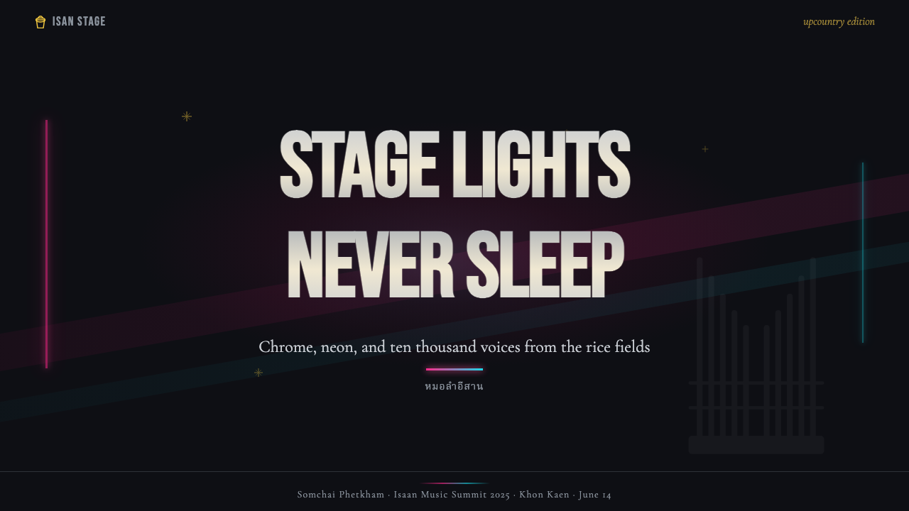
For presentation slides, the system makes an immediate impact on cover pages: a deep black background, a performer- or subject-name treatment in oversized condensed type with a fuchsia or cyan neon-glow effect, and a supporting image treated with halftone overlay. Content slides require more restraint — use the dark ground with a single accent color (fuchsia or cyan, not both simultaneously) to highlight key data points or section headers, and keep body text legible in a clean light weight. Data slides can lean into the aesthetic by rendering charts and graphs with neon-accent fills against black grounds, treating data visualization as if it were stage lighting: isolate the number that matters most and make it glow.在演示文稿中,这套系统在封面页能造成即时冲击:深黑底面,对象或主题名以超大压缩字体排版并施以洋红或青色霓虹发光效果,配图做网点叠层处理。内容页需要更多克制——用深色底面搭配单一强调色(洋红或青色,不同时使用),突出关键数据点或章节标题,正文保持干净浅色字重的可读性。数据页可以强化这套美学:在黑色底面上用霓虹强调色填充图表,将数据可视化当作舞台照明来处理——隔离最重要的数字,让它发光。
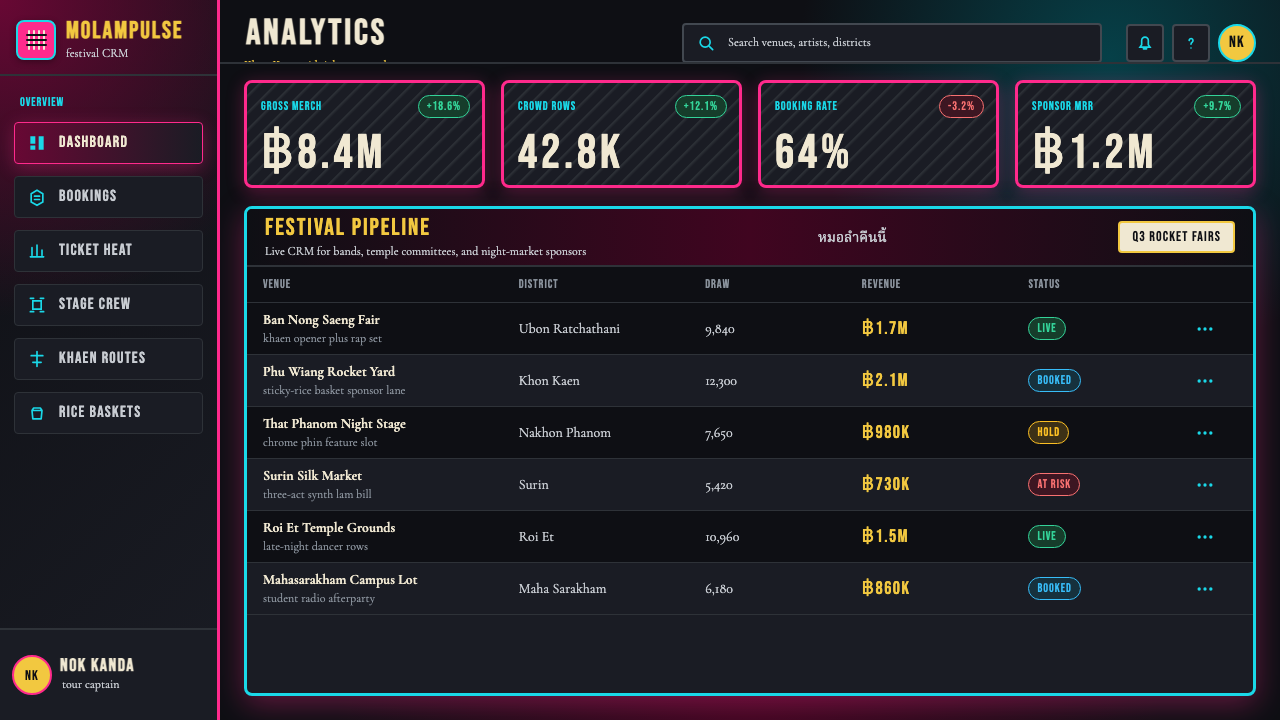
For web interfaces, the system is suited to entertainment platforms, event ticketing, cultural promotion, and nightlife-adjacent products. A dashboard built in this aesthetic would use a near-black background with fuchsia or cyan as interactive accent colors for key states and alerts. Navigation should be bold and typographic; icon decoration, where used, should favor outlined or silhouetted forms rather than filled and detailed icons. The halftone texture can be applied as a subtle background pattern to prevent large dark surfaces from feeling flat and empty. Pricing pages can use the dramatic contrast palette to make tier distinctions immediately legible — each tier differentiated by its accent color.在网页界面上,这套系统适合娱乐平台、活动售票、文化推广与夜生活相关产品。基于这套美学构建的仪表板使用近黑底面,洋红或青色作为关键状态与提示的交互强调色。导航应当粗重且以字体为主;图标装饰(若使用)应倾向于轮廓线或剪影形态,而非实心填充的细节图标。网点质感可作为微妙的背景图案应用,防止大面积深色表面显得平坦空洞。定价页可利用戏剧性对比色板使等级区分立即清晰可辨——每个等级以其强调色加以区分。
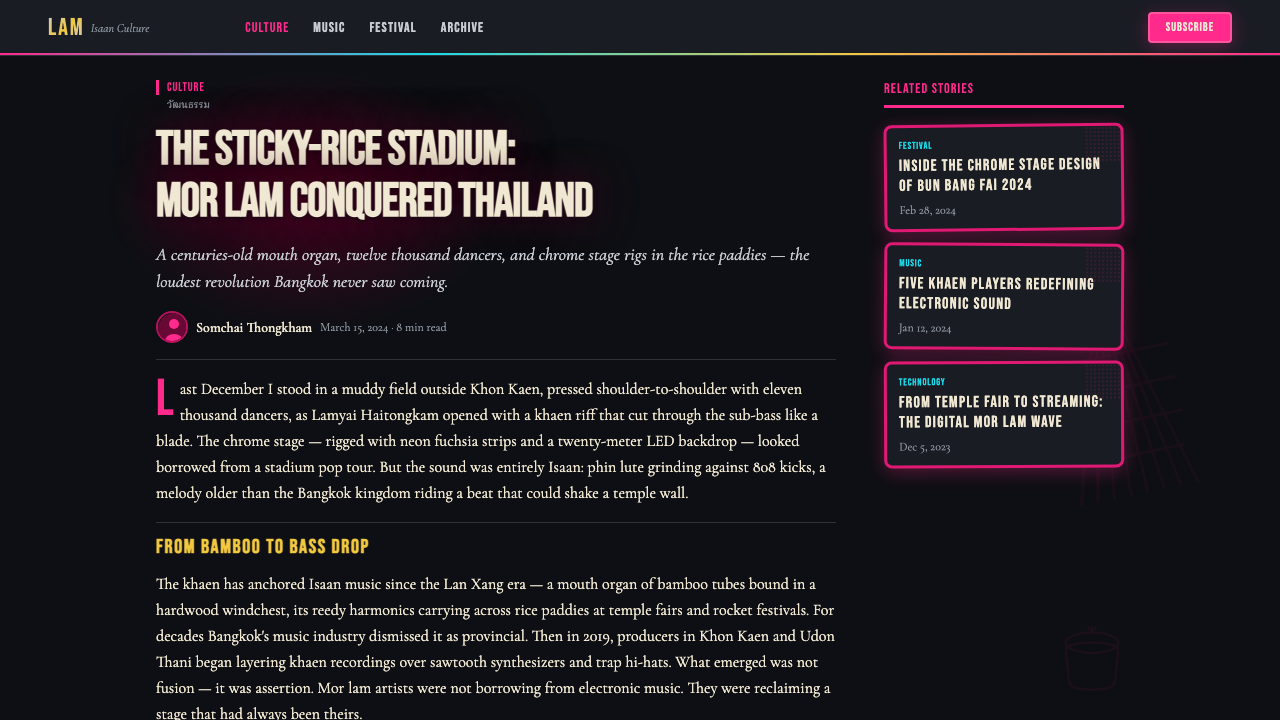
For editorial and marketing work, the aesthetic supports event promotion, cultural journalism, music publication, and festival branding with particular strength. A Mor Lam Isaan-derived editorial spread uses full-bleed dark photography treated with neon-glow overlays, condensed display type for section titles, and generous use of the halftone texture to link photographic elements to the designed frame. Marketing posters and social content benefit from the system's poster-logic: one central image, one dominant performer or subject name at maximum scale, supporting details at minimum scale, and the full chromatic palette concentrated in the center of the composition rather than spread edge to edge.在编辑与营销工作中,这套美学在活动推广、文化新闻、音乐出版与节庆品牌建设中表现尤为出色。摩兰依善衍生的编辑跨版使用全出血深色摄影并施以霓虹发光叠层,章节标题使用压缩展示字体,大量运用网点质感将摄影元素与设计框架连接起来。营销海报和社交内容受益于这套系统的海报逻辑:一个核心图像,一个以最大尺度呈现的主体歌手或对象名称,配套细节以最小尺度呈现,全部色彩集中在构图中心而非铺展至边缘。
The most common error when applying this system is attempting to soften it — reducing contrast, introducing neutral mid-tones, choosing muted alternatives to the fuchsia and cyan, or replacing hard-edge glow effects with gentle soft-shadow equivalents. Each of these moves drains the aesthetic of what makes it distinctive. A related mistake is treating the cultural iconography as mere decoration: the khaen silhouette, sticky-rice basket, and temple-fair lantern are not generic ethnic motifs but specific markers of a living cultural identity. Using them without understanding their specificity risks producing a generic 'tropical Asia' pastiche rather than a genuine Isaan aesthetic. If the iconography feels unfamiliar, lean harder on the color and typographic system and leave the specific cultural symbols out rather than misapplying them.应用这套系统时最常见的错误是试图软化它——降低对比度、引入中性中间调、为洋红和青色选择低饱和替代色,或将硬边发光效果替换为柔和软阴影等价物。这些每一步都会抽走使这套美学独特的东西。另一个相关错误是将文化图像志当作纯粹的装饰:笙的剪影、糯米竹篓与庙会灯笼不是通用民族母题,而是一种活态文化认同的特定标记。不理解其特殊性而使用它们,有制造出通用「热带亚洲」仿作的风险,而非真实的依善美学。如果这些文化符号感觉陌生,就更侧重于色彩与字体系统,将特定文化符号留白,好过错误地应用它们。
See the Thai Mor Lam Isaan (2020) design system →查看 Thai Mor Lam Isaan (2020) 完整设计系统 →
Thai Mor Lam Isaan (2020) — FAQThai Mor Lam Isaan (2020) · 常见问题
Is Mor Lam Isaan the same as general Thai design, or is it specific to a region?摩兰依善与泛泰国设计是同一回事吗?还是说它特定于某一地区?
It is emphatically specific — and that specificity is a significant part of its meaning. Isaan is the northeastern region of Thailand, home to a predominantly Lao-ethnic population with its own language, cuisine, musical traditions, and cultural identity distinct from Central Thai culture. Mor lam is an Isaan tradition, not a national Thai one, and the visual aesthetic it produced reflects that regional identity. Applying it as a generic 'Thai design' is a cultural misreading — Bangkok design, royal Thai court aesthetics, and southern Thai visual culture are each quite different. If you are working with this system, let its Isaan identity be specific rather than generalized.它是鲜明地区特定的——而这种特定性是其意义的重要组成部分。依善是泰国东北地区,居住着以寮裔为主体的人口,拥有独特的语言、饮食、音乐传统与文化认同,有别于泰国中部文化。摩兰是依善传统,而非泰国全国性传统,它所产生的视觉美学反映了这一地区认同。将其应用为泛泰国设计是一种文化误读——曼谷设计、泰国皇室宫廷美学与泰国南部视觉文化各自截然不同。如果你在使用这套系统,请让它的依善身份保持特定而非被泛化。
How does this system work for light-background designs?这套系统在浅色背景设计中如何运作?
With considerable difficulty. The Mor Lam Isaan aesthetic is structurally dependent on darkness — the neon glow, chrome reflections, and spotlight effects that define it require a dark ground to function as visual phenomena. On a white or cream background, fuchsia and cyan become aggressive and ungrounded; the glow effects lose their luminous quality and become flat color blobs; the halftone texture loses its grain-against-night character. A light inversion is possible but requires a nearly complete reconception: the chromatic palette would need to be substantially desaturated and darkened, and the glow effects replaced with flat bold treatment. At that point, you are probably working in a different system. For digital applications where dark mode is not possible, consider using dark-ground cards or feature panels within a lighter overall layout rather than forcing the full system onto a light background.相当困难。摩兰依善美学在结构上依赖黑暗——定义它的霓虹发光、铬反射与追光效果需要深色底面才能作为视觉现象发挥作用。在白色或奶油色背景上,洋红与青色变得攻击性且失去根基;发光效果失去发光品质,变成平坦的色块;网点质感失去「夜色中的颗粒」特性。浅色反转是可能的,但需要几乎完全的重新构想:色彩色板需要大幅降低饱和度并加深,发光效果需替换为平面粗重处理。到那时,你可能已经在使用不同的系统了。对于不可能使用深色模式的数字应用,考虑在整体较浅的布局中使用深色底面的卡片或特性区块,而非将整套系统强行套用在浅色背景上。
What separates an authentic Mor Lam Isaan aesthetic from kitsch?真实的摩兰依善美学与媚俗之间的界限在哪里?
The difference is in structural intentionality versus arbitrary loudness. Authentic Mor Lam Isaan work has a clear compositional hierarchy — even at maximum chromatic intensity, there is a legible reading order from the most important element to the least. The maximalism is purposeful: every layer of neon, every halftone texture, every cultural icon is doing a specific job within the composition. Kitsch applies the surface elements — the neon, the black ground, the chrome — without the underlying compositional logic, resulting in visual noise that lacks the theatrical clarity of the real thing. A useful test: can you immediately identify the most important information in the composition? If yes, the system is working. If the eye has nowhere to rest and no clear hierarchy to follow, the maximalism has collapsed into chaos.区别在于结构性意图对比任意的喧嚣。真实的摩兰依善作品具有清晰的构图层级——即便在最大色彩强度下,也有从最重要元素到最次要元素的可读阅读顺序。这种最大主义是有目的的:每一层霓虹、每一块网点质感、每一个文化图像都在构图中执行特定任务。媚俗的做法是应用表面元素——霓虹、黑色底面、铬——而缺乏底层构图逻辑,结果是缺乏真实之物戏剧性清晰度的视觉噪音。一个有用的测试:你能在构图中立即辨认出最重要的信息吗?如果能,这套系统在正常运转。如果眼睛无处停歇、没有清晰的层级可循,这种最大主义就已崩溃为混乱。
Can this system work for products targeting audiences unfamiliar with Isaan culture?这套系统适用于不熟悉依善文化的受众吗?
Yes, but with calibration. The chromatic and typographic logic of the system — deep black, neon contrast, condensed bold display type, halftone grain — is legible as a nocturnal festival aesthetic to audiences with no knowledge of Thailand or mor lam. It communicates night, music, celebration, and energy in a way that crosses cultural contexts. The specifically Isaan iconography — the khaen silhouette, the sticky-rice basket — will be opaque to uninitiated audiences, but they can still function as distinctive formal elements rather than meaningful cultural symbols. The risk is that using culturally specific imagery as pure decoration, stripped of meaning, is a form of aesthetic extraction. If the product has no genuine relationship to Isaan culture, leaning heavily on the universal elements — the color, the typography, the glow effects — and lightly on the culture-specific icons is both more honest and less vulnerable to criticism.可以,但需要调整。这套系统的色彩与排版逻辑——深黑、霓虹对比、压缩粗体展示字体、网点颗粒——对于不了解泰国或摩兰的受众而言,作为夜间节庆美学是可读的。它传递夜晚、音乐、庆典与能量的方式跨越文化语境。特定的依善图像志——笙的剪影、糯米竹篓——对于外行受众会是不透明的,但它们仍可作为独特的形式元素而非有意义的文化符号发挥作用。风险在于:将文化特定图像作为纯粹装饰使用,剥离其意义,是一种美学提取行为。如果产品与依善文化没有真实关联,更多依赖普遍元素——色彩、字体、发光效果——而轻用文化特定图像,既更诚实,也更不容易受到批评。
How does the system scale for small-format applications like mobile UI or social media cards?这套系统如何缩放到小尺寸应用,比如移动端界面或社交媒体卡片?
The system scales better to small formats than many maximalist aesthetics, because its compositional logic is already built around extreme hierarchy and legibility at distance — qualities that translate well to small screens. The key adaptations are: reduce the number of active color accents from two to one (fuchsia or cyan, not both), scale back the halftone texture to a very fine grain or remove it entirely to avoid visual noise at small sizes, and ensure that the typographic hierarchy is reduced to at most two levels. The neon glow effect, if used, should be confined to a single focal element rather than applied throughout. Social media cards benefit from treating the dark background as the 'stage' and allowing one performer or subject to dominate entirely, with all other information subordinated to minimum readable scale.这套系统比许多最大主义美学都更好地缩放到小尺寸格式,因为其构图逻辑本身就建立在极端层级与远距可读性上——这些品质能很好地转化到小屏幕上。关键调整是:将活跃强调色从两种减为一种(洋红或青色,不同时使用),将网点质感缩减至极细颗粒或在小尺寸时完全去除以避免视觉噪点,并确保字体层级减少至最多两个层次。霓虹发光效果(若使用)应限于单一焦点元素,而非全面应用。社交媒体卡片的最佳处理是将深色背景视为「舞台」,让一位表演者或主体完全主导,所有其他信息降至最小可读尺度。
Related design styles相关设计风格
 Cartoon Network 90s BlocksKids-cable noise, squared. Black-white checkerboards crash into hot-yellow Bu…方块化的儿童有线电视噪音:黑白棋盘撞上热黄 Bungee 字块。
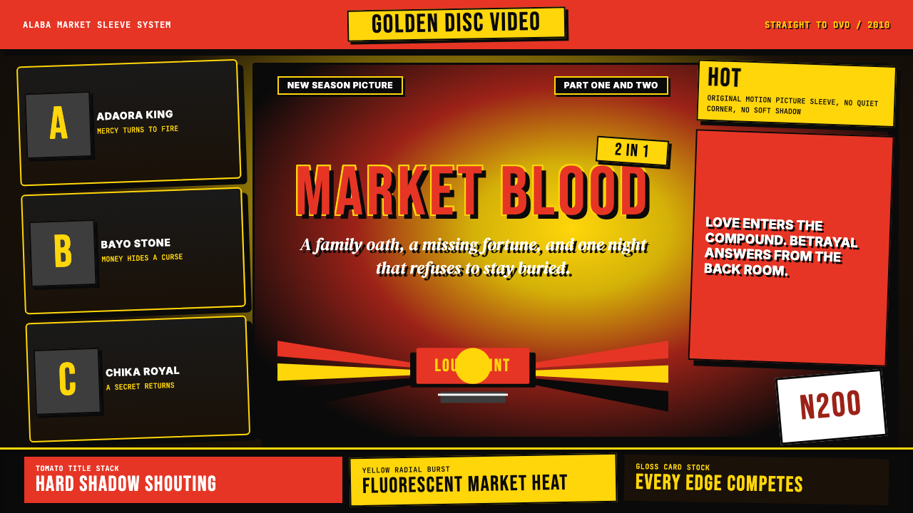 Nigerian Nollywood DVD Poster (2010)Market-stall cinema shouts. Tomato red type and yellow burst collide on jet b…市场摊位式电影在喊:番茄红大字与黄色爆裂撞上黑底。
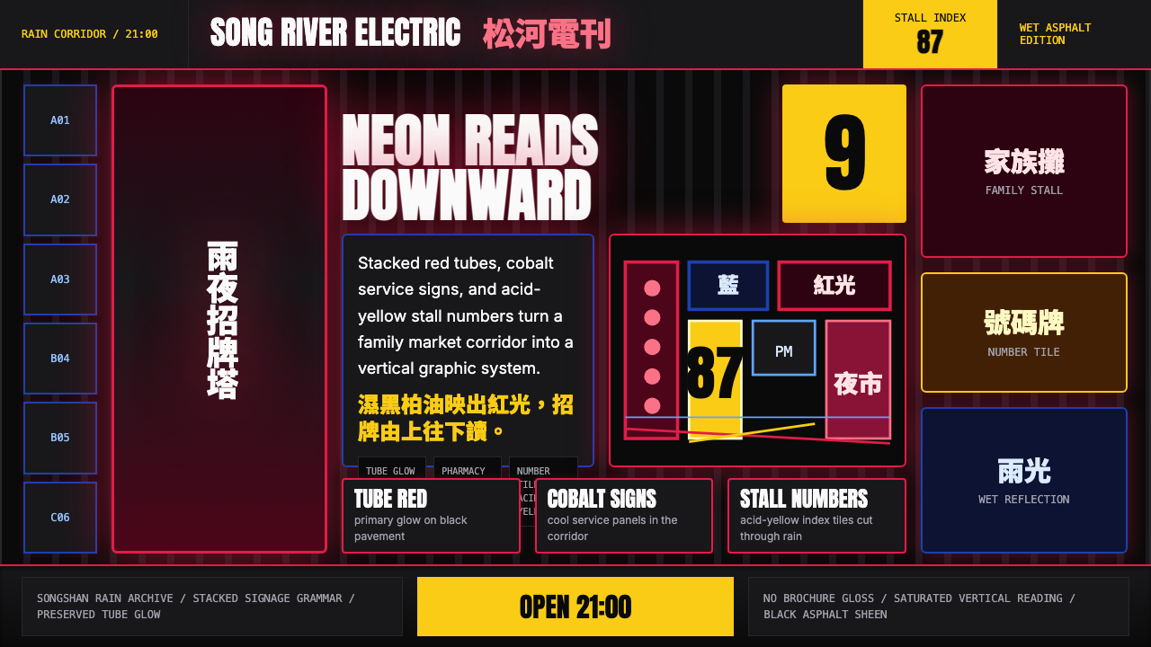 Taiwanese Raohe Night Market NeonTaipei night reads vertically. Neon red, cobalt panels, and acid-yellow numbe…台北夜色垂直閱讀:霓虹紅、鈷藍看板與酸黃號碼疊在濕黑地面。
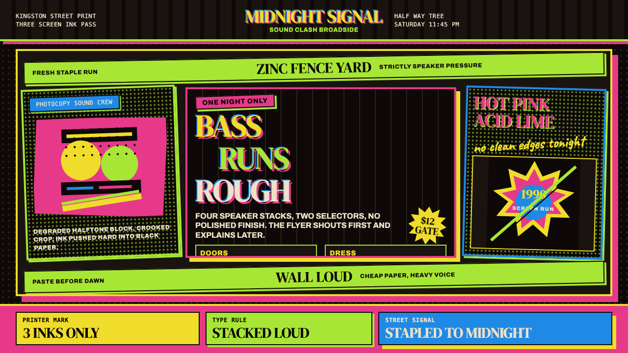 Jamaican Dancehall 1990 PosterMidnight volume. Acid lime and hot pink type stack like screenprint ink on bl…午夜音量:酸绿与热粉粗字叠在黑新闻纸上,如丝印错位。
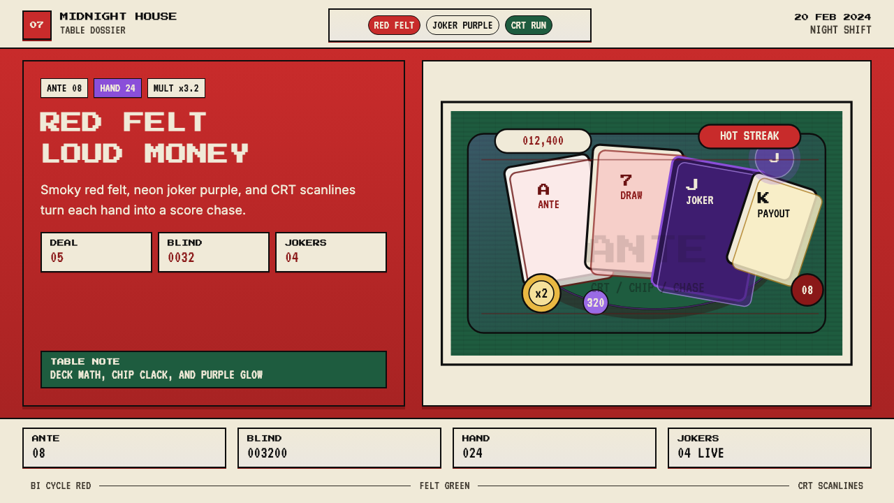 Balatro Poker RoguelikeLate-night poker math with a grin. Bicycle red, felt green, and CRT scanlines.深夜扑克数学感。自行车牌红、毛毡绿和CRT扫描线。
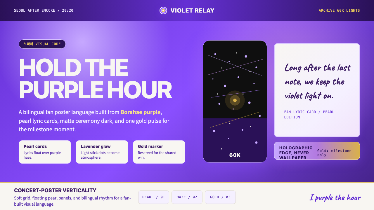 BTS Army Purple 2020Fandom becomes atmosphere. Borahae purple, pearl cards, lavender glow, one go…粉丝成为气氛:Borahae紫、珍珠歌词卡、薰衣草光晕与一束金光。