Design style guide设计风格指南
What is Taiwanese Raohe Night Market Neon?什么是 Taiwanese Raohe Night Market Neon?
Taipei's night markets don't illuminate — they saturate: neon tubes stacked vertically on wet asphalt, cobalt placards humming beside acid-yellow numbers, red so deep it bleeds into the rain.台北夜市不是照明,是飽和:霓虹管垂直疊在濕柏油路上,鈷藍看板與酸黃號碼牌並排閃爍,紅色深到滲進雨水裡。
Taiwanese Raohe Night Market Neon in briefTaiwanese Raohe Night Market Neon 速览
Taiwanese Raohe Night Market Neon is a design style derived from the vernacular visual language of Taiwan's night market corridors — the stacked hand-painted tube signs, the cobalt-panel pharmacy boards, the acid-yellow stall numbers, and the deep wet-black asphalt that absorbs and reflects all of it back. Where most design systems strive for clarity, this one strides toward saturation, layering, and the productive chaos of commercial necessity compressed into a narrow lane.台灣饒河夜市霓虹是一套源自夜市走廊俗民視覺語彙的設計風格——層疊的手繪霓虹管招牌、鈷藍色藥局看板、酸黃色攤位號碼牌,以及吸納並反射一切的深邃濕黑柏油路面。大多數設計系統追求清晰,這套風格卻邁向飽和、層疊,以及商業必要性被壓縮進一條窄巷時所產生的富有生產性的混沌。
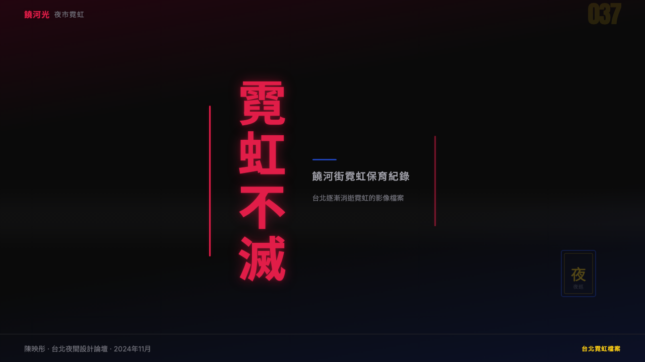
The style is dark-ground by definition. Its palette leans on a deeply saturated red that owes more to traditional vermilion lacquerware than to any Western stop-sign convention, paired with a cold cobalt that reads almost pharmaceutical, and punctuated by an acid yellow so sharp it functions as punctuation rather than fill. These colors do not co-exist politely — they push against one another the way competing stall signs fight for vertical real estate on a narrow facade.這套風格天然以深色為底。它的色板以一種深度飽和的紅為主——這種紅更接近傳統朱漆器皿,而非任何西方停車標誌的慣例——與一種近乎藥品標識的冷鈷藍配對,並以一種銳利到像標點符號而非填色的酸黃作為點綴。這些顏色不是和諧共處的——它們彼此對抗,就像相互競爭的攤商招牌在狹窄立面上爭奪垂直空間。
Crucially, this is not the nostalgic, softened version of Taiwanese street culture that appears in heritage branding. It is the electric, unmediated thing: the typographic stack read top-to-bottom, the neon glow that halos outward on wet surfaces, the layering of scripts and numerals that assumes a viewer who reads on the move, quickly, from a distance.關鍵是,這不是台灣街道文化在懷舊品牌中被軟化、被美化的版本。這是那個電光的、未被調解的本體:由上而下閱讀的文字疊層、霓虹光暈在濕潤表面向外漫延的暈圈、各種字體與數字的層疊——這套系統假設觀看者是移動中的,是迅速的,是從一段距離外掃視的。
Where does Taiwanese Raohe Night Market Neon come from?Taiwanese Raohe Night Market Neon 从何而来?
The visual culture of Taiwan's night markets traces its roots to the post-war boom of the 1950s and 1960s, when street vending became a primary economic survival mechanism for internal migrants who had moved from rural southern Taiwan to Taipei. Raohe Street Night Market — one of Taipei's oldest, dating to the late Qing dynasty as a riverside trading post — expanded dramatically during the economic acceleration of the 1970s and 1980s. As more stalls competed for attention in increasingly compressed corridors, signage evolved in a specific direction: vertical, bright, layered, and legible from a moving crowd.台灣夜市視覺文化的根源可追溯至1950至60年代的戰後繁榮期。彼時,攤販行業成為從台灣南部農村遷入台北的內地移民的主要經濟生存方式。饒河街夜市——台北歷史最悠久的夜市之一,最早可追溯至清末的河岸交易聚落——在1970至80年代的經濟加速期急劇擴張。隨著愈來愈多攤商在日益狹窄的走廊裡爭奪注意力,招牌朝著一個特定方向演化:垂直、明亮、層疊,在流動人群中仍可從遠處快速辨讀。
The 1980s were the defining decade for the neon proliferation that gave the style its name. Taiwan's economic miracle — the period of sustained export-led growth that transformed the island from an agricultural society into an industrial powerhouse — produced a merchant class with disposable capital and a taste for conspicuous illuminated advertisement. Glass tube neon, imported craft techniques from Japan and Hong Kong, and locally produced enamel signage all converged. Pharmacies and herbal medicine shops favored cobalt-blue painted panels with white characters; food stalls and ceremonial goods vendors preferred the deeper reds and warm yellows coded to auspiciousness in Chinese visual tradition. The result was not planned; it accreted.1980年代是霓虹招牌大量增生的決定性十年,也正是這種風格得名的時代。台灣的經濟奇蹟——那個以出口為導向的持續高速成長期,將這座島嶼從農業社會轉型為工業強國——催生了擁有可支配資本、熱衷炫目照明廣告的商人階層。玻璃管霓虹燈從日本與香港引入的工藝技術,以及在地生產的琺瑯看板,在此時匯流交會。藥局與中草藥店偏好鈷藍色底面配白色字體的琺瑯看板;食品攤與祭祀用品商則青睞在中國視覺傳統中象徵吉祥的深紅與暖黃。最終的視覺結果並非經由規劃而成,而是自然積累沉積的。
Taiwan New Wave cinema documented this visual environment with unprecedented specificity. Edward Yang's films — particularly his Taipei trilogy spanning the 1980s and early 1990s — photographed the Songshan and Wanhua districts at night in ways that foregrounded the neon-lit street as a character in itself. Tsai Ming-liang's work in the 1990s took this further, lingering on the rain-slicked surfaces and the haloing of neon light as a kind of urban melancholia. Post-martial-law street photography from the same era, freed from earlier restrictions on public image-making, produced an archive of night market images that design researchers and practitioners would later treat as primary sources.台灣新浪潮電影以前所未有的精確度記錄了這個視覺環境。楊德昌的電影——尤其是橫跨1980至90年代初期的台北三部曲——以松山與萬華地區的夜景為拍攝對象,讓霓虹燈照亮的街道本身成為影片中的角色。蔡明亮在1990年代的作品更進一步,在濕潤反光的地面與霓虹暈圈上久久停駐,將之呈現為一種都市憂鬱。同一時期,隨著戒嚴解除,公共影像創作的限制消失,街頭攝影師留下了大量夜市影像,這批檔案後來成為設計研究者與從業者的原始史料。
From the 2000s onward, Taiwan developed an active movement around the preservation of traditional signage, particularly hand-painted glass tube neon — a craft that was rapidly disappearing as LED signage became cheaper and more durable. Organizations and individual craftspeople in Taipei began documenting, restoring, and commissioning new works in the old tradition. Chang Wan-li, a neon sign craftsman who continued hand-bending glass tubes in the traditional method, became a figure associated with this revival. Jam Wu and other contemporary Taiwanese designers began incorporating the vernacular visual codes of the night market into digital and print work — not as retro pastiche, but as an authentic continuation of a living tradition. This crossover from craft preservation into digital design practice is what established Raohe Night Market Neon as a recognizable, intentional style.2000年代起,台灣形成了一股保存傳統招牌的運動,尤其針對手工繪製的玻璃管霓虹燈——這門工藝隨著LED招牌愈來愈便宜耐用而快速消失。台北的組織與個人匠人開始記錄、修復並以傳統工法委製新作。霓虹招牌工藝師張萬力持續以傳統手工彎管方式製作霓虹招牌,成為這場復興運動的代表人物。吳克軍(Jam Wu)等當代台灣設計師開始將夜市的俗民視覺符碼引入數位與平面作品——不是作為懷舊仿製,而是作為一個活傳統的真實延續。正是這種從工藝保存延伸至數位設計實踐的跨越,使饒河夜市霓虹確立為一種可辨識的、有意識的設計風格。
What defines the Taiwanese Raohe Night Market Neon look?Taiwanese Raohe Night Market Neon 的视觉特征是什么?
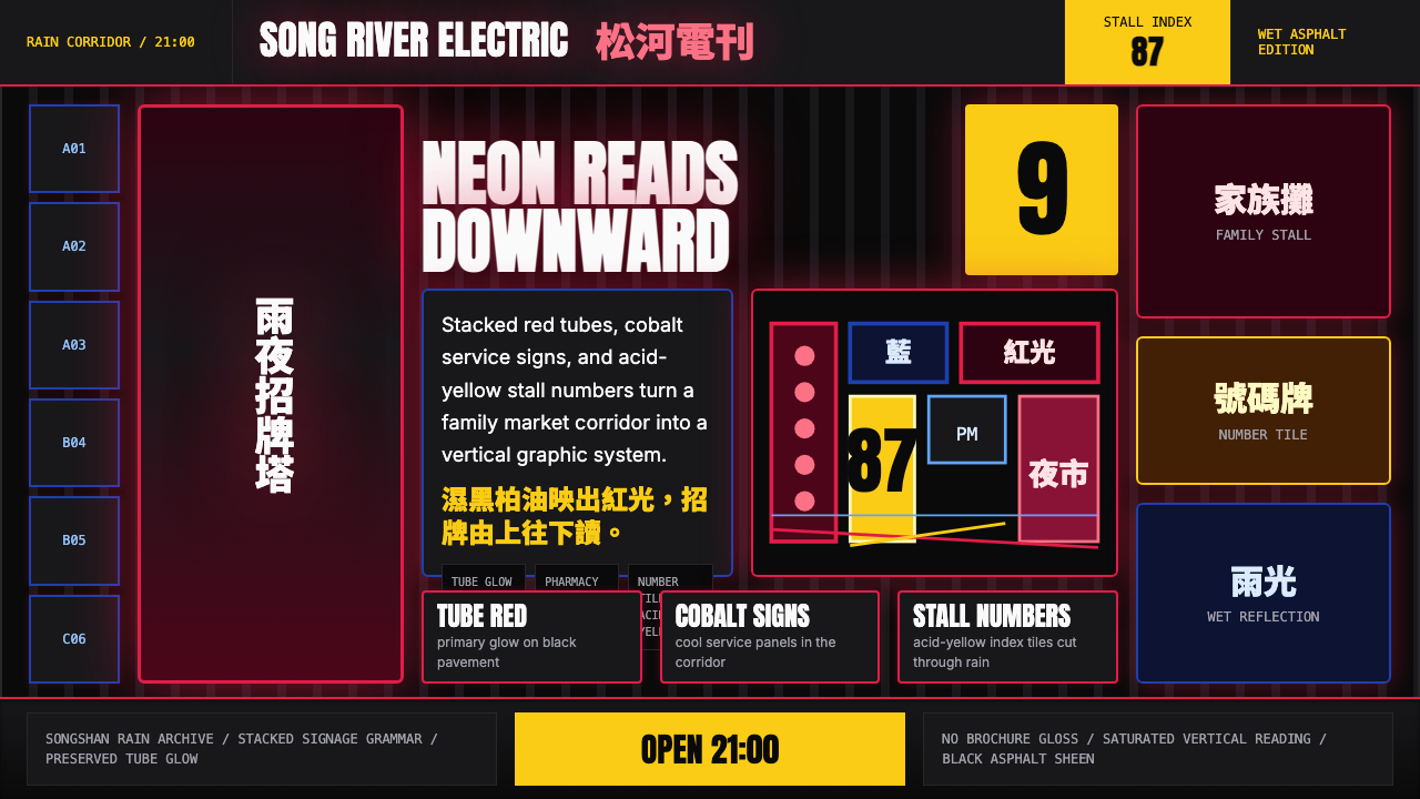
Dark Ground and Wet Asphalt深色底面與濕柏油路面
The foundational surface is always deeply dark — not the clean matte black of a studio backdrop but a black that implies moisture, reflection, and accumulated use. This wet-ground logic means that color does not sit on the surface so much as it glows within it, creating the haloing and bloom effect central to the style. Lighter elements appear to emit rather than to be lit from without.基底色面始終是深邃的暗色——不是攝影棚背景布那種乾淨啞光的黑,而是一種隱含著濕氣、反光與歲月積澱的黑。這種濕地路面的邏輯意味著,色彩不是附著在表面,而是從內部發光,由此產生霓虹暈圈與光暈漫溢的效果,而這正是這套風格的核心。較亮的元素看起來像是自體發光,而非被外部光源照亮。
Saturated Red as Structural Anchor飽和紅作為結構錨點
The red in this system is not a neutral attention-getter — it carries the cultural weight of auspiciousness, ceremony, and vitality drawn from Chinese visual tradition, compressed into the urgency of a commercial sign. It functions as the dominant structural element, typically occupying the largest or most vertically prominent position in a composition. Against a dark ground, this red does not merely pop; it radiates.這套系統中的紅色不是中性的注意力奪取者——它承載著源自中國視覺傳統的吉祥、儀式與生命力的文化重量,被壓縮進商業招牌的迫切感之中。它作為主要結構性元素發揮作用,通常在構圖中佔據最大或垂直位置最顯著的區域。在深色底面的映襯下,這種紅色不只是跳出——它是向外輻射的。
Cobalt as Cold Counterpoint鈷藍作為冷色對位
A cold, saturated blue — borrowed from the enamel panels of traditional pharmacy signage — acts as the primary foil to the red. Where the red is warm, ceremonial, and expansive, the cobalt reads as authoritative, medicinal, and precise. It is the color of information rather than emotion. When set against the dark ground, it vibrates against the red without the visual collision becoming unreadable — a property exploited in stall corridors where both appear within meters of each other.一種寒冷、飽和的藍色——借自傳統藥局招牌的琺瑯看板——作為紅色的主要對應色而存在。紅色溫暖、具有儀式感且向外擴張,鈷藍則讀起來更像權威、醫藥與精確。它是資訊的顏色,而非情感的顏色。置於深色底面上,它與紅色之間會產生視覺震顫,但不至於讓整體變得難以辨讀——這正是攤販走廊中兩者相距數米並排出現時被利用的視覺特性。
Acid Yellow as Punctuation酸黃作為標點符號
Acid yellow in this system functions less as a body color and more as visual punctuation — the number tile on a stall, the price stamp on a menu board, the narrow band of luminescence at the edge of a sign. It is the sharpest element in the palette, the one that reads first from a distance. Its quantity in any composition is deliberately limited; if it appears too freely, it loses its role as the eye's stopping point and the composition collapses toward visual noise.酸黃在這套系統中更像視覺標點符號,而非塊面顏色——攤位上的號碼牌、菜單板上的價格印章、招牌邊緣那條細窄的發光帶。它是色板中最銳利的元素,是從遠處最先被眼睛接收到的那個。在任何構圖中,它的使用量都被刻意限制;如果出現得太過隨意,它就會失去作為視線停靠點的作用,整個構圖便向視覺噪音滑落。
Vertical Typographic Stacking垂直文字疊層
Text in this system reads vertically or in compressed horizontal bands stacked atop one another — an organizing logic inherited from traditional Chinese signage that orients reading from top to bottom and from right to left, as well as from the practical necessity of fitting maximum information onto narrow stall facades. This vertical rhythm is not merely decorative; it is the spine of the layout. Numbers, characters, and icons can all participate in the stack, with hierarchy established by scale and luminosity rather than grid position.這套系統中的文字是垂直閱讀的,或以水平窄條的形式一層層疊置——這種組織邏輯繼承自傳統漢字招牌由上而下、由右而左的閱讀方向,也來自在狹窄攤位立面上塞進最多資訊的實際必要性。這種垂直節奏不只是裝飾性的;它是版面的脊柱。數字、漢字與圖像符號都可以參與這個疊層,層級由大小與亮度決定,而非由網格位置決定。
Neon Glow and Light Bloom霓虹光暈與光芒漫溢
The visual signature most associated with this style is the glow that emanates from lit elements against the dark ground — a soft corona of color that extends beyond the literal edge of a letter or shape. This bloom is not imprecision; it is the authentic optical behavior of glass-tube neon reflected on wet surfaces, translated into a design principle. In practice, it means that hard-edged elements sit within atmospheric halos, and the boundary between figure and ground is never entirely sharp. This softened edge is what distinguishes the style from other dark-palette design systems.與這套風格最密切相關的視覺標誌,是亮色元素在深色底面上向外發散的光暈——一圈超出字母或形狀實際輪廓的柔和色光光環。這種光暈不是不精確;它是玻璃管霓虹燈在濕潤表面上的真實光學行為,被轉化為一種設計原則。在實踐中,這意味著硬邊元素坐落在大氣光暈之中,圖形與底面之間的邊界從不完全清晰。這種被柔化的邊緣,是這套風格有別於其他深色色板設計系統的地方。
Layering and Visual Compression層疊與視覺壓縮
Night market signage does not have the luxury of generous white space — every surface competes, and legibility is achieved through contrast and luminosity rather than breathing room. This compression becomes a stylistic value in itself: elements overlap, colors push against one another at their edges, and the overall composition maintains a density that reads as abundance rather than clutter, because each layer has distinct color identity. The style resists the minimalism reflex; restraint, when it appears, is selective and purposeful.夜市招牌不存在大方留白的餘裕——每一個表面都在競爭,可讀性靠的是對比度與亮度,而非留白。這種壓縮本身成為一種風格價值:元素相互重疊,色彩在邊緣彼此對峙,整體構圖維持一種讀起來像豐盛而非雜亂的密度,因為每個層次都有清晰的色彩身份。這套風格抗拒極簡主義的反射性衝動;當克制出現時,它是選擇性的、有目的的。
Who shaped Taiwanese Raohe Night Market Neon?谁塑造了 Taiwanese Raohe Night Market Neon?
The Taipei-born director Edward Yang is the most significant visual chronicler of the urban environment from which this style emerges. His films of the 1980s and early 1990s — set in the rain-wet lanes and neon-saturated commercial districts of Songshan and Wanhua — established a visual vocabulary for how the night market corridor looks, feels, and functions as a compressed social world. His compositional instinct for depth and layering within narrow spaces directly parallels the typographic stacking that defines the Raohe Neon style. Researchers and designers working in this tradition regularly cite his cinematography as a primary visual reference.台北出生的導演楊德昌,是孕育這套風格的都市環境最重要的視覺記錄者。他在1980至90年代初期拍攝的電影——以松山與萬華的濕潤巷弄和霓虹飽和商業區為場景——為夜市走廊的視覺面貌、感受與作為一個壓縮社會世界的功能建立了一套視覺語彙。他在狹窄空間內對深度與層疊的構圖直覺,與定義饒河霓虹風格的文字疊層形成直接的平行關係。在這個傳統中工作的研究者與設計師,經常援引他的攝影術作為首要視覺參照。
Tsai Ming-liang's films — many shot on location in Taipei's older commercial districts and night market peripheries during the 1990s and 2000s — extended the visual record of this environment into the register of urban melancholia. Where Yang documented the social density of the night market at its peak, Tsai photographed the same environments in decline, in rain, and in the small hours when the signs continue to glow but the crowds are gone. This quality of isolated luminescence against empty wet darkness is a direct visual precursor to the more atmospheric applications of the Raohe Neon palette in contemporary design.蔡明亮的電影——許多攝製於1990至2000年代台北舊商業區與夜市邊緣的實地場景——將這個環境的視覺記錄延伸至都市憂鬱的維度。楊德昌記錄了夜市巔峰時期的社會密度,蔡明亮則在同樣的環境裡拍攝衰頹、雨夜,以及深夜招牌仍在發光而人潮早已散去的時刻。這種孤立的發光體置於空曠濕黑黑暗中的視覺特質,是饒河霓虹色板在當代設計中較具氛圍感的應用方式的直接視覺前身。
Chang Wan-li is one of the last surviving craftspeople in Taiwan who continues to hand-bend glass tubes for traditional neon signs using methods that have remained largely unchanged since the mid-twentieth century. As LED lighting displaced glass tube neon across Taiwan's commercial districts from the 2000s onward, Chang's workshop became a site of active craft preservation — attracting apprentices, documentary filmmakers, and design researchers seeking to understand the material properties of the original signs. His practice grounds the Raohe Neon design style in a specific, recoverable material tradition rather than treating it as a purely visual abstraction.張萬力是台灣為數不多仍在以手工彎管方式製作傳統霓虹招牌的匠師之一,其使用的技法自二十世紀中期以來幾乎未曾改變。2000年代起,LED照明逐步取代玻璃管霓虹燈佔據台灣商業區,張萬力的工坊成為一個主動進行工藝保存的場所,吸引了學徒、紀錄片導演以及尋求理解原始招牌材料特性的設計研究者。他的實踐將饒河霓虹設計風格奠基於一個具體的、可追溯的材料傳統之上,而非將其視為純粹的視覺抽象。
Jam Wu is among the Taiwanese designers most closely associated with translating the vernacular visual language of the night market into contemporary graphic and digital practice. His work draws on the specific typographic conventions of traditional Taiwanese commercial signage — the compressed Chinese characters, the hand-lettered numerals, the grid logic of stacked panels — and applies them to contemporary brand identity, poster design, and digital interfaces. His practice is important because it demonstrates that the Raohe Neon aesthetic is not merely documentary but actively generative: a living style that can be extended to new surfaces and contexts without losing its identity.吳克軍(Jam Wu)是與將夜市俗民視覺語彙轉譯進當代平面與數位實踐最密切相關的台灣設計師之一。他的作品汲取傳統台灣商業招牌的具體排版慣例——壓縮的漢字、手繪數字、疊層看板的網格邏輯——並將之應用於當代品牌識別、海報設計與數位介面。他的實踐之所以重要,在於它展示了饒河霓虹美學不僅僅是記錄性的,更是具有生成性的:一種活的風格,能夠延伸至新的表面與語境而不失去自身的身份。
The lifting of martial law in Taiwan in 1987 removed restrictions that had previously limited public image-making in commercial and street environments. In the years immediately following, a generation of Taiwanese documentary photographers worked extensively in Taipei's night market districts — Raohe, Shilin, Ningxia, Wanhua — producing a body of work that captured the signage environment at its most dense and saturated, before urban renewal and LED conversion began transforming the visual character of these areas. This photographic archive — distributed across galleries, publications, and archival collections — functions as the closest thing to a primary source document for the Raohe Neon design style.1987年台灣解除戒嚴後,此前限制在商業與街道環境中進行公共影像創作的管制隨之解除。在緊接其後的幾年裡,一代台灣紀實攝影師廣泛深入台北各夜市街區——饒河、士林、寧夏、萬華——留下了大量在都市更新與LED改裝開始改變這些地區視覺面貌之前,捕捉到招牌環境最濃密、最飽和狀態的影像作品。這批散佈於畫廊、出版品與檔案館藏的攝影存檔,構成了最接近饒河霓虹設計風格原始史料的參照文獻。
How do you use Taiwanese Raohe Night Market Neon today?今天怎么用 Taiwanese Raohe Night Market Neon?
Raohe Night Market Neon is a high-commitment style — it demands a dark ground, high saturation, and layering discipline. Applied halfway, it collapses into muddy darkness or garish novelty. Applied fully and with understanding, it delivers the most viscerally immediate visual impact of any contemporary design palette: the viewer's attention is not requested, it is seized.饒河夜市霓虹是一套高承諾的風格——它需要深色底面、高飽和度與層疊紀律。若只做一半,它會塌陷為混濁的黑暗或刺眼的廉價感。若充分理解並完整應用,它能帶來當代設計色板中最具本能衝擊力的視覺效果:觀看者的注意力不是被請求的,而是被抓住的。
For presentation slides, this style works best in contexts where atmosphere and conviction matter as much as data clarity — a product pitch, a brand manifesto, a cultural initiative. Cover slides benefit from the full system: deep dark ground, vertically oriented or stacked title treatment in the saturated red or a warm white that glows against the dark, a narrow acid-yellow element as a structural accent. Content slides should pull back from the full density — a dark-ground slide with the body text in a near-white is readable and atmospheric — but the dark ground should be maintained throughout the deck for visual coherence. Data slides are where the palette earns its keep: bar charts and comparative visuals where each element carries one of the palette's saturated tones become instantly legible by color-identity alone.對於簡報投影片,這套風格最適合氛圍與說服力和數據清晰度同等重要的場景——產品推介、品牌宣言、文化倡議。封面頁受益於完整系統:深邃暗色底面、在飽和紅色或映在深色底面上如發光般的暖白中垂直排列或疊層的標題處理,以一個細窄的酸黃元素作為結構性點綴。內容頁應適當收回全密度——以接近白色的正文置於深色底面的投影片具有可讀性與氛圍感——但整副簡報應維持深色底面以保持視覺一致性。數據頁是色板發揮功用之處:柱狀圖與對比視覺,每個元素承載色板的一種飽和色調,僅憑色彩身份即可立刻辨讀。
For web interfaces and digital product design, this style is best matched to platforms where edge and intensity are brand values — cultural platforms, music discovery tools, entertainment dashboards, late-night food delivery. The dark ground should be consistent across UI surfaces; the red and cobalt serve hierarchical functions — red for primary calls to action, cobalt for informational states and secondary actions — while acid yellow is reserved for the single most important status or alert state. Navigation should be lightweight and typographic against the dark, with no drop shadows that create the soft-glow illusion the background already handles at the element level.對於網頁介面與數位產品設計,這套風格最適合品牌價值中包含銳利感與強度的平台——文化平台、音樂發現工具、娛樂儀表板、深夜外賣服務。深色底面應貫穿所有UI介面;紅色與鈷藍承擔層級功能——紅色用於主要行動號召,鈷藍用於資訊狀態與次要操作——而酸黃保留給唯一最重要的狀態或警示。導航應在深色背景上保持輕盈的字體型態,不需製造柔和光暈幻覺的投影——深色底面本身已在元素層面處理了這個問題。
For editorial and marketing work, the style gives poster work and social media visuals an intensity that competes for attention in densely visual feeds. A marketing cover built on this system — dark ground, stacked type in saturated red with acid-yellow numerals — does not need photography to command attention. When photography is included, it works best either as a silhouette against the dark ground or as a color-washed image reduced to near-monochrome in one of the palette's dominant tones. The style supports bilingual typographic layouts naturally: the vertical stacking logic accommodates Chinese and Latin scripts simultaneously without either reading as a caption for the other.對於編輯與行銷內容,這套風格為海報作品與社群媒體視覺帶來在視覺密集動態中競爭注意力的強度。以這套系統建構的行銷封面——深色底面、飽和紅色疊層文字配酸黃數字——不需要攝影就能主導視線。當攝影圖像被納入時,最好的方式是以剪影形式置於深色底面,或將照片色調還原為色板主色調之一的近乎單色圖像。這套風格天然支持雙語排版:垂直疊層邏輯能同時容納中文與拉丁字母,兩者都不會被讀成另一種語言的說明文字。
The most common mistake when applying this style is treating it as a color-swap operation on an existing light-ground design — replacing white backgrounds with black and hoping the colors carry the system. They will not. The style's logic is built from the ground up on the behavior of light on dark surfaces, and every compositional decision follows from that premise. A secondary failure mode is using all three saturated colors at equal weight: without one color clearly dominant, the palette becomes competitive noise rather than structured saturation. Identify the primary color for each composition — typically the deep red — and treat cobalt and acid yellow as measured accents within that dominant field.應用這套風格時最常見的錯誤,是將它視為在現有淺色底面設計上進行色彩替換的操作——把白色背景換成黑色,然後期待顏色撐起整個系統。這行不通。這套風格的邏輯從一開始就建立在光線在深色表面上的行為方式之上,每一個構圖決定都從這個前提出發。第二種失敗模式是以相等的分量使用三種飽和色:若沒有一種顏色明確主導,色板就會變成競爭性噪音而非結構性飽和。為每個構圖確認主色——通常是深紅——並將鈷藍與酸黃視為在這個主導色場中有節制的點綴。
Taiwanese Raohe Night Market Neon — FAQTaiwanese Raohe Night Market Neon · 常见问题
Is this style only appropriate for Taiwanese or broadly East Asian subject matter?這套風格只適合台灣或廣義的東亞主題嗎?
No. The Raohe Night Market Neon style is a visual system, not a cultural label to be applied only to content about Taiwan. Its palette, typographic logic, and layering principles are transferable to any subject matter that benefits from intensity, edge, and atmosphere — a global music platform, a fashion brand, a nightlife-adjacent service, or any product where the dark-ground glow aesthetic aligns with the brand's values. The style's Taiwanese origin enriches it historically and culturally, but it is no more restricted to Taiwanese content than Bauhaus is restricted to German content.不。饒河夜市霓虹是一套視覺系統,而非只適用於台灣相關內容的文化標籤。它的色板、排版邏輯與層疊原則可以移植到任何受益於強度、銳利感與氛圍的主題——全球音樂平台、時尚品牌、夜生活相關服務,或任何深色底面發光美學與品牌價值相符的產品。這套風格的台灣起源豐富了它的歷史與文化底蘊,但它並不比包豪斯更受限於台灣內容,就如同包豪斯並不只限於德國內容一樣。
How does this style differ from other dark-neon aesthetics like cyberpunk or synthwave?這套風格和賽博龐克或合成波等其他深色霓虹美學有何不同?
Cyberpunk and synthwave are primarily Western science-fiction-derived aesthetics with a specific technological and dystopian valence — neon in those traditions signals a future gone wrong, alienation, or retro-futurist nostalgia. Raohe Night Market Neon is grounded in the specific material reality of a commercial tradition: the palette colors are defined by the actual pigments of Taiwanese pharmacy enamelwork and traditional lacquer, and the typographic logic comes from vernacular Chinese signage conventions. Where cyberpunk leans into purples and acid greens with a sci-fi atmosphere, Raohe Neon uses a vermilion red, cobalt blue, and acid yellow that carry cultural meaning specific to the Taiwan context. The result is warmer, more human, and less retrofuturist.賽博龐克與合成波主要是西方科幻衍生的美學,帶有特定的科技感與反烏托邦基調——在這些傳統中,霓虹燈暗示的是一個出了問題的未來、疏離感,或是懷舊未來主義。饒河夜市霓虹則根植於一個商業傳統的具體物質現實:色板顏色由台灣藥局琺瑯塗料與傳統漆器的實際顏料所定義,排版邏輯來自俗民漢字招牌慣例。賽博龐克傾向帶有科幻氛圍的紫色與酸綠,饒河霓虹使用的朱紅、鈷藍與酸黃則承載著台灣語境中特定的文化意義。最終結果更溫暖、更具人味,也更少懷舊未來主義的感覺。
Can this style work in a light-ground version for contexts where a dark background is impractical?在深色背景不實際的場景中,這套風格可以做淺色底面版本嗎?
A light-ground adaptation is possible but requires significant recalibration. The system's core mechanism — light glowing from within a dark field — cannot be directly reproduced on a light ground. What can be preserved is the color identity (the saturated red, cobalt, and acid yellow) and the typographic stacking logic. On a light ground, these become bold, assertive elements without the atmospheric glow. The result reads closer to traditional Chinese commercial graphic design than to night market neon specifically. If the glow and bloom effects are central to the intended application, a dark ground is not optional — it is the system itself.淺色底面的改編是可能的,但需要大幅重新校準。這套系統的核心機制——光從深色場域的內部發光——無法在淺色底面上直接再現。可以保留的是色彩身份(飽和紅、鈷藍與酸黃)以及排版疊層邏輯。在淺色底面上,這些元素變成大膽、有力的存在,但沒有大氣光暈效果。結果讀起來更接近傳統中國商業平面設計,而非特指夜市霓虹。如果光暈與光芒漫溢效果是預期應用的核心,深色底面就不是選項——它就是這套系統本身。
How should Chinese and Latin type be handled together in this system?在這套系統中,中文與拉丁字型應如何共同處理?
The vertical stacking logic of the Raohe Neon system accommodates mixed-script typography naturally, because traditional Taiwanese signage frequently combined Chinese characters, Arabic numerals, and occasionally romanized text in a single sign. The hierarchy principle holds: scale and luminosity determine reading order, not script convention. Chinese and Latin text can occupy the same band in a stacked composition — the Chinese characters typically carrying the larger body weight and the Latin functioning as secondary identification or transliteration. Avoid the common error of treating the Latin as a caption line below the Chinese; in the night market tradition, mixed scripts share the sign face as equals, just at different scales.饒河霓虹系統的垂直疊層邏輯天然能容納混合字體排版,因為傳統台灣招牌經常在同一塊牌面上結合漢字、阿拉伯數字,偶爾還有羅馬拼音。層級原則依然適用:大小與亮度決定閱讀順序,而非字體慣例。中文與拉丁字母可以在疊層構圖的同一條帶中並存——漢字通常承擔較大的字面重量,拉丁字母作為次要識別或轉寫功能。避免將拉丁文字當作中文下方的說明行文處理這一常見錯誤;在夜市傳統中,混合字體以平等的地位共享招牌牌面,只是在不同的大小尺度上出現。
Is this style suited to minimalist or sparse compositions, or does it require visual density?這套風格適合極簡或稀疏的構圖,還是必須要有視覺密度?
Spare compositions are possible but work differently in this system than in light-ground minimalist styles. On a dark ground, a single bold red element surrounded by empty dark space does not read as minimal — it reads as isolated and tense, a spot of light in the dark, which can be dramatically effective for a cover or hero image. The glow effect means that even a single element carries atmospheric weight. Where sparse compositions struggle in this system is when the dark field becomes simply empty rather than atmospherically charged — this happens when the ground is a flat, matte dark rather than one that carries the suggestion of depth and moisture that is central to the style's character.稀疏的構圖是可能的,但在這套系統中的效果與淺色底面極簡風格截然不同。在深色底面上,一個大膽的紅色元素被空曠深色空間圍繞,讀起來不是極簡——而是孤立與緊張,是黑暗中的一點光,這對封面或視覺主圖可以產生戲劇性效果。光暈效果意味著即使是單一元素也承載著大氣重量。在這套系統中,稀疏構圖容易失敗的地方,是當深色場域變得僅僅是空曠而非充滿大氣張力時——這發生在底面是平板啞光的深色,而非帶有深度感與濕潤感暗示的時候,而後者恰恰是這套風格氣質的核心。
Related design styles相关设计风格
 Cartoon Network 90s BlocksKids-cable noise, squared. Black-white checkerboards crash into hot-yellow Bu…方块化的儿童有线电视噪音:黑白棋盘撞上热黄 Bungee 字块。
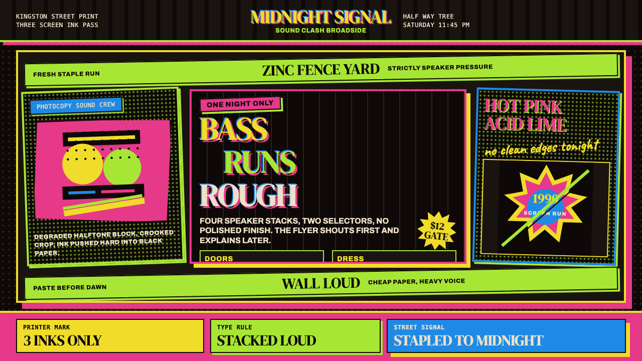 Jamaican Dancehall 1990 PosterMidnight volume. Acid lime and hot pink type stack like screenprint ink on bl…午夜音量:酸绿与热粉粗字叠在黑新闻纸上,如丝印错位。
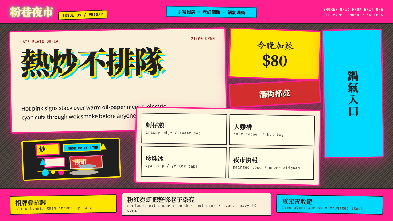 Taipei Shilin Night Market NeonLoud by design. Hot pink, neon yellow, and stacked TC serif signs break the g…張揚就是秩序。夜市粉、霓虹黃與繁體宋招牌打破格線。
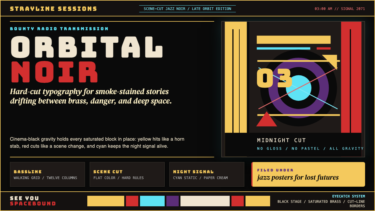 Cowboy Bebop Jazz-NoirCool at 3 AM. Bungee type, jazz yellow, red cuts, and cyan rules hit deep bla…凌晨三点的酷:黑底上 Bungee 字、爵士黄、红切线与青色规则。
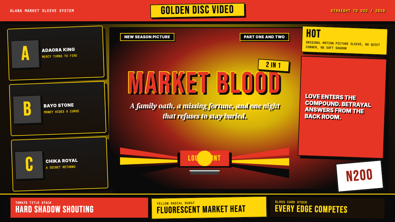 Nigerian Nollywood DVD Poster (2010)Market-stall cinema shouts. Tomato red type and yellow burst collide on jet b…市场摊位式电影在喊:番茄红大字与黄色爆裂撞上黑底。
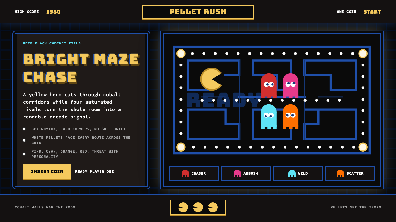 Pac-Man (Namco 1980)Arcade joy burns bright. Yellow disc, cobalt maze, and four ghost hues snap o…街机欢愉高亮燃烧:黄圆、钴蓝迷宫与四色幽灵在黑底上跳动。